#overall i rlly like how the colours and composition turned out here!!!
Note
Hi! I hope I'm not bothering you, but I love your mood board edits and was wondering if you could explain how you go about making/colouring them? I see lots of places to find gifs but turning them into a set is so hard. Thank you in advance!
hi! first of all thank you so much and second of all it’s not a bother at all! i am happy to give some of my own tips even if my explanation probably isn’t super helpful. i won’t give like a ps tutorial but below the cut (since i included example gifs, it’s VERY long) is my process for my latest jily aesthetic:
i keep track of all my ideas/sets in a spreadsheet (which i won’t show bc there’s a lot of info i’d have to blur/black out) but i always have a list of what scenes i need to gif/what gifs i’m editing and where i’m getting them from. i also include a couple extra ideas in case the gifs i have planned end up being too hard to color or don’t fit in the set. i’ve found it’s best/easiest to start w the list bc there is literally nothing worse than spending hours on a set and then not being able to complete it.
as for actually finding the material, i have a pretty healthy number of scene packs saved in my giffing folder, esp. for things i know i will gif frequently. most of the time i will peruse youtube, vimeo, and instagram for any aesthetic scenes. i also have a lot of gif packs saved specifically for the purpose of making mbs (usually i mix my own gifs w gif packs), if you msg me i’m happy to direct you to some gif packs i use regularly or you can check my #resources tag. a couple tips for finding material:
always opt for download when possible, i used to screen record and the difference when i switched to downloading was astronomical. (it’s easy to lose quality and esp if you’re on mac, quicktime duplicates frames so either you have to manually delete those extras or you get sort of choppy gifs when you load them into ps.)
always use 1080p or better, 720p will work in a pinch for 268px or 177px gifs since you can make up some of that resolution loss with sharpening, but don’t go any lower than that, just love yourself.
for pale sets, look for the right colors. i tend to look for scenes w high color contrast especially if it features poc so it’s easier to color without whitewashing, ie if the subject is a person then i look for light colored or blue/green/violet/white backgrounds. it’ll make your life wayyyyy easier. this also means if you’re making a set try to find scenes with already similar lighting bc you won’t have to work so hard to make it look cohesive.
here’s a quick rundown of what i do before coloring:
import all frames and save all the files in a folder together!!
play around with frame delay so all the gifs are moving at about the same speed, usually keep it between 0.03-0.05s
crop and resize gifs (i use 268x145 most of the time)
convert to timeline
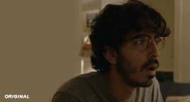
when it comes to coloring it can be really hit or miss, i’ve recently gotten back into my groove but i was having sooo much trouble earlier this year. in general, don’t stress yourself out!! sometimes it’s easier to just find a new scene/gif (hence my list of extras!) than to try too hard to fit a gif into your set. i color all my gifs by scratch (ie no psds) but i tend to follow the same pattern, i’ll explain using these gifs/psd as an example since then i can also explain how to fix white-washing:
first off when you’re coloring gifs with poc always always always make a layer mask so you can compare the edited and unedited skin tones directly! i use the marquee tool to make a selection in the middle of the character’s face, select the folder of my adjustment layers, and hit ‘add vector mask’ (the third button from the left on the layers panel, it’s a white rectangle with a circle in it).
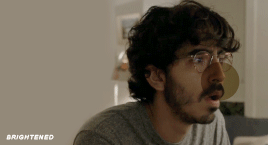
i almost always begin by using hue/saturation layers to highlight and delete certain colors. here i highlighted red and raised the lightness on yellow by a lot since it’s a very yellow scene. then i use a combination of brightness/contrast, levels, and curves layers to brighten the scene. here’s what i have now:
i add a gradient map set to black/white, change the blending to exclusion, and lower the opacity to between 5-10% (depending on the scene) to lighten the contrast further:

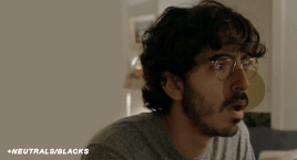
then i add back a little depth with selective color in neutrals and blacks:
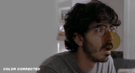
now i have two main goals: 1. add contrast between the background and the subject, and 2. brighten the scene into a pale gif. to do this, i use color balance to tweak the color of the background, taking out the yellows. this step works best if there’s at least some shade difference between your subject and background, otherwise isolating the two will be impossible. here’s what i have after adding color balance:

i use hue/saturation to selectively highlight the background color. in this case i chose to adjust magenta and used the color picker (the first eyedropper on the left) to identify the exact shade i wanted to lighten. now i have a fairly neutral background and a colorful subject, which gives a sort of pale effect:
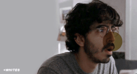
and now i use a curves layer and a selective color (white) layer to brighten further:

before i go further, i start fixing white-washing. keep in mind that some variance is normal since you are naturally changing the lighting of the scene; this gif shows it rlly clearly bc of how yellow and dim the lighting is, so some lightening is to be expected. however, both because the vector mask shows a lot of whitening and because i’ve giffed dev patel before and have a general idea of what he looks like in this type of lighting, i know what needs to be fixed, so i go back in under the psd/adjustment layers with a combination of selective color (red and neutral) and hue/saturation layers to darken his skin again:

now that some more contrast has been added in, i can go back to working on the psd and use curves and selective color to play around with the background again:

i use another hue/saturation layer and a black/white gradient to tone down oversaturation:


usually i leave those layers on top, so if i want to make any adjustments (like lightening the background more), i go in under those two. in this case i tweaked the whites and reduced the contrast a little to get this:
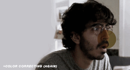
again, you can see his skin tone has changed from the original, but variation is to be expected given how much brighter the room is, the fact that i took out a lot of yellow lighting, and the brightening effect of the computer screen in front of him. some other things to keep in mind when coloring:
when you add layers to correct white-washing, you’re likely to end up with overly red/orange skin tones (red-washing). this can be fixed by upping cyans in the reds, desaturating/darkening the reds, or adding b/w or desaturation later on.
when in doubt, it’s better to be darker than lighter (the issue with white-washing is that it promotes colorism, and there is nothing inherently wrong with a darker skin tone) but really. just put in the effort to color poc correctly.
when changing the lighting a lot it helps to look at pictures of the subject in natural/bright lighting, since you get a better idea of what their normal skin tone is.
don’t try to squeeze all your selective color layers into one. you’ll get less grainy gifs if you separate them out and work one by one.
TURN OFF NIGHT SHIFT/NIGHT MODE! yes i KNOW it’s bad for your eyes (especially if you’re like me and gif at night, when the lighting outside isn’t changing every 20 seconds) but your gifs will look VERY different under f.lux or night mode compared to daytime screens. especially if you’re giffing at different times of day, blue light filters can really change the way your coloring appears. best to keep it consistent.
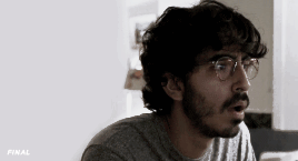
my sharpening settings vary depending on what i’m giffing but in general i do two layers of smart sharpen (500% with radius between 0.2-0.4, 10% with radius at 10px) and then gaussian blur at 2.5px and adjust the opacity so it’s somewhere between 15-20%. i try to strike a balance between smoothing out the graininess from selective color, and sharpening details like clothes and hair. here’s what i ended up with for the gif above:

then i rinse and repeat for the rest of the gifs in the set! i tend to start with the gifs that i know will be hardest to color, which is usually the darker ones (coloring is limited by how much i can brighten the scene) and those that include poc (again, limited by how much i can brighten and adjust the scene’s lighting without white-washing). then i check set cohesion as i go, using those first few gifs as benchmarks. once i have all 8 (or 9 or 10) gifs, i play around with composition and try to balance and vary the subject, colors, and composition of gifs next to each other. i go back and make a couple of adjustments here and there according to what i observe and what i think might improve the overall appearance.
and that’s pretty much it! i hope this was helpful, if you have other questions feel free to message me and i’d be happy to help/troubleshoot. happy giffing!
#Anonymous#*#resources#answered#sorry this was sO long but i hope it helped on the coloring end#tbh i exceeded my own expectations with the dev gif lol#yeahps#completeresources#chaoticresources#tutorial#coloring tutorial
54 notes
·
View notes
Last Seen Blogs