#this isn't the only angle that's repeated a bunch but it does stand out the most to me for some reason
Text
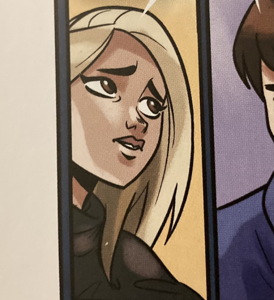
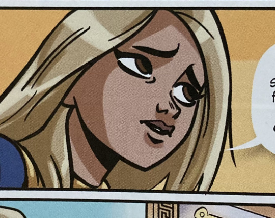
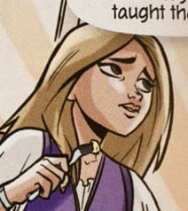
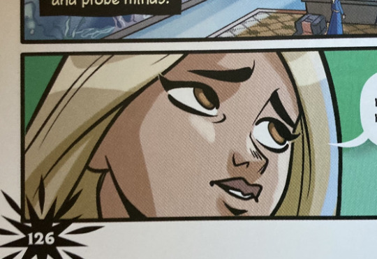

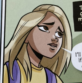
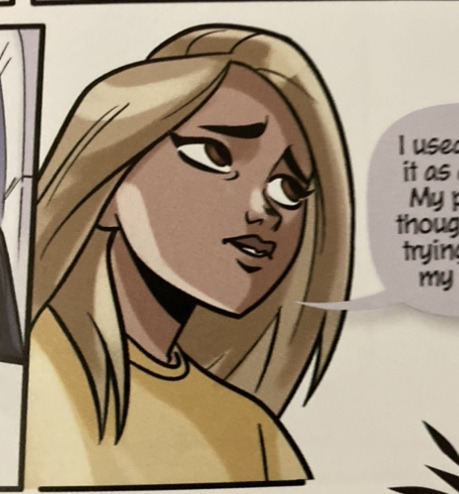
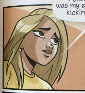
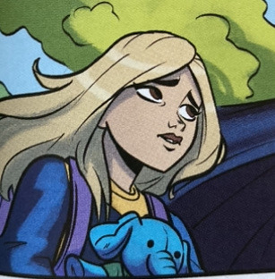

they put that angle to WORK goddamn
#kotlc#kotlc graphic novel#kotlc graphic novel spoilers#this isn't the only angle that's repeated a bunch but it does stand out the most to me for some reason#i'm always just like *points* THERE'S THAT FUCKING POSE AGAIN!!#and this isn't even all of them#i haven't even included any of the ones with slight variations#like her eyes looking slightly elsewhere
99 notes
·
View notes
Text
Game Building #2 - Gameplay, looks and feels
A bunch of different factors go into a game to make it look and feel how it should, these are things like gameplay and art which create your game's overall theme.
Gameplay and feels
How should the game feel when playing, will it be focused more on gameplay or story? It's important to make sure the game you're making feels complete and isn't just a bunch of random things that have been slapped together.
Geometry Dash
My game is going to be a race against time, so there's not exactly time to waste. The player will always have to be alert and playing to complete the level, going AFK for even a few seconds won't allow you enough time to progress. One of my main inspirations for this was Geometry Dash, which is a continuously moving platformer - the only thing you can control is the character's vertical position by jumping, flying, or bouncing. Having to constantly pay attention also brings in another aspect of difficulty because one mistake could cost you your life.
Yoku's Island
Another game which has some ideas that I like is Yoku's Island Express. I made a post on this game a while ago when I first played it, one of the main things I like about this game is that many precise timings are required. The main mechanic of the game is pinball, quite unique, and the character's vertical movement is controlled by flippers. Positioning yourself on different positions of the pinball flipper will send you flying at different angles, some of these require very precise timings and require game skill. For me, being able to complete levels with complex timings is pretty satisfying - and so it's something I would want to implement into my own game.

Terraria
Thirdly, another game I have made a post about already, but I just love the bosses in this game (modded in particular). The gameplay of some of these boss fights just feel like no other game, completely unique, and can be quite the challenge. Complicated boss fights with lots of different attacks and phases are very much my sort of thing. If I combined these sort of bosses with a race against time, I think it would give quite a competitive feel which is exactly what I would want.

I picked these 3 games to explore in detail because I want to include features from all of them - The boss mechanics of Terraria, and the timing aspects of games like Yoku and Geometry Dash.
Looks
Despite this game being pixel art, there are still lots of ways in which you can change the overall look. The style could vary from things such as the game's time in history (past/future), the location/setting, or the characters themselves.
Terraria
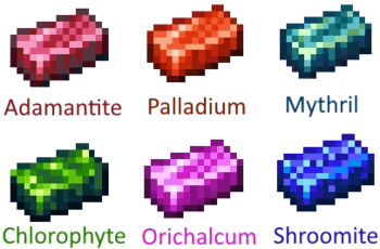
One of the things I like most about Terraria is the items, and this goes for both gameplay and design. There are different ores you can get in the game, some obviously being more valuable than others. Each ore has an entire designated set of items, weapons and armour. Lots of the designs are repeated across different sets but the colours are different, which refers back to the same 'cheating' term from creating sprites sheets. Pixel art can look completely different by just changing the colours and shading, terraria does this quite a lot with some of the pickaxe and armour textures.

Fonts
A game's font should somewhat match its overall theme. If your game is more unrealistic or cartoonish, the font could be more rounded and bubbly. If your game is more medieval/western, your font could be inspired by old-school writing fonts (but try not to make it too hard to read). Or perhaps your game is pure retro and you want a more pixel/bitmap font.
Another important thing to consider when working with fonts is to use a colour that works well with the game's colour pallet - not being able to read text because it blends in too much with the background can be quite a pain.
I used https://www.dafont.com/ to explore different types of font to put in my game.
The idea of a western font definitely wouldn't be suitable for my game. Those sort of fonts belong in a higher resolution game, or not one about a pizza jumping around at least.
Chosen font for my game
I think taking a cartoonish approach would be more suitable for my game's font - after all, the main character is a pizza with the face of a zombie... I also have the option to make a retro-like font, or maybe even a combination of both. However I think I will stick to a more rounded and bubbly font as I find it easier to read than a lower resolution font. My game's colour pallet may very in different levels, so a white font with a thick black outline would probably stand out nicely.
I will probably end up using the 'Hamberger' font (top one) as it is a nice combination of cartoonish but not too curvy/messy. This font is quite blocky, which matches the game itself - most of the tiles are solid blocks. Another reason why I like this font is because the name of it is quite literally a food (spelt wrong..) so it just feels like it would be appropriate.


0 notes
Last Seen Blogs
doodlecat
Random cute comics

telmes
nathalie is bi

shopmanplus
SHOP MAN PLUS

fymetalpics-blog
Fuck Yeah Metal Pics

daddynbabypanda
Daddy N Baby Panda