#watch me change my preset 100 more times before finally using the same one for more than a few days
Text
Plastic Infographic Project: Animation Process
19.02.19
Now, after finishing all of my assets, it was time to animate in After Effects. So, to start with, I opened the first scene up, moved all of the layers to the right places, and started to animate.
The first thing I animated were clouds as I believed that they would be the most simple things to animate, which they were. I simply had the foreground clouds move the most throughout, since they were closest to the viewer, the middle clouds move more slowly, and then the last clouds which are hardly noticeable, move the slowest. I set keyframes for the clouds at around 13 seconds as this was where I planned on ending this first scene.
Next, I thought I would do the “January 1992″ text that I wanted to move onto the screen. This was fairly easy, and it was also the stepping stone for me learning more about the graph tool and how keyframes actually work. It was kind of by chance I suppose, but it was also something I’d been interested in for a while, but not really gotten around to experimenting with. It happened while I was moving the text from the side to the middle, and then off-screen to the right. I used a easy-ease, which is what I’ve been doing up to this point, but then when the text moved off the screen after moving to the middle, it kind of moved backward for a little bit and then moved off screen. This kind of thing had happened to me before, and so I thought I would finally look into fixing it. I searched for a little bit and came across this video. It explains well what I’m talking about, and what you need to do to fix it. It was actually relatively simple. After fixing this, I decided to open up the graph editor tool, since I was just experimenting with movement at this point. I altered the graph on the keyframes for the movement of the words, and managed to make a really smooth transition. I was really pleased with this, and excited that I’d learned some very valuable new skills within After Effects.
After finishing the text movement, I decided to try out the graph editor further by using it on the waves. I had each wave layer move up and down fairly randomly, and then for each keyframe, I altered the graph to make it move more fluidly. I think that I succeeded in doing so. Moving onto the boat, I imported this onto the scene as it wasn’t part of the original ocean scene. I went ahead and parented the cargo and the white cube that I’d mentioned in the previous post, since I wanted the cargo in front of the white cube, but also behind the grey railing around the boat. The boat followed pretty much the same recipe as the wave layer that it was sitting on, with how it moved following that bottom wave. As you can see below, the graph editor shows how the waves looked.
For music, I decided to use a track from games Pokémon Ruby and Sapphire that I’d remembered. I thought that it perfectly fit the atmosphere of a boat travelling across the seas. Alongside this, I thought I would also overlay some sound effects of waves and seagulls. Links to both below.
https://www.youtube.com/watch?v=0lEVphLiFqs
https://www.youtube.com/watch?v=xyA5c-ajXyg

Now it was time for the next scene, which I was pretty excited to start. I’ll start with the waves. They are essentially the same as what I did in the previous scene, except this time, they are a lot more wild and chaotic in their movement, as the up and down sequence is more dramatic. The boat also followed the bottom wave’s movement once again, since it made sense. The clouds were also moving the same way at the first scene, except this time it was kind of just all one layer, since they were so thick.
Now for the fun part—the lightning and splash, and the screen movement. So, you may notice that I only decided on using one of the three lightnings that I created back in the assets creation phase. This was mainly because I believed after experimenting, that more that one would overcomplicate the scene and make it more convoluted. The one was enough, and helps to emphasize the damage caused by it. What I did was make it start at 0% opacity, and 0% scale size. This was so that it would zap onto the screen while taking everyone by surprise. Oh, one more thing that I think looks really good is the glow that I gave the lightning. This was to make it look less flat, and more dangerous in general. I did this by dragging on a glow preset from the effects and presets tab on the right-hand side of the screen. I then set the colour to an electric blue, and also amplified the glow so it was more noticeable. I had the lightning move from its 0% scale and opacity to 100% scale and opacity. Then afterward, it immediately went back to 0% opacity. Lightning is fast, so I wanted to emulate that.
Once the lightning hit the boat, the splash appeared out of the sea. This was easy to do, and was done by messing with the scale again. The wave then kind of dissipates after it reaches its peak size, by lowering the opacity to 0%. I thought that this was the most suitable way of animating a splash, and that is more or less what you could expect in real life. As soon as the lightning hits also, the cargo at the far left starts to slink into the ocean. The parenting of this cargo layer to the boat layer was extremely beneficial. The boat also slightly tips upon being shocked, which I did by using a rotation keyframe. The graph editor came in really handy when it came to animating the cargo box sliding off of the boat, as I wanted it to comically come to a stop once it reached the edge of the boat, and then just plop off into the sea. I reused the splash animation for this also. Upon finishing up the animation for this scene, I decided to put an idea that I’d had since starting the scene. For this I needed to pre-compose the layers for this scene. What I wanted to do was have the screen shake, and then zoom in on the lightning just before it appears. This was to add onto the chaotic nature of the scene. To do this, I searched for wiggle under the effects and presets tab on the right. I’d never used this preset, but I’d heard about it somewhere and decided to give it a whirl (or a shake). I was pleasantly surprised by how easy it was to use, and was able to quickly produce something that I was very pleased with.
(25.02.19) - Upon being suggested more details to add to the final animation, I also animated some ducks popping up out of the sea once the cargo hits the water. This was surprisingly difficult to pull off and took a while to produce something that I liked. Essentially what I did was have three ducks waiting under the first wave layer and then as soon as the cargo hit the water, the ducks popped up in rapid succession—so the first duck came up, and immediately after, the next one appears, and etc. The difficult part that I am mainly referring to here is animating everything to correspond with the waves. It was like this when I was animating the boat, and when I was animating the individual ducks later on—To be honest, I was never completely happy with how those aspects of the animation look, but it still looks convincing at least.
For the music in this scene, I thought I would choose a different track from Pokémon Sapphire this time. This particular theme was played when a storm was happening in the game, so I thought that it fit perfectly with the corresponding scene of the storm. My reasoning in choosing tracks from Pokémon is because the series is very close to me, and when I need to use music for something, I can just about think of any track from the series that would fit well. Anyway, the waves and seagull sound effects carried onto this scene, and, unintentionally, the seagulls began to sound distressed in a way, as if reacting to the storm. The waves were subtle enough, so I believe that they were still suitable. I also used a lightning sound effect, which had a couple different sounds in the .wav file that I used to introduce the scene, and then again when the lightning hit the boat. Finally, a simple splash sound effect for the two splashes. Music linked below.
https://www.youtube.com/watch?v=A0Db9NDkTUQ
https://www.youtube.com/watch?v=U0yKAzXMr4c
https://www.youtube.com/watch?v=AxvzQ386Uao

After finishing the last scene, it was time to move onto the next scene with the duck turntable thing. I had the ducks slide onto the screen using my newly found graph editor skills, and as soon as one duck moved off the screen, the next moved on. This looked pretty good, and then after I’d showcased the duck models that I’d made, the no entry sign popped up as soon as the last duck moved off screen. To do this, I just used a scale keyframe and the graph editor to make it look really fluid. Actually not a whole lot to say about this scene, but after I’d finished with the ducks, I had a text box slide onto the screen, which explained briefly about the ducks having no apertures therefore meaning that they cannot sink and will float eternally if given the chance to.
I was suggested that “no apertures” was a bit confusing, and most people won’t know what it is referring to, so I changed the text box to say “no holes” instead. I suppose it doesn’t need to have complex wording, it was just that that was the word one of the blogs also used when I was reading about the story, so I decided to incorporate it.
For the music this time around, I chose a track from the game Shantae and the Pirate’s Curse. It is a game I was playing recently, and I thought about using it as it’s a happy and upbeat track that fits with the scene in my opinion.
https://www.youtube.com/watch?v=rNus_C9W7YY

Next I animated the ducks going through their hardships, if you will. I started with the duck travelling through the intense heat. The waves and the duck movement followed the same recipe as the waves and the boat in the previous scenes. For the first duck, I had the sweat drops move slowly down the duck’s body(?) and then that was the whole scene for the first duck. I felt no need to add anything more as there was nothing that I could think of that would emphasize the scene. Next was the lightning scene. The duck and the waves moved exactly like how they moved in the second scene with the boat. I didn’t use the same waves, but I did use the same splash and lightning effects. I did, however, make the duck glow a bit upon being shocked by lightning, by using the glow preset from the effects and presets tab and using keyframes that were really close to each other. Finally, for the frozen scene, I just used simple movement, with the icebergs moving faster in the foreground than the ones in the background. The ice block containing the duck just bobbed up and down along with the waves. As for the music, I thought that I would just continue using the theme from the last scene for the rest of the animation, because looking at what I needed to animate, there was no need to change the theme to anything else.

Now moving onto the travelling scene with the different countries. There was a lot of graph editing—I wanted everything to have a smooth transition, and I think that I succeeded in this personally. I started by having Alaska become larger by using the scale tool to resize it to 100% from 0%. Then after this, Sitka pops up quickly and slides off-screen, and a text box explaining that this is the first place the ducks visited. Then comes another text box that exclaims that America, Australia, Japan, and England were all places that the ducks showed up. The box slides off-screen and then all of the countries follow after, in the same way that the ducks went on and off-screen. I had the duck follow the dotted line like how I envisioned, and also a little detail that I added was that when a country appeared over the duck, it would hit it with its head and the flag icon would appear. The duck and the last country, England, both slid off-screen at the end.

The final scene wasn’t too extravagant, with small movements from the duck and Curtis Ebbesmeyer respectively. For the duck, I had it move back and forth against the chalkboard, to kind of emphasize that it was teaching, and then for Ebbesmeyer, I had him jump up and down, as if excited about learning more about the ocean’s currents. The scene ends with a text box briefly explaining how the ducks helped oceanographers to further understand the motion of currents. Then the screen fades to black, which I did so by using a new shape layer which I coloured black, and started with 0% opacity, and added a final keyframe at the end at 100%.

This is the end of my animation process.
0 notes
Text
Sound + Vision: Flexible Learning Week
This week is Flexible Learning Week, also known as a reading week, which means we don’t have our usually scheduled classes, so there was no Sound + Vision session this week. Instead, we had the week free to work on our projects and to get our soundtracks and animated posters finished for Formative Assessment which would be happening in Week 6.
Soundtrack Development:
Before going any further with my visuals, I decided to return to my soundtrack and get it to a relatively complete state early on, just so that I could have extra time to experiment with it as I don’t have a lot of experience within sound design. For my soundtrack, I was originally using Audacity for audio editing, but I felt that Audacity was a bit simple and wouldn’t be able to do what I was aiming for, so I downloaded Audition, which is Adobe’s audio editing suite, and played around with it for a bit in order to learn the basics of the program.
Once I’d figured out everything, I brought my fire kindling/stick break sound into Audition, and began to edit it. I knew that I wanted to use this sound as the foundation of my soundtrack, so initially I just tried to make some corrections and adjustments to the sound to make it a bit better. My first priority was getting rid of the wind blowing noise present in the background of the clip. To do this, I used the ‘DeNoise’ effect, editing the effect to shift the sound’s focus to higher frequencies, which is where the noise of the actual sticks breaking was, and to reduce the amount of noise by 90%. Reducing the noise by 100% made the ‘crackling’ sound dulled down and muted, so I dropped this value by 10% to ensure that the crackling still had some impact. I then duplicated the sound clip, and slightly overlaid the beginning and end of each clip, to form a longer sound clip. I did this just to give myself a bit more flexibility when I’m building my soundtrack, incase there are parts of it which might require the sound to be longer than the three or four seconds it originally was.
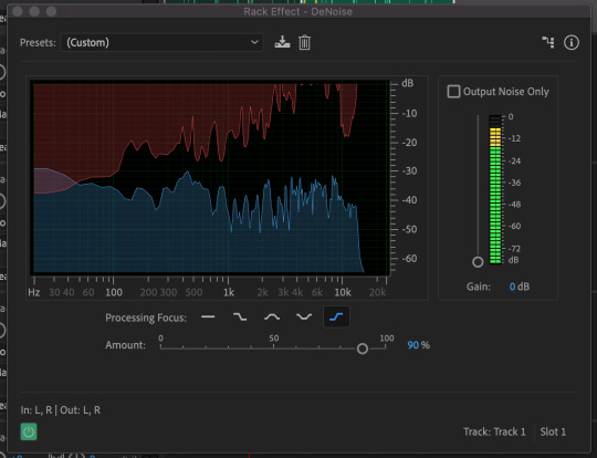
Using DeNoise to remove background noise from my soundtrack
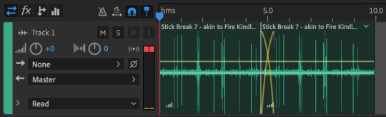
Duplicating and overlapping the sound-clip to create a cohesive, longer sound
https://clyp.it/r0rl5xx2?token=556242b858db38e11e3a25f000463f6b
Link to hear my base sound clip
With my base sound clip cleaned up, I set about creating my soundtrack. I spent a lot of time playing around with this, because I was still learning to use the Audition software as I was editing the soundtrack. I first experimented with a number of different compositions and effects, trying out different effects on each sound clip and layering them in different ways, but nothing felt quite right. Eventually though, I started getting some satisfactory results. I didn’t realise at first, but Audition actually has presets you can use that will apply a number of effects with customised settings on to your sound clips, in order to achieve certain sound effects. I began experimenting with these, and once I applied the “Weaponized Effects” preset onto my sound clip, it started to produce some interesting effects. The preset had made my sound clip sound very percussive, almost like a chime or one of those music boxes that you turn with a crank, which I thought was quite fascinating. It still wasn’t perfect though, I made some tweaks to the preset by removing the Echo effect, adding in the Multiband Compressor effect to reduce the harshness of the sound once the preset had been applied, as well as making tweaks to the Notch Filter effect by using and editing different presets within the effect itself.
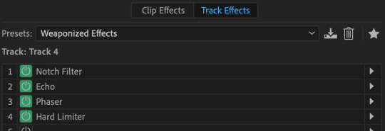
Weaponized Effects Preset, with all it’s underlying effects
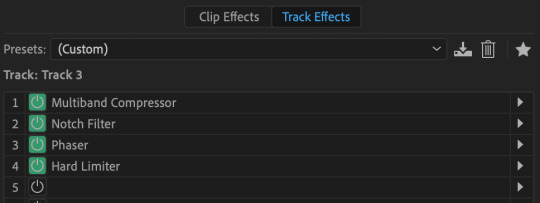
Weaponized Effects Preset after I had made some tweaks to the underlying effects
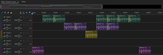
Through experimentation, I had found that the Notch Filter effect was able to change the tone of my sound clips, meaning that I could assign different ‘tones’ to individual layers in order to build a musical composition. Notch Filter also had some presets within the effect itself, and by using these and applying different presets to each audio track, I was finally able to produce something that sounded like a real soundtrack. Using these different Notch Filter presets, I began to build my soundtrack using four different audio tracks. Audio Track 1 utilised the E Minor Chord Notch Filter preset, Track 2 used the A’s and E’s preset, Track 3 used the Minor Thirds from C preset, and Track 5 used the DeEsser preset (Track 4 was used for experimentation and thus is empty).
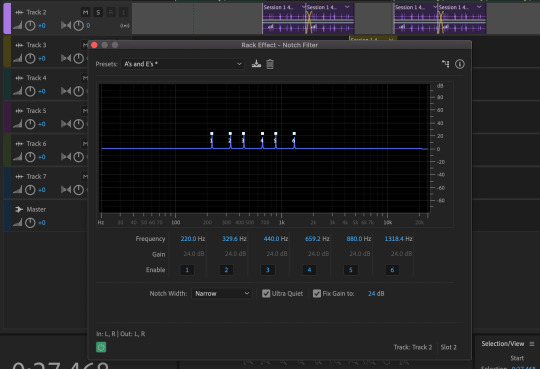
Using the Notch Filter effect on different audio tracks
The structure of my soundtrack consists of these four different audio tracks. By arranging the clips in a certain way within the composition, I’ve built the soundtrack to start off very subdued, then to slowly build through repetition and changing the notes, then the soundtrack reaches a climax where multiple notes are played at the same time to provide a stronger sound, before it slowly retreats again to a single note, and then finally sounding subdued once again. I’m really really chuffed with how this version of the soundtrack turned out, I think it sounds brilliant, especially for my first time using the Audition software. I think I’ve made it a bit too long at 51 seconds long, but I can always come back and trim the soundtrack down at a later date. For now though, this works perfectly.
MEADOWS Soundtrack Draft 2
https://clyp.it/pyukqnuf?token=e32910c383693199894670549ebacc34
Link to hear MEADOWS Soundtrack Draft 2
Animated Poster Developments:
After wrapping up my soundtrack, I went back to developing my animated poster in order to complete it for our formative assessment next week. I was pretty happy with where the animation was at this point, so for this round of developments I focused on adding text to the poster.
In my original animated poster sketch, I had planned to implement large-scale type into the poster, which I still very much wanted to do, but now I’ve also decided that I want the type to interact with the animation in some way, rather than just having the type sitting behind the animation. But I don’t want to animate the text itself, as I feel that it will create too much of a clash within the poster. As a compromise, I’ve decided to place some effects on to the type to give it translucent, distorting properties, much like glass. In order to give the text this glass look, I used the Caustic effect, and added extrusion depth to the type using the Cinema 4D renderer. After tweaking the settings of the Caustic effect for a while, I had a outcome that I was happy with. You’ll notice in the video below that as the animation moves underneath the type, it becomes slightly distorted as a result of the effects of the type. I also added an orange stroke to the type just to make it a bit easier to see on the poster, but as you can see below, I had a problem with this.
Up to this point, I had been using Adobe Media Encoder to render all of my video clips from After Effects, but unfortunately for some unknown reason, whenever I rendered the below clip through AME, the orange stroke on the type had turned black. I couldn’t figure out what was causing this, I tried changing settings in the composition, the effects themselves, and in AME, but the problem still persisted. Eventually I worked out that if I rendered the composition with After Effects itself, it rendered the colour of the type stroke correctly, so I started rendering all of my clips exclusively through AE. Draft 5 was rendered through AME before I discovered a solution for the issue, Draft 6 and thereafter were all rendered through AE.
vimeo
MEADOWS Animated Poster Draft 5 (with AME rendering error on text stroke)
vimeo
MEADOWS Animated Poster Draft 6 (AME render error on text stroke fixed)
I was really really happy with the poster at this point, and felt that it was all coming together. I just needed to add a bit more information on to the poster regarding the festival, when it would be taking place, where it was located etc. I first tried out adding more of the translucent bubble type to the poster just to see how it interacts with the animation when it covers the entire composition. I wrote “MEADOWS 2020 COMING SOON”, and watched the animation play, and I was really happy with what I saw.
vimeo
MEADOWS Animated Poster Draft 7
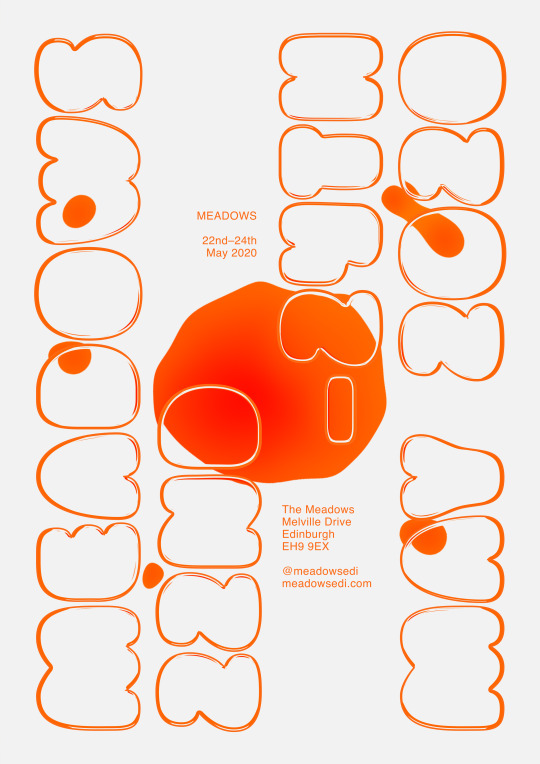
I then changed the translucent bubble type to read “MEADOWS 22nd–24th MAY 2020″; I used a fictional date for the festival that could change, but I think suits my visual direction thus far, the colours all have a very spring/summery feel and I thought it was important to have the timing of the festival reflected in the direction of the branding. I also added some smaller type above and below the main blob in the center of the poster. This type is purely just to inform the viewer in the clearest way possible, giving the name, date, location, and social/website info.
vimeo
MEADOWS Animated Poster Draft 8 (Final) [Moving]
MEADOWS Animated Poster Draft 8 (Final) [Still]
With this 8th draft, I felt that the poster was finally complete. I could have probably made some miniscule improvements to it here and there still, but I was extremely happy with my final outcome. I’d spent so much time on it, and it was very rewarding to have it finally completed. Finishing this off has given me a lot of renewed excitement for developing the trailer and instagram posts, and I hope that they turn out as great as this did. A very productive, successful week all in all leading up to formative.
0 notes
Text
Early Photos vs. Now: Seeing Progress as a Photographer
Whelp! The Internet reminded me a few days back that I’ve officially been shooting photography for over 10 years now. I’ll be honest, I thought my progress would have been further. I assume the end of my life will be something like what I am currently experiencing, which is “Wow, that went fast.” It seems I’m just barely starting to grasp the wise words of my elders when they told me “Time goes quicker than you think.”
Recent artwork from my 2018 RGG EDU tutorial. Both tutorials I’ve released with them are some of my favorite accomplishments.
In the spirit of anniversaries, let’s see just how f**king horrifying Year 1 and 2 really were… *Takes a deep breath* To the archives!
What’s this ‘flower’ setting on my point and shoot?? Oh s**t! You can take pictures of things close up! Woo!”*misses putting subject in focus
“Yes yes, let’s do a fake blood-filled cup and some s**tty pearls cause Anne Rice got me hooked on f**ken vampires in the 90’s!” Shot again with a point and shoot, with some lamps for lighting and some brutal Photoshop work to make up for the lack of lighting knowledge. Also had clearly not heard the term “Color Temperature” yet.
“Flash can be turned on manually on my Nikon Coolpix, and if I put it in front with the sun behind, it does THIS?? Well this is my new favourite thing ever!” Then I remembered that mosquitoes suck and promptly scampered into the studio for mostly ever more.
Photographed in my fridge, cause I learned that big soft light is sexy, and lamps just weren’t doing the trick.
Blown highlights and crushed shadows and no concept of color harmony?? You mean sky glitter and trendy as f**k presets…
When I first picked up a camera it was mostly to be creative in a way that didn’t involve modeling, and it was faster than drawing. I photographed macro, still life, bikes, and over the course of a year, a number of friends and slave labored my sister a bunch. The first few years were the most exciting cause the gains were exponential, obvious, and relatively easy to attain.
Admittedly, Year 1 was probably my most fun year in photography. Not that the subsequent haven’t delivered amazing memories and new friends, but I was in it purely for the fun and had no expectations from anyone but me. I didn’t have goals, a client wish list, no questions of what gear would make my work better, or any desire beyond the next batch of point-and-shoot pixels that would get my dopamine levels hopping off the charts.
Early years are dedicated to trying a lot of things, as many different facets as possible. I don’t think anyone should be really trying to “figure out their style” because if we do enough work and spend the hours just being immersed in it, style will inevitably start to form. Sometimes it looks like what’s already being made, and sometimes it turns into a creature that nobody has ever seen before. Regardless of what it is, you have to have your ass in the seat as often as you can or want, to find that voice.
10 years in, it feels like the gains I make now are at the sacrifice of dragging myself over broken glass while an elephant steps on my back. I’m not here because I retained that energy of “This is the best thing evaaarrrr!” from the early days, but because discipline and stubbornness have forced me to continue. When I’m bashing at the walls of my inability to complete a concept that’s been in my mind for 5 years, and I’m still probably another 2-3 years away from being competent enough to finalize the piece, I know I’m in it for the long game.
Time has taught me the harder things feel in the moment, the more frustrated and pressurized my brain feels over the work, I’m probably just getting closer to my next sliver of a creative breakthrough. I’ll trade one elephant for another bigger, slightly heavier elephant. While they trade places though, in those brief moments I’ll find I can breathe again.
A recent challenge to create an image using only one area of the color wheel. Many thanks to Linda Friesen for channelling her inner Moon Goddess.
Those Moments Are What I Live For
I write this all to serve as a reminder, to those in their first year, or to the grizzled veterans staring down a resume longer than a CVS receipt. Where we started and where we are now is worth celebrating. Most of us weren’t born with a natural “talent” — in fact, many would argue that is a myth. We are simply a result of repetition and practice.
I think a lot of people get intimidated in their early years that their work will never look as good as they want it to. I can’t speak for anyone else, but I can definitely say that 10 years in, I’m still another 10 years away from doing the kind of work I want to make. I hope it never changes.
My inbox is filled with emails asking the same question written hundreds of different ways, but the theme can be boiled down to “How do I get awesome at this??”
Answer? I could write an essay but here are some easy points:
Just keep at it. Put your ass into frequent, habitual practice.
Most who are any good, sit upon a throne of really, really terrible work, and years of it. Every time you complete a work of art that you think is pretty f**king awful, congratulate yourself. It’s one more foundation stone into your cathedral of mastery.
Do not look for shortcuts. You’re only stealing from your future-self.
There is no “one path to success”. There are thousands of ways, and what works for one may not work for another.
Know thyself. Inspiration is great, but nothing beats digging into the nuts and bolts of your honest creative self.
Self portrait, trying to grind down on better color theory. I probably need to watch Kate Woodman’s RGG tutorial…
Maybe you are the creator who does a little bit of everything from now until forever. Maybe you’re the type who started one style and never ever changes. There is no right or wrong answer. Far as I know, they don’t hand out medals in the afterlife… yet.
“They” say if you love what you do, you’ll never work a day in your life. I’ve met some of those humans, and they’re most often either f**king unicorns, or completely disillusioned. Love what you do, or don’t, regardless your ass is probably gunna work pretty damn hard.
I fall in and out of love with my chosen career and lifestyle on a weekly basis. I equate my career to being in a long-term, committed relationship. Some days we wake up and look at each other in bed and wonder why the other is still there. Others we are reminded what got us there in the first place. Regardless of my feelings, I think they’re mostly irrelevant.
Accurate depiction of real life misery. Brought on by walking barefoot into a glacier fed, cold ass lake, or occasionally just trying to will myself into turning on my computer… Side note – Check out those “I clearly only ever wear boots” pasty ankles!
10 years in, I feel like I’m just cracking the surface of “me” and what that means to be a creator. Seated upon a mountain of embarrassing pixels and memories, I’m staring at the bottom of an even larger heap that I will create over the next decade. My well-made list of goals and plans will probably get muddled and misplaced by the chaotic influence that is life, but another 10 years will pass regardless.
I just hope that my small, infinitesimal contribution of creativity will maybe start to balance out the number of straws I’ve used.
Commissioned work for guitar queen Nita Strauss.
Inspiration time! I managed to convince some mind-bogglingly awesome artists from a variety of genres to also dig into their archives, and bravely share some of their own humble beginnings. This was a very cathartic experience for me. It was so just absolutely f**king perfect seeing where they all started to their current favorite work. Remember, we all start somewhere, and with a few years of dedication, we never know where we will wind up.
Dave Brosha
2003. “Pure garbage. Both emotionally and metaphysically.”
2018. “The only thing between where you are and where you want to be is the passion to learn and putting the time in. Some of my earliest images are laughably make-your-eyes-bleed bad – but I never beat myself up for them. They are what they are…and that’s to say, they’re part of the process of learning and growth.”
Visit his website here.
Curtis Jones
2012. “Cape Spear, Newfoundland. Completely disregarding geography, composition, and proper use of a tripod, I felt this was a pretty solid shot of my friends under the northern lights. To be honest, I’m not 100% certain a tripod was even involved but I was out there making an effort and that’s what sticks with me. Turns out the most easterly point in Canada isn’t a hotspot for aurora activity.”
2018. “Khongoryn Els, Mongolia. Now, with a few more miles racked up, an appreciation for location scouting and a better grasp on my gear, putting in the effort still counts but the returns have become more consistent – less random and more intentional.”
Visit his website here.
Felix Inden
2008. “I was really stoked about this one. Enough to save it as my first .psd (of course after reducing to 72 DPI)”
2018. “I was incredibly lucky that I got this shot… it was not thought or anything. I just saw it coming, fired away and luckily had the right settings from shooting out of the heli before of this moment. Don´t plan to much. embrace spontaneity. be there and be ready.”
Visit his website here.
Michael Shainblum
2007.
2018.
Visit his website here.
Tim Kemple
2004. “From my first commercial shoot. It was on Mt Washington for Eastern Mountain Sports and we had this awesome but wacky creative director that wanted a shot of the less glamorous moments that happen when you are out hiking. Shot on slide film. Provia 400F pushed a stop.”
2015. “Two climbers on Mt Huntington in Alaska. Shot with Phase One medium format from a helicopter.”
Visit his website here.
Elizabeth Gadd
2008. “10 years ago I discovered my passion for taking moody self portraits (because sitting on the ground and staring into space with a blurry focus seemed cool). Can’t believe how proud I was of this one once.”
2018. “10 years later, still taking moody self portraits. Hoping the practice has paid off!”
Visit her website here.
Bella Kotak
2008. “This was when I first discovered Photoshop! It took me a few more years to figure the program. At that time it wasn’t really about improving my “photography” but more about how I could improve on what I wanted to express. It just so happened that the camera felt like most natural medium to do that through.”
2018, The Kiss. “It’s amazing what time, practice, and knowledge can do. When it comes to creating pictures I’ve never focused on what I can’t do but rather, what I can do. The goal is, and has always been, to shoot often, keep learning, constantly experimenting, never hold back, and always try to level up.”
Visit her website here.
Kate Woodman
2014. This image represents my first real foray into using Photoshop in a creative/artistic way vs. a more conventional dodge-and-burn-cleanup kind of way. The image was accidental–one of my strobes didn’t fire, and I was left with something I wasn’t anticipating but though could lead to something interesting. It was the first time I really embraced a mistake as a learning opportunity–and I’ve made many more and learned so much from them, from both a technical but also a conceptual perspective.”
2018. “I feel like I’m finally getting to the stage where my photography not only reflects my aesthetic preferences but also my conceptual interests. This is a more recent image which I think is pretty successful in portraying a narrative that is both visually and viscerally impactful. There’s definitely something going on but it leaves room for interpretation–that ambiguity is something I’ve always liked in others’ art and strive for in my own.”
Visit her website here.
Richard Terborg
2009. ” I like the snow, and I like photography. So I figured it would be funny to combine the two in a “creatively next level” way, by wearing my normal “day” clothes instead of winter clothing. Because I didn’t want my garden in the background this frame was the only one that worked.”
2018. “I’ve been on a Wes Anderson exploration/funk/inspired by/phase/binge??? So I asked my friend to bring anything yellow he has and a puffy hat. It was around 35 degrees celcius outside and he had to put on the only yellow woolly shirt he had and a warm cap. Love places with a lot of color and lines because of ‘Wes’ and this place just clicked perfectly.”
Visit his website here.
Julia Kuzmenko
2007. “I honestly had no clue what I was doing. I know now, that the best thing to learn something in a specific photography genre is to break apart and analyze every aspect of the images of a handful of successful artists whose work resonates with me the most. The cropping, the colors, the makeup, hair and facial expressions.. everything that we photographers have control of at the time of the capture.”
2018. “Shoot, shoot, shoot more! Practice like a maniac, so you are at the right skill level when the opportunity comes along.”
Visit her website here.
Tina Eisen
2009. “February. I had one light and a friend called Hannah. We knew nothing. Even less than Jon Snow. Not even the cat bowl was safe.”
2018. “September. I know a couple more things now! I still experiment to this day and wake up happy every morning that I took this step 10 years ago!”
Visit her website here.
Pratik Naik
2008. “I wanted to be a fashion photographer with my wonderful wide angle kit lens and sweet angles. I thought the more angles the better and so we angled all day.”
2018. “I realized what was actually kept me inspired was the complete opposite. It was energy, mood, and emotion. Through my attempt at fashion photography, I carved the path to what I really loved shooting.”
Visit his website here.
Benjamin Von Wong
2007. “Well, I found a second set of mirrors… on another escalator haha. Theres a nice big flash hiding my head but I thought it’d make a cool effect on the metal parts.”
2018. “Ironically, I believed myself to be a better photographer then, than I do now, even though my skill level is objectively higher. I wonder how I’ll feel about myself and my work in another 10 years!”
Visit his website here.
Ashley Joncas
2010. “I was always a disgruntled little $hit even when I started teaching myself photography. I was obsessed with antique portraiture but also obsessed with HotTopic…so the dynamic duo combined with me barely knowing how to turn on a camera ended up in a branch explosion from my friends head surrounded by fake smoke. Thankfully 8 years has made a big difference…and I’ve gone from doing a horrible job to actual horror photography.”
2018. “The work I do now is directly indicative of how my creative mind works and what it responds to. For a while I thought being a good photographer meant doing pretty images with flower crowns and safe color palettes, but I realized my voice was in the strange and irregular chasms of our reality. So, my favorite image from this year is a shot of someone sitting in a basement with a bloody eye and shackles.”
Visit her website here.
The Art of Mezame
2013. “I thought using a single LED light and a Samsung Galaxy S3 was good enough for toy photography. I remember the motivation for using the LED light was just so I could see something in the dark. I don’t remember editing the image though haha!”
2018. “I am now actively shooting portraits in studios and using more than just LED lights. Instead of lighting things up just so I can see something in the dark, I use lighting and lightshapers to craft images that tell stories. Only time will tell what else I could discover in my journey as a photographer. Still learning, never stopping.”
Visit his website here.
Joel Robison
2009. “Back in the early days I was still a bit nervous to really get outside and shoot, I was largely taking self-portraits inside my apartment and really only had one bare wall to play with. I was doing a 365 project and ideas were getting thin so I decided to do a week of making props out of cardboard…I whipped up a cardboard gun, money bag and mustache and spent a good solid 5 minutes shooting this image which I then ran through Picnic AND Photoshop to get the desired “vintage” effect.” We all started somewhere and I can’t believe I thought it all looked good!”
Visit his website here.
Webb Bland
2005. “Distortion? Check. Vignetting like I stacked too many polarizers? Check. A pass of every free plugin I could find? Check and mate, photographers! *Retouchers. Whatever.”
2019. “High noon in an airplane graveyard, spacing each car between stark wing shadows. The only thing missing is the abysmal HDR and VIGNETTING OH GOD HOW DID I FORGET THE VIGNETTING??! Shot for Audi.”
Visit his website here.
Alex Ruiz
1993. “Crappy figure drawing: This gem was from my submission portfolio to Cal Arts. Needless to say, I didn’t get in. In retrospect this was valuable lesson for me: get damn good at figure drawing or else I wasn’t going anywhere!”
2018. “Kat Livingston as Elven Queen. There’s something about creating portraits that I’ve always been drawn to more and more over the years. There’s a deep intimacy to it, having a character stare deeply back at you, and sometimes through you. This one is based off New York model, Kat Livingston. Giving her an ethereal, elven quality seemed fitting for her.”
Visit his website here.
John Gallagher
2013. “My Little Pony – A cautionary tale. I’m fond of migrating beloved and nostalgic animated content to ‘real world’ to test my own ability to stay true to the characters while transforming them for fun. This is a gorgeous cringe worthy example of what not to do. Cue sharp inhale.“
2018. “So Deadpool… This won 2nd place in the DeviantArt fan art poster contest with Fox. DA picked five fan-favorite artists to compete for prize money and a trip to New York to the premiere. There was a long list of no-fly zones for content and just a couple days to do it so we all hit the ground running. I thought it came together pretty well and dovetailed nicely with the slo-mo mayhem of the DP cineverse. It’s a natural fit for my brand of hyperkinetics.”
Visit his website here.
The best way to see our progress is to occasionally take an honest look back at our past. What kind of people we were, what we valued, and how we expressed it. While it sometimes feels weird or awkward to look back at our less than experienced selves, they are the treasures that helped us become who we are, and what we do now shapes our futures.
It’s also so easy to get caught up in comparing ourselves to others, the mysteries behind the scenes that helped evolve the final product they now share to the world.
This list is only a snapshot in each person’s life, a single Polaroid in an entire journal to be perceived as warnings or inspiration. Inevitably there will be someone commenting about “I like x image more!” or “I wish I was as good as their befores”. If those are your thoughts, I applaud your skill in missing the point.
Remember, we are only in ultimate competition with our younger and future selves. Our journeys are our own, appreciate the past and embrace the next 10 years.
About the author: Canadian born and raised, Renee Robyn is a former model turned photographer who has developed an ethereal style, combining fact and fiction. The opinions expressed in this article are solely those of the author. Merging together expertly shot photographs with hours of meticulous retouching in Photoshop, Robyn’s images are easily recognizable and distinctly her own. She travels full time, shooting for clients and teaching workshops around the world. You can find more of her work on her website, Facebook, and Twitter. This article was also published here.
from Photography News https://petapixel.com/2018/09/13/early-photos-vs-now-seeing-progress-as-a-photographer/
0 notes
Text
Texture an authentically worn K-2SO droid
In this tutorial we’ll be texturing and rendering K-2SO from Star Wars: Rogue One. We will focus on texturing the droid using Substance Painter to make him fit into the Star Wars universe; slightly reflective, yet dull and worn for that truly lived-in appearance. This will be broken down by surface damage, scratches, micro-noise and the roughness properties of the robot’s surfaces, with a final layer of grime to build up depth like a true Star Wars prop.
Finally, we will output everything for rendering in KeyShot for that advertising poster look. The model has been built in quads using subdivided surfaces, so it can be smoothed at render time using the surface normals of the mesh.
Download the files you’ll need for this tutorial and the accompanying video.
01. Initial setup
Download and import the model into Substance Painter
Download the model and you should find that it’s ready for importing straight into Substance Painter. This has been set up for a VFX production pipeline in mind. We will render in KeyShot and use the surface normals of the geometry with multiple textures per component. On importing into Painter, shaders are applied to each respective model part that require their own texture. To select the model parts use the Texture Set List window. UDIM’s are not used since KeyShot does not support them.
02. Blocking in: smart material presets
Quickly block in materials using Painter’s presets
Using the presets that come with Painter, quickly block in the values and materials of the droid. Use Steel Gun metal that ships with Painter, and place this onto the model as a starting point, masking appropriately for the light trim and elbow joints by using the polygon fill tool, shortcut key [#4]. ZBrush is also used to create ID maps on the fly as and when required.
03. Building up the damage in layers and metal blemishes
Inspect and replace the preset layers with custom layers
Although the smart presets serve as a good starting point, the layers are inspected one-by-one and replaced with custom layers better suited to this project as we want a custom appearance. The dark metal material properties of K2 are broken down into three categories; (Colours above are exaggerated in the images for clarity). Metal colour/roughness variety – In effect this is procedural noise to create a variety of metal blemishes all over the surface to make the surface appear more worn and even sun damaged. The roughness channel is tinted to help alter the light absorption.
04. Micro scratches
Add scratches to subtly break up the surface highlights
Next we want to add some scratches to give the droid a more used look. Create a new fill layer, mask it and then apply an MG Mask builder with a stock Grunge texture to Image Input #1 to apply scratches. Manipulate and balance to your liking by using the exposed sliders. With this layer, we are aiming to subtly help break up the surface highlights.
05. Paint surface scrapes
Use the MG Mask builder surface to paint surface scrapes
Again, use the MG Mask builder surface to create variety, for example, you could make it appear that the paint has worn off or picked up other coloured abrasions by K2 interacting with an environment. At this point, the metal texture is tinted to again add texture variety. Strengthen the idea that this droid has been around by adding deep battle damage: my approaches are shown on the accompanying video walkthrough.
06. Deep battle damage
You can either add battle scars by hand or by using generators
Battle scars can be done by hand and/or by using generators. There are two approaches that are demonstrated by video. Ultimately ensure the diffuse fill layer is white with some opacity; this is the paint primer. The height channel for this layer is tinted darker so we can carve the scratches nice and deep. If they are not sharp enough, add a sharpen filter to the layer by right-clicking for that freshly sheared appearance.
07. Copy and paste
Copy and paste your material data to the other nodes
Now it’s time to copy our material data across to the other nodes. To do so, group all your layers and name them appropriately, then right-click and create a Smart material. It will appear in your shelf ready to be used on the other components. By focusing on each component as we have done so far for the head, we can achieve the same level of detail for our other texture sets.
08. Dirt and grime for that weathered look
Paint in dirt and grime with a Dirt 1 brush
Finally, a custom dirt/residue pass is completed across the model. This could be done using the particle brush system, but I feel like I get too amazed by watching it and have more control this way. Apply a fill layer and paint in a dark value with the Dirt 1 brush, around areas where it would collect. By applying an alpha to this layer and changing the brush alpha to Drips, this layer is then customised further with weathering streaks. Since Dirt is not reflective, its roughness is made white and metalness is turned to zero.
09. The imperial icing
Add the rebel alliance emblem to K-2SO’s shoulder plate
For the grand finale, we now get to add that rebel logo on the shoulder plate! Drag the logo provided into your texture shelf. Whilst in brush mode apply the decal as a stencil to your brush by dragging it into your stencil slot. You should see it immediately tile across your screen. Press the S key, a gizmo will appear and with the Alt key and MMB you can move the stencil to your chosen position and scale with RMB.
10. Emblem integration
Work on the emblem to give it a more worn appearance
Rather than blocking in the decal 100 per cent as if it was brand new, I use a standard layer and the Crystal brush; as it has some noise in its alpha, from the outset I can give the emblem a worn appearance. To finish using the stencil, hit the X next to the brushes Stencil slot. To bed the decal into the metal surface I then apply a Surface Worn Smart Mask and alter the MG Mask Editor’s Generator parameters to my liking. Roughness is then increased to break surface highlights by adding a level to only affect this channel.
Next page: Find out how to finish off your design
11. Keyshot preparation
Export your textures from Painter
The textures are exported from Painter using the KeyShot present configuration for Diffuse, Roughness, Height and Metallic. Before we take everything into KeyShot, subdivide your meshes until the geometry smoothens to your liking, whilst ensuring Smooth UV is not active under the ‘Tools > Geometry’ menu. Remember, every subtool also needs to have a unique name as duplicates will not export.
12. Material preparation
Take care when preparing your materials
In ZBrush the diffuse textures are applied to the meshes in their texture map slot. This is done so UVs are sent with the model to KeyShot. Be mindful that between sessions, the KeyShot bridge may wipe over the materials you’ve set up if you change a subtool name, for instance. So, try not to rename subtools and keep everything as consistent as possible to prevent this. As a failsafe, get into the habit of saving your materials in a folder.
13. Material focus
Pay special attention to setting up the head’s material properties
The head is isolated, since it has a large variety of forms, which allows me to focus and tweak its material properties. Using a metal shader, the rest of the textures are brought in and assigned one by one. Diffuse goes into Colour, Roughness goes into Roughness, Height goes into Bump. Spend some time adjusting the roughness texture brightness and contrast sliders to fine-tune to the desired look.
14. Perturb the surface
Add a subtle grain to the model with a noise texture
To further enhance that metal feeling, a subtle grain is added to the model by layering in a simple noise texture. Using a Bump Add utility in KeyShot, the Chest height map is assigned along with the supplied Metal_Noise_Bump. Be sure to untick Sync on this texture so you can change the mapping to Box Map. Adjust the Bump Add ratio slider and texture intensities to your liking to balance the damage scrapes with this texture.
15. Advance material tuning
Fine-tune your material then duplicate it
Finally, labels are used and our roughness textures are layered into our material again to provide more control over the grimy appearance. Once you’re happy with this material setup, we can then duplicate this shader and roll it out to the other components for consistency and assign their respective textures.
16. Create a sandstorm effect
Build up sand deposits across the model’s panel crevices
In Painter add a white fill layer with a mask and a Mask Builder Generator. Add a custom grunge texture such as Dirt 1, reduce the default grunge value to your liking and use the AO slider to build up sand deposits in the panel crevices. Increase the layer’s roughness, add some height and apply a Sharpen filter.
17. Keyshot dust label
Add a diffuse material type label to your shader in KeyShot
Back in KeyShot, a ‘diffuse material type’ is added as a label to my shader with a sand RGB colour value. Within the material graph, I import the new textures and assign the base colour texture as the opacity mask, adding the height map into the bump channel for extra definition. You can develop the look further from here.
This article originally appeared in 3D World issue 216; buy it here!
This post comes from the RSS feed of CreativeBlog, you can find more here!
The post Texture an authentically worn K-2SO droid appeared first on Brenda Gilliam.
from Brenda Gilliam http://brendagilliam.com/texture-an-authentically-worn-k-2so-droid/
0 notes
Text
The year 2016 was really hard for me, well not really. I am thankful and grateful and there’s always be roller coaster that I want to throw up and ride again, and throw up and ride again, until we reach tomorrow! Life is an adventure, your own adventure. Some people have it different, or may be a bit similar. Mine? it goes like..
Warning: Please do grab a tea or coffee or coke with snacks, it will be a long one.
❀ The Lessons Learned
I was able to explore where I have always wanted to go and understand things more in terms of different point of view thanks to my boyfriend. To take better care of myself, to have someone to rely on and knowing it will be alright. Listen, to every conversations, taking note what one’s likings and one’s not, I keep on trying to understand but hardly accept if it’s things that are so different. Giving up, on some of my friendship, just because it’s poison. It’s alright, it’s fine to walk away, it will be hard to recall every funny moments we have made, the silly choices and little things that you used to remember, where now it’s just the past. To either learn or run from it. At this point, I am confuse between learn from the past or still running for it. In which leads me to trust issues. As for this part makes me insecure, is it a friend or just using me to get what he or she wants. Pretty nasty to have that mind set plug in me ever since I cut it off. Learning the hard way apparently.
“it’s the one you don’t see coming. the one you trust who betrayal is most lethal. They know how to hit the lowest ..”
Kyrian
It still hit me hard, more than a break-up. The side effects? I hardly make new friends, if I do, the idea of second choice and third wheel gets in. Or just simply to get something for me, I get that a lot. Like, use the term friendship in exchange of money, who the hell do that? Well, I have been there, give it anyway. “Why are you so dumb” I know, as my mother always said, be kind but not too kind, people will use your kindness into something else. University life is hard, I am fine with individual report, but group report? more like eighty percent you twenty percent to oh-I-Have-Personal-other-modules-whatever-going-out-things-to-do-rather-than-helping. Tingtong! apparently we took 5 modules, yes different timetable and such but do take note it’s a group work not a free ticket. Ah life. I manage to report this case to my lecturer, YES I DID. Set up the date for meet up, at that day- transportation problem, I asked for a change of date, my lecture said she’s fine with it, BUT hey lets just go anyway, no need to rearrange another meeting. Nice, they went without me. Ah, life so much. I just let it be, +100 point to trust issues.
Besides all of that, getting to know my parents more every year is what motivates me. To know how much they love me, always and I do too. I might need to open up a bit, or not. Fighting inner demon is ugh, but I am glad to have someone to talk to and cry to.
❀ Best of The Year
The year where I Meet Farid, or get to know him, which is now my wonderful boyfriend.
Along the way getting to know, still. something goes like “Really? Damn same! Hahaha I know.” and more, can’t write everything down. Or simply put how he sees me: curious to get to know to – hardly talk to – ay the best girlfriend ever!! to – my girlfriend is an otaku and a weirdo plus annoying af. That, I love him. To accept who I am, how much he cares and notice things.
Finally learn Japanese Language, since I have always wanted to watch anime without subtitle and go to Japan, eat all of the food, buys all of the CDs and Manga and Games and everything nice! #Wishlist
Officially Launch FallingForSnow, where I bought my own domain and show it off to my parents. Gain more readers, get to know some bloggers. Probably the year when I realized, damn there’s a lot of blogger in Brunei that I want to get to know but too insecure to do so. You see, I hardly talk to girls which I want to BUT ITS HARD IDK WHYYYY. even if someone left a comment got me all excited, and worried at the same time. sigh. Am I the only one?
To have black cat is all I have ever wanted as a cat person, which I do. Plus more than seven cats. All of those eyes, fluffiness and poop that you just have to deal with it.
Celebrate Boyfriend’s birthday! How To Surprise Your Boyfriend 101, I wanted to make something personal, which is a DIY explode box of our moments from day 1 with cute messages of course! A day before his birthday, trying so hard not to get caught, and more surprises from movie to dinner to two whole boxes of snacks. yep.
One of the best feelings – meeting numbers of people IRL recognized FallingForSnow, WOOOOOOOH! “omg you’re fallingforsnow!“, “so you’re the one – that fallingforsnow” not in my wishlist, but damn it feels so good to know people do read my posts! Thank you! I appreciate that really.
❀ Worst of The Year
Stepping down. As you know or just do, I used to join student council. An official student council. They asked, the reason why do I want to join. Technically I do not know, I just do. But when they asked me infront of twenty or more hooman, Wanting to know my limit that’s what I said back in 2015. It comes to an end, I hardly manage my studies, my sleeping pattern messed up, I don’t eat as much – healthy food, to be honest stress af. To the day my father asked me to stop. I put way too much effort and time rather than studying. Yes, I do like to do, what I do being in student council. It hits me, yes to get the paper, might be the experience as well and management of events, but where do I go after that if I don’t take my studies seriously. Well you can manage your time? I tried, a year and I know myself I would put more efforts to activities. There was arguments to let go of me, which I don’t want to see fights between the council. I do remember things like, I finally talk to girls more than 5 THATS A LOT FOR ME, the struggle is real moments, the laughter, to have friends outside my circle, the joy when I was elected to be the Head of Entrepreneur Department thing . As soon as I left, that’s it. It was a good experience, but I don’t like the feeling of sort-of-left out-but-it’s-not, just a plain cut.
Group work – you know where this goes.
❀ Achievement of The Year
Blogging, is something that I never thought would be things that I am looking forward to write and post every week!
Managing events – Get to collaboration with Shin Cat Lover! If you are curious what was it all about click Coffee House
Start Doodle, trying to learn new things, doodle seems fun, and it went well for a first timer, does not include when I was a kid.
A boyfriend to watch anime with HEHE! Achievement unlock.
Bought Lomo’instant (which still I don’t know how the hell to use it properly)
Went to Malam Ini Kita Punya Event, Spectacle 2016 Art & Design Graduation Show, Under Ground, YouMa, I do not go out often, it’s a new experience for me. Better than never.
Processed with VSCO with hb2 preset
Processed with VSCO with hb1 preset
Explore Bandar Seri Begawan; Walk around, went to Museum and goes to Bandar Ku Ceria. Of course take tons of picture while so.
Watched tons of anime, like a lot! More than ever. Click here if you want to know all of the list!
Learn more about photography, thank you to my man.
No such thing as too much sushi! I like salmon, like like kind of like, yknow? that kind of like to rip money.
Win spicy noodle challenge HEHEHE. You know that Korean Noodle. yep it was gooooooooood.
❀ My First Time
Watch Sunsets at the beach, it was amazing!
Ate my first Mcdonald (yes, I know don’t judge me hooman I like Jolibee more.)
My first confession, it was…
First FaceTime – with my boyfriend of course and I fall asleep at our first FT. Nope we we’re not together yet at that time, noice move.
Had my first Coffee Bean – not a coffee person but please do add more chocolate
Bouquets of flower
Processed with VSCO with a6 preset
Processed with VSCO with s2 preset
Sungkai outing with my boyfriend, again I do not go out often, if I do I hardly get the permission from my parents even with friends. Now with boyfriend? Approved? *Insert all of the emotions*
Processed with VSCO with a6 preset
Celebrate Raya (approved by parents) with my boyfriend (how exciting it was MAIGAD)
Bought my own Lomo’instant, it was expensive. Worth it? It cute but still learning how to – I don’t even know.
I do cook, but cooking with boyfriend is a new thing.
Korean food
❀ Favourite Class
Japanese Class
Business Law
Organisational Behavior
❀ Top Posts of FallingForSnow
Get To Know Me: 25 Questions
Theme: Songket
Wish list 2016
BEST OF JUNE: Surprises, Photography and To do List
What Matters & Giving Up
❀ Messages to my Friends
To my friends,
thank you to my GP/Socio ex-classmate now japanese-buddies, you have been a great friend, more like the closest/coolest to me where I easily open up, even when I speak straight up Kedayan, probably the only Kedayan/Half blood kedayan friend I have. why does it sound so sad. Thank you for listening to my rants, and taking Japanese Language both level 1 and 2, although I suck at Oral test, for taking my pictures although both of us used to afraid of heights. Laugh at my lame jokes too.
thank you to the chippiness of my life, well isnt that obvious who am I thanking to. I know that I’m hardly around when you need someone to talk to, but I am glad to have you around since 2013. But damn, lost of contact this year I would say. Still, happy new year and wish you all the best in any paths you take. Stay awesome bruh!
thank you for the early years of food, food, food and some movies. The times that I have to stop you guys from buying clothes every week. I guess it was a good move (what) to call someone I do not know to sit next to me, and to left my ex-registration-mate when she needs help of direction. STILL SORRY! Overall I am glad to have you guys around, although I went missing and took different module last semester. Can’t thank you guys enough for being around.
lastly, thank you to わたしの友達 ( do you want to google translate that? Or.. it means my friends) from SBE SC, if you guys still think if your friend tho, or else its fine, its fine I shall summon my satans. Just kidding. Its been a great journey with you guys, will remember all those memories in my phone. I keep it on my phone – the picture – get it?
– ❀❀❀-
Note to boyfriend, ONLY IF HE’S ACTUALLY CHECKING,
I can’t thank you enough for all of the moments together, through ups and downs, you’re there for me, support me and also lead me. It’s been a wonderful year with you by my side. Another year to come, bare with me and lets write more ❤︎
Thank you for everything love,
– ❀❀❀-
Hows 2016 for you so far? Hopefully its good, although my timeline is full with people saying its shitty.
2017 post will be up soon enough!
Yumie
Thank you 2016 The year 2016 was really hard for me, well not really. I am thankful and grateful and there's always be roller coaster that I want to throw up and ride again, and throw up and ride again, until we reach tomorrow!
0 notes
Last Seen Blogs

notacoward
Severus Snape

ask-the-hellion-studio
ask-the-hellion-studio

currykawa2005
四日市 カリー河 本場のスパイス自然派インド?

stefqas
Untitled

steampoweredjellyfish
steampoweredJELLYFISH