
My blog for my third and final year as a Visual Communication student at Arts University Bournemouth.
Don't wanna be here? Send us removal request.
Statistics
We looked inside some of the posts by abijonesdesign-blog and here's what we found interesting.
Average Info
Notes Per Post
0
Likes Per Post
0
Reblog Per Post
0
Reply Per Post
0
Time Between Posts
1 day
Number of Posts By Type
Text
7
Photo
7
Link
2
Video
1
Last Seen Tumblr Blogs


Fun Fact
Tumblr was acquired by Yahoo for $1.1B in 2013.
Text
Major Project Evaluation
Looking back at where I started this unit, I definitely would not have guessed it would end up where it did. For this though I am happy because had I have had a definite idea of what I wanted to create at the beginning, I don't think I would have gone through the progression as naturally to lead me to my final outcome. I’m happy that because my progression has been research driven, it has given me the ability to look at this somewhat niche subject of Britain’s sense of urgency when it comes to weather more in depth and make my solution fit that problem.
I think the turning point in this project was when I was able to identify my problem. This was the point where I had gained knowledge from research and people I had spoken to and then from this was able to formulate the way forward. This was the point where I was writing my brief for the project and the knowledge I had gained directly was able to influence how I wrote my personal brief and where this subsequently lead me to create my final pieces.
Creative Conscience
I’m so happy that I submitted my project to creative conscience. I set myself a goal and was so pleased I was able to do that. It also helped prove to myself that I could complete a project to a reasonable standard in a very short amount of time. I really enjoyed the process of submitting to creative conscience, and this gave me a really great opportunity to assess where I am in terms of the bigger picture of my major project and getting my components improved and finalised.
Overall, I'm pleased with my final outcomes for my Major Project. I think it is a strong piece of work that would be able to function in its intended context. I feel that this a project that could be expanded and altered to different living situations easily. The kit in this context would serve as a solid base product that could be adapted. For this reason I think this solution is successful. To improve, I would probably revisit my branding again, I think this is the aspect I struggled with the most because I was focussing more on the workings of the different components. I don't think I've done a project that has had as many components as this one so that was a new task for me to deal with on this project. Overall I am happy that my project has taken the journey that it has and I have discovered a passion for social design which I didn't know I had before. I think its something that has been present to a certain degree in some of my other work but not at the forefront. This has lead me to seriously consider what area of design I would like to go into in the future.
0 notes
Text
Final Paper Choices
My final paper choices are relatively unchanged from before. In terms of the cards, I tried both 250 uncoated and 350 silk. I chose the heavier paper for silk as it feels thinner than regular uncoated. In the end I have decided to go for uncoated as I prefer the thicker feel of the stock.
0 notes
Text
Links for Information Used
https://assets.publishing.service.gov.uk/government/uploads/system/uploads/attachment_data/file/467902/LIT_3833.pdf https://www.gov.uk/government/publications/flooding-what-to-do-before-during-and-after-a-flood https://www.metoffice.gov.uk/barometer/advice/your-home-in-winter http://www.who.int/phe/phe-info-for-the-public--heatwaves.pdf https://www.metoffice.gov.uk/guide/weather/symbols#temperaturesymbols https://www.rac.co.uk/drive/advice/winter-driving/Winter-breakdown-kit-checklist/
http://evaq8.co.uk/Emergency-Preparedness-Heatwave-how-to-prepare-for-a-Heatwave.html
0 notes
Photo


Final Edits
Whilst taking some photos of my final piece, I decided the cards needed something to hold them together. I decided to create a little band to wrap around them which would also explain what they were, as they're the only aspect in the box that may not be as clear right away.
0 notes
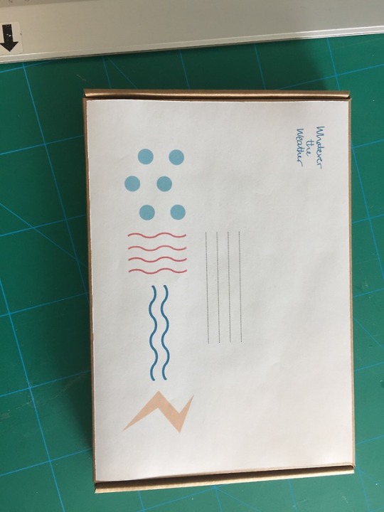
Photo


Box Label.
I have decided to stick with the wrap around style for my box label. I think it is the most practical and still allows the user to identify the box after opening. For this reason, I will be mounting the paper label onto the box directly so it does not need to be removed in order to open the box (except for a seam at the opening of the box) I’m really happy with how this turned out. I was nervous it would look a bit sad as I haven't been able to print directly onto the box or anything like that but I think it looks good and is in keeping with the contents.
0 notes
Photo


Box Label Continued.
I have decided to trial a wrap around style for my box. This will allow me to utilise the space on the front and on the spine in a neater way. It will also allow for the contrast of the white with the cardboard, which I really like. I have started placing the items where they potentially would be positioned but need to make more mockups to get this right.
0 notes
Photo


Box Label.
I need to design a label for the front of my box. I have decided to start this process by looking at the size and shape of the label I want. I started by creating one that was C5 size- the same as my box. It looked really bad and like a total afterthought so I decided I wanted the cardboard to be seen as well as the label. I started this by sizing down to both an A5 and A6 piece still situated in the middle. It looked really boring and as if it would be a difficult format to work with. Then there was the issue of also wanting to put the symbols on the spine, so it would be visible when stacked into a bookcase or somewhere.
0 notes
Photo


Type Changes
I have decided to change my typeface from Gill Sans to Univers based on my recent type trials. I think it is slightly clearer and more understated, after all the main goal is for the aspects to be readable and clear. Since changing my typeface, I have also made a few changes to the look of the inside pages. I have made them all one consistent colour, as the colours are used elsewhere to distinguish between weather events, I have kept other things simple and in a limited colour palette based off the overall colour theme to avoid confusion. I have also added lines to ground the page more and allow more practical space for writing.
0 notes
Text
Paper Choices
When thinking about paper stuck, I had several things to consider. Firstly I will need the components to be sturdy, as they will be used and referred back to so they need to be able to withstand use. Secondly, they should be appropriate for the type of item they are; i.e. not using thick cardstock for the inside pages of the contact book, which would need to be easy to flip through quickly.
What I'm thinking of using:
Educational Cards: thick cardstock- 250 uncoated to start but may also try silk
Contact booklet: regular paper inside, outside thicker card/paper 200gsm?
Ice Breaker Card: same as other cards
Poster: thin so its easier to keep folded up
Explanation Card: something nice- maybe a thin gloss? To give the kit a more legitimate appearance.
0 notes
Photo

Type Options
Looking at some new type options, I feel like I've seen a lot done in Gill Sans recently and am looking at some other nicer options. I’m really leaning towards Univers at the moment, I think it gives a nice symmetry but still has its own personality. I think I’ll try it on a couple of pieces of copy and see how it looks.
0 notes
Text
TYPE.
After submitting my work, I’m trying to further progress and improve my elements. It is at this point that I think my typeface may be holding it back a bit... I think its started to look quite heavy, particularly in the components that contain larger amounts of copy. I think I may have to look at some more even san serifs to really help me to reach the point I am envisioning.
0 notes
Photo


Creative Conscience
My images of my Creative Conscience submission. I’m really pleased that I was able to get each of my elements completed to a mostly finished standard for this entry. It has allowed me to think about papers and binding methods I would like to use for my final piece. For the entry, I used 270gsm uncoated card for the weather cards. Although they were really nice, I’m thinking of trying more of a gloss or silk for the final cards as they would feel a lot nicer when being held. I think I will keep the stock similar though, it felt nice at the A6 size. I think I will also use either a similar finish for the welcome card as it will not need to be written on and will be the first element seen when opening the box. For the icebreaker card and contact book, I will use a slightly thicker than normal uncoated paper, maybe 100gsm? because these will need to be appropriate to be written on. I’m also not sure about how best to bind the contact book. Currently it looks quite nice, however it is not very easy to actually write in so I think I’ll need to look into possibly a more practical way of binding this that is easier to use. As seen in the first picture, I have chosen to present my elements in a box. I want to use a flat postal box so will be ordering a couple of different sizes to see what works best. I have also decided these should be a natural brown cardboard colour as it compliments the colours inside the box.
0 notes
Text
Creative Conscience
I have decided to enter my piece into the Creative Conscience Extreme Weather brief. This is the original brief that I am working from and I have been really inspired by creating something to help other people. As this deadline is about two weeks before my Major Project deadline, it will allow me to push to get each component finished to a presentable standard. It will also allow me to evaluate where needs improvements, what paper stocks to use etc.
0 notes
Text
Symbols and Numbers
I have decided to make my posters contain either symbols or numbers. I have chosen this for safety and security reasons, but I now need to choose one or the other. I have begun to write out different meanings I would want to use in the communication, and believe that it may be simpler to use a number system, since there are already a set of symbols in my kit. The number system will have a key- which I think I will put on a small welcome card which will outline each piece of communication and how you can use it.
0 notes
Link
Symbolism
After deciding to create a poster series as an added component to my kit, I’ve decided to look at how these look as both words and symbols. As my kit already contains symbols on the cards, Im not sure yet if I will end up using this, as it may over complicate the idea. The reason I am looking at using some form of symbolism is because the concern about safety may be an issue if there is a poster in someones window saying that they've had to evacuate, making their home susceptible to opportunistic thieves. I am going to do more research and have a think about creating something that could be the best of both the written signs and a coded system.
0 notes
Link
This article is interesting as it explains the importance of typographic considerations when delivering news. It explains how the National Weather Service has, within the past two years, began to incorporate mixed cases of type in their statements. Previously, all weather reports were given in all caps, this meant there was no differentiation between the weather forecast for the day and a weather warning alert. This could have been causing people to become desensitised to the important and more urgent announcements, and ultimately causing there to be a lack of urgency within the areas population. This would directly affect the readiness of the majority in the case of an “unexpected” weather event.
0 notes
Video
youtube
I saw this advert recently and thought I could relate this to my project. Obviously it is based around a different issue, however, it makes a really effective use of highlighting the importance of being an active member of your community and also the idea that communities have more power than the believe to make changes and possibly save lives.
0 notes