Don't wanna be here? Send us removal request.
Statistics
We looked inside some of the posts by amberunit04 and here's what we found interesting.
Average Info
Notes Per Post
10
Likes Per Post
9
Reblog Per Post
1
Reply Per Post
0
Time Between Posts
10 minutes
Number of Posts By Type
Text
17
Last Seen Tumblr Blogs


Fun Fact
Hackers stole 65M passwords from Tumblr in 2013.
Text
FINAL VIDEO
In my opinion, although this video didn't end up how intended, I'm still fairly happy with how the animatic turned out, as everyone's signature style is prevalent, visually distinct and interesting. The biggest issue I have is that some story elements and scenes are unclear and confusing, this would've helped by more peer review sessions and more time to develop on our animation.
0 notes
Text
Talk Show Moving Image Production 600 word evaluation
With this project, our task was to create either a proof of concept or a fully realised Talk show inspired piece of content, meaning that it’d have to contain aspects of motifs found in talk shows, such as an interview format, a host, an audience, or a filmed/obvious cameraman present.
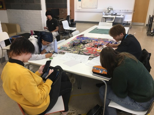
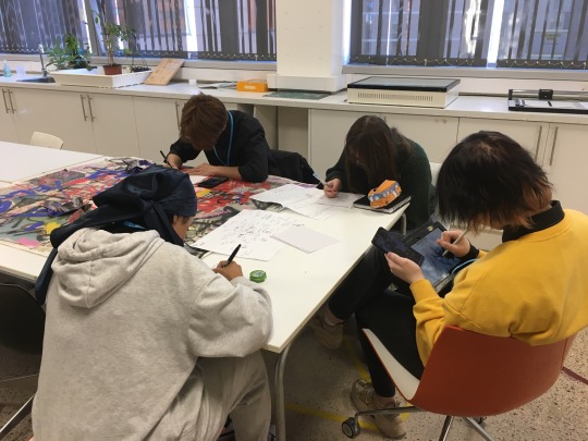
What made this specific project stand out from the rest in this unit was that it was a group project, meaning that you would have to actively work with other people to get your hoped-for result. A problem that arose from this was that many people dropped out from this project, including members from my original group leaving just me and Rowan. After the groups were re-organised, Tyron and Misela joined our team. This solved the low team member problem, but also caused some confusion, later in the project I had learned that members mistaken me for the team leader, this would explain why throughout the project people would mostly only come to me for information and guidance. I believe this miscommunication came from me and Rowan being the initial ones in the group, thus having a clearer perspective on the project idea. This was a fault on my part as I should’ve allowed the newer members to have a larger helping hand in the initial idea generation of the project. This role issue not only caused stress and pressure on myself , but this also affected the other teammates as I often couldn’t give clear enough answers and couldn’t organise the work, roles, and deadlines in a cohesive way.
The topic we chose to base our project around was composed of two different concepts me and Rowan discussed with our previous teammates who dropped out, that being a story based around a cult and an interview taken with a demon currently possessing a body. This was combined to create our finalised concept, that being an animation, chosen as everyone in the team enjoyed illustration and character design, mimicking the style of a cult initiation tape, showcasing the cult, its facilities, and activities as well as multiple interviews with the cult members, the cult leader and the demon inside a person who is being exorcized. The script I wrote for this project was very story heavy, so it was a hard task to be able to depict and make it easy to understand all the story elements and what was happening in each scene clearly and accurately. In my opinion, I don’t believe this was that accurately achieved in the final product, as the animation idea had to be scrapped for time. Instead, it was settled that we would create an animatic all done in our individual art styles. This sacrificed a lot of the clarity between scenes, making it hard to understand what is happening frequently in the animatic, this is down to time constraints as well as the script not being followed correctly, this is evident in multiple parts of the finalised animatic where multiple scenes, audio clips and visuals happen out of proper order or are done inaccurately.
The initial research I made in this project was around various imagery relating to and around cults, the occult and demonology. To let the group share ideas and research with each other, I created and invited everyone to participate in a collaborated Pinterest board. Looking back, I do think this was a very beneficial inclusion to our project as it helped us generate a lot of visual ideas for the project, It also was an easy way for all of us to help each other with designing certain characters, locations, logos, etc by finding visual inspirations and references that may be useful to one another. This aspect was really fun and in my opinion, the designing aspect and discussions amongst us where definitely the best part of my experience working on this project.
I believe the overall purpose of this project was to allow us to experience working as a team to create a competent piece of work, although our own project didn’t go the way it had initially been intended, I am glad I had got to experience it as I now know what to do and what not to do when it comes to group projects, it also allowed me to see the wider possibilities of work you could create within a group project, as you are within a team of people with various skills and accesses that may help create many different incredible outcomes if organised and determined enough.
Time management was a huge problem within this project as many teammates would work at different paces from each other, unintentionally slowing the project from progressing further. This could’ve been avoided is members would be given individual group roles solely based on their strengths. This was probably the biggest issue that happened during this project, however another issue that arose from this project was lack of communication. This was a common problem that occurred as the first week of the project was during half term, the second week I was off ill and the third week Misela was off sick briefly as well. This caused a lot of distance between the group and caused a lot less face to face discussion and feedback. Despite this, I still continued to communicate with my group through the group chat, this was something I did continuously throughout this project as it keeps everyone aware of where we are in the project and what needs to be done by when. However due to most of the groups communications being remote, a lot of times messages were left on read and ignored, this was disheartening and honestly quite annoying in how frequently it happened and I think its down to how everyone is the group lost interest over time due to the stress of all the work needing to be done without strict timetables or deadlines.
Overall, I am disappointed in how the final animatic turned out, as it wasn’t what I envisioned, however I am still fairly proud of how it ended up looking as well as the experience I had making it as my team were for the most part fun to work with and I experienced working in voice acting and sound creation, which I have never done before and enjoyed a whole lot to the extent that id like to further experiment with both topics in the future. If given the opportunity to change something about the project, it would definitely be to create a more definitive and useful timeline for our work process, so that we would have much less time planning and much more time storyboarding, animating and editing.
0 notes
Text
Resources used
Pinterest board I created to allow the whole team to collaborate, compile and discuss different art styles, visuals, motifs, etc with each other. Overall I believe this strategy was helpful as it allowed the generation of many ideas and story elements that ended up appearing in the final outcome
Youtube playlist I created of various different visual and audio inspirations we could draw from within our project. Although I found this playlist personally helpful when writing the script and dialogue, it was never really brought up of discussed within the group. This was unfortunate as I believe it could've really helped in some production aspects.
Multi-animator project research
youtube
As we were taking a different stylistic approach than originally intended, that being that everyone stylised and animated their animatic parts in their own individual style, I researched into Multi-Animator Projects or 'MAPs' which are a genre of animated short composed of a range of different individual animations made by different people all joined together by a shared song or audio track they're animated over in a certain order, ending in a concise and diverse animation. One MAP I specifically looked into was this one set to Buttercup by Jack Stauber, with this MAP, each animated part has a different story and characters, but in some parts edit merge into each other through clever editing effects. This was something I had hoped to include in our final animatic, but didn't have the time to complete.
Video effects and artificial glitches (compiled by Rowan)
A youtube playlist made by Rowan compiling a bunch of VHS glitch visuals that would be later used and implemented into the final animatic.
0 notes
Text
Independent artist research
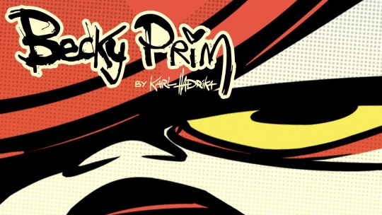
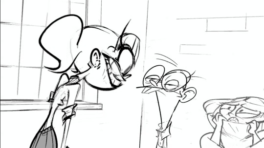
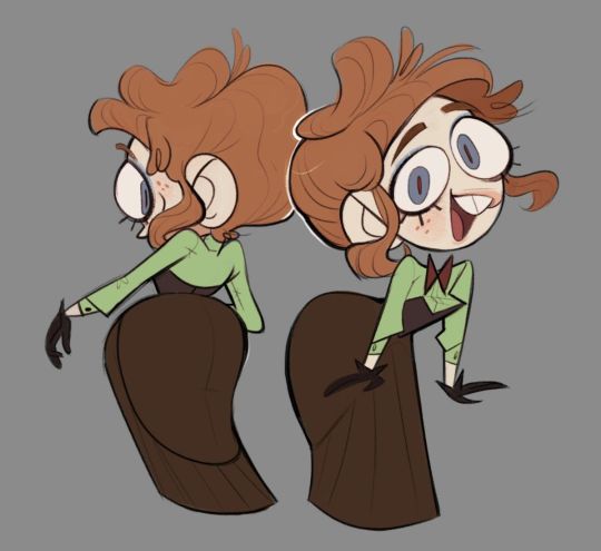
Karl Hadrika
Karl Hadrika is a Canadian writer director and storyboard artist that wholly inspired me when creating my storyboard and animatic. Hadrika has a very unique and sharp style that is extremely recognisable in how snappy he animates and poses his characters. The main inspiration I looked at for when creating my animatic half was Hadrika's animatic for the pilot episode of their show, 'Becky Prim'. This animatic pilot is a perfect example of how you don't necessarily need to animate something to give it character or life as Hadrika's characters are so expressive and dynamic in their movement and emotion that minimal animation isn't a problem in their story telling.

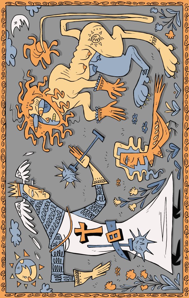

Potozaur
Emil or Potozaur is a Romanian artist, who's art is often inspired by Romanian and Slavic folk art. I absolutely love the charm and character that Potozaur's art has, each character moves to fluidly whilst features such as eyes and noses protrude from the face in a surreal but impactful way, creating a solid and readable character silhouette. Throughout this project I have been taking inspiration from Potozaur's art style with my own as I believe he has an amazing talent for creating sleek character silhouettes and simple but memorable character designs. As well as this, Potozaur's folk art inspired style links into the topic surrounding our project as cults often incorporate traditional folk art and customs into their beliefs and social identities.


onebadnoodle_
Onebadnoodle_ is a twitter artist who creates imaginative and fun character designs as well as original art. What inspired me about Noodle's art is the variety in their designs, they have an incredible imagination and creative spark when it comes to designing characters and has a wide array of styles they can work in, a good example of where this is shown is the piece of theirs on the left. All the characters on that page were designed based on the simple prompt of three random emojis. This shows their talent in how they can make an inspired and unique character design out of a wide array of prompts. Noodle specifically inspired me within this project when it came to monster and demon design, as they are incredible at creating gory but fun characters.
9 notes
·
View notes
Text


Becky Sloan and Joe Pelling artist research
Becky Sloan and Joe Pelling are artists most notable for their puppeteering work, especially on the show Don't Hug Me I'm Scared.
Throughout their work, they handle very dark and morbid topics, usually in a humorous or overexaggerated way, this is most evident in their web series turned tv show, Don't Hug Me I'm Scared. Throughout the show, the main puppet characters get taught a new lesson episodically, similarly to that of a kids show, however often times the lessons have dubious morals and give a satirical statement on the topic they're covering. As well as this each episode is filled with excessive gore which is usually never addressed by the characters for a humorous affect.
Another more kid friendly example has to be the Trolli gummy worms adverts directed by Becky Sloan and Joe Pelling. Although not as dark due to the adverts normally being targeted for children, the adverts still have a lot of dark dry humour as well as disturbing imagery. These adverts use puppetry as well as stop motion to create an uneasy and unnatural atmosphere, audio and sound are also used to create tension for a humorous and off putting effect as well.
The last piece of work I will be discussing by the two is their short film, Bad things that could happen. This short is very different whilst still being familiar to the rest of their work. With this short, puppetry is used like with a majority of their work, however the actors puppeteering are very visible an are worked into the puppets and designs of the costumes. This adds a surreal and unnerving element to the short. As well as this, there is a complete lack of voice acting and characters, making the whole video more solemn and bleak. This makes it more unnerving when in the video, like most of their work, gory and unfortunate events unwind, causing the actors to lash out and act wildly in fear and discomfort. Unlike with most of the pairs' other works, this piece isn't necessarily humorous and is instead very contemporary and surreal, making it somewhat more frightening.
Overall, I am heavily inspired and fond of Sloan and Pelling's work, however I don't believe that they will be much of an influence on the work me and my group will be making, aside from possibly the dark dry humour and gory elements found in their work. However, I would love to make inspired work off of their style in the future by incorporating puppetry into a future project.
1 note
·
View note
Text


Anatomy and character study
At the start of this project, I made sure everyone in the group participated in an activity to gage what everyone's art style was, so we could develop a style we could all use in the animation. This eventually fell through and didn't develop into anything, but instead we decided on animating our separate parts in separate styles.
For the activity, I found a random image off of Pinterest and everyone had to draw it in their art style, seeing what similarities and differences we all had in style and ability. In hindsight, this wasn't the best way to see everyone's individual process as we all had the same clear visual prompt, what would've worked better would've been a shared written prompt, such as a character description that we could all design and develop in our own separate ways and styles.
0 notes
Text


Primary research
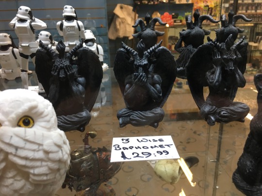
Rowan and I both took part in researching and finding inspiration for our gothic and satanic imagery. For this, we went to a shop in town called OASIS that sells many alternative clothes, music and other items. Here we found a wide range of different statues, books and art depicting Baphomet and other demons that we would later take inspiration and influence from in our final designs.
0 notes
Text
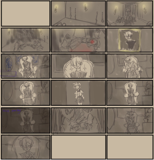
My finished animatic part
With my finished animatic part, I composed and animated using Flipaclip. Although I believe this finalised part works alright enough, there still is a lot of issues, including the scene pacing which is extremely fast and hard to keep up with, various art and animation errors that occur such as layering and colouring issues, and the pictures aspect ratio constantly changing. This was an issue that kept on occurring as Flipaclip has an annoying habit of whenever you import an animation frame from camera roll, you have to scale in down by hand. This makes it very obvious when human error makes the scales inaccurate to each other when played in succession.
I would improve upon these mistakes in future by taking more time to evaluate each frame and their consistency and use a more professional animation software.
0 notes
Text

Character planning
Due to me being off sick, I wasn't able to come into lessons and wasn't fit enough to do a whole lot of work. As I knew this would draw us back, I made sure that the rest of the team had work to do and we wouldn't be behind on the project. The week I was off ill, I set everyone the task of coming up with character design concepts, however this didn't end up getting done within this week and only got resolved when I finally came back into lesson. This was disappointing as I was hoping for the rest of the team to work independently without me there, this caused us to fall very behind on the project and way more time than what was needed was spent finishing character designs.
0 notes
Text
Teammates story boards
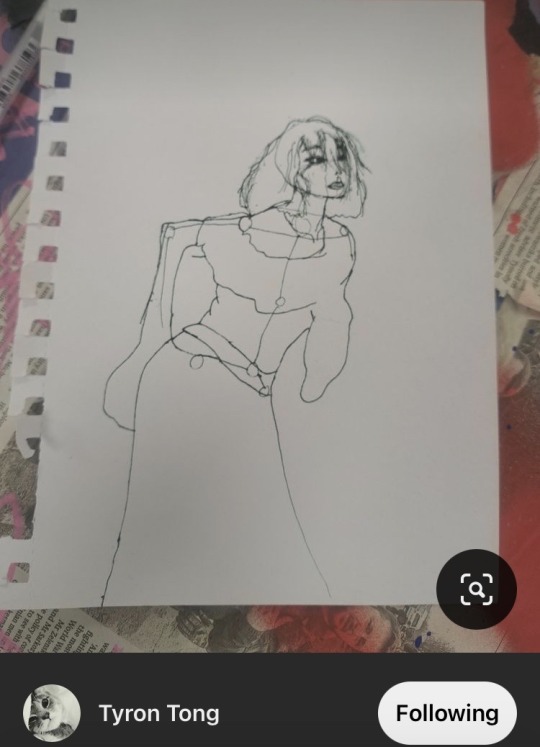
Tyron's storyboard

Rowan's storyboard


Misela's storyboard
The storyboards were created individually and followed individually due to time management issues. Despite this, I believe everyone's storyboards came out amazingly, having a lot of detail and engaging composition choices. They also all display unique and differing art styles, which was an aspect I was hoping to achieve.
0 notes
Text


Background and prop design development
As me and Misela had scenes taking place within the same room, it was important that our locations resembled each other. Because of this, I took heavy inspiration from the room layout in her storyboard, and applied it to my background design, I also fully drew out the paintings which were hung on the wall depicting the cult's beliefs as to add more interesting world building and eye-catching design elements.
0 notes
Text
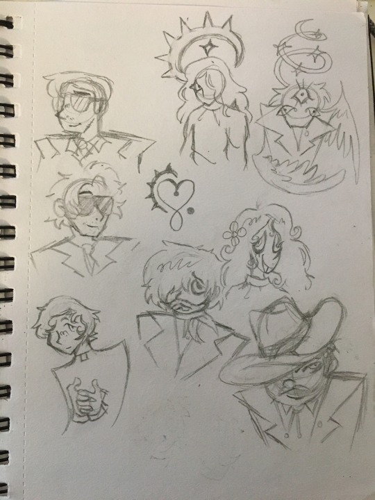

Initial character design and art development
When coming up with character designs for the cult leaders, I wanted to experiment with them all having something to hide, I showed this by having all my concept designs have a part of themselves concealed, usually their eyes with hair, glasses, etc as to hide their shame and demonic soul.
In the end, I chose the soft looking priest-like character to base my final design around, as the group agreed on it being the best and having the most design potential in how seemingly friendly he appears on the outside.
I had also experimented with designing the character who gets exorcized in the story. I wanted them to be shy with long light hair covering most of their face, this would show their shyness and vulnerability. As well as this, I gave them an unusual halo design, hooked like a large claw emerging from their head and spiked outwards, this is to show that they're still holy but have been corrupted by a demon.
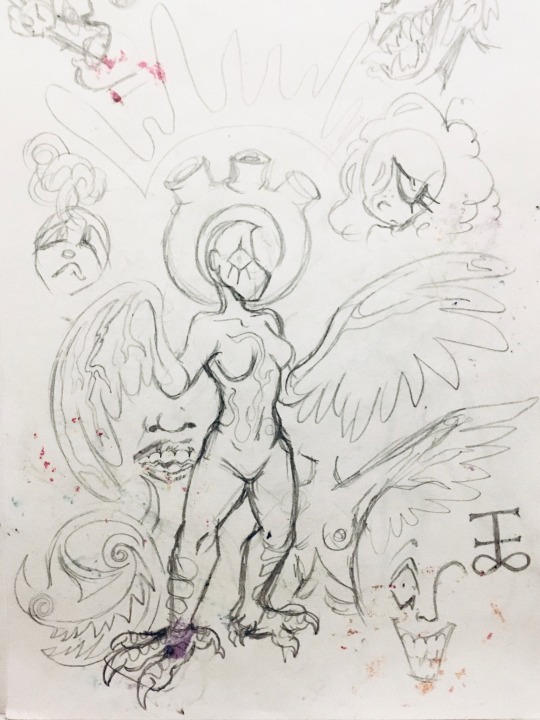
I also minimally designed a simple logo and demon design. The logo I had designed was simple, having a heart to show the false love the cult gives its patrons and a curled spiked motif, resembling the corrupted halo design I had created for the possessed character, alluding to their business in exorcism. With the demon design, I had an idea inspired by how harpies have their arms replaced by wings, my idea was to have a more fleshy body horror design, having the arms be replaced by big thick veins that trail along the body and branch out to form wings, this demon's halo would also resemble the aorta of a heart, adding more to the body horror aspect of the design.
0 notes

Text


Animation practice using flipaclip
To re-fresh my skill and knowledge using Flipaclip, I wanted to practise animating on it before finalising the finished animatic. I chose to create a slow morphing animation as to experiment with movement and pace, this was fun to do and the process of drawing out each frame wasn't hard and didn't take a whole lot of time to do.
0 notes
Text
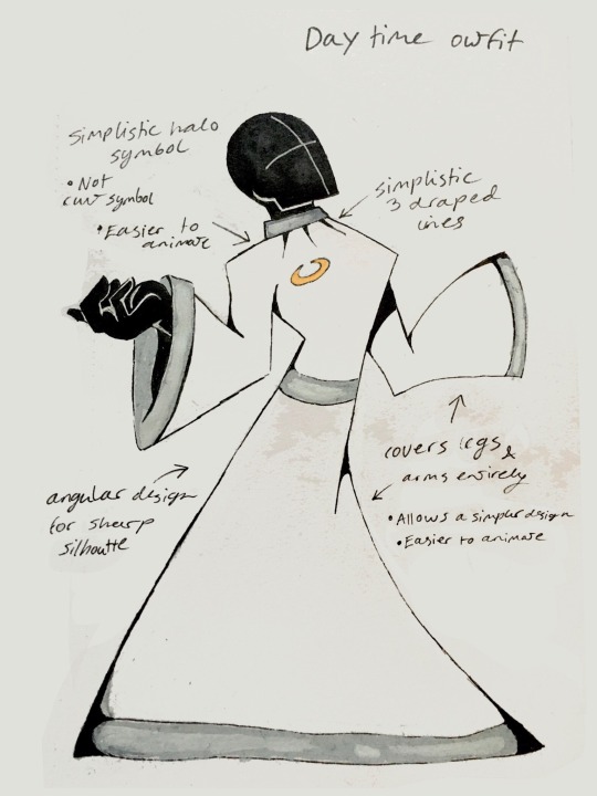
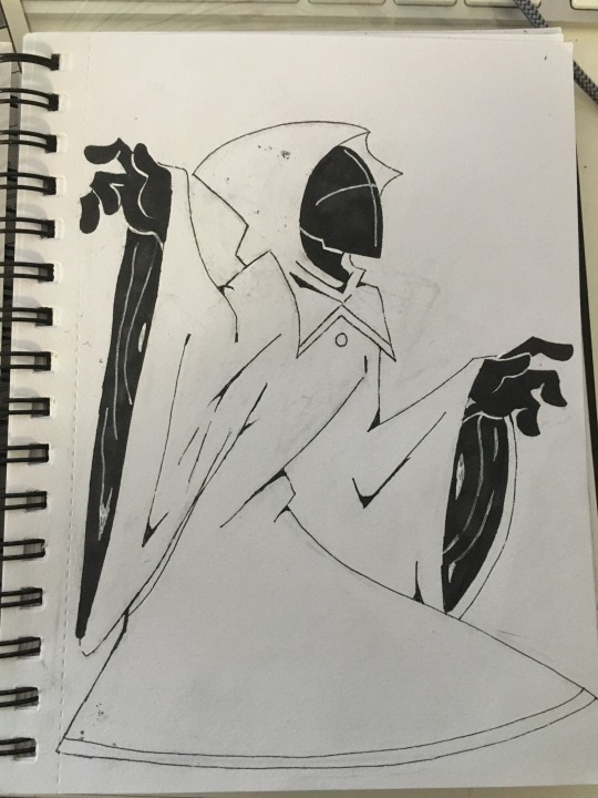

Costume design development
Me and Misela were the main costume designer for this project and we worked together to create a simple and easy to redraw robe design.
With the design I created, I made sure to keep it simple as to make it easier to be animated and redrawn, elements I kept in mind to achieve this was by using simple shapes and colours as to make the design more readable and streamlined. Another design feature I based my design around was to keep the legs completely covered, to save everyone time when animating as the characters legs when walking wouldn't be visible. Like most cult robes, I made the colour scheme light as to make the cult look holy, pure and trustworthy on the outside.
This is contrasted with Misela's exorcism robes as they're dark and gloomy in colour and are hooded, completely obscuring the wearers face, adding mystery and guilt to their character. As well as this, Misela also designed the hooded robes with separate gendered designs. I believe this was an interesting idea as most religious or spiritual groups separate members by gender through differing clothes.
0 notes
Text
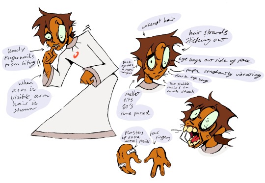
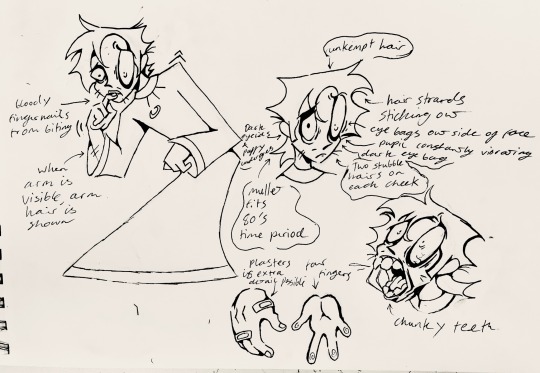
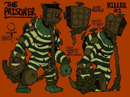
Member 267 character design
When designing this character, kept in mind that he was constantly paranoid and stressed whilst living within the cult, as he has constantly wanted to leave but cant. To show this in his design, I made sure that he looked unkempt, had messy hair and patchy stubble, showing that all his time and energy was spent on trying to escape and stay sane.
I also gave him purposefully unevenly sized eyes with dark eyelids and puffy under eyes, I decided to go with this asymmetrical style as I believe it lends into the angle that he's unhinged and skittish, about to snap at any moment.
Another design aspect I took into consideration when designing him was the time period in which the story is set, that being the 80's. To show the time period, I decided to make him have a mullet, a hairstyle that was incredibly trendy and fashionable at the time. The contrast between his trendy hairstyle and his gaunt dishevelled appearance may hint to how long and how he has been in the cult and how it has abused him mentally, showing how he has completely changed his personality from once caring about his appearance to completely disregarding it.
As well as this, a design feature used for the cult uniforms is that the halo symbol is a different colour for each member, hinting to their personality and character. For this design, I made the halo red as to not only symbolise his fear and hatred towards the cult but to also foreshadow that he gets killed brutally by the cult for speaking out about it.
0 notes
Text


Background work
When designing the backgrounds for the scenes I was creating my animatic part for, I wanted to keep everything with a similar purple colour scheme, so that the scenes look connected and to also show the cult’s interior connection to Banks in how everything is cold tinted.
As I knew we didn't have much time to actually animate this project as we had hoped to, I made sure to add as much detail to the background as possible, as to make the visuals more immersive and engaging to watch.
One artistic feature I decided to use was the use of a grainy paper texture over top of my backgrounds. I believe this added a charming story book-esque feel to the scenes, making them seem more mystical.
With Banks' throne design, I once again wanted to hint to the fact that he is demonic and not to be trusted. Because of this, I designed Banks' throne intentionally to subtly resemble a demons face, with curled horns, eye holes, a third eye, and a gaping mouth in which Banks would sit in, foreshadowing how Banks would later die as he was too greedy with his power.
0 notes