
Don't wanna be here? Send us removal request.
Statistics
We looked inside some of the posts by barnseyjr and here's what we found interesting.
Average Info
Notes Per Post
0
Likes Per Post
0
Reblog Per Post
0
Reply Per Post
0
Time Between Posts
9 days
Number of Posts By Type
Text
17
Last Seen Tumblr Blogs


Fun Fact
The Tumblr app for Google Glass was released on May 16, 2013.


Text
Reflection
I think going into this class, I had a lot more knowledge about Photoshop and Illustrator then actually turned out to be true. I think what little background knowledge I did have helped a little, but ultimately starting with the basics has been tremendously helpful and has given me a sturdy base to jump off from. Shortly into the whole experience I realised the importance of this Tumblr blog, especially in the context of intricate shortcuts and useful features hidden away behind layers and layers of menus. Looking back through here has come in handy more than once, and I'd probably be dead in the water without it. I hope in the future I will continue to add knowledge here and keep it updated as a mecca of adobe information.
I hadn't had any experience at all with InDesign at all, so going in blind was a very interesting experience. I think in the future InDesign will become an incredibly important part of my designs, as the blending of text and image has always been an interest of mine and its brilliant to know that there is a program designed for that purpose. I still think Illustrator is somewhat of a blind spot for me, as even with the necessary knowledge I still find it difficult to put my ideas to the screen, and I still ultimately find the pen tool to be very, very finicky. I wasn't really expecting it, but Photoshop turned out to be decently easy to pick up the basics in, even with my limited use of it in the last couple years. All of the classroom practice helped to solidify knowledge, and although of course there are differences between the three programs we learned about, a lot of the ui is very similar between them and makes finding things doable enough. I think in the case of InDesign this was most true, as it feels very similar to Photoshop in terms of function.
Overall, a very fun and sometimes difficult learning experience, and looking forward to take all of these new skills and putting them to use in a project.
Scrolling back through everything we've done is pretty astonishing honestly.
0 notes
Text
Illustrator Pattern Swatch

If we create a shape, in this case a bird, and put the shape on a background, then we can select both of the shapes and then drag the shape into the colour swatch window til we see a thick blue line appear beside the colours. If we release, then we should see an icon of our shape on the background amongst the colours.
Now if we create a new shape, and choose the fill option to be this bird image, then a pattern of this image will appear inside of the shape.

If we want the pattern to be a physical object that can be copied and pasted into InDesign, we need to expand the objects appearance. This can be done by selecting the shape with the pattern inside, and going to the object window at the top of the page and expand appearance, which will convert the pattern into actual shapes which can be seen in the preview mode. Shapes that are not squares such as any of the polygonal shapes like a hexagon, can also be used for swatch patterns. In order to make these shapes fit into a grid pattern, it may be required to double click on the icon in the swatches and edit the layout to make it fit. When double clicking on the swatch you can also edit the shape itself which will be duplicated to the whole of the pattern.
0 notes
Text
InDesign Page Layout

Under the pages window, we can add new pages to the layout by using the + symbol at the bottom of the menu. This is the same button used to create new layers in Photoshop and Illustrator. If creating a booklet we must have an amount of pages that is a multiple of four, due to formatting when printing. The layout we see in the page menu shows our cover page at the top to the right, the internal pages and then the back cover aligned to the left. This emulates how the booklet would look as a physical object.

At the top of the pages page, separate from the pages we just created, there is a page labelled A-Parent. This is basically a formatting page, which will copy any edits made to it to all the other pages. So if we create a text box on this page with the page number, then it will show on all 12 pages of the booklet. This is only useful if there is a feature which shows the current page number.

Assuming we already have text in the bottom of the page that says "page 1", we can select just the 1, and then open up the type window at the top of the screen, and follow the path shown above, selecting current page number. On the parent page, this will show as "page A". However, on all the other pages, it will show their respective page number in the order of the pages. We do not want this on the cover and the back cover pages, so if we click and drag on the "none" page shown at the top of the page window, and drag it down to the cover and the back cover individually, this will remove the formatting associated with the A-Parent page and just leave them with no formatting instead.

The chain icon in the centre of the margins and columns tab decides whether the numbers are linked to one another or if they can be edited individually. Unlinking them allows us to have the bottom margin be different from the rest.
We also add columns until we have six columns which will allow with formatting things on the page at a later date.

By creating a new parent page and adjusting the page numbers to a new layer above the background layer we can make a specialized B-Parent page for use on black backgrounds. If we make the text on this B-Parent page white, then the page should appear blank. This is what we want.

Because these pages have black backgrounds, our page numbers from the A-Parent formatting do not show up. If we drag the B-Parent page format to these pages then it will reformat them with the white page numbers, which will allow these page numbers to show up on the black background.

0 notes
Text
InDesign Shortcuts
Space: Pan
Z: Zoom
V: Select
A: Direct Select
T: Type Tool
W: Toggle Preview Mode
Shift return: Moves just one word down to next line
Shift Command and click and drag gizmo: Resizes image instead of resizing frame
Option with selected text and arrow key: Adjusts space between line.
When selecting text:
Click and drag: Basic select
Hold shift and left and right: Select letters individually
Command, shift and left and right: Select words individually
Shift and up and down: Select whole lines
0 notes
Text
InDesign Basics
Ideal for typography based design, things like magazines and other print media. Organising blocks of text and images.
Paragraph Styles
A paragraph in ID is described as a passage of text between two presses of the return key. So this includes actual paragraphs, and any lone pieces of text like titles. Paragraph styles can be saved and applied to other paragraphs, which can be good for large designs.
Paragraph styles are one of the main functions of InDesign, so it will be important to get familiar with them.
Under the parapgraph styles windows we can basically edit all of the aspects of the text, like the kerning, leading, text size and font. This is ideal for editing large bodies of text because the style of the paragraph can be saved and placed onto other bodies of text.

Pink lines at the top and bottom of the page represent the margin. These can be adjusted, but should be used as a sort of guide for where the page design should end.
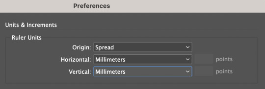
Under the top InDesign tab, we can access preferences and change them to millimeters.
The main ui of ID is familiar to photoshop, with windows being accessed from the windows tab. The most important one for todays lesson is the styles tab, under which we find paragraph styles which is what we will be experimenting with today.
Once a text box is created, the software will expect any keyboard clicks to be typing, so typical shortcuts and commands won't work. In order to exit the text box, we can command click anywhere outside of it and then will be able use shortcuts again. In order to edit the text we can just double click back inside the text box.

This screenshot was taken while the text box was edited, so in order to exit it I would have to command click outside of the box.
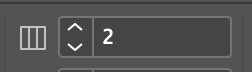
This tool at the top control screen is the gutter tool, which is ordinarily set to one. If we edit this number and make it two, it creates a "gutter" in the middle of the screen with two columns.
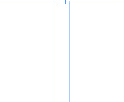
The aforementioned gutter, showing a split between what will become two distinct columns of text. In order to create this we had to select the outside of the text box with the select tool.
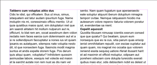
When in the type tool, we can select the type window at the top of the screen, and near the bottom of the options is a "fill with placeholder text" option which will fill the text box with lorem ipsum.
By creating a new paragraph style and calling it heading, we're able to select the headings and just clicking on the new paragraph style and it will automatically apply the style to them.
Now if we edit the heading style after the fact, it will apply any changes to any of the pieces of text that have the heading style applied to them. Using this we can put some space before and after the heading to make it somewhat more visually appealing.
After applying more before and after space to the heading style:
These changes are consistent across all of the pieces of text with the heading style applied.
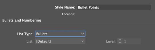
Adding bullet points is possible through the paragraph styles as well, using the bullets and indents tab. Selecting the area we want bullet pointed, and then creating a new paragraph style for bullet points and selecting the list type as bullets adds bullet points.

In order to format the bullet points properly, we need to make the left indent and the first line indent the same number, but with the first line indent as a minus. This will format the bullet points properly and make them look like actual bullet points.
Character styles function similarly to paragraph styles, except instead of editing a whole body of text it will only edit the selected area. This is good for bolding certain pieces of text, or making edits to just certain pieces of text or a sentence instead of an entire paragraph or body of text.
Edited using the character style option with bold italic selected under Basic Character Format.


Using the text wrap tool we can create borders around linked images. This image has been edited and then linked from photoshop, so any updates made to the image in photoshop will appear in InDesign. Using the text wrap tool accessed from window, we can create boundaries around the outside of the image in which text will not clip. This can be done with round images as well, in order to create a wrapping around effect.
0 notes
Text
Importing to Photoshop from Illustrator
The illustrator file must be saved in the same folder as the photoshop file.

When saved into the same file, click on file, and then place linked. Select the illustrator file, and then before accepting okay in the pop-up in photoshop, change the option in the top right to the media option.
Now, when the illustrator file is edited and saved, it will update the file in photoshop.
0 notes
Text
Composite Images

Using the object select tool, this is the total selected object of the man. There are some obvious rough edges with the selection where he blended in with the background, such as his top arm which is partially cut off and around his hair which will be very difficult and time-consuming to fix. On the edges where the mistakes are more obvious like the piece jutting out from his leg, we can use the path tool to create an outline with bezier curves and then convert it to a selection to clear these parts.
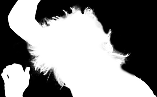
With the hair, it is essential to make a layer mask in order to brush away the parts of the image that are still showing and to restore some of the parts of the hair which the object select cut out at the start. Using the square bracket keys to adjust the size of the brush and adjusting the hardness in order to get some of the finer edges. Although the process takes a long time, it does make for lots of accuracy and editing onto the layer mask instead of directly onto the image gives the ability to reverse mistakes and bring back parts of the image which might have accidentally been erased. Switching between the black and white layer mask view, the view of just the man on the green background, and an overlay layer which shows the entire original image, allows for us to see parts of the hair we missed, and can serve as a guide to show what we should be brushing.
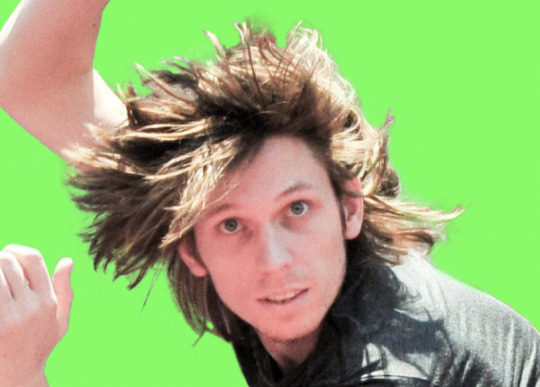
Final product. Against the bright green background we can see the parts of the image that are slightly transparent around the edge of the hair, giving the impression of strands of hair. Although some strands of the hair look a little rough, once the image is on a detailed background it will not be noticeable.
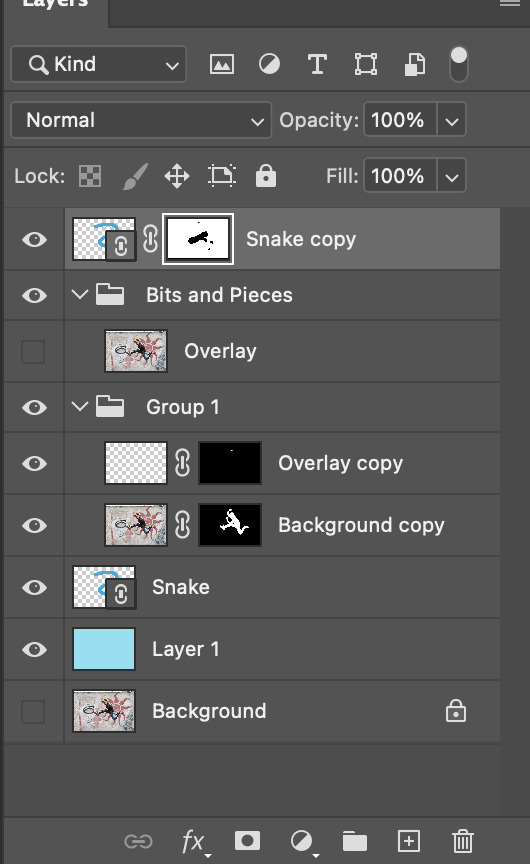
In the layers tab, we can see that there are two copies of the snake, one above layer of the jumping man, and one behind it. By doing this, and creating a layer mask on the top layer, we are able to use the brush to paint away parts of the top layer to reveal the man underneath. This way, it gives the appearance of the man being behind parts of the snake shape and above other parts of it.

Because we implemented the snake shape as a linked smart object, when we update and edit the snake in illustrator and save it, it updates the appearance of the snake to match in photoshop. We edited the snake to make it more detailed and have a much more stylistic and appealing appearance. Because it is embedded, the only think we need to do is to edit the top layer mask and widen the transparent sections to show the parts of the man that were previously hidden.
Homework Additions:
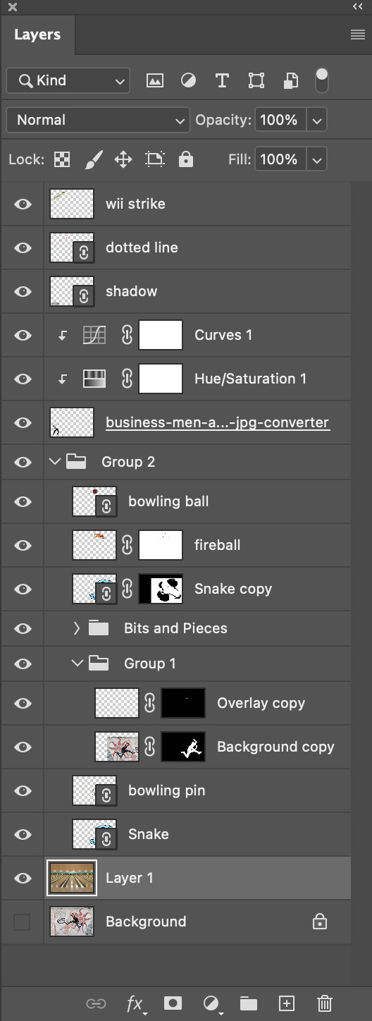
In total, all of the additions made accounted for all of the new layers shown above. Toby mentioned something about bowling in class, so I decided to take the idea of bowling and make a scene out of it. To me, the snake looked a bit like a backwards S, which I figured could stand for strike or something similar. This gave me the idea to flip the current composition, which gave the impression of the jumping man looking like he was throwing something over his shoulder. This something in my mind could only be a bowling ball. I created a bowling ball vector in illustrator and embedded it into the photoshop composition. Same idea with the bowling pin which was the next addition. That covered the two vectors required for the homework, so I decided to start adding some pixel images to supplement the scene. I started with the flame behind the bowling ball, which should hopefully give the impression that this man is a god-like bowler. The flames gave somewhat of an evil look to the picture, so I figured there should be someone in the composition to reflect this atmosphere of fear. I added the business man to the image and used the object select tool with some slight additions from the polygonal lasso tool to remove his background, and gave him a shadow using an imbedded illustrator vector. The man needed some slight curve and saturation adjustment in order to get his lighting a little more similar to the other mans. The next edition was the classic wii bowling "Strike!" banner, which I had to also remove the background on. For this I used the colour range selection option to grab the white background which the word was on and touched it up with just the rectangle marquee tool to add or remove some pixels which the colour range select had missed. The next addition was the dotted line, which I created using the pen tool and the stroke edit window which has a "dotted line" feature which could be useful in the future. Finally it was the background image which I found online, although it was in a much more widescreen aspect ration than what would fit the photoshop outline. Because of this, I had to add a section at the top of the image using a selection and a colour-picked fill. I then used the smudge tool to drag the lighting from at the top of the image upwards over colour filled area, and then blurred the area to make it blend a little better. The original image also had a blue bowling ball going down the right side of the middle lane which I had to remove by copying a section of the left side of the lane, flipping it, and covering up the ball. It ended up a little rough but the imperfections happened to be hidden by the S and jumping feller so I didn't worry about it too much.
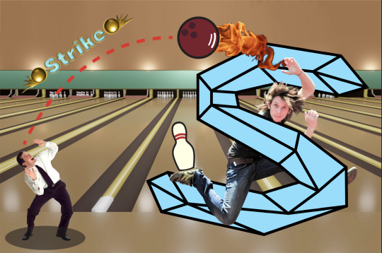
In reflection, although the image obviously doesn't look professional or even remotely realistic, I had a good time creating it and actually feel like I learnt a lot. Because of the scattered nature of the composition, it gave me lots of chances to try different things and experiment, all of which taught me new things about both photoshop and illustrator.
0 notes
Text
Pink Panther Vector
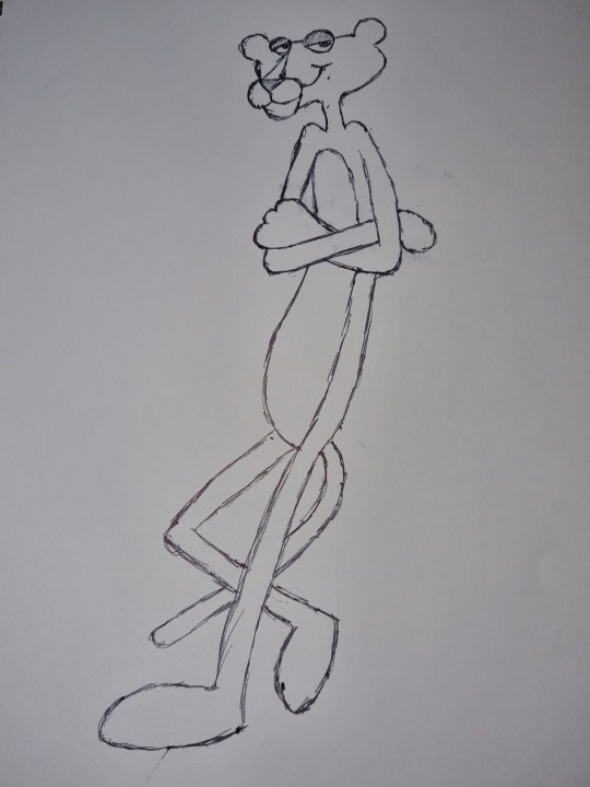
I'm not sure why exactly I chose the Pink Panther as the character to recreate in illustrator but I settled on the idea when looking at images as I felt the lack of straight lines and lots of overlapping body parts would be an interesting challenge, and would require lots of careful use of layers in order to recreate properly. I also wanted to get some more practice with bezier curves, especially broken points which I would have to use to recreate lots of the intricate shapes around the arms and hands. I also thought it would be good practice with complimentary colours, although I would have liked to have been able to practice highlights.

In making the image in illustrator, I started with the rough outline of the entire body, before creating a new layer and beginning to work on the finer details around the face. In the end, I had to copy lots of the aspects of the image, especially parts of the arms and legs to new layers using the Shift-Command-V shortcut in order to get the layers in the correct order and having the arms appear correctly above the main body and the belly section.
If I were to do this again, I would make sure to create every aspect of the image on a separate layer in order to be able to edit them individually without effecting other parts of the drawing, as the arms section ended up causing me lots of trouble and I spent a lot of time going back to redo sections and fix past mistakes. I also had difficulty with getting the features of the face in correct proportion with one another, and I'm not particularly proud of some of the shapes of the some of the curves in both the face and body.
I think I will need significantly more practice in illustrator until self-guided projects like this come naturally, but I enjoyed making this as a test of my own skills.
Probably should have done something a bit simpler.
0 notes
Text
Path to Selection in Photoshop
Start by creating a path outline of whatever it is that you want to select. Once completed, finish the path and adjust if needed.
Then go to window and select the path widget.

Holding command, click on the icon for the created path, which will turn the path into a selection without deleting the path. This will allow you to make adjustments on the selection if it is a difficult shape to select.

Now we can adjust only the top five leaves of the plant.
0 notes
Text
Selecting Uneven Shapes

Both of the oranges in this image were selected in order to change their shapes. The trouble is that the oranges are not a consistent shape so selecting them can be difficult. In order to make the full selection we needed to make use of the shift select function and the option select function to add and remove parts of the selection. In doing this, we can select the oranges piece by piece until the total selection shows the only the orange and nothing outside of it. After making these selections we adjusted the hue of these oranges to show a differentiation.
0 notes
Text
Selection Mask


In order to remove the background from the image of the copied boat, we created a selection mask in which we are able to paint in black to show the pixels which will be transparent, and everything in white will still be shown in the image. In the above image on the right, we can see the selection mask which shows the white and black pixels, and in the image on the left we see the top boat, which was an exact copy of the boat below, now has some transparent pixels determined by the black in the selection mask.
0 notes
Text
Photoshop Edits


For the first photo, I aimed to try and make the foreground of the photo stand out more than the background, while making the background slightly more visually interesting. It kind of felt like in the original that the shed slightly disappeared into the fog and I wanted to avoid this, having the shed appear more like the main focus with the fog serving as just a framing device. To achieve this, I first adjusted the curves to slightly brighten the image, before adding some saturation as I knew this would give the effect of having the foreground pop while having little effect on the background. I then slightly adjusted the colour balance to make the foliage in the foreground pop more and give the fog a more mysterious appearance.


This image required very little editing. I just wanted the blacks in the foreground to appear darker and the fog at the end to appear lighter to catch the viewers attention and to draw their eye up towards the end of the street. To achieve this I adjusted the curves with a slight s shape, as simply dragging from either side would have lost either some of the lighter detail or darker detail.


With this photo, I feel that what makes it interesting is the similar colours between the water and the sky, but their much different textures. So when editing, I wanted to darken the islands in the centre of the image to make them appear as more of a barrier between the sea and the sky. To do this I adjusted the curves, removing some of the lighter features in the islands, and then added some colour balance and saturation to draw out the colour in the water and sky.


The reason I chose this image to edit is due to the comparison between the white of the mans shirt and the white of the light aiming into the sky behind him. With editing, I wanted to increase the contrast between the dark of the image and the lighter features, while trying to minimise the presence of mid-tones. Using the curve feature and slightly dragging it from the right to darken the overall image, and then adding a point on the line and dragging it down slightly to create an arc which increased the contrast between dark and light. Doing this eliminated much of the grey mid-tones which helped to create the look I was going for.
0 notes
Text
Photoshop Shortcuts
Command W: Closes current page. Only do after saving.
Shift Command I: Invert Selection
X: Swap foreground and background colour
Option Delete: Fill selection with foreground colour
Shift-Option-Delete: Fill selection with background colour
Command D: Deselect
B: Brush
E: Eraser
Window > Brushes > General Brushes: Brush selections ie. hard and soft.
[ + ]: Shrink and enlarge tool
Command A: Select all
Number Keys 1 - 0: Equal to opacity ie. 5 = 50% opacity
Hold option: Select colour
V: Move tool
Shift while making selection: Constrains to even sides
Shift Command Z: Redo
V then hold down option: Copies and pastes selected area on same layer
Using the move tool, photoshop will always move what is under your pointer. Must be careful about this to not move things on the incorrect layer.
Command J: Copy selection to new layer in same position
Option Click on Mask: To see mask
Command T: Gizmo
When selecting:
Shift adds to selection
Option subtracts from selection
Space moves selection
Command Shift I: Invert selection
Tab: Hide tools
Command Option Delete: If in higher layer clears selection and fills it with lower layer.
0 notes
Text
Curves Adjustments

Accessing the curves image adjustment can be done by selecting the half-moon looking tool in the layers tab, and choosing the curves option. This created a new sublayer which will adjust the curves of the layer below it without directly affecting the layer itself. The curves tab is the one on the left, where the line can be edited via dragging to adjust the spectrum of light which the image uses. In this example, the image was far too bright and had a lot of greys without much dark shadow, so selecting the left hand side of the curve line and dragging it over to where the grey section begins in the middle, it darkens the parts of the image that are supposed to be black while maintaining the status of the lighter parts of the image.

In this example, the image was much too dark, which is why the grey hill looking things on the histogram appear so far to the left. By selecting the right side of the curve line and dragging it over to meet the grey sections, it limits the darker parts of the images and allows for the whites to shine, creating a greater sense of contrast and making the image much more presentable.
0 notes
Text
Photoshop Colour Introduction
Hue:
What is the base colour. Like picking a colour off of the colour wheel.
Saturation (Tone):
More saturation = More vibrance, pure, and saturated.
Less saturation = More muted, duller, greyer
Brightness (Value):
Adding brightness is tint. Adding white to the colour.
Removing brightness is shade. Adding black to the colour.
0 notes
Text
Types of Point

Hybrid Points:
Require the use of the alt function after clicking amd holding on the second point of the straight line, and then releasing option and then releasing the click, allowing you to make a curve with handles on both ends out of a straight line.
For creating a straight line out of a curve, you can hold down option and then drag the handle back to the anchor point on which it is connected, until the handle is no longer visible. From here, when the next point is dragged it will be straight.
Broken Points:
Require the use of the option function on the handles, dragging the handle into the desired direction which the next line will begin from. It can be difficult to get the lines symmetrical but they can be edited after the fact with the direct-select tool.
0 notes