
Don't wanna be here? Send us removal request.
Statistics
We looked inside some of the posts by cobrienba1b and here's what we found interesting.
Average Info
Notes Per Post
1
Likes Per Post
1
Reblog Per Post
0
Reply Per Post
0
Time Between Posts
15 hours
Number of Posts By Type
Text
17
Last Seen Tumblr Blogs


Fun Fact
69% of Tumblr users are millennials.
Text
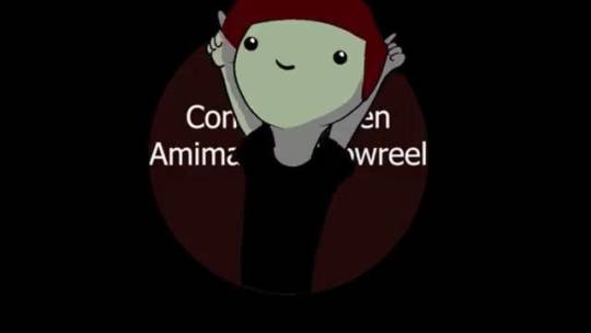
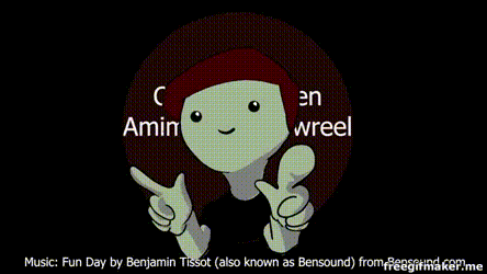
Final Showreel
youtube
This is the finished version of my showreel, I am super happy with how it all turned out. The start could have used some more saturation, however, all in all, it looks really good. I might try and fix it in my own time at some point. It was a good reflection of everything I have achieved this year, I have put in not only uni work but also personal work that I have made during the year that links to the Uni work so it doesn’t look too out of place. I am really pleased with the transition from the intro to the first animation, it flows really well and it works really well.
0 notes
Text
Showreel - Making the Intro and Outro
After I had gotten the pop up animated for the intro. I went to put it into the start of the showreel in progress but I realised that there was not only a gap between that and the first Animation, but the first Animation didn't start with the beat, in fact, the beat began in that gap. So I made the ideas shown in the previous blog and got to work on it using the video tutorial from said previous blog to make that idea into a reality.
Firstly I went into after effects and got to work on putting the animation together. I placed a circle exactly the same shape and colour as the one on the pop up animation, then placed that behind it so when it comes to the animation part, it will look like nothing has changed. Then I looked at the tutorial on seeing how to make something look like it's folded. After, I went and did that to the circle, putting a mask over the new layer, making it a 3d layer and rotate it on the X axis. I then made it change colour when it got to the midway point to white and have it come down to complete the flip. I put a white circle underneath that and thus made it look like it folded into a white circle.
After this I had to make it into the first Animation, so to do this, I made it have its own animation, I made it shrink and the burst back out with all of its features. Although after this, I was completely stuck on ideas for the transition since there wasn't a lot of time left to make that transition possible.
After a lot of thinking, I decided to put it into premiere pro with the rest of my showreel, made it the length it needed to be and tested out ideas, seeing what looks best with the transition. In the end I decided to have the character shrink and shoot straight into the start of the next animation as the exact size and at the exact position so it looks like one constant animation. I then added a panning scene transition to make it look like the camera is following the character, going to the right.
It was all a bit illusion but it worked out really well in the end.
As well as this, in the intro, I wanted the title to appear on the first part over the circle but I wanted my avatar to be on top. So I used the ultra key and placed it on top and got rid of the background, this proved difficult however, since the side effects included making the front bit really unsaturated for some reason, but it's still passable.
This is the finished version of the start, I'm really impressed with how this turned out, it flows really smoothly, if I had the chance to do it again, I would try and animate the pop up with a different background so I can ultra key it easier.
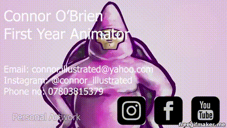
I then went to make the end of the video, I wanted to use the pop up again so I minimised it and put it in the corner. I faded it in from the last image and put all my contact information in there.
Overall I am really happy with how both of these turned out, it looks really creative but also retains the professionalism it needs.
As you can see, I got some digital media icons, really nicely placed in there, I went to this website below to get them, they do plenty of icons that you can download and use.
https://iconmonstr.com/youtube-3-png/
0 notes
Text
Finished Cast Line-Up
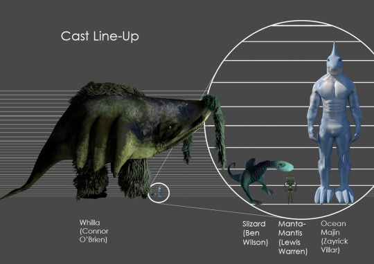
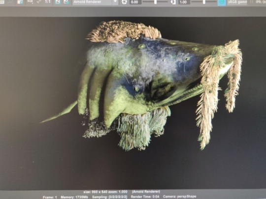
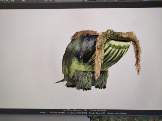
This is the finished cast line up that I made with Ben Wilson, Lewis Warren and Zayrick Villar. We all had aquatic creatures so it was a fitting environment to put them all in. We had good communication skills so we managed to get all the models around very quick.
They all got into Maya and saved their projects as pngs to send to me, this enables them to have a backgroundless render of their model, when it was sent to me, I got a render of my Whilla with the background and used that background colour for the cast Line-up.
There was one problem however, the Whilla is gargantuan in size, whilst the other creatures are fairly small. I had an idea to solve this issue, what I did was add a magnifying glass effect. I had two sets of everybody's creatures, one that were scaled accurately to my Whilla and then have a zoomed in version next to it to show them better in more detail. All in all, it turned out very well, it's effective and shows a slightly comedic side to it which adds to the appeal.
0 notes
Text
Weekly Summary 20
Showreel
This is the last week of my showreel project, I have successfully completed my showreel, have gotten the music for it and placed in my best work. In this week also, I have made a mini animation to place into the start and end point of my showreel, it is small and subtle but it really personalizes my showreel and gives it a nicer feel. I am quite proud of this showreel, I was worried about not being able to get it done because of the deadline was closing in and there were still lots of projects to get done, in the end I managed to get them all done and then dedicate a day to my showreel, I have finished it, however, I don’t think I have time for a second iteration.
Pros: I got my showreel done very quickly which meant I was able to finalize everything, I also got really lucky with the music since it manages to fit my style quite well. I also managed to get lucky with the length of my shorter animations since most of them fit the beat of the soundtrack which was very beneficial.
Cons: My computer had crashed a couple of times whilst doing this showreel, there was a lot of things added into this showreel, I also duplicated a lot of images to put them in the background blurred. I also had a tough time for the beginning as it did hit the beat the way I wanted to so I had to spend a lot of time trying to animate a small thing that will transition into the first animation that fits the beat, but I did it in the end.
Overall I am very proud of how this turned out, although I do wish I could have started it earlier because there are a lot of animation ideas and remastering of old animations that I wanted to do.
Fantastical Creatures
This is the final week for my Fantastical Creature project, I have finalized everything by finishing the cast line up sheet. This was fairly easy because my peers also did aquatic/land creatures just like myself. I had 3 people join me on my cast sheet, Ben with his Slizard, Lewis with his Manta-Mantis and Zayrick with his Ocean Majin. There was one obstacle that needed to be overcome and that was the fact that my creature stood towers above the rest. This turned out to be ok though because I had an idea to make the cast sheet and have it to scale, but use a magnifying glass effect to show the characters in full detail as if it were a regular cast sheet. This was a good problem solver that could also be seen comedically.
Pros: I managed to completely finish this project, everything is in the showreel and I am completely happy with how it all turned out. As well as this, the cast line up sheet did not take long at all, the good communication between my team led to a swift finish.
Cons: The one problem I had when making this was halfway through, realising that the page dimensions were too big, so I had to spend a little while trying to figure out how to cram it all in whilst still showing as much detail as I can.
Overall, I feel like this has been my favourite project, I really enjoyed all the processes and it feels really good to have finished it all.
0 notes
Text
Research Statement
My group and I have been researching the visual development in Spider-Man Into the Spider-Verse. We covered the animatics and storyboards, the concept art mid production etc. I looked into the comic book art style plays a massive part in this film, it’s very recognisable and unique due to its daring use of more traditional comic-book techniques that both looks nostalgic and fresh at the same time.
I’ve found a video made by Adobe detailing the involvement of Photoshop into the designing and editing process. “We spent probably almost two years, developing the look and also the way our characters move. We just had a philosophy born out of comic books.” This was said by Bob Persichetti, one of the directors on the film. This particular quote really stuck out to me, it basically sums up my research. The main focus of the aesthetic was to get it as comic like as possible, not only that but it took them so long to get it right it shows that it wasn’t something they thought just looked cool, they spent so much time, growing their animator count from the 60s to 177. They did a lot of things with this movie to help with the style, they made unique, custom brushes that everyone uses to keep that consistent look, hand drew some animation and still frames like the ones up here. All the paint overs, lighting and effects keys, are done in Photoshop, to quote Peter Ramsey, another director for this movie, “I don’t know if there’s a frame in this movie that didn’t get touched in some way shape or form”. And Patrick O’Keefe mentions that everyone uses the same brushes to keep consistency.
I contacted around 9 different crew members and I didn’t get an answer back and if I did they were too busy to answer any questions so I took my questions elsewhere. I found this youtuber called Maniakra / Jeremy Canton, who was working on recreating the art style thus I thought he would be the next best person to message. I asked him four questions:
- Firstly, I found that you have so far worked on the model and lighting, what else would you say plays into the comic book aesthetic?
He said that the aesthetic requires a very “planar/boxy” look to the characters, so that they can have stronger and more readable silhouettes. Also adding the 2D lines and half tone patterns help with this effect.
- What would you say the most challenging part replicating the art style was?
For Jeremy, it was modelling and sculpting and trying to morph between soft and harder shapes just like the film. For Sony he thinks it comes to putting the 2D linework onto 3D.
- In your opinion, what is the most important part of getting that style?
Straights vs curves.
- Finally, what would you say makes the style unique?
The 2D linework over 3D is the most unique part as well as spider-man related artwork updating to reflect the art we see on the internet.
He replied with a massive amount so I only summarised what he said. He also gave me an unlisted link to a preview he made for me to show to the presentation.
https://www.youtube.com/watch?v=QF81hGraamQ
0 notes
Text
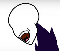
Showreel Title Card Ideas and Research
I’ve had an idea of what I can do for the beginning of my showreel. The first animation doesn’t exactly fit with the music so I have chosen to include the little ball creature in the intro somehow and have his appearance start at the beat of the music.
I have made a short animation of what I want to appear in the beginning and I thought I could try and incorporate the first animation into the beginning with this animation.
youtube
I was really impressed with this animation and I wanted to use the circle when bringing in the first animation, so I drew up some ideas to see what I liked best.
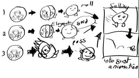
I’ve drawn up a few ideas to all lead to the same conclusion, I thought that the circle could have been a ball that rolls, but that could be difficult and taxing on the PC, not to mention it doesn’t look that great in concept as the animation is 2D. The second one I got, it is a folding one, I would have the circle fold and create a white one underneath, this could also be difficult but it would look elegant and suitable for the animation style. The third one would be the easiest to do, as it is just the ball boy passing the circle, although it doesn’t look that good in concept, it’s quite boring.
Thus I chose the second idea, I needed to figure out how I could go about this so I looked at a youtube video that did a good job showcasing a fake fold in after effects that looks slick and elegant. I will try that with the circle and add another circle underneath with the face on it.
youtube
0 notes
Text
Mystery Box Experimentation Reel
youtube
I have finished my Mystery Box animation and now I have used Premiere Pro to create the experimentation reel. It turned out very well and I was very relieved that I still had a lot of my old videos so I could show my progression through this project. I have even added some of my trial and errors with some humorous aspects such as the question marks when the model was mysteriously levitating. Or the lighting and rendering section, I mainly only added this in because it was fun and I enjoy adding small comedic aspects to my work. The people I have shown this to enjoyed this also, although I won’t add it in my professional showreel as that should be centered on my work as opposed to my trial and error.
0 notes
Text
Weekly Summary - 19 (3/5)
Showreel
I haven’t done anything in my showreel this week, although I have made an experimentation reel so I have had time to practice using premiere pro. I have finished everything I want to add to my showreel so I can start it as soon as possible. I plan to start looking for fitting music as soon as I can, I need to see what fits my style.
Mystery Box
This week I have made my experimentation reel for my mystery box, thankfully I have a lot of my trial and error videos saved. I have added a good amount of progressive shots and a good balance of trial and error shots. I have added a couple of humorous clips to show my thought process during these trial and error events. It took quite a while to make because I had to try and edit the videos in a way that it continues on nicely, I am really proud of how it turned out. Pros: I have had a lot of fun putting everything together, to things that seemed frustrating at the time was fun to look back on, it was also a good indication of how far I’ve come and how well the extra iterations benefitted me. It was very relieving. Cons: It took a very long time to make the video as I wanted to get everything as perfect as I could get it, as well as this, the computer almost crashed twice trying to render all of the images. Overall, it is fair to say that I am fully finished with the mystery box task, I am very relieved. The last thing I need to do now is getting people’s opinion on it and using that to build my evaluation.
Stop Motion
This week is the first time I have added something to my stop motion project. I didn’t do much other than removing the rig in my ball bounce using photoshop I believe I am fully finished with Stop Motion now, it is ready to add into my showreel.
Fantastical Creature
This week I have done a lot for my Fantastical Creature Project, I have finally finished the design, UV and texture for the creature and I have made a turnaround that showcases the character in full 360 degrees. I have also rendered the character in different live-action environments and used photoshop to help make the creature look like it’s actually there. Pros: I have done so much for my character this week, I have spent a lot of time working on it and it has all paid off. I am really happy with how it has turned out and I have successfully learned how to properly use substance painter, UV and I managed to do a lot of problem-solving. Cons: I had a couple of problems when trying to do the turnaround, the creature would move but the hair would stay in place, I fixed one problem but created another where it would do the same problem but only when rendered. I didn’t know how to fix this problem so I decided to instead make my camera and light orbit around the model to make it look like the creature was turning, it worked perfectly. Overall: I am really happy with how this turned out, now the only thing I have to do is get it in a cast sheet with people who made creatures that belong in the same eco-system. The only problem is, my creature is meant to be absolutely massive, the size of a block of flats. However, I can get around this by having 2 cast sheets, one with accurate sizes and one where my model is the same height as the others.
Lip Sync
I have started and finished the second iteration of my lip sync this week, I am very proud of how this has turned out and the animation is much better in quality. I have also made a second mouth chart that includes more mouth variations, the eyes, hair and a second mouth set for the second phase my character goes in, it has more detail and looks more elegant. I am pleased with how it turned out and I think I am completely finished with the project. Pros: I have completed my second lip sync iteration and it looks a lot better than the first, it is bouncier, smoother and has a lot more appeal. I managed to take the hair and body from the previous one which saved a lot of time. I also added some secondary action with the mask ends that adds to the animation. Cons: I had to sacrifice detail for a smoother animation as the first iteration had a lot more detail and softer shading, but I could argue that this was beneficial as not only does it have a smoother look, but it doesn’t draw attention away from the mouth. Overall, I am pleased with how this turned out, I am now going to create a small questionnaire to get some feedback and see what I can add to my evaluation when I complete that.
0 notes
Text
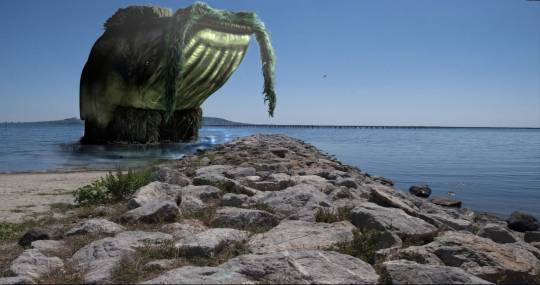
Fantastical Creatures: Composition Photos
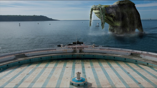
After I had completely finished with my model, I went on to put the images into live-action backgrounds, each of these backgrounds has been taken by one of our lecturers. The only bad part about this was the fact that I wanted my character to be huge so I couldn’t put it in a lot of backgrounds, only ones with massive open spaces.
This composition is my favourite I put lots of effects in here to make it look like he has not long emerged from the water. This one showcases the creature at its biggest (mainly because I couldn’t fit it in with any other picture. I used photoshop to create the ripple effects using the dodge and burn tool and google searched lots of splash and waterfall pngs.
This one is good to showcase the silhouette, the problem was that there was another tree right in the way, I managed to fix this by highlighting the Whilla, putting it in a new layer, deleting the space between the branches and removing the tree in front.

This one is very similar to the first one, I really like how this fits in with the environment, it is just standing there, enjoying the sunlight, I took care to try and put the reflection in the water, even though you can’t see it very well.
0 notes
Text
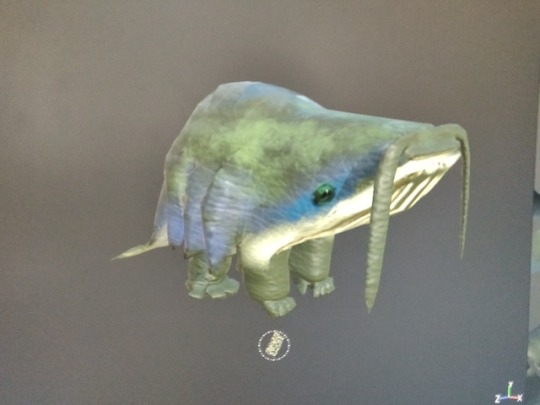
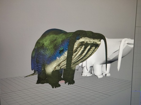
Whilla Finished Turnaround
Once I had the model finished, I went ahead and started the turnaround. I ran into a few issues on the way. One of which was that I didn’t have any eyes in my object, so after adding the eyes, I mistakingly merged that and the model together, this ended up with my hair and moustache staying in place whilst the model was able to move, I solved this issue by grouping everything but later on down the line for some unknown reason, it started again but this time, only when I rendered.
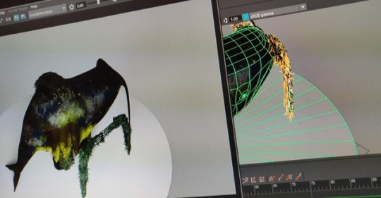
I had no idea how to fix this one as it seemed to be very persistent no matter what I did to try and fix it. In the end, I decided to solve this problem by instead, turning the camera rather than the model. I did this by creating a circle NURB and then attaching the camera and light to it and then rotated the circle 360 degrees, I also made sure the circle was centered and after that, it looks like the model is spinning rather than the camera.
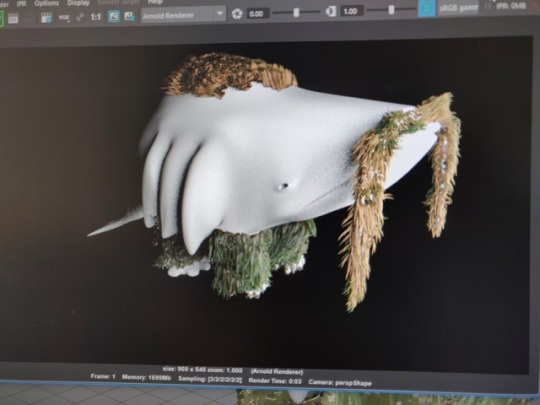
I spent all night rendering this and here it is. It came out fairly saturated so I fixed it up in premiere pro. I am really pleased with how this turned out, the fur turned out amazingly and the bumps on the Whilla are subtle but effective, overall, a job well done, next is to put this into Live Action
youtube
0 notes
Text
Finished Lip Sync Animation
youtube
This is my final and finished animation for my lip sync project, it is fair to say that I have definitely improved from my last piece. I have decided to not go and add any of the wrinkles and definition in the last bit, even though it is supposed to be a more ludicrous look at the end, I think the mouth and head shape do it just enough without having to overcomplicate things, I also didn’t want to take away from the mouth movements as that is the main focus.
I really enjoyed how this turned out, the shading is a lot better, the smears were a really good idea, there is less detail but a smoother and less complicated animation, I feel like that works better. The mouth has more variations and even an alternate chart. The mask ends were a nice addition and the animation in general is bouncy and fun, I am very pleased with this in total. One thing I would do if I had more time and a different brief, would be to add arm movements, as I feel like this would do a good job expressing things too.
0 notes
Text
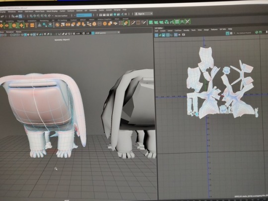
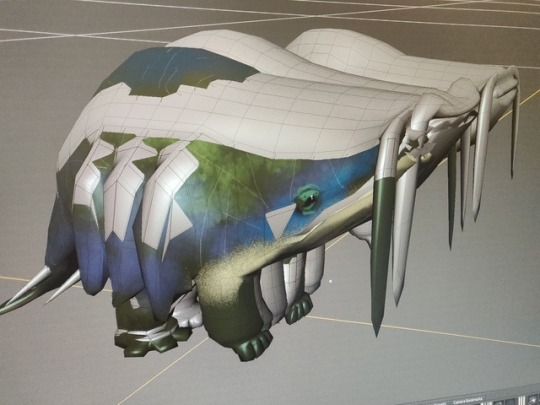
Texturing and UVing my character (Successful attempt)
When I went to start again in my Whilla design, it did turn out unsuccessful because, for some reason, Maya kept refusing to cut the whole model all the way through and would end up creating triangles and n-gons that will stop me from being able to model properly later. So, in the end, I just decided that I would go back to the previous iteration before I made any changes to UVing or anything like that and start again from there.
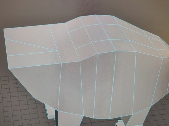
First things first, I decided to make that eye socket I needed and it worked really well, it looks convincing and will be good to put some texture and bump mapping on later down the line.
I then went on to the UVing stage, this time I was much more thoughtful about how I would go about cutting up the mesh, I went and cut more practically and made sure there were no extreme red spaces or blue spaces, tried to make sure that on the checkerboard, all of the squares remained roughly the same size which would make texturing easier and more efficient. This turned out a lot better than the other time and it is fair to say that is a lot more symmetrical and better for texturing.
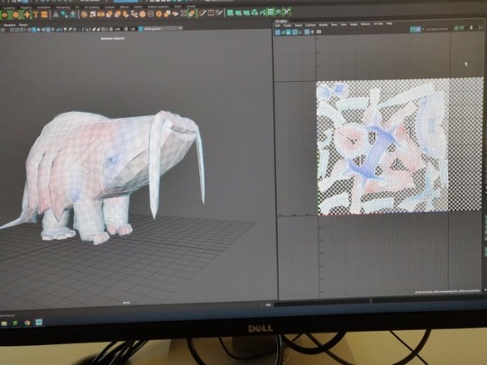
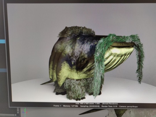
I then went on to texture this piece, I went on Substance Painter and applied things like the welding tool, to give a bump effect to some parts of the Whilla, as well as this, I layered lots of materials on top of another. I made layers for the main colour, one for the eys, one for random details and bumps on the body, etc. I managed to give the texture a slightly wet look to it, to make it look more like a sea creature. This was textured a lot better than the other one.
I then went back to Maya and decided to try and finish off the hair. I watched the tutorials and managed to get decent looking hair, it looks really good and the gorilla aspect becomes believable.
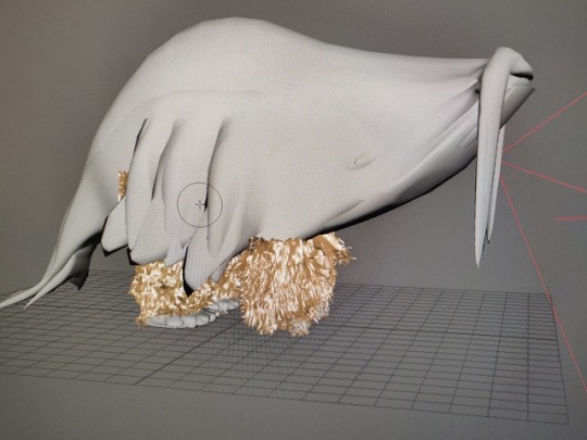
I finished the hair, recoloured it and removed a lot of the shine and I put it through the render and it looks really good.
I then brought in the texture from substance painter and it still looks really good with the hair, it fits in really well. The only thing I will need to do to make this better is to add eyes because, at the moment, it is just an eye socket with nothing in it, I can fix that with adding a couple of spheres in either socket, overall, I am super happy with how this design is turning out.
1 note
·
View note
Text
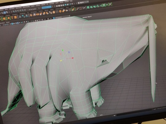
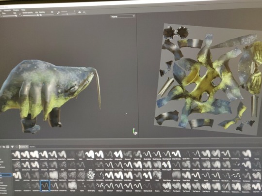
UVing and texturing my creature (failed attempt)
I have been working more on my Fantastical Creature. I tried to cut it up into UVs and it didn’t work out very well at all. I started off with trying to UV my character, I was thinking of retopologizing it but I realised it is pretty much ready and perfect for texturing already. I decided to start cutting it up into UVs, however, I had clearly not thought it through enough as I ended up with a massive, cut up mess of a UV, it was asymmetrical, it had bits cut up that didn’t need to be and very stretched polygons that wouldn’t have worked for texturing at all. It even cut up individual faces without me noticing and I couldn’t undo enough to fix it, so I ended up with a lot of tiny shells I had to sew back to the feet.

After this was sorted, I had still needed a massive change in my UV but I decided to bite the bullet and go full steam ahead into the texturing phase to see if I could somehow bypass the UV, still make the texture look good and hopefully solve the problem.

It didn’t turn out ridiculously amazingly but I got it done and it still looked quite good, the problem was that I hadn’t modelled the eye sockets or the eye on my creature so I had to try and draw it on, it didn’t look too bad but when it comes to the turnaround I know it wouldn’t look good at all.
I tried to export all of the textures and transfer them to Maya, it didn’t really turn out the way that I had hoped, in fact, it looked quite ugly, thus I used this as just a test run and wanted to try again and make it better this time. I am going to ask friends and lecturers instead of relying on my gut instinct.
Also, I did keep running into weird glitches, so I forced myself to start over.
0 notes
Text
Further Progress on my second iteration
youtube
At this part of my animation, I am very close to being finished, I only just ran out of time by the point I got to the final stretch. I have gotten the hair sorted out and animated, I imported the layer from the previous version with various tweaks to make sure it fits in with the new, smoother movements. It has also been given its own smears to help with the flow of the animation. I have also added in the ends of the mask, now it doesn’t just seem like a headband over the eyes but now it looks like an actual ninja mask. I made sure to have this for that reason and also because it gives a really nice sense of secondary action. I also started on the shading of my animation too. I decided to go with cel-shading all the way through this time as I prefer that look to the smoother shading I had in my previous iteration, it just gives it a much cleaner feel and I can do more with it, detail wise.
0 notes
Text
Removing the rig in my ball bounce
youtube
I have finally gotten round to cleaning up my ball bounce animation for the stop motion project. It wasn’t a requirement to remove the rig, but I would like to try and include this into my showreel so I wanted to clean this up and make it look presentable. As well as this, I believe that removing the rig really emphasizes the principles I have used in this ball bounce since the rig is removed and all you have is just the ball to take notice of. I used photoshop to remove the rig, it worked out quite well. It was really difficult to keep the consistency going, I believe if I had a cleaner surface in the ball bounce, it would have been a lot easier.
0 notes
Text
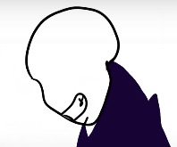
Lip Sync Iteration 2
I had finished my previous iteration on my lip sync, I tried recreating my mouth chart, I have kept the eyes and the hair the same as last time as I didn’t see a need to recreate them as I was happy with them as they were. I created more mouths than I did the first time, so the mouth movements I had could be more fluid.
I also went and made another variation of my mouths to fit the “2nd phase” that my character delves into, I gave him more defined facial features, a top lip, and cheek lines, I also tried to go for more elegant/posh expressions.
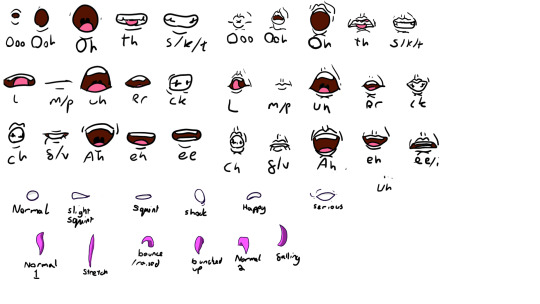
I then went on to create the next iteration of my animation, this time I got a head sample and placed it next to the new animation, this is so I can measure the current head as I go along to make sure I am keeping the head size and position consitsant.
youtube
I then went on to add the new mouth set and I also worked to add animation smears with the head, for smoother animation. I then just copied and pasted the cloak in since I had no problem with the previous one. I also managed to get the new mouth set in there and it looks so much better than the previous animation. I had a problem when the character turns his head, the mouth would have to leave the face just to keep consistency. To fix this, I managed to erase the parts of the mouth in a way that it looks natural in the side view.
youtube
Overall, I am extremely happy with this animation so far, next will be to animate the mask.
0 notes
Text
A look into the use of Adobe to create the comic-book feel
youtube
After looking at some more behind the scene videos, I have found one posted on Youtube by Adobe. Showcasing Into the Spider-Verse and its use of Photoshop to get the comic book look. There is a good quote in here that I used that was super useful for my part of the presentation.
“We spent probably almost two years, developing the look and also the way our characters move. We just had a philosophy born out of comic books.”
- Bob Persichetti
This is good because it gives a good insight into the dedication that this team had when making the movie, to get the look right. They also talked about using custom brushes unique only to this film, they also talked about using photoshop to touch up, add effects and lighting keys to just about every frame, really bringing in that hand-drawn feel.
0 notes