
Statistics
We looked inside some of the posts by converting-the-landscape and here's what we found interesting.
Average Info
Notes Per Post
1
Likes Per Post
1
Reblog Per Post
0
Reply Per Post
0
Time Between Posts
20 days
Number of Posts By Type
Text
17


Fun Fact
Premium Tumblr themes are available from anywhere between $9 to $49.


Text
Superkilen
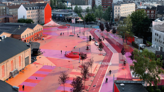
Bjarke Ingels
I am, personally, obsessed with this public space and the surreal vibe it gives off. At first glance, I find the colour impactful, and that alone makes the place fascinating. But on further research I learned that the designers, Bjark Ingels, Superflex and Topotek 1, have incorporated a range of features into the space, owing to the 60+ nationalities of the people of the neighbourhood, which makes for an interesting collection.
0 notes
Text
North Place Conceptual Drawings


My initial design is centred around 2 big buildings - the multi-storey car park with an amphitheatre on top, and the creative hub. I wanted to tuck the car park away in the corner and lump the creative workspace together in the middle to hopefully open up some green space around it, as well as featuring an open green space at its centre.
On closer inspection of the requirements, I realised the hub would need to be a fair bit bigger, and I had nowhere near enough car parking spaces. I rejigged some bits, moving the car park to the east section of the site where it will step up from ground level at the South, to 3 storeys (plus underground level) at its highest towards the North in order to fit all the required parking spaces.
This lends more space to the creative hub on the West section of the site, which is needed in order to cover the required squared meterage without exceeding 4 flours in height. I also decided to break up the central building into 4 connecting buildings, maintaining the central opening. The paths from the various corners of the site now easily flow right through the building.
I've also decided to veer away from the mushroom-like roof on the hub, to make use of the roof space. The roof of each of the connected buildings will have a different use, including a rooftop restaurant, open-air pool, a park/spot for relaxation, and some productive gardens.
0 notes
Text
King County Jailhouse Plaza, Seattle
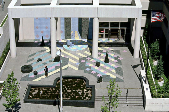
Martha Schwartz
Martha Schwarts has a playful arty element to her work that makes it stand out.
One of her earliest works was a design for a plaza outside a jailhouse, which she approached in her playful manner with pops of pastel colours and elementary 3d shapes. The aim of this was to create a welcoming space for attorneys, families with children, and other visitors to meet since there was no lobby or a foyer built-in.
With very little to work with, Schwartz has created space that holds, addressing the needs of the people who use it, and still reflecting a deeper message of chaos and fragility in the colourful mosaic fragments that make up the strips of colour in the design.
0 notes
Text
Bay East, Singapore
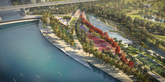
Katherine Gustafson
The work of Katherine Gustafson can be found worldwide, her earmarks clearly being the way she works with water. She has created some lovely sculptures using water, from the contoured ripples of the Washington City Centre fountain, to the contrast created in the water feature at the National Museum of African American History and Culture.
I feel that a lot of her most recognised work is more focused on the artistic element than how people would interact with it. That said, her design for the Princess Diana memorial fountain offers both an artistic element, and a landmark place that people can (and love to) interact with.
Bay East is easily my favourite Gustafson design, as it is less 'monumental' and more about creating a place for people. While the design did win prizes, a quick look on google maps reveals that the project wasn't executed accordingly.
I like the way this design offers variety and connectivity, as well as addressing the environmental needs of the site, with reed beds to filter and recycle water.
The design around the shape of a tropical leaf is charming and I like the pathways that lead across the water, but unfortunately, this doesn't appear to have made the final cut.
0 notes
Text
The Blue Planet design


From my favourite colour mind map, I selected the theme "the blue planet" to base some spatial sketches on. I linked this to the 7 wonders of the world, and tried to reflect each of them in the design.
I used Magnolia Court as a base for my design. In it you can find nods to 5 of the 7 wonders of the natural world, from the shade sail which might be lit up at night for the Aurora Borealis, the firey dogwood planting for Paricutin volcano, the Himalayan planting for Mount Everest, the waterfall water feature for Victoria Falls, and the succulent plant mix that looks like coral for The Great Barrier Reef.


The first spatial sketch is done using colour pencils and depicts the succulent planting (to resemble the Great Barrier Reef) with benches built into the beds on the left, and some of the Cornus sanguine (representing Paricutin Volcano) on the right.

The next one is done in watercolour with a view from the other end of the space. In this sketch, you can see the shade sail, the existing magnolia, some of the Cornus sanguinea bed and the Himalayan planting bed.

0 notes
Text
Fountain Place
Dan Kiley
On the whole, I don't love Kiley's designs and find the formal arrangements a bit boring. I took particular offence to Cudahy Gardens at the Milwaukee Art Museum, which seems like a wasted opportunity to create a meaningful connection between the museum and the lake.
However, his work isn't always boring. One of his later collaborations in Pittsburgh nicknamed "Eyeball Park" is quite distinct from his other work which I think is why I like it. The sculpted eye benches (by Louise Bourgeois) and organically shaped fountain make it delightfully unique. It also has more of a sense of place, with plenty of images of the plaza filled with people enjoying it.
But I also really like one of his more on-brand parks, Fountain Place, pictured above, which is heavily based on a grid pattern. There is so much interest in this design with the various layers that the water flows from and islands of trees, transforming the grid layout from something monotonous to something far more captivating.
0 notes
Text

I snapped this photo at Bristol Parkway to sketch on the train. I decided to overlay them in Photoshop which has highlighted how I need to work on perspective 😬
0 notes


Text


Barnwood park scribbles for AD5604
1 note
·
View note
Text
Intervention
While flicking through the list of keywords to define, I got stuck on intervention and what that really means in the world of design. Normally, an intervention would be a subtle action to change a behaviour or outcome. But I learned that in design, it was less about "coming between" and more about preserving something while giving it new life.
This article by ArchDaily highlights 10 Interventions on Historic Buildings, which I found really helpful.
Despite the fascination that we have with ruins, sometimes conversion or rehabilitation is a better, more contemporary alternative to conservation. By doing so, it is possible to introduce new innovative materials, which, rather than take away from the original structure, can actually add even more value to architectural works. It is also possible to convert spaces that were originally designed to accommodate certain functions into spaces that admit new uses relevant to the present.
Read the full article
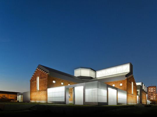
Rehabilitation of Former Prison of Palencia as Cultural Civic Center / Exit Architects
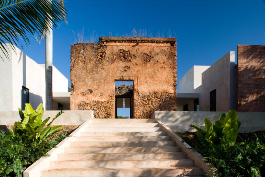
Bacoc Hacienda / Reyes Ríos + Larraín Arquitectos
Rehabilitation Ancient Royal Butcher XVI Century in Porcuna / Pablo Manuel Millán Millán

0 notes
Text
Xinhua Waterfront Park

Adriaan Geuze/ West 8
Xinhua Waterfront Park is a project that transforms an industrial wasteland into an open and green public park stretching along 1.9km of Shanghai’s Huangpu River.
The park opens up previously cut-off access to the river and created new connections through the city. It's clear that the design has been well thought out as the park is well used. It also acknowledges the four distinct seasons of the area, with different places to sit and observe while sheltered from the sun or rain.
I love how this project appears to have rejuvenated the area and injected life into this disused bit of land. I chose this image of the project as you can see the use of different layers and get an idea of how the views might change as you move through the park, with the cityscape unfolding behind. But this picture only shows a snippet of what the whole experience would be like!
0 notes
Text

This is the image you see at the header of my blog, a photo I took of the most perfect field to ever exist (I will not be considering other opinions) in Scotland. I decided to create this image for the front page of my digital portfolio for the AD4601 hand in using a photoshop filter for the black and white section, and using the sketch that I drew in the model making session in AD5605.
0 notes
Text
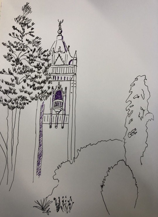
Sketch on Brandon Hill in pen. I used a purple pen for more shaded areas but I don't think this effect looked very good.
0 notes


