
Don't wanna be here? Send us removal request.
Statistics
We looked inside some of the posts by danielducasse and here's what we found interesting.
Average Info
Notes Per Post
1
Likes Per Post
1
Reblog Per Post
0
Reply Per Post
0
Time Between Posts
2 days
Number of Posts By Type
Text
16
Video
1
Last Seen Tumblr Blogs


Fun Fact
Mobile US users spent an average of 115.8 minutes on Tumblr app monthly.


Text
Final Major Project

Click the Link:
https://www.figma.com/proto/OIDZldZaRxyGW12K9SWsBw/Silent-Studios-Website?node-id=37%3A1&scaling=scale-down&page-id=0%3A1
(Please Allow Time for Content to Fully Load)
Development:


Some major changes had to be made to my project in the last minute as the model I initially wanted to play the character of Eve couldn’t end up coming for the shoot. I instead changed the approach and went with something that was closer to my very first concept of doing a photoshoot. I kept as many of the original elements as I could. I believe I managed to effectively convey the message I had for the project and stayed true to the overall tone.
I want the project to be perceived as professional and to a high standard, incorporating as many different expressions of creativity as possible through photography, graphic design, moving image and music. In order for the ‘brand’ to come across as genuine and to have a fuller more wholistic experience, I created a website through Figma, complete with a title page, about page, pages to present the campaign images, a shop and page to showcase the soundtrack for the campaign.
The title page and all the pages throughout have functioning navigation buttons.
In order to create the brand identity/brand voice I looked to other brands that I believe work in a similar vein as ‘Silent Studios’. I looked to Comme des Garcons, Rick Owens and the relatively new brand Heliot Emil. Heliot Emil’s approach to brand identity in particular especially in terms of tone was something I thought could inform my own perfectly. Heliot Emil uses sophisticated diction and has clearly targeted the brand towards the dedicated creative individual. This is who I envisioned the target audience for my brand to be also, so I took the same approach.
I wanted the website to have a clear order. So I structured the site to exactly mirror itself with a moving image at the centre to act as a centrepiece. It is organised with two black-themed pages, one full-screen image page, two white-themed pages, the centre page, then mirrored by two white-themed pages, one full-screen image page and two black-themed pages.
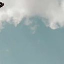
For the image above I edited it in a manner that aims to give a somewhat dystopian feel. The skies have been cleansed of any warm colours. Instead presenting a cold, intentionally vapid white tone. The grass has also been stripped of most of it’s green tones and replaced with a brown/red hue that is much less vibrant. The material on the ground is meant to look otherworldly. This all as a way to unsettle the viewer. To give a sense that this is not present day and that the future that is being offered is a lot bleaker.
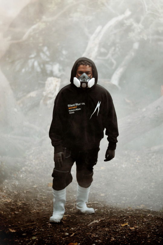
This image was taken on an incline. I pulled a smoke grenade at the base of the incline and asked the model to stand beside it. As the smoke rose I moved to the top of the incline and asked for the model to move closer towards me. I captured the image as the smoke began to reach the heels of the model. The smoke itself represents many things. It is a reference to the initial speech that inspired me to choose this theme for my project by Greta Thunberg, ‘I want you to panic. I want you to act as if your house was on fire’. It represents the pollution we as a human race fill the skies with. It represents fear, an omen/ dark cloud. A warning of a future possibly filled with suffering. It also mirrors today and our current fear of the air we breath due to the deadly corona-virus.
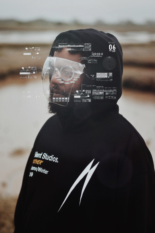
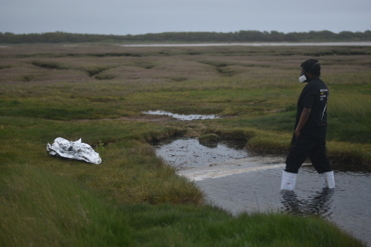
This image was to incorporate the technological angle to the project. In preparation for the project I asked people around me, from work, my friends and family what they thought of the current state of technology. The most common answer was that it connects us greatly and it divides us greatly and that it has become almost an essential part of our modern day living. The project has a focus on human survival, in my scenario those who have survived in the future have done so because they had the means to afford to survive. Technology is what aids ‘Adam’ in his survival. It is essential for him to survive but those that are not able to be included in this technological world are left behind and left to die. This is to speak on our current system and how those who have less are usually not the cause of many of this worlds problems, especially when it comes to the climate crisis, yet they have always been and seemingly always be the ones that will suffer the consequences.

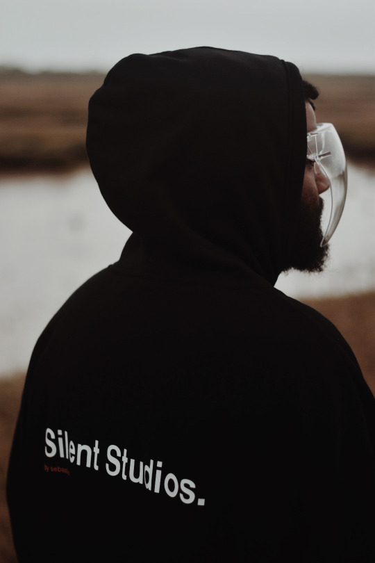
This image is to incorporate the spiritual side of the project. To suggest that perhaps in the future when we have lost everything we have built we will return to the simplistic, to what is seemingly most important. To suggest that our connection to the earth and our respect of it is what allows us to thrive and that once that is lost, so are we. I also was able to attain the image through the use of a diffusion filter. After my self-evaluation I looked further in how I can use light to convey a mood. I bought a diffusion filter to soften highlights in the image, giving the images a sort of glow, a smoother look.
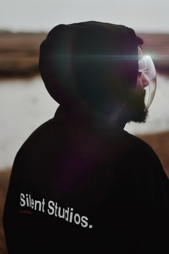
This image is to reference other Sci-Fi related work that inspired me. The lens flare effect is something used in many Sci-fi movies and so was something I wanted to include in my work. To me it also adds a spiritual feel to the image as it is already quite contemplative.
References:


0 notes


Text
Planning - E-mails
Email sent to AI-Printers in order to get my designs printed.
0 notes
Text
Planning - Messages


Instagram DM’s to Model describing the shoot. In it I describe a difference in tone for the images. I initially wanted the tone of the film to be dark and to have a stronger sense of emergency to them. But after presenting my ideas to the class and receiving feedback where it was suggested that I should keep a balanced approach to the film, making sure that the spiritual aspect of the film is able to also come across, I altered my approach. I thought that the feedback was a useful and would make the project work better.
References:
https://www.youtube.com/watch?v=K3rz9hEUUgM&feature=youtu.be
https://www.youtube.com/watch?v=EgDQMPyOlbM
1 note
·
View note
Text
Styling

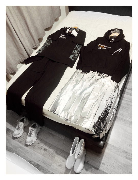
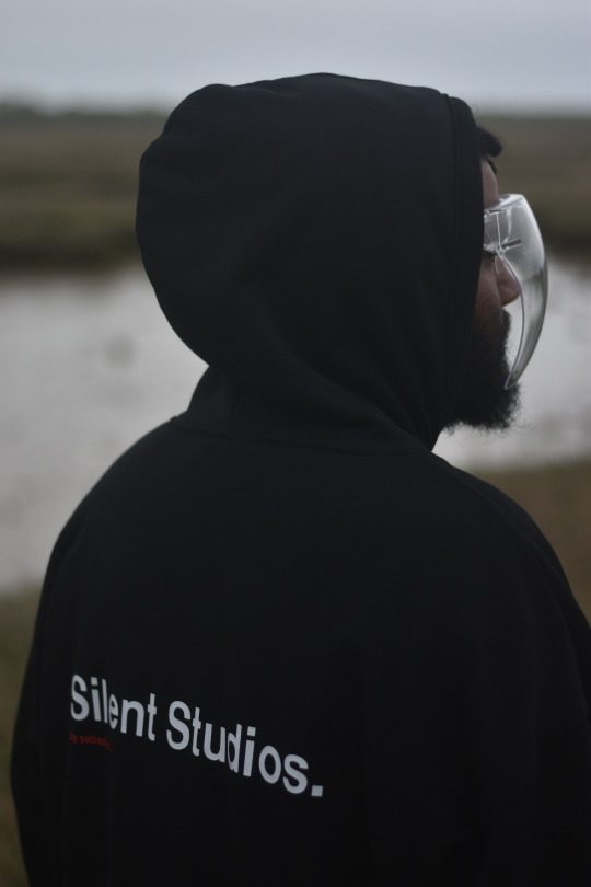
I wanted to style the clothes in a way that was futuristic but not cartoonish. A realistic vision of how people of the future may dress. I went with a monochromatic colour palette with an unbusy look. I incorporated untraditional materials as garments also, utilising a thermal blanket as a skirt. This is to fit again within the theme of the project and to push slightly further what is expected.
0 notes
Text
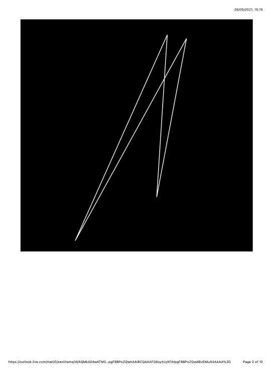
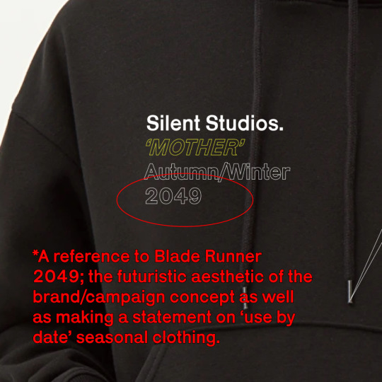
Printed Clothing Designs


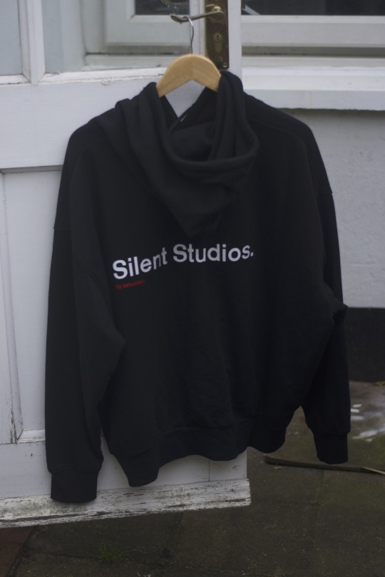

After a couple of consultations with the printers, I adjusted my designs to work with what was possible for them to do. I couldn’t have the designs be outlines as they originally were as they would be too thin for the machines, so I instead filled them in. This worked out in the end as they made the logos bolder and stand out clearer.
0 notes
Text
‘Mother’ Fashion Film Script


Initially starting off as notes to help myself direct the shoot, it subsequently became a more detailed script. Shoots in the past that I have done have had an element of freedom to them that have proved to be useful for those particular projects, however with this particular project I had a very clear concept that would likely be time consuming. Taking into account the factors to do with the virus as well, any way that I could to keep the project as organised as possible seemed to me to be the most sensible.
0 notes
Text
Clothing Designs Progression


Development:


After developing my logos I wanted to get a better sense of how they might look on items of clothing as well as to gain a better sense of where I might place the graphical elements. Using Figma I placed the logo’s where I thought appropriate. This helped me visualise how the final product might look.
0 notes
Text
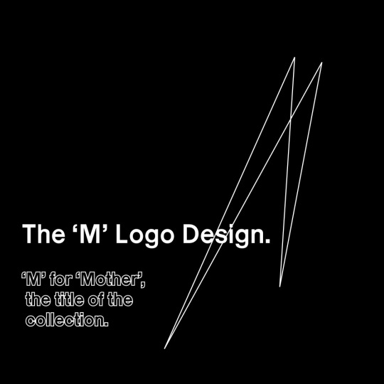
Logo Designs

Development:

Font sourced from Velvetyne. Font: Karrik by Jean-Baptiste Morizot and Lucas Le Bihan.
‘Karrik is rooted in vernacular typography. The weight disadjustments, the lack of optical corrections, the uneven width of the letters are some of the features of early sans serif typefaces that inspired us in this boundless “reinterpretation.” We kept these features noticeable at display font sizes — but with the constraint that the typeface remains legible at body copy size. A set of random, chaotic uppercase letters—accessible with the stylistic set “SS01”–has been added as tribute to the roots of Karrik; uneven garage letterings, nameless fonts of obscure and discontinued foundries’.
I wanted a typeface that was bold and minimal so this particular font seemed appropriate.

0 notes
Text
FMP Mood Board
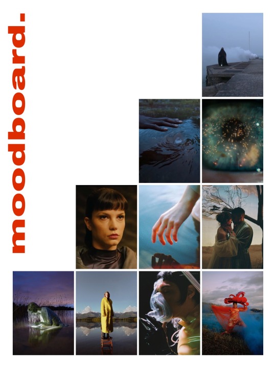
For my mood board I have selected images that I believe relate to the themes of my project, whether visually or in tone. After my self-evaluation I looked further into artists and directors that I could use as references. The top image is of Rick Owens’ Fall Winter 21/22 show. I also make reference to Denis Villeneuve’s Blade Runner 2049, Producer Arca (who’s music is experimental and abrasive and served as inspiration for my own production on the ‘Sonic Concepts 01′ soundtrack, as well as others that work to inform the project.
0 notes
Text
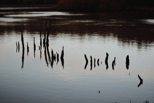
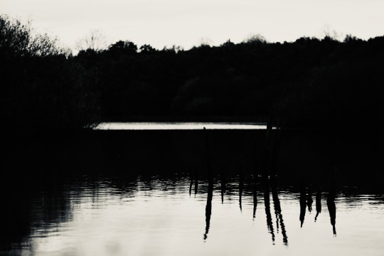
Location 03 Test Shots - Pagham Harbour

These test shots are of a possible location for the shoot/film. Shot in Pagham Harbour, the location is vast and has a serene almost spiritual quality to it making it perfect for what I am trying to achieve for the project.
0 notes
Text
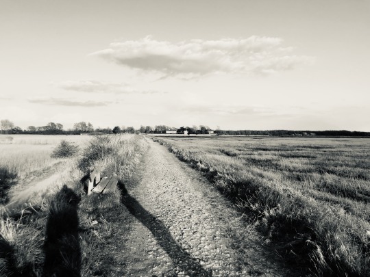
Location 02 Test Shots - Epsom Common
The final possible location I took tests shots of was of Epsom Common. I picked this location as a sort of backup in case any last minute changes were to be made as this location is closer to me. The common also has the natural, isolated and serene beauty that I am looking to include for the project.
0 notes
Video
tumblr
Location 01 Test Shots - Bognor Regis Beach
Filmed on my Nikon D5500, I took some test shots of possible locations for the shoot/film. I wanted the locations to be full of natural texture and far from people to make sense in the context of the project. The natural environments play a crucial role in the shoot/film and to the best of my ability I wanted to incorporate the four elements, earth, wind, water, fire. This particular location is Bognor Beach.
0 notes
