
I take makeup palettes and rearrange them through Bad Photoshop™.
Don't wanna be here? Send us removal request.
Statistics
We looked inside some of the posts by deconstructedpalette and here's what we found interesting.
Average Info
Notes Per Post
1K
Likes Per Post
992
Reblog Per Post
124
Reply Per Post
5
Time Between Posts
1 month
Number of Posts By Type
Note
1
Photo
15
Text
1
Last Seen Tumblr Blogs


Fun Fact
Total funding amounts to $125.3M.
Note
oh my god your account is what i have needed my whole life and never knew i did Thanks for existing ily
TY!! I’m glad you enjoy it.
Sorry I took such a long hiatus. I had to move back into my parents’ house, and then I was Dealing with some things as a result of that. I’m still Dealing, but I hope to get back with the program on this little project. It’s fun and I always enjoy being salty about makeup.
#sprksfly#answers#They keep making dumb palettes so I keep having to fix them#I just posted a new one today and I have several more for the near future.#hopefully I can get back to the consistent schedule soon
2 notes
·
View notes
Photo


And for my dramatic return, I bring you... CONTROVERSY!!
By which I mean this Too Faced Gingerbread “”””” Extra Spicy””””” pallette. Everybody is dunking on this pallette to a ridiculous extreme. People acting like this is the most boring palette ever released when Tarte as a brand exists will never not be funny to me. That said, I can see why they feel that way; it’s definitely pulling from the same playbook as last year’s pallette. I’m not mad at it, though. It hasn’t got any exact duplication, and it has a much warmer and orangier vibe. I’m a basic bitch, so I like it.
But seriously tho, I think the issue here was the marketing approach. If they hadn’t called it extra spicy, but had named it after some other christmas cookie it would have probably done fine. Like seriously. if they had named it the pizelle pallette, people would have lost their shit.
Alternatively, if they had released this for, like, christmas 2021, and had some other cookie-tin pallettes or whatever in between, I think it would have been much better recieved.
I actually bought this one because I am a basic bitch, but also because I collect the too faced tin pallettes, so I’ve included some first impressions/ thoughts about it under the cut for people who are interested. If you want to know some more informed opinions later on, feel free to hit me up. Also, the shade names are down there, too.
I bought the pallete like 9 hours ago, and have done one (1) look with it, so bear that in mind. Here are my down and dirty quick thoughts:
-the mattes are the same Extremely Smooth formula that you find in the OG (Original Gingerbread, ha!) and the just peachy mattes pallettes. They are very finely milled and blendable. 10/10 -The shades Spicy Mami and Candy Queen are a high-glitter, kind of scratchy formula. It’s not my favorite, but it’s better than that weird clumpy and flaky formula that was in the OG. -Midnight snack (the teal) will read as a black shadow in basically every circumstance. It’s not a Matte With Glitter, but it is shimmer with a black base. It’s way deeper IRL than it looks in the photos. Less scratchy-feeling than Spicy Mami/Candy Queen. -The rest of the shimmers are an Extremely Smooth (buttery, to use that term) high-impact metallic. -THERE ARE NO DUPLICATE SHADOWS IN THIS PALLETTE WHEN COMPARED TO THE OG. I know, I was suspicious of it, too. All the colors are different either in value, undertone, or formula. There are some quite similar shades, but they are pallettes on the same theme, so like, that makes sense.
tl;dr: quality-wise, it’s very consistent with the OG. If you liked those formulas you will enjoy this. It’s also a very good companion to that pallette, and will give it a little more daytime versatility. The OG is very vampy, so the lighter mattes in this give you a little more utility when Deepest Fall is not the vibe you want to present. That said, it is very similar, so if you have the OG and this color scheme puts you to sleep, or if your transmission just died and u gotta buy a car instead, for instance, you don’t strictly need this one. Also if you are blessed with an abundance of melanin, you may want to swatch it and make sure it won’t be ashy on you, since it leans lighter.
Extra Spicy Original Shades: Vanilla Wafer, Cookie Cutter, Soft & Sweet, For the Graham, In a Pinch, Drizzle it
Lick the Spoon, Spicy Mami, Extra Spicy, Half-Baked, Butterscotch, Cookie Call
Plenty of Dough, Candy Queen, Gingerbread Glam, Hot Tamale, Cinna-moan, Midnight Snack
Extra Spicy My Version: Vanilla Wafer, Cookie Cutter, In A Pinch, Half-Baked, Hot Tamale, Cinna-Moan
Lick the Spoon, Soft & Sweet, For the Graham, Candy Queen, Gingerbread Glam, Cookie Call
Plenty of Dough, Drizzle It, Butterscotch, Extra Spicy, Spicy Mami, Midnight Snack
#too faced Extra Spicy Palette#makeup review#eyeshadow#I seriously don't get why they released this pallette this year#especially when they had just re-promoted the other one in Fucking July Good Lord#but if they were committed to this pallette they shouldve named it something else#it is not more spicy than the other.#That said I like the palette#It's cute and it is a good companion to the other#but I'm pale af and also a basic bitch#people graced with an abundance of melanin may have some issues with it IDK#lmao i went to ulta to buy foundation and I came out with foundation and also this palette#also a shit load of samples and a ''free'' drawstring bag#I got the samples because I buy old lady foundation from an old lady brand#(by which I mean a department store brand. Old Lady Makeup is a Fake Concept by mean people)#the rep was like I See You Are Buying This Brand would you like some samples? Please Take Some Samples I have a jillion billion#I'm not sure why they gave me the bag but it was cute and ''free'' so#it was not actually free because I payed Money for foundation and an eyeshadow pallette and one of those was an impulse purchase.
6 notes
·
View notes
Photo

LORAC MegaPro 3 -- sometime in the last 3 years.
Hi folks, Sorry for the dry spell in terms of posts. I am moving, and it has kind of been taking up all my time. Hopefully, I will get back to more regular posts after I am finished.
Anyway, here is the LORAC MegaPro 3 palette. If you like beige, this is the palette for you.
The shades are under the cut.
pink cream, mist, dusty mauve, vintage, violet gray, hickory, eggplant, dk navy
crepe, toffee, tan, pecan, maple, walnut, bark, jet black,
snow, glacier, tulle, pink bronze, rose quartz, pomegranate, dk. roast, deep fog
bellini, cava, cider, rust, olive, brown sugar, sequoia, licorice
#loracmegapro3#makeup#eyeshadow#I think I got the shade names right#this one was a bitch to read#and the fact that half the colors look identical didn't really help matters
24 notes
·
View notes
Photo

Lorac MegaPro 2--(haha idk)
It’s ya girl, back again with another MegaPro; this time it’s the MegaPro 2. Less wild about this one than the MegaPro 1, but I ‘m kind of digging the Orange/Purple combo. I’m still maintaining the 2 mattes, 2 shimmers format in this one, too.
Shade list below the cut
porcelain, custard, melon, tawny, burlap, tangerine, saddle, cabernet lavender, bisque, sorbet, goji, purple, ash, forest, black
sugar, moonlight, seashell, peony, gold leaf, cinnamon, penny, dark sienna prosecco, chiffon, soft plum, sandstone, olivine, gunmetal, blue quartz, black ivy
#makeup#eyeshadow#loracmegapro2#lmao every time I do one of these I find five value mistakes while writing the post#at which point it's too late#see I wouldn't have this problem if they wouldn't make it 15 nearly identical shades of mauve or similar#this time it was 15 suspiciously similar shades of frosty pink
219 notes
·
View notes
Photo

Lorac MegaPro 1-- (who knows)
Happy New Year’s Eve, y’all.
Here is the Lorac MegaPro palette. The OG. I like this palette as-is, and I also like my version of it. Like when I rearanged the Megapro 4, I retained the “Two rows of matte, two rows of shimmer” format.
shade list under the cut.
cream, fawn, khaki, camel, sepia, stone, brown, espresso white, lilac, orchid, dusty plum, wisteria, grey, mulberry, black
opal, sand, cashmere, apricot, sienna, copper, maroon, granite vanilla, blush, dusty rose, smoky topaz, merlot, deep teal, caviar, indigo
#makeup#eyeshadow#loracmegapro#I like this palette#i know nothing about lorac's formula but it's pretty#lmao this post is full of hot takes & profound commentary#it pretty me like
205 notes
·
View notes
Photo

Dose of Color Hidden Treasure Palette–Fall 2017
This palette has the literal most infuriating packaging of all time. I hate it, and I still hate mine, but like, at least it’s compact.
I kind of rage quit, because I couldn’t get the pans to line up evenly, or in a 100% satisfying color placement. ain’t nobody got time for that, tbh, and aint nobody got time for this dumb pallette that takes up 2x as much room as it should.
shade list under the cut
pearl, diamond, map gemstone, locket, ruby coin, crown, key, onyx
#eyeshadow#makeup#doseofcolors#i mean somebody with more than basic photoshop capabilities might be able to fix this shitshow#but i do not have the patience
86 notes
·
View notes
Photo

Too Faced Semi Sweet Chocolate Bar palette-- (lmao who even remembers when this was released. A while ago)
Here is another Old Standby, which I sure don’t care enough about to google release info .
I really have some Conceptual Issues with the large pans in the chocolate bar palettes (aside from the fact that they’re irritating to photoshop). It always seems like the colors they make rectangular are disproportionately useful to people with fair skin. Which. Not cool, too faced. Not Cool.
Anyway, I like this palette. Shade lists under the cut.
Also, thanks to @ysoria, who reached out to me about my carriage return woes. It’s [shift+enter] for single space, y’all.
here’s some legit proof a dank haiku that I wrote totally for you.
Coconut Creme, Pink Sugar, Peanut Butter, Truffled, Frosting
Butter Pecan, Nougat, Mousse, Blueberry Swirl, Puddin’
Caramel, Bon Bon, Rum Raisin, Cocoa Chili, Hot Fudge, Licorice
#makeup#eyeshadow#too faced semi sweet#lmao if haikus can be dank this one sure isn't#anyway I do legit like this palette#I just wish they would occasionally make the large pans not be a matte cream and a shimmery cream#as usual I know nothing about the actual quality of the shadows.
78 notes
·
View notes
Photo

Viseart Sultry Muse palette --- IDEK when this released.
Normally Viseart palettes are arranged impeccably, since they are a pro brand for pros. This one, though, was a little bit head-scratchy.
shade list under the cut
Yves, Kifu, Ceska, Melonie
Chloe, Gitte, Camille, Chantille
Tym, Cindi, Diana, Jori
#makeup#eyeshadow#viseart sultry muse#another brand where I'm there for it until I see the pricetag#this is a pretty palette#it does kind of have 5 very similar pinks though
61 notes
·
View notes
Text
crystalandjustin replied to your photo “Too Faced Clover Palette—>Fall 2017 This palette is inspired by the...”
Are these two different palettes????? �������� there really pretty
I’m glad you like them. These are both the Too Faced Clover palette, which released for sale a couple weeks ago. The top image is the actual palette, but in the bottom image I’ve rearranged the placement of the shadows so that they move from light to dark across the palette. I also removed the bright yellow, replacing it with a darker green, but that was the only actual “change” I made beyond shuffling the color placement.
#crystalandjustin#I also moved the names so you can match the colors up if you have time to burn#I also think this is a pretty palette tbh#definitely prettier than the other two tin shaped palettes they just released in my opinion#as usual I know nothing about the actual quality of the shadows.#I just do bad photoshop on them.
6 notes
·
View notes
Photo

Too Faced Clover Palette--->Fall 2017
This palette is inspired by the founders of Too Faced’s dog, Clover. It’s limited edition, and word on the street is that a percentage of proceeds are going to an animal rescue charity. It’s way brighter than Too Faced’s usual, so I’m vaguely intrigued. It’s also gluten free, apparently. Do people with Celiac disease have to worry about topical contact with gluten, or is Too Faced just hopping on a trend with this?
I must admit, I feel personally victimized by the shade “Good Boy,” which is that Bright-Ass Yellow. It doesn’t go with anything else in the palette, and it throws off the color scheme,IMHO. Now I willingly own up to the fact that I am not a fan of yellow in most contexts, but I try to give it fair treatment in spite of this, as you can see in my treatment of past palettes. BUT THIS YELLOW DOES NOT GO, Damnit. So, for place-holding purposes, I replaced it with “Bless Her Heart” out of the Sweet Peach palette. What I would actually rather have, though, is a dark matte olive green. This is not something I like to do, because I don’t find it to be in the spirit of the challenge, but I just truly feel that this particular yellow doesn’t work. My apologies. Imagine the yellow where I put Bless Her Heart, if you prefer. I know sume people are totally here for That Yellow In Particular.
Also I’m kind of mad that I was forced to read the words “fur baby” and “Daddies <3 Me” with my own two eyes.
shade list under the cut.
Puppy Eyes,Chihuahua, Love is Love, Paw Print, TF Mascot, Spoiled,
I Ruff You, Lucky Clover, Wet Kisses, Cuddle Buddy, Daddies <3 Me, Best Friends
Cuteness Overload, Good Boy/BHH, Fur Baby, Ruh Roh, #savethemall, Woof
#makeup#eyeshadow#too faced clover palette#I hate that yellow. I hate it#everything else about this palette looks lovely but the yellowwwww#and like I'm not categorically opposed to yellow#the subculture palette has great color selection and it's like half yellow.#but this one just doesn't work.#even if it were more mustardy it would go better#but no it's like fuck-off primary yellow#blerg#I have opinions about color selection; news at eleven.
237 notes
·
View notes
Photo

Tarte Magic Star Collector’s Set— Holiday 2017
This is Tarte’s Ulta holiday palette. It has weird triangular flaps that I removed for formatting purposes. They had, like, blushes and lip products in them. Gotta say, as far as shade range is concerned, this set is kicking the Sephora set’s Behind. It has a nice selection of colors, so it seems like a good buy (provided the quality is good; I, as usual, haven’t actually seen it).
I do wonder why they named that metallic sage color “broach” (the verb) instead of “brooch” (the noun). Given the theme of Vaguely Islamic Orientalism their holiday stuff has this year, the noun would make more sense.
Shade list under the cut, per uszh.
Shades, L—>R
Pendant, Wander, Treasured, Palatial, Festival
Magical, Paradise, Euphoria, Gems, Starry
Sweets, Majestic, Joyous, Fringe, Genie
Getaway, Indulgence, Bangle, Goblet, Lavish
Broach, Desert, Tassel, Antique, Sublime
#eyeshadow#makeup#tarte cosmetics#tarte magic star#kinda want this one ngl#it kind of has all the colors i use.#that said i categorically never actually look at big-ass palettes like this so who even knows#i would probably end up depotting it.
27 notes
·
View notes
Photo

Anastasia Beverly Hills Subculture Palette—Summer 2017
I can’t fix the formula for you, but I can fix the layout.
In the interest of full disclosure: I do not own this palette (as usual). I have seen many reviews, and all of them indicate that this palette is…finicky. It’s really pretty, though, so that’s a shame.
shade list under the cut.
Shade list, L—>R
Cube, Electric, Edge, New Wave, Adorn, Fudge, All Star
Dawn, Roxy, Mercury, Destiny, Untamed, Axis, Rowdy
#eyeshadow#makeup#abh subculture#i really like the colors in this#which is impressive bc it has a whole row of yellow and i still like it...#altho that would probably be sickly looking on my personal eyelids now that i think about it#@ makeup companies do more green eye palettes plsthx
47 notes
·
View notes
Photo

Natasha Denona Sunset Palette---Summer 2017
Here is one of the most raved-about, most expensive eyeshadow palettes ever. Pls excuse the bad image quality; I def. screenshotted it from a video by Tati, because I couldn’t find one that wasn’t at a weird angle.
I don’t have a whole lot to say about this. Natasha Denona’s palettes are never laid out sensibly. I feel like for the amount people pay for them, she could afford to arrange them in a useful way, but I also can’t afford them, so...
As usual, the shade list is under the cut. I’m still messing about with formatting on this, so my apologies if it looks janky or whatever.
Shade list, L/R--> T/B
Ice Gold, Sundazed, Sol, Morgana, Terra
Bermuda, Aubade, Mandarine, Sinai, Vulcano
Atmosphere, Bronzage ,Horizon, Panjin, Igneous
#eyeshadow#natasha denona#natasha denona sunset#I see natasha denona palettes and I'm like ooh that's pretty#then I see the price tag and I'm like Gurl nah.#lmao I had this done like a week ago but I forgot to upload it
42 notes
·
View notes
Photo

Too Faced Sweet Peach Palette--- Too many release dates
Since I just slam-dunked that Tarte Holiday palette without actually doing anything besides rotating all the pans 45 degrees, I figured I should do some actual analysis. So, here for your viewing pleasure is one of my favorite palettes ever. I’m pretty sure everyone and their grandma got this when they made it permanent, so I do own it.
It gets a lot of hate for being ‘’’’’’’’not peach enough,’’’’’’’’’ but that’s at least partially the fault of the shade layout. It’s pretty clearly half peach when you arrange it sensibly. My only wish is that they had gotten rid of either Talk Derby To Me or Tempting, because lbr, they look exactly the same, and given us another color. Maybe a matte olive green?
Also, Luscious is the best rose gold, so if anyone could point me at an affordable dupe for when I inevitably finish it 8 months before the rest of the palette, I will be forever in your debt. Or @ too faced if you would sell that in a single, I’d buy the hell out of it.
anyway, the improved shade range is under the cut.
going in rows, L--->R
White Peach, Nectar, Peaches N’ Cream, Just Peachy, Candied Peach, Georgia, Luscious, Bellini, Cobbler, Bless Her Heart, Caramelized, Peach Pit, Puree, Summer Yum, Delectable, Charmed I’m Sure, Talk Derby To Me, Tempting
#Makeup#eyeshadow palette#too faced sweet peach#this is my fav palette y'all.#i don't mind that it smells like Peach Buds#I have a Vision for Bless Her Heart and it needs an olive matte tbh#also tiny gripe#i wish beauty ''''influencers'''''' would make themselves familiar with metals?#like half of what they call rose gold is actually copper?#they don't look the same?#theyre like oh idk how to describe this it's like gold but yellower and faker#I'm like it's brass my guy my pal my bud#you know that stuff people use when they too broke for gold?#copper-zinc alloy?#hm????#and just fyi that is not fools gold.#fool's gold is pyrite and the two look entirely different#and while I'm bitching about this#old gold and new gold look the same bc gold doesn't tarnish#and the word you were looking for is still probably brass#wow apparently I had some Opinions about this#anyway I like this palette
26 notes
·
View notes
Photo

Tarte Treasure Box Collector’s Set---(Holiday 2017)
I was honestly more annoyed by the packaging on this one than the shade placement, because I think that the dumb angled layout was a red herring to distract us from the fact that this palette is 2/3 beige. I didn’t even rearrange any colors, because I was so distracted by how beige it was, and I was sure I would get mixed up about which ones went where. Y’know. Since they’re all beige pretty much.
(To be fair, there is a little bit of tonal variation between the beiges, but I still feel it’s a little exessive when they could probably have condensed the first column into, like, 3 pale af beiges, and then expanded the midtones. But what do I know.)
#tarte cosmetics#eyeshadow palette#makeup#pls ignore the replacement background#i got tired of trying to reassemble the actual background#i hate jigsaw puzzles#so I just found the closest thing on google#i actually like the aesthetic of this holiday collection#I'm just still stunned at how samey this palette looks#tbf it might be that the photo is washed out#and I haven't seen it in person#but that's still a lot of beige my guys#also the packaging on this one is kind of dumb#it's super bulky and the side compartments are unwieldy af#2/10 highly impractical
13 notes
·
View notes
Photo

Too Faced Pretty Little Planner --- Holiday 2017 (Ulta exclusive)
I actually own this palette, for once. It didn’t actually need that much fixing, all things considered. I really only even made this post because, while reviewing isn’t really my thing, I thought I could give a brief overview of the kit, and help some people who might be on the fence make a purchasing decision.
My main thing I want people to know is that the notebook cover that comes with this kit is a weird size, and doesn’t fit the majority of commercially available planners. More details under the cut.
Also if you want more specific info about the shadow palette, hmu. I am happy to answer questions, since I own this one.
The eyeshadow palette is fine, and the pigmentation is good. The mattes are blendable, and the shimmers are pretty smooth. Over all, if the color range appeals to you, the eyeshadow probably won’t disappoint. It’s a good quality basic palette, with enough interesting shades that you probably won’t be bored by it unless you have oodles of eyeshadow. You also will get a sample of the Better Than Sex mascara, which is exactly what it says on the tin. It’s fine. It’s all fine, and if you’re here for the makeup you’ll be good.
The other main feature of this kit, though, is the planner. You get a paperback, monthly view calendar, a page of stickers, and a really cute cover. It’s sturdy, and it has a pocket, a little mirror, and a pen loop. All in all, it’s the sort of thing that would entice someone who was on the fence about the eye pallette to purchase the kit anyway. So if that is you, and you rock with a monthly calendar, then you’re golden. Buy it and have fun.
Most people don’t though. A lot of people might look at this set with the intention to buy it and replace the calendar with a more robust agenda, or maybe put their school-issued one into this cover. I just want to warn you that it will be tricky to do. The internal dimensions of the book cover are 4.75″X 7.25″. Which. isn’t a size planner that anyone actually makes. Some companies make a 4″X6″, but they’re hard to find, and a lot of them are spiral-bound. I’m not sure if that will play nicely with the cover. If you like the eye palette, and you can find a planner that also fits the cover, it’s probably worth it to buy the kit anyway. Just, be forewarned that it may be hard to find a replacement planner that fits both this cover and your scheduling needs.
I’m going to try this one by Shinola. I will let you know if it fits.
#too faced pretty little planner#too faced holiday#makeup#eyeshadow#makeup review#actually it's more of a planner review#toofaced wyd with this planner#why didn't they make it 5X8 ffs?#they were like oh our thing this year is planners?#let's make them in a size that's impossible to find#nailed it#Don't they know planner people go hard?
16 notes
·
View notes
Photo
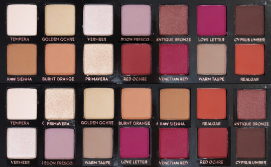
Anastasia Beverly Hills---Modern Renaissaince palette (Fall 2016)
I’m not mad at the original layout, but I do think this is an improvement. I am still not pleased with the position of Warm Taupe and Buon Fresco, but I didn’t like it when I had them switched, either. Idk bro, idk.
You know, for being The Warm-toned Palette that started the trend, this actually has quite a few cool-toned reds in it.
going in columns from left to right, the new shade list is as follows:
Tempera
Vermeer
Primavera
Buon Fresco
Golden Ochre
Warm Taupe
Burnt Orange
Love Letter
Raw Sienna
Venitian Red
Realgar
Red Ochre
Antique Bronze
Cyprus Umber
#eyeshadow#abh modern renaissance#makeup#but what is a cool toned red u may ask?#Love Letter. Love Letter is a cool-toned red.#Also I love the shade names in this palette#the part of me that didn't hate being a painting major is swooning rn#it is a very small part#i legitimately hated painting
26 notes
·
View notes