
Where every pixel tells a story and every interaction inspires delight. Transforming concepts into intuitive experiences that captivate and engage.
Don't wanna be here? Send us removal request.
Statistics
We looked inside some of the posts by design-studio-ui-ux and here's what we found interesting.
Average Info
Notes Per Post
1
Likes Per Post
1
Reblog Per Post
0
Reply Per Post
0
Time Between Posts
3 days
Number of Posts By Type
Text
17
Last Seen Tumblr Blogs


Fun Fact
Tumblr is used by 21% of adults online aged 18-29 years.
Text


Corporate website design in 2025 isn’t just about aesthetics — it’s about alignment, agility, and smart automation. From stakeholder buy-in to headless CMS workflows, here are 5 modern strategies to future-proof your site.
💡 Want the full breakdown? Read the complete guide here: 👉 https://www.designstudiouiux.com/blog/corporate-website-design/
👇 Save this if you're planning a redesign soon.
0 notes
Text


🧑💻 Dispatch operations, reimagined. We helped Smart Moving replace inefficiency with intelligence — and chaos with clarity — through a unified, user-first SaaS platform.
Here’s how thoughtful design transformed the everyday workflow of moving companies. 👉 Swipe →
0 notes
Text


✅ Responsive design? Table stakes. But in 2025, users expect fluid experiences — not just resized layouts.
🌊 A fluid UX adapts seamlessly to any context, user need, and interaction — beyond just screen size.
👇 Swipe to see why “responsive” isn’t enough anymore, and how to create truly flexible, user-friendly designs.
0 notes
Text


🖤 Before users read a word, they feel your brand — through your typography.
Bold or subtle, classic or modern — your type tells your story before your copy does.
✨ In a world of sameness, typography remains your strongest branding tool.
👇 Swipe to see why it matters — and how to get it right.
0 notes
Text


💳 The fastest way to grow revenue? Stop making checkout a pain.
Even in 2025, a confusing or clunky checkout process is one of the biggest reasons users abandon carts.
Here’s why optimizing your checkout UX still delivers the highest ROI—and what to focus on.
👇 Swipe to see what actually works.
0 notes
Text
Going Behind the Scenes To Understand How Website Redesign Experts Work

Flickering, nearly invisible "Buy Now" buttons. Check out forms that always get abandoned mid-type. Mobile visitors bouncing in under 3 seconds. These types of design issues plague millions of websites. But website redesign specialists can easily rectify them.
Consider Clay’s overhaul of Serena & Lily's website. This high-end home furnishings eCommerce site was struggling with poor conversion rates. So, Clay's redesign specialists engineered a brand-new, highly immersive scrollable product feed. This feed mimicked high-end catalogues and had optimized checkout flows with custom animations. Making the shopping journey more immersive and 40% shorter drastically boosted the store's ability to score high-value conversions.
Similarly, Bank of America's online banking enrollment process used to be a mess. They wanted more people to sign up, so they hired redesign pros to help. By testing new looks that aimed at this one goal, they saw real results. The site's enrollment rates doubled shortly after the redesign.
More recently, we saw The Guardian reimagine its online presence from the lens of their mobile users. The redesign was a ground-up rethink of news consumption on phones. The new platform introduced curated highlights, a streamlined "My Guardian" tab for personalized content, and a dedicated podcast section. It also brought new levels of art direction and flexibility to digital news. Breaking free from rigid desktop layouts has made their redesigned site one of the most-visited news sites of 2025.
The point is website redesigns work, especially when they are overseen by specialists. But what exactly do these experts do? How do their surgical design changes drive real-world business improvements? To gain clarity on that, we'll have to pull back the curtains and take ourselves behind the scenes.
The Modern Website Redesign Process Decoded
Early web redesigners prioritized aesthetics > economics. Modern specialists do the opposite. They treat websites as revenue engines, not digital brochures. 3 factors forced this shift:
Tools like Google Analytics and Hotjar now expose user struggles in real-time.
Google’s Core Web Vitals (LCP, INP, CLS) now directly impact rankings.
The modern website user expects websites to anticipate their needs.
Bamboozling users with better aesthetics is no longer a guarantee of success. Modern redesigns have to be systematic. They have to be data-driven. They have to factor in user behavior and the company's business goals at every step.
That's why the initial steps of modern redesign projects have little to do with design. They start off with deep, unflinching analyses of the site's current state of affairs. This phase is about diagnosis and strategy. It is about measuring twice before a single pixel is created.
1. Stakeholder Alignment and Goal Definition
A redesign impacts everyone, from marketing and sales to customer support. The first step is to clarify expectations across all internal teams. Specialists conduct cross-functional workshops before touching code.
The sales team may need improved lead capture forms.
The support team may want the redesigned site to have a more intuitive knowledge base to reduce ticket volume.
CMOs may present specific revenue targets.
Through structured workshops, redesigners convert abstract wishes into measurable objectives like:
"Reduce checkout friction to lift AOV by 18%".
"Cut support tickets 30% through intuitive IA".
Bank of America's yield-focused brief became their surgical north star. It prevented subjective design debates later. This initial phase crystallizes success metrics into contractual KPIs. It keeps everyone on the same page.
2. Performance Analysis and KPI Benchmarking
You cannot improve what you do not dissect. Specialists conduct digital autopsies of the site they are redesigning by using:
Google Analytics 4, which reveals conversion leakage points.
SEMrush exposes keyword erosion.
WebPageTest films load-sequence failures.
They also document all baseline vitals of the site, including its:
Core Web Vitals scores
Bounce hot zones
Mobile conversion gaps
Number of daily, weekly, and monthly visitors
Bounce rate
On-page time
Current SEO rankings
Domain authority
Current traffic sources
Conversion funnel analytics
All of this data paints the "before" picture against which all future "after" results will be judged. The raw numbers also transform vague goals into quantifiable targets for the redesigners, like "Achieve LCP < 1.2s on product pages", or "Increase form sign-up rates by 35%"
3. Identifying Very Important Pages (VIPs)
Not all webpages are created equal. Not all pages deserve equal intervention. The experts categorize webpages into a four-quadrant matrix using traffic/conversion metrics.
Critical Care (High Traffic + High Conversion): Checkout flows, top lead generators. Treated like ICU patients - incremental changes with constant monitoring.
Growth Candidates (High Traffic + Low Conversion): Homepages, category listings - pages where growth-oriented experimentation is encouraged.
Hidden Gems (Low Traffic + High Conversion): Niche service pages that must be redesigned to boost their visibility.
Low-Risk (Low Traffic + Low Conversion): Legacy content and deadwood pages that need totally replaced.
This matrix now dictates the redesign strategy:
Protect the crown jewels at all costs.
Polish the hidden gems to attract more traffic.
Experiment boldly on the missed opportunities.
Demolish and rebuild the dead wood.
This strategic mapping guides redesign efforts where they'll have the greatest impact.
4. User Persona and Intent Mapping
With the "What?" out of the way, the focus shifts to "Who?" and "Why?" Redesigners build psychographic profiles of their target users by analyzing the website's CRM data, session recordings of different user segments browsing the site, and transactional patterns of different user groups. Heatmaps and recordings are also not ignored. These are very thoroughly scanned through to identify user "barriers" (where they get stuck) and "hooks" (what delights them).
Why are these data sets so important? The answer is simple. Analyzing the data sets helps in arriving at the types of users the site should be redesigned for. It helps them determine what percentages of the users visit the site to:
Know (researchers comparing options)
Go (visitors seeking locations)
Do (users ready to activate features)
Buy (decision-makers with a budget)
This understanding prevents them from making errors, like pushing sales messages to user segments that exclusively browse for support articles on the site. It also helps them create detailed psychographic profiles that represent every major user segment, like "Time-poor operations director seeking 1-click procurement solutions."
The Guardian identified its main user segments as "Commuter skimmers" (mobile, know intent) who need short headlines and "Deep divers" (desktop, do intent) who crave long-form content. This knowledge informed their targeted redesign strategy.
5. Analyzing Barriers and Hooks
Once the professionals narrow down on the user, the next step is to find out what helps/hinders them. To pinpoint the "user barriers" (friction points) and "user hooks" (positive drivers) on the site, redesigners use:
Heatmaps from Crazy Egg that show rage-click zones on unresponsive elements.
Session replays that expose form abandonment triggers.
Scroll-depth analytics that reveal content engagement cliffs.
This analysis reveals what bad things the redesign shouldn't replicate and what good things it should retain.
6. Content Strategy and Auditing
An old industry saying states, "Design without content is just decoration." Modern redesigns live by this by auditing the site's existing content library and then creating these categories:
Preserve: Evergreen pieces that are still driving organic traffic.
Revive: Articles needing factual updates, SEO tweaks, or schema enhancements.
Retire: Thin content damaging domain authority.
Create: Gap-filling opportunities for creating new types of content (comparison charts, interactive calculators).
What stays? What goes? What needs rewriting? What new content needs to be created? Deciding all of that before the redesign really kicks off is vital. It ensures that every piece of content, every content page on the site, serves a purpose.
7. Technical SEO and Redirect Strategy
A redesign can obliterate years of accumulated search engine authority if not handled with technical precision. To avoid this and preserve SEO value, specialists:
Perform deep keyword research.
Crawl the site with Screaming Frog to log every URL.
Identify the most important pages and keywords to protect (and which ones to remove or augment).
Create a plan for adding new, more relevant keywords to the site.
Create a 301 redirect map that pairs every old URL with its new counterpart.
Map old → new paths in Airtable matrices.
Test redirect chains to avoid "hops" (old → intermediate → new).
Implementing tactical redirects tells search engines exactly where the content has moved. It preserves precious rankings and ensures that users who click on old links do not hit dead ends.
This type of technical SEO stewardship was essential for The Guardian. It successfully maintained its high search visibility despite a complete design overhaul by redirecting 200,000+ old URLs with military precision.
8. Information Architecture and Sitemap
Once the plan is set, the team works on how the website is organized. They want users to find things easily. So they study how people use the site and build clear, simple pathsThrough card-sorting exercises with real users via OptimalSort, specialists rebuild navigation from behavioral data
Bank of America streamlined their enrollment IA by using session recordings data that showed which navigation points caused cognitive overload. From their successful IA redesign, we can learn a few things:
Limit primary nav to 5 items.
Enforce shallow navigation depth (<3 clicks to content).
Implement "mega menus" for complex catalogs.
Test the main menu tabs for mobile-friendliness extensively.
9. Wireframing and Prototyping
Next, specialists create the website's "skeleton" through wireframes:
They start as simple sketches.
They evolve into high-fidelity, interactive digital mockups.
Wireframes show the placement of key elements like text, images, and forms on each page.
They also explain - mobile thumb zones for key CTAs and other clickable elements, and cross-device content hierarchies.
This step is purely structural. It allows the redesigners to test the new, refined user flows before design.
10. Visual Design and Layout
Once the structure is set, the visual design process begins. This is where the new redesigned visual identity of the website comes to life. Color, typography, and imagery-related changes are tested, refined, and applied. A refined visual language is created for the site.
Designers replace SVG icons with fast-loading PNGs. They strategically add/eliminate whitespace to better direct eye flow. They add brand-specific visual design elements like Serena & Lily's muted palette and cinematic product zooms.
The Serena & Lily redesign is a masterclass in this step. There, the redesigners created a new visual language of "elegance" that perfectly captured the brand's intended essence.
11. Development and Quality Assurance
The final phase is about execution, testing, and creating a framework for continuous improvement.
The web developers turn the static designs into a living, breathing, redesigned website. Be it a link, button, or form- it undergoes rigorous testing across a plethora of devices and browsers.
All website code is optimized, and images are compressed to ensure lightning-fast load times. All backend functionalities, like forms and checkout processes, are rigorously checked for speed and responsiveness.
Redesigners use atomic design systems for their reusable web UI components. They implement progressive enhancement for legacy browsers. They implement lazy-loading via the Intersection Observer API for fast loading.
Now, the redesigned site is stable and ready for launch.
12. Launch, Monitoring, and Iteration
The launch itself is a carefully coordinated event. A detailed checklist is followed to ensure all technical steps are completed. Everything is rechecked, from 301 redirects to making sure analytics codes are working.
The team keeps an eye on the site as soon as it’s live to quickly fix anything that goes wrong.
Redesigners create real-time dashboards to track the site's Core Web Vitals.
They create their own error log streams on Slack channels.
They carefully track all the KPIs established in step 1 to measure the impact of the redesign.
Don't think your job is done once you launch the new website. That’s not the end — it’s just the beginning. Now it’s time to keep checking how it’s doing and keep making it better.
Conclusion
If you want to redesign your website, remember this: working with experts isn’t a one-time thing. To get great results, plan to work with them for the long run.
0 notes
Text


🧠 Great UI isn't about guesswork — it's about logic. Here are practical, logic-driven design tips that will make your interfaces more intuitive, accessible, and user-loved.
📏 From spacing to buttons to contrast — swipe through for clean, conversion-friendly design principles.
0 notes
Text


👀 Users aren’t landing on your homepage anymore — they’re meeting your brand through AI answers.
Whether it’s ChatGPT, Perplexity, or Google SGE… Your website needs to be understood by machines and trusted by users — instantly.
🧠 In this new era, your UX has to speak to both humans and algorithms.
👇 Swipe to see how to design for visibility, clarity, and engagement in the AI-surfaced web of 2025.
0 notes
Text


Not every trend deserves your homepage.
But in 2025, some web design trends aren’t just aesthetic — they’re converting.
📊 Backed by UX data and user behavior shifts, here’s a curated moodboard of what’s actually working on modern websites right now.
👇 Swipe to explore styles, elements, and layouts that are making users stay longer and click more.
1 note
·
View note
Text


🚀 Motion in UI isn’t just “pretty” — it guides, delights, and converts.
But here's the catch: ⚡ Too much motion = lag. Too little = boredom.
Here’s how to use smart, lightweight motion design that enhances UX without slowing down your product.
👇 Swipe for actionable tips that balance beauty and performance.
0 notes
Text
Why Teaming Up with a Top USA UX Design Agency Fuels Product Success

America's lead in digital tech did not come from smooth planning in fancy offices. It came from lots of failures, big risks, and a deep focus on making things easy and pleasant to use. That hard-to-describe feeling when an app is simple, works smoothly, and just feels right — that has been a big reason why American digital products are so successful.
A lot of the time, the people making this happen work at local UX (user experience) agencies in the U.S. These agencies are not just regular contractors — they are experts at handling the fast-paced, often messy world of American tech innovation.
They do this with:
Battle-tested UX design methodologies
Market-hardened pragmatism
Technological fluency
Sheer resilience needed to lead multi-million dollar digital projects
And if they can exhibit these qualities in the USA, they can do it anywhere. That is why brands with digital aspirations from across the world clamor to team up with top UX agencies from the US. Let us learn how and why these agencies boost the chances of a digital product's success. But first, let us look at some of the American agencies that fit the lavish praise we have just showered upon them.
The Architects of Digital Dominance: How US UX Agencies Propel Global Brands
American digital leadership is built on the backs of its premier UI/UX design agencies. Apple, Amazon, Meta, Slack - these firms have been instrumental in helping some of the world's most iconic brands imagine, co-create, launch, and maintain mega-successful digital products. But discussions of this epic history often glide over the sheer pressure involved in this journey.
Take the legendary partnership between Apple and Frog Design from the 80s as an example. Sure, they co-designed the minimalist aesthetic language that made the personal computer a sleek, ultra-desirable gadget. But, imagine Frog's designers presenting radical minimalism to a company that was hemorrhaging market share to beige IBM boxes. With this partnership, Apple was not just seeking something "different"; it was betting the farm that people would pay more for beauty and ease.
So, Frog wasn't just co-designing a new identity for this digital brand; they were co-conspiring in a high-wire act of business transformation disguised as a design upgrade.
That pressure cooker environment where you have to innovate, succeed, and maintain that success all at once? That’s the US digital ethos. It’s not about safe iteration; it is about existential reinvention through design. UX agencies that are forged in that pressure cooker have a massive edge over other agencies from less-pressurized environments.
Clay, a San Francisco-based UX firm, has a similar story with Slack. The agency crafted the popular enterprise software's design decades ago. It is still considered the gold standard for enterprise software design today. That gold standard wasn't born from placid brainstorms. It emerged from the sheer frustration of selling complex enterprise software.
Traditional marketing fell flat. Clay understood Slack needed to show, not tell - to make the visceral benefit of streamlined communication undeniable in seconds. They hacked demos that felt like using the real thing, bypassed cynical IT gatekeepers, and spoke directly to the exhausted team lead drowning in email chains. That’s what it took for this American UX agency to understand and address its target users' desperation.
IDEO's partnership with Mayo Clinic is another example of an American UX agency going the extra mile to do what most agencies won't. Surface-level analyses of this case study will tell you that IDEO helped the Mayo Clinic reimagine its patient experience. But dig deeper and you'll see this reimagination didn't just come from "applying design thinking." It came from a brutal audit of a broken healthcare experience.
IDEO's UX designers didn’t just observe - they likely felt the cold dread of a misdiagnosis scare, the Kafkaesque maze of paperwork, the dehumanizing wait times. The redesigned digital patient care system was a direct response to systemic pain points witnessed firsthand. The "power of design thinking" here is really the power of ruthless, uncomfortable empathy within a complex, often resistant system.
Ramotion and Firefox. Design Studio and Pretaa. There are hundreds of other case studies of top UX agencies from the USA going the extra mile to deliver extraordinary results. These agencies succeed not because they operate in a vacuum of genius, but because they thrive within the specific, brutal, pressures of the US market.
They know how to deal with venture capital demanding hockey-stick growth. They know how to serve users conditioned by world-class experiences. They know all the ways to outsmart cutthroat competition. Hence, they're widely regarded as the best in the world.
The American Advantage: How US UX Agencies Apart Boost Product Success
Here's why a digital product's chances of success multiply when it goes through the American UX design landscape:
Deep Integration in the Tech Thunderdome
American UX agencies are not just located in the same country as the world's leading tech companies:
They are an integral part of the same tech ecosystem
Proximity to NYC, Silicon Valley, LA, Boston, Austin, and other tech hubs gives them unparalleled access to the latest technological advancements
They learn about emerging digital trends and industry insights into user needs, long before other agencies
For instance, US-based UX firm Neuron designs B2B workplace tools for companies like Atlassian and Salesforce. Their designers are not just near the action; they are in the daily scrum. They feel the raw pain points of scaling SaaS before they become case studies. They hear the unfiltered rants of engineers battling clunky interfaces.
All of this info is not gleaned from reports. It’s absorbed through the walls. Replicating this depth of immersion from afar? Nearly impossible. You need to smell the stale pizza and burnt coffee of the all-night hackathon.
A Culture of Venture-Backed Design Thinking
In the US, design is not a cost center; it is recognized, often begrudgingly, as a core survival mechanism. The billions invested in American digital startups are cold, hard bets that superior UX drives acquisition, retention, and ultimately, valuation. This brutal pragmatism forces agencies to speak the language of P&L alongside user delight.
Their work must prove its worth, leading to methodologies deeply intertwined with business metrics, not just aesthetic ideals. This is UX design being held accountable to the highest degree.
Talent Magnet & Pressure Cooker Pedagogy
Elite schools like Stanford d.school or MIT Media Lab are not just teaching Figma shortcuts. They are pressure cookers simulating real-world chaos. Students learn to:
Prototype in hours
Defend radical design ideas to skeptical VCs
Fail publicly, fast
This breeds a specific type of designer: resilient, business-savvy, and allergic to preciousness. Combine this pipeline with the gravitational pull of working on products impacting millions, and you get a global talent drain towards US UX agencies.
Advanced Technological Infrastructure
Access to bleeding-edge tech (AI/ML, cloud platforms, insane prototyping tools) is a major perk for US-based UX design agencies. But it also raises their baseline expectations. For instance, a local UX firm Goji Labs designing for Sony/Disney will never get to blame technical limitations if their design fails. This unique pressure forces agencies to merge deep UX thinking with serious technical chops from day one. They design knowing what’s possible (and impossible) at scale.
Market-Driven UX Design
Forget art for art's sake. US agencies operate under a simple, brutal mandate: Does it move the needle? Every pixel, every flow, is scrutinized through a lens of measurable impact. For instance, Momentum Design Lab is a major local UX firm. They have contracts with firms like AT&T and Wells Fargo. These contracts will die if Momentum's designs are not able to reduce call center volume, increase digital onboarding, stop fraud, or meet other key business KPIs. This results-oriented pragmatism is baked into the local UX design culture. It is UX design stripped of all vanity. That is why brands that team up with such agencies start meeting major business goals pretty quickly.
A Global Perspective on Digital Behavior
American tech platforms dominate globally. This market share comes with unparalleled access to data on how the world's users behave online. US UX agencies gain access to patterns across cultures, economies, and tech literacy levels simply by virtue of their clients' reach. This empirical understanding informs designs that navigate cultural nuance not through guesswork, but observed reality. These designs then fuel rapid product success.
An Innovation-First Mindset
The celebrated "innovation mindset" of America is not just pure optimism. It is a hard-won tolerance for risk, funded by VCs who know 9 out of 10 bets fail.
They allow agencies like IDEO or Clay to experiment wildly and, yes, fail fast, publicly. Those failures are then dissected, learned from, and become the bedrock of the next design breakthrough. That's why a successful product design is always around the corner.
Conclusion
Partnering with a top USA UX design agency isn't about buying a veneer of polish. It is about hiring a guide who knows the treacherous terrain of high-stakes digital product development intimately. It is about maximizing your digital product's chances of success.
0 notes
Text


A beautiful dashboard is useless if it doesn’t answer the right business questions.
In this post, we break down the essentials of designing Power BI dashboards that prioritize clarity, action, and business impact.
Swipe through for 5 quick tips to make your dashboards truly decision-ready 👇
#power bi#dashboarddesign#uxdesign#user experience#ui ux design#ui ux agency#designstudiouiux#businessintelligence
0 notes
Text


🚨 Users don’t read first — they judge visually.
Your website might be beautiful… …but does it feel trustworthy in the first few seconds?
In this quick breakdown, we’re showing how visual UX design silently influences trust — and conversions.
👉 Swipe to learn 3 key ways to visually build credibility (with zero dev work).
0 notes
Text
The Future of Responsive Web Design in the AI-Powered Device Landscape

The way users interact with websites has undergone a seismic shift, driven by AI’s ability to predict, adapt, and personalize experiences in real time. Static, one-size-fits-all websites now feel as archaic as dial-up internet, clunky relics in a world where adaptability defines relevance.
Similarly, Responsive Web Design (RWD) is no longer merely about flexible grids and adapting to screen sizes. It is about intelligent, predictive, and deeply personalized interactions.
The future, in this AI-powered device landscape, belongs to web designs that do not just react but anticipate and adapt in profoundly intelligent ways.
The Crumbling Walls: Why Old Web Interaction Models Fail in the Age of AI
The way people engage with websites has fundamentally changed, accelerated by the pervasive nature of AI integrated into the devices they use daily. This transformation highlights critical shortcomings in traditional web design. It shows why non-responsive, non-mobile-first designs are being relegated to the digital graveyard:
The Rise of Anticipatory User Experiences
AI-powered devices no longer wait for cues; they predict them. So, users expect website interfaces to adapt before they click, leveraging historical behavior, location, and even biometric data (with consent) to serve hyper-personalized content.
When a site fails to leverage AI for responsive personalization, engagement plummets. Users feel unseen, misunderstood, and they bounce, likely towards a competitor offering that tailored touch. With most projections showing mobile devices dominating traffic today and, in the future, delivering static desktop views is a sure-fire recipe for failure.
Multi-Modal Interactions
Voice assistants like Amazon Alexa and gesture-controlled AR interfaces have shattered the dominance of touchscreens.
Users today toggle between typing, speaking, and swiping without hesitation. A site designed solely for keyboard input ignores shoppers who start product/service searches via voice, completely.
Responsiveness now means designing for ears as much as eyes. It means adapting to interaction modality, not just screen dimensions.
Context is King (and AI is its Interpreter)
AI-powered devices can now analyze a wide range of ambient factors, from device orientation to ambient light to local weather, and adjust website interfaces on the fly. We are talking travel sites that automatically emphasize indoor activities during rainstorms or food blogs that auto-dim on-site visuals for late-night readers.
True responsive design today is about delivering the right content, in the right format, at the right time, informed by AI-driven contextual understanding.
Ecosystem Continuity is Non-Negotiable
Users flow between smartphones, smartwatches, and AR glasses, expecting seamless transitions. Start a cart on your phone, and your car’s dashboard should let you check out.
AI often acts as the connective tissue, aiming to make these transitions seamless. Non-responsive websites shatter this continuity. Logins are lost, carts are emptied, and preferences are forgotten. This jarring experience forces users to repeat steps, breeds frustration, and significantly increases the likelihood of abandoning tasks like completing a purchase. It damages brand perception, painting the business as technologically lagging.
Ecosystem-aware responsive web design, facilitated by AI, is crucial for maintaining coherence and user trust across the entire journey.
The Death of “One Layout Fits All”
AI cannot just resize website elements, it can reinvent website hierarchies. Tools like Firefly can now generate layouts tailored to individual cognitive preferences. So, modern website interfaces are increasingly expected to surface relevant options or content before the user explicitly asks.
Users with dyslexia might see simplified typography; visual learners get more infographics.
A travel site might preemptively show packing lists based on a booked destination, or an eCommerce site might highlight accessories compatible with recently viewed items.
Websites that lack this predictive layer force users to manually navigate predictable pathways. They fail to leverage AI’s power to reduce effort and streamline interactions. They make even visually adaptive sites feel fundamentally unresponsive to user intent.
RWD Today: From Fluid Grids to Intelligent Adaptation
Responsive Web Design has certainly come a long way. Its origins, famously articulated by Ethan Marcotte around 2010, focused on tackling the explosion of screen sizes.
The core toolkit involved fluid grids, flexible images, and CSS media queries. It was a groundbreaking web design concept. It allowed layouts to reflow and adapt based primarily on viewport dimensions.
This initial phase was largely reactive and device-centric. The goal was technical functionality: make the site usable on different screens. It did not deeply consider the user’s specific context, behavior, or intent beyond the device they held.
Fast forward to today’s AI-infused landscape, and the definition of RWD has profoundly shifted. It has moved from being merely device-responsive to becoming user-responsive. The integration of AI allows for a much more dynamic and intelligent form of adaptation. So, modern RWD must leverage machine learning to personalize content hierarchies in real-time.
Responsive web designers must analyze user behavior to predict preferences. They must use computer vision techniques to optimize images not just for size, but for content relevance and visual impact across varying contexts. They must also use Natural Language Processing (NLP) to power sophisticated voice interactions and make websites accessible and navigable through conversation.
Overall, today’s RWD is less about fixed breakpoints and more about creating fluid sites that continuously optimize their UX around the individual user and their current context, with AI.
AI-Powered Responsive Design Imperatives for 2025
As AI capabilities mature and user expectations climb higher, the future of responsive design will be defined by even deeper integration and intelligence.
Here are eight key elements that are set to dominate RWD in the coming years:
Adaptive Neural Interfaces & Real-Time Layout Generation
Forget rigid breakpoints. The future involves interfaces powered by neural networks that generate optimal layouts on the fly.
These AI systems analyze device specs, user behavior, interaction history, environmental data (like ambient light), and potentially even inferred user states (like stress or focus) to construct the most effective interface for that precise moment.
Imagine an eLearning platform that dynamically simplifies its layout during complex tasks or an online store that rearranges product displays based on detected user intent.
To create such sites, web designers must:
Embrace Headless CMS architectures and modular, component-based design systems (using frameworks like React or Vue).
Use these modular website systems to decouple content from presentation and to give integrated AI tools the flexibility to rearrange elements algorithmically.
This level of unprecedented personalization will drastically boost engagement and conversion.
Predictive Content Prioritization & Preloading
AI will move beyond simply reacting to navigation clicks. It will predict the user’s next likely action or information need based on complex behavioral analysis and context.
This enables hyper-efficient preloading strategies, not just lazy-loading images below the fold, but potentially pre-rendering entire sections or data sets. The AI calculates what the user is highly likely to access next.
Think of a news site preloading articles related to the one you are currently reading and your historical interests. To adopt this feature, responsive site designers should:
Implement sophisticated, privacy-respecting user analytics to fuel the predictive models.
Architect the site using progressive loading techniques where content blocks can be loaded dynamically based on AI triggers, not just linear user scrolling.
Use edge computing for faster predictive model execution.
These efforts lead to faster perceived load times and smoother user journeys.
Context-Aware Typography & Visual Hierarchies
Static typography systems are obsolete in AI-driven responsive design.
Future interfaces will deploy machine learning to analyze environmental inputs - ambient light levels, device motion sensors, screen distance measurements, and user interaction patterns, to dynamically adjust typographic properties and visual hierarchies.
This goes beyond simple font scaling: AI will optimize line spacing based on reading speed patterns detected through scroll velocity, adjust contrast ratios in real-time for glare conditions, and select typefaces that align with both brand guidelines and user accessibility needs.
To implement this, designers must adopt variable font technology and integrate browser-level APIs like the Ambient Light Sensor while maintaining semantic HTML structures.
The challenge lies in balancing computational overhead with real-time adjustments. Over-optimization could drain device batteries or introduce latency.
Success requires progressive enhancement strategies that prioritize core readability while layering AI refinements for capable devices.
Voice-First Interaction Architectures
Voice will transition from supplementary feature to primary navigation mode, demanding fundamental restructuring of content delivery.
AI-powered voice responsiveness requires websites to parse natural language intent rather than predefined commands, maintaining conversational context across sessions. This requires semantic content tagging that works equally well for screen readers and voice assistants, with hierarchical information architectures that mirror human dialogue patterns.
Developers must implement W3C Voice Interaction Guidelines and adopt schema markup that bridges visual and auditory interfaces. The friction point? Ensuring voice navigation parity without compromising visual design integrity.
Solutions involve creating bidirectional content maps where voice commands and visual menus reference the same information nodes.
Behavioral Authentication Flows
Static login screens will be replaced by AI-curated authentication experiences that adapt to user behavior patterns and device trust scores.
Machine learning models will analyze typing cadence, touchscreen gesture biometrics, and typical access locations to dynamically adjust security requirements. High-risk actions on unfamiliar devices might trigger multi-factor checks, while routine access from verified environments could enable password-less entry.
Implementation requires integration with WebAuthn standards and behavioral analytics platforms that establish continuous authentication baselines.
The balance?
Eliminating friction without compromising security. Overly aggressive verification prompts could disrupt user workflows.
Effective responsive sites already employ explainable AI that transparently communicates risk assessments and allow users to manually escalate security when desired.
Cognitive Load-Responsive Interfaces
AI will actively monitor and respond to user cognitive states by analyzing interaction patterns like hesitation durations, error rates, or navigation backtracking. Interfaces will simplify dynamically during detected frustration, surfacing guided workflows or collapsing non-essential UI elements.
Conversely, engaged users could unlock advanced tools through progressive disclosure triggered by confident interaction signatures. This requires real-time analytics integration with modular component architectures.
Designers must create UI variants with identical functionality but varying complexity levels, tagged for AI-driven substitution.
The ethical consideration? Avoiding paternalistic overrides. Users should retain a large degree of manual control over interface density.
Successful implementations use subtle visual cues to signal adaptive changes while providing opt-out preferences.
Ecological Performance Optimization
Responsive design will extend beyond screens to address environmental impact. AI will balance resource consumption against device capabilities and network sustainability metrics by:
Serving low-color assets on solar-powered devices.
Deferring non-critical scripts during peak energy grid loads.
Prioritizing text alternatives when carbon-intensity thresholds are exceeded.
Adoption requires integrating Green Web Foundation APIs and building performance budgets that account for both user experience and ecological impact.
Conclusion
The path forward for responsive web design is undeniably intertwined with AI.
To implement these sophisticated, adaptive strategies, the best responsive web design services are also evolving.
They are going beyond traditional web development skills and honing expertise in AI integration, data analysis, user behavior modeling, and cross-platform experience orchestration.
0 notes
Text


Color isn’t just visual—it’s emotional. Design smarter by knowing when to go bold or stay cool. Which one fits your brand better—🔥 or ❄️?
0 notes
Text


Responsive design isn’t just a trend — it’s a must. Here are 4 simple principles to keep your website smooth, smart, and screen-friendly.
Make your design work everywhere.
0 notes
Text

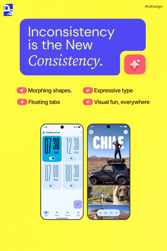


Forget flat. Forget consistent. Google’s latest UI language — Material Design “Expressive” — just flipped the script.
🎨 Morphing shapes 🌀 Spring-based motion 🔤 Typography that plays a visual role
It’s not just a design update — it’s a shift in how we build digital experiences.
But here’s the challenge: ⚠️ Freedom without clarity = chaos
👉 Swipe through to see what’s changing, why it matters, and what’s next for digital products.
0 notes