#dashboarddesign
Explore tagged Tumblr posts
Visit Tumblr Blog
Explore Tumblr blogs with no restrictions, modern design and the best experience.
Last Seen Tumblr Blogs


Fun Fact
Tumblr posted its first advertisements in May 2012 and subsequently earned $13M in revenue.
Text
Is your billing dashboard secretly costing you?
A billing dashboard should offer effortless access to calls, usage, and charges. We transformed our client's Open-Source VoIP Billing Dashboard. Here’s how. 1. Confusing Layout ❌ Data hard to scan. ✔ Clear, structured data for better readability. 2. Weak Visuals ❌ Slowed decision-making. ✔ Enhanced data visualization with trend charts. 3. Limited Insights ❌ Users had to dig for key details. ✔ Custom filters & date range options for deeper insights. 4. Outdated UI ❌ Created unnecessary friction. ✔ Modern UI & improved hierarchy for easy scanning. A great UX isn’t just about looking good. It’s about working smarter. What’s the biggest UI/UX issue you’ve faced with dashboards? Let’s discuss below!

#UXDesign#DashboardDesign#VoIP#SaaS#UIDesign#ProductDesign#DataVisualization#BillingSolutions#EnterpriseTech
2 notes
·
View notes
Text

Customizable Interface Users can configure their home page and dashboards according to their preferences, enabling a more personalized and efficient user experience.
Unlock actionable insights now! Schedule your demo today! https://calendly.com/fresatechnologies
For more queries please visit below link 👇https://fresatechnologies.com/fresa-gold/
For further inquiries, please contact us : [email protected]
#Fresa#Freightsolutions#Freightforwarding#Import#FresaGold#ERPSoftware#FresaAIChatbot#SmartFreightAssistant#G2Awards#EasyUsability#BestSupport#AutomateYourBusiness#FresaTechnologies#LogisticsSoftware#ERPforLogistics#FreightSolutions#CustomizableInterface#UserDashboard#PersonalizedExperience#EfficientUI#TechInnovation#UserPreferences#DashboardDesign#UserExperience#DigitalCustomization#InterfaceDesign#ModernSolutions
0 notes
Text
Unlock the Power of Your Data with Power BI Business Analytics at UpShik Academy
In today’s data-driven world, transforming raw numbers into compelling insights is the key to staying ahead. UpShik Academy’s Power BI Business Analytics course empowers learners to do just that. Whether you’re an aspiring analyst, a business manager, or an IT professional, this program equips you with the tools and techniques to harness data like never before.

🎯 Why Power BI?
Power BI is Microsoft’s flagship business intelligence platform, allowing users to connect to multiple data sources—ranging from Excel sheets and SQL databases to cloud services like Azure and Salesforce. Its intuitive, drag-and-drop interface makes it ideal for beginners, while its advanced features support seasoned analysts in crafting interactive dashboards, rich reports, and insightful visualizations.
UpShik Academy’s curriculum is designed to bridge this gap between theory and practical application. Led by expert instructors, the course offers live sessions and hands-on assignments that build real-world problem-solving skills.
What You’ll Learn
Data Connection & Transformation: Import data from diverse sources, clean it, and prepare it for analysis using Power Query.
Data Modelling: Build efficient data models, define relationships, and write DAX measures to unlock advanced analytics.
Visual Reporting: Create intuitive charts, maps, and KPI visuals—aesthetically polished and business-ready.
Dashboard Publishing & Collaboration: Share reports via Power BI Service, set up data refreshes, and manage user roles for organizational access.
Real-World Projects: Apply your knowledge to real datasets—sales trends, customer segmentation, financial reporting, and more.
UpShik Academy Unique Benefits
Flexible Schedule: Enjoy a blend of self-paced and instructor-led sessions tailored to your timetable.
Certification Support: Gain access to exam-prep coaching and mock tests to confidently pursue Microsoft’s DA‑100 certification.
Career Boost: UpShik Academy offers career counselling, internship placements, and guidance to help you leverage your Power BI skills in the job market.
Community & Mentorship: Learn alongside peers, receive regular feedback, and grow in a supportive learning ecosystem.
Is This Course Right for You?
Ideal for beginners, with no prior BI or strong technical background needed.
Beneficial for mid-level professionals aiming to enhance reporting capabilities.
Perfect for decision-makers who wish to interpret data, not just collect it.
Ready to pivot your career with actionable analytics? Enroll in UpShik Academy Power BI course today and start visualizing your success—one dashboard at a time!
#PowerBI#BusinessAnalytics#DataVisualization#MicrosoftPowerBI#BITraining#UpShikAcademy#OnlineLearning#DataAnalyticsCourse#PowerBICourse#DashboardDesign#DataDrivenDecisions#PowerBITutorial#DataScienceSkills#LearnPowerBI#BusinessIntelligence#CareerInData#PowerBITrainingOnline#PowerBIforBeginners#BIForBusiness#UpskillWithUpShik
0 notes
Text

Create Interactive Dashboards with Charts, KPIs, Tables & Maps – AIVHUB
Use AIVHUB to create robust interactive dashboards. Use dynamic charts, tables, KPIs, and maps to visualize your data. Use real-time data and layouts that can be customized to meet your company's needs to make well-informed decisions. Check out AIVHUB.com to learn more.
#aivhub#aiv#aivconsultant#InteractiveDashboards#DataVisualization#BusinessIntelligence#DashboardsWithKPIs#RealTimeAnalytics#DataDrivenDecisions#CustomDashboards#VisualAnalytics#DashboardDesign#AnalyticsPlatform#DataInsights#DataMonitoring#KPITracking
0 notes
Text
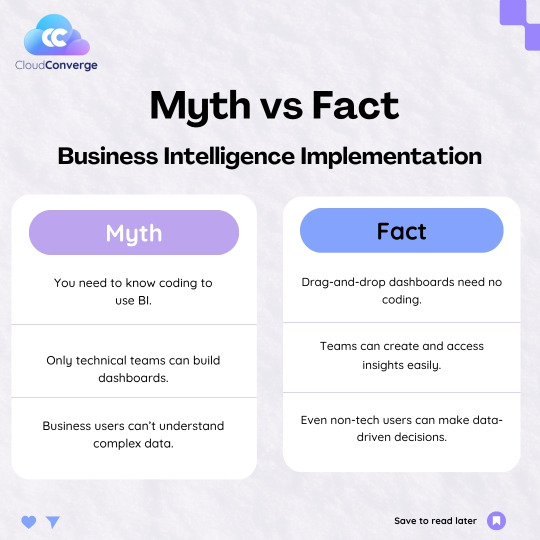
Think Business Intelligence is only for coders and data scientists? Think again. With modern BI tools, anyone from marketers to managers—can build dashboards, access insights, and make smarter decisions. Let your data work for everyone, not just the tech team.
📩 Contact us today:[email protected] 🌐 Visit us: www.cloudconverge.io
#BusinessIntelligence#BItools#DataDriven#TechMyths#NoCode#DashboardDesign#SmartDecisions#DataForAll#ModernWorkplace#CloudConverge#BIforEveryone#DataVisualization#DigitalTransformation#BusinessGrowth#AnalyticsTools
0 notes
Text
youtube
The video titled "3 Ways to Use Tableau’s 'Describe' Feature" by Playfair Data explores how users can unlock deeper insights and improve their workflow using Tableau’s built-in "Describe" functionality. Ryan begins by showcasing how right-clicking on a field and selecting “Describe” reveals important metadata such as data type, source field, and even a sample of field values, allowing users to preview the data structure without dragging it into the view. This saves time and helps avoid unnecessary performance issues. He then moves on to the second technique—describing an entire worksheet. By navigating to the “Worksheet” menu and selecting “Describe Sheet,” users can view all the fields, filters, mark types, and calculations used within that worksheet. This is especially useful when reverse-engineering someone else's dashboard or understanding complex visualizations. Lastly, Ryan dives into describing nested calculated fields. When a calculated field contains other calculated fields, Tableau allows you to explore and expand these inner layers, giving full visibility into how advanced logic is built. This feature is incredibly valuable for debugging and reusing logic in other parts of your dashboard. Throughout the video, Ryan emphasizes how these three methods enhance productivity and deepen comprehension of data and visual elements. He also points out that using the "Describe" feature requires minimal system resources, making it an efficient tool for both beginners and advanced users. Whether you're building a dashboard from scratch or trying to understand one created by someone else, Tableau’s “Describe” feature can be a real game changer.
#TableauTips#DataVisualization#TableauTutorial#DataAnalytics#BusinessIntelligence#PlayfairData#DashboardDesign#DataScienceTools#TableauTraining#DataDrivenInsights#Youtube
0 notes
Text
Infographic - Freelance Data Analyst vs. Data Scientist Who Delivers Better ROI?
Thinking about hiring a freelance data expert?
Before you pick between a Data Analyst and a Data Scientist, you should really ask:
Who gives you more ROI for the project you’re working on?
Dashboards vs. predictions. Speed vs. complexity. $5K vs. $50K pipelines. Here’s a visual comparison to help you decide wisely 👇

TL;DR:
Analysts = great for fast, visual insights and tight budgets
Scientists = great for complex ML models and predictive workflows
Right choice = more ROI, fewer delays, and less burn
Best Use Cases:
Hire a Freelance Data Analyst if:
You need dashboards, reports, or cleaned-data insights
Your budget is under $5,000
You want something shipped this week
Hire a Data Scientist if:
You're building ML systems or predictive engines
You’ve already got structured data pipelines
You’re looking to automate, not just analyze
Need Help Finding the Right One?
Check out Pangaea X — the only platform just for Data Analytics & AI freelancers.
#infographic#dataanalytics#freelancing#dataanalyst#datascientist#techjobs#startuphelp#ai#machinelearning#roi#analytics#tumblrtech#businessinsights#dataengineer#projectplanning#freelancetech#dataviz#dashboarddesign#developerblog#techstartup#mltools#pangaeax#datavsteam#startupstrategy#careertech
0 notes
Text
Telling the Story: Effective Visualization for Big Data
In the era of big data, the ability to effectively visualize information is more crucial than ever. A well-crafted data visualization not only communicates insights clearly but also tells a compelling story that can drive decision-making. This blog will explore best practices for visualizing big data, including choosing the right chart types, maintaining clarity and minimalism, embracing interactivity, and utilizing powerful tools. We'll also look at real-time dashboards and delve into case studies that illustrate these concepts in action.
Choosing the Right Chart Type for the Right Data
The foundation of any successful data visualization is selecting the appropriate chart type. Here are some guidelines:
Bar Charts: Ideal for comparing quantities across different categories.
Line Charts: Best for showing trends over time.
Pie Charts: Useful for illustrating proportions but should be used sparingly.
Scatter Plots: Great for revealing relationships between two variables.
Heat Maps: Excellent for displaying data density or intensity.
Choosing the right chart type ensures that your audience can quickly grasp the key insights without getting lost in the details.

Data Visualization Types
Best Practices: Clarity, Minimalism, Interactivity
Effective data visualization hinges on a few core principles:
Clarity: Ensure your visualizations are easy to understand. Use clear labels, legends, and annotations to guide the viewer.
Minimalism: Avoid clutter. Every element in a chart should serve a purpose; eliminate anything extraneous.
Interactivity: Engage users by allowing them to explore the data. Interactive features like hover effects, filters, and drill-downs can make complex datasets more accessible.
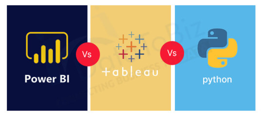
Tools Overview: Power BI, Tableau, Python, and R
Harnessing the right tools can significantly enhance your data visualization capabilities. Here's a brief overview of some popular options:
Power BI: A user-friendly tool from Microsoft that integrates seamlessly with other Office products, ideal for business analytics.
Tableau: Renowned for its ability to handle large datasets and create interactive dashboards with ease.
Python (Seaborn, Plotly): Offers robust libraries for creating a wide range of visualizations, from simple plots to complex interactive graphs.
R (ggplot2): A powerful package for creating elegant and complex visualizations with a strong statistical foundation.
Data Visualization Tools
Real-time Dashboards with Live Data Sources
In today's fast-paced world, real-time data visualization is invaluable. Real-time dashboards allow organizations to monitor key metrics continuously and respond to changes as they happen. This is particularly useful in fields like finance, logistics, and social media analytics, where timely decisions are critical.

Real-time Dashboards
Case Studies: Sales Data, IoT, Social Media Analytics
To illustrate these concepts, let's look at a few real-world examples:
Sales Data: A retail company uses a combination of bar and line charts in Tableau to track sales performance across regions and time periods, identifying trends and areas for improvement.
IoT: A manufacturing company employs real-time dashboards in Power BI to monitor machinery health through IoT sensors, reducing downtime and maintenance costs.
Social Media Analytics: A marketing team leverages Python's Plotly to create interactive visualizations of social media engagement, allowing them to tailor campaigns more effectively.
Frequently Asked Questions
What is the most important consideration when choosing a chart type? The most critical factor is ensuring the chart type aligns with the data's story, allowing for easy comprehension of the insights.
Why is minimalism important in data visualization? Minimalism helps eliminate distractions, enabling the viewer to focus on the most critical information without unnecessary clutter.
How can I incorporate interactivity in my data visualizations? You can use tools like Tableau or Python's Plotly, which offer built-in functionalities for creating interactive charts and dashboards.
What are the benefits of using real-time dashboards? Real-time dashboards provide up-to-the-minute data insights, allowing for prompt decision-making and the ability to react swiftly to changes.
Which tool should I choose for my data visualization needs? The choice depends on your specific requirements, such as data size, the complexity of visualization, and integration needs. Consider experimenting with a few tools to determine the best fit for your objectives.
By adhering to these best practices and leveraging the right tools, you can transform complex datasets into clear, actionable insights that drive your organization forward.
Home
instagram
#DataVisualization#DataStorytelling#DashboardDesign#PowerBI#Tableau#BigDataViz#VisualAnalytics#DataInsights#SunshineDigitalServices#BIReporting#Instagram
0 notes
Text


A beautiful dashboard is useless if it doesn’t answer the right business questions.
In this post, we break down the essentials of designing Power BI dashboards that prioritize clarity, action, and business impact.
Swipe through for 5 quick tips to make your dashboards truly decision-ready 👇
#power bi#dashboarddesign#uxdesign#user experience#ui ux design#ui ux agency#designstudiouiux#businessintelligence
0 notes
Text

Tableau Public vs. Tableau Desktop: What’s the Difference?
Read More: https://assignmentonclick.com/tableau-public-vs-tableau-desktop-what-s-the-difference-a-side-by-side-comparison-for-students-and-professionals-choosing-between-free-and-paid-versions
#TableauPublic#TableauDesktop#TableauComparison#LearnTableau#DataVisualization#BusinessIntelligence#TableauForBeginners#DataAnalytics#VisualAnalytics#DashboardDesign#AssignmentHelp#AssignmentOnClick#assignment help#techforstudents#aiforstudents#assignmentwriting#assignmentexperts#assignment#assignment service#machinelearning
1 note
·
View note
Text
Power BI Dashboard Development: The Key to Real-Time Decision Making
Data is only as powerful as its presentation. With Power BI dashboard development, businesses gain a competitive edge through real-time, interactive data views.
Our data visualization services specialize in crafting dashboards that drive decisions. From financial overviews to customer behavior analysis, we make your data work for you.
As trusted Tableau and Power BI consultants, we go beyond charts and graphs. We design systems that deliver custom data dashboards for business insights across all levels of the organization.
Awelion is a leading name in data reporting services in India, helping companies become more data-driven. Recognized as one of the best data analytics companies in Ahmedabad, our goal is to make every decision informed.
0 notes
Text

Top Tools for Data Visualization
Want to turn complex data into clear visuals? Start learning tools that professionals use every day!
✅ Tableau – Build dashboards & reports
✅ Power BI – Make business data simple
✅ Infogram – Create beautiful charts in minutes
✅ Google Data Studio – Easy to share & collaborate
📊 Data visualization is key to success in today’s data-driven world!
👉 Learn these tools with real-time projects and expert guidance.
✅ Why Choose Us?
✔️ 100% practical training
✔️ Real-time projects & case studies
✔️ Expert mentors with industry experience
✔️ Certification & job assistance
✔️ Easy-to-understand Telugu + English mix classes
📍 Institute Address:
3rd Floor, Dr. Atmaram Estates, Metro Pillar No. A690, Beside Siri Pearls & Jewellery, near JNTU Metro Station, Hyder Nagar, Vasantha Nagar, Hyderabad, Telangana – 500072
📞 Contact: +91 9948801222 📧 Email: [email protected] 🌐 Website: https://dataanalyticsmasters.in
#DataVisualization#PowerBI#Tableau#GoogleDataStudio#Infogram#DataTools#DashboardDesign#VisualAnalytics#BusinessIntelligence#DataAnalyticsCourse#AnalyticsTools#LearnPowerBI#TableauTraining#ExcelToPowerBI#DataStorytelling#TechSkills#DataAnalyticsMasters#VisualizationTools#CareerInAnalytics#UpSkillNow
0 notes
Text

Data Visualization Consulting Services: Transform Data Into Clear, Actionable Insights Unlock the true potential of your data with our Data Visualization Consulting Services. We help businesses turn complex datasets into clear, compelling visuals that drive informed decision-making. From interactive dashboards to custom visual solutions, our experts deliver actionable insights through advanced tools like Tableau, Power BI, and more.
0 notes
Text
Dashboards that do more than just display — they respond.
From real-time mortgage task flows to beautifully navigated list views, we transformed how one lending team operates inside Salesforce.
✨ Automation. 📊 Instant updates. 🚀 Smarter decisions.
#SalesforceExperts#SalesCloud#MortgageTech#FintechCRM#LWC#DashboardDesign#CRMThatWorks#AutomationInFinance
0 notes
Text

Customizable Interface Users can configure their home page and dashboards according to their preferences, enabling a more personalized and efficient user experience.
Unlock actionable insights now! Schedule your demo today! https://calendly.com/fresatechnologies
For more queries please visit below link 👇https://fresatechnologies.com/fresa-gold/
For further inquiries, please contact us : [email protected]
#Fresa#Freightsolutions#Freightforwarding#Import#FresaGold#ERPSoftware#FresaAIChatbot#SmartFreightAssistant#G2Awards#EasyUsability#BestSupport#AutomateYourBusiness#FresaTechnologies#LogisticsSoftware#ERPforLogistics#FreightSolutions#CustomizableInterface#UserDashboard#PersonalizedExperience#EfficientUI#TechInnovation#UserPreferences#DashboardDesign#UserExperience#DigitalCustomization#InterfaceDesign#ModernSolutions
0 notes
Text
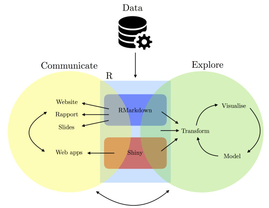
Building Dashboards & Applications with R: Shiny in the Real World
In today's data-driven world, the ability to transform raw data into actionable insights is crucial for businesses, academics, and policymakers. Shiny, an R package, is at the forefront of this transformation, enabling users to build interactive web applications with ease. This blog explores what Shiny is, how it works, and its applications in the real world.
What is Shiny and How It Works
Shiny is an open-source R package that allows users to create interactive web applications directly from R, a language and environment for statistical computing. By combining the power of R with the interactivity of web development, Shiny enables users to build applications that can host complex data visualizations, perform real-time calculations, and provide an engaging user experience.
Shiny applications are composed of two main components: the UI (User Interface) and the Server. The UI defines the layout and appearance of the application, while the Server handles the application's functionality and logic. Users can utilize HTML, CSS, and JavaScript to enhance their applications, making Shiny a versatile tool for data scientists and developers alike.
How Shiny Work
Creating Interactive Apps for Data-Driven Decisions
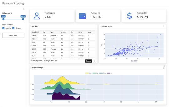
The true power of Shiny lies in its ability to create interactive applications tailored to data-driven decision-making. By enabling users to manipulate data through dynamic inputs such as sliders, dropdowns, and text fields, Shiny apps allow for real-time analysis and visualization, encouraging informed decision-making.
For instance, a company could use a Shiny app to visualize sales data, allowing managers to adjust variables like time frames and product categories to identify trends. Similarly, academics can harness Shiny to create tools for exploring complex datasets, facilitating greater understanding and discovery in research.
Embedding Dashboards in Business or Academic Projects
One of Shiny’s significant advantages is its ability to embed dashboards in various projects, providing a seamless way to share insights. Whether in a business context, where dashboards can be embedded into company intranets, or in academia, where they can be incorporated into online courses and research papers, Shiny applications offer versatile integration options.
By sharing Shiny dashboards, stakeholders can access up-to-date information, enabling collaboration and fostering a data-driven culture. Furthermore, the open-source nature of Shiny encourages customization and the development of bespoke solutions tailored to specific organizational needs.
Business Dashboard
Real-World Hook: Shiny Dashboards in Action
Shiny dashboards have found applications across numerous fields, including healthcare, policy analytics, and business reporting.
Healthcare: Hospitals utilize Shiny dashboards to monitor patient data in real-time, helping medical professionals make informed decisions quickly. For instance, dashboards can track patient vitals, medication schedules, and bed occupancy rates, optimizing hospital operations and improving patient outcomes.
Policy Analytics: Policymakers use Shiny to analyze data related to social issues, enabling them to model the potential impact of different policy decisions. By visualizing data effectively, policymakers can communicate findings to stakeholders and the public, facilitating transparency and informed decision-making.
Business Reporting: Companies implement Shiny dashboards to report on key performance indicators (KPIs), allowing executives to drill down into data for in-depth analysis. These dashboards can be customized to reflect organizational goals, providing a clear picture of business performance.
Shiny Dashboards
FAQs
What makes Shiny different from other dashboard tools?
Shiny stands out due to its integration with R, offering robust statistical and graphical capabilities. Its open-source nature and flexibility make it ideal for customization.
How difficult is it to learn Shiny?
For those familiar with R, learning Shiny is straightforward. Its intuitive structure and extensive documentation make it accessible to a wide range of users.
Can Shiny applications be deployed on mobile devices?
Yes, Shiny applications are web-based and can be accessed on any device with a web browser, including smartphones and tablets.
What industries benefit the most from Shiny dashboards?
While Shiny is versatile and applicable across many industries, it is particularly beneficial in healthcare, finance, academia, and government sectors.
Is it possible to integrate Shiny with other technologies?
Absolutely, Shiny can be integrated with other technologies such as databases, APIs, and JavaScript libraries, enhancing its functionality and reach.
In conclusion, Shiny offers a powerful platform for building interactive dashboards and applications, driving data-driven decision-making across various industries. Its real-world applications demonstrate the transformative potential of data visualization and exploration, making it an essential tool for the modern information age.
Home
instagram
youtube
#ShinyApps#InteractiveDashboards#RWebApps#DataTools#BIWithR#RealTimeData#RForBusiness#AppDevelopmentWithR#DashboardDesign#SunshineDigitalServices#Instagram#Youtube
0 notes