
Statistics
We looked inside some of the posts by emmacorbe and here's what we found interesting.
Average Info
Notes Per Post
0
Likes Per Post
0
Reblog Per Post
0
Reply Per Post
0
Time Between Posts
1 day
Number of Posts By Type
Link
4
Text
13
Last Seen Tumblr Blogs


Fun Fact
The Tumblr app for Google Glass was released on May 16, 2013.
Text
User Testing Feedback
The majority of my user testing feedback was positive however I quickly discovered some errors in my app when it came to forgetting to put glows around certain elements and making navigation more clear.
For example, below is one of my opening screens in sketch. However, my user testing was done through Adobe XD and my glows weren't strong enough as through Adobe XD my shadows were dulled down. Therefore, my user was confused as to what to tap on, they tried tapping on the word ‘enter’ but I wanted to them to tap on the door knob.
Old screen

New Screen
To solve this problem I first of all tried to make ALL my glows stronger on Adobe XD. Below was as strong as I could get my shadows but hopefully the glowing pulse animation will help users to understand what to tap on. I then moved the word ‘enter’ to above the door knob to enforce what I want the user to do.

0 notes
Text
Changing my back buttons
On receipt of feedback from Rick and John they made me notice a fault in my navigation. I have an “X” at the top left hand corner of EVERY screen for my user to tap on and go back to their previous screen. An X normally symbolises something that interrupts a person, they usually appear on overlay screens and make your process come to a halt. For example, error overlay screens appearing all over your desktop.
Therefore, we came to the realisation that a back arrow would be better for screens which aren't overlays and a smooth transition from left to right to go back would be a better idea to help my user understand their navigation.
X at the top of my Screen

Changing the X to a back arrow


Keeping an X for my Overlay Screens

0 notes
Text
Changing up my Bookcase
Below is the bookcase for my app, otherwise known as the options screen were you can select what topic you want to find out more about. As you can see lots of different colours are used, this makes the bookcase look bright and colourful. However, the multiple colours can make it more difficult to choose the correct book. Only some books are clickable therefore I want to make this more clear and I think the use of colour could help me do this.

As you can see I have changed my design to have more subtle colours for non clickable books. It is definitely more clearer as to which books you should tap. However, choosing a topic like this is an unusual way of navigation so my user wouldn’t be familiar with it.
Perhaps showing my user the front covers of the books will make it more obvious as to what book they should choose. For example, a cover of your chosen book zooms up when tapped and you can then choose whether to continue reading that option or put the book back.

0 notes
Text
Improving my Opening Screen
I realised that the navigation when it comes to my opening screen can be quite difficult to understand. I have my glowing tappable elements however I think my user needs more direction on how to ‘enter’ into the next screen.

My glows around the tappable elements will be pulsing indicating that you can click them. However, I also have the words ‘enter’ above the door now, making what I want the user to do even more obvious.

0 notes
Text
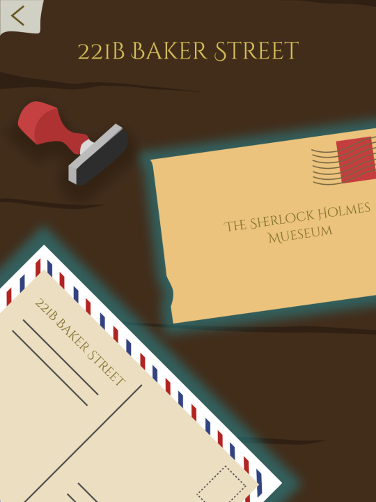
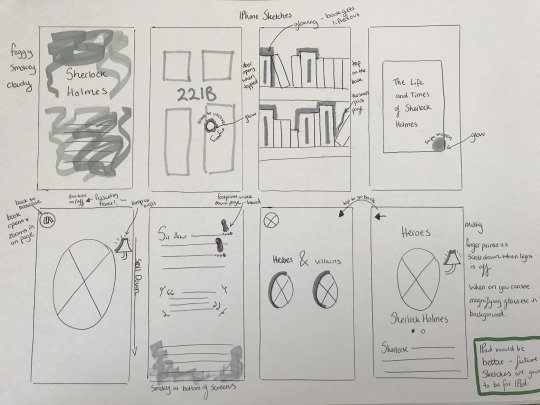
Sketches for my Sherlock App
Below are some ideas and concepts I sketched out for my Sherlock app. As you can see the first set of sketches are created for IPhone however now seeing my app is for IPad these can be easily changed to suit the appropriate dimensions.
I want the tappable elements in my app to be glowing to identify to the user you can click on them. I hope to keep an old fashioned style throughout the app.

0 notes
Text
Black Mirror - Create your own story
Black Mirror have released a new episode called “Bandersnatch” which allows you to interact with the programme and send characters on different pathways depending on your choices.
This was great to interact with as I found the experience enjoyable and made me realise how important choice and interaction is for the user. For my app I want my user to have the option of going where they want when they want as I think this will give them a better experience. I don’t want to limit my user to follow a set story path throughout my app. I want them to be able to go back and forth with ease. The only part of my app I would want to be ‘story’ like is the opening pages to the bookcase as they act as an introduction to the product.
0 notes
Link
This is a link to the prototype for my app, ‘Silver Lining News’.
0 notes
Text
App Store Preview
I created a mockup of what my app would look like on the app store.


0 notes
Link
I came across this site and it’s inspired me to divide my own app website up into colourful sections. This site uses a lot of bright colours which is what I want to use on my app also. I think I am going to divide my site up into the different sections of home, about, 3 key features and download through the use of different bright colours.
0 notes
Link
I decided to look at some websites to promote apps as inspiration as to how I’m going to design mine. I found a site I like for an app called cutest paw, I am going to list some things I like about it. I love how as soon as you open the site the option is there to download the app. Screens and features of the app are shown frequently throughout the site, giving the viewer opportunity to see what they will be downloading. I want the features of my app to be shown throughout my site giving viewers the chance to understand more about my app.
0 notes
Text
Trying to perfect my curves
I love the way my logo has turned out, it resembles the way I wanted it to look however one issue I have with it is how the curves on either side of my ‘s’ are uneven and not as curved as I imagined. I am going to try and perfect this.

Attempt at trying to perfect my logo
Below I tried to make my curves more equal, it was very difficult however it’s definitely an improvement from my previous logo. Considering it is an ‘S’ I am creating both sides aren't going to be equal but the aim is there.

I am going to change my news app name to ‘Silver Lining News’ instead of ‘Silver Linings News’ as I think this rolls off the tongue better.
0 notes
Text
Changing my news feed presentation
On receipt of feedback from my lecturer Chris, he suggested that instead of coloured overlays, I use coloured banners. I agree with him on this as I personally think the coloured overlays are messy looking and tacky. It was also suggested that because I’m going to change my overlay idea, I should also change my topic icons and how they look. For example, currently all my topic icons are white but I am going to change these to a bold key colour to stand out.
Whilst doing this I am also going to assign a colour to an icon/news topic more accordingly so there is consistency across my app. For example, all news stories on the environment are colour coded green.

My News Feed Now

0 notes
Text
My nav bar transitions
I would like my nav bar to transition like a carousel, hence why it is round. I am going to experiment on Adobe XD with auto-animate and see if this is something I can achieve whilst prototyping.

0 notes
Text
Adding a Notification Bell
I wanted to add a notification section to my news app so users can get notifications about news submissions they may post to see if it has any likes etc. I am going to place this on the top right hand corner as this is where notification bells are on most apps.

As you can see below I’ve implemented my notification bell to my app. Any notifications will appear in a blue circle to get my users attention.

0 notes
Text
Making my dates stand out
A key feature on my news app is that you can look back at the good news from previous days using my ‘date scroller’. I want to make this stand out and clear to understand for my user so below are a couple of options.
With this option below, the text on today's date is in black and the backgrounds are grey. However I think the key date blends in too much with the rest the dates and looks too dull, needing brightened up.

Below is my second option. I changed the background colour of my key date to white. This makes it look different from the rest. I am going to use this design instead and do some user testing to see if my users understand that the function of this element is to view different dates of news.

0 notes
Text
Silver Linings Landing pages
Below are two different landing pages I created for my app. One includes an animated wordmark and the other just has ‘Silver Linings News’ text. I think I prefer the wordmark as I could animate this and make it look slick and professional. I am unsure as to whether I should animate the sun as well as my wordmark as it might be too much however I will gather people's opinions and make a decision.

0 notes