
Don't wanna be here? Send us removal request.
Statistics
We looked inside some of the posts by ericotley-blog and here's what we found interesting.
Average Info
Notes Per Post
0
Likes Per Post
0
Reblog Per Post
0
Reply Per Post
0
Time Between Posts
3 days
Number of Posts By Type
Text
10
Photo
7
Last Seen Tumblr Blogs


Fun Fact
The Tumblr app for Google Glass was released on May 16, 2013.
Text
Time Post-Critique Response
For this project my goal was to capture the build up of dust, and I think for my first attempt I pulled it off. You can clearly enjoy watching the dust collect as the images roll through. I’d say some of the weaknesses would be the ending didn’t go as smoothly as I had hopped, and some camera shots were out of focus. I also had a hard time keeping shots lined up, although I did a decent job of correcting this it still could be done better.
Some great ideas from classmates were to use a tripod next time. If I don’t have studio lighting equipment, I could use a lamp as this would be better than nothing. This would correct the issue of the shots not lining up perfectly. The lamp, or studio lighting would fix why I chose to forgo the tripod – which was because the camera cast a visible shadow over the shelf that engulfed half the shot. Remote shutter, or time-lapse camera equipment were other great ideas to keep everything stable. One last thing, when going to wipe eight weeks’ worth of dust, it would be a good idea to wet the cloth first.
I learned a lot from this project. While it was not perfect, it came out decent and got the idea across. I will revisit this again using all of the suggestions. I think this could be a really great video portfolio piece once done in a cleaner way.
0 notes
Text
Place Post-Critique Response
With this project I achieved what I set out to do. Which was to create a tranquil journey that people would go on when viewing this artwork. The weaknesses of this project would be not enough video overlay. This should happen throughout the full video. When you enter a regular scene without the distorted reality effect it tends pull you out of the video.
Some suggestions to improve this artwork would be to use more of the overlay effect. This effect achieved some great responses from people in the class. Some found it peaceful, while some found it jarring or threatening – when the water would appear to flow over the bridge, or the crunch of the snow. It was interesting how some of the experiences were mixed. However, the overall experience with the sound and the meditative motions of the camera with overlay tended to be a meditative one.
I learned a lot from doing this project. I really want to explore video more. There are a few items I’d like to invest in; although not necessary for this project, a remote shutter, and a gimbal camera stabilizer to start. These would be nice tools to help my future video endeavors.
0 notes

Text
Project 4 — Proposal
FORM:
Digital Video, displayed on the TV.
PROCESS:
Recording footage on a camera, the paths I’ll walk down, and rivers that are close to homes I’ve lived in. Then, I’ll be putting the recordings together -- the footage of flowing water overlaid onto the footage of paths I will be walking down. The sound will be enhanced, so you can hear the crunch of footsteps, the breath as I walk, and the babble of the river.
CONTENT:
With this video I want to create a surreal experience of paths I used to travel as a young child, and the places I would explore. I want to tie this in with the tranquility of rivers that are close to places I’ve lived in the past. This will be a personal video to myself, of past memories that I will be reflecting on as I take this journey. To the viewer I want to capture visuals and sounds to stimulate and enthrall them. They may not understand everything, but I would like them to enjoy the journey with me through the footage I compile.
0 notes
Photo
Time project - week 8
Area of the shelf showcasing the amount of dust that has collected so far. The dust collection photos are coming along great!
0 notes
Text
Project Place — Research Journal
Artists name: Bill Viola
Weblink: https://youtu.be/GHdX7sApIMc
Form: Video art, experimental
Content: Video includes water, “The reflecting pool”. It uses the relationship between the sounds of water, reflection, a man jumping and then freezing into place. While he is frozen in place, you notice things happening in the reflection of the water. The man frozen slowly fades away while your attention is diverted. Bill does some really interesting things in the water, with reflections, splashes, reversing footage. The tranquil sounds help you to get drawn into this video.
Process: Video with a lot of clever editing it looks like.
Artists name: TheWaterwhispers
Weblink: https://www.youtube.com/watch?v=VkZ4eStoaQY
Form: Video art, ASMR
Content: Video of person walking on sea shell path. You can hear the crunches and minute sounds.
Process: Video filmed of person walking on shells. Sound seems amplified.
Artists name: TheSilentWatcher
Weblink: https://www.youtube.com/watch?v=zofBinqC2F4
Form: Video art, nature
Content: Video of a river. You can hear all the tranquil sounds of the water flowing over the rocks.
Process: Video filming of a river.
0 notes
Text
Project Place — Project Ideas
1. Either take pictures, or find old pictures of places I’ve lived, and put them together in a short video showing the aging of the house where applicable, and maybe some interior shots as the video flickers and fades to the next picture. This would be set to music.
2. Take video footage of water that are located close to the places I’ve lived. This could be environmentally themed or just tranquility. I’ll need to visit the sites to decide, but it would capture the natural sound of the water. Maybe combine ideas 1 & 2 and have the sound of the water with an overlay of the images showing up over the water?
3. Video footage of places and paths I would explore as a child.
0 notes
Photo


Time project - week 7
More dust build up. Looking good!
0 notes
Text
Identity Post-Critique Response
Coming up with the idea of a full sized silhouette of myself was the easy part. The hard part was tying in themes and ideas that I wanted to express about myself. At first they were very literal, but after some discussions the direction to go more abstract became the focus. I’ve never delved into abstract artwork before, so I was very excited to create this piece about myself.
I knew I wanted it life size, or close to it. Eventually the idea to create this art as a three piece vertical triptych came to me. Breaking the artwork into three sections would help create an interesting visual experience as the artboards would be separated, but at the same time joined by the art. This also had the benefit of making this large piece much more portable.
Starting off I had many ideas of objects and visuals I wanted to include. Finding out what was needed, and what could be dropped was quite the exercise in cutting down excess concepts and ideas. Changing all my ideas and concepts into abstract forms was challenging, but once I stopped overthinking it it became a rewarding exercise and I enjoyed creating interesting colors, shapes, and creatures for this piece.
To create this artwork I needed an idea of what I would be building it on. I knew I wanted to use foam core board, and to create a sense of depth. I went to the store and found what I needed, and this helped me set up and create my artboards in illustrator. Each foam core board is 30” wide x 20” high. I bought nine of them, but ultimately only used six. The original idea was to create a deeper depth with the use of three layers. However with time constraints I opted to only do two layers of depth which in the end I am happy with the results.
I set up an illustrator file with three artboards stacked on top of eachother, so I could see how the art would look in the real world. I even made sure to create a 1” gap between the artboards to mimic the 1” gap the foam core boards would have in real life.
Finding the correct image of myself to alter took a long time, but once I settled on one I was able to start creating my layout, and design. The image I chose I had a shirt on, but I edited myself to be shirtless to add a sense of vulnerability. I built one panel at a time, starting with the top, then the middle, and then the bottom. My concept was to depict myself and how the outside world has a large influence in shaping, not only me, but who we are.
The external forces of the outside world bombard my senses in this piece. They enter my mouth, and my eyes. My eyes are covered by literal coke bottles. Poking fun at the idea of coke bottle glasses - thick lensed glasses that one would wear when they can not see well. I myself wear glasses, so putting these on my face in the art was to both be humorous, but also tell a story of how we don’t always see the outside world clearly. It is distorted by many outside factors.
The exposed bones of the jaw and the arm represent past events. The arm I broke with a compound fracture when I was a young child; it’s oddly a happy memory I have with my father, and not the traumatic experience of falling off the monkey bars that I remember most from that ordeal. The jaw is a surgery I had to correct my under-bite. It was an eight hour surgery, and took months to recover from, and I lived off of liquid food for most of that recovery. I really wanted to include these as parts of my identity, that only myself or people really close to me know about.
The artwork was done in black and white because I wanted the bits of color that show in this piece to really stand out. The idea behind the black and white is that the world really is pretty awful out there. On a global scale we have wars, diseases, deaths; and on a personal level we have our own wars we deal with everyday, and our own losses. However, despite all this there is still beauty in the world, and a reason to love, and live. That is where the color is coming from. The light enters the coke bottle glasses and diffuses out like a light prism, showing all the beautiful colors. These were represented with the squares and circles of color spilling out of the coke bottle glasses. I carried these throughout all three panels. Sprinkling the beauty into every panel.
Finally, I put in little creatures that were inspired by mythological creatures like fairies, goblins, and spirits. The idea behind these is that the creatures are not necessarily evil, but they are mischievous -- it’s in their nature. In my artwork the little creatures I created are hindering my path through the world, ripping my skin open to expose past injuries -- that they most likely caused themselves. Now, I’m not saying these creatures are real or that they caused these injuries in real life, but they are an abstract idea of outside forces in the world that we can not control.
After printing the artwork. I placed the art on the foam core boards, and cut out the top layer, and then glued the images to the board with rubber cement. Then I glued the background images to the uncut foam core boards. After these were assembled I glued the background foam core to the foreground foam core with a hot glue gun. I then poked tiny holes into the artwork and bound them together with a thin wire.
I will be replacing the wire that holds the panels together with clear fishing line, and the paper that the creatures are pulling back will be replaced with a colorful velum, and I’ll make it more stretched out looking like the creatures are really pulling on it.
It was exciting to hear everyone’s interpretations of my artwork in class as it is mostly abstract. The meanings everyone came up with are both relatable, and enjoyable, and I accept them as alternative truths to this artwork.
I really enjoyed working with abstract concepts and imagery, I plan on taking this further in the future.
0 notes
Photo


Time project - week 6
Dust is already building up nicely after the fresh start. Everything is coming together.
0 notes
Photo


Time project — week 5
I decided to start fresh with the new angle. This is a close angle to the desk to really get a view of the dust collection. I have a bright light set up to help reveal any tiny dust particles. In testing before the old dust was wiped away it looked really good; you could see dust particles and even tiny fibers. I’m looking forward to the progression of dust build up at the new angle.
0 notes
Text
Project 3 — Proposal
FORM:
This is to be a 67” shillouette of myself placed on three pieces of layered white foam core board. Using black foam core, I will build the silhouette. This will also be layered enough that when nooks are cut out exposing images below you will see depth. The main materials will be foam core to build depth and layers, and printed digital artwork. It will be displayed as an always open vertical triptych.
PROCESS:
This will be created by cutting a silhouette of myself out of black foam core board and attaching it to white foam core board, and this will be layered to create depth. There will be strategic cut outs exposing different elements — most will be digital prints, but there may be other materials introduced. The artwork itself will be assembled in three panels, a bottom, a middle, and a top — these will be assembled vertically.
CONTENT:
My intended meaning is to convey what it feels like to be me, what I think it is to be myself, how do I think others view me, and what are the elements that make up myself; that may, or may not be known to the external world. The form is to be a life-size silhouette of myself; this is to impose a presence of human proportions that will draw you to the piece, and hopefully create a sense of interest, and wanting to know who, or why? The materials are to create depth, so you can explore the external — the raised, the surface, and what lies beneath. This is as much for the viewer as it is for me. The process of creating this piece is to explore, learn, and know myself. The majority of images will be digital prints attached to the foam core boards. The digital prints will be a series of miniature artworks in themselves, all tied to what it is to be myself, and abstracted to various degrees — conveying the known and unknown when encountering, or experiencing me; and when I experience myself.
0 notes
Photo


Time project — week 4
Dust is building up nicely. Taking pictures at this new angle has me thinking, is it too late to start over and do it at this new angle instead? Or, perhaps start taking additional photos at this angle and including it in the final compilation? For example: I could contiune taking pictues at the old angle, but also start taking pictures at the new angle. Then, at the end when I have the compilation unfold -- I could do a series of photos at the old angle, wipe clean, then have a series of the new angle, wipe clean, old angle, clean, new angle, clean and repeat on a loop. I think that is what I’ll do.
0 notes
Text
Project Identity — Project Ideas
1. A silhouette of myself, printed at life size - black. Then have various objects that represent myself flying out of me. Stuff that I feel represent me, and my identity. Thinking one arm could have a fracture, representing me breaking my arm when I was young. My skull with an x-ray look showing where I had surgery on my jaw. The inside of the silhouette very physical things, that have happened in my past. The outside are things that make me me. What others see, and may or may not know. Maybe tattoo like images on the silhouette representing things about me as well?
2. A video compilation of things that represent who I am. Maybe audio with it as well?
3. Very abstract imagery of what I feel represents my identity.
0 notes
Text
Project Identity — Research Journal
Artists name: Robert Rauschenberg
Weblink: https://www.moma.org/collection/works/78248
Form: Lithograph and screenprint
Content: It’s a life sized self portrait of Rauschenberg’s skeleton, surrounded by furniture, drills, astrological chart, and cutouts of athletes in motion. X-rays both reveal everything, and nothing.
Process: Six X-rays of Rauschenberg’s body, joined together to form a life-sized lithograph. Overlaid with an astrological chart, images of furniture, drills and cutouts of athletes in motion.
Artists name: Uygar Demoglus
Weblink: https://theculturetrip.com/europe/turkey/articles/moving-portraits-exploring-the-potential-of-video-art-with-uygar-demo-lu/
Content: Six channels, face the viewer and in each channel he does not tell a story, but rather shows cuts of reality re-assembled in different sequences to unsettle the viewer and sow the powerlessness of life. He wants you to get lost in the 4th wall.
Process: Six-channel video-installation, occupying a booth. Each box has multiple planes to show video.
Artists name: Yael Zahavy-Mittleman
Weblink: https://www.gallery110.com/an-abstract-self-portrait/
Form: Oil paint on canvas, other elements, mixed media, photographs.
Content: She creates artwork that she wants you to explore through her abstract paintings. Searching for what is inside a wonderful existence given to her.
Process: Oil painted on canvas with cut out imagery inserted into the abstracted paint and colors.
0 notes
Text
Language - Post-Critique Response
Coming up with a concept for this piece took a little creativity. I was actually inspired by a cutout collage I created using magazine cut outs, that included a couple images of fences. One was white fence with a black background, the other was a bright background that blacked out the fence in the foreground. Taking this imagery I envisioned how I could incorporate this into language. My initial ideas were pretty crude, but after discussions with classmates and the professor I ended up creating a much more interesting body of text for this piece.
Some of the weaknesses of this piece was how hard it was to read the abstracted text. I did intentionally make it hard to read, but I ended up making it way too hard to read. The viewer should be able to be rewarded if they spend the time looking at the image.
I plan on implementing a more fence like font, something more wire like, I also plan on making the intersections of text much more clear, so the viewer can follow the line of text without getting lost. It will still be abstracted a little, and difficult to read, but not impossible. I plan on playing with colors of the background as well. This needs to be tweaked a little bit, if not just adjusted slightly.
I feel like I have gained skills that help build out ideas, and put meaning into my artwork.
I can imagine continuing this line of research. Creating objects with text, that tie into a concept that the viewer gets to enjoy and explore.
0 notes
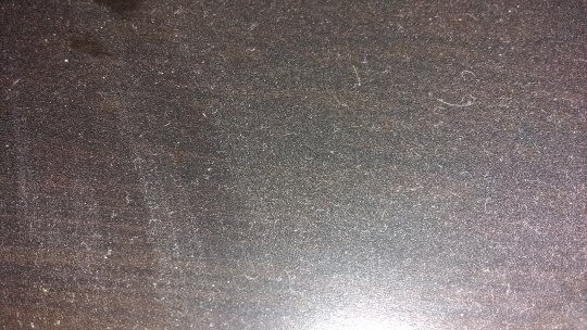
Photo


Time project - week 3
The dust is actually collecting faster then I would have expected. I also, had an unexpected visitor jump onto the space. Cat prints can now be seen in the dust. I don’t think this will ruin the project. It actually helps show the build up of the dust, and while not my intention it could provide ammusment to the viewer.
0 notes