
Statistics
We looked inside some of the posts by ernestsdesign and here's what we found interesting.
Average Info
Notes Per Post
5
Likes Per Post
5
Reblog Per Post
0
Reply Per Post
0
Time Between Posts
1 day
Number of Posts By Type
Text
17
Last Seen Tumblr Blogs


Fun Fact
The total number of visits Tumblr.com received during January 2021 is 327 million.
Text
Researching Web Agency Websites
The first website I decided to look into, Gekkoshot. I really like the animation they put on the header of their site. It makes the website that little bit unique. Immediately the company lets the user know that they can "get a free quote", this is good for attracting clients who have no time to look at other parts of the site. The site then shows off one project they must be most proud of before going into showing their achievements; 14 years of experience and 5 star Google reviews.
They then show off more projects. I feel like the presentation of this is a little weak though, even on desktop the project showcase photos are hard to see. It feels like more focus was put into showing that the sites work on mobile, desktop & tablet. In my opinion this isn't the best approach, most clients will want to see what the companies other projects look like. Instead, they are being shown very small illustrations for each project. The illustrations of all three devices blocks the actual look of the site which is a shame in my opinion because of how good the sites actually look.
The website features simplistic colours which are created with different tones of green and blue's. That combination of colour seems very nice because it lets the company show off different tones depending on what they are showing.
The next website I decided to explore, GreenPixel. Immediately I am not a fan of the purple/green colour scheme because its telling me two different things. This is personal but for me the green expresses nature and calmness whereas the purple is energetic and enthusiastic. The design of the website is great however. The illustration for the header looks great, they immediately show off their clients and add some animation to aspects of the site making it more interesting. They relate to the client by showing off common frustrations. They then turn around and state how their company can make life easier for the potential clients. They show off the journey that the client will go through from start to completion of the project which is great because it means clients will understand the process more before it begins. The obvious benefit of this is that since the client understands the process, they will be more likely to choose that agency.
The biggest downside of this site is that no project is shown in the homepage. The client will want to see other work, it is a super important part of looking into web agencies and with GreenPixel, they decided that the projects will have their own separate page. The problem with this is that it creates more hassle for the client. The client expects to see some introductory past projects since this is common practice within the industry so they might ignore the navigation bar thinking it will be somewhere within the homepage.
There is soo much to talk about KOTA. Lets start with the background that moves with your mouse, super unique and I love it. The wording that is used; youthful, energetic, rebellious and cool. It is somewhat different from the typical brand diction used by many other agencies. The first display of past projects is great, it has good timing that gets you excited about what they do and is big enough for everyone to get a glimpse at what the outcome actually is. They then showcase what their design work encompasses; beauty, thought and impact. A great way to show what the agency does with clients' websites. Each of their project showcases the name of the brand they worked on, a description of what was done and the things that got changed such as the website or branding.
The downside of this section is that the pink colour scheme is a little heavy. It is used in many occasion but stands out most in the photos. As the mouse moves over images (down in the work section) then the pink takes over the images and makes it a big contrast against the black background used in that section.
5 notes
·
View notes
Text
Project Conclusion
This is it… The 359th post. This is (probably) going to be the last post of my university life. It has been a long and hard journey that had its ups and downs.
Through the duration of this project, I noticed the biggest change in how I was handling the workload. I noticed how much faster I was creating my illustrations, how much more efficiently I was dealing with coding problems regarding HTML & CSS and how much better my app and website design was looking.
But one change that I am very proud of is my typing. I used to write with very advanced words that were making my written content harder to read. This changed when I listened to Dan’s explanation of why doing this was unnecessary. This change is very meaningful for me, I feel like my typing is much more “personal” now not only in my blog posts but even in everyday conversations on social media. It also means I am spending less time writing because I’m no longer double-checking if my sentences make sense. I know they do because I write them as I think of them instead of dwelling on how to make them longer.
Even before I started university, I wanted to create a boxing app/website that would advance the sport forward. I wanted to make a boxing project that was innovative, motivational, fun and educational. Now my biggest dream has been accomplished. Like I mentioned before, so many people give up the sport after just a few sessions. Motivation, fear and seeing others do so well are all valid reasons why people feel discouraged to come back into boxing clubs. This does not mean the end however; I still want to launch the app within the App Store(s). To do this however, I still have to include video tutorials to make the app much more effective in the teaching stage and I still want to add a lot more sessions. I want the app to last a lot longer than the initial 24-day introductory period, I have already half-achieved this with the introduction of the challenge mode but more needs to be done!
The biggest advantage for me was that I played to my strengths with this project; I mixed my passion for design & boxing to create this app. I knew what newcomers to the sport needed and had coaches, participants and martial arts forums to turn to for help. My project was driven on feedback and understanding and I feel this makes the app unique.
The biggest weakness of the project is that I wanted to quickly advance to the prototyping stage. I feel like I could have focused more on sketching more interfaces, trying out different monograms and playing around more with different colours. This weakness was reduced by the fact that I experimented with the app layout, colour, fonts and monograms later on which led to that huge rehaul and changed the apps direction. I can’t help but think what the outcome would be had I stayed longer in the sketching phase. I’m interested in this because the updated app idea came along when I was experimenting with the digital wireframes.
In conclusion, the project has been a big success in my eyes. Not only am I proud of the work I have done but I am also happy with how much I have progressed myself. The project has exceeded all expectations I had, I can proudly say that this app is something that can function in the real world like any other professionally designed app. That is a huge win for me, and hopefully for the boxing community it will be too.
0 notes
Text
Instagram
https://www.instagram.com/punchandrise/
Website
Research
Pinterest
0 notes

Text
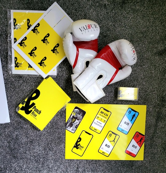
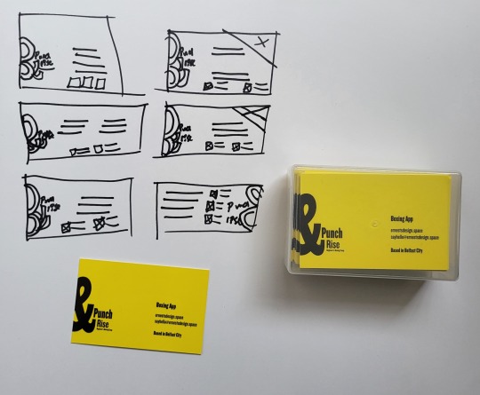
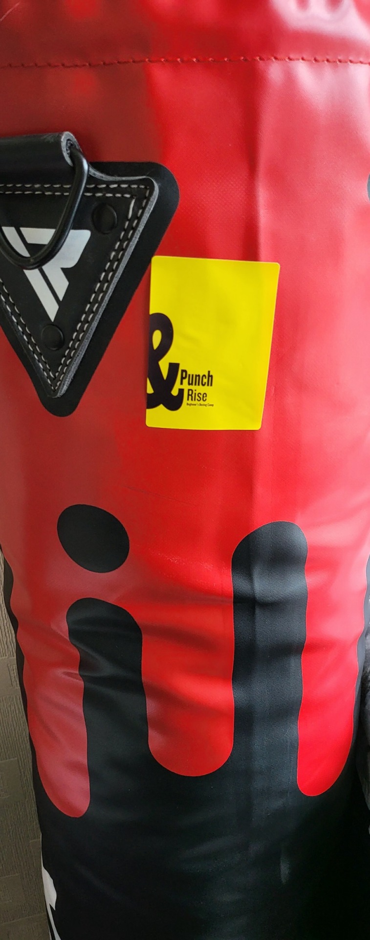
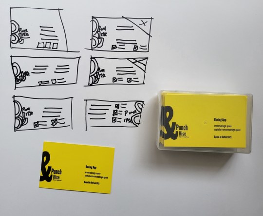
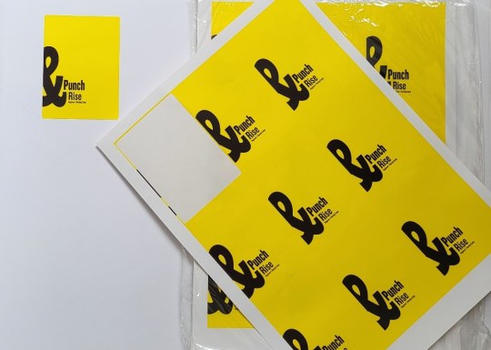
Brand Merchandise Design
The design of printed material had to be a statement of the brand. All promotional material features the same content seen through other media and the colours & monogram had to be present in these materials.
0 notes
Text
True Boxing Successor
Vision
This will be the first app with an easy-to-understand interface, different colours & evolved design. The app is meant to be quick, to-the-point and motivational. This is done to create an app for the future of boxing, where participants are encouraged to try something new.
Purpose
There is nothing better than enjoying a hobby. Punch & Rise has the purpose of motivating participants and helping them develop that enjoyment. To do that, the app helps participants gain confidence before entering the gym.
Community
There is nothing more important than spreading the hobby & community involvement is essential to make a sport viral. From posts to sponsors to community events, this aspect of the app is what will set it apart. People making photos of their home workout setup while participating in the app is what will bring people together.
Progression
After the launch, the goal for the app is to make the app more focused, longer & more helpful. This will be done through the inclusion of more exercises, a longer introductory period & more tips to get people familiar.
0 notes
Text
Increasing Awareness
Visiting Boxing Gyms
The gym is where people will first see & hear about the app. This will be done through mentions from the coach & participants, but also through merchandise such as shirts which could be hung on the walls of gyms. By doing this, newcomers are more likely to become aware of this app thus making it more impactful.
The coach will first let newcomers use the onboarding app before they come into the gym for sessions, this will save the coaches time & let them focus on motivated participants who will stay there in the long run.
Merchandise
Obtainable
These would consist of items like shirts, boxing gloves, shorts & water bottles. Essentially, they would be items that can be purchased, won or given. These items are designed to raise knowledge and curiosity regarding Punch & Rise.
Local
These would consist of banners in gyms, gym-owned boxing equipment, local posters and outdoor challenge areas (and equipment) for people to participate with. Some of these items could still be classed as obtainable but are instead created for the community and owned by Punch & rise or participating gyms/events.
0 notes
Text
Funding And Aid
Kickstarter
A Kickstarter would be done before launch. This would help see if people have a positive outlook regarding the app idea & help make critical adjustments from people who will genuinely support the development. Merchandise would be given to people who would fund certain amounts. These would be called starter packs where common boxing equipment (created by Punch & Rise) would be given; gloves, shirts or wraps could be included.
The need for a Kickstarter is immense. It would help build the brand, roll out the app smoothly, sponsor community events & help with getting gyms onboard with the idea.

0 notes
Text
Technologies Used
The main technologies were paper, Affinity Designer, Affinity Publisher & Invision. There were other technologies used too such as PowerPoint, Google Slides, Tumblr (of course), Pinterest & Miro.


0 notes
Text
Target Market
The target audience for the app is people aged 14-26 years old. This target group is young and at a stage where they want to be active to help them feel better about themselves.
They will know about the newest & most popular boxing matches so they will have that motivation to want to start their own boxing journey. They will know about the sport and will be curious about how boxing sessions are conducted. The identified needs are to have an app that will be fun, to the point and simple. The combination of quotes & bright colours has been created to grab their attention.
They will be more excited about trying out new exercise methods that are somewhat different to the typical weight lifting.
0 notes
Text
Why Focus On Boxing?
Boxing has always been a popular sport and it continues to strive amongst the younger population.
There are currently 20,000 active professional fighters. The sport is very popular in terms of viewership. In 2019, the average Fight Night viewers were 1,403,000 per fight.
Fighters can earn loads of money because of its popularity.
There are loads of people watching PPV and they are happy to pay a fee to watch these fights. Floyd Mayweather's net worth is $560 million and during the Mayweather V Pacquiao fight there were 4,600,000 viewers.
There was a poll done in 2021 which asked 2,072 American adults whether they consider themselves a fan of certain sports.
33% of respondents said they would consider themselves a fan of boxing. Out of all participants, 89% of them said they knew who Mike Tyson is.
In comparison, boxing failed to make the top 10 back in 2010. Now it is ahead of MMA, hockey, tennis and golf.
0 notes
Text
People Giving Up Boxing
Many people give up the sport after just a few sessions. Here are a few reasons for this;
Exhaustion
Lack Of Knowledge
Unsuitable Schedule
No Motivation
Anxiety
These are all aspects that need to be addressed for the app to be helpful and more importantly for more people to progress further within the sport instead of giving it up at an early stage.
0 notes
Text
Poster Design
The poster was an important aspect of the brand. It was going to be 170cm in height so it had to be a little different. Simply keeping the monogram would not be enticing enough to bring people to the stall. I decided to keep the monogram but add something to help people walking by understand immediately what the project was all about; boxing.
The addition of the boxers in the top right corner was a very thought-through decision. It was going to be a little different since such images were not done in that style within the app. To keep that consistency, I had to design it following the rules of the brand. The cut-out of the boxers' image is done in the same style as the back buttons to keep that consistency, it was also done in black & white for that same purpose. I feel like it is a little stray from the app appeal but is a very nice touch, done with purpose that still has a place in the appeal of the app.

0 notes
Text
Illustrations
The illustrations that I have chosen are simplistic; they only feature black which is a dominant color within the app. The black & white combination is used on all text, background and even images hence making it a part of the illustrations was a step in the right direction. It feels like a part of the brand and connects well with it due to the simplicity of colours. The aim is to never have more than the black, white and one of the secondary colours visible. An exception had to be made for the challenge mode screens, but it was done for a purpose which was continuity; every exercise has its own colour which couldn't be changed.

0 notes
Text
Logo
After experimenting with new colours, I knew that the logo/monogram also had to be changed for the app. There were quite a few possible ideas, all of which looked very nice. The final decision was to have the Punch & Rise where the "&" was a lot bigger than the rest of the monogram text. The reason this sits very well with the brand is because within the app screens, information such as the timers or repetitions needed all have a much larger font size and weight than the rest of the text.


0 notes
Text
App Flow
This is how the app moves from one screen to another. The app starts with a loading screen which fades into the login page. From there the user can either log in or go into the sign up page. They then land on the home screen (shown on the left). From there, the participant can either go into the scheduled daily workout or go into challenge mode.
Within the challenge mode they can choose which exercise they want to conduct. If punching or skipping is chosen then the participant can choose between rapid speed or technique modes. The exercise then begins. After finishing, the user is led back to the home screen which will show updated statistics including their newly-completed session. Top scores are displayed within the workout screen for motivation.
If the participant goes into the scheduled workout then they will be greeted by a motivational quote and tutorial to explain how exercises are conducted. This is done in almost all scheduled sessions as something new is being added each week to help them move forward.

0 notes
Text
Research Into Other Apps
After researching boxing apps I found some common themes that meant digitally the sport was advancing at a slower pace than it could be…
●Lack of innovative colours and app design which means boxers are only getting barebone features.
●Most apps focusing solely on boxing were not user-friendly & had very little features.
PRECISION STRIKING
●Confusing UI that made it difficult to operate the app.
●External links that users would not be interested in; people usually know about his YouTube before they become aware of the app.
●Only shadow boxing is included within the app; little features.
FIGHTCAMP
●Good user experience app that features statistics and training sessions created for boxing.
●Costs $39 a month and requires specialised equipment for a minimum of $300. Makes it a prestigious & out-of-reach app for newcomers & someone unsure of whether they like the sport.
NIKE TRAINING CLUB
●Has great user interface but no focus on boxing at all.
●Only kickboxing workouts are included.
●Great, full-length sessions that are video-based.
●Only 3 available & nothing to tell you session has been completed.
0 notes