
Let Me Teach You How To Identify AI Art So You Can Stay One Step Ahead Of Them When They Begin Their Inevitable Take Over
Don't wanna be here? Send us removal request.
Statistics
We looked inside some of the posts by identify-ai-art and here's what we found interesting.
Average Info
Notes Per Post
68K
Likes Per Post
38K
Reblog Per Post
30K
Reply Per Post
201
Time Between Posts
2 months
Number of Posts By Type
Note
1
Text
7
Photo
4
Last Seen Tumblr Blogs


Fun Fact
Tumblr has a 66 index score for customer satisfaction in the US.
Note
As someone who has had to dig through AI "cozy home" photos I thoroughly appreciate @thenordroom for posting photos of REAL homes. I haven't checked every single post, but the ones I've looked closely at pass my criteria for REAL, not to mention this blog links sources! And through those sources the articles often have more photos of that house from different angles. If the post itself has 2 photos of the same room from different angles you can be confident that is a REAL home! The AI image generation softwares cannot remember things and thus cannot recreate an entire setting from a different angle, so if you confirm a few details between the images then you've got an authentic.
I have in fact used photos from their blog when showing friends and family an example of real homes photos versus ones that are AI. The level of detail is different, they can look similar at first glance but under scrutiny AI photos fall apart and these stand up!
If this anonymous person would like to bring up specific posts they think are AI or might be unsure, I would be more than happy to help analyze them to determine authenticity. I understand that as the technology progresses it gets harder and harder to identify, but it will not be perfect. There will always be signs, it just takes a little practice to notice them.
Do you post things that you know are AI?
These are all real homes!
45 notes
·
View notes
Text
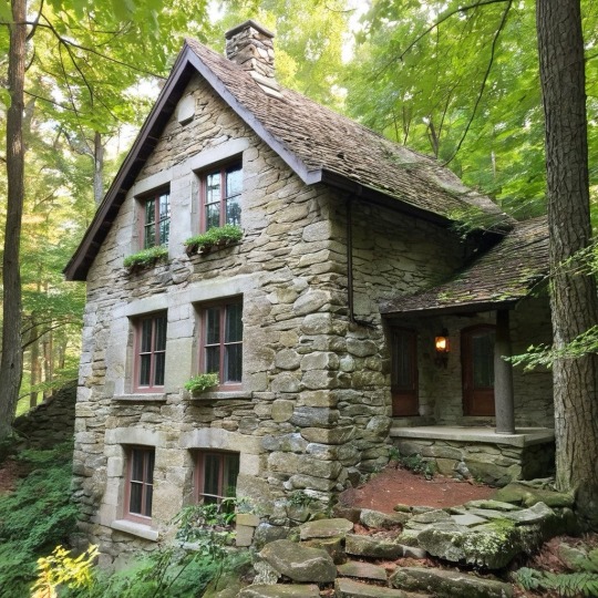
Unfortunately this is AI generated.
I came across this while in the #craftsmanship tag looking for the genuine article, and this ain't it. Let's review everything wrong with this image. Now any of these things on their own does not constitute an AI image, but the fact they all exist within one image makes a very strong argument for AI.
The most obvious error is how do you even get to the front door? The porch is like 3ft off the ground with no stairs.
There's two front doors.
The chimney is centered on the roof, 6 feet from the wall with 6 windows. Even, assuming for a moment, that it's on the third floor and is somehow a stand along fireplace (not attached to a wall) why would they only allow like 4 feet of clearance to two beautiful windows???
If you zoom in the image quality is poor, even on images with low resolution you can generally tell where branches are coming from and which leaves belong roughly to which trees.
Speaking of plants, there's no planters on the windows, there's no reason for them to grow on the sills.
What is that L-shaped metal bit on the wall? A half assed gutter drain? For what gutters?
The pillar holding up the porch eaves is thicker at the base than the top, I'm no housing expert but I think those sorts of things are generally uniform.
Again, no housing expert, but roofs tend not to be overlapping like that, and if they are there's generally some sealant you need where the roof meets the wall of a house because water will collect there or something. Something about this isn't ideal.
This home appears to have almost no ventilation with windows that don't appear to have any means of opening. They must rely on both of those doors and some unseen windows I guess.
I'm not trying to call anyone out, I simply ask that if you KNOW something is AI please tag it accordingly, and if you don't know if something is AI art I hope you've learned something here to help you identify it in the future.
85 notes
·
View notes
Text
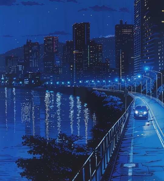
This piece is AI generated. At first I was duped as well thinking it was one of my fav pixel artists that does a lot of large scale amazing nighttime cityscapes in pixels.
It is not.
What directed me to being AI was the following:
1. The lights in the water are reflecting light from buildings that don't exist. Water normally reflects dimmer in general so this is absurd.
2. The road cracks were odd, but the shoulder of the road disappearing before the turn was odd.
3. The car appears to be veering oddly, but not indicative on its own, it should just ring bells that make you look a little harder at everything else.
4. The buildings on the right have lights and shapes that might indicate a balcony but there's nothing specifically discernable.
Most folks making art will make things appear like recognizable things by using simplified shapes even when zooming in. AI makes things look recognizeable by using shapes that are recognizeable by squinting or scrolling quickly.
I only ask that these types of images are tagged appropriately.
2K notes
·
View notes
Text
Hi, I'm here to identify images that are AI generated and may not have been tagged with any AI tags. I think it's important to learn to identify these images when it's not explicitly stated to be AI. As image generating AI continues to develop, without proper regulations AI images can (and will) be used to spread misinformation or propaganda. I mean no offense to those whom I reblog from, this is a friendly and safe learning environment! If I make a mistake please let me know!
This blog attributes all their posts to a source, and the Instagram @benmyhre does include in their posts that their images are all AI art that the are generated with midjourney. I appreciate this Instagram blog for being up front about it, and I don't think it's intentional that this Tumblr blog didn't tag it with #midjourney. But for Tumblr users like me who don't always want to leave the site to investigate the source, I'd like to tag it appropriately and take the time to explain how to identify AI art like this.
The biggest giveaway here is the window panes, the higher up they go the more the AI struggles to maintain perspective and create continuous separation.
I've seen a lot of home design AI images and often they look beautiful and cozy with lush plants everywhere, but often the issue is that those plants rarely have the logical pots or planters visible. On the left beside the sofa there is two plants in visible pots, but the hanging plants below the overhang appear to just grow out of the ceiling. Most people have hanging pots for these types of plants that would be clearly visible.
AI struggles with lighting, especially wall mounted sconces or candelabra fixtures. This image struggles to define two or three point fixtures in the walls and carry through the wrought iron design. There should be an apparent bolt plate fixing it to the brick, but it's just ambiguous enough to let your brain assume there is something there.
Nothing particularly apparent in the sofas or rug, except they appear a bit too polished. The wood flooring does change panel direction which isn't completely unrealistic but a likely sign that something could be amiss since AI doesn't understand continuity it likely made this mistake.
The last thing to note is that the angled wall of the roof appears to be brick. It's very difficult and not recommended to create a flat angled wall with brick as bricks are intended to take loads vertically or in compression and angled walls experience a sheer and bending stress from gravity that would make the bricks unable to support fully the brick above them. It is possible this is just brick wall decor as often applied to many new buildings in the US to maintain a brick aesthetic, but it would be an odd choice to put that on an angled interior wall. Bricks can be made into arches as seen over the window because the force of gravity on the arch actually wedges the bricks tighter together making a more stable design.
I appreciate AI images like this for mood board inspiration, but they don't take into account practical architecture. When looking for house ideas I like to know I'm looking at something that's been done, and sometimes I can't always be vigilant and think critically about everything in life and when my guard is down, images like this can go unnoticed.
It's easy to leave out information and twice the effort to go back and piece it together. I can't tell anyone what to do, but I can encourage everyone to help carry the information across platforms.

Brick Lofts by @benmyhre
Get Inspired, visit www.myhouseidea.com
237 notes
·
View notes
Photo
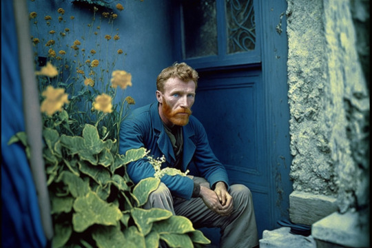
Colorized photo of Vincent van Gogh at his home in Arles in 1869.
36K notes
·
View notes
Photo
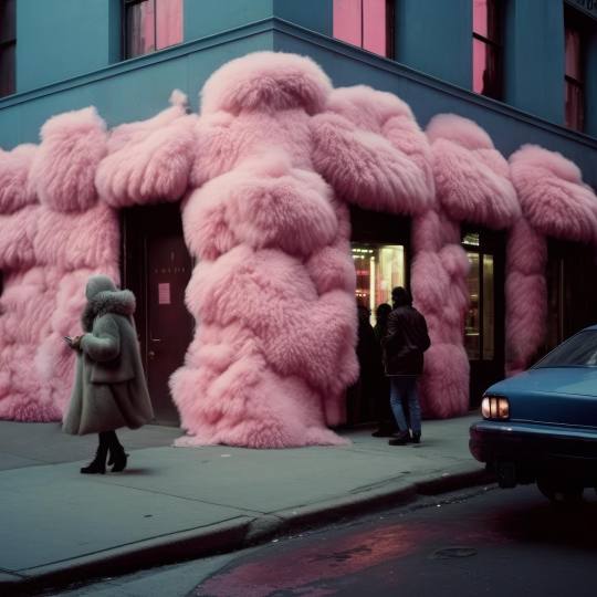
So I have already addressed this person's AI art before on my blog, I will rehash the biggest features here again but I also want to address something else.
I do appreciate that the OP included a link to the original source and credited the creator. Following the link to the Instagram and personal website I can see this creator is actually a very good artist who makes intentional, surreal rendering. A lot of them are animated, have effects or are otherwise very clean. This leads me to believe that the images shared here are part of this person's inspiration posts or a rough draft of their work.
Personally I think AI art can support artists in offering inspiration or a foundation to add their own unique changes to and that appears to be what this person does. I encourage you to take a look through their Instagram and personal website because I found a lot of their piece to be fun and distinct. They clean up the AI work and add more distinct people as far as I can tell.
Now I will say these AI pieces are quite good at the sidewalk and roads. With the exception of understanding how road markings work and intentional curb designs for driveways or crosswalks on corners.
The first image has:
1. Inconsistent window design that you could expect for a building.
2. The car is pretty good but the details are indistinct and it's unclear which direction the car is facing. Presumably away from the viewer due to the sloping of the glass. Though the lights make that unclear as they appear to be headlights and not red brake lights.
3. The people are done ambiguously or blurry which can be a design choice but the lady on the left has an odd shoe on her back foot which causes suspicion.
The second image
1. The road markings are indistinct and not even in the way that some are faded and aged.
2. The building in the back has a lot of strange shapes on top that appear to try to mock attic and roof windows but the shapes are approximating and not mirrored in the same building as you might expect.
3. The snow is a nice touch but oddly I would expect wet marks of it melting or some indication of ice on the sidewalks or footprints or odd clumping or something indicating why it is piled like that?
The last image
1. If presented separate from the previous ones I might believe it was good surreal art,the buildings and blur are just right enough to obscure any indication of detail in a believably way. The people are blurry and in motion and the lighting is like dusk so it's quite believeable.
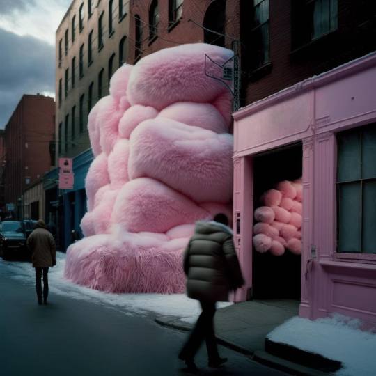
2. The biggest one here is the interior space filled with puff balls. Again ambiguity and viewer interpretation are an AI's best friend. It's unclear if this is an entrance, exit, alcove, alleyway or whatnot. So the lack of intentional purpose to the space as even a cozy bus stop bench makes me think AI.
3. The small detailing on the buildings, the unclear signage and the opaque windows are also just slightly off the longer you study them.

78 notes
·
View notes
Photo
This is not difficult to tell it's AI, possibly one of the older or smaller generations of AI art. I don't really feel like I need to explain why this is AI but I'll do so briefly below. I include this mostly because this showed up in my scrolling and I glanced at it for a moment, thought "aww that's cute art" and scrolled away before coming back to it a few minutes later when my brain wouldn't stop pinging me to go back because something felt off.
The edges and distinctions are very blurry and they blend into each other when you look closer.
The bride's headdress is indistinct from the stained glass when a real artist would put in extra effort to make the subject of their art contrast more from the background.
The biggest indicator when it comes to AI art is that computer algorithms don't understand what should or should not be mirrored. Obviously in architecture, a lot of things are repeating patters viewed from different angles and AI art doesn't quite understand how to do that yet.

a bride and groom standing in front of a stained glass window
25 notes
·
View notes
Text
I believe this to be AI art, and I'll explain why. But first I want to explain that this one has a chance to be some kind of rendering or unique art style but I'll let you decide what you think and explain what makes me thing it's AI.
The first thing is the water. The outline and water level of the edge of the water is somewhat unclear especially as the waters edge gets further away. This is odd to me because the rest of the picture has very sharp defined lines as part of the style with stark blocks of color over the sky.
Additionally the reflection in the water isn't consistent. Renders would reflect things more accurately and most artists use a copy and flip trick for reflections. I have a hard time matching anything in the reflection with anything in the image so I suspect AI. Also the plants/stones in the water are unclear as to what they are supposed to be so that's usually a big hint to AI is when a viewer can't reliably discern what something is intended to be. Ambiguity and viewer interpretation is what AI relies on.
My last point, which isn't as strong as my othet is that the large blocks and shadows feel inconsistent and upon closer inspection don't really feel like they are as sharp as they appear. The edges blur and whether a certain piece is behind or in front of one another. AI also does not understand distance and perspective very well so when things are layered it has a difficult time imitating continuity.

1 note
·
View note
Text
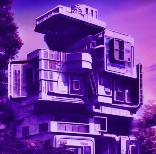
This AI generated art.
Most of the time I scroll by these types because they are generally uneventful in my mind, my subconscious just checks it off as "art" and "building" and "purple vibes". It feels a lot like those blocky monochrome art styles I see around but it isn't.
You can tell if you look long enough that it's AI art and the edges don't make sense. When real artists draw this kind of thing they at least make the edges distinct and make some kind of sense. This doesn't have that logic, the lines collapse as they continue and the shadows and trees and skyline blur too much.
AI art is getting better and this is still a bit old. So far one of the most reliable indications (though it's not proof on its own) is when the image is pretty low resolution. Most artists do work at higher res and clearer detail so until the AI generators can generate bigger pieces this has been a good indicator to help me separate real art from AI.
13 notes
·
View notes
Text
a lot of people still have trouble spotting AI art and i just want to give some quick tips on how i usually quickly recognize it
often it’s the smoothness of the image that sets off my initial alarms, a distinct lack of minor textures you’d expect from real things.
sometimes the texture doesn’t match what it was supposed to represent, and often things look oddly soft and rubbery. the light doesn’t bounce off it quite right and it feels over-rendered.
i’ve seen weird random blurring on many AI works as well
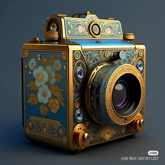
The longer you look, the more you realize that it’s lopsided in several places, positions and distances of objects make no sense.
A closer inspection usually makes you notice the smudged details, which i think is what truly gives it away - AI mimics real patterns, but doesn’t always nail them.
More complex small objects get smudged and blended together, and complex patterns look more like an oil spill rather than anything designed with clear vision and intent.
If there are any letters, they never look real or readable
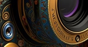
I’ve seen people AI generate “"historical”“ objects and paintings and post them with a fake caption, claiming that they are real
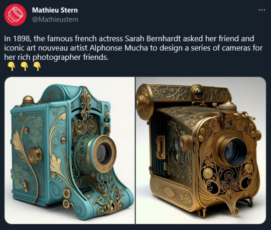
Be wary, because we live in a very uncertain age when it comes to information. Learn to spot AI-generated images, reverse image search and fact-check when something seems off.
In this case it’s just a fake camera, but this technology can, will, and already is used in much more malicious ways.
19K notes
·
View notes
Photo
These surreal images are made via AI imaging engines. It is unclear which engines but let's take a look.
In the first image:
1. The pink car on the right has indiscernable side mirrors and edges that don't well define the door from the hood from the headlights.
2. Perhaps most obviously, the room in which the people are congregating is unclear in purpose and even unclear in where the walls start and end. The AI cannot understand continuity so it struggles to draw straight lines through objects to CO tinue them on the other side.
3. The unclear sign(?) on the pink wall that doesn't know what jt wants to be.
4. I will note in this that the AI did a good job of approximating the sidewalk with sections and damage and decay.
The second image:
1. Unclear street markings. The crosswalk is not marked properly. There are attempts to add the dotted lines or lettering (presumably STOP).
2. The top edges of the buildings are unclear in that they look too uniform. Not to mention what may be an attempt at a streetlight protruding on the left.
3. Signage is unclear and muddled because AI cannot yet intentionally add language into scenery and settings.
Third image:
1. As mentioned in previous images the car is a good approximation but the lack of doors or possibly lack of wheels shows proof of AI.
2. Again the street markings are unclear and not uniform and the feign lampposts protruding from the top edge of the building.
3. The pillars at first glance seem passable but once you look closer ypu will notice the spacing is not uniform and there's probably too many.
4. Again unclear lettering on the license plate and signs.
The last image:
1. This one is probably the most passable lacking evidence of language or road markings completely and the buildings in the distance appear adequate height for odd power lines to stretch a cross.
2. The windows are inconsistent is the biggest giveaway on this one. Inconsistent spacing and divisions. The interior back light could be evidence because there's no clear shapes, but also the windows could be yellow glazed and intended to scatter light like that.


10K notes
·
View notes
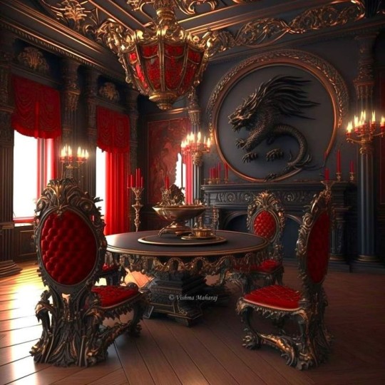
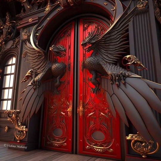
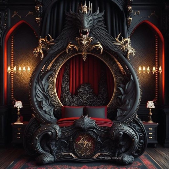
Text
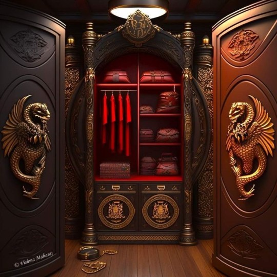
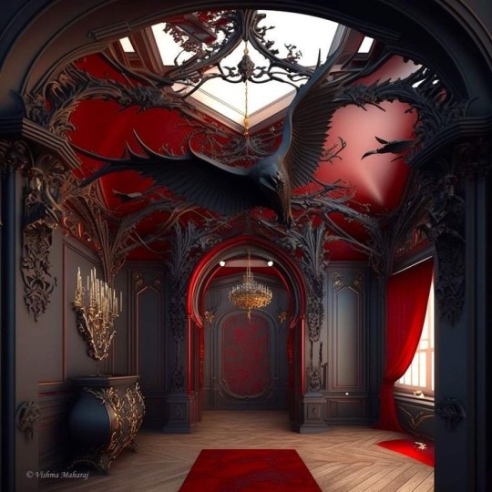
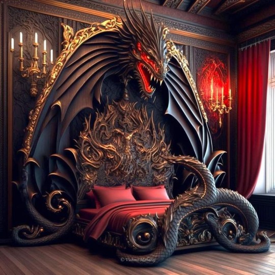
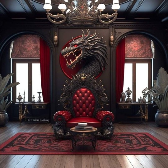
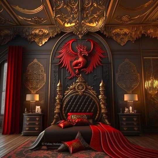
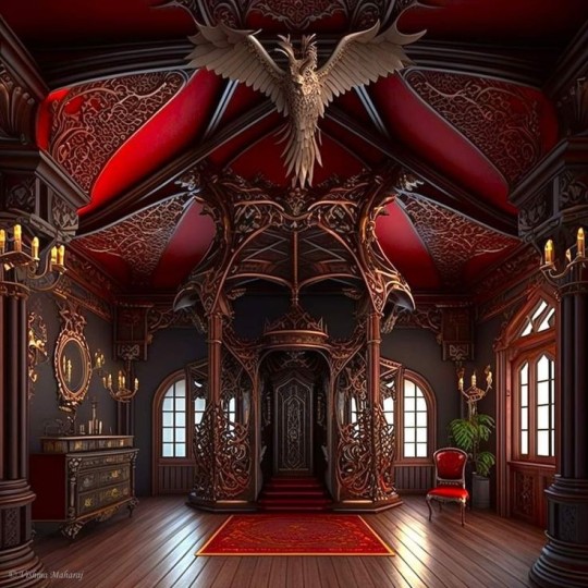
This selection, while hauntingly gorgeous, is indeed AI generated.
Lets talk about how to spot AI generated images.
1. Look for mirrored symmetry in complicated designs. Many of the dragons and intricate furniture patterns are not symmetrical. The dragon wings and feathers are almost but not quite right.
2. Windows. AI generators do not yet understand depth and distance very well and cannot generate consistent scenery. There is lighting but no environment.
3. Light fixtures. Often AI generators can duplicate the light source and general lighting effect but they have yet to nail down how light fixtures connect. Looking for cords or distinct wall fixtures is a good way to identify AI generated images from a rendered image or photograph.
4. Tile and wood patterns. While simple wooden patterns are easy for AI to duplicate, the fishbone or chevron pattern is much harder for AI to duplicate consistently. As well as tile sizes.
There are more signs and symptoms but those are the major ones for this particular set.

652 notes
·
View notes