
Don't wanna be here? Send us removal request.
Statistics
We looked inside some of the posts by indig3aux01 and here's what we found interesting.
Average Info
Notes Per Post
0
Likes Per Post
0
Reblog Per Post
0
Reply Per Post
0
Time Between Posts
25 days
Number of Posts By Type
Text
17
Last Seen Tumblr Blogs


Fun Fact
Tumblr has 411 employees.
Text
WK12 - Compulsory Q2
As I revisited my artistic vision statement, I still strongly resonated with it. I only made a few changes (highlighted in red) afterwards considering my self-reflections and classmates’ comments.


I added composition in my strengths because it was another factor I believe to contribute in making my works memorable. For the question, “what do i want to do between now and then?”, I responded with being experimental. It was a good starting point but I realized that it was not enough for me to achieve my goal of becoming a designer with a memorable style. To support it, I added another plan of action, which was to discipline myself into developing and maintaining a style. It is indeed good to explore and experiment, but I needed to be proactive and critical in knowing which ones of my explorations are to be integrated and developed into my “uniquely memorable style”. Afterwards, I needed the discipline to remain true to this particular style.
The last part I believe was the most crucial, as it was how I believe my works could be “memorable” to people—by ensuring that I personally have an emotional connection with my own work, so that it fosters an emotional connection with the people viewing my work as well.
One work of design that really resonated with me was Maragsâ, a modern serif inspired by the pakupyâ accent mark used in Filipino languages. It was an iconic typeface for the Filipino community. I could vividly recall almost everyone from my generation using it, from student organization publication materials to slide decks for class. It was memorable because it was the first time we felt represented in the world of type design—the first time we had a modern typeface tailored to our culture’s aesthetic.


Maragsâ was from Jad Maza, a Filipino type designer whose practice focuses on developing Latin and Baybayin (ancient Philippine script used prior Spanish colonization) fonts and explores what more type design can look like in the Philippine context. Ever since discovering Maragsâ, I’ve been admiring his body of work. He was dedicated to creating typefaces inspired from different aspects of Filipino culture. I could tell he was driven by genuine hopes of properly representing our culture, especially with the way he conceptualizes each typeface. He had an emotional connection to his works and as a result, the people who felt represented also had an emotional connection to his works.

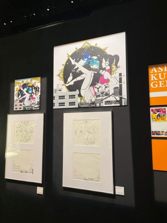
He chose a particular design practice, type design, and a niche to which his works could be memorable. I chose to feature his work because I hope to do the same, choose a design practice, probably publication design, and a niche and style to which my works could be memorable. I believe this could be in my way of storytelling. In terms of tradition and artistic lineages, I also hope to continue incorporating my identity as a Filipino in my works. One way I practiced both was through my Materiality Zine project (See Figure 4).

(484 words)
Maza, Jad. "Exploring type design in the PH latin + baybayin fonts". Jad Maza - Type Design, https://jadmaza.com/. Accessed 13 November 2024.
0 notes
Text
WK11 - Compulsory Q1
Our group’s manifesto is a compilation of one pledge from each member and I believe it was an accurate representation of our design priorities at the moment. Before creating it, we realized we had drastically different personalities and identities as designers. Hence, we decided to create a collage to capitalize on these differences, especially as we could not collectively agree on one cohesive style.
It was genuinely interesting to create a manifesto with other people, especially people whose design processes and growth I have been personally observing. While I understand and agree with our pledges, I knew I could create a manifesto that could be better tailored to my own creative process. This semester has been an eye-opener for me and it allowed me to see the shortcomings in my own creative process.


I believe that this aspect of CTS B, creating a manifesto, was particularly significant to me. In the conceptualization stages for Studio, Materiality, and Illustration class, I found myself tumbling down the rabbit hole. I create complex mind maps and wander too much in my research and exploration stage (See Figures 3 and 4). It was a good practice to achieve breadth and depth. I always recognized conceptualization as my strength but too much of it led me unable to establish a creative direction, which had repercussions in my execution, time management, and presentation. Eventually, when my lecturers from these modules pointed this out, it brought forth realizations and I was eventually able to regain my footing. The fact that it occurred across different modules meant that it was not an isolated problem, it was a pattern that I kept falling into.


Across three semesters, this was not the only pitfall in my design process and I've been gradually learning more and more about them. I kept mentally reminding myself to not repeat the same mistakes whenever starting a new project and even tried putting them as reminders in my design journal. Still, they were all over the place and there is only so much I could tell myself before designing.
However, when we were introduced to the idea of creating a design manifesto, I immediately knew that this was the solution to compile all my reminders to myself as a budding designer. I am genuinely dedicated to keep on improving myself as a creative. One way I could definitely prove this dedication is to recognize my shortcomings in designing and to actively address them. A design manifesto, I believe, is a tangible way of doing this. One good reference I found was from Andrea Cincotta (See Figure 5), which I found inspiring.

My pledge, “Down the rabbit hole”, drew inspiration from one of my favorite classics, Alice in Wonderland and I have decided to create a manifesto themed around the same work of fiction. As I hoped to make it more tangible as a daily reminder, I am planning to create an A3 poster-zine version of it (See Figure 6).


(495 words)
Cincotta, Andrea. "Ethics over Aesthetics: A Personal Design Manifesto". Andrea Cincotta Design, https://andreacincotta.com/design-ethics. Accessed 13 November 2024.
Carroll, Lewis. Alice's Adventures in Wonderland. Chicago, IL, VolumeOne Publishing, 1998.
0 notes
Text
WK06 - Critical Self-Reflectivity
The whole is greater than the sum of its parts. This was how I could best sum up how I felt about group works. This was most especially the case in the last few sessions. I am honestly self-aware that I prefer working alone. However, I do know my strengths and weaknesses, which was why I am also capable of being a team player.
I know when I need someone else’s skill set because it was something that I lacked, or when I need to step up in doing something because it was a strength that I knew I could perform well. An example would be how others are good at taking candid photos of strangers for our documentary and another is how I am able to create a script for our documentary because copywriting has always been a strong suit of mine.

This is also why I also have good self-regulation, as I know when to say no to things that I know are beyond my own skill set or comfort zone. As a team player, I also have no issues in terms of motivation, as I would always love a good challenge and would actually be more motivated if I knew that my team felt the same way. But in times when I knew that I wasn’t on the same wavelength or level of agreeability with my team, I show that I understand them and don’t push them into doing something they aren’t comfortable with. Which is why in terms of empathy and social skills, I believe I also I have it managed.
(265 words)
Ratan, Zubair Ahmed et al. “Smartphone Addiction and Associated Health Outcomes in Adult Populations: A Systematic Review.” International journal of environmental research and public health vol. 18,22 12257. 22 Nov. 2021, doi:10.3390/ijerph182212257
0 notes
Text
WK03 - Connecting Practice with Society
Designers have the power to shape the world we live in. From today’s session we were introduced to how we could properly wield that power as social agents.
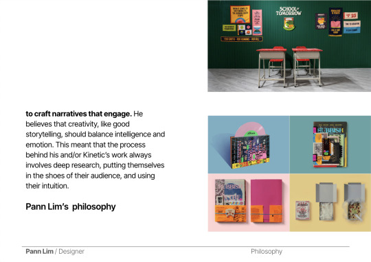
Most of the examples shown advocated for sustainability, one of which was The Waste Refinery from Kinetic Singapore. I was not able to witness that exhibit but I was able to go to the School of Tomorrow by Kinetic. From that experience, I can attest to the power that designers hold in evoking empathy and driving action.

This session made me reflect on what I was personally inclined to socially advocate for. I did not have to dig deep as I have always known it to be women empowerment.
One recent experience that strengthened this conclusion was through my visit to a museum exhibit. It was an exhibit that aims to reframe how women in ancient myth are depicted. It recognizes that their stories have always been handed down by authors from the male-dominated society of antiquity, and that they have always been beyond their stereotypes.
I truly admired the way the exhibit was conceptualized and the way they branded it. It was memorable both in form and content. Upon leaving that exhibit, I recall telling myself that one thing I would like to try in the future is to work at a museum, maybe for an internship, and conceptualize and execute an exhibit that is geared towards empowering women. I want to be able to wield the power of design in fostering empathy towards my cause. If done properly, design has the ability to spark an emotional connection between the people and social causes, and ultimately, to influence behavior and drive action from them as well.


(285 words)
"The Waste Refinery That Turns Waste Into Resource", https://kinetic.com.sg/singapore-design-week-2022-a-celebration-of-everything-by-design/. Accessed 23 September 2024.
"Preparing For Humanity’s Greatest Test At The School Of Tomorrow", https://kinetic.com.sg/school-of-tomorrow/. Accessed 23 September 2024.
Altes Museum, "Goddesses and Consorts Women in Ancient Myth", https://www.smb.museum/en/exhibitions/detail/goddesses-and-consorts/. Accessed 23 September 2024.
0 notes
Text
WK02 - Connecting Theory and Practice
“Every human being is a brand”. This phrase resonated with me the most from the session. A strong brand leaves a lasting impression, not only through its visual appeal but also through a meaningful message. From the past year, I came to the conclusion that my design philosophy is to create memorable designs. Through this session, I realized how developing my self-identity, as well as being influenced by it simultaneously, was a key factor in pursuing my philosophy.
From the activity, I identified my identity as stated in the slide (Figure 1). Upon retrospect, I could have narrowed it down simply this way: my personal identity to be creative, introspective, and idealistic, while my social identity to be female, Filipino, and a designer.

In my self-portrait, I drew a panel of starry eyes (Figure 2). This was an attempt to highlight my “idealistic” trait, as homage to the expression of being “starry-eyed” (Figure 3).


As mentioned, I had a realization on the importance of developing and being influenced by my identity. I looked back to my creative works and found a pattern. I had an inclination to feature my culture (Figures 4, 5, and 6) or to empower my gender (Figures 6 and 7). This was a manifestation of how my identity guided me in knowing “what” to create, in terms of meaning and content.


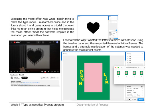
In terms of “how” to create, my identity has guided me by encouraging me to be idealistic, to push through no matter how hard the execution. One example would be how I attempted the moire effect on my trading card (Figures 8 and 9). While another way my identity has guided me was how being introspective has allowed me to incorporate my musings and writings into my works (Figures 10 and 11) .


(274 words)
0 notes
Text
WOII — Final Reflection
The list of topics for WOII gave the impression that there was a whole new layer to the way we would view, and eventually create, designs. While they seemed intimidating at first, I realized how understandable they were—if you see them for how they apply to your past experiences, immediate surroundings, and possible inclinations. If it weren’t for the reflections, I would have glossed over these topics, dismissing the thought of them being relevant to my design training.
This module has instilled a habit for me to be active in understanding a work of design— to not only see but observe, and to not only touch on it at a surface level but dissect it for its broader complexities and in-depth intricacies. Knowing that works are crafted with such intention urges me to become more intentional with my own works.
Lastly, with the way that WOII has opened up this whole new layer to our design training, it has driven me to maximize the exploration phase of my design process. I believe that introducing these concepts was a way for us to not only explore the works of those who came before us, but for us to have philosophies we could deeply derive from, so we may be able to explore and soar more in our own unique way.
(220 words)
0 notes
Text
WOII — Week 11 - Postmodernism
I imagine there to be endless possibilities to pursue for each design prompt. This was why I’ve always felt inclined to be a maximalist. I believe more in the amalgamation of these possibilities—of ideas and elements, as well as the exploration of various mediums and techniques. Robert Venturi, a postmodern architect, conveyed it best with the phrase “Less is a bore”.
We were introduced to postmodernism and etched into my mind that day were the keywords, ‘reinvent’ and ‘extraordinary’. I found it to be interesting that postmodernism was about breaking conventions and turning the ordinary into the extraordinary. Ultimately, I understood it as a movement that sought to leave a lasting impact. It reminded me of the works of GIGIL, a Manila-based creative ad agency known for their outlandish ads that always turned out to be viral hits. Their most known commercial featured a boy with drinking glasses growing from his back and his mother having a carbonated drink for a head. It was the most bizarre way to promote a carbonated drink yet it created a lasting impression.
youtube
For the activity, we made a poster about a black bean milk drink. We were given very limited time yet I believe we were heading for the right direction in making it as unconventional as possible for a milk ad. This short activity also steered me towards the realization that I did have the affinity for designs that seem to “surprise” its viewer. I enjoy seeing them and making them as well to the best of my ability.

(258 words)
Diaz, Ann-Christine. "THIS IS THE WEIRDEST AD WE'VE SEEN ALL YEAR", https://adage.com/creativity/work/rc-cola-basta-rc-cola/2300386. Accessed 11 April 2024.
0 notes
Text
WOII — Week 9 - Cultural Materialism
Living in between two countries, I often found myself comparing fragments of my daily life here and there. It was interesting how this session allowed me to recognize these differences as manifestations of cultural materialism. I see it in varying aspects such as in the transportation system to localized advertisements from big brands. Cultures, do indeed interact and change. As a designer in training, I realized that this was a crucial consideration in one’s design process—to deeply understand the cultural context for which you are designing a project.
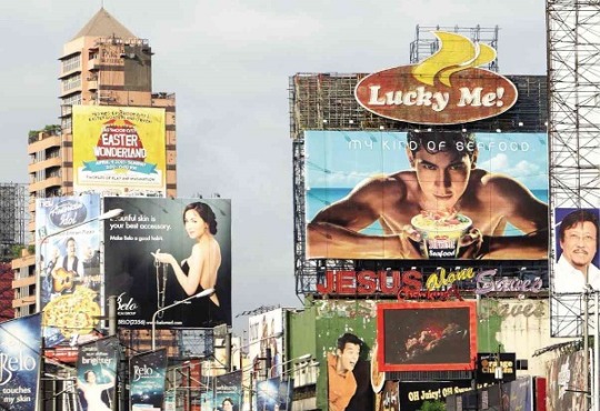
Seeing the question, ‘How do you experience design in-person vs digitally?’ struck me the most. In the Philippines, billboards were everywhere. It was the best advertising method because people spent a large amount of time in traffic. There was one that made the billboard seemingly vandalized, a marketing ploy for Netflix’s Trese by GIGIL agency. I believe it was an effective and creative concept that maximized the use of physical billboards along with the internet. It also tapped into the Filipinos’ deep cultural belief for folklore.

youtube
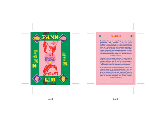
As a designer, I want to do the same, to maximize the way in which my designs could be experienced and the way my concepts can be executed. I attempted this in my trading card design. I really wanted to make the type move in a physical card to show my “kinetic” concept. This project made me realize how I have a strong inclination for designs that maximize interactivity and tactility.


(257 words)
"Philippines: This business is thriving in Manila's heavy traffic", https://www.worldooh.org/news/philippines-this-business-is-thriving-in-manilas-heavy-traffic. Accessed 11 April 2024.
"What’s the issue behind the Netflix Trese billboards? GIGIL agency reveals the campaign", https://gigil.com.ph/our-articles/whats-the-issue-behind-the-netflix-trese-billboards-gigil-agency-reveals-the-campaign/. Accessed 11 April 2024.
0 notes
Text
WOII — Week 4&5 - How to Analyze a Work of Design
Whenever tasked with analyzing a work, I take a long time in formulating an opinion. I observe things as a whole and could not deconstruct them immediately. This was why I found the ‘How-Design-Means’ framework to be a valuable tool I could use, because it allows me to systematically analyze things through different aspects.
For our object sharing, the aspects that stood out were materiality and purpose. At first, I was so fixated on the visual aspects, but when someone pointed out their functionality, I began to see more connections.

I believe this was helpful for my studio work where I had to analyze an illustrators' body of work comprehensively.

The same goes for my Craft Visual Narratives project, where I tried to deconstruct the works and process of artists who embroider on old photographs.


The museum trip made me realize what type of works I was more compelled to observe. While the history gallery presented objects with interesting materiality and craftsmanship, I was more drawn to works from the late modern period, such as travel ephemera.

The points of interest I chose were from the Now Boarding exhibit, particularly transit link cards, vintage postcards, tigerbalm packaging, and kopitiam tableware. Visually, they were similar because of the temporal limitations in which they were produced, especially in terms of color, typography, and printing. Functionally, they represented different aspects of Singapore as a travel destination, namely, transportation, accommodation, shopping, and cuisine.
Altogether, I found it interesting how reflective they are of the times they were created in, and how seeing them today evokes nostalgia and comfort. It was compelling for how a simple collection of designed objects from that period’s mundane life created a holistic experience of traveling through Singapore back in the days. It made me realize that the designs we put out into the world could never be separated from its spatial-temporal context, and how someday, they might be relevant in exhibits like these, which aim to give a glimpse of the past through design.


(294 words)
Michael, Megan. "New travel-themed exhibition lets visitors experience S’pore as a tourist destination over the years" The Straits Times, https://straitstimes.com/singapore/new-travel-themed-exhibition-lets-visitors-experience-s-pore-as-a-tourist-destination-over-the-years. Accessed 11 April 2025.
0 notes
Text
WOII — Week 3 - Semiotics
There are a lot of factors in play when decoding a design, which is why making sure to properly deliver one’s intended meaning is highly crucial. Otherwise, it can be understood wrongly and lead to harmful consequences, such as in the Pepsi ad. This was something I wanted to keep in mind in my long journey ahead in the field of design communication.
For the activity, we decoded the “Circle of Life” campaign of Gentle Monster. I found it interesting how we immediately agreed on it being an allusion to surrealism because of the presence of certain elements.

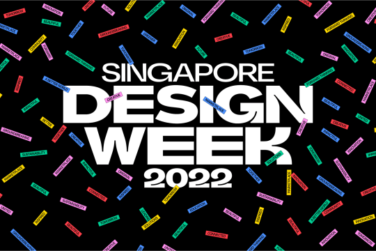
For this reflection, I wanted to decode the visual identity for Singapore Design Week 2022 by Kinetic Singapore. In terms of formal analysis, it was as simple as it could be, using colorful labels that were composed to look like confetti. In terms of contextual analysis, it signifies the overarching concept for the event, as a celebration of everything by design. I believe it was a strategic way of using semiotics, to play on the idea of visually translating an intangible idea such as “celebration” using confetti into campaign deliverables.

youtube
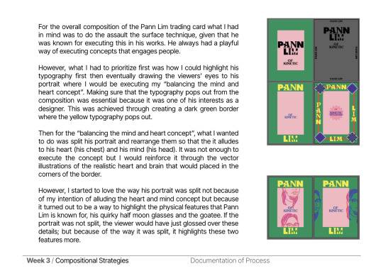
For my studio work, which was designing a trading card, I attempted to wield the power of semiotics by visually translating my chosen icon’s design philosophy about balancing intelligence and emotion.
This was through incorporating illustrations of a realistic brain and heart in the trading card design. Again, it was an attempt to visually translate the intangible ideas of intelligence and emotion into something recognizable for people viewing my card.


(248 words)
Showstudio, https://www.showstudio.com/news/aesf-create-circle-of-life-campaign-for-gentle-monsters-nano-collection. Accessed 11 April 2025.
"Singapore Design Week 2022: A Celebration Of Everything By Design", https://kinetic.com.sg/singapore-design-week-2022-a-celebration-of-everything-by-design/. Accessed 11 April 2025.
0 notes
Text
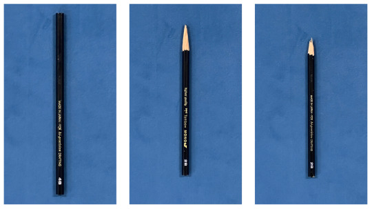
WOII — Week 1 - Phenomenology
White light, when filtered through a prism is separated into a spectrum of colors. The session evoked the image of a prism for me. I imagine reality as white light, our lived experiences as a prism filtering our perception, and the colors as our resulting perception.

The activity reinforced this imagery in my head because my class had varying interpretations of shadows and time. I chose to interpret time through images capturing the life span of a pencil. Seeing others’ interpretations, I noticed how they captured their images in areas they frequent, like the lounge or smoking area. While those with a fine arts background, chose to sketch. These tell a lot about their lived experiences.
Ultimately, I believe that phenomenology is something I should consider in the things I create. The way I see things is uniquely mine and I believe that art and design can be the medium through which I could better share this with others.
In my Craft experimental type, we were tasked to think of a memory, associate an emotion to it, and create a typeface expressing that emotion. I chose the memory of leaving my home country. Most people expressed that such memory made them anxious, but it only thrilled me. I had a different take on that memory but it was an experience uniquely mine. I knew I wanted to execute the design in the best way I could so even if others may not feel the same way, I could at least make them understand why I felt that way.


(255 words)
“Dispersion of Light by Prisms”, https://www.physicsclassroom.com/class/refrn/Lesson-4/Dispersion-of-Light-by-Prisms. Accessed 11 April 2025.
0 notes
Text
CTS A — Week 12 - Compulsory question 3

A collaborative project I am highly interested in doing is a social media campaign together with the Diploma in Creative Direction for Fashion. It would be about advocating for proper pockets in women’s clothing. In our collaborative campaign, they would spearhead the creative direction for a photoshoot exploring women’s pockets, highlighting the way it is right now versus the way it should and could be. My role would be to produce the deliverables that could visually communicate the campaign’s message, such as posters, publications, and videos. It would hopefully be an eye-opener to the public and inspire concrete change in the fashion industry.

For my final project, I want to explore the misrepresentation of women in pop culture. Various stereotypical portrayals of women still persist today wherein they exist to be damsels-in-distress, domesticized, objectified, or used to advance a man’s self-development (Walters et al.). I want to foster change in this matter by designing a website similar to the Bechdel test website but encompassing forms of media beyond movies—such as books, comics, video games, etc. This would be accompanied by a publication and a video that would provide a rationale for this advocacy and why there is a need for such a website.

An organization I would like to collaborate with is UNESCO, particularly in the aspect of their Intangible Cultural Heritage (ICH) Lists. I want to aid in preserving the intangible cultural heritage of Asian countries through creating a documentary series; as well as creating branding and publication materials for the ICH campaign.

If there was one word to describe how I aspire my designs to be, it would be “memorable”. I aim to be a designer and/or illustrator for book covers, posters, and brand materials but I believe that a better placeholder for all these for now is a graphic designer in general. Through CTS A, I believe that I would be equipped with the skills, work ethic, and mindset to think creatively and critically for every project I am faced with, ensuring that each of them is memorable, as I aspire them to be.
(348 words)
Cornwall, Gail. “Why girls need pockets - The Washington Post.” Washington Post, 15 January 2020, https://www.washingtonpost.com/outlook/2020/01/15/why-girls-need-pockets/. Accessed 15 November 2023.
Diehm, Jan, and Amber Thomas. “Women's Pockets are Inferior.” The Pudding, https://pudding.cool/2018/08/pockets/. Accessed 15 November 2023.
Walters, Aly, et al. “A Look at Women Represented in Media.” Study Breaks, 17 July 2017, https://studybreaks.com/culture/women-representation-media/. Accessed 15 November 2023.
“What is Intangible Cultural Heritage? UNESCO Intangible Cultural Heritage, https://ich.unesco.org/en/what-is-intangible-heritage-00003. Accessed 15 November 2023.
0 notes
Text
CTS A — Week 11 - Compulsory Question 2

Almost all CTS A topics are applicable to Studio. The in-class activities have always involved collaborative skills and emotional intelligence. I believe that it was a good approach for us to explore certain lessons as a group so we may learn from each other first before proceeding to do our individual assessments. Facts, reliable sources, and filing them, as well as documentation for art practice, were also helpful for the creative process behind our studio work. Lastly, having a growth mindset proved to be the most crucial one for our final outcomes because it was the driving force that allowed me to break through my technical barriers so I could achieve my vision for each assessment.

I used to go ahead with the first idea that pops into my head for craft work and sometimes ended up disappointed. Through critical thinking, finding reliable references, and incorporating a growth mindset, I became more intentional with the work I do for craft.


In the beginning, my best shots for photography relied on happy accidents. However, as the semester progressed I realized that I had to become more proactive in honing my photography skills—such as by critically thinking about my subject and the way I frame the composition, collaborating with others to model for me, and documenting reference photographers that I would want to emulate for my shots.


For Digital Skills, there’s only so much we can do by memorizing the program shortcuts and following our instructor step by step because what matters in using softwares is understanding how and why things work. To do that, critical thinking is essential. There can be many ways to achieve a certain design outcome—ways we could only come up with if we explored around and understood things for ourselves. In this regard, having a growth mindset also turned out to be crucial because it takes a great deal of initiative to continue exploring something as technical as the programs we use.
(327 words)
0 notes
Text
CTS A — Week 10 - Compulsory Question 1
The word “navigate” comes to mind at the thought of critical thinking skills. CTS helps me navigate my way through daily life so that it may always be filled with intention and deliberate decisions. The same goes for the module, only that it is geared towards my creative practice. This was why I felt like our metaphor should convey navigation. I suggested a compass and we were leaning towards it until the lighthouse idea sprung up. It seemed like a vague idea but the experience of working on it together reminded me of how crucial it is to listen to each other’s ideas so we could develop them collaboratively.

A lighthouse was our starting point. From there all the other elements branched out. It is a metaphor alluding to a “guiding light” that leads someone to the right direction (Invernizzi). It guides sailors safely to shore across turbulent waters, the same way CTS guides us in our creative practice. Each element appropriately corresponded to the topics, especially because each of us thought hard to connect them (See figure 1 caption). Thus in terms of content, I was satisfied. I only wished we did better in drawing it, like how the group with the burger did.
Among the topics, my favorite was growth mindset. It was something I strongly aligned with. Our metaphor represented it as the land which the lighthouse was “grounded” upon. I found it suitable because it was what I believe growth was all about—grounding yourself so you can be present and grow in a way that is in alignment with your vision.
Looking back, what I recall the most is the slide with the growth vs fixed mindset. These were phrases I usually ponder on—only that I roam between both columns. This session made it clear to me how I could better practice a growth mindset. It also reminded me of a book quote that inspired me to do something beyond my abilities for studio.


(329 words)
Invernizzi, Anna D. “The lighthouse. For my love of metaphors, I couldn’t… | by Anna D. Invernizzi.” Medium, 7 August 2018, https://medium.com/@annainvernizzi/the-lighthouse-dd676d3ed2ec. Accessed 16 November 2023.
Akikawa, Tetsuya. Sweet Bean Paste. Simon & Schuster, 2017
0 notes
Text
CTS A — Week 03 - Emotional Intelligence
Through the years, I developed a strong sense of self-awareness. I attribute it to the fact that I routinely reflected on what transpired during the day on the way home. It was a wild guess for me to credit it to this habit but I recently confirmed that reflecting indeed has a direct correlation to self-awareness (Bailey and Rehman 2022). During those moments, I became more aware of my values, aspirations, feelings, and capabilities. It has been helping me in studio work, as I create with the guidance of my own values and aspirations (see figure 1 caption). It has also been helping me in our studio collaborations because when I know my own feelings and capabilities, I know when to step up for a particular task.

As for my weakness, it would be relationship management. I am aware of my emotions and can pick up on others’ emotional cues. Yet I always find it difficult to properly respond to or navigate through other people’s emotions, most especially during conflicts. This was because, in the past, I always asked for help in handling conflicts.
A visit to a recent exhibit, the School of Tomorrow, reminded me of the topic on emotional intelligence. It explored sustainability through subjecting its audience to a school day experience ("School of Tomorrow"). For a topic as serious and complex as environmental concerns, they were able to deeply engage their audience. In my opinion it was a testament to how good design is about storytelling—one that balances intelligence and emotion.


(256 words)
Bailey, James R. Rehman, Scheherazade. “Don’t Underestimate the Power of Self-Reflection”. Harvard Business Review, 4 March 2022, https://hbr.org/2022/03/dont-underestimate-the-power-of-self-reflection. Accessed 16 September 2023
“School of Tomorrow.” Singapore Design Week, https://sdw.designsingapore.org/events/school-of-tomorrow/. Accessed 16 November 2023.
0 notes
Text
CTS A — Week 05 - Growth Mindset
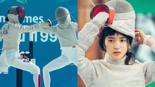
Encountering the phrase “process not product”, was the most eventful moment for me. it was something I always struggled to embrace. I get really fixated on the product itself. To corroborate, I never kept a sketchbook because I hated seeing my rough sketches. I simply ideated on scratch paper that I’d eventually throw away.
This changed when I watched a K-drama featuring a girl born as a fencing genius but lacked self-discipline. The plot develops with her becoming fixated on self-growth. She kept a journal to document all her fencing progress, especially her failures. This happened in the drama and real life where she also studied fencing for her role (Tamondong). In a way, it inspired me to start my personal sketchbook/journal.


The phrase “process not product” also reminded me of my visit to the exhibit of my favorite illustrator last November in Japan. It was an eye-opening experience. Not only did I see the illustrations come to life on display but I also witnessed the rough hand-drawn sketches behind them.


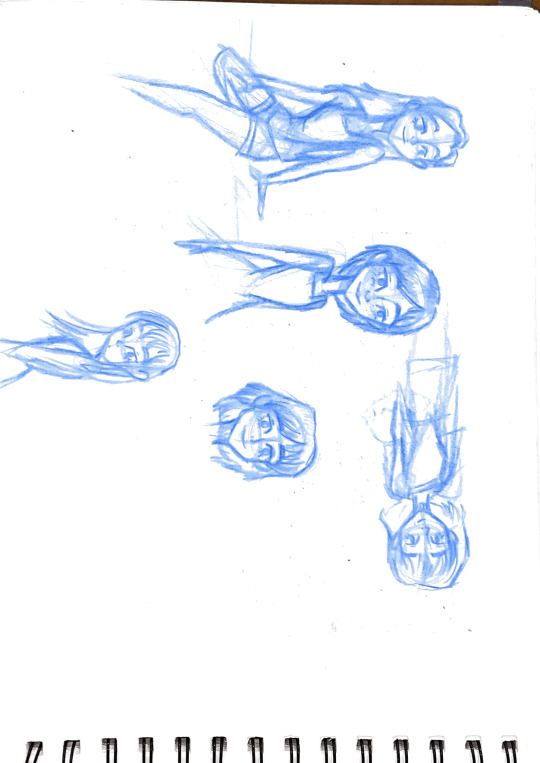
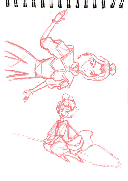
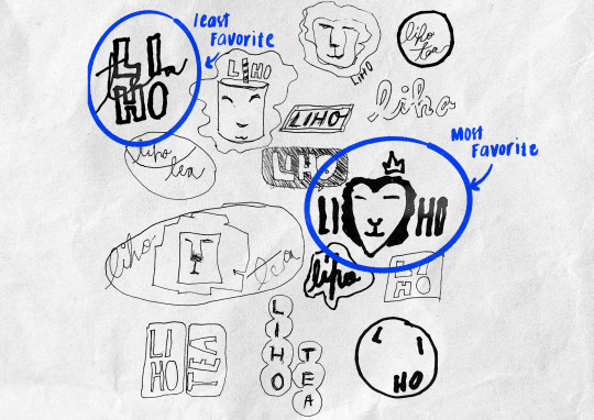
Regarding our sketches, the lion with a heart-shaped face was my most liked one. It was my most unplanned one. I just let my hand play around with the marker. I realized that not having a particular image in mind would not lead to disappointment because there’s no way to fail. The one I hated the most though was the very first one I made. Starting to draw was the hardest step because the moments leading to that made me overthink what it should have looked like.
(258 words)
Tamondong, Hanna. “Omo, Kim Tae Ri's Own Diary Was Actually Used In 'Twenty-Five, Twenty-One'” Cosmopolitan, 21 February 2022, https://www.cosmo.ph/entertainment/kim-tae-ri-diary-twenty-five-twenty-one-a4575-20220221. Accessed 16 September 2023.
Gallery Aamo. 東京ドームシティ, https://www.tokyo-dome.co.jp/aamo/event/yusuke_nakamura20th.html. Accessed 15 November 2023.
0 notes
Text
CTS A — Week 02 - Collaborative Skills
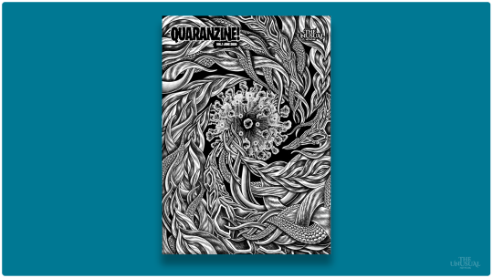
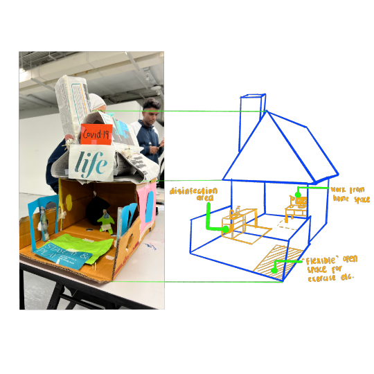
I have always had a preference for working alone. However, in times that I am expected to collaborate, I end up unexpectedly fulfilled with my group’s output. The same goes for today’s activity. We produced a monument that exceeded my own expectations and came up with a theme worth making a monument for, the pandemic. It reminded me of a collaborative zine I was interested in, the Quaranzine, which also aimed to be a time capsule for that period in history (Khalid 2020).
As a collaborator, I believe I did well in always taking the first step to execute our ideas. However, I need to improve on quickly brainstorming for ideas. I tend to perfect them in my head first before suggesting them. At times, I consider this my strength because through this, I bring fresh ideas.


Given the limitations, I was fulfilled with our output. However, If I were to re-design it, I would evidently show the different interior spaces created during the pandemic.
In studio, we did a pair collaboration on a hand-drawn animation. I was not satisfied with my own ideas then but my pair had a great one. My weakness was three-dimensional sketching but she assured me it was her strength. My strength was useful for the next step—rendering and photoshop animation. Eventually, our strengths complemented each other. This experience provided me with the insight on how crucial trust was in collaboration. We could only do so much on our own but if we put our trust in others and their capabilities, they would do the same. Together, we could reach great heights that would not have been possible alone.
(272 Words)
References:
Khalid, Cam. “The best art zines and independent magazines in Singapore”. Time Out, 9 July 2020, https://www.timeout.com/singapore/things-to-do/the-best-art-zines-and-independent-magazines-in-singapore. Accessed 16 September 2023
UP CHE Clothing, Textiles and Interior Design Department. Safe and Healthy Home Interior Spaces. Facebook, 15 April 2020 3:34 p.m., https://www.facebook.com/UPCTID/posts/pfbid02TfJny8gT8FkmYNkMVkzahMtR7457XEzHp5Tem8ibhArXYcdpgVV1XsipnEkPzHGml. Accessed 16 September 2023.
0 notes