
Don't wanna be here? Send us removal request.
Statistics
We looked inside some of the posts by jakewhalendesignsurveyjournal and here's what we found interesting.
Average Info
Notes Per Post
3
Likes Per Post
1
Reblog Per Post
0
Reply Per Post
2
Time Between Posts
6 days
Number of Posts By Type
Text
14
Photo
1
Last Seen Tumblr Blogs


Fun Fact
Users from the US are the majority of Tumblr visitors.
Text
15 Final Thoughts
Where is the future of design headed? I’m not sure but the current climate of post modern nostalgia seems to be spurred by more than just a collective yearning. The internet has finally hit a point of information collection that anyone can with a computer can learn about any time period, sub-genre, or fringe movement. The moment is informed by a general fascination with all the particularities of the past that can now be easily accessed. I feel that future of design will probably be an amalgamation of all the past has to offer including sidelined fringe groups overlooked in their time as well as more traditional elements. Hopefully, This means the future abandons the popular reductionist/minimalist styles that have and continue to pervade the popular spectrum for the last 100 years. Perhaps, a new ornate style that captures personality while not being decadent will blossom. I’d love to see web design that incorporated enigmas and texture in a way that intrigued the viewer rather than cuties games, like Facebook, or soft minimal mazes of menus, like Amazon. I would also love to see industrial design take on a new presence in peoples lives. I think smart watches are a sign people are tired of simple bland devices and are looking for the products they use everyday to develop ornate design and presence in their lives.
0 notes
Text
14 Your Choice
I’m so tired of the lack of the texture and character in logo design. Most websites and companies are adopting that clean smooth Helvetica look that simply feels lazy and uninspired to me. The world is a busy place and communicating some of the fun, openness, and hopefulness of that busy textured natural world seems like a worthwhile way to connect with users. As far as Art VS Design, After this class I feel that Not all Art Is Design but all Design is Art. Design seems handicapped by the need to be utilitarian for whatever its driving, and paying, directive is. Art can be about nothing and everything or unidentifiable things which seems more freeing in my mind.
0 notes
Text
13 New Media
Digital Aesthetic is a design style that arose in the early 1990s just as the internet was setting its roots down in society. The movement was defined by a visuals that were texture-less and unbroken. The science fiction and virtual world inspired smooth images were created with an idea that the internet encapsulated a utopian near future filled with championed personal expression and true democratic values. This idealism informed the smooth reductive look of the style. The style still remained busy in its early days, such as the Wired “Mind Grenades” in a nod to the contemporary Grunge style of the era. Modern examples of this style can still be seen in the smooth minimalist logos for Facebook, Tumblr, and Instagram.
0 notes
Text
12 New media
The fields that have the greatest impact on interactive design are the internet and the devices/technologies that facilitate it. The internet allows interactivity on its largest scale by creating an instant feedback loop between creators/brands and users/customers. This instantaneous interactivity allows companies and creators to cater to specific demographics with customized services. The technology of web design has also evolved to allow these creators/companies to introduce videos, music, games, and virtual experiences that encourage user interaction. Youtube, Spotify, Soundcloud, Facebook, Kindle, and more are just some examples of content hosting websites that encourage user interaction. Pokemon Go is a great example of how the internet facilitates interactive games that also double as virtual experiences. The hunt in your neighborhood for augmented reality Pokemon is interactive within your space, the space of the game, the user feedback on the product and the introduction of newer Pokemon in different locations. These ideas are all powered by software programs that allow users and creators to post, blog, join, talk, and listen in new and exciting ways. Then, of course, The next field that influences interactive design is the actual hardware through which the interaction takes place. Its been evolving from desktop computers to laptops to smart phones to smart watches. Each iteration has opened up new possibilities for interactive experiences to unfold in users lives. The most significant, so far, has been smart phones as they offer the internet on the go meaning apps like Instagram, Ticktock, and more can offer users the ability to drop content, experience it, and improvise it anywhere.
0 notes
Text
11 Graphic Design
The citizen designer is a designer that advocates important social issues with their work. Graphic design is and has always been one of the most prominent loud speakers in human civilization. Today, designers are creating interactive experiences in increasingly populated digital worlds to grab peoples attentions and give them reasons to interact with brands, business, movies, and more. Using those abilities to raise awareness about issues that affect the citizens of Earth is a noble and righteous thing to do. Our book mentions designers that create stylized interactive flowers that raise awareness about climate change and its disastrous effects on communities around the world. The level of engagement these projects generate help make a better world and work as advertising for the graphic designers as well as offering participating companies good PR that also happens to be engaging.
0 notes
Text
10 Graphic Design
I was most interested in how typeface can ignite a set of ideals. Looking into Wolfgang Weingart and Punk Typography I was in love with how anti-Helvetica the movement was. How Helvetica, just an innocent typeface came about as a sociological and political move away from the old serif fonts. then it was co opted by, or perhaps always was apart of, corporate rigid neatness. The ideals of minimalism and rigid rules somehow gave corporate designers the faux-universalism they were after to sell their product. The Punk Typography of the 70s abandoning straight lines of text and standard font for entire words was a beautiful revolution against that over bearing corporate neatness. It is a rebellion against the ideals that a simple minimalist utility is the maxim of universality. Everything not in Helvetica explodes out in Punk typefaces and lets us know in all its garish chaos that communication in print symbols has so much more meaning to be offered in that extra variety. I was also intrigued by the fact that hand-script was based on human movement (like hieroglyphs?). The fact that some typographers looked to the human body as an ideal for the print incarnation of text is a testament to connected our bodies are with the little characters that define our communications. I will never look at the Latin alphabet the same way again.
0 notes
Text
9 Industrial Design
Brooks Stevens said he stayed in Milwaukee because that was where all the work was. Its true. His design legacy is Milwaukee’s and the legacy is one that continues to this day. Milwaukee's most famous export, Miller beer, has a logo designed by Stevens that is still seen by millions of customers to this day. He designed the Oscar Meyer Wiener-Mobile which is still a pop culture Icon to this day. Harley Davidson, Another famous Milwaukee export, still bases the designs of their motorcycles on the ones that Stevens invented for them in the late 1940s. Milwaukee sits in the history of industrial design as a mid-century industrial production capitol. The city once sent out huge amounts of cars, motorcycles, bottled beverages, train cars, and more. It makes sense that this city at that time was the perfect soil for a designer like Brooks Stevens to shine.
0 notes


Text
7 Architecture Uni-Design
Universal Design is an architectural principle that basically calls for design which is equitable and low effort for all users. Those are two of seven principles that define Universal Design but the bedrock is that the design is inclusive to all people.
The first principle and bedrock of universal design is that it is equitable to all users. If you the design regardless of your abilities the experience should be the as much the same as possible. Elevators are the example which comes closest to my mind when thinking of this in and architectural way. The idea is that the device raises of lowers users with minimal effort and maximum speed. With an operator present one must simply enter the elevator in the way that works best for them and communicate their desires to go up or down. Without and operator, they must press a button indicating their desire. These buttons usually light up and offer braille for the visually impaired. No design is perfect, and elevators fail people that suffer motion sickness, but the ideal is their in the design and it strives to be as inclusive as possible.
Low physical effort is another principle that teaches designers to create efficient designs that minimize physical effort and repetitive actions. You can see this principle in action at the fountain facing entrance to Michell Hall on the UWM Campus. It features both a concrete ramp down to the entrance which has a button for mechanical opening and a side stair with only a few steps as well as a door that possess a handle for quick convenient entrance to those that don’t need the mechanical action.
0 notes


Text
5 History of Design


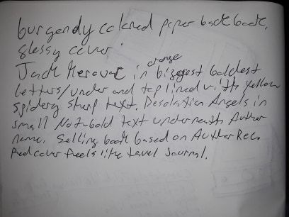
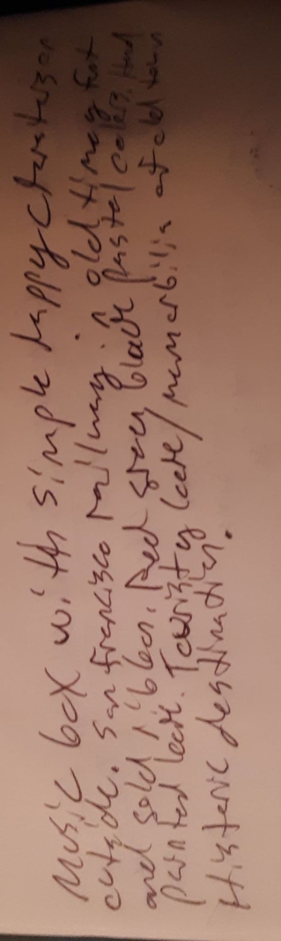
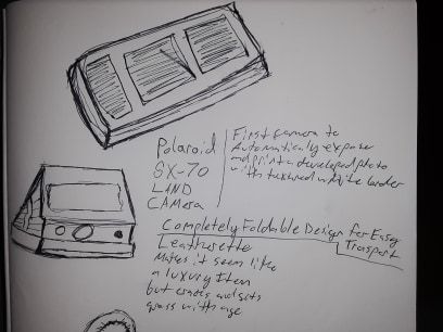
Starting from the bottom and heading up you can see three examples of design in my everyday life. The bottom one is a box of post cards covered with Henri De Toulouse-Lautrec artwork. This is obviously an example of Art Nouveau as Lautrec was a famous artist within the movement. The interesting thing in this box design is how the designer created an asymmetrical collage out of Lautrec’s posters. the inclusion of shadows gives a photographic depth to the posters, as if they are laid on top of each other, that suggests influences of Russian contructivism. The can of vegetable broth in the middle is a great example Russian Constructivism because it combines geometric De Stijl type rectangles and straight lines with photographs. The combination of these styles is thrown off a bit by the ornate plaque-like lines around the bold sharp typeface alerting the consumer to the product type. It’s still a close fit and a tacky but definitely Constructivist inspired design. The top photo is totally De Stijl in design. We have stylized geometric typeface that generally, although not completely, favors squares and straight lines. The color palate is restrained to just red, white, and black. Something that calls back to the De Stijl movements use of only primary colors. The only shapes are squares and rectangles. The design is a really good throwback to De Stijl in my opinion.
0 notes
Text
4 Found Object
The neighborhood roundabout. Its a small replacement for stop signs with a decidedly more natural and artsy flare. They’re all over the neighborhood where I live. Basically, these are just round mounds of concrete in the middle of an intersection that signal to drivers to slow down and carefully pass through. If the driver has to turn the round about adds the step of literally going around the circular mound in order to turn. This differs in design from the traditional four-way stop which employs four octagonal red metal signs mounted on the side of the road each containing sharp font letters spelling STOP in white on their face. These signs also signal to licensed drivers that, other than stopping before continuing, they must concede the right of way to the first comer. These signs are neat from art design level in that they mix geometric shapes with simple graphic lettering to communicate a set of written road rules. The stop and go fluctuation inherent in the stop sign design does create traffic congestion issues (or so I have been told in newspapers praising the European minded design that is a roundabout and justifying the building of them in Green Bay). The roundabout is really a very cool solution to the flaw in the previous design. By stopping the stopping and using a circle to signal to drivers that they must slow down and cautiously approach while also going around instead of just turning the flow of traffic has a steady pace maintained without the start-stop dynamics of the previous design. I’ve never seen urban planning that incorporated such a design into a neighborhood until I moved here. Its fun because the raised circles in the middle of the intersections are usually filled with beautiful flower arrangements and small trees. The utility seems somewhat unpredictable because drivers blast through the roundabouts at full speed halting (and freaking out) the other drivers or pedestrians. Not too infrequently, the flowers get run over by cars looking to just slam straight ahead without a care for the circular sculpture in the middle of the road. Altogether, i think it is a lovely design element in a urban neighborhood even if people don’t respect it.
0 notes
Photo


Some photos, drawings and notes on different design elements I’ve noticed in my everyday environment. They all utilize text, texture, and drawings or photos in a why that grabs attention and sells the onlooker on a certain features of the item as well a style that brings people in.
0 notes
Text
Design Thinking
After reading the Harvard Business Review article on design my understanding of design has definitely evolved. I considered design to be a later re-interpretation and art marketing step in the launch of a product. This article has me redefining design as more of scientific, social, and aesthetic process. Businesses integrating design teams at the earliest stages of product development allow more trails and error detection in the development process as well as sculpting the product to cater to specific, and well researched, markets. It seems that design is a creative process that looks to understand and optimize both the product and the market for that product. Ways I can see this products around me would be Fujifilm X-Series cameras. they are designed to look like older smaller film cameras with knobs instead of laborious menus. This appeals to both an artistic consumer base looking for a eclectic design that matches their practice and a documentary consumer base looking for a light travel camera that can be quickly adjusted in the moment with knobs rather than menus. The design of these cameras pays homage to Fujifilm’s past with an old school design that hits well with the retro trend of the moment but the design pulls a duel purpose in that the retro design is a utility to a certain subset of the photography market (documentary photographers). I’m sure the Fuji design team singled that subset of the market out as under-served and built the Fujifilm X-series product and design to uniquely match that part of the market. This is much like Ipod example in the article, though I don’t know about Fuji’s marketing for sure. It is still a handsome camera though.
0 notes
Text
Week 1 About Me
Hello,
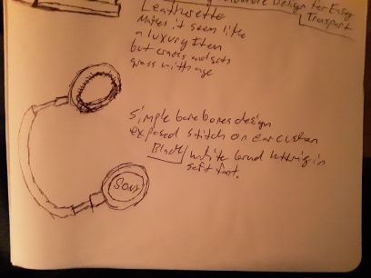
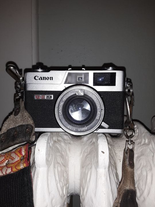
My name is Jake. I am currently a Film major and I am taking this class in design to both fulfill my Art minor and to get a chance to study the ideas and mechanisms that go into design. My background in design is mostly in making my own experimental films, photos, and paintings. I’m usually inspired by strange, surreal, and symbolist ideas and aesthetics. Design is usually a major factor when I purchase something. I like the utilitarian factors of things and how that can be incorporated in design or absurdly interrupted for the sake of design. I recently purchased an old rangefinder camera from the 1960′s that has a compact leather-patterned pressed steel cover. The leather pattern looks good, doesn’t kill animals, and it helps the user maintain a good grip. A neat design I’d say.
1 note
·
View note