
Statistics
We looked inside some of the posts by k00253353 and here's what we found interesting.
Average Info
Notes Per Post
10
Likes Per Post
10
Reblog Per Post
0
Reply Per Post
0
Time Between Posts
2 days
Number of Posts By Type
Text
17
Last Seen Tumblr Blogs


Fun Fact
69% of Tumblr users are millennials.
Text
Painting Elective Statement
I choose painting as my elective to get a better understanding of how to work with paints, painting tools and anatomy. It was the subject I have enjoyed throughout the exploration of the different mediums in first year. I have enjoyed the exercises my painting lecturers have given me.
For the self portrait project given to us; I wanted to explore the fatigue and being bed bound. I had been very sick a couple of years ago that made me very ill and thus had me spending a lot of time in bed just trying to recover. my room and bed is also where I spend most of my time so,for me, that can tie into a self portrait of its own.
I did a couple of pieces of me in the bed and a few bed studies. I was drawn to the old beds and cots found in old Irish cottages. The cold interiors sometimes paired with colourful blankets. I wanted to try and capture both almost the coziness yet the suffocating vibe a bedroom can give us.
1 note
·
View note
Text
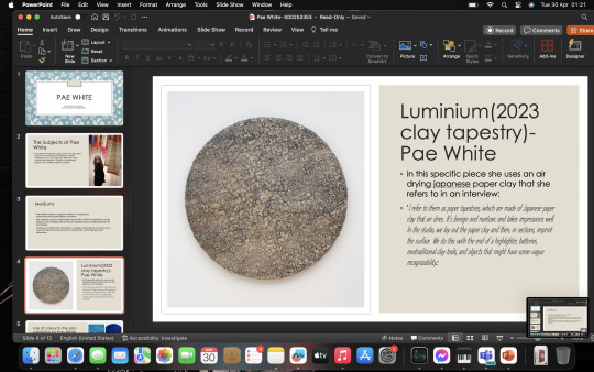
PAE WHITE; POWERPOINT PRESENTATION
this was the presentation I did on page white. the multimedia artist.


0 notes
Text
Self portrait using mirror
This was a self portrait I had I done using a mirror as a reference. This was quite a fun exercise as having a mirror on hand is quite helpful to practice 'from life' drawing. As you will always have your own face at hand. I did find blending the skin tone a little difficult and it will be something I would take into consideration again next time


0 notes
Text
continued self portrait in water inks


With these portraits I did them in Aquafina inks. I wanted to contrast the colour with the previous monochrome grey acrylic portrait I did. I was focused more on getting a slightly freer result as I made the watercolours sort of do the work. I then just outlined it in ordinary pen so it wouldn't completely lose its shape.
1 note
·
View note
Text
Bed wall
this is just the small collection of the bed studies and self portraits ive so far done for my self portrait project. I like how it is coming out so far

1 note
·
View note
Text
Self portrait in bed
this was a self portrait I tried to do in grey scale. This one was a little easier to do than the blue one as I could use a filter to help me see where the shading could go. The anatomy was also really difficult to pin down for this too. It might have been easier at a different angle but I wanted to sort of try and achieve a look as if I was sinking into the bed. almost becoming it.


This was the reference picture with the filter. The result I wanted out of this was, I wanted it a little dark to fit with the theme of contrast. The other side. The grey is actually a comforting colour but also a little lonely.
0 notes
Text
Self portrait
This was a small self portrait I did in relation to my painting project. I used primarily blue. Blue is a calming colour and can be at times,associated with the night, sleep and dreams. Since my project is loosely themed on those concepts. I thought it was fitting. it was quite difficult to blend at times and get the correct shading.
these are still slightly unfinished


1 note
·
View note
Text
Small colour theory exercise
This small exercise is taking a colour and slowly darkening it so it becomes different shades. This was also quite a difficult exercise as I couldn't exactly get the right amount every time for the shade. Still I was able to manage a small demonstration of how the red gets darker and darker with each spot of black paint until it almost becomes black itself.

0 notes
Text
life drawing
This is a continued bits of my life drawing sessions. Using Indian ink and pencil as the mediums. The Indian ink is both good for free flowing drawing but for me it can be a bit hard to really pin down anatomy and control it but I still like how these came out.


0 notes
Text
Life drawing (quick sketches/multimedia)
These were ten minute sketches that I did again with the life model in some different multimedia. These were a combination of ink and acrylic paint which I really liked doing as it gave the tone of the drawings a certain moodiness I like to put into my drawings


This session was a bit easier than the last time as I could do multiple sketches to warm up and the model changed poses so the change of that gave me less time to think and just do, and focus on the anatomy rather than overthink it.
0 notes
Text
Life drawing
This was life drawing conducted with our model. I took a risk going a bit bigger than usual with the life drawing. It was quite difficult to get the anatomy correct and I really struggled with this. Though I may have struggled with the anatomy I was quite pleased with how the colour came out. I really liked the vibrant green. especially since it is exclusively green with no white highlight. The life drawing exercise gave me a much better grasp of shading and mixing with paints.


If I had a bit more time I would love to go back and maybe would have done some warm up sketches to get into getting the gist of the pose a bit better.
1 note
·
View note
Text
Life drawing colour palette
This was the colour palette for one of my life drawing classes. there is a deep tone, middle tone and light tone. I only used cerulean blue, a little bit of marine blue and yellow to make this palette,there is no white in this to make the lighter colours. I just adjusted the blue and yellow accordingly.

1 note
·
View note
Text
Colour theory exercise
This was a colour exercise we did with coloured sheets that had coloured paper so we could try and pinpoint the subtle reflections of different colours of the fruit. i.e making them cooler, or warmer or sharper or muddier.


This was actually quite a difficult exercise as the subtleties in the colour can be so miniscule to can be diiffcult to really pinpoint them accurately to get the exact colour. Still I felt I learnt a lot in just a small time because I know how to look closer when considering colour pallets and their complimentaries.
2 notes
·
View notes
Text

just some of my research of beds and the album I used for inspiration.
1 note
·
View note
Text
Looking at some shadows and light


I really liked the feeling of this old bedroom in Kerry and decided to paint it.

once again with this drawing I was trying to capture a feeling. the bed in crayon and blacked out windows in the pitch black ink.I was looking at the contrast of bright crayon with black ink for the windows. Experimenting with light and dark
0 notes
Text
Experimenting with Indian ink on painted surface.


Using Indian ink I liked how it sat on the wall paint. it sort of boldened it and I was going liminal and abstract again. This is supposed to be a sort of abstract painting of a bedroom.
1 note
·
View note
Text
Artist Research. Louis Wain
the cat obsessed illustrator and painter that lost his mind but was so beloved by the community that he was taken care of quite well. I was inspired by the small illustrations of cats in bed, or around beds. Which brings it back to the whole project of me being in bed and how it makes me feel. Trying to capture that feeling of my own personal comfort.


He does use quite a few sentences in these.Which I was also encouraged to do this. I tried but I struggle to think of words to put over my work that's somewhat relevant.
0 notes