#colour theory
Explore tagged Tumblr posts
Text
Back in the June livestream, I asked what Thomas considers cThomas’ official colour(s). I think we landed on white, with black as secondary. Which makes sense as white light contains all colours of the rainbow before refraction! So he’s full rainbow all the time 🤍🖤🙂↕️😁
And it makes a lot of sense to be both white and black (light and dark) as cThomas has both light and dark sides, so he is balanced/well rounded
#ts details#ts stuff you missed#colour theory#thomas sanders#sanders sides#cThomas#ts livestream#patreon#June livestream#2025
47 notes
·
View notes
Text

note* I will not reveal which side I am on until the poll is over to avoid bias
9K notes
·
View notes
Text
Tiny… oversight in the planning


Re-visiting Colour theory for a Uni assignment and I can’t get over the fact that, with his red visor, Sounders would 100% be colourblind
N e ways, bonus images without the text for u (cause im proud of the perspective on Screamer okay shush)


#YOU’RE WHAT??! -Starscream the instant they get back to the nemesis#art#my art#fanart#comic#tf comic#maccadam#maccadams#Starscream#Soundwave#tf#tf g1#tf idw#seekers have talons#Soundwave is colourblind I’ll fight you on that#I’ve see a similar concept done with Scott summers but i can’t for the life of me find that post#fan comic#Decepticons#Jazz waz here <3<3#decepticon high command#they’re so stupid /aff#colour theory#idk what the machine is btw I just needed a plot device so this comic could be relevant to the colourblindness :’)#he’s never needed colours before he just tells me he’s apart from their thoughts#‘why would you rely on paint jobs to tell mechs apart?? paint jobs change all the time you guys are weird’‘#-Soundwave to an increasingly frustrated/distraught command trine
1K notes
·
View notes
Text
⭐ Pixel Art Fundamentals - Hue Shifting
This technique is not uniquely specific to pixel art, but it's a very common term to hear when starting out watching those "dos and don'ts" videos. So what is hue shifting?
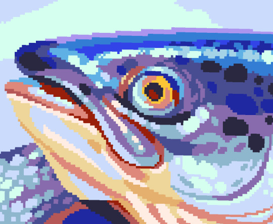
Hue shifting basically means to change the hue when making your shade darker or lighter. In this context, 'hue' = colour!

You may hear 'you need to hue shift more' when getting feedback on your art, but what does that mean really? Here are some examples:
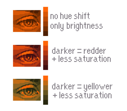
We can see even with just a bit of hue shifting, we have quite a different vibe for each drawing. In warm / daylight settings, no hue shifting can sometimes look a bit muddy or grey.
If we swap the image to grayscale, you can see that they look much the same:
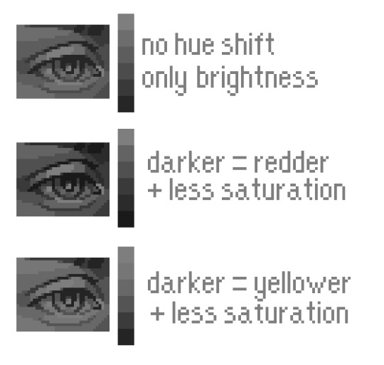
As long as the hue shifted colours have a brightness that makes sense, they usually will work. You can get quite wacky with it.

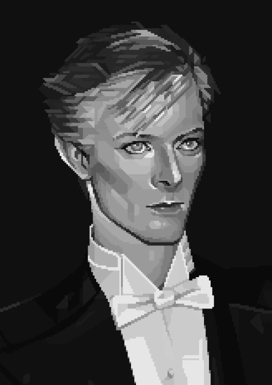
But is hue shifting always good? Not necessarily.
Below is some of my art where I intentionally didn't hue-shift at all. You can see it gives them an uncanny, digital, or photographic kind of look. As always, techniques are about your intention, or personal style.
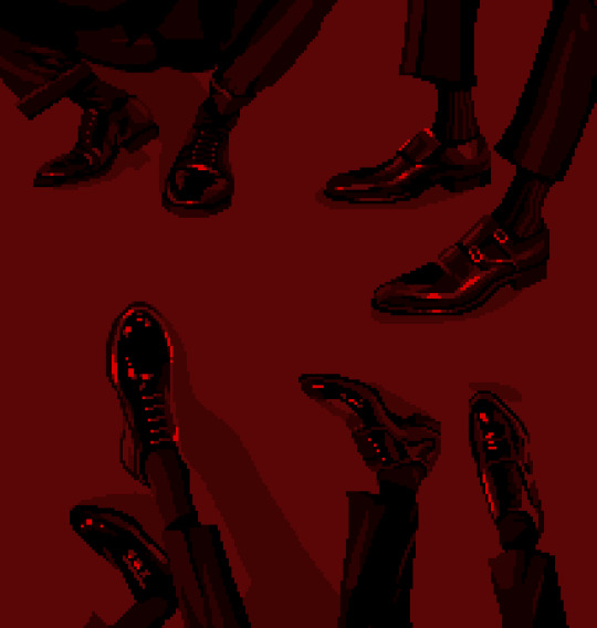
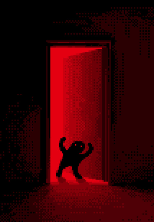
I recommend trying different hue shifting methods! I especially love to use a cool blue or teal for the lighter shades.

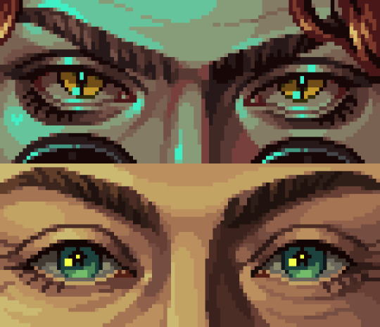
Thanks for reading and I hope this helped a little! Have fun with it!!
⭐ Read my full pixel art guide here!
#pixel#pixelart#pixel art#pixel art tutorial#tutorial#art tutorial#colour theory#color theory#hue shifting#art#illustration#pixel illustration
6K notes
·
View notes
Text
Guys guys!!

Ya ever thought about how Goofy wears green in a goofy movie instead of orange (his usual colour)


It’s because orange and red (Max’s colour) are next to eachother on the wheel, cuz in goof troop max and goofy are close.
In a goofy movie they are failing to understand eachother so they’re wearing opposite colours (they couldn’t change Max’s colour because he was already redesigned and it’d make it harder to recognise him)

THEN in extremely goofy movie, what’s goofy wearing… (when he’s not dressed up)

Red! He’s still not wearing his own colour, instead he’s straight up wearing Max’s colour. Because he’s now TOO attached to max and relying on his relationship with his son.
Movies are cool man…
#a goofy movie#an extremely goofy movie#goof troop#colour theory#goofy#max goof#disney#character design
408 notes
·
View notes
Text
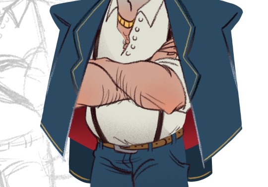
There has been requests about getting a full body colour for Kook!Ford, so here he is, in all his beige, white, and brown minimalist glory <3 (THERE’S A REASON WHY HE HAS SUCH A BORING PALETTE I PROMISE)
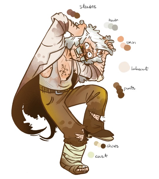
Stupid colour rambles that are WAYY too in depth and probably mostly far fetched but this is my AU and I get to pick how much over-analysis goes into the characters’ colour schemes, fuck you:
Ford:
Characterised by pale, almost pastel-ish colours to emulate a sort of sick, unhealthy look.
The paler colours add to the illusion of Ford lacking presence, almost disappearing into the background, to convey how his existence often ignored or dismissed by most of the townsfolk.
Without any visually striking or contrasting colours in his palette itself, his own features blend into one another, blurring the details and diminishing any identifiable traits that would have typically identified him as Ford, or even a person (<- if that mindfuck of a sentence make any sense)
Hints of yellow to show remnants Bill's past influence on him. Because I’m dramatic like that.
Fiddleford:
Deep, rich forest greens with golden accents (influences of Bill appearing in his outfit) (I need to hammer Fidds out a lil’ more ngl)
Stanley:
Deep, rich blues and purples (opposite spectrum of yellow, aka. Bill's colour, which means = safety to Ford)
The inside lining of his jacket is vivid red, to reference his original colours palette and as a representation of his past self being hidden underneath the layers of his predominantly blue exterior, colours representative of his new identity (also red = warm and blue = cold)
His colours palette will eventually open up into something warmer on the outside, veering into purple.
Extra notes on his character: Stan (in this AU) is colder and quieter than his canon counterpart. After years of being in the mafia business, and years of running it as well, he has long since learned to mask his facial expressions and master the poker face (*cough cough* resting bitch face *cough cough*). But, his intimidating and serious air does not serve him any favours when it comes to literally anything other than his “work”, his inexperience when it comes to emotions all the more apparent with the twins. He has trouble expressing his feelings outwardly, and despises this part of himself, because it reminds him of his own father. He feels as though he is failing the twins by being too cold and distant, and tries his best to open up more.
Mabel:
Maintains her original colours palette with pink, but has more hints of red in her outfit, similar to Stan’s, particularly around her sleeves (allusion to “wearing your heart on your sleeves.” Yes, I know that it’s tacky)
The red shows she is more inclined to trust Stan, as she is willing to see past Stanley’s exterior facade of cold aloofness to see his “true” colours (good HEAVENS that is disgustingly cheesy to say but idk how else to really word this)
Extra notes on her character: Mabel trusts Stan fully. Perhaps a little too much. She I dolises Stan to an almost unhealthy degree, and is constantly plagued with the underlying fear of somehow losing Stan’s “interest”, as their mother seemed to have lost interest in her and Dipper. Deeply fears being abandoned again, and believes she “owes” Stan for having adopted them. She believes it is her fault that neither of their parents wanted the twins during the divorce.
Dipper:
Maintains original colour palette with blues, but pretty solidly lacks red in his outfit. He serves as the opposite spectrum of Mabel, instead being unwilling to fully trust Stan and takes him at face value.
Extra notes on his character: Dipper does not trust Stan, and is far more hyperaware of what kind of “business” their “uncle” runs. He is mostly worried about Mabel’s slight obsession with pleasing him, and fears that if they don’t behave, Stan might use his dangerous power and influence against them. He is convinced that Stan had ulterior motives to adopting them, cannot fathom what he, a seeming stranger with all the power in the world, could possibly hope to gain in adopting two abandoned children. Even more so, when even their parents didn’t seem to want them.
#my art#my post#sput chatters#stanford pines#ford pines#grunkle ford#fiddleford mcgucket#stanley pines#stan pines#grunkle stan#mabel pines#dipper pines#mystery twins#colours#colour theory#I guess???#anyways- hope the OOC ness didn’t throw anyone off but like- this IS an AU so#character design#town kook ford au
569 notes
·
View notes
Text
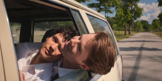
ok but the way they've been on again off again for three seasons specifically shrouded in the colours of the swedish flag - showing us the monarchy has intruded on their relationship. even the good, even the private, and always, always the bad and the ugly.
💙💛
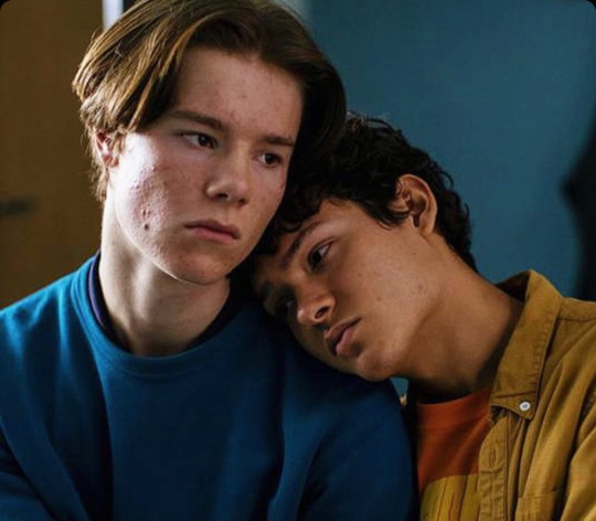
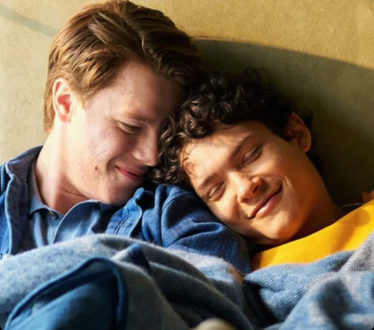
makes this white flag moment of surrender even more powerful. they're stripped of this blue and gold brushed over them by society, colourless and allowed to create their own existence - together, a blank slate. themselves, again and only - forever.
🤍🤍
#I know you've missed me xoxo colour theory lili#young royals#Young royals analysis#Colour theory#Young royals s3#Young royals season 3
2K notes
·
View notes
Text

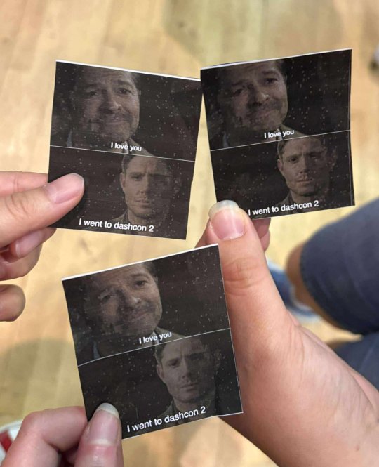
Had fun with friends at Dashcon 2 <3
(thank you @sugakookiesbutbadass for taking awesome photos! <3 you friend)
#one of the people cosplaying the best colour for a children's hospital was handing out memes#we couldn't resist#tumblr hell#dashcon#dashcon 2#dashcon two#colour theory#supernatural meme#letuce talk
203 notes
·
View notes
Text

From: Shobi Shobikai, [Beauty of clothing], (1 page of text and 190 silk colour samples mounted on 12 cardboard sheets), Horiguchi dyeing sample factory, Kyoto, 1954 [Ursus Books & Gallery, New York, NY]
#graphic design#design#textile#colour theory#color theory#colour study#color study#geometry#pattern#grid#cardboard#catalogue#catalog#shobi shobikai#1950s
147 notes
·
View notes
Text


kicks dirt … been trying 2 learn how to use colour (arch nemesis) … pls lmk what u th ink
(the star is meeee !!!! we r hanging out wow !!)
#bununii when she actually has to improve#art is hard#AGH#rdr2#red dead redemption 2#kieran duffy#red dead redemption#bununii#art#red dead fandom#kieran duffy art#rdr2 fanart#rdr2 art#colour theory#o’driscoll boy
343 notes
·
View notes
Text
Phan vs jedas RPF polls Suez canal glup shitto horse plinko live slug reaction I like your shoelaces do you like the colour of the sky Goncharov 1973 eeby deeby vanilla extract Nov 5th ides of march Tumblr TV summon crabs sexymen blorbo from my shows destielputinelection twitter downfall children's hospital colour theory sonadow generations ourgoodshadows no seriously imagine it car covered in hammers porn banned tramp stamps bug race muppet handjob corporate manufactured yaoi superhell
#deadpool and wolverine#phan#dan and phil#goncharov#goncharov 1973#bug race#vanilla extract#jedas#rpf#suez canal#glup shitto#live slug reaction#i like your shoelaces#do you love the color of the sky#eeby deeby#november 5#ides of march#tumblr tv#summon crabs#tumblr sexyman#blorbo from my shows#destiel putin election#twitter downfall#childrens hospital#colour theory#sonic x shadow generations#our good shadows#no seriously#imagine it#the croaker
254 notes
·
View notes
Text
Hitting the ground running with a new mini costume meta - thanks 911 for dropping that reel with Oliver and Aisha!!!

I’ve already seen a few people comparing the shirt Oliver is wearing with the shooting pinstripe shirt. I don’t disagree with you!
I’ve also seen the shirt being compared with the buck-tommy coffee date shirt - again I don’t think the comparison is wrong!
I do however think that maybe the bigger picture of the actual meanings of the various shirts is being missed!! So I’m here to help explain everything to you - I’m gonna take you on a walk through all of Bucks white/cream pinstripe shirts to help explain everything to you!!
Let’s start with the the colours and the colour meanings in context with Buck!
So we have white and we have cream. White on Buck when its in shirt form is generally an indicator of upcoming danger (in much the same way guest cast in check pattern (as well as the mains sometimes) means they’re the one in danger!) there are countless examples of this over the 7 and 1/2 seasons so far! White as a colour generally means purity and innocence as well as balance. But, it can also mean hope and clarity and self reflection. These are the meanings I associate most with the use of white on Buck - because although the white shirts signify danger, it is danger that brings a sense of hope and clarity to Buck, and generally leads him to a period of self reflection. We perhaps see this the most clearly with the tsunami arc - the white shirt foretells the danger Buck is about to be in (with Chris) but in the aftermath of the tsunami we get Ucks voice over and then are shown a reflective and pensive Buck just before Eddie shows up with Chris (helping to settle buck and reaffirm his reflections)
Then we have the cream - cream is a colour between white and yellow - there is a lot of implication to this - we can take the meanings of white from above, and also apply some of the meanings of yellow - so optimism, communication, clarity, curiosity, and confidence. Clarity being present in both colour meanings means this is the most important aspect of cream as a colour.
There is also the aspect of the pinstripes - there can be two main meanings attached to them - the concept of being trapped or imprisoned is the first one as they can resemble the bars of a jail cell and that connects into the use of pinstripes by mobsters and gangsters in the early to mid 20th century - thus deepening the connection to imprisonment. The alternative meaning stems back to their origin. Pinstripes in clothing were first seen in the early 19th century when they were used in the banking sector, when the different banking houses in London used different coloured pinstripes to identify their employees. It is from this historic use that the pinstripes comes to mean order, clarity and sophistication. And yes - once again we have clarity popping up!!!
So if we look at the times Buck has worn white or cream pinstripe shirts
4x13 shooting scene long sleeve white pinstripe shirt - this is the first time we see the white shirt become a pinstripe shirt and that is symbolic.

5x13 - Taylor moves into the loft - short sleeved white shirt with black pinstripe

6x01 - we do have the blue and white pinstripe zip front shirt, but it is blue with white pinstripes rather than the other way around (it is relevant in this meta I promise - I will be coming back to it!)

At the end of the episode wile Buick is moving his armchair, we have a cream shirt with light blue pinstripes

6x11 - coma dream Buck is wearing a white shirt with green and grey pinstripes

7x05 - Buck and tommy coffee date - cream shirt with blue and red pinstripes

All of these shirts are worn at really key moments for Bucks journey and connected to a very specific theme - self discovery and clarity. Not necessarily complete clarity, but the idea that things are becoming clearer for him - he is gaining more and more clarity with each white or cream pinstriped shirt - clarity of different aspects of who he is as a person. It is about the context of the scene and the episode more widely (and sometimes a couple of episodes like in the shooting arc).
The shooting shirt is about the clarity of stepping into a parental role with Chris - it is very much connected into the will reveal and the self reflection Buck does throughout this and the hope that the will reveal brings him - all things he discovers throughout the two episodes of hte shooting arc. Taylor moving into the loft and his conversation with Maddie is not about Taylor moving into the loft, it is more about the conversation with Maddie and Buck reflecting on the mistakes he has made in asking Taylor to move into the loft - the clarity around being a clinger!
The cream shirt from 6x01 is all about Buck reflecting and gaining clarity throughout hte episode about needing to be happy in his own skin - be happy with who he is - getting to know himself better, and that fits in perfectly with the cream shirt from the coffee date in 7x05 - Tommy is basically an irrelevance in this scene - he is being the plot device he was always intended to be. The episode is title ‘you don’t know me’ and the entire scene is about Buck recognising that he doesn’t know Tommy - but more importantly that he doesn’t know himself - this new part of himself that he has discovered - that he is bisexual. The scene is about buck gaining the clarity that he needs to learn more about this aspect of who he is - Tommy just represents a safe space for him to do that. The pinstripes shirt from the coma dream plays basically the same role - within a coma verse - the scene we see Buck in the pinstripes shirt is about him getting some clarity on the reality of this world he has found himself in - beginning to put the pieces together that all is not quite right in the world and that he needs to look for the answers.
The other aspect of the white and cream shirts is when we see the use of white or cream. White shirts being connected to Buck in danger in some way is the overarching theme of the white - but generally speaking the white appears as a visual representation of Bucks danger coming from external forces. The shooting,the tsunami, the coma dream shirt, and pretty much all the other times we see him in white, are all about external forces - they did not come directly from Buck himself. Whereas the cream shirts are very much connected to the inner workings of Buck - the armchair moving scene, the coffee date - both representative of Buck’s internal turmoil and inner forces being at work.
So as you can see all of these scenes are about clarity and self reflection - they are about Bucks journey to know himself and learn to love himself. This means that the new shirt we have will most definitely play into this theme. We don’t have any context for what episode or location its going to appear in because we only have a very out of context bts video to go off, but the fact it is oversized to an even greater degree than anything we’ve seen Buck in thus far, and the fact that it is cut pretty short at the waist is actually pretty revealing. I’ve spoken about the fact that Bucks clothes got increasingly smaller and ill fitting throughout season 5 and 6 and that it was symbolic of Buck not fitting in his skin any longer. This was then proven correct when we had Buck dressed in (standard) jeans for the first time and in properly fitting clothing for the first time in 7x04 when Tommy kissed him and basically revealed a part of Buck that he hadn’t been aware of - the fact the clothes now fit him pretty much perfectly in that scene revealed that he had found his fit - he was no longer under the impression he was straight - a label that didn’t fit him - and he now knew he was bi - a label that does fit him.
Since that bi awakening scene, we have been shown Bucks clothing moving in the other direction - becoming increasingly ill fitting by becoming increasingly bigger. I’ve spoken about how this was representative of the fact that whilst he now knew he was bi, he was still misunderstanding the assignment, that he wasn’t recognising that it was Eddie that he was in love with. Because the thing is - throughout season 7 and 8a, after his bi awakening, we’ve seen a variety of fits in Bucks clothing moving- from the ill fitting to the better fitting and the interesting thing is the context of when we’ve seen the ill fitting, too big clothing compared with the scenes when we’ve seen the better but still slightly too big clothing. As a general rule - scenes with buck in street clothes where the focus is on his and Eddie’s relationship - we have seen the clothes fitting him much better. Whereas the scenes where his relationship with Tommy was the focus, the clothes have been too big and baggy and ill fitting.
It a subtle way of conveying to the audience the reality of things - the costumes play their part in cluing the audience into the fact that Tommy is not a good fit for Buck, but that Eddie is. Becasue this is actually something that can be traced back to Bucks too small clothing era as well - often times his clothes fit better when he was in scenes with Eddie (and Chris) and less well fitting in scenes with Taylor, or later with Natalia, or indeed scenes with characters such as Connor and Kameron. There was the general overarching fit of being too small, but that was less pronounced in scenes with Eddie.
So the fact this new shirt is soooo very oversized - to an extent we’ve yet to see and to the point of swamping him (impressive considering the man is a unit!) - the grey goodbye to Eddie shirt might also joint the ranks of this, but I’m holding fire on that one for the moment as I want to see better quality stills or video! This shirt in particular is very telling becasue we have the dual aspects of the shirt being both too small and too big - too small because the cut is short, and too big because it is so oversized - its really playing into his spiralling out after Eddies departure in a big way. My personal feeling is that in line with white shirt theory, we are going to be watching Buck go through the ringer - but likely in an internalised way, because this new shirt is definitely in the cream side of the spectrum - much lighter than the other two cream shirts, so I’m expecting to see some external happenings as well, but I think it is much more inner turmoil we’ll be seeing. I also think the idea of being imprisoned is also relevant - the idea that Buck is trapped in his own head as he starts to realise the nature of his feelings and the fact he has lost Eddie (or thinks he has) just as he’s realising he loves him. Of course this is speculation on my part, but speculation grounded in my studies and understanding of the costuming on 911 - especially when it comes to Buck and Eddie!
These shirts also sit in tandem with his white high tops - the ones that represent his wider journey to find himself and his family - to find his happiness. We’ve seen a bit of a step back on the shite high top front in seasons 7 and 8a so far, but we have had other white trainers used and I think we’re just transitioning shoe to fit in better with the new clothing styles and that it is white shoes more generally rather than those specific high tops that represent that ongoing journey.
The other thing that sits in parallel with the white and cream pinstripe shirts is the shirts with pinstripes in the opposite colour way - dark shirt with light pinstripes.
4x14 we have the black shirt with white pinstripes he’s wearing when Taylor turns up at the loft

5x09 - the navy shirt with white pinstripes in the awkward ILY scene

6x04 - the navy shirt with light blue pinstripes - in the scene where Buck agrees to be a sperm donor

6x17 - conversation with Maddie - the ring cutter scene!

7x05 - first date at the Italian - navy jersey shirt with cream pinstripes

7x10 - hospital and awkward dinner date at the loft - the brown shirt with mint green/blue pinstripes

All of these shirts represent moments of Buck doing the opposite of the white and cream shirts - these are all scenes where Buck is effectively harming his journey forward - they are scenes where his clarity becomes clouded, where he is unable to be self reflective - when he has false hope, or when his mind is obfuscated - so the happenings in those scenes leads him away from his path. The way the dark pinstripe shirts nearly always follow a light coloured pinstripe shirt is very telling - the idea of the dark shirt clouding his previous clarity that the white or cream shirt had brought him - almost as if he was making progress and processing things - moving forward - only the darkness rolls in and we see Buck basically locking away his progress - locking away any clarity he was gaining.
The dark shirts are all about leading him away from his true path. The white shooting shirt in 4x13 is followed by the black shirt in 4x14 when Taylor chases Buck - obfuscating him from his path towards Eddie. The 5x13 white shirt - when he chats with Maddie and starts to understand what he’s done by asking Taylor to move in, is preceded (in this single case) by the awkward ILY scene in 5x09 - he’s already got clouded judgement (because of Eddie) and even though he’s gained clarity he can’t walk it back - but we do see him confessing later in 5x13, perhaps suggesting that his clarity is that he needs to be honest with himself and with those around him.
Then we have the 6x01 cream shirt followed by the navy pinstripe shirt in 6x04 when Buck agrees to become a sperm donor - once more Buck veering off course. And remember the blue zip up shirt with the cream pinstripes from 6x01 - yeah coming back to those now, because those three shirts all play in tandem with one another. The blue shirt is in Bucks blue - the blue he wears when he is his truest self - the blue we see connected to Eddie most frequently. The scene has Eddie in yellow for the first time and Bucks pinstripes more or less match Eddies shirt - followed at the end of the episode by the cream one with the blue stripes - and very much part of a scene about Buck deciding to figure himself out before he looks for love. The more I watch that scene and look at the context with the other pinstripes shirts the more convinced I become that the lasagne scene was the set up for Buddie canon had we ended the show at the end of season 6. The whole thing was setting up buck to figure himself out - figure out he’s bi and in love with Eddie. I obviously cannot prove it, but the pieces are all there to play into that being Bucks intended arc - the sperm donor arc was likely meant to actually be a wider arc about Bucks desire for family and about learning he already made one - about learning and understanding families come in all shapes and sizes and that you can build one if you want to - that he already has.
Then we have the coma shirt followed by the ring cutter shirt. The pairing is maybe a little less obvious here, but there is something about the idea that Buck is gaining awareness of being trapped in his mind whilst oblivious to the reality of his sexuality. The coma dream shirt is about him beginning to figure out that the reality he is in is not his actual reality - its about making him begin to question what he actually knows and understands about himself and that spins out into the wider plot for the coma dream -about getting back to his family. It makes the lack of Eddie in his dream even more pronounced - that he’s figuring out that he has a family who loves him and is there for him, but that he still isn’t in a place to look at the romantic aspect of love. The ring cutter scene is really about Buck once again mistaking sexual attraction with romantic attraction - it is tied into Natalia and into Bucks death - there is a connection to this idea of looking in the wrong places (hence why he can’t find the ring cutter in the kitchen utensils pot - which is where it would be if sex and romance were actually aligned - because love is found in the kitchen!) Natalia is sexual attraction - not romantic.
The trio of the BT first date, coffee date and then the third date (that we are shown on screen) the pattern is a bit more like the Taylor ILY/ Maddie conversation shirts i that we have clouded/obfuscated Buck to start with - the kiss has confused him, and the date has also confused him - it is about him not actually looking at himself and recognising who he is - it is also a bit about the fact that he’s misunderstood his jealousy - that if Tommy hadn’t kissed him, he may well have eventually figured things out and realised that it was actually Eddies attention he was after and the full reality of that - which is what the Maddie conversation is all about. The cream shirt in this trio is then about Buck recognising the need to work on himself - the need to explore who he is more fully and also recognising that Tommy is essentially a safe space to do that - he literally says that he doesn’t know what it is yet but he wants to find out - it isn’t about Tommy, its much more about his self - that he doesn’t;t know how this new label he has fits him yet, fits into what he wants from life, but he wants to embrace it and find out. The subsequent move into brown on the third shown date, is all about that obfuscation coming back in - that Buck is very much in family mode - worried about Bobby - but Tommy distracts him with sexual innuendo and the implication is there in the subtext that this is a relationship based on sex rather than on love and knowledge. Which is what we then see play out through 8a.
All this to say that the new oversized whilst also too short shirt is in my opinion really going to help play into Bucks spiral out in the absence of Eddie and that it will be worn in a scene that is about Buck finding some clarity around Eddie and his potential return to fuck boy Buck and why he has gone down that route - be that his full OHHH moment or something else I can’t really guess at, but the fact it might be a scene with Hen is interesting to me as we’ve seen Buck go to Hen when faced with some difficult decisions - and I will confess the idea that he’s going to talk to her about missing Eddie and feeling lost and not knowing what he’s feeling - not understanding and that she might help him into his ohhhhh moment is a rather delicious one to me. I’m expecting this to be a scene in 811 or 812, I think it’s coming after Eddie has left for Texas at he end of 810 (because I believe the goodbye scene will be in the last 10-15 minutes of 810), and that it will be towards the end of his spiral when his abandonment issues are causing the most havoc with him - because we’ve gone to extreme on the oversizing - so it has to be at the point just before Buck is able to start finding himself, to stop over correcting and beginning to fit in his own skin - when we will see the costumes begin to fit him better again - up to the point where we hit perfect fit - which will be at the point Buck is either ready to fight for Eddie, or at the moment Buddie goes canon. I will write another post about the Eddie goodbye costumes - I have many thoughts - and about the fit and styling of Bucks uniform in the maroon teeter totter car, but it is late and I need to go to bed so you’ll have to wait until tomorrow or Friday for that one!
I never meant for this to end up this long - it was supposed to be a mini meta on the new shirt - and well this is me so I spiralled and here we are!!! Aren’t you glad to have me back 😂😂😂
Tagging a few people who might be interested, but as I haven’t figured out peoples new url’s I don’t actually know who wants tagging!! @lover-of-mine @fruityfirehose @spotsandsocks @leothil @lemotmo @satvojihusana @buddiediaz118 @bewitchedbewilderedbisexual @sunflowerdigs
#911 spoilers#911 costume meta#evan buckley#buddie#Kym costume things#911 costumes#its all about the pinstripes and the fit of the clothes#colour theory#911 colour theory#colour meta#costume analysis#I’m back and I’m still writing ridiculously long metas!#let me know if you want tagging in future metas!!!#I’m so excited for 8b and Bucks abandonment spiral!
211 notes
·
View notes
Text

Wake up babe new children's hospital colour theory post just dropped.
184 notes
·
View notes
Text
So, I saw another post talking about Astarion's epilogue outfits. And it got me to thinking about colours. Specifically the colour choices in his Ascension version, vs the Adventuring fit.
And I think it's a really smart choice to have Ascendant Astarion in the Red and Black that was Cazador's Colour scheme, is all over the palace, and is just the very stereotypical vampire get up. All the spawn feature prominent red in the colour scheme (except Leon, because he simply has no shirt.) The Ritual's magic is red. It's very red. Even Astarion's staring get up has red and purple. Which are typically fancy colours that convey a sense of wealth, so it makes sense. Cazador want's his spawn to look flashy, and Astarion especially comes off initially as a harmless fop. Whereas Adventurer Astarion is in cool colours or neutral which marks a really strong visual shift away from the role he used to play, as opposed to AA, who's leaning even harder into the vampire thing than ever.
117 notes
·
View notes
Text


something that took me some years to figure out is that desaturated colours are much easier to vary in hue because they are literally closer together


also the greys make your more saturated colours stand out more. if its all saturated then nothing really is
thats the power of the greys my friends
goot bye
2K notes
·
View notes
Text

The official Jujutsu Kaisen website put out a list of colours representing many of the characters. They go like this:
Gojo Satoru: light blue (literally, colour of the water)
Geto Suguru: yellow
Ieri Shoko: bright green (literally, colour of young grass)
Amanai Riko: pale pink
Kuroi Misato: white
Nanami Kento: ochre (literally, yellow earth colour)
Haibara Yu: gray
Iori Utahime: pink beige
Mei Mei: light blue
Yaga Masamichi: navy
Kong Shiu: dark brown (the "koge" can mean "scorched rice". "Tea colour" means brown. Literally, scorched rice tea (colour))
Fushiguro Toji: turquoise (literally, blue/green + green)
Itadori Yuji: orange
Fushiguro Megumi: emerald green
Kugisaki Nobara: red
#jujutsu kaisen#jjk#fushiguro megumi#yuji itadori#gojo satoru#toji fushiguro#geto suguru#mei mei#utahime iori#nanami kento#haibara yu#nobara kugisaki#yaga masamichi#shoko ieiri#riko amanai#kuroi misato#kong shiu#colour theory
85 notes
·
View notes