My name is Alexis Gee and I'm from Hampton Roads, Virginia. I am a Graphic Designer pursuing my master's degree in Media Design. After a study abroad trip to Cuba, Afro-Cuban art has become one of my favorite styles of art.
Don't wanna be here? Send us removal request.
Text
Final Mastery Reflection
Course 1, Mastery: Personal Development and Leadership
This course contributed to my personal and professional development as a media designer by helping me carve out goals. I wrote an intention statement in this course that outlined what I wanted to pursue. I determined that I wanted to achieve mastery in the field of Graphic Design. My research consisted of exploring Robert Greene’s “Mastery” text. A quote that stuck with me was to “find a niche in the ecology that you can dominate” (Greene, 2012, p. 35).
I also performed a Grit and Ambition self-assessment. According to the Grit and Ambition Scale I am extremely ambitious. Strengths that I possess consist of creativity, discipline, and professionalism. This course aided in my thesis project by allowing me to practice proper APA formatting. My most outstanding personal triumph in this course was creating a Mastery Journal Timeline that outlined what I wanted to learn from each course. Here is where I established my Mastery path.
Course 2, Defining Client Needs
In Defining Client Needs a lot of my confusion about the process of creating a logo was clarified. This will aid in my career as a freelance designer. We began drafting logos for our chosen destinations. I decided to do the place branding project for Kyoto, Japan. I began with hundreds of sketches focusing on different aspects of Kyoto such as the geography, culture, and tradition. Here is where I did the foundations of my research that benefited me in creating my thesis website. Understanding how to find credible information to support your claims is a technique that I acquired by completing this course.
Course 3, Brand Development
Brand Development was a continuation of projects that were begun in course two. In Brand Development I created Vision Boards reflecting different aspects of Kyoto. I also revised my bamboo logo that was the product of collaboration and feedback. This course taught me the elements of branding and place branding that I would later discuss in my thesis project. In this course we also did color studies. As a professional media designer I will have to be able to explore color successfully for my clients’ interests.
Course 4, Effective Copywriting
Effective copywriting was a challenging course for me. I originally didn’t think of myself as a stellar writer. However, with my professor’s guidance I was able to excel. I learned about personas and target profiles. Knowing this terminology and the meaning behind it will help me be a better designer by enabling me tp design for the appropriate audience. My biggest personal triumph was developing testimonial advertisements for a non-profit animal shelter. This class contributed heavily to the creation of the solving problems portion of my thesis site. I used the testimonial ads I developed as examples of attaining mastery for the Solving Problems section.
Course 5, Design Research
In the Design Research course I devoted much time to researching Kyoto, Japan. This proved to be just an umbrella for many additional topics that my reading led to. My biggest personal triumph was creating the Kyoto vision board. It was harmonious and represented the topics that I added to my skill set. For example, the reading I did into organic shapes I then synthesized into my Final vision board to represent aspects of that research. I learned how to develop a style sheet which will probably be a task as a professional designer. The techniques I learned such as synthesizing research was applied to my thesis website.
Course 6, Organizational Structures
Organizational Structures challenged me by requiring me to work with motion. This was one of my weaker points and proved to be frustrating. My biggest personal triumph however was creating two professional parallax image videos for my Kyoto brand. I found research in this course that established organic shapes convey feelings of nature. Understanding this principal, I included as an acquired competency for my thesis website.
Course 7, Design Strategies and Motivation
Design Strategies and Motivation was about establishing a brand identity for my local community of Great Bridge in Chesapeake, Virginia. I conducted primary and second Ary research into my area. I also immersed myself in the area by driving through and walking around the district. This allowed me to conduct interviews and engage with people on a personal basis. I got to understand subject’s motivations and behaviors. Freach writes, “Understanding behavior gives designers at least two important kinds of insight.” (Freach, 2011). It provides a sense of action and recognizes practices and patterns. This course benefits me in my professional career by teaching me how to interpret and conduct a case study. This course also allowed me to acquire competencies such as photographing and interviewing that I would discuss on my thesis site.
Course 8, Design Integration
Through the Design Integration course I developed a brand voice for my branding project Victory Park. I did this by creating a brand voice chat. I developed a tagline for the community based in the tone and voice. I then made a static vision board which will be a great addition to my professional portfolio. My biggest personal triumph was creating a dynamic vision board for Victory Park. Establishing the brand voice for Victory Park was a technique that played into my thesis website. Learning how to develop a media plan will assist eye in my professional career because the principle will be the same for various brands I work with.
Course 9, Multi-Platform Delivery
In course nine, I developed multiple design solutions for different media assets that would support my Victory Park brand. This month was beneficial to my professional career because it taught me how to develop a brand guide. The Victory Park branding campaign was further developed throughout the month which aided in my argument for master on the thesis website.
I also learned essential practices for the creative process a dealing with clients. What I found most valuable was the Lynda video by Von Glitschka entitled “Logo Design: Illustrating Logo Marks”. This step by step tutorial shed light on great tips that will stick with me. The toughest part of the course for me was creating a catchy logo. The Glitschka video made creating the logo look very simple and it became frustrating when I wasn’t producing the same polished results. I had to constantly remind myself that the designer had been in the industry way longer than me and I will get better with time and practice.
Course 10, Measuring Design Effectiveness
During course ten I developed a questionnaire that measured the results of my place branding campaign for Victory Park. I received great feedback from the participants on the effectiveness of the campaign. I translated this information into an infographic which was my biggest triumph. This technique of synthesizing data into a design solution is a competency that I discussed acquiring on my thesis website. The infographic received great feedback from my instructor and was definitely of graduate level caliber.
Course 11, Thesis: Presentation of Design Solution
The Thesis: Presentation of Design Solution course taught me essential skills of a professional media designer. I immediately learned that it was vital to show your process rather than just the end product. I applied this to my thesis presentation site by presenting the research that I conducted, exhibiting early sketches, and showing how the vector image progressed. I fine-tuned my writing skills by drafting many abstracts for my mastery website. I was able to exercise my knowledge of Wix to build my assignment.
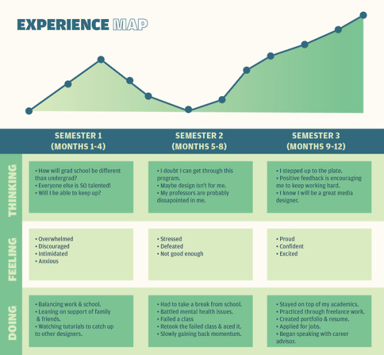
FINAL EXPERIENCE MAP *CLICK HERE TO VIEW IN HQ*
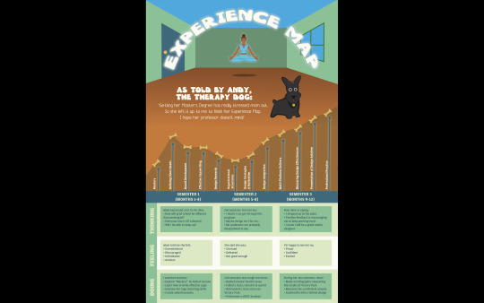
References
Freach, J. (2011, May 27). “The Art of Design Research (and Why It Matters)”. Retrieved from https://www.theatlantic.com/entertainment/archive/2011/05/the-art-of-design-research-and-why-it-matters/239561/
Greene, R. (2012). Mastery. New York: Penguin.
0 notes
Text
Mastery Journal Reflection - Month 11
The first takeaway I absorbed from the Presentation of Design Solution course is that it is important to show your creative process. Employers need to see that you can replicate the design process for their interests. I’ve learned that designers should reveal how ideations were created. This can be done by showing the steps of progress from the research phase all the way through to refining solutions based on feedback. I applied this to my thesis presentation site by presenting the research that I conducted, exhibiting early sketches, and showing how the vector image progressed.

The second takeaway that I got from this course is that time management is vital to success. This course proved to be rigorous. It seemed as if there were deadlines due one after the other. Also, the importance of the thesis project was a big stress factor. Prioritizing my time wisely is the only way that I succeeded. As a Designer I will have to juggle various deadline for various clients and projects. Learning now now to budget my time will benefit me in the long run.

Lastly, I have learned that it is necessary to seek out feedback from peers. This is in order to create the best design solution. A designer can easily get tunnel vision on their work and miss design opportunities. Having peers critique your work allows you to test your solution before releasing it to the client.
0 notes
Text
Victory Park District Survey
Survey Link
Thank you for participating in this survey that measures brand perception for a fictitious rebranding campaign for the Victory Park district (currently known as Great Bridge) in Chesapeake, Virginia. My name is Alexis Gee and I'm a graduate student at Full Sail University studying Media Design. The following questionnaire will gauge the success of the designs developed for Victory Park.
This is a historical community known for the Battle of Great Bridge during the Revolutionary War. Generations later it has become a tight-knit community rooted in American values. This project was intended to rebrand the Great Bridge community into one that embraces diversity.
0 notes
Text
Month 9 Mastery Journal
Month 9 was very educational and provided real world experience with the place branding project. Week 1 was devoted to logo production. Week 2 focused on media asset production. Week 3 and 4 covered project retrospective and the brand guide. This month taught me essential practices for the creative process and dealing with clients.
• Connecting/Synthesizing/Transforming — What research did you conduct and utilize to arrive at the design decisions you present. How did you connect the research to your design work? What information did you synthesize and pull from the research and how did you transform the information into what you've presented this month?
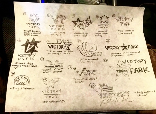
Before drafting any logo concepts, I devoted research to the fundamentals of logo design. There are many advantages to beginning the process with sketching. Ray suggests, “the mistakes you make in sketching on a paper become the idea of a logo” (Ray, 2018). I transformed this information into 15 logo sketches (as pictured below).
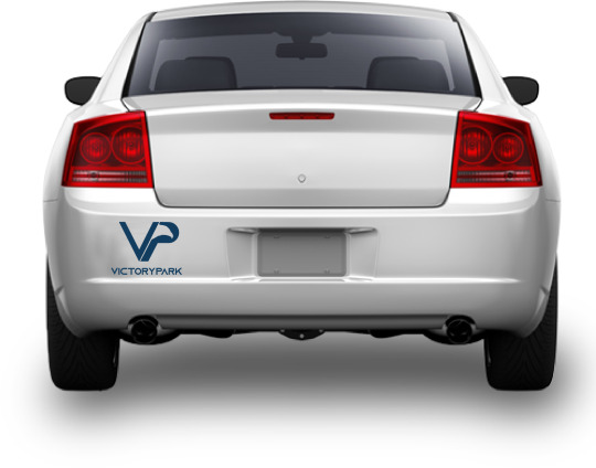
Research was devoted to which brand assets would be the most cost effective and gain the most visibility for the Victory Park district. The bumper sticker was an obvious choice for an effective branding tool. “Compared to many other promotional mediums, stickers are highly cost-effective” (Zee, 2017). Therefore, I transformed this into information into development of a car sticker (pictured below).
• Problem Solving — What design problem were you solving? What design problem does the medium you designed for solve according to the industry? How did you solve the problem? Restate your design problem to help explain this section. Remember: A design problem is not the same as a technical problem.
The original design problem sought to be solved is to rebrand the Great Bridge Community into Victory Park. At this stage in the process the challenge is to create a logo that represents the brand, brand assets, and a brand guide. According to Parr, a brand guide “is the primary visual DNA of your company’s branding, though it can also reference grammar, tone, word usage and point of view” (Parr, 2018). It also, “describes, defines and presents examples of what your brand looks like in various visual media such as print, Internet and broadcast” (Parr, 2018). The brand guide supports the solution by keeping it consistent and available for others to review.
• Innovative Thinking — How does your work compare to others in the industry? How did you approach the subject of innovation? How is your work innovative?
Considering this was my first experience with place branding, the execution of the work isn’t overly innovative. In order to best execute this project I heavily relied on previous case studies, peer feedback, and designer’s intuition. However, the premise of my design solution is innovative in that in blends America’s history with diversity in a positive & progressive light. My work competes with others on a polished, professional level.
• Acquiring Competencies — What did you learn overall throughout this process? Any new software? Techniques? Skills? Explain.
I gained a better appreciation for InDesign through month 9. I dove into numerous tutorials to better advance my beginner skills with the program. I went from knowing minimal information about the software to familiarizing myself with the tools and commands that are readily available. Additionally, I learned more about using mock up templates to easily and professionally display my designs. The use of smart objects makes composing high quality examples simple.
A technique that I haven’t used in a long time came in handy for my car decal mock up. I had extreme trouble finding a mock up template of the back of a car that was in my budget and would best represent the decal. Ultimately I found a stock image of the back of a vehicle that would work but it already had a bumper sticker on one side. I placed the image in Photoshop and used the clone stamp tool to erase the sticker. I then placed the decal over the new bumper area for an almost seamless image.
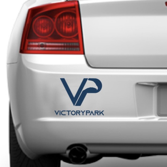
Reflection
This course added to my confidence as a professional graphic designer. Receiving encouraging feedback from my peers and professors has inspired me to push through and keep going. What I found most valuable was the Lynda video by Von Glitschka entitled “Logo Design: Illustrating Logo Marks”. This step by step tutorial shed light on great tips that will stick with me. The toughest part of the course for me was creating a catchy logo. The Glitschka video made creating the logo look very simple and it became frustrating when I wasn’t producing the same polished results. I had to constantly remind myself that the designer had been in the industry way longer than me and I will get better with time and practice.

Another project I found to be very beneficial was the creation of the brand assets. Researching what mediums are the most effective for your brand sheds light on the hard work it takes to run a cohesive media campaign. Creating visuals that corresponded with each other across the board was a challenge. Deciding on a car decal, pole banners, phone cases, and signage allowed me to let my creativity loose. My personal favorite outcome is the pole banner. It was created in both Adobe Illustrator and Photoshop.
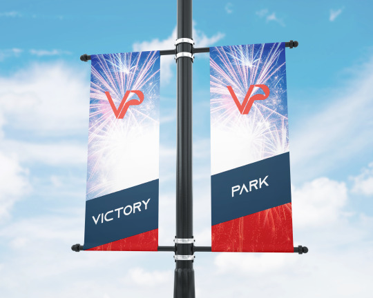
References
Parr, R. (2018, June 12). “What Is A Brand Style Guide and Why Does My Business Need One?” Retrieved from https://www.executionists.com/website-brand-style-guide/
Ray, H. (2018, March 10). “How To Proceed With Sketching Of Logo Design”. Retrieved from https://www.designhill.com/design-blog/how-to-proceed-with-sketching-of-logo-design/
Zee, B. (2017, June 15). “Why Big Companies Use Stickers in Their Marketing (and Why You Should Too)” Retrieved from https://stickerbeat.com/why-big-companies-use-stickers-in-their-marketing-and-why-you-should-too/
0 notes
Text
Design Integration Mastery Journal
Connecting/Synthesizing/Transforming — What research did you conduct and utilize to arrive at the design decisions you present. How did you connect the research to your design work? What information did you synthesize and pull from the research and how did you transform the information into what you've presented this month?
Research that was done to influence design decisions aided in making typographic choices, color choices, and texture choices. Research was done to investigate what type of fonts would be good for digital versus physical environments. The red, white, and blue color scheme is obvious for a patriotic brand in the United States but the shades of each color were selected based on consumer psychology and research. I transformed this information into the static vision board and the dynamic vision board.
Problem Solving — What design problem were you solving? What design problem does the medium you designed for solve according to the industry? How did you solve the problem? Restate your design problem to help explain this section.
The design problem sought to be solved is to rebrand the Great Bridge Community into Victory Park. At this stage in the process the challenge is to apply the appropriate voice and tone to the brand identity. The current perception is that the area is for predominantly Caucasian people. This is because of the amount of events that are centered around country music that take place in the area. To solve this problem I created an inclusive branding campaign that incorporates other cultures while recognizing the history and significance of the area.
Innovative Thinking — How does your work compare to others in the industry? How did you approach the subject of innovation? How is your work innovative?
The strategies used throughout this project are similar to what is done in the industry. The process of collecting and synthesizing research into final design solutions is common. However, the scope of what my solution is doing is innovative. Mixing history with diversity can sometimes be an awkward subject due to America’s pre-Civil Right’s era past. Intentionally making a campaign that would make everyone feel inclusive despite that past is innovative.
Acquiring Competencies — What did you learn overall throughout this process? Any new software? Techniques? Skills? Explain.
New competencies that were acquired through this course work range from the skill of researching, creating a brand voice, creating a tagline, and Adobe AfterEffects. I learned how to conduct research into a community. I also gained an understanding of how to create a brand voice. It is essential to know how to be a chameleon for different clients. “The best choice for one client in a certain situation may be totally wrong for another client, or even the same client when addressing another problem” (Stone, 2013). Technical skills on software were gained as well. Adobe AfterEffects was used to create the dynamic vision board. Learning how to edit frames and lay music over visuals to align with the narrative was a new idea to me.
Reflection
Throughout this course much knowledge was attained. First I understood how to create a brand voice through a brand voice chart. This allows the message to be specialized. I was then able to come up with a tagline for my community based on the established tone and voice. Then from this information I was able to compose a static vision board that aligned with my research.
I look forward to proceeding to the next course. I’m excited to see what media assets I can produce now that so much research has been conducted. I look forward to rebranding my local community. I hope that this assignment will be a strong part of my portfolio.
Brand Voice Chart
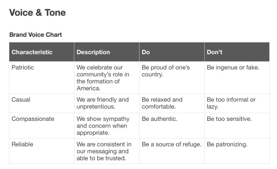
Static Vision Board
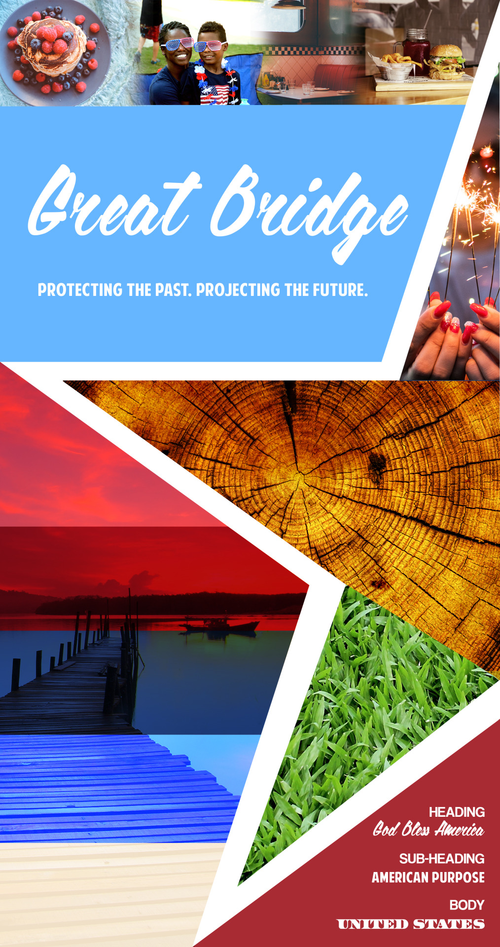
Dynamic Vision Board
youtube
References
Stone, T. (2013, January 7). “Define the Delivery Medium”. Retrieved from https://www.howdesign.com/parse/define-the-delivery-medium/
0 notes
Text
Design Strategies & Motivation
Connecting/Synthesizing/Transforming
I conducted primary and secondary research to arrive at my design decisions. I first did my research on the area of Great Bridge. I discovered its historical value as a battleground during the Revolutionary War. This allowed me to acknowledge the present day patriotism that exists in the area. I also immersed myself in the area by driving through and walking around the district. This allowed me to conduct interviews and engage with people on a personal basis. I got to understand subject’s motivations and behaviors. Freach writes, “Understanding behavior gives designers at least two important kinds of insight.” (Freach, 2011). It provides a sense of action and recognizes practices and patterns.
Problem Solving
The design problem that was being solved was to establish a brand identity for the area of Great Bridge. It is known for its history but it is not an inclusive area. Data shows that the area is predominantly white with Caucasians making up 75.1% of the Great Bridge population. This leaves African-American residents only making up 12.1%, Asians making up 3.4%, and Hispanics making up just 5.9%. A solution would be to establish the identity that Great Bridge is a modern and safe place to raise a family (Race and Ethnicity, 2018). Interviews reflect that some subjects didn’t feel included in the community. Shifting to a more diverse society will be an appropriate solution as well as making the area more socially competitive.
Innovative Thinking
With place branding we are technically copying techniques that have already be done. Conducting primary and secondary research and gathering quantitative and qualitative data is a staple in the place branding process. It was impossible to be innovative but I was able to think innovatively. I ran into obstacles when interviewing. I ran out of storage on my phone recorder. Instead of throwing in the towel I thought to take physical notes of the responses.
Acquiring Competencies
Many competencies were acquired in the process of exploring place branding. Interviewing subjects is something I was familiar with as a previous automobile accident adjuster. However, shifting the subject matter to community centered questions was new. I was able to successfully acquire interview skills. Translating those interviews into a final design solution is another competency that I acquired. Being able to connect the dots is essentially a skill in itself. Additionally, doing research and gathering photographic evidence was a competency I acquired. Also, I am able to distinguish the difference between place branding and fashion branding. Most importantly, I was able to acquire the competency of connecting and synthesizing.
Freach, J. (2011, May 27). The Art of Design Research (and Why It Matters). Retrieved from https://www.theatlantic.com/entertainment/archive/2011/05/the-art-of-design-research-and-why-it-matters/239561/
Race and Ethnicity in Great Bridge, Chesapeake, Virginia. (2018, September 18). Retrieved from https://statisticalatlas.com/neighborhood/Virginia/Chesapeake/Great-Bridge/Race-and-Ethnicity
Reflection
The Design Strategies and Motivations course has really given me a clearer outlook on the idea of place branding. This month was about establishing a brand identity for my local community of Great Bridge. The task was to find the voice for this community through messaging. Much research was needed to be conducted and then synthesized into a design solution. I utilized web search engines, interviews, literature, and personal observations.
Choosing an area was the first step. Deciding which areas to include based on socioeconomic factors and natural borders was essential to the process. Below is how I selected my district. Feedback given was to be careful in highlighting the area to be sure not to exclude or include certain areas. Also, below is a comparative analysis assignment where I compared two local communities to Great Bridge. This allowed me to find differentiating factors about my community that I could explore for technical purposes.
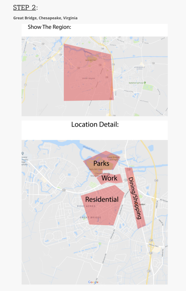
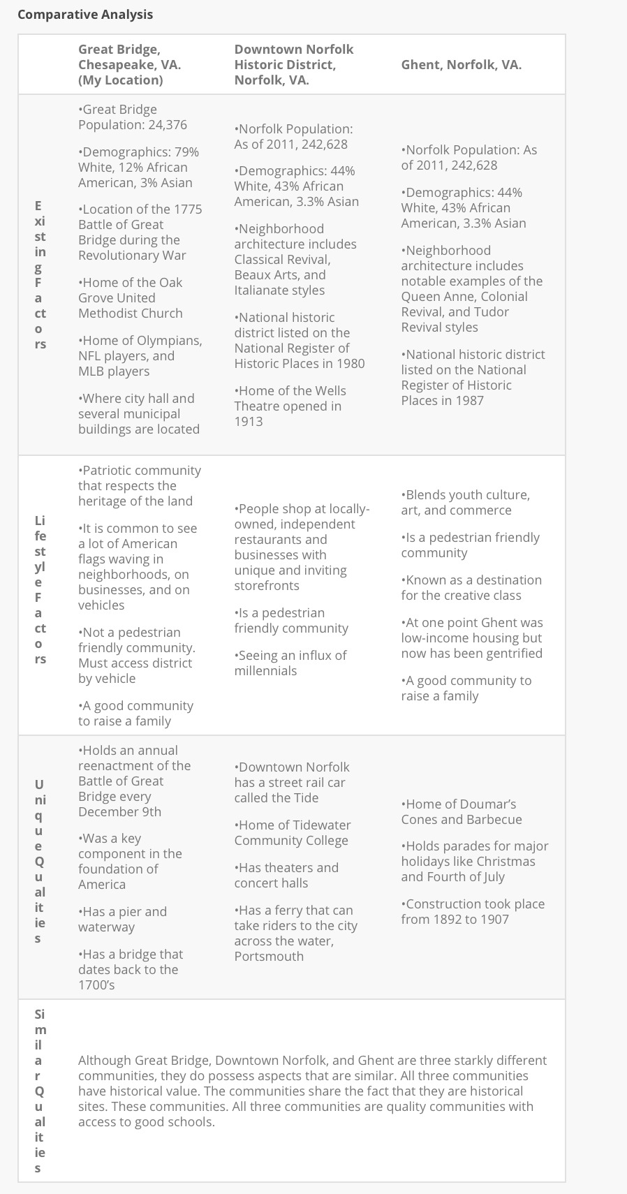
From here I am well prepared to venture into the Design Integration course. I’m open to challenging myself with developing visual components to my place branding concept. There will be guaranteed challenges like figuring out how to establish a brand for families when there is little to no entertainment in the area. If I was doing this project in reality for the area of Virginia Beach there would be possible resistance from residents. I may want to make the community more diverse. However, the majority group may be comfortable with the way things are and oppose change.
0 notes
Text
4.5 Mastery Reflection
Connecting/Synthesizing/Transforming - What research did you conduct and utilize to arrive at the design decisions you present?
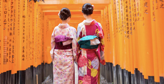
The research that was initially done was on the city of Kyoto. I discovered wonders like the Bamboo Forest, Torii gates, traditions, and tea ceremonies. Research was done to come up with a color scheme. Blue and green were then selected based on the research. Cherry noted that “green is a cool color that symbolizes nature and the natural world” (Cherry, 2018). “Blue is a color often found in nature such as the pale blue of a daytime sky or the rich dark blue of a deep pool of water” (Cherry, 2018).
Problem Solving - What design problem were you solving? What design problem does the medium you designed for solve according to the industry? How did you solve the problem? (***Remember - a design problem is not the same as a technical problem***)
The design problem to be solved is to increase tourism in Kyoto. The problem was solved through an audio visual campaign. The campaign utilized motion graphics are to promote the brand.
Innovative Thinking - How does your work compare to others in the industry? How did you approach the subject of innovation? How is your work innovative?
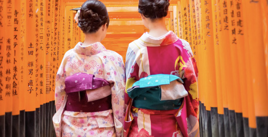
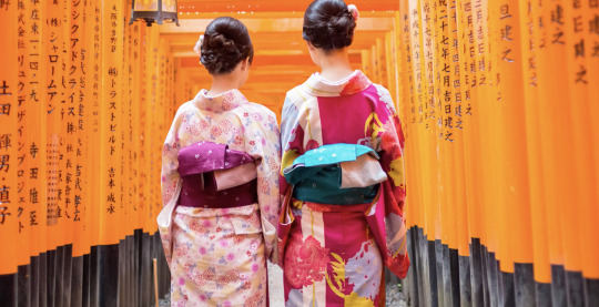
My work compares to others in an innovative way because I used the parallax imagery to push the narrative.My work consists of people walking down a path through gates almost resembling a virtual reality environment.
Acquiring Competencies - What did you learn overall throughout this process? Any new software? Techniques? Skills? Explain.
I was familiar with AfterEffects for basic creations like lyric videos for songs where the words would pop up when it was sung in the music. However, with this project I better understood key frames. Simultaneously, using Photoshop and After Effects I was able to use both to my advantage for the project. A skill I obtained was how to prioritize the software. With so many Adobe options it reminds me of having a box full of tools. You have to know which to use for the fastest and most efficient creation for your project. Most importantly, the concept of planning was acquired.
PARALLAX SCREENSHOTS
In addition to demonstrating the above, reflect on your experiences in this course and state where you plan to go from here. Post your reflection in your Mastery Journal in 2-3 paragraphs. Include relevant screenshots from this month’s projects with short written captions for each.
This course was quite a challenge for me. It started off smoothly and towards the end life circumstances arose. I was able to rise through the adversity to get my assignments done. Maybe not to the caliber I had wanted but considering the circumstances I am proud of what I have accomplished in this course, When I first learned this was a motion graphics course I was terrified. But after researching and applying myself, I found this course to be enjoyable.
From here I plan to expand my knowledge of motion graphics. I plan to research more into the Cinemagraph. I can apply these techniques to my freelance projects and impress clients. This class has given me the confidence to continue as a motion graphic’s designer.
References
Cherry, K. (2018, July 9). The Color Psychology of Blue. Retrieved from https://www.verywellmind.com/the-color-psychology-of-blue-2795815
0 notes
Text
5.4.2 Mastery Journal Reflection
Synthesizing
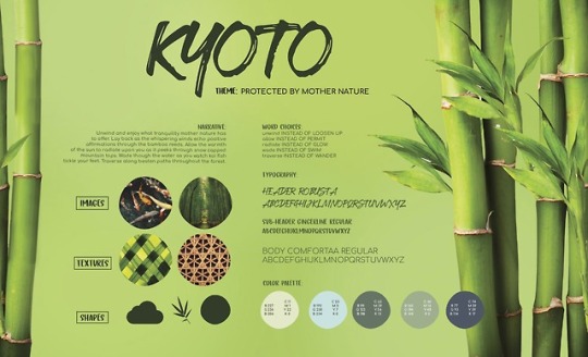
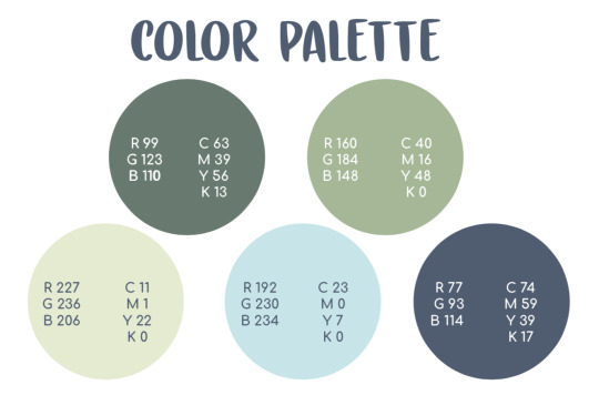
I researched many concepts so I could make the most informed design decisions. Concepts that struck me were the power of color psychology. I found that the types of colors that you use can convey different messages. My project was themed “Protected by Mother Nature” and needed to convey a natural, serene message. Within my research, I discovered information that indicated that blue and green would convey the message I was aiming for. Cherry writes, “Blue is a color often found in nature such as the pale blue of a daytime sky or the rich dark blue of a deep pool of water” (Cherry, 2018). “As the color of the spirit, it invokes rest and can cause the body to produce chemicals that are calming and exude feelings of tranquility” (Bourn, 2011). Next, I researched the color green. “Green is a cool color that symbolizes nature and the natural world” (Cherry, 2018). I used this information to create a seamless blue and green color palette.
[Examples]
Problem Solving
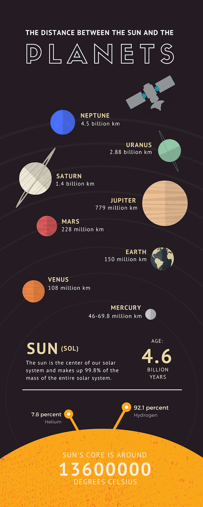
The biggest design problem that I faced this month was how to layout my infographic in the most aesthetically pleasing way. When I originally thought to do a vertical infographic it was easy to think of a grid pattern to layout the info. “Columns are essential tools to standardize your layout” (Nikola, 2013). However, When applying this to a horizontal vision board I didn’t like the results. To solve this design problem I created a timeline like visual.
[Example]

Innovative Thinking
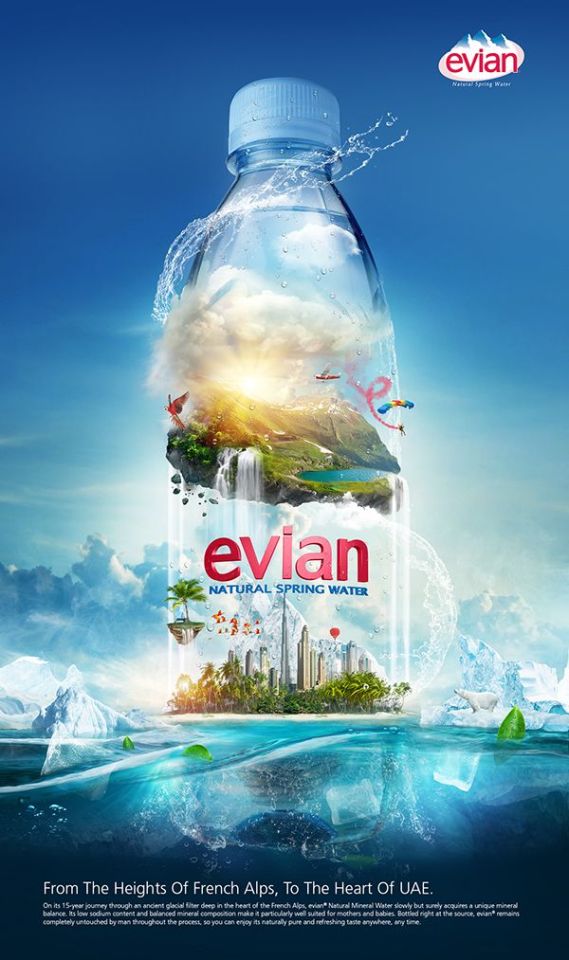
A popular way to disseminate information creatively is through an infographic. It is “a collection of imagery, charts, and minimal text that gives an easy-to-understand overview of a topic” (Nediger, 2018). This month I challenged myself to think critically on how I could design my infographic with innovation. I looked at many infographics and mentally noted commonalities between them all. The most evident common practice in the designs were that they were for the most part all vertical. I made the intentional design decision to design my infographic horizontally.
[Examples]
Acquiring Competencies
Three competencies that I improved upon this month are my typography skills, APA formatting, and time management. In regards to typography, I was able to improve upon the overall look of my work by keeping in mind the baseline grid. Even though I used various text sizes and weights, they all aligned to the baseline grid. “The baseline of a piece of type can be forced to ‘snap’ to this grid to maintain continuity across the pages of a design” Ambrose & Harris, 2011, p.50).
[Example]
A soft skill that I’m acquiring through this month’s coursework is time management. A lot of grad students work full time jobs and have many responsibilities in addition to school. My problem is opposite than most. I don’t work a full time job so I have a lot of time on my hands. Even with the extra time, if I don’t know how to manage it I can still potentially not do my work timely. Over the month I battled procrastination in hopes of becoming better at time management. I used tools like a physical planner, my iPhone calendar, and my iPhone alarm to stay on top of my deadlines.
Lastly, I learned how to use a theme to create a cohesive branding campaign. Choosing the narrative proved to be difficult for me at first but once I figured that out the designing became easier. The theme tied right in to learning voice and tone. I learned that “voice is the character of the brand” while “tone is the expression of that brand character to the audience at hand” (Potts, 2016).
References
Ambrose, G., & Harris, P. (2011). “The Fundamentals of Typography” (second edition). AVA Publishing.
Bourn, J. (2011, January 15). Color Meaning: Meaning of The Color Blue. https://www.bourncreative.com/meaning-of-the-color-blue/
Cherry, K. (2018, July 9). The Color Psychology of Blue. Retrieved from https://www.verywellmind.com/the-color-psychology-of-blue-2795815
Nediger, M. (2018, August 20). What is an Infographic? Infographic Examples, Templates, and Design Tips. Retrieved from https://venngage.com/blog/what-is-an-infographic/
Nikola, J. (2013, April 20). Magazine Columns – Backbone of Every Good Layout. Retrieved from http://www.magazinedesigning.com/magazine-columns/
Potts, K. (2016, July 11). What is the difference between voice and tone? Retrieved from https://medium.com/evoking-brand/what-is-the-difference-between-voice-and-tone-5f0fca775520
0 notes
Text
5.2.1 Rationale
Shapes & Textures:
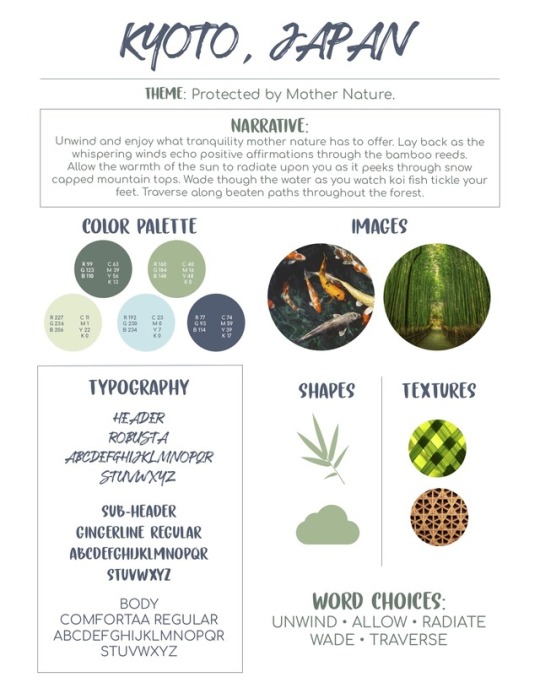
“Organic shapes are those that often represent things found in nature. These shapes are more free flowing and less symmetrical” (Cousins, 2015). I chose organic shapes to convey a feeling of nature. The shapes that I chose were of a bamboo leaf and of a cloud. “When we want to convey an emotional message or a sense of calmness and naturalness, organic shapes serve our purposes best” (Organic Shapes, n.d.). The textures chosen were of wood and of plant texture. This connects with the earth because they are products of Mother Nature.
Imagery:
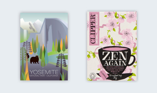
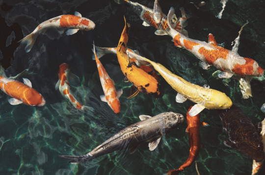
All images used in the campaign are of natural scenarios. No people are depicted in the pictures because it is focused on the environment.

Color Palette:
I chose blue and green because they are both colors that convey naturalness. “Blue represents both the sky and the sea" (Bourn, 2011). “As the color of the spirit, it invokes rest and can cause the body to produce chemicals that are calming and exude feelings of tranquility. Blue helps to slow human metabolism, is cooling in nature, and helps with balance and self-expression” (Bourn, 2011). “Green, the color of life, renewal, nature, and energy, is associated with meanings of growth, harmony, freshness, safety, fertility, and environment” (Bourn, 2011).

Typography:
The calligraphy style font is chosen to allude to the beauty of Japanese writing. The following quote explains the process of calligraphy and the result of the writing. “The master creates a work of art by bamboo brush and inks on the rice paper. It transfers harmony and beauty” (Japanese Calligraphy, n.d.)
References
Bourn, J. (2011, January 15). Color Meaning: Meaning of The Color Blue. https://www.bourncreative.com/meaning-of-the-color-blue/
Bourn, J. (2011, January 15). Color Meaning: Meaning of The Color Green. https://www.bourncreative.com/meaning-of-the-color-blue/
Cousins, C. (2015, May 12). The (Sometimes Hidden) Meaning of Shapes. Retrieved from https://designshack.net/articles/layouts/the-sometimes-hidden-meaning-of-shapes/.
Japanese Calligraphy. (n.d). Retrieved from https://www.japancalligraphy.eu.
Organic Shapes in Design: Definition & Use. (n.d.). Retrieved from https://study.com/academy/lesson/organic-shapes-in-design-definition-use.html.
0 notes
Photo
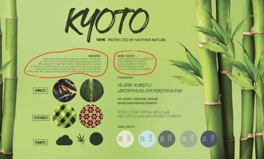
Kyoto Style Sheet
1 note
·
View note
Text
4.4.1 Mastery
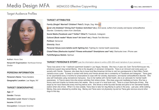
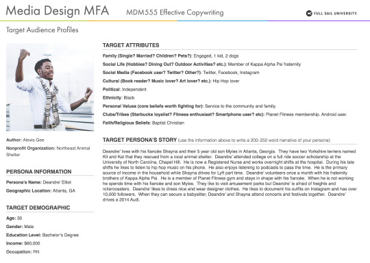
My target audience is composed of men and women ages 25-34. This segment of the population is often referred to as Millennials. Research was done to reveal what outlets would be best to direct the campaign messaging. Connecting the research to the project allowed me to institute a social media segment of the campaign to reach millennials. My personas were of Tiana and Deandre. Both are millennials that constantly use social media to start connected.
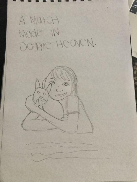
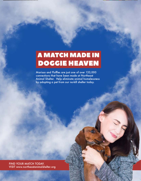
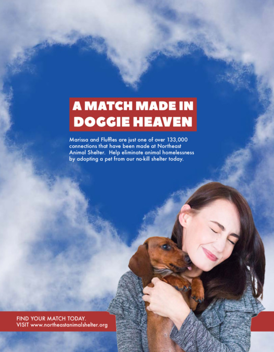
For the Northeast Animal Shelter advertising campaign, I selected six types of testimonials based on George Felton’s categories. The first type of testimonial was “Plain Folks”. For this ad I illustrated a regular young woman hugging a dog with a headline that reads “A MATCH MADE IN DOGGIE HEAVEN”. George Felton described why this is effective. He stated that “people trust other people more than they do corporations” (Felton, 2013, pg. 246). Word of mouth is stronger than claims from a brand.
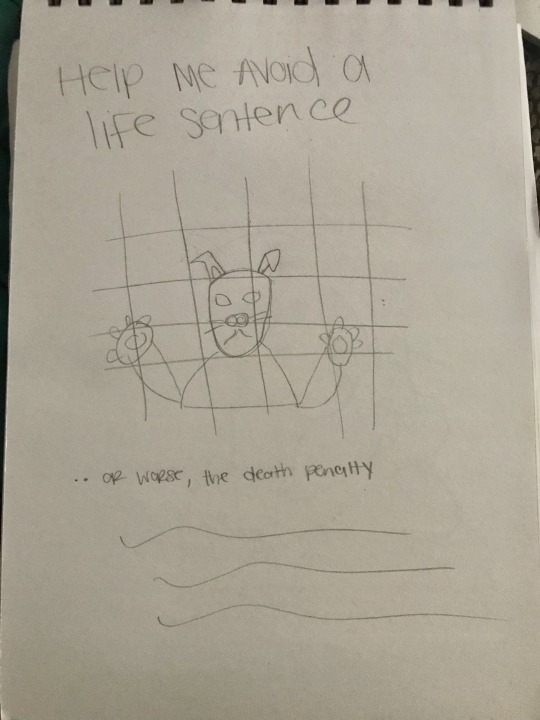
The next type of testimonial I chose was an “Expert”. The imagery is of a dog behind bars pleading “HELP ME AVOID A LIFE SENTENCE”. The dog is an expert because he is the one experiencing the shelter. Felton advised to “find somebody who stands outside the brand and has the expertise to evaluate it” (Felton, 2013, pg. 241).
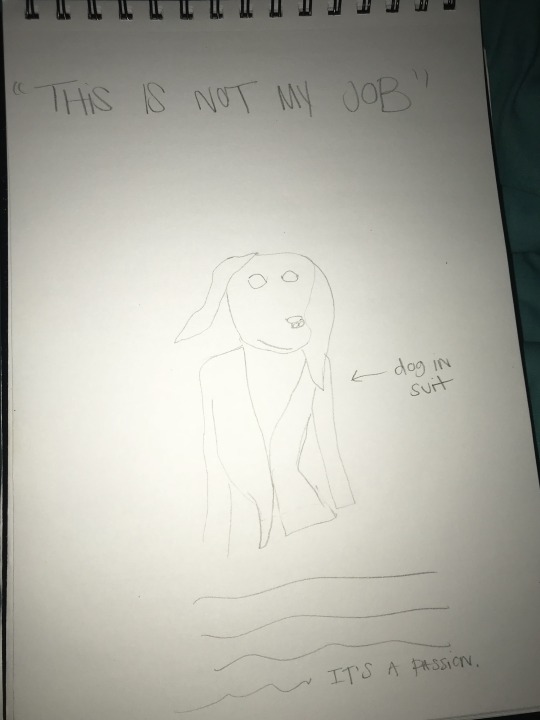
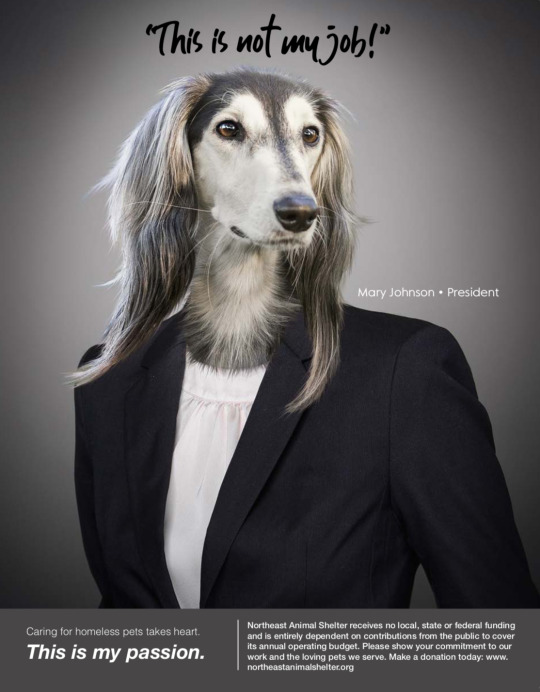
The “CEO” type of testimonial formed the basis of my next ad concept. It is of a dog in a suit representing the CEO stating “THIS IS NOT MY JOB….THIS IS MY PASSION”. CEO testimonials according to Felton “give the brand a human face” (Felton, 2013, pg. 241).
The next advertisement is an example of an “Ironic” testimonial. There is a large lumberjack guy that looks intimidating saying he isn’t a dog person, but he is an Andy person. You wouldn’t expect this type of guy to have an affectionate side for animals so that is why it is ironic. Felton states that “ironic testimonials gain absurdist power” (Felton, 2013, pg. 245).

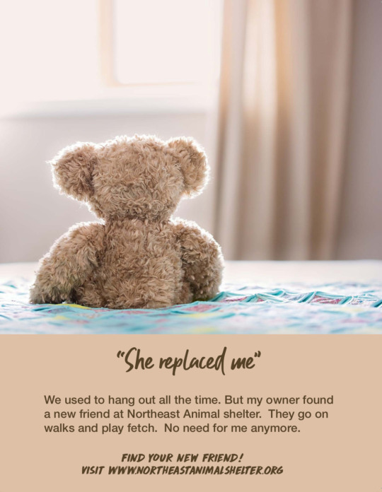
The next advertisement is an example of “Unreal People”. It is spoken from the angle of a teddy bear that has been replaced. He discusses being forgotten about because his owner found a new pet. This type of advertisement is utilizing an unreal person to make a point. Felton wrote that this type of character can be used “for their attention-getting quality as well as their unusual ‘relationship’ to the product” (Felton 2013, pg. 246).
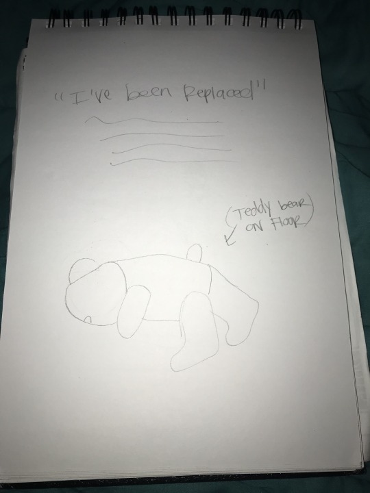
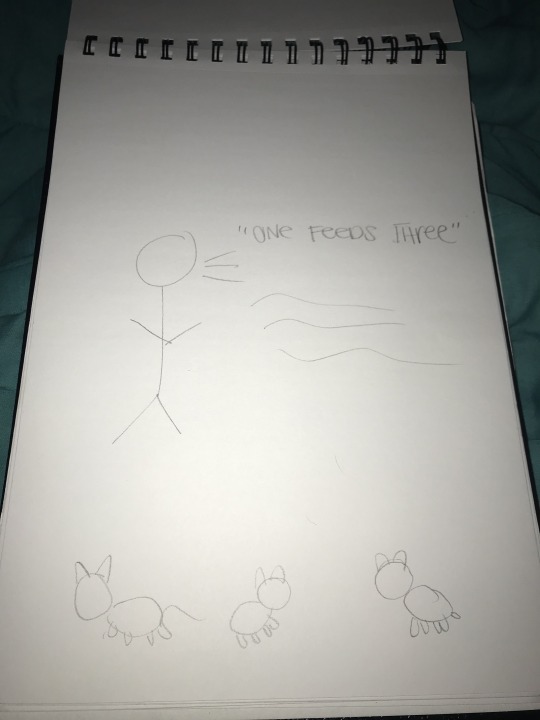
The last example was a hypothetical example of a “Celebrity” testimonial. People trust their favorite celebrities’ opinion when it comes to selecting brands. This ad’s imagery would be of a celebrity juxtaposed with 3 animals. It would say “Here at Northeast Animal shelter it cost only $1 to feed 3 shelter pets a day. Won’t you consider making a $30 donation: northeastanimalshelter.org“. This is to make the point that it doesn’t cost much to feed shelter pets when donations are made.
From the 6 sketches I chose 3 concepts to transform into my 3 initial comps. I developed the concepts by brainstorming the headlines first. For example, Ad A I chose to play with a cliché. Instead of using “A MATCH MADE IN HEAVEN” the headline reads “A MATCH MADE IN DOGGIE HEAVEN”. According to Felton traditionally cliché’s should be avoided. He does list an exception. He writes, “clichés can work in advertising, drawing people in with their familiarity but surprising them with your witty alterations of the expected langauge” (Felton, 2013, pg. 215). Therefore, inserting the word “DOGGIE” is a way to put a twist on an overused expression. I wrote the best body copy by adhering to tips by George Felton. He recommends ”all good copywriters read aloud (at least in their heads), solicit commentary, and then, invariably, rewrite” (Felton, 2013, pg. 128).
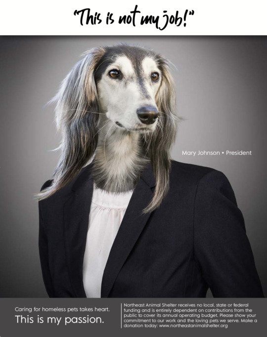
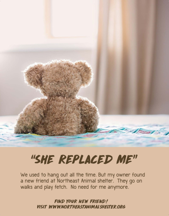
I found difficulty in making the ad campaign seem consistent across all 3 design solutions. This is because the ads are all three strikingly different concepts. I did attempt to make revisions that would make the campaign look somewhat consistent. Per market research, I changed some of the fonts to Helvetica to appeal to the target audience. Ads B and C were changed to share the same header handwritten font, while the body copy is in Helvetica. Doing the same to Ad A wasn’t successful so I left that font unchanged. On Ad A I enlarged the picture of the pet owner and puppy. As recommended, for Ad B I extended the gray area for the headline. This way the ad is no longer segmented into boxes.
However, the feedback from the instructor I received was positive. My professor suggested how I could turn Ad A into a cohesively branded campaign in the future. I can use different types of dogs and dog owners for the imagery on Ad A to make it cohesive.
3 TAKEAWAYS
The first takeaway that I learned from Effective Copywriting is that good copywriters need to read just as much as they write or even more. Exposing yourself to literature can improve writing skills. The second takeaway is from Craig Smallish. He advised that “one of the most important things a creative can do is produce as many different ideas as possible” (Smallish, 2013). Lastly, I learned that in APA formatting the title must go above the start of the body of the paper.
References
Felton, G. (2013). Advertising: Concept and Copy. New York, NY: W.W Norton & Company.
Smallish, C. (2013, August 16). Developing Ideas and Design Concepts [Lynda.com online course] Retrieved from https://www.lynda.com/Design-Business-tutorials/Developing-Ideas-Design-Concepts/126121-2.html
0 notes
Photo
Final Vision Boards
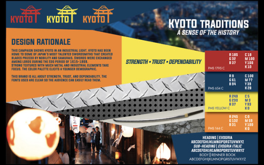
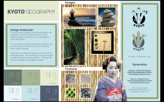
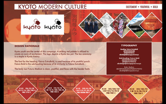
With the feedback of my peers, Professor Kratz, and my own self-evaluation, I made various changes to my brand vision boards. For the Traditions brand, Professor Kratz challenged me to explain why I went in an industrial direction. With further research I discovered that Kyoto was “home to some of Japan’s most talented swordsmiths, who have produced many famous blades” (Kyoto National Museum). For the geography vision board I was challenged to make the border more irregular. An irregular border would be more cohesive with the “natural” keyword. I changed the border to a more rough edged border to align with the feedback. I changed the culture board completely. In an effort to make the board more exciting I got rid of the box like border. I added diamond shapes and made more of the background visible.
References
Kyoto National Museum. “Swords of Kyoto.” https://www.kyohaku.go.jp/eng/special/tenrankai/katana_2018.html. Accessed on [2018, November 16].
0 notes
