
liom-ids
47 posts
sideblog for providing visual accessibility aids to the liom community
Don't wanna be here? Send us removal request.
Statistics
We looked inside some of the posts by liom-ids and here's what we found interesting.
Average Info
Notes Per Post
16K
Likes Per Post
9K
Reblog Per Post
7K
Reply Per Post
19
Time Between Posts
12 days
Number of Posts By Type
Note
9
Text
8
Last Seen Tumblr Blogs


Fun Fact
Tumblr is available in 18 languages.
Note
hello! You may have answered this before, but I was wondering, is it better to include transcripts in alt text or in the text of a post?
I have been asked this before, and the answer is I don't know. I don't use a screenreader and don't need IDs, so I don't know what works best for those who do. I don't know about the other mod, but I'm not able to give you this kind of advice, because it's likely to be innacurate. I'm just doing my best to make sure people who do need IDs are able to have them.
8 notes
·
View notes
Note
Hello! @paranoid-and-pretentious here! I was wondering if you could make some IDs for my flags? I'm not entirely sure how to do IDs and I want to be accessible. Thank you so much for your time, I will attach a few, and if you respond I can send in more!
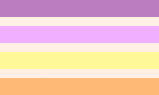


ID 1: a rectangular flag made up of 7 horizontal stripes. The stripes from top to bottom are dark lavender, off-white, lavender, off-white, light yellow, off-white, light orange. The off-white stripes are smaller than the others. End ID
ID 2: a rectangular flag made up of 5 horizontal stripes. The stripes from top to bottom are dark teal, light teal, pink-ish red, light teal, dark teal. The pink-ish red stripe is bigger than the others. End ID
ID 3: a rectangular flag made up of 5 horizontal stripes. The stripes from top to bottom are lavender, dark lavender, brown, light green, pale green. End ID
ID 4: a rectangular flag made up of 5 horizontal stripes. The stripes from top to bottom are dark grey, green, light green, pale green, off-white. The grey and off-white stripes are bigger than the others. End ID
ID 5: a rectangular flag made up of 5 horizontal stripes. The stripes from top to bottom are light grey, lavender, grey-ish purple, darker purple, dark brown. The light grey and dark brown stripes are bigger than the others. End ID
4 notes
·
View notes
Text
i think more people need to listen to blind and visually impaired people when they talk about how they interact with media and the internet and stop making up your own rules because “well i think” i don’t care what you think with peace and love. alt text is important and should be used regardless if you think just putting the description below is “good enough”. they’re literally not even the same thing. use both.
4K notes
·
View notes
Note
hi! can i ask for a template ID for this kind of flag template?
https://at.tumblr.com/kiruliom/palettegender-example-templates/c39y9own60ql
template id: a rectangular flag made up of [insert number here] wavy diagonal stripes, going from the top left to bottom right. in the middle is a [insert colour here] circle with smaller circle cut out of the middle. the stripes from leftmost to rightmost are [insert colours here]. end template id
hope this helps :)
3 notes
·
View notes
Note
"Accessibility" ruins aesthetics
It doesn’t tbh y’all’s aesthetics are just shit
7K notes
·
View notes
Text
accessibility and aesthetics, as well as just having fun and being yourself, are things that can co-exist if you put in the effort. the reason why it's hard is because people are often not taught to value these kinds of things to begin with.
so yes, it does cause changes, because being used to having accessible web design and text is new and weird. abled people have the option to ignore disabled people every day of their lives. but it's not hard because we're asking a shit ton of you, because we aren't. the issue has always been the inaccessibility of that design, not disabled people who are unable to properly use or see it.
less complaining to disabled people about how hard it is to accommodate and more learning how to do so. aesthetics will never be as important as functionality in public spaces or on public blogs that you're intending to share. placing value on things looking "cool" over whether or not anyone can actually use it is not just ableist, it's also just ridiculous. people are willing to help you and be nice to you and guide you, and even do some things for you if you let them.
33 notes
·
View notes
Note
in a fit of angry passion, i write. here's my guide to graphic design, for anyone and everyone who has been tagging "eyestrain tw" on every post. - look at your color wheel. is the color all the way up in the top right corner? does the hex code have "FF" or "00" at the back of it and it's not white/black? move it down. somewhere more in the center, leaning more left or right depending how desaturated you want it. desaturated is the adjective for desaturation, removing saturation. (how bright a color is) (explaining because sometimes i get people asking what it means if i use it in an id or something) - turn your brightness down for a minute. look at your flag, can you tell the difference between the stripes? if you can't, lighten or darken the stripe. still can't? hue shift it. just a little bit, doesn't need to be anything drastic. just take the wheel/bar and move it ever so slightly to the left. - if your flag is still straining eyes, time to grayscale it. this desaturates it. many ways to do this, using a gray color on it with the "color" blending filter (on most art softwares), using a gradation map, etc. i typically just desaturate them myself one by one, but obviously that's not the best way to do it lol. i use this site. if it still is, green, cyan and pink tend to be the main offenders. might want to darken those manually and see if it still is. there's probably more i missed, but there's just an overview. tldr: - don't use colors at the very top right of the color wheel. - turn down your brightness, shift colors so they're clearly different from one another. - grayscale eyestrain flags.
👏🏻👏🏻👏🏻👏🏻
47 notes
·
View notes
Text
people on tumblr learned the term "conflicting access needs" and decided that it means "my needs take priority over everyone else's"
4K notes
·
View notes
Text
- dos and don'ts of adding plain text
this is a simple guide meant to help people who want to add a plain text version of their formatted text on their posts but aren't sure how to go about it.
disclaimer: this post is long, but separated into sections using emojis
❌️ put the plain text at the bottom of the post, under a read more, on a link, etc
this makes it harder to find the plain text and makes disabled people have to go through more steps to actually access your post. links are specially bad because if they break, the plain text is lost. a read more will break if your blog is deleted or you change your url.
✅️ make it directly above or below the original text
this way, it's much easier to find for the people who need it, and won't have the risk of breaking or no longer appearing if something happens to your blog
❔️ parenthesis or no parenthesis?
the use of brackets or parenthesis at the start and end of a plain text transcribe isn't too necessary, but it isn't harmful either, so it's up to you to decide if you want to add that or not.
❌️ lack of start and finish mark
if you don't make it clear where the plain text starts and finishes, it will just be confusing, and people will struggle to figure out if it isn't just a caption to the post. people who use screen readers will also have a hard time telling apart the transcription and any comment or caption added
✅️ add a start and finish mark
you can make that in several ways, such as, but not limited to:
- PT: plain text here. End PT
- Plain Text: plain text also here. End of Plain Text
- Start Transcription: plain text here as well. End Transcription
❌️ make the contents different
plain text is meant to make inaccessible text be accessible. if you think the wording on your post is bad, or made a typo, don't use the plain text to fix that
✅️ keep it the same
remember, if you edit the original text, you should also edit the plain text
❌️ make it formatted
plain text is what it says on the tin, plain, default. if you format it in any way, like making it bolded or colored, it'll defeat the purpose of having it in the first place
❔️ what to add plain text to?
any sort of formatted text, such as bold, italics, large or title text, small text, special fonts, colored text, and such
❔️ what not to add plain text to?
bullet points, numbered text and indented text. they may sometimes not actually be read by screen readers, but cause no harm as far as i'm aware
✅️ add to your posts
if someone turns the text from your post into plain text, add it to the original. this way, more people will see the plain text version and it will be more easily accessible then if left ignored
❔️ what if i can't make it?
if, for any reason, you can't add plain text to your post, you can always request people to do so! it's not bad to ask for help and there are plenty of blogs on this site focused on accessibility that could help you with that. and, again, if someone does add plain text to your post, add it to the original
this is all that i could think of, for now, but i hope this is helpful to anyone looking to make their blog accessible
221 notes
·
View notes
Text
hate you post written in smalltext hate you so so so so much
896 notes
·
View notes
Note
hi; im back! again!
do you mind describing this artwork for me, if it's not too much trouble? /nf
sorry if that's also eyestrain-y. /gen
i have a hard time figuring out what counts and what doesn't
the image is not eyestrain, no, but it is also not liom-related, so i will instead be directing you to the people’s accessibility server (link), which has a dedicated channel for providing and helping with image descriptions
1 note
·
View note
Note
i (starrygender) have been making a lot of flags and such, but i struggle every time i try to id flags! i can id literally anything else, but not flags for some reason, so i hope you dont mind me sending in a few flags every now and then so i can be more accessible! i think this is five images, but sorry if i sent more
https://at.tumblr.com/starrygender/can-i-get-an-objectum-term-for-being-attracted-to/r1whvnpbd0oe
https://at.tumblr.com/starrygender/can-u-make-an-objectum-term-for-attraction-to/q8e1opcll2p2
https://at.tumblr.com/starrygender/could-you-please-design-a-flag-for-age-regressors/k5awfpyg1kxn
https://at.tumblr.com/starrygender/an-objectum-ter-for-when-youre-attracted-to/xj53wql5aun7
just a heads up, there are 9 flags in total from all of the links. i'm still gonna do them, but maybe next time just have a look at how many flags are in each link, cause most of them have more than 1 flag
Sportsbikum: a rectangular flag made up of 5 vertical stripes and the outline of a black circle in the middle. The stripes from left to right are light green, pale green, yellow, dark red-ish orange, dark red. End ID
Motorcyclum: a rectangular flag made up of 5 vertical stripes and the outline of a black circle in the middle. The stripes from left to right are light red, orange, yellow-ish green, dark yellow-ish green, dark blue. End ID
Microwavum: two rectangular flags made up of 8 vertical stripes and the red outline of a circle in the middle. The stripes from left to right on both flags are grey-ish blue, light blue, light yellow, pale yellow, light orange, grey-ish blue, dark grey-ish blue. On both flags, the light yellow and orange stripes are a lot bigger than the other stripes. The left flag has an overlay on the three middle stripes. The overlay makes the stripes appear dotty and shiny. End ID
Objectum agere:
Images 1 and 2: two rectangular flags made up of 5 vertical stripes and the outline of a circle in the middle. The only difference of the flags are the colours of the circles. The one on the left has a light purple circle, and the one on the right has a circle made up of lots of different colours, giving it an irridescent look. The stripes from left to right on both flags are light blue, light yellow, white, light yellow, light pink. End ID
Images 3 and 4: two rectangular flags made up of 4 horizontal stripes and a light purple circle. The only difference of the flags is that the left flag has an outline around the circle. The outline is made up of lots of different colours, giving it an irridescent look. The stripes from top to bottom on both flags are light yellow, light blue, light pink, white. End ID
Obcutum: a rectangular flag made up of 17 vertical stripes and the outline of a light indigo circle in the middle. The stripes inside the circle are slightly different to outside the circle. The stripes outside the circle, from left to right, are light turquoise, turquoise, dark teal, indigo, light purple, pale pink, light pink, pink, darker pink, pink, light pink, pale pink, light purple, indigo, dark teal, turquoise, light turquoise. The four outside stripes on each side are very small, as well the two stripes on either side of the darker pink stripe. Inside the circle are 5 vertical stripes of the same colours as outside the circle, but of different sizes. The stripes inside the circle, from left to right, are light pink, pink, darker pink, pink, light pink. Instead of both the light pink and pink stripes being very small, only the pink stripe is small. End ID
1 note
·
View note
Note
Hi I am a blog similar to this, @mogai-described,,
Realizing the tone of my last ask may seem bad :bangbang:, what I'm asking is that is there any way we could like, team up? I haven't had the spoons to run the blog recently- @mogai-described
it seems that this blog has deactivated or something similar, because i can't find them, but if anyone has blogs that focus on making ids, feel free to add me (@gendiegremlin) to the blog. i'd love to help /gen
0 notes
Text
hello :) i am a new mod on this blog (@gendiegremlin). asks will probably be responded to faster now cause there's two of us
2 notes
·
View notes
Note
Hi, me again. May you please describe this for me?

As well as make description templates for these (The left one its similar coloring, the right completely different but same layout) /nf


Also thank you thank you THANK YOUUU so much for helping me with my previous requests /p, I was genuinely having a very hard time figuring out a way to describe them
you're welcome! for the second image, i will note different hues do look different at the same numerical saturation, but i would describe the colors pictured with these adjectives, in order: dull, dull + pale, soft, deep, light, muted, soft + deep. for both the second and third image, i encourage you to reference my description templates (link) and writing process outline (link), and the aldernic symbol is now available in the former.
[IMAGE DESCRIPTION: a rectangular flag of 6 centered and evenly-spaced concentric circles, each with a thin border on the outside, save for the innermost two circles. the colors of the circles, innermost to outermost, are: pale pink, dusty magenta, dull rosy pink with a magenta border, pink-purple with a dull purple border, soft blue-purple with a soft true blue border, and soft cyan. in the center of the flag, there is a dull purple circular symbol. the symbol consists of a hollow circle, with two equally-spaced straight horizontal lines inside it splitting it into thirds, and two curved lines forming an oval taller than it is wide, with the height being the same as the circle it's inside. the circle's outer outline is dull dark purple, and the cutouts formed by the lines inside the circle each are outlined in a translucent purple-pink. END DESCRIPTION]
4 notes
·
View notes
Text
finally getting to requests today! apologies for the wait, disability & irl obligations make for less time and energy to spare
3 notes
·
View notes
Text
when you say "it's okay to continue making inaccessible content so long as it's tagged," whether intentionally or not, the core meaning of the statement is "it's okay to functionally exclude disabled people from your content so long as you tell them so beforehand." and it is marginally better than no tag or warning at all, but that course of action does not address the actual problem of inaccessibility, and certainly doesn't work towards solving it.
#activism#been seeing a lot of good convos on discord lately so here's a slightly modified version of one of my messages
34 notes
·
View notes