
Statistics
We looked inside some of the posts by m-ercurian and here's what we found interesting.
Average Info
Notes Per Post
802K
Likes Per Post
388K
Reblog Per Post
413K
Reply Per Post
626
Time Between Posts
16 hours
Number of Posts By Type
Text
16
Photo
1
Last Seen Tumblr Blogs


Fun Fact
The Tumblr app for Google Glass was released on May 16, 2013.
Text
i hate when you google a word and some fucking company comes up instead. Do you think you are more important than the english dictionary you piece of shit corporation
128K notes
·
View notes


Text


FILMS WATCHED IN 2025 FOUNTAIN OF YOUTH (2025) Dir. Guy Ritchie
154 notes
·
View notes

Text


What are you thinking about?
THE BEAR | 2.08: BOLOGNESE
274 notes
·
View notes
Text


AGATHA CHRISTIE'S POIROT: THE MYSTERIOUS AFFAIR AT STYLES (1990)
dir. ross devenish
186 notes
·
View notes
Text
It's jarring to see how many people deeply believe that the progressive solution to the oppression minorities face in their countries is to distill each country into its constituents and give each group its own mini ethnostate.. do you, by any chance, know if the mossad is hiring? Should we send women to Venus and men to Mars?
3K notes
·
View notes
Text


brought my little camera on my walk yesterday. still trying to learn the basics of photography and i’m having a great time so far
1K notes
·
View notes
Text
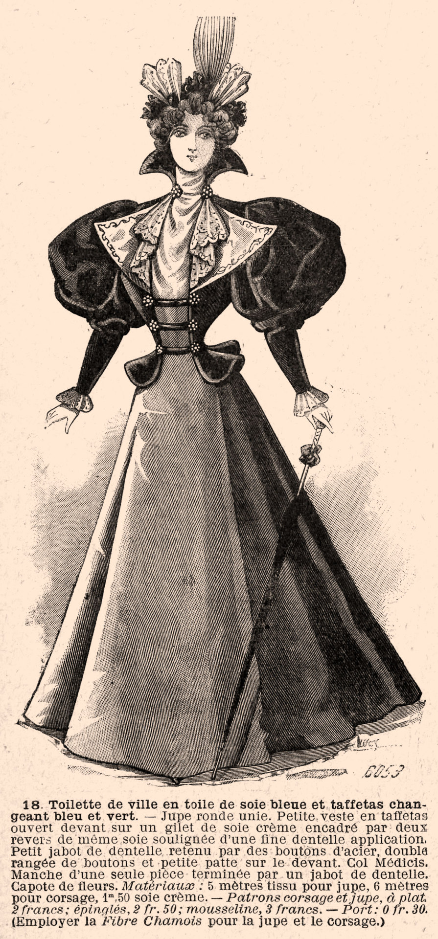
Le Petit écho de la mode, no. 24, vol. 18, 14 juin 1896, Paris. 18. Toilette de ville en toile de soie bleue et taffetas changeant bleu et vert. Ville de Paris / Bibliothèque Forney
(18.) Toilette de ville en toile de soie bleue et taffetas changeant bleu et vert. — Jupe ronde unie. Petite veste en taffetas ouvert devant sur un gilet de soie crème encadré par deux revers de même soie soulignée d’une fine dentelle application. Petit jabot de dentelle retenu par des boutons d’acier, double rangée de boutons et petite patte sur le devant. Col Médicis. Manche d’une seule pièce terminée par un jabot de dentelle. Capote de fleurs.
(18.) City ensemble in blue silk canvas and changing blue and green taffeta. — Plain round skirt. Small taffeta jacket open in front over a cream silk vest framed by two lapels of the same silk highlighted with a fine lace application. Small lace frill held in place with steel buttons, double row of buttons and small tab on the front. Col Medici. One-piece sleeve finished with a lace frill. Hood of flowers.
Matériaux: 5 mètres tissu pour jupe, 6 mètres pour corsage, 1m,50 soie crème.
85 notes
·
View notes
Text

i got these knockoff boots online and instead of the brand name on the tag they have the name of an apparently nonexistent martin scorsese movie??? what the fuck
380K notes
·
View notes
Text


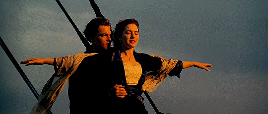
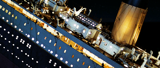


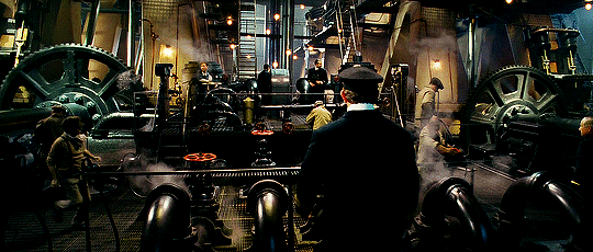

Academy Award Winners for Best Cinematography: 1998 — Russell Carpenter, ASC Titanic (1997) Directed by James Cameron Aspect Ratio: 2.39 : 1
Outlining his general lighting approach on the film, Carpenter says, "Early on, Jim [Cameron], production designer Peter Lamont and costume designer Debra Scott made decisions in regard to the period style, but there really aren't any set rules about what kind of lighting is or is not appropriate for a period film. Titanic will bear the stamp of Jim Cameron's very blue night lighting. But there's also a lot of amber in this picture, which is quite a departure. With the warmer tones, we sometimes added a bit of a sepia feeling to some of the light." Carpenter had considered the cinematographic approaches of several other period films, including Howard's End, Heaven's Gate and The Natural. Other influences included paintings by John Singer Sargent and Caravaggio. — American Cinematographer, December 1997
2K notes
·
View notes
Text
Something I try to keep in mind when making art that looks vintage is keeping a limited color pallette. Digital art gives you a very wide, Crisp scope of colors, whereas traditional art-- especially older traditional art-- had a very limited and sometimes dulled use of color.
This is a modern riso ink swatch, but still you find a similar and limited selection of colors to mix with. (Mixing digitally as to emulate the layering of ink riso would be coloring on Multiply, and layering on top of eachother 👉)

If you find some old prints, take a closer look and see if you can tell what colors they used and which ones they layered... a lot of the time you'll find yellow as a base!
Misprints can really reveal what colors were used and where, I love misprints...
Something else I keep in the back of my mind is: how the human eye perceives color on paper vs. a screen. Ink and paint soaks into paper, it bleeds, stains, fades over time, smears, ect... the history of a piece can show in physical wear. What kind of history do you want to emulate? Misprinted? Stained? Kept as clean as possible, but unable to escape the bluing damages of the sun? It's one of my favorite things about making vintage art. Making it imperfect!

You can see the bleed, the wobble of the lines on the rug, the fading, the dirt... beautiful!!
Thinking in terms of traditional-method art while drawing digital can help open avenues to achieving that genuine, vintage look!
65K notes
·
View notes
Text
Sometimes I have to remind my dad that he’s a master furniture maker and most people do not possess encyclopedic knowledge of European and American furniture styles and the history of wood glue
18K notes
·
View notes