
For artists of the manga style with questions! Tools, techniques, guides, ask away!
Don't wanna be here? Send us removal request.
Statistics
We looked inside some of the posts by mangakaquestions and here's what we found interesting.
Average Info
Notes Per Post
2M
Likes Per Post
892K
Reblog Per Post
657K
Reply Per Post
428
Time Between Posts
3 months
Number of Posts By Type
Note
3
Photo
8
Text
5
Video
1
Last Seen Tumblr Blogs


Fun Fact
Tumblr has been banned in Indonesia for providing people with access to pornographic content.
Note
how do you paint metal?? owo
first, like i always say, find loads of ref pics and have them open right next to whatever metal thing you are painting. other than that, one trick i recentlyish learned is to not be afraid of a super hard and crisp pen when coloring metals! i usually use a soft edged pen at 65% opacity in sai to “layer” colors like glaze, which is how i shade, i dont actually,,, use any blending / painting tools ^-T BUT i found using a 100% opacity crisp hard pen for bold highlights look rly gud!

idk if u can rly tell but everything there is either 1. solid color 2. with a gradient / ambient light & glow airbrushed on 3. soft shaded with the low opacity brush and, 4. hard edge coloring on the metal candle holder and the highlights on candle. see how the candle pops from the other objects? idk it looks that way to me lol

rly rough but here is a diagram:

maybe 1 can be a duller metal but for super reflective metal i suggest 2 or 3. at the very least make the highlight super hard and crisp!

it works for other reflective surfaces as well such as jewels or pearls, etc. dont forget colors reflect onto the shiny object, and the color of the object itself (esp if its reflective or translucent) will throw itself onto it’s cast shadow! if u have no idea wat im talking abt you can look up the physics of shadows and reflections~


and lastly, if u add a glow to a shiny object like metal or jewels or reflected light it looks so pleasant? just airbrush on a little bit of white or u can use a layer mode like luminosity / soft light / whatever else looks good! heres a sexi pic of madara lmfao


its kinda subtle idk if u can see but i just like it lol happy drawing!
278 notes
·
View notes
Photo
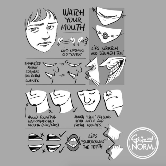
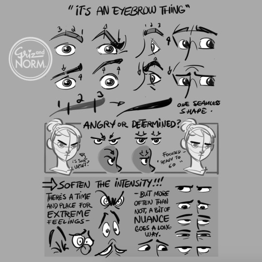
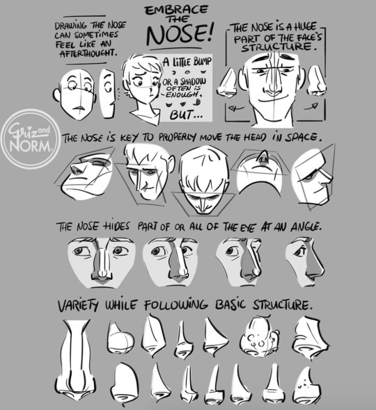


Art tutorials by Disney artists Griz and Norm Lemay
94K notes
·
View notes


Text
i think ppl should draw smooches more because basically if you can draw a heart you can draw a KISSSSSSSSSSSSSSSS
i mean these are simple smooch poses but… they are so fun 2 do *_*

246K notes
·
View notes
Photo

Ray Frenden reviews the too-cheap-to-be-true Monoprice graphics tablets. How do they stack up to industry standard Wacoms?
After spending a week with the 6.25“x10” Monoprice, my Yiynova and Cintiq remain unplugged and I gave my Intuos away to a friend. The Monoprice tracks subtle pressure variances and small movements with less lag and more crisp fidelity than any of the others. It is, put crudely, fucking awesome, in both OSX Lion and Windows 7 x64.
139K notes
·
View notes
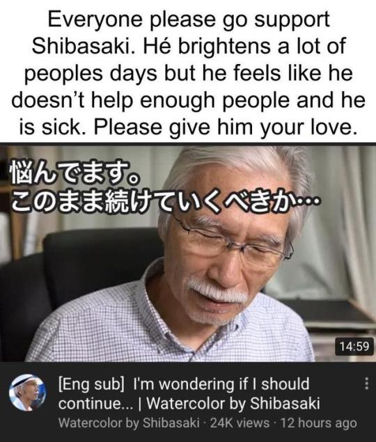
Text
In Review: Loew Cornell Watercolor Set & Goldfaber Aqua
Recently I treated myself to some new watercolor supplies since I've started painting more, and I wanted to do a proper review.
I wanted to expand my color selection, since I've only ever used my Reeves 12 color pan and my pencils. But it's surprisingly hard to do when you prefer pan/cake watercolors over tubes. I paint infrequently and in the past I've had tubes bust on me when I'm trying to open them. My search started at Hobby Lobby. Their selection was... not great. Really the only pan options I had was Artist's Touch. And I don't mind them but I always try to go middle of the road in terms of both quality and price, unless some guardian angel blesses me with low price and high quality. There was only one other craft store in town. Jo-Ann's. While I'm sure the Artist's Touch would have been absolutely fine for a hobbyist like me, I wanted to know all my options. At Jo-Ann's I found this:

It was about $7 after tax, but I used the app and clipped a 60% Off coupon (if you love yourself download the Hobby Lobby and Jo-Ann apps. Every day you can use a 40% off at HL and Jo's has anything from 30-60+% off one item). Total I paid maybe $2.50.
I had seen mostly positive to mixed reviews for this product. A lot of "vibrant colors goes on smooth" but also a lot of "dries chalky". Overall the price was right and the amount of good reviews was enough to sway me. And boy am I glad! The reviews were right. When I put the color down it was bright and bold, lots of pigment. It went onto the paper smoothly and looked damn near identical to my Reeves when I put it down. The colors dry vibrant, and there's so many of them it's exactly what I wanted. It does however dry a bit chalky, but not how you might imagine. The colors dont get all weird and powdery looking. There is a marked difference between the smooth feel I get from my Reeves and the slightly rough powder feel I get from the Loew Cornell.
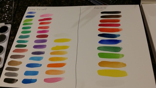
But! If you're like me and this is a hobby of yours, and you dont need the best top quality paints money can buy but still want it to look decent enough to maybe take photos or make prints from, this is it. I'm going to do more tests and see how it interacts with my Reeves and my pencils, but I havent had an issue before so hopes are high! I give the Loew Cornell watercolor set a solid 7.5/10. There's better and fancier for sure, but I'd still reach for it without hesitation.
As for pencils, I picked myself up a few more browns for skin tones, since my current collection is seriously lacking. At Hobby Lobby there was a fancy new display for Faber Castel Goldfaber pens, pencils, and watercolor "Aqua" pencils. There was tons of shades but I picked out two perfect ones.
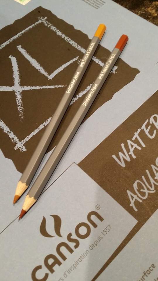
They're each about $1.49 before tax, so total I'd say around $1.55-ish after. I own two different types of pencils, Artist's Loft and Sargent Art. Here's what my quick test looks like:
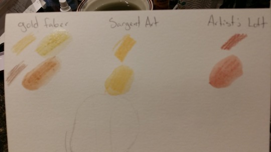
The lead on the Aquas is much harder than my other pencils. Which can be good for building up color, but you can see the strokes are much more visible than in the Sargent and Loft pencils. But that also may just be an issue of not having much experience using them. Unlike the other pencils I noticed the color on the Aqua pencils seemed to get more vibrant after using water. These three brands are ranging from cheap to decently priced, but I would say again for someone like me, all three work great! They all come with some upsides and downsides, and in comparison to the untrained eye they are all fairly similar in use. I would definitely recommend the Goldfaber Aqua pencils, mostly because their color selection was amazing, and had a lot of colors in shades I haven't seen in standard packs of watercolor pencils. For the Faber Castel Goldfaber Aqua water color pencils I go with a solid 8/10! They're fairly priced if you're looking for a few colors you don't have, and work great!
3 notes
·
View notes
Note
any hand drawing tips help i'm dying over here

- fingers consists of three joints
- i usually separate the thumb
always start off with simple shapes, trying to tackle complex shapes from the start will skew proportions
- to start guideline sketches, i usually make a box for the palm, then drawing the thumb as reference, and then adding the rest of the fingers

FINGER NAILS ARE YOUR FRIEND, DONT BE AFRAID TO DRAW THEM!!! THEY ADD PERSPECTIVE, CHARACTER, AND DEPTH TO YOUR HANDS!!! I LOVE DRAWING FINGER NAILS


GO HAM!!!!!!!!!!!
IF YOU REALLY WANT TO GET GOOD AT DRAWING HANDS JUST WATCH MOB PSYCHO 100 HONESTLY LMAO…. even if the hands arent proportional to real life, the movement and gesture can REALLY REALLY HELP
AND DRAWING FROM REFERENCE AND OBSERVATION IS YOUR BEST ADVICE
hopefully this helps anon ^^!!
4K notes
·
View notes
Photo

Have a great big ol’ sheet of kissing references!
Support me by reblogging and checking out my commission info here!
62K notes
·
View notes
Photo

did you find the pic? here it is anyway
YES!!!! this is the one, thank you so much!
33K notes
·
View notes
Text
shading colour tips
hey yall its me the Art Mom™ to help you shade pretty
rule 1: DO NOT SHADE WITH BLACK. EVER. IT NEVER LOOKS GOOD.
red- shade with a slightly darker shade of purple
orange- slightly darker and more saturated shade of red
yellow- i think like..a peach could work but make it a really light peach
green- shade with darker and less saturated shade of blue or teal
blue- shade with purple
purple- a shade thats darker than the purple you’re using and maybe a little pink (MAYBE blue)
pink- darker shade of red
white- a really light lavender or blue..or i guess any really light colour??
black- okay listen dont use pure black to colour anything unless you want to leave it with flat colours because you cant really shade black lol
grey- a slightly darker shade of purple or blue (less saturated)
brown- slightly darker and less saturated shade of purple or red
aaaaand thats all i got lol. let me know if there is anything i should add to this list!!
469K notes
·
View notes
Photo

Twitter / 38miyoji: 90年代から現在にかけての絵柄についてまとめました http …
11K notes
·
View notes
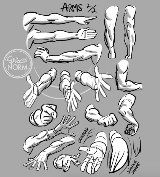
Video
youtube
There’s three main groups: the flexors and extensors each take one half of the forearm, and the ridge muscles sit on top like a little tiara. Each group has it’s own unique form. Learning their anatomy will help you design awesomely dynamic arms.
Let’s try to make forearms manageable to draw. This is a body part most artists don’t quite understand. It can be real intimidating if you don’t know the muscles.
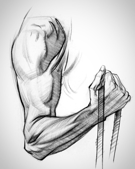
The arm has a simple chain design and the forms interlock down the arm.
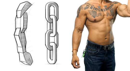
To avoid the snowman effect, use straight, angular lines and look for asymmetries. Compare the apex of both sides of the forearm to understand the curvature better. Notice that the flexors reach lower on the wrist than the extensors and ridge muscles.

Look for this kind of thing when you’re drawing the gesture of the muscle groups. A wave rhythm where the curve on one side leads into the next curve on the other side.
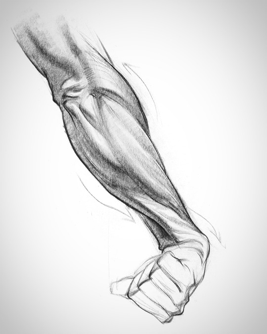
I’ll explain more in-depth in the video - www.proko.com/179
52K notes
·
View notes
Text
How I draw kisses!
A quick tutorial/cheat sheet on how I draw kisses!! I’m going to assume you already know how to draw a head and how to angle it, because that’s an entire procedure in itself. I’m going to focus on mainly the lips and also try and tackle some common mistakes when you’re first starting out.
Pursing the lips

So this is boring but crucial. If you don’t purse, their is no real kiss (take notes) bc placing your lips on top of someone else’s is not how you kiss… The most important part are the corners of the mouth, especially from the side view, because that’s what changes the most.
The actual kissing yeee
Let’s start do a basic side view kiss on the lips. And believe it or not, I think this one is the hardest!

Think about which parts of the face are going to be in front of the other! This can take some time to get the hang of, but once you get that down it’s easy. Also, focus on getting the heads at the right distance and angle. A common mistake is drawing them too close.
The Lightning Shape:

Still keeping in mind which part of the line is “Red’s” upper lip and which part is “Blue’s” lower lip, play around with the shape of the lightning. Very subtle changes can have a very strong impact! I usually go by feel, so take your time, but here are some things to look out for:

Details squishing etc.
So yeah once the lightning shape looks good, I usually add details and squish parts of the face that will touch. Which usually includes the noses, but from this angle they won’t squish unless you intend on making nice big noses <3. By now it should look something like this:
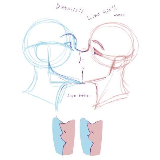
You don’t have to add the corners of the mouth! I usually do when I want to show that the character is smiling.
One technique used a lot in anime/manga + other cartoony art styles, is fading lines where two soft-ish objects press hard against each other. The picture above explains it.
Common mistakes
Getting down the crucial kissing part of fanart is hard and you will mess upp SO MANY TIIIIIIMES, but you learn from your mistakes, so don’t be discouraged. There are some things though that I frequently see when people draw kisses that makes it look awkward and stale, many of which I used to do myself. Here are some examples:

Try your best to avoid these. Most of the mistakes have little to do with the lips and more to do with the angle of the head. So getting that down before you move on to the lips is important.
¾ view Kissing
There are not a lot of angles where you actually see the lips meet (or at least not that I can draw…). Depending on how the heads are placed in relation to each other, you may or may not see the lips in a ¾ view. The way I have demonstrated is done in a way that the nose will bump into the other’s upper cheek.

Aaand that’s about it! These things will make more and more sense the more you draw them. At first it can seem very hard with so many things to keep track of, and it is, but practice makes perfect!
Rule of thumb: does the angle and position of the heads make sense? How are the lips going to align? What parts of the face are going to be in front of the other? How much will the lips purse? And finally, what is going to squish?
Thank you for reading! 😘

(☞゚∀゚)☞ now draw kisses
73K notes
·
View notes
Text
How to do “extra” facial expressions!
Drawing basic facial expressions is not the hardest. Most people can draw a sad face, a happy face, angry etc., but making more multidimensional expressions is more of a challenge. I have gotten a lot of compliments on how I draw facial expressions, (specifically “angsty ones”) telling me that they are very dramatic and well… expressive! And there are actually only a few things I think about when I draw faces that take them to the next level, so I thought i’d illustrate them all here!
SUPER IMPORTANT TIP BEFORE WE START: Look at your own face when you draw faces. Even making the face when you are drawing (you don’t even have to look at it), will give you some sense of how the face muscles pull and where things fold and stretch, because you can feel it. You are the best reference when it comes to facial expressions!
Angles
Draw the head in an angle that matches the expressions you want to make. It is not a requirement, but is going to add to the effect.

Symmetry vs asymmetry
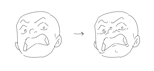
A face is rarely symmetric. Unless the face the character is making is 100 % relaxed or even dissociating, the eyebrows, mouth and facial muscles will have different placements of their respective side. This image shows the dramatic impact asymmetry has on a face:
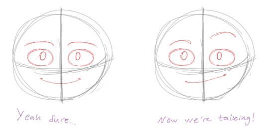
That’s the difference between a smile and a smirk!

The first one’s like “oh yeah?” and the second is like “oH YEAH??”
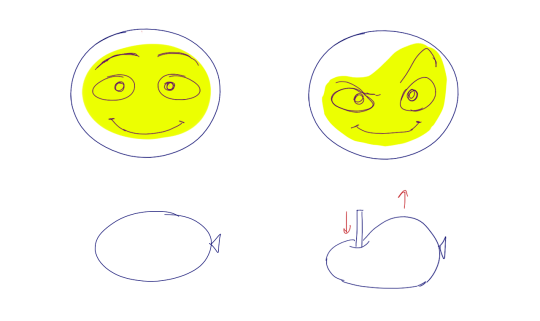
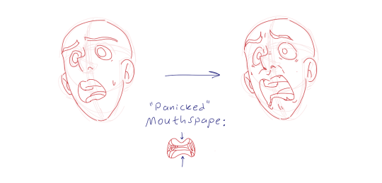
The “balloon squishing principle”
This is something I did subconsciously, and I didn’t know about until I made this tutorial. And this principle goes hand in hand with an asymmetric face. Basically, if you squish one part of the face, you need to even out the empty space by “inflating” the other part of the face so that it doesn’t appear shrunken. The picture hopefully explains it:
Teeth
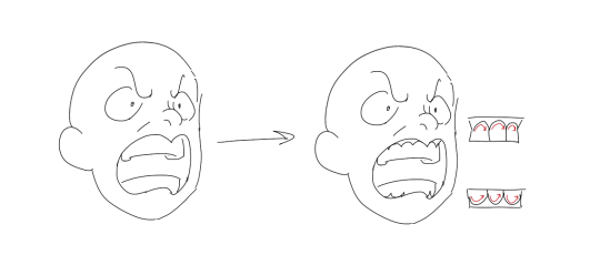
Don’t forget to add the gum when the mouth is open to its full potential!
Squinting and folding
Adding folds around the eyes when a character is squinting makes a HUGE difference. It makes a smile more genuine and a growl more intimidating. Adding folds to the face in general makes your characters more lifelike and ‘visually relatable’. Like, they look human, and less plastic or fake.

and so on..
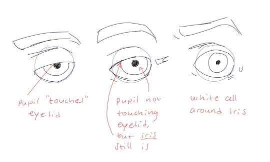
Pupils and irises
The placement of the iris and pupil in relation to the eyelids is very important! The less of the white you see, the more relaxed the character is.
And then of course eyebrows and eyes go hand in hand!


Gestures, spitting, sweating…
Adding more elements than just a face is key to making the character actually look like they are feeling what you want them to feel. Just the tiniest sweat drop adds to their anxiety, spitting adds frustration to their rage, slouching shoulders, waving hands, a double chin, extreme angles, the list goes on! Add whatever and see what kind of impact it makes! Does it do the trick? Great! Add it!
Over exaggeration!!
Remember that you can almost always exaggerate more. Don’t be afraid to do draw “too much” because you’re just experimenting. See what works and what doesn’t. What do you like to exaggerate?

Now that you know some theory, it’s time to practice!
Practicing!!
The 25 Essential Expressions (a classic! I’ve done it multiple times)

And the one I do when I’m bored:
Fill a page with circles and fill them in with different expressions. Try and exaggerate as much as you can!

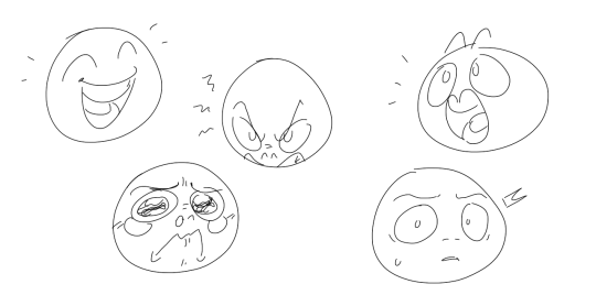
This is mostly for experimenting. They are quicker to draw than complete faces, but the same rules should apply!
And that’s about it!
I don’t know if I covered everything in this tutorial, since some things might be obvious for me, and this post perhaps only scratches the surface. So feel free to send me a message if you want an explanation about something more in depth! Thank you for reading! And now DRAW!!! ✨🎨
169K notes
·
View notes
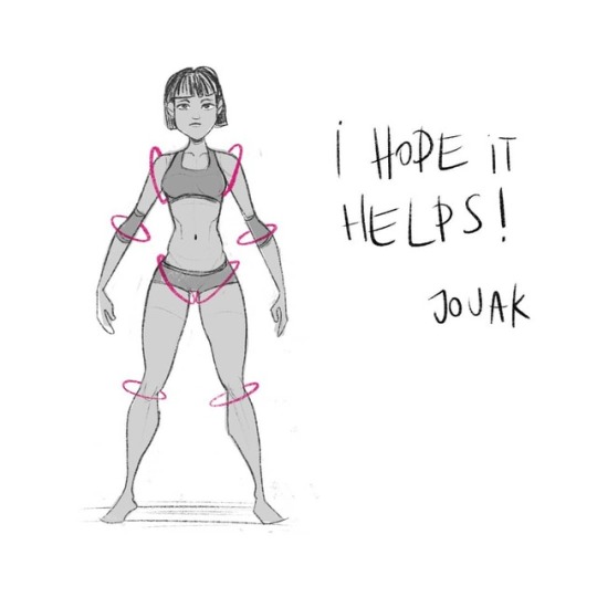
Note
Help! I have been trying really hard to improve my drawing skills, practicing almost everyday. I have been watching tutorials and studying anatomy but I can't get my characters to look natural.. They look extremely stiff and blocky... Any advice?? Oh! I almost forgot, I LOVE YOUR ART SO MUCH!!!
GESTURES. GESTURES. GESTURES!
Studying anatomy is fantastic. Whatever you do, don’t stop! I’m going to suggest gestures but that is by no means a suggestion to swap. Just start implementing gestures as well.
Okay. So. Look at this.
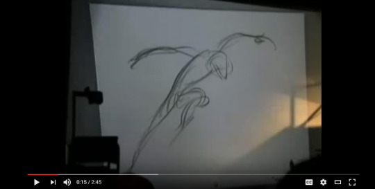
This is a still from Glean Keane animating Tarzan - and it exactly nails what a gesture is. Just a few simple lines that are full of movement and you can tell exactly what the heck is going on. All with a few simple lines.
Learning anatomy is great - but learning how to implement it is another thing. If I focus too much on nailing anatomy - the drawing starts to feel stiff, exactly as you’ve stated.
Gestures are all about forgetting what you think you know about muscles and structure and instead drawing what movement in a body FEELS like. That might sound cooky but that’s kind of how I approach it in my head. It’s all about those lines of movement and contrast and CURVES.
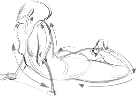
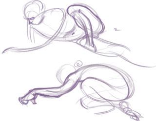
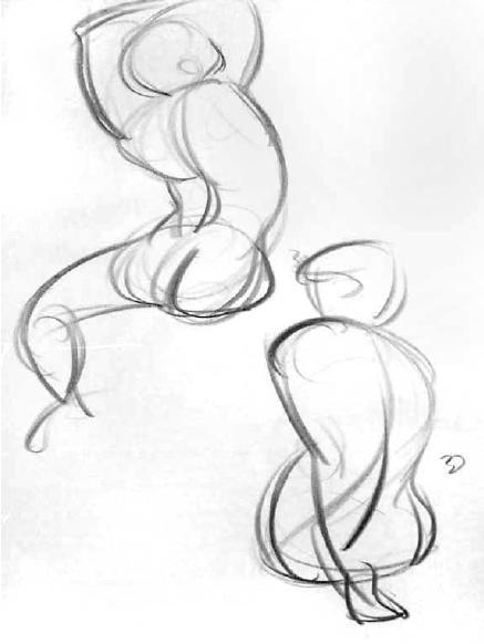
I think loosening up and forgetting about how technically correct a drawing is and instead embracing something rough and full of movement, and looking at how the lines in the human body contrast themselves will do you wonders. Keep learning anatomy, but look at how we move and look the weird shapes we can make with our bodies. Look at the way we slouch and stand tall. The way we dance, the way we run. Sit in a coffee shop and try to draw the heart of someone’s pose in like 30 seconds.
Observe MOVEMENT AND RHYTHM AND MY GOD THE HUMAN BODY IS POETRY *GESTICULATES WILDLY*
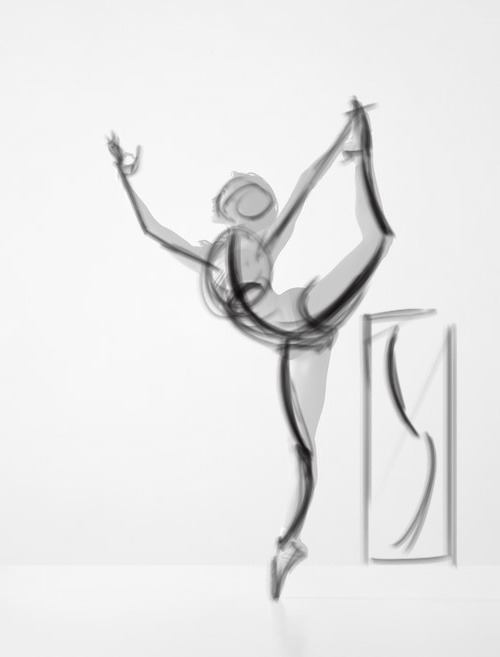
Even just grabbing a photograph from the net and looking at it objectively - how would this pose break down into a few simple lines? It’s so damn simple to look at something this way. You can endlessly improve your knowledge of anatomy and your technical abilities - but I think so many of us (myself included) stumble at the simplest foundations.
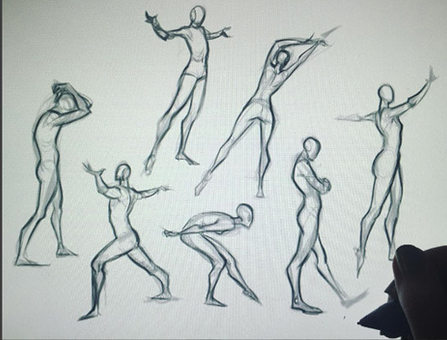
My last suggestion is a wonderful book (videos are floating around on youtube as well) from Mike Mattesi in which he talks about Force. It’s fascinating stuff! I love this example of a simple gesture being built up on.

I hope at least some of that was useful! Just start small okay. Think about learning the chords before you try and master Stairway to Heaven.
25K notes
·
View notes
Photo


I really hope this helps you out at least a little bit, anon!
It’s like one of my professors said, “This one time in grad school I hadn’t slept in a few days, and when I looked at my painting I realized everything was just shapes. It’s all shapes! After I realized that, I could paint ANYTHING!”
I don’t want to keep you scrolling down your dashboard for 900 years so for the male anatomy tips I just shared the nitty-gritty stuff I know up there, and I’m gonna put a couple anatomy tutorials ‘n references down here!
Aranda’s Hip Tips
How to Draw Beef (MAN beef)
(there is donger in this one, beware if in public) Male Anatomy Reference their male tag is also worth scrolling through!
4K notes
·
View notes