
I'm here to talk about cool maps. Twitter: @maphugger E-mail: [email protected] About Me: www.maphugger.com/about
Don't wanna be here? Send us removal request.
Statistics
We looked inside some of the posts by maphugger and here's what we found interesting.
Average Info
Notes Per Post
834
Likes Per Post
494
Reblog Per Post
339
Reply Per Post
0
Time Between Posts
18 days
Number of Posts By Type
Photo
14
Text
2
Video
1
Last Seen Tumblr Blogs


Fun Fact
Kazakhstan’s Minister of Communications and Informatics has blocked the Tumblr site because it contained 60 sites of terrorism, extremism, and pornography in 2015.
Photo

Screenshot from: FiveThirtyEight: Which Flight Will Get You There Fastest? (2015)
FiveThirtyEight just published their most ambitious interactive map to date, doing all their usual number-crunching to determine which U.S. airports will delay you the most on average.
Tool around with it at the source: http://fivethirtyeight.com/interactives/flights/
28 notes
·
View notes
Photo

Screenshot from: Tim Wallace/New York Times: A Giant Picture of Snow Across the United States (2015)
There's something to be said for an outrageously nice-looking satellite composite. Fun to compare the past three winters by clicking through them, too.
See 'em all at the source: http://www.nytimes.com/interactive/2015/03/05/us/one-giant-picture-of-all-the-snow-across-the-us.html
45 notes
·
View notes
Text
5 Favorite Maps of 2014
Normally when people write end of year best-ofs, they publish them before the turn of new year. But I'm counting down my five favorite maps of 2014 right now just to make sure there weren't any map contenders created in the last seconds of 2014 ... or maybe because I was just procrastinating.
Like my 2013 roundup, this isn't intended as an end-all be-all survey of mapmaking from last year, but rather an opportunity to give kudos to the maps that I personally found uniquely impressive or inspiring.
In the broad world of cartography and the geospatial, 2014 can best be summed up as "full steam ahead". Web map technologies continue to evolve and impress (Turf.js made its debut right before the years' end). Peer education like Maptime is expanding rapidly (I had the pleasure of attending the first Twin Cities maptime in November). But most of all, lots and lots of folks made lots and lots of nice maps.
For me, the biggest map-related development in 2014 was the rise of data journalism, exemplified by the launches of FiveThirtyEight and The Upshot. Their work is not strictly cartographic of course, but the sort of map-related work they do promises to elevate the quality of thematic cartography and geographic analysis being delivered to the general net-browsing audience. The launches haven't been without their growing pains- FiveThirtyEight in particular had a particularly instructable map-related gaffe- and the hackneyed "X Maps that Explain Y" listicles that float around probably won't disappear anytime soon. But nevertheless, I believe data and explainer journalism will be an important and valuable source for cartographic communication.
Anyway, onto the maps.
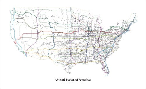
5. Cameron Booth - Highways of the United States
By now, anything and everything has been represented in the style of Beck's iconic London underground map. What makes Booth's latest project stand out amongst the Beck pastiches is its immense scope and attention to detail. A true work of art, whether your looking at the full map or just one of the individual states.

4. Enigma Labs - Temperature Anomalies
A very rich dataset, elegantly presented with a rich interface for exploration. Interactive maps don't get much more impressive than this.

3. Joey Cherdarchuk/Darkhorse Analytics - Breathing City
A have a soft spot for the medium of map gifs, and this highly detailed, animated look at day-to-day movement in New York is probably the most impressive map gif to date.

2. Barry Richards - FindARoom
This website, developed for the University of South Wales, pulls up a nifty set of maps to help people navigate the University's confusing buildings and campuses. In the age of Google Maps, it's tempting to think that the world doesn't need any more wayfinding maps- but this website proves that notion is quite wrong. Where was one of these for my freakin' school?

1. Owen Mundy - I Know Where Your Cat Lives
It's an iconoclastic choice, but as far as I'm concerned this is a no-brainer pick for the best map of 2015. A map that yoinks geotagged photos of cats would, ordinarily, be a neat technological feat, but a bit too banal of a subject matter to heap praise upon. What transforms I Know Where Your Cat Lives into a true masterpiece is that those cat pictures are merely a cutesy means to deliver an intense rhetorical message: be careful what you put online. It's a share-friendly map with a cutting and timely message.
2015, by the way, is being recognized as the International Map Year. Happy mapping in this upcoming year!
22 notes
·
View notes
Photo

Screenshot from: Demeter Sztanko - On Solstices and City Planning (2014)
Tonight is the winter solstice (for the northern hemisphere, anyway). This lovely series of maps lets you peruse cities for roads that line up, Stonehenge-style, with the solstice sunset.
See for yourself at the source: http://sztanko.github.io/solsticestreets/
3 notes
·
View notes
Photo

Reuben Fischer-Baum/FiveThirtyEight - How Predicatable Is U.S. Weather? (2014)
I'm posting this article as much for its writeup as the map(s), which go into very nice detail about the volatility of weather in the U.S.
Read the whole thing at the source: http://fivethirtyeight.com/features/which-city-has-the-most-unpredictable-weather/
18 notes
·
View notes
Video
tumblr
Matthew Parrilla - wxGIF (2014)
A decidedly cool project that automatically collects doppler data and posts it to Twitter, bringing weather mapgifs to your social feed.
See the full list of twitterbots here:
https://twitter.com/wxGIF/lists/wxgif-bots
4 notes
·
View notes
Photo

Screenshot from: The Guardian - How voter-friendly is your state? (2014)
Ever since I saw this animated/interactive map my mind keeps coming back to it. There's lots of cleverness and charm in this one: the snazzy animations, the step-by-step presentation of data, and of course the abstracted cartogram-esque basemap.
See for yourself at the source: http://www.theguardian.com/us-news/ng-interactive/2014/oct/22/-sp-voting-rights-identification-how-friendly-is-your-state
3 notes
·
View notes
Photo
On the one hand, this ramp is definitely ill-suited for the dataset. On the other hand, it's just so cool looking.

HT @matthewbgilmore
NOAA’s new weather modelling uses a harsh and dramatic color ramp - so much so it overwhelms the data it attempts to portray—story seems to be ice vs. volcanos, evidently!
87 notes
·
View notes
Photo

For the supporter drive of Sydney’s most glorious radio station experience FBi. For international folk, it’s a surprisingly accurate illustrated map of Sydney’s Bands, recording artist and institutions. Every item is a reference to the band or musicians’s imagery or attitude. Also a couple of diamonds and sand-castles on the norther-beaches thrown in for some biting social commentary on the Sydney’s alarming class differences. But mostly it’s puns and rock’n’roll.
19 notes
·
View notes
Photo
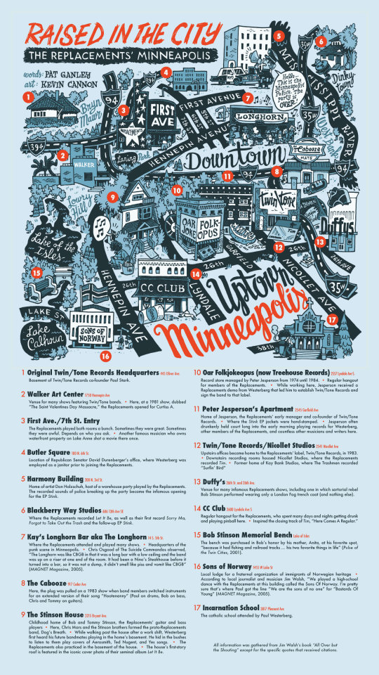
In honor of the big Replacements show on Saturday, my friend Pat Ganley and I whipped up this map of the Mats’ beginnings in Minneapolis in the early 1980s. Click to read the high-res version.
532 notes
·
View notes
Photo

Screenshot from: Spotify - Serendipity (2014)
This map pulls from Spotify's servers those rare moments when two people hit "play" on the same song at the same time. It's most charismatic feature, however, is definitely its squash-and-stretch approach to the map projection.
Experience it yourself here (note: site auto-plays audio):
https://www.spotify.com/us/arts/serendipity/
6 notes
·
View notes
Photo

Screenshot from: Katherine Wells/The Atlantic - Soda vs. Pop vs. Coke: Mapping How Americans Talk (2013)
This subject matter should be familiar to anyone who saw Joshua Katz's wildly popular maps of American dialect. The reason being that this video uses Katz's data itself! But it incorporates recordings of surveytakers, providing a very different experience of the same information.
View the whole thing here: http://www.theatlantic.com/video/index/281808/soda-vs-pop-vs-coke-mapping-how-americans-talk/
2 notes
·
View notes
Photo

Screenshot from: Owen Mundy - I Know Where Your Cat Lives (2014)
This site uses a supercomputer (!) to pull in geotagged cat photos from various photo sites, and places them on a map.
(But it's not so much about the cats as it is about privacy in the age of web 2.0)
http://iknowwhereyourcatlives.com/
7 notes
·
View notes
Photo

Screenshot from: Enigma Labs - Temperature Anomalies (2014)
Just in case you ever wanted the best map of climate change in the U.S. over the past half century.
Explore the full thing at the source: http://labs.enigma.io/climate-change-map/
19 notes
·
View notes
Photo

Joey Cherdarchuk/Darkhorse Analytics - Breathing City (2014)
A contender for world's best mapgif. Read the original blog post to learn about the crazy technique used to make it, which included modeling the behavior of 1.5 million people and rendering each frame in Excel:
http://darkhorseanalytics.com/blog/breathing-city/
12 notes
·
View notes
Text
Intro to Psychogeography: The Art of Getting Lost
For those of us in the northern hemisphere, summer is right around the corner, and that means being able to spend more time enjoying the outdoors. With that in mind, I figured it's an opportune time to introduce one of my favorite outdoor activities: Psychogeography- or, more accurately- Dérives.
The term “Psychogeography” refers to both an academic discipline and a set of techniques for informal research, all focused on understanding urban environments. It's a little tough to describe the idea of Psychogeography, probably thanks to its avante-garde origins. Psychogeography's Wikipedia article has the “may be too technical” and “lacks a single coherent topic” disclaimers, and probably not by happenstance. You can't try to read about the origins of Psychogeography without running into fun and terrifying terms like “Lettrism” and “situationalist”, and the whole concept of Psychogeography has been co-opted, revived, and redefined by various groups, with various motivations, at various points in time.
Here's my attempt to summarize: In the 1950s, a bunch of French intellectuals realized that we all have a very limited perspective of the places we live. We mostly travel to-and-from the same workplace, on the same roads, visit friends that live in the same or similar neighborhoods to our own, and hang out in places specially designated for public recreation. The 'psycho-' in 'psychogeography' comes from these intellectuals' fascination with the cognitive aspects that underpin such everyday city living: environmental cues that subconsciously instruct us where to go, what to do, and how to think. A simplified example: a well-lit, planted boulevard feels like public space, and invites us to walk along it. A dimly-lit alley surrounded by industrial buildings feels like private space, and encourages us stay away. Psychogeographers sought to jolt themselves out of this naïve, banal inhabitancy of the city. They attuned themselves to discover events, things, and processes that would be otherwise invisible in their everyday lives. To this end, Psychogeographers invented the “Dérive” (lit. “drift”) - defined simply as any activity designed to take a person 'off the beaten path' and take a critical eye to their surroundings.
The good news is that you don't have to worry about all those avant-garde underpinnings to participate in Psychogeography. From a practical standpoint, a dérive is nothing more than wandering around a city, using a route that is generated by random chance. It's a fun (and free) activity to do either alone or as a group; I especially recommend it to get acclimated to a place you're visiting, or have just moved to. Also, it gets you outside and walking around, which is always a plus. I'd even categorize dérives alongside other “geo-sports” like geocaching and orienteering.
The way you pick your route is the central component of a good dérive. The simplest method is also one of the best: packing some dice, and rolling them at each intersection. For instance: a dead-simple rulebook with a six-sided die:

If you're more tech-inclined, there's some great smartphone apps that will not only send you along a randomized route, but also prompt you to better analyze your surroundings and document the experience. I know of three:

“In the near-future... finding your way from point A to point B will not be the problem. Maintaining consciousness of what happens along the way might be more difficult.”
Serendipitor is the simplest of the apps, in a sense. Simply select your starting and end points, along with how much “meandering” you want to do, and Serendipitor will generate a randomized route for you to follow. Curiously, it positions itself as an “alternative navigation” app, suggesting they envision using this app not just when you've decided to block out some time for a dérive, but rather while running your everyday errands.

“This task is a suggestion, an invitation to explore your environment in a new way. The task can be completed in any way, literally, figuratively, or even metaphysically.”
Dérive app is a website that pulls up a series of randomized 'cards', each with their own instructions e.g. “Search for construction”, “Move East“. In contrast with Serendipitor, it prompts you to think about your surroundings more. Some of the instructions even push you outside the role of a passive observer, like asking someone where the nearest pharmacy is (and then heading in the opposite direction), or finding (and going inside of) the nearest nail salon. Those sorts of prompts are the reason this site isn't my favorite, but I guess that's just my personal preference as a more hands-off psychogeographer.

“Each instruction will ask you to move in a specific direction and, using the compass, look for something normally hidden or unnoticed in our everyday experiences.”
Drift is probably my favorite of the app options. It generates dérives comprised of ten different prompts, each one involving taking a photo of some kind. The photos get geotagged and saved, making it easy to revisit and share your past adventures. My only complaint is that some of the prompts are a bit weird and challenging (“find something inquisitive”?), but as long as you're willing to interpret them liberally then it's all good.
Those are the basics: hopefully you're now inspired to go out and start exploring.
14 notes
·
View notes
Photo


Whiskas - The Living Room Plain (2014)
A mental map of a mental map... of a cat.
More info and maps from this writeup at Creative Review: http://www.creativereview.co.uk/cr-blog/2014/may/ad-of-the-week-whiskas-maps
13 notes
·
View notes