
Don't wanna be here? Send us removal request.
Statistics
We looked inside some of the posts by mariaphilp-grad602-54-1b-blad and here's what we found interesting.
Average Info
Notes Per Post
2
Likes Per Post
1
Reblog Per Post
1
Reply Per Post
0
Time Between Posts
4 days
Number of Posts By Type
Photo
12
Text
1
Last Seen Tumblr Blogs


Fun Fact
There were a total of 171.5 billion posts on Tumblr in 2019.
Photo
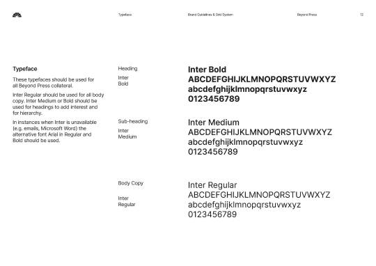
Another change made was to use one typeface throughout the brand, this was done in order to keep consistency throughout collateral by only using different font weights.
0 notes
Photo
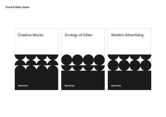


The one major aspect that I changed in the brand guidelines was how the brand element is used. In my iteration I went with a solid pattern system instead of stroke version of the brand elements. This would utilise the colour palette and create a more solid and bold look.
0 notes
Photo

Continuing on the special/edition feel I decided to make the cover a sleek black to create a strong contrast between this book and the rest.
0 notes
Photo


Draft 3 Paula Scher
Once the layout was tweaked finalised I went ahead an added colour. I wanted to add more of a special/edition feel to the book so I chose to use colours relating to the prominent colours in the designers work. This led me to use red with Paula Scher. In the next post I will continue onto Stefan Sagmeister which will better reflect the use of colour in the overall design in relation to subject.
0 notes
Photo


Draft 3 Stefan Sagmeister
Similar to Paula’s chapter, I chose to use yellow to reflect one of Stefan’s prominent works — ‘The Happy Show’.
0 notes
Photo


Second Draft
Feedback
Potential to tighten leading.
Use HSB codes to match blacks but change Brightness to create contrast.
Watch text frames edges.
Right now it is in black and white for the purpose of finalising layout.
0 notes
Photo


Cover Options
These are basic cover options based off the brand guidelines. I decided to go with the horizontal versions as it gives the type enough breathing room and makes the reader feel a bit more comfortable.
0 notes
Photo


First Draft
This draft was made following along Katie’s class so it is due to change.
I wanted to make sure there was an obvious design system in place, as well as hero imagery on some pages to get a good balance between words and photography.
0 notes
Text
A bit random but I found some words/quotes that relate to these design heroes. This was a good way to capture in a few words what these designers were about on a basic level.
David Carson - Break the rules
Saul Bass - Design the iconic
Stefan Sagmeister - Blend inspiring qualities
Paula Scher - Treat type as a visual image
Michael Bierut - Make content complex accesible
Massimo Vignelli - Convey Ideas
Milton Glaser - Bridge the gap between seeing and understanding
Paul Rand - Merge copy with design
Alan Fletcher - Be expressive with typography
Hermann Zapf - Change the game
Lester Beall - Be a problem solver
Jacqueline Casey - Pair strong meaning with your designs
Armin Hofman - Blend minimalism with context and meaning
Alvin Lustig - Suggest, dont tell
2 notes
·
View notes
Photo


Presentation Heading Checklist
Using google doc, we laid out all the headings/slides we had to cover and write about in our presentation. We numbered each heading. The headings marked red are the ones that still needed to be filled in. We all added what we could, blue words are the paragraphs that were either recently added or edited.
Google docs is a good platform to share copy as we can see realtime when someone is adding, editing or deleting copy.
0 notes
Photo
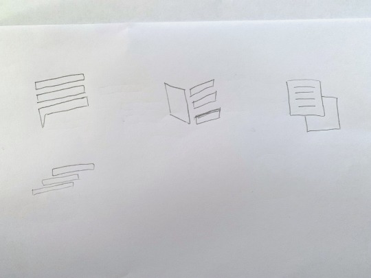
In Class Activity: 5min Logo Ideation.
Just some tips to creating a brand concepts especially if you’re pressed for time:
Brand Name
Area/Location
Building/Store Front
What they sell
Brand Personality/Essence
How do they mostly communicate (Online, In Person)
0 notes
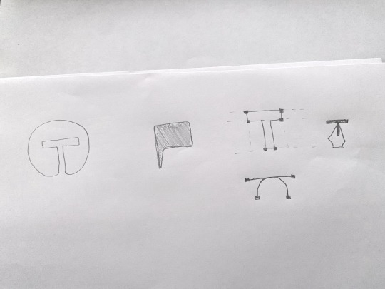
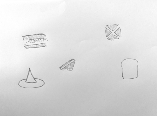
Photo

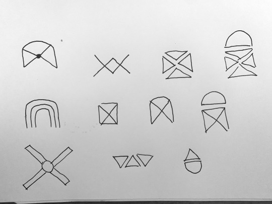

In Class Activity: Logo Ideation.
Using surroundings and simple shapes and forms to create brand elements.
I took inspiration from the location of the company, as they are named after the location they are based in. The visual elements I created were heavily based off the structures surrounding that area.
0 notes
Photo


Design Heroes
Today we got into our groups and we started by setting up our sharing and communicating platforms.
Google Document
Google Drive Folder System
We also discussed visual inspiration and design heroes.
A design hero that came up was Saul Bass, Katie suggested looking at Noma Bar who is a modern and contemporary take on Saul Bass’s work.
What stood out to us about his work, it was minimal and was able to communicate what a book/movie is about in one image or graphic. He used a minimal colour palette to create a bold contrast which we felt would stand out on the shelves. In addition to this, he had a really good eye for positive and negative space which was cool when communicating a relationship.
0 notes