
Don't wanna be here? Send us removal request.
Statistics
We looked inside some of the posts by mynicholascaldwellblr and here's what we found interesting.
Average Info
Notes Per Post
1
Likes Per Post
1
Reblog Per Post
0
Reply Per Post
0
Time Between Posts
7 days
Number of Posts By Type
Photo
12
Video
1
Text
1
Last Seen Tumblr Blogs


Fun Fact
25% of US internet users with an annual income of $80-100K use Tumblr.
Photo

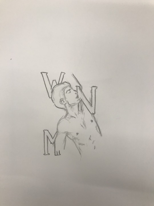
Further Development on my Label
I developed and refine my illustration and found learnt how to get the best text texture for the look I'm going for.
CAUTION: Pinot is spelt wrong and I have corrected it!
0 notes
Photo

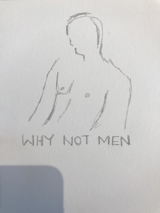
Week 8: Further Development of Logo
I have taken my sketches to a software called Sketchbook- where I developed a line drawing of a male figure. I then transferred this to photoshop where I added the title of Why Not Men to tie it in to the label layout.
Although, I came across a challenge.. I found it difficult to place this logo on the design to fit well and look nice.
0 notes
Photo
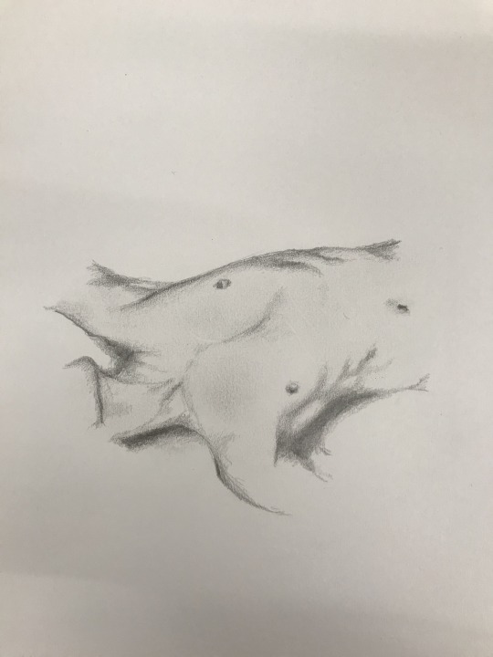
Week 8: Logo Development Process
On top of our Pitch presentations, we also had to start working out a logo design for our beverage brand. As I had already started refining my label design, I was able to create a design based on the fonts and design vibe of the label layout.
I looked over my sketches and layouts, and narrowed my logo down to include the main concept elements- A male figure and the words ‘Why Not Men’.
0 notes
Video
tumblr
A1 Slides:
Week 8:
This week I presented my two concept/direction ideas to the class. I have attached a screen recording of the slides without audio, as I am having trouble uploading PDF files to Tumblr.
After showing everyone, majority have voted for Concept 1 of Why Not Men, which I am extremely happy about because it is personally my favourite.
It was great to see everyones concepts and participate in the votings!
0 notes
Photo


Mood boards 2.0
Rationales
Concept 1 (top image):
The concept of ‘Why Not Men’ aims to differentiate social norm in today’s liquor industry. Whilst exploring design labels for wine, feminism seems to predominate. Although, when it comes to men, designs are extremely limited to suit a sort of masculine norm. But why can’t men be shown to feel the way the beverage makes females feel?
In saying that, I have produced a label that portrays men in a feminine/sexualised way, because why shouldn’t the design show that all genders can feel this way?
Using sketching and typography, I merged the two graphically to convey a sophisticated, and sensual display. The colour of the typography and bottle cap will change depending on the type of wine. For example, metallic red will be featured for red wine and gold will be featured for white wine. By adding original sketching, I have found a balance in the contrasted mediums that conveys the desired design.
The target market and audience will be individuals and businesses who won’t fear the challenged social norm and have an eye for creativity alongside a delicious beverage.
Concept 2:
The second concept of ‘Why Not Men’ similarly aims to challenge the norm in the wine industry.
Although, the design will use the simplicity of line to portray a symbol of man. This focus on appreciation of space, minimalism and simple typography and symbol is quite refreshing for the consumer. The classic style of minimalism is a growing trend with an enormous audience interest. By incorporating illustration into the design, I aim to for it to be subtle enough to not push boundaries of minimalism.
The whole design of the wine bottle is black. The bottle shape will have more curve to it, similar to a Champaign styled bottle. This will allow more space around the white symbol. If bought through a bottle shop, the wine will come in a similarly designed box, adding more style and classiness.
The target market and audience will be consumers who are intrigued by simplicity, and who may go further into looking at the concept within.
0 notes
Text


Further Updates
Further updates of my two wine labels.
0 notes
Photo

Update:
This is my updated version of my wine label. I’m going for a minimalist design. Still a lot of work to do but I'm personally liking where it is heading.
0 notes
Photo

Further Experimentation:
This is some more experimentation at home. I am currently trying to figure out how to scan my drawings to easily edit them with the typography. It is quite challenging, but I am thankful that photoshop allows me to edit and work my way around it.
0 notes
Photo


Week 3 Mood boards:
In week 3, we started and were asked to complete 2 mood boards for the two different directions for our beverage. The first board is more complex and conveys my message clearly and completely. Whereas the second board is even more minimalistic than the first, aiming to produce a typographic based label. I would still love for both directions to convey the same message easily.
Week 4 Mood boards presentation:
In week 4, I was the first to explain my mood boards and concepts to the class. After explaining my ideas of setting gender balancing as my goal, I found I had a lot of positive comments from the class. Overall, I didn't get much negative feedback so I aim to continue with my concepts and design path.
0 notes
Photo
Week 2: Ideas and doodles
This is some experimentation for my design label. I would love to incorporate type with sketching.
0 notes
Photo
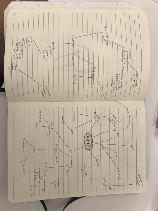
Week 2 Tutorial: Mind mapping
During this weeks tutorial, we were asked to start coming up with ideas and brainstorming potential beverage ideas. I have always had a fascination with wine bottles (but not so much the taste of wine...)
Whilst brainstorming and mind mapping wine ideas, I stumbled on the category of gender and automatically assumed to write down female domination. And that straight away sparked my idea for a concept that will somehow challenge social norms.
0 notes
Photo
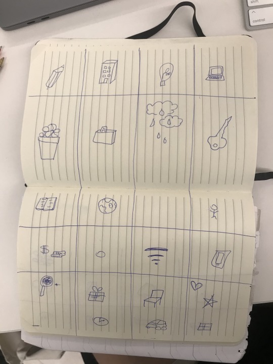
Week 2 sketch-note exercise:
During out lecture this week we were asked to draw the essence of objects and try our best to keep up with the the lady talking in the video. This was quite challenging but fun to do.
0 notes
Photo


Week 2 Pinterest boards:
In our tutorial in week 2, we were asked to create two different Pinterest boards. One for our beverage label design ideas, and the other for my aimed audience.
0 notes
Photo
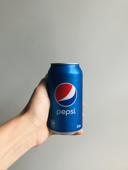
Week 1: Drink Branding
Throughout this week I came across situations where myself and my friends interacted with cans of soda. As shown in the images, I choose to analyse both Pepsi and Sunkist.
Unsuccessful Beverage label: Pepsi Can
Personally, I much rather the Pepsi design, as I’m a lover of minimalist design and this specific one is so well known for something so simple. Although, not in any way is the design of the Pepsi label/can corresponding with the drink itself. The can is blue, the drink is brown. It doesn't instantly give off a feeling of what the drink will taste like or make you feel.
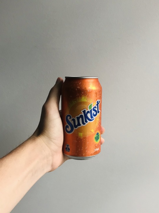
Successful Beverage label: Sunkist Can
Although the design of the Sunkist can is more complex, it sends way more of a message to the consumers. Before consuming the drink itself, you instantly face a design that conveys the colour of the drink, the texture of the drink, and refreshment. I feel as though the Sunkist has a less famous label, yet sends a greater factual message through the can itself.
1 note
·
View note