
Don't wanna be here? Send us removal request.
Statistics
We looked inside some of the posts by natpitt23-blog and here's what we found interesting.
Average Info
Notes Per Post
6
Likes Per Post
2
Reblog Per Post
4
Reply Per Post
0
Time Between Posts
5 days
Number of Posts By Type
Video
3
Audio
1
Photo
4
Text
7
Link
1
Last Seen Tumblr Blogs


Fun Fact
Tumblr has been providing a Korean-language service since 2013.
Audio
I sampled Vivaldi’s Winter from his Four Seasons sequence. Shout out to Jerry Sanchez for his rap!
0 notes
Photo


Part 2 of Charlie Ate My Homework!!!
(Mom finds out, subsequently gets pissed...)
0 notes
Photo


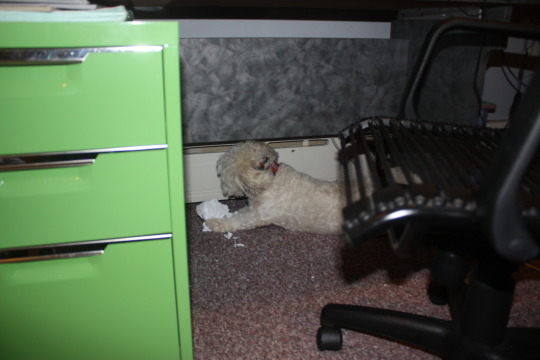


Part 1 of Charlie Ate My Homework!
(Naughty Dog!!!)
Tune in to part 2 to see the consequences of being an adorably rambunctious dog!
2 notes
·
View notes
Photo


1. Shallow Depth of Field
2. Blur
3. Framing and Composition
4. Foreshortening
5. Occult Depth of Field
6. Silhouette
0 notes
Photo

My dog has always wanted to be a star. I now have fulfilled his dreams. Anyways, I have never really used Photoshop before so this was quite an experience, but a fun one all the same. I used Microsoft Word to make text boxes with black backgrounds then made them into PDFs which I then converted into JPEGs and added into the add.
0 notes
Text
MediaDesignFall15
White Space and Size

This ad for Volkswagen utilizes white space to emulate its message to “think small.” The car advertised here is small in comparison to the vast amount of white space around it. This is done in order to make the reader feel that the car is compact and economical. The words below try to convince the reader to buy the small Volkswagen because it is small and it lists reasons why one would want to buy it, summarized by the last line in the list of reasons, “Think it over.” It should be noted too that the font follows the message of the ad because it is so small. I am not sure how effective the ad is, but it does certainly keep to its message of thinking small.
1 note
·
View note
Link
0 notes
Text
White Space and Size
This ad for Volkswagen utilizes white space to emulate its message to “think small.” The car advertised here is small in comparison to the vast amount of white space around it. This is done in order to make the reader feel that the car is compact and economical. The words below try to convince the reader to buy the small Volkswagen because it is small and it lists reasons why one would want to buy it, summarized by the last line in the list of reasons, “Think it over.” It should be noted too that the font follows the message of the ad because it is so small. I am not sure how effective the ad is, but it does certainly keep to its message of thinking small.
1 note
·
View note
Text
Groupings and Symmetry

This ad uses symmetry to show that Geico does more than just auto insurance. On one side of the axis line Geico displays the idea that they offer more than just auto insurance and on the right side of the axis it shows all the different kinds of insurance that Geico offers. There are also seven groups in this ad. The first is Geico’s famous slogan “You could save 15%” which is the grabbing line with which Geico hopes to attract new customers. Another group is the line that says that Geico offers more than just auto insurance. The next group delineates all the types of insurance that Geico offers. The next group entices the potential customer to call immediately to get his or her free rate quote. The mascot or the famous Geico gecko is another group followed by the group of the url and finally the last group is the Geico logo that the Geico gecko rests his arm on. Essentially, this ad is well-organized and like the Insurent ad provides a feeling of tranquility and order to a occupational field that must often deal with hectic requests and problems.
0 notes
Text
Repetition, Groupings, Positive and Negative

I have not seen this company before (perhaps they have been around for a while, but this is the first ad I have seen in NYC). The “Insurent” logo is repeated twice on the bottom, with positive and negative coloring (the first half is in white and blue in the first one and blue and white in the second one). The groupings here are also very interesting. The first grouping is two slogans. The second grouping is a photo of a happy couple seemingly in their new apartment. The third grouping is the description of what the company does and the fourth grouping highlights the name of the company. The groupings are done in such a way that the atmosphere seems relaxed and organized, a feeling that Insurent wants the customer to feel. It should also be noted that the company pitches itself as a proud sponsor of the New York Yankees, just another way of gaining more customers based on similar baseball team affinities.
0 notes
Text
Size and Position

The size of the Coke bottles and their position (they are adjacent to one another) manifest the importance of friendship. The ad is clearly trying to show that friends share bottles of Coke with each other. The size of the Coke within the slogan “Share a Coke with a friend” is bigger than the rest of the words and is colored red as well as being in a different font to highlight the name of the product. The font types in this ad seems to delineate relative importance of words. Coke is the key word obviously, but the typeface of “Luke” and “Kylie” show the friendship that Coke brings together.
0 notes
Text
Symmetry, Balance, and Size

The ad here has symmetry along an axis to the left and right. The purple can is symmetrical to the blue can and the red can serves as the axis line through which we can see the symmetry. As far as size goes, all three cans are identical in size even though the red can (strawberry lemonade) is at the forefront of the picture. This ad is also a good example of compositional balance as the weight on the left balances the weight on the right. The words on the bottom make less of an impact than do the pictures, but the slogan “Sip in good. Give out great” seems to make more of an impact than the small paragraph above it. Essentially, the words below summarize the idea in the paragraph above.
1 note
·
View note
Text
Symmetry, Balance, and Size
The ad here has symmetry along an axis to the left and right. The purple can is symmetrical to the blue can and the red can serves as the axis line through which we can see the symmetry. As far as size goes, all three cans are identical in size even though the red can (strawberry lemonade) is at the forefront of the picture. This ad is also a good example of compositional balance as the weight on the left balances the weight on the right. The words on the bottom make less of an impact than do the pictures, but the slogan “Sip in good. Give out great” seems to make more of an impact than the small paragraph above it. Essentially, the words below summarize the idea in the paragraph above.
1 note
·
View note