
Don't wanna be here? Send us removal request.
Statistics
We looked inside some of the posts by omarrr and here's what we found interesting.
Average Info
Notes Per Post
5K
Likes Per Post
3K
Reblog Per Post
2K
Reply Per Post
0
Time Between Posts
3 months
Number of Posts By Type
Text
4
Photo
11
Video
1
Link
1
Last Seen Tumblr Blogs


Fun Fact
The Tumblr app for Google Glass was released on May 16, 2013.
Text
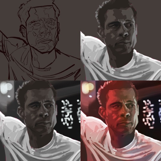
Movie Still Study — Ad Astra

Photo reference: Still frame from the 2019 science-fiction movie Ad Astra starring Brad Pitt as Roy McBride, a major in U.S. Space Command.
Notes:
Let's start by acknowledging that Brad Pit doesn't look like Brad Pit in the final image. He does looks closer to Brad than to Mr Bean, so let's call it a win.
The brushstrokes on the face are neither here not there. They are not smooth enough for realism, nor sharp enough to be a clear stylistic choice (Note to self: apply more decisive strokes).
I definitely learnt something about color and lighting, but honestly the color is just not there either. I struggled with matching the values from the film. The backlight and the face in shadows threw me off. First I struggled to go dark enough in the face, and then overcorrected and went too dark. The shirt is a mess too. I gave up fixing it though. Once I feel that I have learnt what I could I stop fixing things and move on to the next piece.
Bonus round: 2 minute alt to make Ad Astra as if directed by JJ Abrahams:

Lessons learnt:
Who knew that the simple round brush could make realistic background lights? I am impressed with how well the background turned out considering the little effort I put into it.
Adding grain made this look like a photo still. Thanks for the tip Jens Claessens!
Goals for next time:
More decisive brushstrokes. After color blocking the line art, the brushstrokes looked boring (again like paint by numbers). Towards the end, in frustration, I enlarged the brush size and made some quick strokes to try to fix the worst offending areas (it kinda helped!) So, I need to be more decisive with the brush, be less precious with what's already been laid out and cover it, redo it if needed.
Also, I wish I had pushed the portrait further, stylizing it more. I love hyperrealism, but I'm not going for that, and this just looks boring.
#portrait art#procreate art#digital art#digital illustration#procreate app#brad pitt#ad astra#fanart#scifi#scifi movies#procreate#ipadpainting
6 notes
·
View notes
Photo

Info
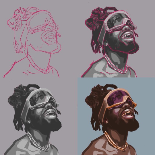
Photo reference: Johnny Venus by Louis Browne
Art reference: Viktor Titov
I am kicking myself for sticking to the photo reference so closely. I always lean towards realism. If I'm honest to myself, that's because in some sense it is easier to "copy" than to imagine. (I'm oversimplifying, of course. There's noting simply about what Robert Bechtle or Richard Estes do). Once I sketched the proportions I got in autopilot and forgot to look at the big picture. So I ended up with too faithful a study and little imagination added. I lost the emotion and intensity of the photograph and was left with too still a still. Does that make sense? The proportions are too close to the original for my linking basically.
Somehow I forgot how shadows work. The neck and body look like paint by numbers. I do like very flat colors, and limited palette. In this case however this was not a deliberate choice, so it's clear that it lacks intent.
Also, I forgot to study my art reference as I went along, and I don't know how to paint backgrounds :(
1 lesson learnt: Don't forget to draw a figure with intent. Stylize the proportions, create more interesting profile, etc...
1 goal for next time: For more graphic illustrations separating the figure from the background makes sense, but when going for the painterly look, I feel that it would be better to paint the figure and the background on the same layer.
Self-rating: 🥨 / 10
1 note
·
View note
Photo

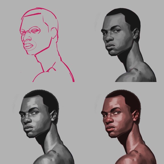
Photo reference: Malick Bodian by Vito Fernicola.
Art reference: Meybis Ruiz Cruz, specially this study.
I was very inspired by Meybis portraits. The shapes and the brushstroke quality of their work are beautiful and very personal.
I tried a couple of things I hadn't done before. I painted the values first and then added color. This definitely made things easier. It allowed me to focus on just value and how to apply the brush (Thank you YouTube for the tip.)
I altered the original proportions of the figure. I like what I was going for, but I the anatomy feels somewhat wrong and the end result doesn't fully work for me. I pushed for a more angular profile, which i like better than the soft one I started with.
The thing though, is that the portrait is lifeless. It is somewhat bland if not boring.... I do like the the brushstrokes, though.
Oh, yeah, and the background is a mess...
1 lesson learnt:
Patience pays off. I always try to get stuff done in 15-20 minutes and it took hours to get to the end on this one. So... that.
1 goal for next time:
I'll try more adventurous brushstrokes. More variety in thickness and more decisive hard lines.
Rating: 🦴 / 10
Feedback always welcome.
6 notes
·
View notes
Photo

David Fahrenthold goes from tweeting pictures of his notepad to winning a Pulitzer Prize
“I think I knew there was going to be a lot of futility to the process. I was looking for a way to make the futility look interesting and give people something to follow.”
Man, if I was working on an update to Show Your Work! this would definitely go in. (It always makes you feel like you wrote a somewhat relevant book when the news writes new sections for you every week…)
Filed under: show your work
67 notes
·
View notes
Photo

Iconic Star Trek stamps.
(via Update Supply - Updates every minute.)
2 notes
·
View notes
Photo

Preparing the title card for "The Fall of the House of Usher" ebook. The type is a recreation of classic blackletter type with geometric shapes #poe #geometric #typeface #blackletter #edgarallanpoe #fallofusher
0 notes
Text
Just rewatched Pacific Rim and Dr Newton Geizler was my favorite character. His anti-nerd/geek-chic look, including his estilized japanese tatoos of the Kaijus was iconic.
Newton Geiszler doodles
As (kinda) requested!!


Newt adopts one of those Kaiju parasite thingies…


5K notes
·
View notes
Photo

Working on this guy's portrait for one of his short stories that I'm illustrating. #edgarallanpoe #portrait #vector #art #wip #poe
1 note
·
View note
Text
Fixing Amazon's Kindle Previewer in El Capitan
Fixing Amazon’s Kindle Previewer in El Capitan
For some reason getting Amazon’s Kindle Previewer to work on El Capitan is not an easy task. There are a few resources online that pointed in the right direction but didn’t fully solve the problem for me. Here is what worked for me, extracted from the Amazon forums 1. Install Java for OSX Download: Java for OS X 2015-001 2. Open the Launcher shell script with a text editor The Launcher file is…
View On WordPress
0 notes

Photo

Profile of man #2
1 note
·
View note
Photo

Profile of man #1
0 notes
Video
instagram
Dedicated to @ronosaurusrex and all those #StarWars fans waiting in line to watch #TheForceAwakens right at this moment 🚀🌌‼️
0 notes


Text
On Spanish Newspapers that would make Franco Happy
The New York Times recently wrote an article that questions the editorial independence of many news organizations in Spain that are being pressured by the government and by the financial institutions that hold their debt. Over the past two years, the editors of three major Spanish newspapers have been ousted. Their removal came amid steep financial losses, but also followed the publication of…
View On WordPress
0 notes
Link
Femme Wars – The Helmet Trilogy
Here's the making of the first illustration of this series. Created with a homebrew app for vector/pixel drawing. I recorded the illustration as it was being made. Darth Vader was great to draw as a woman.
Femme Wars is Star Wars homage with evil characters reinterpreted as female icons.
#FemmeWars#StarWars#Star Wars#DarthVader#Darth Vader#geometric#vector#2d#illustration#icon#icons#geometry#8bit#8bits
0 notes