Don't wanna be here? Send us removal request.
Statistics
We looked inside some of the posts by punkindunkin and here's what we found interesting.
Average Info
Notes Per Post
57
Likes Per Post
49
Reblog Per Post
7
Reply Per Post
1
Time Between Posts
2 months
Number of Posts By Type
Text
16
Link
1
Last Seen Tumblr Blogs


Fun Fact
Average visit duration of Tumblr.com is 10 mins and 25 secs.
Text

Here is the Cool and Warm colors drawing I did in Figure Drawing II. It was made with oil pastel that had shades of blues which were complementary to orange that had analogous colors of yellow. It was based on a model I saw in class.
Plus, it was made in the spring of 2022 of last year and it has been 9 years since I first started drawing realistically in order to achieve artistic success.
I hope you will like it.
9 notes
·
View notes
Text

Here is the second contour drawing I did in my Figure Drawing class from last year in 2022. I used a charcoal stick to make a c and s curve for the head, rib cage, and pelvis. Then, I drew the arms and legs based on the real life human model that I fully observed.
It has been this way since I started doing contour drawing which is the foundation for basic shapes of character design based on humans which is the bipedal species that I previously experienced in Physical Anthropology 4 years ago.
In conclusion, it’s been 9 years since I had been focusing on figure drawing which is the foundation for drawing characters for comics, illustration, and in animation that is the formal art education.
1 note
·
View note
Text

Here is the Inside and Outside oil painting which was made in my final project for Beginning Painting.
It was inspired by my childhood memories of growing up neurodiverse by using visual thinking through geometric and abstract shapes which was influenced by Kandinsky, Margarete, and Picasso, an homage to the great artistic masters which I learned in the past.
It represents a fantasy world which was in contract to a golden gradient door which was projecting a filmstrip that records everything I remembered in the past and present such as the semi colon that is a representation of anxiety along with the rainbow infinity symbol.
I want to give hope through the power of art that could find solutions to the problems we face in the neurodivergent community in order to bring in equality for a better world that embraces humanity.
0 notes
Text

I made the color wheel for Beginning Painting which I used yellow, red, and blue as the primary colors. Orange, green, and purple are tertiary colors which are complementary to each other. Next I mixed the colors with white oil paint by a palette knife to create a hue. Finally, I mixed red, yellow, and blue to make black and I painted it in the center calling with an oil based liquid called turpentine to make it more smoother.
0 notes
Text

Here is the monochromatic painting which I painted last night which took 2 days to produce. It has to have hues and values of a color like blue for example. Next, I used Winster Newton water based oil paint along with turpentine to make it a more smoother and cleaner edge.
I used a reference photo of a African American man which expands more ethnic diversity to promote equality.
I mixed white and ultramarine blue to make lighter shades with the highlights with a palette knife like flipping pancakes or hamburgers.
Furthermore, It looks purely realistic and amazingly great with the shadows and highlights to make it look like the photo.
I just adjusted the oil based liquid which I had to be careful of in the future by being stoic to control the emotions.
What is your feedback on the Monochromatic painting of a cropped eyes and nose so I can get more advice from you?
1 note
·
View note
Text

I painted a sphere in a monochromatic tone which was my first assignment from my Beginning Painting class. I used Winster Newton water based oil paint colors of Burnt Sienna and Blue to make the color of black from scratch and used Titanium White for the shades ranging from dark to light gray for the shadows, highlights, reflected light, and cast shadow which I learned from Intermediate Drawing.
First I used the blue tape because I didn’t have artist’s tape and was nowhere to be found.
Next, I used Mars Black acrylic to mix with water as an alternative to turpentine a water based liquid for oil paint.
Secondly, I used a brush for darker colors and a brush for blending in.
Then, it took 2 days to finish the painting which oil paint takes 6 to 8 hours to dry and a coat of it for 24 hours.
The advice I got from my professor Dyanne Duffy was that don’t mix oil and acrylic paint together.
1 note
·
View note
Text
This is the linear perspective assignment in my figure drawing class back in 2016. At first I was trying to use the ruler to make a perspective background that was used during the Renaissance like Brunelleschi when he did the Florence cathedral in Florence Italy and Leonardo da Vinci when he did the famous painting called Mona Lisa. Next I use the vanishing point to make sure it's all correct which is based on velocity according to fphysics that requires a lot of algebra which is one of the hardest math classes I took it seriously. I created three figures which were based on black form rectangles and squares which is very simple to do which look like artificial maniquins rather than natural skeletons and muscles of the human body. First of all I really liked the finalized version of the drawing which was improved a lot and I was influenced by my professors advice in order to be successful as an artist in the future.

0 notes
Text


These are the Old Master Copies I drew on my sketchbook for Figure Drawing which were based on drawings of the Grotesque Man drawn in 1488 to 1490 and The Head if Leda which was made between 1505 to 1508, and the Head of a Young Woman for the Study of the Angel in The Virgin on The Rocks from around 1483 to 1485.
I selected Leonardo da Vinci who was a Italian artist and inventor who lived in the Italian Renaissance a period which saw the rebirth of Greco-Roman culture and philosophy in Italy that later spread throughout Europe that broke away from the Middle Ages. I drew it in graphite and used an ink pen to draw some hatching for the shadows by using light logic.
I hope you will enjoy the three drawings, please like and send feedbacks.
0 notes
Text

This a self portrait of me which I drew from my Intermediate Drawing class last semester and I applied light logic into the hair and the details of the face which was based on a selfie I took of myself. I used measurements and proportions with a ruler to make sure it’s correct. I used charcoal pencils, compressed charcoal, and vine charcoal for the highlights, shadow, reflected light, core shadow, and cast shadow to make it look realistic. I hope I will do future portraits like in this style that symbolizes maturity.
1 note
·
View note
Text


For my Intermediate Drawing class, I drew a 5 hour charcoal drawing of a vase, a teapot, grapes in a gold bowl, some leaf plants, and a triangle that looks like a 3 dimensional pyramid. I used highlights, reflected flight, shadows, and cast shadows to make the drawing more dramatic on the details of the grapes which made it realistic. I used the shadows instead of lines to create more depth in the value on the drapery which looks like theater curtains. Overall it looks terrific and stunningly beautiful. What is your feedback on the long charcoal still life drawing I did in class?
#charcoal#charcoaldrawing#faithbutterfield#FaithButterfield#@punkindunkin#still life#stilllifedrawing#charocoalstilllife
0 notes
Text
My art was inspired by the child-like side of my soul. As an adult, the reality of living in the real world can sometimes be boring and very hard, so that’s why the first piece is done in charcoal. The immature whimsical part of me is represented by a colorful fantasy scene, bringing joy and inspiration to my work as a artist and animator. I used color on the realism side to show that I am still listening to my child like side of me. A side that I still use to bring hope to inspire future generations. The picture of the brain with a rainbow infinity symbol represents the neurodiverse part of my life, and my autistic gift of thinking in images. Having the picture of the brain there represents inclusion and acceptance in a neurotypical society.
The title of my double self portrait is Never Grow Up.

#pasteldrawing#faithbutterfield#charcoaldrawing#neurodiversity#neurodiverse artist#neurodiverse#autism#autism art
25 notes
·
View notes
Text


I did a pre-instruction drawing of my closet of my bedroom where it was a observational drawing based from real life. I added shadows and highlights to make it look 3D in video games. Next I used a blending tool to make not look like a cartoon and I used a eraser to make more highlights like chiraacuro in Renaissance paintings.
I drew a self portrait of my delft which I learned how to shade in the hair based in the root it grows from and add some highlights like in real life
I need some help with inspiration for gesture drawing of everyday objects from daily life and what was your first experiences you had with a strict teacher of professor in a class like I am going through now as I act mature and super serious.
7 notes
·
View notes
Text

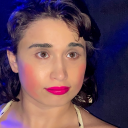
I got some new glasses from my optometrist Dr. Boyer and this has anti glare vision which will help me read and see what I am drawing clearly.
1 note
·
View note
Link
3 notes
·
View notes

Text


I had a Snapple and a coke zero because I don't drink sugar drinks anymore
6 notes
·
View notes
Text


I had a Kiwi Strawberry Snapple and a Coke Zero tonight
2 notes
·
View notes