Where I put all my artworks in one place to keep everything in order.Main account: @rex-shadao
Last active 60 minutes ago
Don't wanna be here? Send us removal request.
Statistics
We looked inside some of the posts by rexshadaoart and here's what we found interesting.
Average Info
Notes Per Post
728
Likes Per Post
512
Reblog Per Post
206
Reply Per Post
10
Time Between Posts
6 days
Number of Posts By Type
Text
17
Last Seen Tumblr Blogs


Fun Fact
Post activity is at the highest at 4:00 pm EDT; notes peak at 10:00 pm EDT.
Text
"Pam? What happened to us?" - Barbara Gordon
I had this in works for a while, just a redrawn scene of Barbara Gordon and Pamela Isley meeting up... with a different background and Babs being hit by mutagen mulch. Again, it's a fun experiment, but I didn't feel the need to post it as I felt this AU scenario hasn't been explored in the wider fandom, especially fandom of The Batman (2004).
However, a fanfiction on AO3, called where the wildflowers grow (thick as weeds and snow), has been updated recently, which tackles this AU scenario. The latest chapter is Babs realizing that she has become a plant person, which is usually where most of this set of fan fictions ends, unfortunately. It's currently in private, however, so you better have an AO3 account to read it.
Regardless, it does give me an excuse to post this up and hopefully get others to do more with this idea. I mean, Babs and Ivy do have a past friendship and Ivy never interacts with Harley Quinn in the show at all.
7 notes
·
View notes
Text
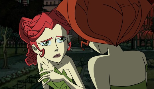
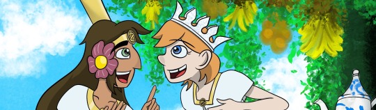
Tea Time: Ozma and Dorothy
The 7th and final Dorzma artwork and possibly my most ambitious piece yet. The two princesses of Oz, having some nice besides a tree that bears them bananas and oranges. And chatting about their adventures and activities of the day.
Well, I found this official artwork by John R. Neill a while back and the interactions the two share here are so good that I had to make my version of it. It was rather difficult at first since the arms and face had to be resized to fit my character proportions. But I do love the hand gestures as they really make the characters feel lively.
The background was tricker. I didn't wanted to be cel ink, so I went with pencil outlines with arcylics and water colors instead, with a few touch ups with elements from Procreate.
For the tea, I based it on a Chinese tea set, complete with a blue flower pattern. I thought about making the tea set emerald, but I felt that it needed a more familiar and calmer mood. For the table, I decided to make it have a motif of a tree, with branches and a trunk being the legs and the tabletop being emerald green
#procreate#dorothy gale#land of oz#princess ozma#ozma#ozma of oz#dorzma#dorzma month#tea time#tea#fruit#digital art#dorothy x ozma#lesbians#lgbtlove#lgbt couple#lgbt art#pride month#pride month 2025#oz#the wizard of oz#princess dorothy
21 notes
·
View notes
Text
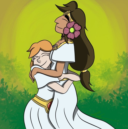
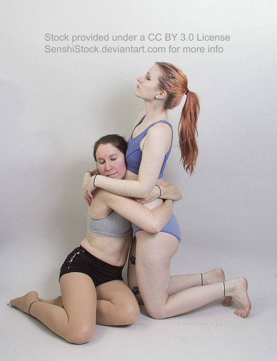
Dorzma Hug
Well, it's Dorothy Hugging Ozma. Nothing too special (aside from Dorzma itself).
Pose reference: @adorkastock
#procreate#dorothy gale#land of oz#princess ozma#ozma#ozma of oz#digital art#dorzma#dorzma month#otp#shipping#lesbians#lgbtlove#lgbt couple#lgbt art#pride month#lgbt#dorothy x ozma#princess dorothy
51 notes
·
View notes
Text

Watching the Cherry Blossoms
The Princesses of Oz sitting by the bushes, relaxing and watching the cherry blossom petals flutter by.
Pose reference: @adorkastock
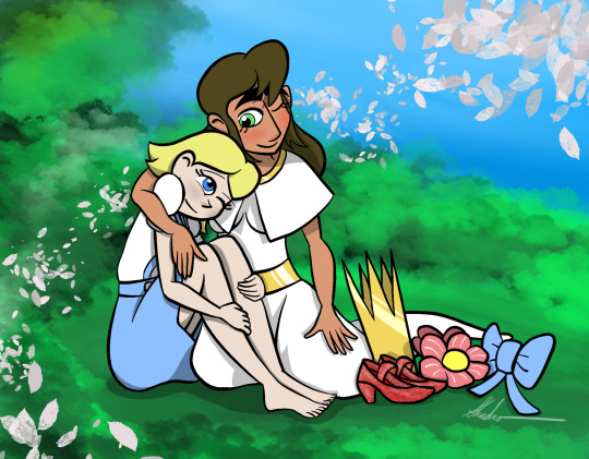
Well technically, it's a remake of this old artwork I did and posted back around 2022. Back when I was experimenting on the designs to make them viable for animation. As you may notice, a lot of things have changed between this and the new one. For instance, Ozma's crown has been redesigned to be more blunt rather than pointy. Dorothy's slippers went from Ruby to Silver. Ozma's eyelashes are removed and her hair was redesigned to avoid her bangs from becoming too wonky in proportions.
Dorothy's body proportions have been improved, no longer being too long or too skinny with the limbs. And the hands feel more natural in poses. Additionally, she's wearing her princess outfit and mainly because I realize these would artworks of them after Dorothy permanently moves to Oz. I guess making several outfits beyond the default one has made me more inclined to formulate a timeline.
And maybe make artworks or animated scenes from the actual books...
Either way, I do like to see how far I've come with my artist skills.
#princess ozma#dorzma#dorothy x ozma#dorothy and ozma#dorothy gale#ozma of oz#ozma#land of oz#digital art#procreate#princess dorothy#princesses of oz#dorzma month#lgbt couple#lgbtlove#lgbt art#lesbians#remake of my old artwork#old vs new
48 notes
·
View notes
Text
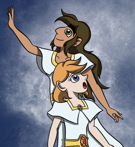
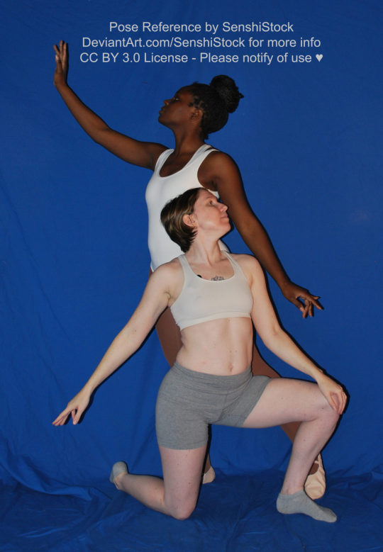
Milky Way Gazing- Dorzma
Here we see Dorothy and Ozma observing the starry, Milky Way night. It's before they head off to their bedroom, so they don't have their crowns on them. Ozma practices her magic while Dorothy gaze in awe of Oz's starry night. She has seen beautiful starry nights in Kansas before, but these starry nights of Oz puts them to shame.
Pose reference: @adorkastock
#procreate#dorothy gale#land of oz#princess ozma#ozma#ozma of oz#digital art#wizard of oz#dorzma#lesbians#sapphic#lgbt couple#lgbtlove#pride month#milky way#dorothy#oz#oz series#procreate app#lgbt art#lgbt#lgbtq#dorzma month
30 notes
·
View notes
Text
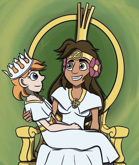
Upon the Oz Throne
There is only one throne of Oz, but that won't stop Ozma from getting Dorothy to sit on the throne alongside her. Even it means having Dorothy sit on her lap. Dorothy insists that they get a second chair to sit next to the throne, but Ozma wants the people of Oz to know that Dorothy Gale is her equal as the Princess of Oz and thus must be treated with the same respect as they would for Ozma.
Plus, she enjoys having this kind of company when dealing with day-to-day reports in Oz. Such political sessions can be so boring and emotionally draining for her, but Dorothy always has that lively spirit that makes such sessions bearable. Shouldn't be surprising since Dorothy is the reason why Uncle Henry and Aunt Em haven't succumbed to the grey misery of their former Kansas home.
Pose reference: @adorkastock
#procreate#dorothy gale#princess ozma#land of oz#ozma#ozma of oz#my art#digital art#dorzma#lgbt couple#lgbtqia#lgbtq#lgbt art#lesbians#throne#pride month#lgbt#dorzma month
43 notes
·
View notes
Text
I have to admit, I thought this was an official book artwork due to how good the lines are. And thus, I couldn't resist doing my own take on your drawing pose for my Dorzma month.


Princess Ozma of Oz and Princess Dorothy, her "constant companion"
#dorzma#dorothy gale#princess ozma#kiss#couple kissing#pride month#jackimer#inspiration#happiness#wizard of oz#land of oz#ozma#ozma of oz#princess dorothy#lgbtlove#lgbt couple#lgbt#lgbt art#dorzma month
331 notes
·
View notes
Text

The Princesses of Oz
Well, for the first week of June, I'm going to be on a long vacation to Orlando, Florida, and visit nearly all the major theme parks located there. As such, I would not have time to make Dorzma artworks as frequently as I want to… and I know of the legal battles between Disney and DeSantis over the "Don't Say Gay" bill or whatever nonsense is going on.
So instead, I make Dorzma artworks in advance. And for this one, I wanted it to be like a book cover, a poster for people to put on their walls. You might say a royal portrait. And indeed, that's what I was going for.
Instead of using the traditional anime-style ink pen and cel-shaded filling, I decided to go for a more painted feeling. This meant the outlines were done with dark sketch pencils, and the colors were painted with digital acrylics, both wet and dry, and maybe a few watercolor brushstrokes here and there. It's meant to give the impression that an artist was commissioned to paint a royal portrait of the princesses to later display in one of their hallways (or maybe in a museum).
For this reason, I had to design a new outfit for Dorothy to be more fitting of a princess rather than a farm girl. Since Ozma was considered to be a princess (despite technically being queen), it made sense that Dorothy would have a white dress similar to Ozma. Given that Dorothy was not the descendant of King Pastoria and Fairy Queen Lurline, I felt she could inherit the original design of Ozma's dress with the Oz emblem at the center of the neck collar.
Obviously, since this would take place after Dorothy's family permanently moved to Oz, Dorothy can now wear the Magic Belt of the Nome King freely. And being a princess, Dorothy out to have a crown of her own. I decided to go with the book design with a nostalgic look back at my very first Oz artwork. Dorothy would have a crown made of silver that glitters so brightly.
It may not be emerald, but it makes Dorothy feel like a young apprentice of Glinda the Good, and I want the audience to feel like Dorothy is training to be a good witch herself.
The Oz banner, was there to give a finished polish for the portrait. Made it through symmetry tools and careful observation. For the background, it was a pain to figure out what goes on there. I planned windows, thrones, and gardens to go there. But I settled with a foggy, brief glimpse of the Emerald City with Dorothy and Ozma standing by one of the gardens.
#procreate#my art#my art stuff#dorothy gale#princess ozma#ozma#land of oz#ozma of oz#princess dorothy#oz#wizard of oz#oz books#dorzma#dorothy x ozma#lgbt couple#lgbt art#digital art#pride month#magic belt#sapphic#wlw#dorzma month
47 notes
·
View notes
Text
First Week of June - Dorzma Week
For the first week of June, I'll be heading out on vacation to Orlando to enjoy all the theme parks there, specifically the ones with attractions that'll likely close down for the next year. Due to the fact that June is considered Pride Month, and the fact I always exclusively make Dorothy x Ozma artworks in June, I decided to preemptively make 7 Dorzma artworks, with one being posted every day of June for the first week, so I can focus mainly on my vacation trip while all of you can enjoy my artwork postings without delay.
Dorzma is honestly my OTP in the Land of Oz and I wanted to top myself this year by making more artworks, and hopefully inspires others to make more Oz artworks. Oh, and an early Happy Pride Month!
9 notes
·
View notes
Text
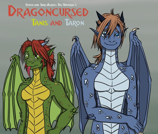
Dragoncursed: Tanis and Taron
Children of Dragon Hunters halfway into their Draconification curse.
Characters owned by @evion (also found in @tfseeds) and @star-across-the-universe.
Now this was an interesting challenge. Tanis has many artworks, sketches, and descriptions already to determine the various stages of her slow transformation into a dragon. She had curved horns like antlers, forest green and gold-yellow colors, a red mane, smooth freckle-like scales, four digits on each wing, and green/yellow eyes. Her transformation started at the claws and feet, with her teeth sharpening into fangs. Her final dragon form was drawn from head to neck, while the rest of her body was described to be like that of an East Asian dragon (plus two European wings) with a ferret-like appearance.
But Taron, Tanis' older brother, was a different story. There are only a few artworks of him that showcase his transformation and they are very subtle. Whereas Tanis' dragon features were obvious, Taron's features were more subtledue to them occurring on his back, which he covered with a scarf. All that's clear is that he's growing horns and wings, and there's only one sketch where he's midway into his transformation. In that sketch, he apparently has four horns rather than two and more reptilian-scale "freckles".
Meanwhile, the character model sheet of Taron showcased him being significantly taller than Tanis and that his eventual dragon form would have blue scales, blue eyes, and blond hair.
This told me that Taron's dragon form was not going to be like his sister's dragon form, so any educated guesses based on Tanis was going to be limited to the shape of the wing and color scheme patterns (in that the scutes and the freckle scales were likely the same color based on Tanis).
And this proved to be quite an obstacle because Taron's underbelly scutes could any color depending on the direction and theme. It could be tan, it could be white, or it could even be yellow (which would make him look like Spyro). For a time, I just used the base colors of green and blue wash for the characters (even posted it on Bluesky for TF Tuesday), but it felt incomplete. I could have gone much further.
Luckily, @star-across-the-universe filled me in on the details regarding Taron's dragon form. He has a silver underbelly with dark horns that will grow into spirals like an antelope. He had a storm motif in contrast to her sister's forest motif, which reminded me of Azymondias from Dragon Prince. That actually helped me figure out the colors of minor details like the underside of the wings.
As I was drawing Taron, I actually began to revise my old fan art of Tanis all those years ago to accommodate better what I now see in these various sketches. For example, the sketch of Taron's draconic features implied the wings were much smaller than I realized, so Tanis' wings were reduced in size. I also redesigned her scutes to have a more solid form instead of the blob shape that I could not unsee in my old drawing. Also, I didn't want Tanis to look too short compared to Taron, so I just had Tanis be a head shorter than Taron, with the implication she had a growth spurt as she progressed into the draconification.
Also, for those who see the Bluesky Sketch, do note that I did some revisions to Taron's outline after noticing a few mistakes with body anatomy (such as the thumb being shown outward rather than inward in his right hand).
This has been fun drawing sessions, and it helps me a lot with understanding anatomy, particularly with dragons and dragon humanoids.
#dragoncursed#tanis#taron#fanart#evion#star-across-the-universe#evion's oc#star-across-the-universe's oc#oc#dragon tf#dragon#dragon art#dragon oc#dragon design#draconic#dragon humanoid#dragon hunters
8 notes
·
View notes
Text

Well, didn't expect to do The Thirteenth Year again, but I suppose I'm obligated to do at least one MerMay stuff after spending an entire month of Oz and June being the month I dedicate to Dorzma.
Again, this is inspired by the fan fiction The Secret Lives of Fish. Sure, @andy-the-8th's The Creatures That Defy Logic is the most well-known The Thirteenth Year fan fiction, even getting its own TV Tropes page. But TSLOF is the first TTY fan fiction to be completed from beginning to end. And it was the fan fiction that entertained more mer-transformation that made the Disney Channel TV movie memorable (everything else, high school drama, swim team, family misunderstandings, etc. is just forgettable).
For that, The Secret Lives of Fish holds a special place in my heart (plus it came out on my birthday).
Of course, the fanfiction kinda teased me on many plot points that could warrant its own sequel. A tip of the iceberg of where it could go. And I guess that's what fueled this artwork. Seeing where we could go with the premise.
I'm not much of fan fiction writer and if I do write fan fiction in the future, it will about the Land of Oz and Dorzma (which I swear I will it make into reality one day).
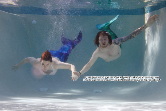
This is the @adorkastock image reference I used for the artwork. I have to admit, it was kinda hard to draw these poses, especially when Sam has massive hair that blocks much of the mermaid figure. Took me several pencil sketches before I went "I could actually draw them."
The fun part of The Thirteenth Year is really playing on the physiology of merfolk. The patterns of scales on Cody and Sam's arms were refined into a neat pattern that should match with the movie, while the arm fins are of different shapes to reflect merfolk variety.
I decided to go one step further and decorate these two with merfolk attire. For Sam, I based her attire on Cody's mother. Seashell bra and a tiara made of shells and starfish. For Cody, I decided to give him a necklace made of shark teeth and shells. I recall that there was incident where Cody was bitten by a shark in Creatures that Defy Logic, so I thought sharks are a fitting motif for him.
As to why I decorated them with merfolk attire? Well, I wanted to expand the merfolk culture a bit based on what we saw of Cody's mother. And I like to do visual storytelling with my art. In this case, after Sam got used to her mermaid form for several days or weeks, she went on a long date with Cody to the world of the merfolk and came back wearing seashells and starfish handpicked by Cody's mother. Maybe date is the wrong word to describe it. It was more of a vacation, a holiday if you will.
Oh, the two mer-teenagers manage to get a handle over their electric hand holding pulse. Seems to give them extra speed and lure a school of fish to follow their bubbles.
#the thirteenth year#procreate#cody griffin#sam#Samantha#mermaid art#mermaid#merman#merfolk#mermay 2025#digital art#mermay#merpeople#disney#disney channel#disney channel original movie
29 notes
·
View notes
Text

"I am Oz... the great and... terrible... But don’t strike me! P-please... don’t... I’ll do anything you want me to!"
Behold! The man behind the curtain. The supposed great and powerful Wizard of Oz... is nothing more than an old humbug from Omaha, Nebraska.
Oscar Zoroaster Phadrig Isaac Norman Henkle Emmannuel Ambroise Diggs. Or OZ PINHEAD for short. We'll just call him Oscar Diggs because he ain't Oz (but he is a pinhead). As a bonus, here's him with his top hat:

Unlike other Oz characters I drew, I need no Moodboard reference to know exactly who to base Oscar Diggs on. PT Barnum, the original humbug.

I don't know if L. Frank Baum based Oscar Diggs on PT Barnum since there were other showmen like balloonist Washington Harrison Donaldson that fit the inspiration better.
But PT Barnum was known for being a hoaxer and a shameless showman. He's even known as the Prince of Humbugs and is attributed with the phrase "A sucker is born every minute", and this caricature cartoon I found fits better with Oscar Diggs' look in the books than Donaldson's handsome, mustache appearance. I want to make it clear that Oscar Diggs is not a dashing, charming rogue, but an old humbug who is meeker than Dorothy Gale.
Plus, Donaldson did work with Barnum, so I envision that Oscar Diggs did work with Barnum during his young career and used the skills he learned from the master showman to trick the Ozians into thinking he's a genuine wizard.
Anyways, I based Oscar's face on Barnum's caricature and gave him a little shave and the Wizard is described as a bald, old man. I also was reading Eric Shanower's graphic novel adaptation of Dorothy and the Wizard of Oz and got a reminder that the acronym of Oscar Diggs' full name spells OZ PINHEAD, and the artwork of Oscar Diggs gives him a pinhead look not unlike Arnold Wesker from The New Batman Adventures. So, I did a little simplification of Oscar's face and somewhat straight his head and neck to look more like a pinhead while still maintaining the primary features on his giant head puppet (as it's supposed to be based on Oscar's head just exaggerated to be more god-like).

#my art stuff#procreate#digital art#wonderful wizard of oz#wizard of oz#the wizard of oz#wizard#oz#oscar diggs#oz pinhead#my art#land of oz#digital drawing#procreate app#big head#giant head#pt barnum#l frank baum#humbug#top hat#Washington Harrison Donaldson#oz the great and terrible#oz the great and powerful#showman#magician#stage magic#wicked 2024#wicked#professor marvel
5 notes
·
View notes
Text

I AM OZ! THE GREAT AND TERRIBLE!!!
One thing I love and hate about the book version of the Wizard of Oz is that he appears in many forms, not just the giant green head that adaptations simplify to. That means more subjects to draw, and more hair-pulling moments when trying to translate the book text into something feasible in the visual department. But I'm getting ahead of myself.
Big Head. The classic form of Oz. A giant, bald head that sits on a throne, acting all high and mighty to Dorothy Gale. Quite an impression for many people and certainly the best representation of what people think the Wizard looks like. I based the head on PT Barnum and removed his hair. You might notice the eye pupils are hollow and the mouth looks awfully like a wooden puppet's. Hmmm...
The Beautiful Lady. With green hair, two sparking bird-like wings, and long flowing dress. Scarecrow was certainly not expecting the Wizard to be a woman, but Oz is said to take any form he desires. The Tin Woodman would be certainly envious of Scarecrow's encounter. I wanted the beautiful lady to be like my version of Glinda, but clearly not as beautiful or imposing as her. Her face is based on the Force Priestesses from Star Wars: The Clone Wars series, particularly with the glowing hollow eyes and the mask-like face. It gives her a sureal aura to her, almost like she's some marionette with strings attached...
The Beast. This design was a pain to draw. A beast with a rhinoceros' head, five eyes, a woolly body the size of an elephant with five arms and five legs? The limbs in particular were a pain because I had no idea how they're supposed to align. I work better with pairs. At some point, I just resorted to basing the Beast on a large heavy sack with limbs dangling out with no rhyme or reason to biology anatomy. Certainly it would give the Tin Woodman a heart attack if he had a heart. The Lion can't tell if he's lucky or unlucky he didn't meet this particular beast.
The Fireball. This was simple. Draw a ball, like a cotton ball for example, and paint a fire using oil brush on Procreate. Really make it bright like it's burning magnesium. That'll scare the Lion.

Of course. None of these forms are real. They're props and hoaxes to make the Wizard seem more impressive than the humbug he really is. Add some emerald-tinted glasses to make these forms appear green, and you got yourself some fine illusions that hide the strings and stitches to each form.
The big head is a dummy puppet made of plaster, clay and wood that resembles the Wizard's face, Oscar Diggs.
The beautiful lady is just a mannequin dressed in a royal garment found in the Emerald City, given a wig, a customized theater mask, and some swan wings sprinkled with emerald glitter.
The beast is a stuffed rhino head with its second horn removed to make room for light bulbs of sorts to be stuff into the rhino's sockets (and it's lower jaw is decayed to showcase its teeth). It's attached to several bodies of deceased Oz creatures stitched together. These creatures seem to be of giant spiders from the forests.
And the fire ball is just a cotton ball dosed in oil and lit aflamed.
Now what does Oscar Diggs looks like behind the curtain? That's for another time.
#procreate#my art stuff#my art#digital art#fanart#land of oz#wizard of oz#wonderful wizard of oz#oscar diggs#wicked#wicked 2024#the wizard of oz#oz the great and powerful#oz the great and terrible#giant head#beautiful women#fairy#angel#puppet#beast#fireball#wizard#rhinoceros#humbug
28 notes
·
View notes
Text

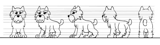
Toto
I'll get you my pretty... AND YOUR LITTLE DOG TOO!!!
Well, you can't have friends of Dorothy and not include her little dog, Toto. I have to admit, Toto may be the hardest character to draw for me thanks to being an animal (which is not what I'm used to) and the books using on two different breeds of terriers to depict Toto: A Cairin Terrier and Boston Terrier. It may even border on three if we include Yorkshire Terrier into the mix.
The reason for this is that John R. Neill changed Toto's species from Cairin Terrier to Boston Terrier. I do not know the reason why, though some people speculate that Neill had a Boston Terrier as a reference for his drawings. Now it can easily be surmised that Toto is a Boston Terrier... if it weren't for the fact that L Frank Baum described Toto as having "long silky hair", which is not a trait of a Boston Terrier.
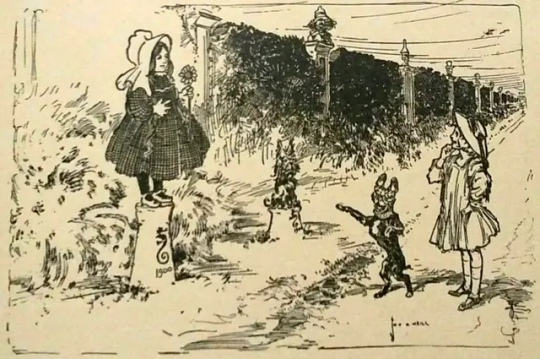
Now some works, like @yellowbrickramble, embrace Toto as a Boston Terrier. And it's not surprising why. It allows new interpretations of Toto to stand out from the shadows of the MGM movie and draw more from the books.
But Toto has been described by Baum with long hair and Neill wasn't consistent with Toto's design as he went back to the Cairn Terrier look in other books. But I didn't want to forget the Boston Terrier look, so I began picking and choosing traits from both designs to create a unique character. I even took inspiration from the Pokemon's Herdier as reference for a more cartoonish animal look. The most difficult part, ironically, was choosing the Toto's colors. I experimented with various shades of black and dark grey to both stay true to the original book description while making sure you can actually see Toto by breaking up the colors. I even went through various colors for the little bowtie collar before settling with pinkish-white one.
It's certainly better than my last attempt at drawing Toto:
#procreate#my art stuff#digital art#my art#dorothy gale#dorothy#toto#dog#and your little dog too#land of oz#wizard of oz#wonderful wizard of oz#oz#ramblings#my ramblings
3 notes
·
View notes
Text


Friends of Dorothy
The original companions that accompanied Dorothy on her first adventure in Oz. The Scarecrow, the Tin Woodman, and the Cowardly Lion. Each designed with the general theme of both missing and having the traits they desired at the same time.
I have a lot to say for each character design of mine:
Scarecrow is based on rubber hose characters of the 1920s and 30s, with long, rope-like limbs and a circular head with a very simple face. He has white, cartoon gloves with four fingers and a blue Munchkin farmer's outfit, complete with an oversized Munckin hat.
He's quite intelligent and witty, philosophical at times. But he tends to overthink too much, which is what leads him to conclude that because he has no physical brain, he is not smart and thus needs get a brain to be smart.
Nick Chopper aka Tin Woodman is essentially rough sketch of a character taken to the logical extreme, with ball and lines becoming his limbs. The ball joints (and his lower jaw) are darker color to imply why he needs a can of oil to lubricate despite the fact he's made of tin, which cannot rust. He primarily takes inspiration from Abraham Lincoln and robots like Optimus Prime, Iron Giant and others that fit the description "Be strong enough to be gentle."
Tin Woodman's eyes are black sockets with blueish white glowing dots to give a sense of hollowness and weariness to his character, but they also give him a sense of a soul inside. A heart, suffice to say. Yet, the Tin Woodman feels empty inside, and thus he desires a physical heart to feel complete.
The Cowardly Lion is honestly the most challenging character to draw, as I don't do animals that often. But the general idea I had was take Mufasa's brick-build design... and add a lot of Scar attributes such as a triangular head and long tail. But also make them soft so the Lion appears cuddly not cruel. It's the same method as Scooby Doo's character design, was deliberately the polar opposite of the Great Dane depiction.
Overall, the Cowardly Lion also exemplifies strong enough to be gentle to others. It's how he made many friends, but also why so many do not fear him and even mock him. And the Lion believes in their mockery because he buys the belief that a lion must be fierce, fearless, and strong all the time. He never realize that courage doesn't come from the outside, but from within. And give it enough push, the Lion can be a very fierce beast.
#my art stuff#my art#friends of dorothy#scarecrow#tin woodman#tin man#nick chopper#lion#cowardly lion#oz#land of oz#wizard of oz#wonderful wizard of oz#procreate#digital drawing#digital art#oz characters
40 notes
·
View notes
Text

When doing the redesign of Ozma's outfit, it got me thinking to doing something similar with Dorothy Gale. Only instead of changing one outfit, it's to document several outfits (and a hairstyle) she most certainly worn in her many adventures of Oz.
1) Default. This is the character design I refer to when drawing Dorothy in general. The iconic blue dress with a white blouse (and silver shoes), with the short flapper-styled hair from the later books.
2) Beginning. This is what Dorothy would look like when she landed in Oz for the first time. A pair of braids that invokes her classic Wizard of Oz look before the sequels opted for a short hair style akin to a flapper. It's also a darker shade of blonde to indicate that Dorothy's family have been living in a very dusty farm and it's only after her trip to Oz does she clean up nicely.
3) Default with Magic Belt. The Magic Belt she got from the Nome King.
4) Voyage to "Oz". In this case, to Australia, but she ends up in the Land of Ev instead. Rather than the icon blue dress and white blouse, she wears a plain pink dress with belt and ribbon. It also reflects the weary nature of her journey, with ocean storms and an unfamiliar (and hostile) land where there seems to be no Good Witch to rescue her. Also note the lack of silver shoes.
5) With the Magic Belt. This is what Dorothy would look like she takes the Magic Belt from the Nome King and use it against him. A little note with the belt, it has a ruby gem in the middle as a little nod to the Ruby Slippers.
6) Princess of Oz. Ozma made her the official Princess of Oz. And when Dorothy permanently moves to Oz, she completely embraces this role thoroughly. And naturally, a princess out to have a special royal dress completely with a crown. A crown of silver, perhaps. She also wears the Magic Belt as part of her princess outfit since she no longer needs to depend on Ozma using the Belt to take her back to Oz anymore. She also wears the silver shoes, though I do not know how she got them back... but it's too good to pass up. Fun fact: The Oz emblem was originally part of Ozma's design before it was removed this year. I decided to reuse it for Dorothy's princess design.
#procreate#my art#land of oz#wizard of oz#dorothy gale#the wizard of oz#wicked#digital art#my art stuff#dorothy#princess dorothy#princess of oz#magic belt#ozma of oz#silver shoes#ruby slippers#character model#model sheet#character designs#outfits
23 notes
·
View notes
Text

An update of Princess Ozma's design.
Funny thing about character designs. There's always room to tweak it even after having the model sheet established for about two years or so. And that's mainly due to seeing how other artists draw my depiction of Ozma. You often learn what stands out and what needs improvement.
In this case, it's Ozma's necklace that I wanted to do a little revision. Originally, it was a simple emerald ring around her neck. But it was too boring, so I tried to add an ornament at the center to make it look fancy. Originally, it was the book circular cross ornament, but I found the design to be too complex at first due to having four circular holes. So it was changed into a simple Oz emblem. And it has been the staple of my Ozma's design in both my art and other people's fan arts (like rocketdave's art here).
But during a commission discussion with artist Kris Dobbins, who is on BlueSky and Instagram, for headshot artworks of Ozma/Tip, I realized in hindsight that having two Oz emblems close to each other (one on the head, the other on the neckline) creates a redundancy of details that is actually distracting. Ozma only needs one Oz emblem, and that shall always be her headpiece just like the books and adaptations. But this left the question of what to replace the Oz emblem on the neckline with. I remember the cross ornament, but I couldn't get it to look right for a long time. Luckily, Kris Dobbins did a rough sketch of the novel's cross ornament, which made me realized something:

The four circles and the tiny gem look like a compass. Like the four lands of Oz plus Emerald City. I realized that the ornament should have five gems embedded to represent the lands that Ozma rules. And thus, I updated my design for 2025.
I should also note the gems are oriented to Baum's Oz map where East and West are reversed. I actually debated on whether using the correct orientation or just use Baum's original depiction and "mistake". But I decided to go with the reversed map because it's the Land of Oz, not real life Earth. Having East and West flipped is a good indication that, to be cliché, we're not in Kansas anymore.
#my art stuff#fanart#procreate#my art#digital art#land of oz#wizard of oz#oz series#princess ozma#ozma#ozma of oz#updated design#ornament#necklace#jewelry#gemstones#ozma and tip are same person#tip#tippetarius
5 notes
·
View notes