Online gallery for RMHS's IB Visual Arts class of 2019-2020. Welcome to our page!
Don't wanna be here? Send us removal request.
Text
Angel Vico
Throughout my experiences of being alone a number of times, I’ve seen many beautiful things around the city of Oxnard that are sometimes places that used to be abandoned. Throughout my life, it's given me the questions of who, what, where, and why the places are there or no longer there. I also have experienced the personalities of a few of my friends and most family members such as my oldest brother’s problem with alcoholism in which I symbolized my hot topic. However, I even symbolize myself to the self portraits that I created. When taking IB Visual Arts SL to show my artworks, I evolve my studio pieces around the themes of loneliness and beauty. The mediums I like to use sometimes changes the mood of my created artworks, to show emotions by the value and saturation colors. Such as my summer assignment and self portrait where the faces show the emotions as well as the colors in the background to symbolize it. Furthermore, both themes evolve around studio piece # 1 and 3 such as studio piece #1 that shows an early morning view of the strawberry fields as well as the mountains outside of the art class, how it’s colored using prismacolor nupastels, and why it’s beautiful to look at. Next, is studio piece #3 that shows a painting of a fictional building that was inspired by Soviet Union architecture because these buildings were beautiful to look at and how lonely the abandoned ones are.The main thing that always influences my artwork comes from the variety of artists and digital artworks online that I've seen as a child that are beautiful to look at and to think about. My created artworks tie into a cohesive body of work by the use of mediums that are commonly used by other artists. My intention for creating these artworks is to show the audience the themes of loneliness and beauty. Also, to improve as an artist in general so I can become a famous artist in the future. I would like for the audience to experience it by looking at artworks and to think about how beautiful it is and why it is lonely. A way I would like to display my artwork would be to put the self portraits on the sides left and right.Then, to add studio piece # 1 and 3 to the center at the exhibition.
0 notes
Photo

Angel Vico
Acrylic on Cardboard Architecture 1 38cm x 22.7cm
On my third free choice, I painted and drew a fictional building with blocks sticking out in two point perspective. Before this, I’ve learned that in Russia there are apartment buildings that are so large that a whole village can live inside one of these massive buildings. Also, the architecture is sometimes very extraordinary to watch which gave me the idea to draw a regular building with blocks sticking out, that way it wouldn’t be just a block. I decided to use acrylic paint to improve my skills on using this medium.
0 notes
Photo
Angel Vico
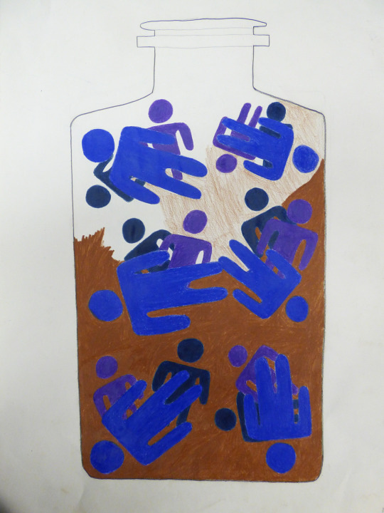
Alcohol Controls you Prismacolor Pencils 46cm x 60.5 cm
In my Hot Topic assignment, I included the subject of Alcoholism because it’s something that can ruin your life if you’re not careful. It is also something that I've seen happen to someone that I love, which was my older brother. I drew an alcohol bottle with people inside to show that Alcoholism can control you and that the only way to escape it is if you get help from others such as rehab. I used a different medium which was prismacolor pencils because the pigments are better than other pencils.
0 notes
Photo
Angel Vico
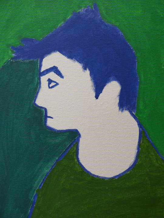
Green Profile Acrylic on Canvas
On the Summer Assignment, I painted a self-portrait to try out a new medium which was acrylic paint on canvas. I chose to paint myself because I wanted to try painting in a “fauvism” style. Fauvism was an art movement that I had interests in because from the brush strokes other artists paint in their artworks as well as the colors that blend on the object in the background. I used cool colors such as green to green-blue as the negative space to show the expression of myself painted on the canvas.
0 notes
Photo

Angel Vico
Self-Portrait Acrylic on Canvas
On my Self-Portrait assignment, I painted myself again in acrylic on canvas because I wanted to get used to the art medium. I also painted myself in front view giving a death stare with warm colors in the background. I added warm colors in the background because I wanted to show the mood within myself giving a death stare.
0 notes
Photo

Dawnae Dixon
Character design has been an interest of mine ever since I started drawing, so I decided to make it the base of my body of work. I chose to explore the concept of creating characters to represent certain ideas, emotions, and experiences of mine, thus my body of work is an attempt at doing just that. I intend for my viewers to get a glimpse into my creative mind and how I perceive events. Though my works don’t all follow a specific theme, I still intend for all my pieces to demonstrate the qualities of life that are often overlooked and help the viewer see these qualities as a living being that needs to be understood.
The ideas that are featured in my works range from realistic to out-there, so I arranged my pieces from the more realistic on the left to more fictional on the right. The expectation is that the viewer’s eyes follow this path from left to right and start to realize that the pieces are getting more abstract and absurd. My intention is that this arrangement goes to show that the most fictional concepts can come from reality itself, and it’s these concepts that I decide to put my attention to in order to cope with reality. My self-portrait Artistic Embrace is in the middle of the spectrum to show that through my art, I combine these separate concepts of realism and abstraction in order to make pieces that are very interesting to me.
The media in which I completed these pieces intensify the mood and ideas I intend to convey through them. For reference, the first piece that I want my audience to see is Measuring Cup, and it is painted on canvas using Tempera paint. I've always seen painting and Realism as a sort of sophisticated, traditional symbols of art, as historical events such as the Renaissance has influenced me to believe. Using this idea, I decided to apply that to the spectrum of realism to abstraction that I represented through my works, therefore I thought a still life painting would perfectly fit on the far left to represent reality and pure life. A more fictional and abstract piece such as Akuma is done digitally to effectively cater to the more modern and virtual world and improve the ideas I’m trying to portray. As opposed to those two opposites, Artistic Embrace was composed of a mixture of digital painting, Ebony pencil, and colored pencils, which emphasize the idea that I am combining all of my major foregoing artistic styles, including current ones, into one piece. The mixture of both traditional and digital media is meant to portray the idea that my art is a combination of both, and enhances the mixture of styles and art phases that I went through as my art progressed over time.
Through my choice of media and arrangement of my pieces, I intend to show that though reality and fiction are two different concepts, they are still connected by our perception as people and that through my art I constantly cross the boundaries between these two and mix them to make something special. Characters are just the tool I use to put my ideas into a form that people can resonate with. I aim to help the viewer think for themselves about how they perceive their own reality and the abstractions that come from it, and how these two can blend.
0 notes
Photo

Jaylin Velasco
Throughout this year, I have compiled studio pieces that define who I am as well as my artistic ability. Just as any first-year student, I found that there were many bumps in the road that I have had to conquer within each studio piece. Although I started off the year unaware of my art style, I do believe I have found pieces of myself to say that I am now aware of my interests.
My first piece is a self-portrait that portrays how I feel about myself. I attempted to create exotic color patterns and designs to portray the craziness that makes up who I am.
My second studio piece was inspired by Wassily Kandinsky’s technique of using music to inspire his artwork. Kandinsky uses a lot of lines and two-dimensional shapes, and that’s what I was trying to achieve as well. I used acrylic on wood because I wanted a smooth surface to build layers and texture. This was one of my very first pieces, so I wanted to experiment with the use of color as well as incorporate contrasts between tints and shades. I use lighter hues to represent the happy things in my life and the darker hues to represent moments that were created in order to achieve happiness.
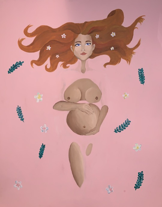
Although my first two pieces used a lot of colors, this next piece was personal to me, because it was my attempt at portraying my thoughts on a real-world controversial topic. I used acrylic on cardstock and used pastel colors to create a soft and vulnerable atmosphere. My hot topic was my opinion on abortion. I tried to illustrate pro-life by creating an artwork where a woman holds life in her hands. She lies in water because water is often associated with the birth of something or a life-changing experience.
After experimenting so much with acrylic and the use of color, I decided to try gouache and went for a more naturalistic attempt. My hot topic inspired me to paint a waterfall with a beautiful bright palette view.
For my last free choice, I decided to use colored pencils, because I wanted to create something with more detail. I decided to color two penguins which seem to be communicating with each other.
All in all, every studio piece I created helped inspire me to experiment more and find myself within my art.
0 notes
Photo

Jaylin Velasco
Penguins (Free Choice #3) PrismaColor 40 x 30 cm
With my previous studio pieces, I continuously used wet mediums. For my last piece, I wanted to try a new medium so I chose PrismaColor. I was inspired by my previous piece to create something in a cold environment. In order to create a cold environment, I chose a cool palette with different shades of white and tinted blues. I chose penguins because I enjoy their clumsy nature.
0 notes
Photo

Jaylin Velasco
Northern Lights Reflection (Free Choice #2) Acrylic on Canvas 40 x 60 cm
I was inspired by watching the movie “The Polar Express” because in the movie they all look at the northern lights. I was attracted to the northern lights because of the contrast between light and dark. I chose to use acrylic on canvas because acrylic dries fast and in order to achieve the contrast between bright hues and dark hues I had to layer on top of dry paint.
0 notes
Photo
Jaylin Velasco
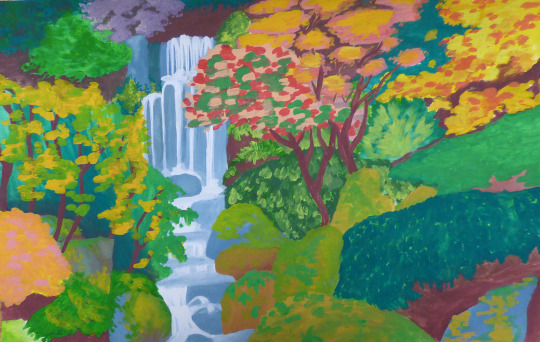
Outdoor Waterfall (Free Choice #1) Gouache on Watercolor Paper 30.5 x 45.7 cm
I chose to create a waterfall surrounded by nature because I wanted to experiment using gouache for the first time. Since gouache is an opaque form of watercolor, I chose to create a scenery with lighter colors that could be layered.
0 notes
Photo
Jaylin Velasco
Pregnant Woman in Water (Hot Topic: Pro-Life) Acrylic on Cardstock 40 x 60 cm
For my hot topic, I chose to create a piece that expresses my opinion on abortion. I chose to paint a pregnant woman in pink water while she’s holding her stomach. This was to represent that a child’s life is in her hands. I chose pink water with flowers around her to show the natural beauty that comes with life. Water is also associated with the birth of something new or a life-changing experience.
0 notes
Text
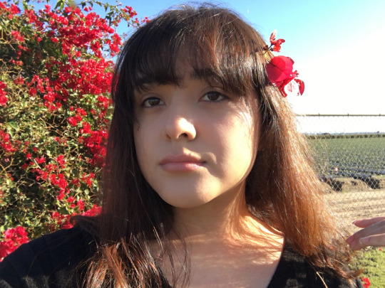
Valerie Muñoz
Power.
Power and how people use it has been a great interest of mine. The topic of those who have power and lack power is something we see in our day to day lives. Whether it is those who have a seat in a place of power and how they use the power they hold.
The injustice in the world has reached the point where those who are in a position of power abuse their privilege and use it for what it was not intended for.
It's saddening to see the abuse of power and that is why I am so interested in this topic. Those who have power should never abuse it for harm.
My drawing “The Conch” is based on the novel Lord of The Flies which is a novel based on how power is taken when there is no civilization around. The boys, or self appointed leaders, use a conch to call themselves to attention and they have the power to speak when they have the conch. The conch represents the fragility of power and how strange it is when we put our faith in something as small as a conch. Just as we put our hope in people who may or may not do something about the people of the world.
0 notes
Photo

Jaylin Velasco
Expressionism Acrylic on Wood 50 x 70 cm
This piece was inspired by Van Gogh’s use in layering and Wassily Kandinsky’s expressionism technique from the sound of music. I tried to create shapes and lines while listening to music just like Kandinsky and I used the layering technique with multiple hues just like Van Gogh. I chose to use acrylic on wood because the wood has a smoother texture compares to canvas and I liked the way the layers looked on wood. I listened to classical music and painted how music made me feel. In the end, the piece reminded me of my life and how I’ve experienced many ups and downs in life, but I’ve always pushed through.
0 notes
Photo
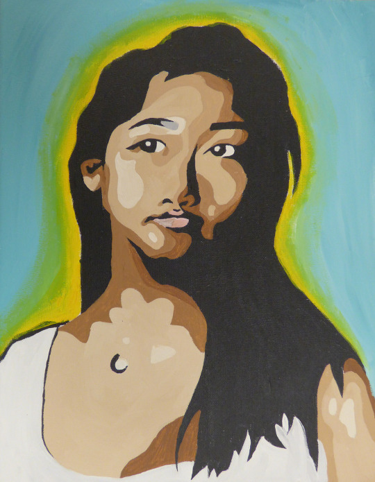
Jaylin Velasco
Self Portrait Acrylic on Canvas 30 x 40 cm
For my self-portrait, I wanted a piece that expressed who I am and how I feel about myself. I made this piece at the beginning of the class and I tried to portray a lost atmosphere because I didn’t fully understand what my main theme would be. I did so by creating patterns and using exotic colors.
I used acrylic on canvas because that’s my favorite medium.
0 notes
Photo
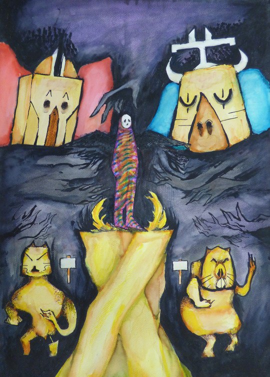
Dawnae Dixon Pedestal Watercolor on Paper 30.48 x 35.56 cm
In this piece, I took inspiration from the tribal art of the Dogon Culture, the Jomon People, and Apple Cup by Hans Krug. It demonstrates a concept of various outside sources (society, family, media) working together to develop a person, so the figure in the center is colorful with the various virtues it was given. The gold pedestal is the foundation of the figure’s life. Hands protrude the negative space to create an unsettling controlling atmosphere.
0 notes
Photo
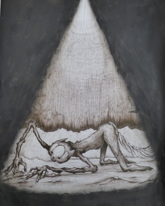
Dawnae Dixon
Fruitless Reach Ink on Paper 45.72 x 50.8 cm
This piece illustrates one of my current mental struggles. I designed a beast with elongated arms from endlessly reaching towards the light above it. It’s pictured crippled, missing a foot, sprawled out on the floor looking at petty stones. It symbolizes my feeling of reaching towards goals in vain and becoming excessively weary because of it, then taking my defeat as I sink into the insignificant issues and distractions that further thwart my success.
0 notes
Photo
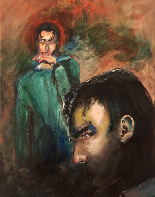
Dawnae Dixon
Comparative Study Acrylic on Canvas 30.48 x 35.56 cm
In this study, I took inspiration from the self-portraits of Edvard Munch and Eugène Delacroix, and John Decker’s The Lady of Brute Force. I composed the two figures with Munch’s and Delacroix’s composition in mind and formed my negative space with reference to the backgrounds of their two portraits. The strong contrast and shadows are inspired by Decker’s portrait. This piece communicates the idea of a strong sense of identity as an artist.
0 notes