
Don't wanna be here? Send us removal request.
Statistics
We looked inside some of the posts by rs2fmp2021 and here's what we found interesting.
Average Info
Notes Per Post
0
Likes Per Post
0
Reblog Per Post
0
Reply Per Post
0
Time Between Posts
3 days
Number of Posts By Type
Text
15
Photo
2
Last Seen Tumblr Blogs


Fun Fact
Tumblr was the first site to host the blog for President Barack Obama in 2011.


Text
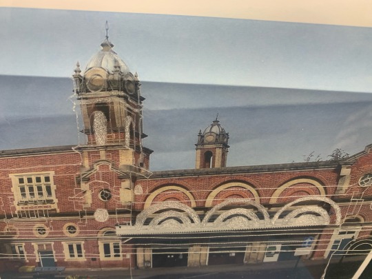
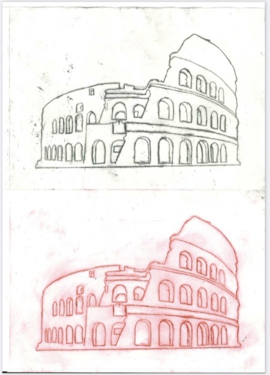
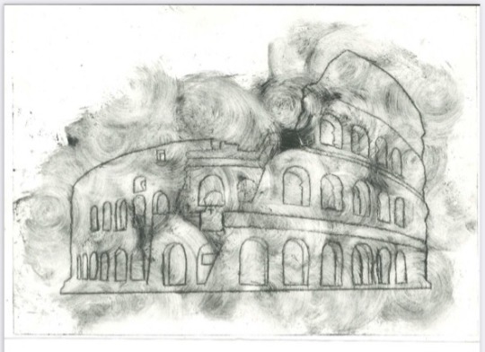
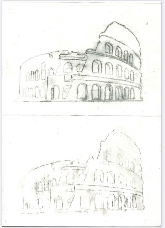
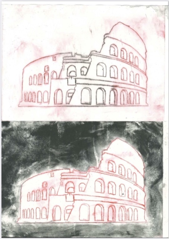
I started to create dry point prints of the community train station which i made by using a thin sheet of clear plastic to tape onto my image and used an etching tool to etch the surface of the plastic of my image. I was able to draw all of the main outlines as well as include some block colour by scratching large amounts of surface to add some detail within the piece as well as add some contrast between the black and white. I wanted to create a similar style to Heather Greenless by keeping it simplistic although i would like to create another stencil using shapes to add texture and objects within the image like bushes which i would create by using spirals for the leaves.


0 notes
Text
Moyses Hall Final Outcome
I started to think of composition ideas I could use within my final outcome which I first thought I could make my floor plans into a rectangle in the negative space on the poster. I found it hard to find where I could place things and where the space would be to fit.
I then decided to duplicate my Moyses Hall drawing and change it to a teal colour to create an offset shadow. I turned the opacity down to make it less visible and subtle so it doesn't take too much attention from the rest of the image. I then added my archway drawings and erased any overlapping parts between the two drawings so it doesn't look too crowded. I then made both of the floor plans the same way as I thought it would make more sense for my audience to be able to see the plans properly although they are still rotated onto its side which I think would be be better to be rotated to how the plans would be in the building.
I then made the floor plans black and white to fit the rest of the image and rotated them so the entrance of the hall faced the bottom of the page. this would make It easier to see the how the plans are supposed to be laid out. I then duplicated my archway drawing and rotated it 180º and placed it underneath the original drawing. I erased anything overlapping the outside drawing as well as off the floor plans so it didn't look crowded and chaotic. I offset it slightly towards the top right corner of the page to add some negative space between all of my drawings. I changed the colour to a pastel blue to make it subtle for my target audience to see. I decided to use my stamped type for my title on the poster as I found it fitting for the older styled drawings. I also added some type for the floor plans to show each floors better which I used ‘old school typewriter’ which I was able to download online.

0 notes
Text
Type Workshop
I started to create my own type to fit my Moyses Hall outcome which I created by making numbers and letters I would use within my outcome such as A, E, H, L, M, N, O, Y, S and 1, 8, and 0. the first effect I wanted to make was a hand written type which I used inks to paint my numbers and letters in a couple of different styles so I could choose which ones I wanted to use.
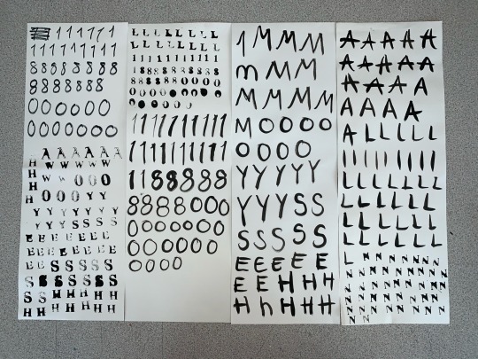
I then found some stamps which I dipped into my ink and stamped them onto the pages until the ink ran out slightly. I made many stamps of each number and letter so I could include different effects with the ink and make it look like an old fashioned typewriter.
0 notes
Text
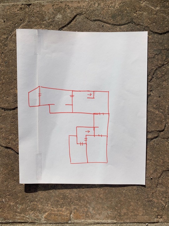
Moyses Hall Outcome Sketches
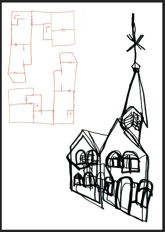
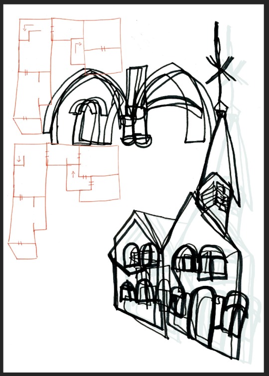
I started to use the line art technique from a previous workshop to start to create my drawings for the Moyses hall museum. I started by drawing the outside of the museum without looking at the page to use self perception to overlap my images while drawing them. I enjoyed this process of drawing as it showed me to not care as much about the level and accuracy of the drawing.

I decided to create a similar effect with the inside arch ways within the hall to be able to show as much of the historic building to the community. the hall is well known for all of the archways within the hall as the rooms are separated by these rather than doors and it is a very opened planned space.

I then made rough architectural floor plans based off images I found online of the ground and first floors of the building. I first drew the floor plans then traced the outline onto another page to use as a guide to place the rooms inside. this helped me to keep them the same size to be able to keep them the same shape.

0 notes
Text
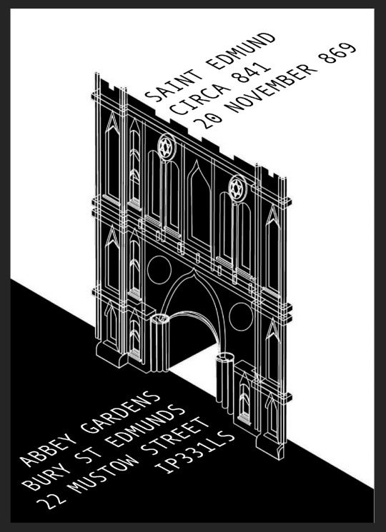
Abbey Gardens Final Outcome
I started to think of composition ideas to be able to place my text within the poster to show people where in bury it is to guide them there as well as information as to why it is there and to show them some history that they could google and find out more about the gardens.

I started by just putting the address and time frame onto the poster in the top right and bottom left corners of the poster. I thought this would fill the negative space as well as give my audience some information they can find out more information. I kept to the black and white minimalist colour scheme to keep the 2000′s feel to the piece. I decided to use a sans serif font to keep the minimalist feel as a serif font would look too fancy and old to fit the piece.


0 notes
Text
Abbey Gardens Outcome
I started to digitally design my outcome for the Abbey Gardens great gate from the community to help to modernise it. I wanted to try to get a 2000′s feel to the design so I kept it quite minimal by avoiding to use many gradients and shadows as this would make it too detailed for my audience. this would make it hard to see where everything is and wouldn't be as clear as I would like.

I used my illustrator workshop to help to design this which helps to add dimension into the piece and adds perspectives in for the 3D effect. I started by designing the left hand side of the gate by overlapping many shapes and combining some to create new shapes. I made sure to keep a white fill in the shapes to simplify the piece as I was designing it as well as using a red outline to contrast from the black and make them easier to see everything.

one of the problems I found along the way is making everything proportional on the right hand side as the buildings walls tuck in which made it tricky for me but I overcame this with trial and error with placements of windows and doorframes until it matched. in the future if I was to do this again I would try to find a rough guide line of measurements for the buildings.


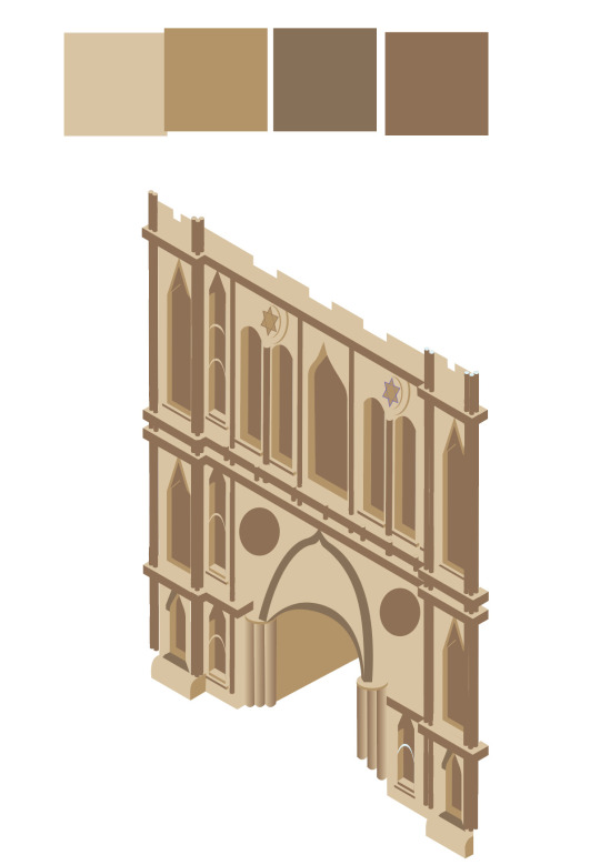
once I had completed my outlines, I was able to colour it which I separated everything by using 3 main colours. once I had filled all of my shapes with the desired colours, I saved them as swatches and was able to alter the colour swatch which would change all of that colour in the piece. This helped me to test colours quickly and find a scheme I was comfortable with.

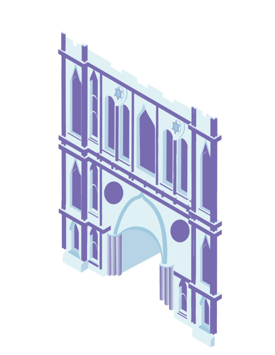
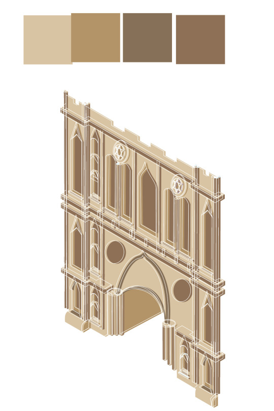
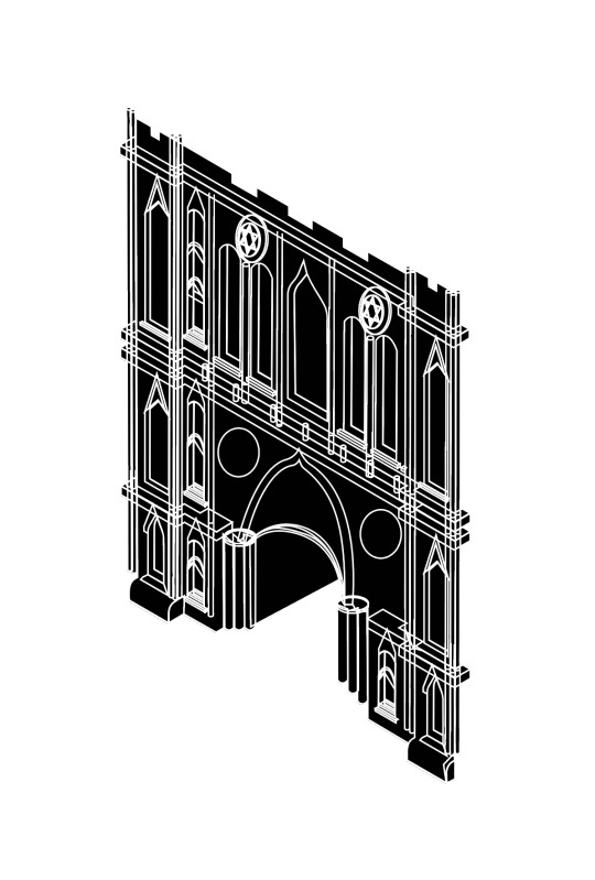
I decided to use this black and white version which i duplicated my design and changed all of the shapes on one layer to black with no outlines and the other layer to white outlines and no fill colour. I then arranged my outline layer overtop of the block colour layer as this added detail to my outcome as well as shown the building more for my target audience. This helps them to be able to see my design of the historic building more clearly which would make it more recognisable for the community.
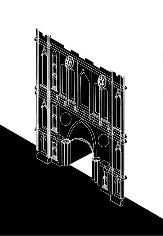
I then added a black shape within the bottom half of the frame which i made by using the shape tool to draw a rectangle within the bottom part of the frame, then used my perspective grid to move the top edge of the rectangle shape as a diagonal line. I did this by using the white direct selection tool to drag the top right corner down nearer to the bottom of the frame along the side of the page.
0 notes
Text
Composition Ideas
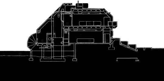
i started to look into different styles and layouts i could use to create my designs of buildings around the Bury St Edmund's community. i wanted to be able to link each outcome to a different time period which i tried to find 3 different pieces, one from the 1800′s, one from the 1900′s and one from the 2000′s. this would allow me to show as many techniques and processes i have learnt throughout the course. the first image i found was a traditional architecture plan from the 1800′s of a two story house designed for a suburban residence. This type of design i would hand draw and keep it simplistic with some negative space around the top with simplistic floor designs which don’t show which ways doors open to keep it looking as simple as i can.

the next design i found was from the 1900′s which looks like the top image has been painted or used an early version of CAD to design the final outcome of the home they're wanting to build. This design has a lot more detail in and has no negative space on the top half unlike the last image and the floor designs show a lot more details about each room. for this style i would use a CAD to design the building and i would add details within the colours by using Photoshop to add textures. this piece has lots of colours within the image unlike the last that has only been drawn so only uses the black and white.
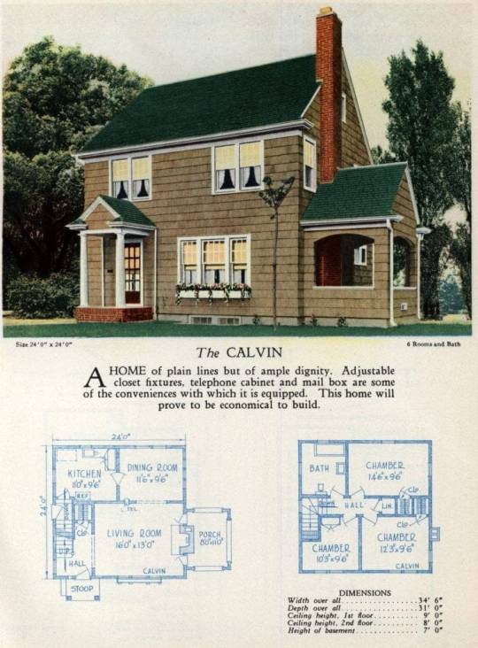
the last design i found for the 2000′s is very simple and only uses black and white to show where everything lays on the image whereas the other designs had many colours and effects on the outcome. this piece hasn’t got any dimensions on the piece and doesn't have much detail about the building unlike the last image.it includes a scale on the bottom of the image to somewhat show the sizes of the build.
0 notes
Text
Leonie Bos Artist Research
I decided to research Leonie bos who is commonly known for her modernistic screen prints and graphic design work which mostly consists of architectural structures or parts of houses such as living rooms, gardens, etc. A lot of her pieces use a varied colour palette and typically includes 3 or more colours to add a sense of depth within the pieces as well as helping to separate the objects from each other. Some of her prints may only have one or two main colours but she may use different tints and tones to slightly vary the piece and objects further.
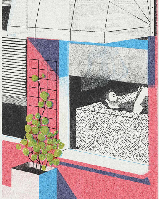
the first image I decided to look closely into was one looking through a shop cafe window onto a man reading a book. the line work within this piece are varied between straight and hand drawn lines as well as the thickness between them all.

0 notes


Photo


I decided to find a perspective workshop to help me to be able to start creating architectural drawings and sketches towards my final outcomes. I started off by making a simplistic house using geometric shapes and shadings to make it more realistic. I started off by using the rectangular grid tool and changing it to 176.389 for the width and height of the grid and then changing the dividers to 125 both ways to create squares. once I had my grid I then rotated it 45′ and changed the height to 50% in the transform section as this will decrease the height by exactly 50%. I locked the grid to make it easier to draw on top of it without moving or changing it at all. on another layer I started to create my building which I used the pen tool to draw irregular geometric shapes and using different colours I was able to help show the 3D effect within the drawing.
0 notes
Text
Willem Sandberg Artist Research
I decided to research closely into Willem Sandberg who is a Dutch typographer and a member of the dutch resistance during World War II. He has always followed a set of rules when designing a poster which include:
The posters have to be joyous, unless it has to stimulate compassion.
Red has to be in every poster.
A poster has to provoke the eye.
The poster has to respect society, the poster can set the mood out in the street, it therefore needs to be human.
Every poster has to be an artwork.

Since him, nearly all German resistances have adopted the red and blue colours as they view “Red is the colour of extremes” as it's the colour of passionate love, violence, danger, anger, and adventure. Their prehistoric ancestors saw red as the colour of fire and blood and most of red's symbolism today arises from its powerful associations in the past. they also view blue as “representing both the sky and the sea and is associated with open spaces, freedom, intuition, imagination, expansiveness, inspiration, and sensitivity. Blue also represents meanings of depth, trust, loyalty, sincerity, wisdom, confidence, stability, faith, heaven, and intelligence”. The fact that posters should be joyous, gives an impression of hope that there are happier days ahead, which is supported by the idea that they want to make people feel compassion, so that they feel a need to feel hopeful and to develop an opinion. The fact that red needs to be in every poster shows its urgency, as well as red being the least visible to the human eye, so that could suggest the secrecy behind the poster. Developing onwards red also displays compassion and anger, this shows the strong opinion they are trying to reflect in the posters.

I want to create something similar within my own final outcomes by using my own type to make my outcomes more unique. I want to try the ripping out type where I can and I may use this within my final outcomes for a 1900’s feel to my pieces. I could try to make it look like a typewriter as they would have been common back then before the technology evolution.
0 notes
Text
Raphael Vicenzi Artist Research
I decided to research the typographic poster designer artist Raphael Vicenzi to inspire my posters. In a lot of his work he uses portraits as well as type and layers them up and overlaps images or edits images. I like this composition as a lot of the artists work looks sketched with a limited colour palette often of black and white but with one or two bright bolder colours. When I create my work I am going to try to use a similar colour scheme to link my work to the artists. I also want to use a portrait as a main focus in my piece with text embedded within the image or around the image. I chose to look closely into this piece by the artist as it does not follow their normal pattern of work as it doesn't have many bright colours apart from a pastel pink to show the femininity of the woman in the piece. In the foreground of the piece there is a woman in a small black outfit sitting on top of a snail holding a flag that says procrastination. On the shell of the snail there are a lot of types as well as underneath the snail for the ground. I think the artist has done this to show he sometimes can't be bothered to create anything and it takes a while for him to create a piece.
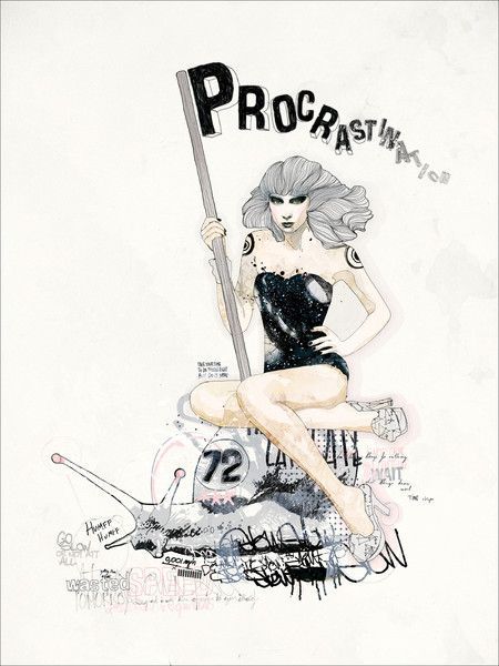
The woman on the snail has been painted using water colour but her hair has been drawn with pen and lines similar to Luke Dixons artwork. This is effective in the piece as it is simple and adds texture to the hair as well as giving a sense of direction of the hair. I am going to try this in my piece as it gives the piece more detail but it simple and subtle in the image. It also looks natural and gives the hair shading ad the closer the lines are the darker the shade is and the further away they are the lighter the shade is. The artist has used a natural tone colour scheme of light browns for the skin and pinks for extra decoration to the piece. He has created other pieces with more colours which are bolder which makes it stand out more to the audience. The linework in the pieve is mostly curved lines as the woman and snail are natural so there wouldn't be any straight lines and a lot of the text is distorted and hand written so there aren't many straight lines.
0 notes
Text
Stencil Screen Printing Workshop
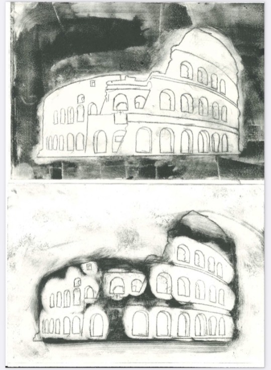
We started to work within the print room and looked into using different types of stencils i have used before but wasn’t able to experiment as much and spend more time with it. The first technique i tried was dry point printing which i used a thick smooth plastic typically used within dry point printing to cast my image onto. I did this by finding a A5 image of a historical architectural build and taping the image behind the plastic to use as a stencil. I then got a sharp etching tool to help me scratch into the surface of the plastic. I traced around the main outlines within the build to keep the image simplistic which i could add to in the future. I found the deeper the line, the darker it was which i could add shading within the image by finding steel wool to add shadows as this doesn’t allow the plastic to be too deep to possibly blend the shadows out. Once i had my image on the plastic i then removed the image and added an oil based paint over the plastic and used a scram cloth to rub the ink into the scratches more as well as remove excess ink.
I was able to use many different effects with the cloth such as showing points of light by only taking away the ink from around the windows which i liked the outcome of this effect although i think it would have looked better by making the stencil bigger and using cotton buds to take the ink away to be able to take the ink away with more precision. This would help to add some detail within the print without making it seem crowded. I want to try this effect using different colours and gradients to add more variety over the piece.
i also created some prints using the scram to create whirling effects as well as dragging the ink in a direction to be able to create a movement like effect across the image. i was able to create this effect 2 different ways by inking the whole stencil and taking the excess ink off like normal then by using a piece of soft lino plastic and a little ink on one side to scrape it across the print in the direction of movement you want to show. this adds lots of dark lines which all vary in size and shape. i then used the scram cloth to create a similar effect by inking the stencil but instead of cleaning the excess ink off, use the scram cloth to drag and clean the excess ink which creates a more subtle effect across the image. I liked the outcome to create the sense of movement which would work better with an image of an object rather than buildings as they would be more realistic.
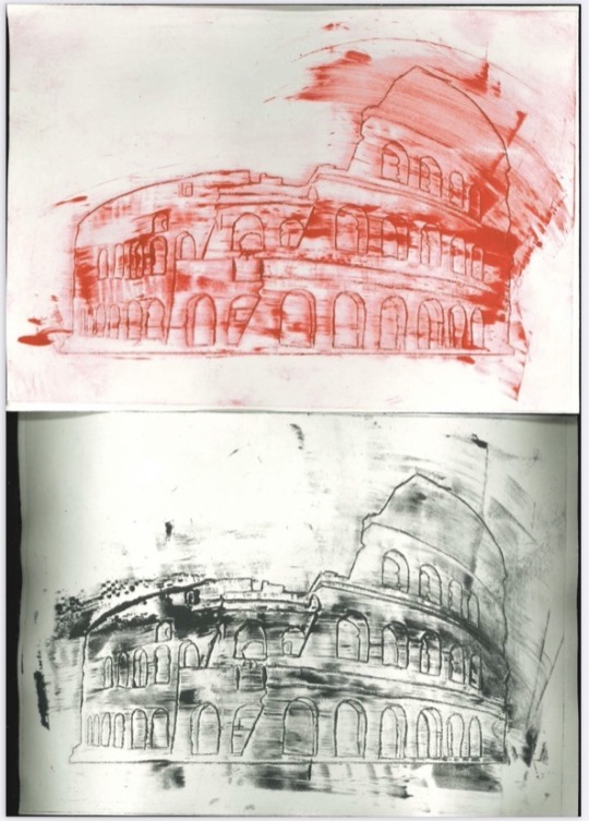
I also tried to print the same image in different colours overtop other prints which worked well but one print was distorted which created a slight 3D effect within the print. this would work well to help to create futuristic effects as well as a movie feel to the outcome. I don't think I will be using these within my final piece as it doesn't relate well to my theme. I then made a print which I had washed my stencil but it still held some ink so I pressed the stencil onto pieces of paper which creates a water colour effect within the print.
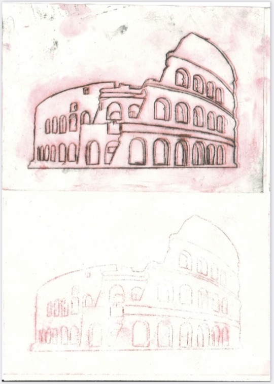
I also tried to blend colours together which I did in strips as the stencil I used wasn't very big so I wasn't able to precisely apply the ink. I put the ink in the sections I wanted each colour then I used a scram cloth to remove the solid red sections and another to remove the solid black section. I then used a clean scram cloth to blend the two colours in between and kept applying and removing in until I had a blend I was happy with. I think this would look better with a larger stencil to add the colours easier to parts of the image rather than large sections.

0 notes
Text
Heather Greenlees Artist Research
I decided to research the designer Heather Greenlees who is locally known for her line artwork. Her work mostly explores landscapes in the countryside. She doesn't use colour or shades within her drawings, creating a minimalistic feel to her outcomes as well as allowing her to be able to detail the piece with structures and shapes straight from the landscape. I want to create a similar effect within my outcome to vary my outcomes and to show different styles between the different time periods. I would like to create an array of designs for each individual style to show links between some of my designs.
I decided to look into the piece located in the Silent Valley in Northern Ireland, is an abstract piece showing steep hills and mountains in the background of the piece which are seen at the bottom of the valley behind the field. A wall and a gate are positioned within the foreground of the piece, laying along the central horizontal line across the page. Trees and bushes can also be seen in the scenery just above the centre, they surround the area immediately behind the wall. The artist has drawn the lines so that most of them are disconnected, which helps show the individual objects and changes in structure in the scene also helping to add a sense of depth within the image, stretching the scene beyond the page, almost like a tunnel. the clouds are lines, which could possibly show the layers of the clouds, it could also reflect how bare the landscape is. The artist has created the tree outlines as just two lines to show how little is needed to show that it is a tree.
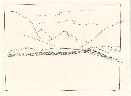
The hills are steep and pointy which mimics Northern Ireland's jagged points which typically people can associate with the cold landscape, the bare page and the scene shows how strange and isolated it could be. The wall being the centre piece has the most decor, and appears to be the boldest and most defined in the piece, being the darkest, its central which catches anyone walking past, intriguing them to look more, and notice the outlines and features. The fact that the artist has left the piece so empty and raw, excluding things like grass, cattle(cows) and weather etc, allows the viewer to use their imagination to invite ideas such as cattle grazing in the greenery or snow and trees on the slopes, or possibly a family picnic in the field or hail and rain, breaking the somewhat silent looking landscape, giving it life. This idea is enforced by the fact that some of the artist's lines are not within the box she has drawn, suggesting the onlooker to think outside the box.
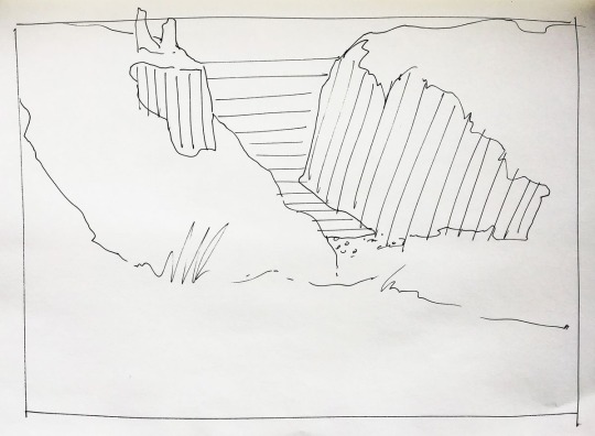
Above is another pen drawing by Greenlees of the Dunseverick Ruins, also in Northern Ireland, said ruins are seen on the edge of the cliff, it's sort of a focal point that leads of the page, but i feel the main eye catcher is the cliff drop at its centre, this time the artist has expressed the change in colours having drawn more lines on the ocean ands the cliff sides, giving the drawing depth, as well as an illusion with the lines on the sea being horizontal and those on the cliffs nearly vertical. The artist has drawn in some tufts of grass, which look almost like a signature, boasting about its stature on top of the cliff, when really, the real display is the ruins, which the artist has acknowledged naming the piece after it. The artist has drawn it so that the main feature isd the bay and the cliffs, and when noticing the ruins then onlooker wants to explore, to know more of what surrounds these runs, in terms of scenery and history. The artist has managed to gauge the cliffs in the image and to make them slope towards the focal point, creating the idea that you are a giant looking at a small section of history.
0 notes
Text
Line Art Workshop
I wanted to try to create my own line art work similar to Jim Butlers to relate to my theme of architecture. I did this by creating 2 square grids out of paper, one to tape to my paper to limit the drawing space and one to look through and draw what is within the square. This helps to limit what I’m drawing to simplify the drawing as well as focus on closer detail within the image. I related this to my theme by finding different aspects of buildings around me which i took images of sky lights within my house as well as chairs and a climbing frame. I chose these as they all include different shapes and curves as well as different styles of builds. I started taking photos onto my phone using a square frame to limit my drawing space which made it easier to be able to draw from. It also allowed me to draw multiple of the same object to overlap and invert to add more detail within my images as well as try different effects and layouts. I added some colour to some of my drawings by using pens and pencils with different thickness as both add different effects and overlapping sequences. While drawing my images, i worked in pen which made the drawings more permanent as then i was able to incorporate any mistakes i may have made whilst working. This helped me to not worry as much about mistakes i make whilst drawing as well as helps me to think of new ideas for my final outcome within the project.
0 notes
Text
Jim Butler Artist Research
i decided to look into the artist Jim Butler who is most commonly known for his from life drawings which are mostly created with a brush tip pen and rarely takes the pen off of the page. He often includes a lot of detail within his pieces but does not use any shading to create a 3D effect, instead he uses a vanishing point to focus the place is an object around to create the sense of depth and 3D. Doing this allows him to simplify his work further by reducing the shading and colour used although the artist still includes a large amount of detail within the line work of the drawing. He often uses quite muted colours rather than bright colours as this would attract attention of his target audience. He does not colour the entire of the piece, often just one part of the image. 

I decided to look closely into this image by Jim Butler which is of a French department and is set on the banks of the river Garonne. Within this piece he has created a background as well as the foreground by using vanishing points to add a staggered layering effect within the piece rather than using shadings as this would add too much detail within the piece. Using this effect keeps the piece simplistic which I want to try to mimic within my drawings. I feel like I could achieve this by drawing the same building twice from 2 angles from around the community or finding a corner to draw from life. On the left-hand side, there are apartments and buildings which spread at an angle towards the right hand side. A lot of the line work used within this are curve lines as it is a freehand drawing and the lines range from thick to thin throughout a lot of the piece. The varied line weight  adds some detail and character within the piece which I want to try and mimic within my own outcome. This related to my theme of architecture as the outcome being around buildings and the line use makes the buildings look older and more rustic than they may. i feel like these pieces are made for the community to show how people care too much about everything being perfect so he created a piece which would show all of the imperfections within the town for the people of the town. I think the target audience for this piece would be the older generations of the town who may have lived there most of their lives or may have been born and grew up in as they would appreciate how the artist has captured and portrayed the town.
0 notes