
Don't wanna be here? Send us removal request.
Statistics
We looked inside some of the posts by rudimotiongraphics and here's what we found interesting.
Average Info
Notes Per Post
0
Likes Per Post
0
Reblog Per Post
0
Reply Per Post
0
Time Between Posts
9 days
Number of Posts By Type
Text
8
Last Seen Tumblr Blogs


Fun Fact
Forty percent of Tumblr users are between the ages of 18 to 25.
Text
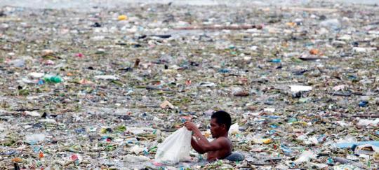
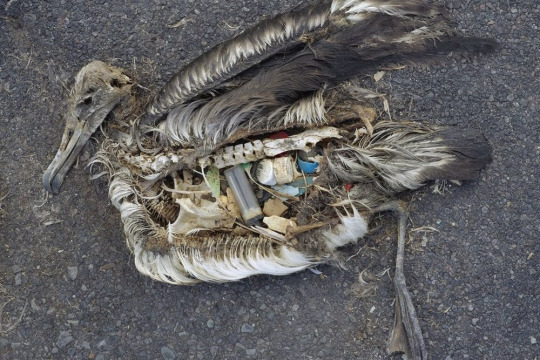
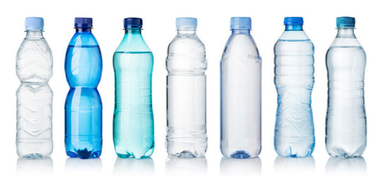
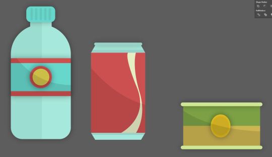
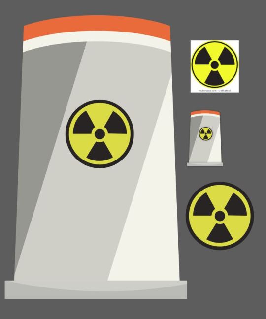
Plastic.
Plastic is something the everyday person uses every day because it constantly every where in water bottles, furniture, stationary, technology the list is massive. Plastic is a useful material that has been manufactured so many things but the process of making the material contributes to pollution and many of the products made from plastic damage wildlife and our Eco system.
Because of the damage materials like plastic can cause we have a process called recycling where the main concept is that used items like bottles can be recycled and it will go through a process were it can be put into something else or refined down to slow down plastic pollution.
Not all plastics are recyclable and some end up in land fills but disposable plastics like straws and bottles go through the recycling process where firstly people put the items they thing are recyclable in the recycling bin. The contents of the bin then gets taken away to a facility were all the plastics go through a machine which sorts all the plastics into different groups and verify if the plastics can be recycled or will haft to go to landfills. The next thing that happens is resizing where plastics get crushed and shredded into small pebble sized peaces. Then the plastic goes through a wet separation process where the plastic gets cleaned getting rid of other things that might be attached to the plastic like dirt and clue and then the plastic goes through dry separation where plastic is differentiated based on air classification, which basically means that thinner materials are filtered from thick ones, they can also be filtered on shape and size. The final stage of recycling is compounding which is where the grinded bits of plastic gets turned into small pebbles so they can be easily transported and easily re manufactured and put into new things.

Not all plastics are recycled this way lots of people try and recycle at home and in schools bu turning items into new things for example in my school we made hammocks out of plastic bags and a green house out of water bottles these are just a few examples people reuse and turn plastics into all sorts of things.
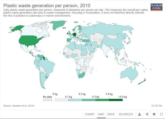
Places like Canada, Indonesian and Mexico have lower plastic pollution rates compared to other countries with the average use of plastic by a person per day being around 0.09 kilograms per day, but on the other hand places with the worse plastic pollution are places like Ireland, Germany and Guyana with averages like 0.50 kilograms per person per day.
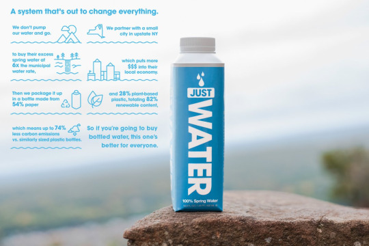
Plastics get recycled into all sorts like clothing, benches, art pieces and more. With plastic bottles being one of the items that plastic is heavily manufactured for all over the world rapper Jaden smith is a part of an organisation called just water were they focus on plastic bottles and turning them into things to help schools like stationary and desks made out of recycled plastics to help poverty struck areas with little funding. This company also came up with a better solution to plastic bottles using a material that is environmentally friendly, recyclable and can still preserved items to help with long lasting shelf life.
Plastic pollution is a huge problem as plastic is getting manufactured and used on a huge scale making this sort of problem not a easy fix and a problem that will need to be tackled for a long time but with pollution and global warming being a huge problem new measures and procedures are being put in place to cut down on plastic pollution.
Here are some measures that the UK have put in place and are trying to reinforce to cut down on plastic pollution.
Banning Microbeads
Plastic-Free Aisles in Supermarkets
Extending the 5p Carrier Bag Tax
Banning Cottonbuds
Banning Plastic Straws
Cutting Down on Plastic Bottles
Getting Rid of Disposable Coffee Cups
Making Industries Take More Responsibility
Getting Young People Engaged
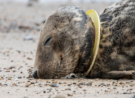
Long term plastic use will proceed to pollute the environment with plastics ending up in the ocean make animals like sea birds, whales and turtles just to name a few get stuck in things like beer rings and also eat the plastic harming and killing the animal.
Links
https://www.plasticseurope.org/en/about-plastics/what-are-plastics/how-plastics-are-made
https://www.recyclenow.com/recycling-knowledge/how-is-it-recycled/plastics
https://plasgranltd.co.uk/how-is-plastic-recycled/
https://ourworldindata.org/plastic-pollution
https://www.recycleyourplastics.org/consumers/kids-recycling/plastics-can-become/
http://www.justwater.com/
https://www.globalcitizen.org/en/content/uk-tackling-plastic-pollution-waste-plan/
https://www.bbc.co.uk/news/science-environment-21236477
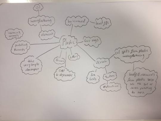
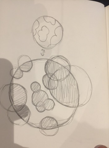
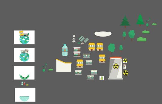
After doing research into plastic I did some mind maps to work out what sort of animation I wanted to create and the visual elements I want it to contain.
The first mind map is just looking at things like different plastics and things that relate to them which might be land fills or chemicals from the manufacturing process.
I then did a mind map of some ideas of what I want this animation to be about/what angle am I going to take within plastic pollution.
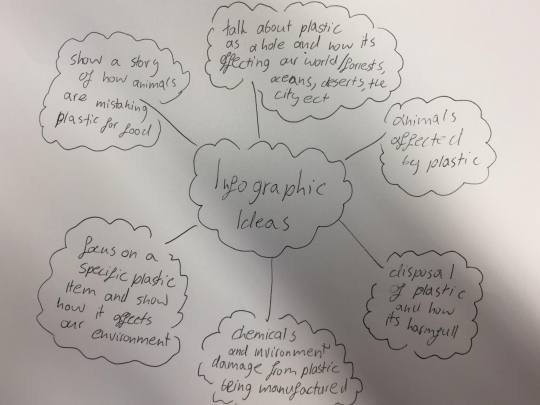
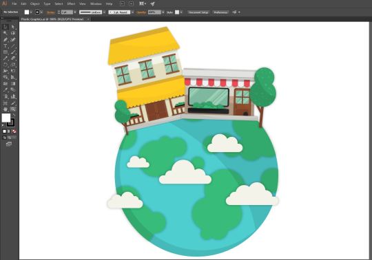
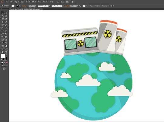
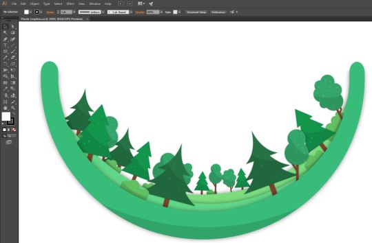
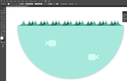
Next I decided what sort of direction I wanted to take the animation and I wanted to build a animation around (How plastics affect the planet and different environments). This mind map is about thinking of and looking at the visual elements I can use and link to the theme of the animation.

Proposal.
The Idea.
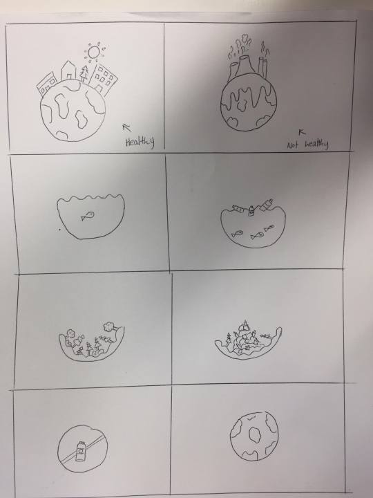
The idea is to make a animation talking about how the plastic affects the world as a hole in general so I want to look at different environments so for example, Forests, Ocean, City etc and then create these environments in illustrator and I want to express the damage of plastics by showing a healthy version of these environments and then a unhealthy version of the environment which has been caused by plastic pollution. For example I want to have a forest scene where there is a healthy Forrest that I will make in illustrator and then plastic will fall onto of the Forrest creating a landfill pollution the planet. I want this video to be almost a quick advertisement that talks about the problem as a whole and not focus on one specific element making it something that’s easy to understand and promote and create more awareness around the problem. I am going to write a script so that I could potentially make a voice over where I make short points on the planet and plastic and then represent my words with visual elements made in illustrator. I also want to possible try and create a custom sound track using my knowledge of music being able to play 7 instruments I can use software like Ableton Live and create some music that represents the visuals so a more up beat happy sounding piece for the parts in the animation that are showing a healthy planet or a healthy ocean or forest and then create a more dark moody sounding piece for the visuals that are showing the damage of plastic pollution. So to wrap things up for the beginning I want to talk about the planet as a whole and then show the different environments such as a city, ocean and Forrest and what they look like before and after plastic pollution and then at the end I want to tell people to cut down on plastics to prevent plastic pollution. These visuals will be created in illustrator and then animated in After affects. The animation will hopefully be accompanied by a voice over which will also be supported with text on the screen as almost sub titles and then there will also be a custom soundtrack and sound effects and add more depth and make the animation more interesting.
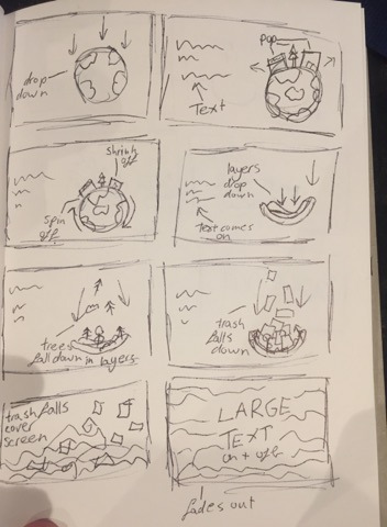
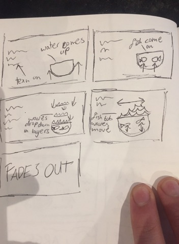
I then made a story board to plan out my animation and give me a better idea of the graphics I want to create.
The next step I wanted to do was do some research into a few motion graphics artists and companies, here are some that I like.
Gloria Ciceri

Gloria Ciceri is a motion graphic arts, graphic designer and illustrator. She was born in Italy in on 24th January 1988 but now lives in Berlin in Germany. She says that motion graphics have always been her passion and she is her hobby but she has managed to turn it into a career.

She originally worked as an art director but quit her job to focus more on building her skills within graphic design and illustration and now does mainly freelance and works with companies. One of her more well known works is a motion graphic she made for Ryan air.
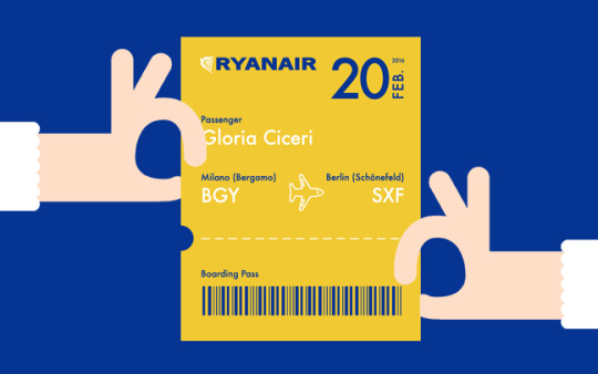
I personally really like her work I think she has a very modern sleek vector style as lots of her work is very clean and geometric and looks like her assets might of been made in illustrator. I think her work has a real simplicity to it in terms of colors and how much is going on within her motion graphics. If you look at the Ryan air advert she has made it is simple and short but it think all the movements and motions look nice and allow her to get whatever message she is trying to get across in this case it is an advert promoting Ryan air and you can clearly tell that from watching the video as its very simplistic with movements and colors but that allows the viewer to not get distracted and understand what the motion graphic is promoting.
The Ryan Air video http://www.gloriaciceri.com/archives/portfolio/ryanair?id=59
Down the streets.
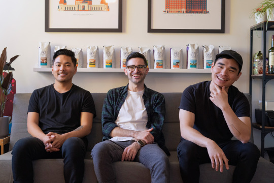
Down the streets is a studio base in Los Angeles america that is run by three people and the company specializes is illustration and animation. They all met in university and after they graduated one of the members called Colin started Down the streets as a motion graphics artist and then he expanded the companies workers and the company has done work for many large brands like Coca Cola, Ford, Microsoft and more.
There work https://downthestreet.tv/
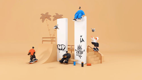
This company has a very large amount of work with a variety of different styles but everything is to a very high standard as they are a company with works with large brands so its expected. They also follow a more vector modernist illustration style like Gloria Ciceri in some of there work but also branch out depending on client demands. One thing that I see in the work that I really like is the colors. I think there videos and illustrations have a great use of color with bright clashing colors to more mellow pastel shades. Also lots of there art uses nice gradients which look like they have either been done in illustrator or drawn with spot brushes which could possible be done in software such as Photoshop. There videos have a great fun quick flow and all of there art looks very sleek and modern and I really like that.
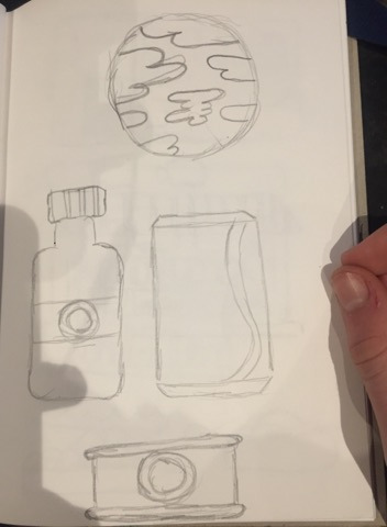
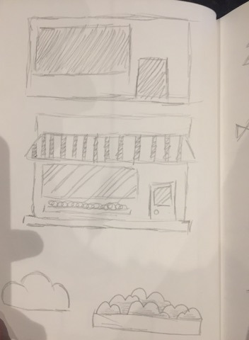
Now that I have done some research in to some designers and companies I am going to work on some sketches to help me create them in adobe illustrator and then I will make a final story board and start making the illustrator assets which will be put into after affects.
Here are some of the quick sketches I did to give me a better idea of what I would like some of my vector graphics for the animation to look like.
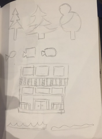
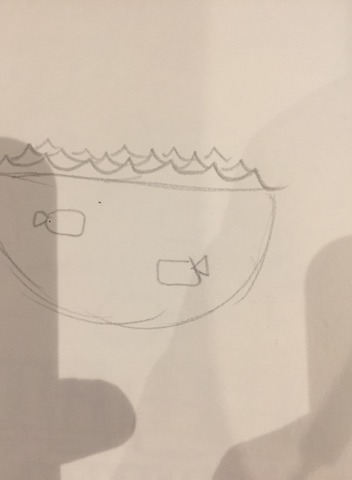
Here is my final story boards I did with some animations of movements and how I would like the animation to look.
I then went into illustrator and made my assets.
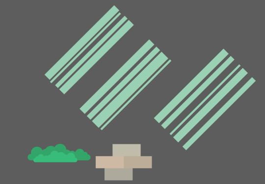
Here are the final assets and how they were made.
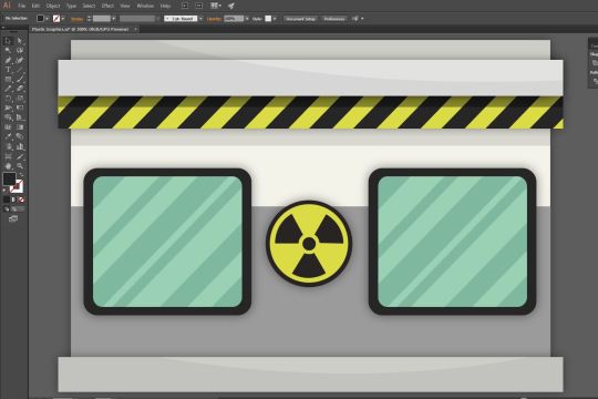

Tools.
The tools that I used most in illustrator were the Pen tool so I could make what ever shapes I needed to. The Shape builder tool so I could make shapes using outlines and form of other shapes. The shape tools so the rectangle tool, ellipse tool rounded rectangle tool etc.
Process.
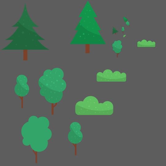
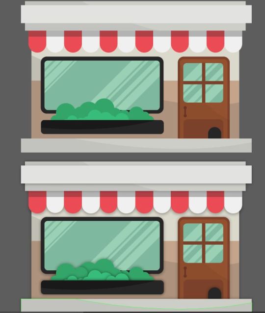
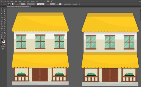
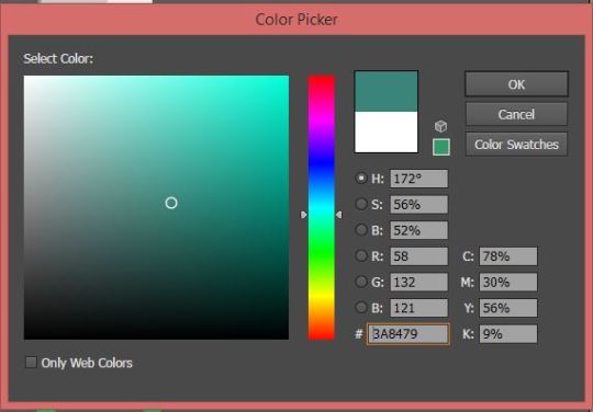
I usually start by looking at my sketches or at images online so for example when I was making the houses I used my sketches as influence but also looked and modernist style buildings and some vector art or illustrations of buildings to inspire me. I then start creating.
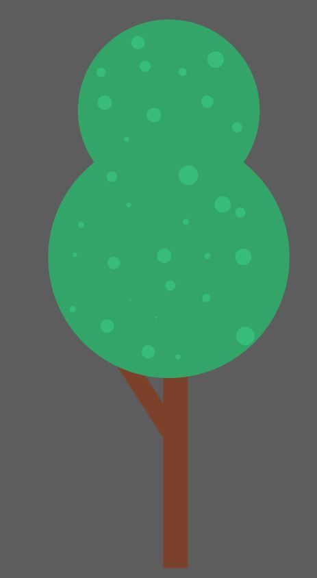
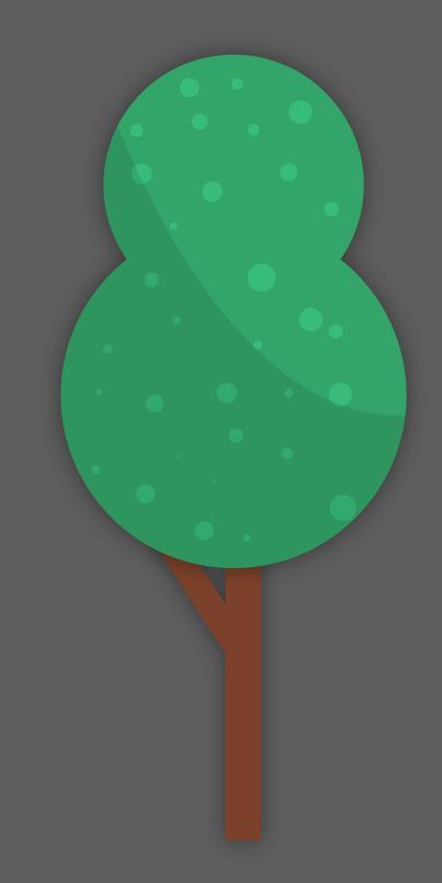
Here is how I make a tree in illustrator for my animation and I use a similar process to create the other assets.
First I took the rectangle tool and created a long thin rectangle for the bass of the tree and picked a oak brown color.

I then did the same thing to create a slightly shorter brown rectangle and then rotated it by using the move tool and clicking on the vector and rotating it.

I then created two circles using the ellipse tool and made the circles green. Next I staked the circles on top of each other how I wanted and then placed them on top of the branch layers.
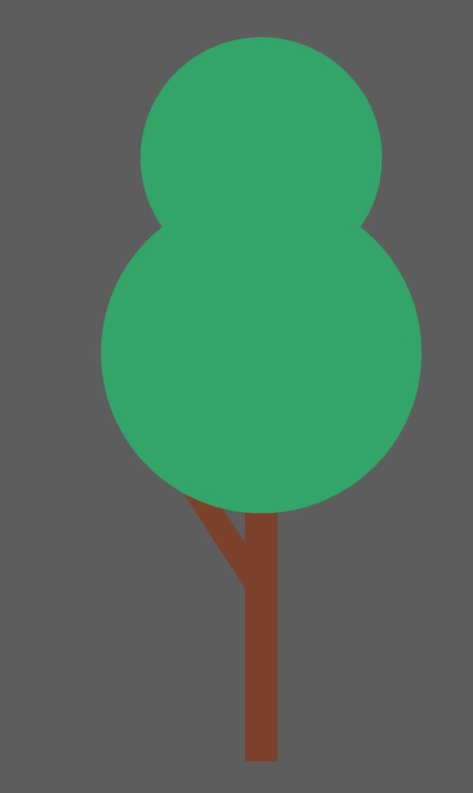
I then once again took the ellipse tool and crated lots of little circles on the two large green circles and made all the little ones a lighter green.
I then used the pen tool to create a black shape that curved over around half of the two large green circles.
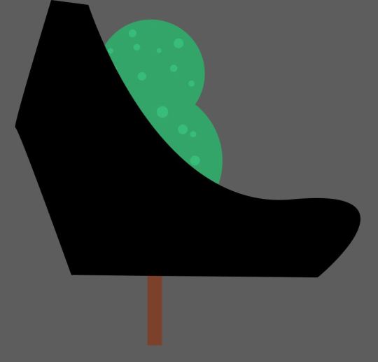
I then selected the black shape and the two green circles and then selected the shape builder tool. I then held alt and clicked on the sections of the black shape that was on the outside of the green circles which deleted the black shape around the edge of the circles.
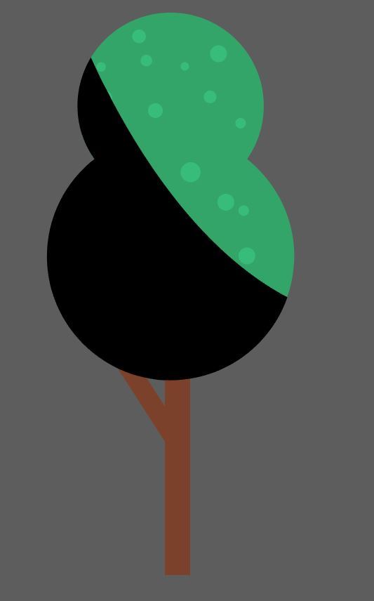
With the black shape that was left over I turned the opacity of it down and made sure it was on top of all the other layers for the tree.
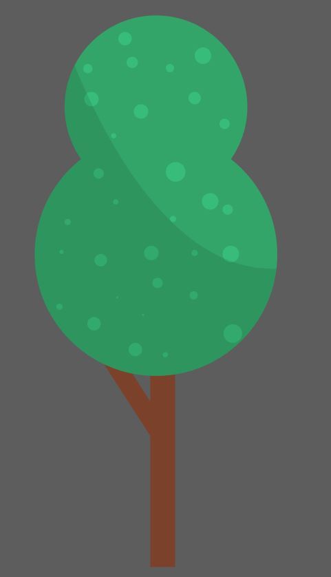
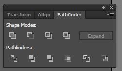
Lastly I merged the two large green circles using the pathfinder tool and selecting merge with both circles selected and I also did this for the two sticks at the bottom, then lastly to finish the tree I added a light drop shadow to the two shapes I just created by merging and this left me with my tree.
So the main things I made use of were the tools, the align panel, effects, shape builder panel, and appearance panel.
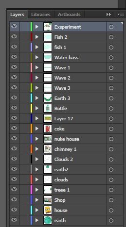
Before I put the assets Into after affects I need to make sure all my assets were finished and also arranged correctly on layers of how I want them to be animated. Essentially I had an experimentation layer where I made all the vectors so I wouldn't be using this layer in illustrator and then for all the assets I had them on individual layers that were labeled and I had each scene built on art boards.
I then saved the file and it should all be fine to import into after affects and use and animate all the assets but this is where I hit problems.
The Problems.
So what happened was I went into after affects and imported the file and I tried to drag my assets onto my stage like I should be able to do but only some of the assets had thumbnails and a very few only appear on my stage whilst most of them were invisible of black. It was suggested to me to put each scene into an individual illustrator file to cut down on the amount of vectors so I did so with the first scene and all the assets worked but the problems didn't stop there.
The next day I saved each word into a individual file and imported them but it did not work and now my assets were no longer coming up as illustrator assets in after affects but images and they once again did not appear. I conferred with my teacher at the time and they also had no idea why it was happening as it should work fine with the way I set up my files so I went to google and googled my problem how a long time looking in chat rooms and articles to help me. There was lots of suggestions and I tried them from getting rid of art boards to minimizing the amount of shapes and saving the file in different forms. After a lot of trial and error one person said to save your illustrator file as a older version which was CS3 and then import them so I did and weirdly my assets all appeared and worked fine.
The next step.
Now that I had made the assets and managed to get them working in aftereffects I need to make a sound track and wright a script. I am going to make the sound track first so I can than wright the script to fit the sound track because as planed out in the story boards there will be a healthy scene and then a not healthy scene as a result of plastic pollution and I want the music to represent that so I will be making a more calm bit of music for the happy scenes and a more distressed sounding section of music for the unhealthy scenes within the animation.
Here is a video explaining the process of me making making the sound track going through the software that I used which is ableton live.
youtube
Hear is the full soundtrack.
youtube
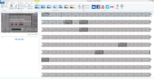
The video was edited in movie maker just making some cuts getting rid of long sections were I am not talking.
Now I have the sound track I need to wright a script. Whilst writing the script I will be covering 4 sections. Firstly I will talk about the planet as hole and then go on to how the planet is dying from plastic, I will then go on to talk about woodlands and forests and how they are important which will then transition into how landfills our polluting the planet, and then for the third scene I will talk about the ocean and its importance and then how we our polluting us and how it affects us and out planet and at the end I will talk about preventing pollution. The aim is to show how plastics is affecting us and our planet as a hole.
Here is my script.
As of 2019 the human population on earth is 7 billion 714 milling and is growing. This planet is our home and for that reason alone it is our job to look after it.
Plastic is a hugely used material that is manufactured on a massive scale which is polluting our planet. And it doesn't help that its in almost everything, making the material have a high demand allowing the toxic manufacturing process happen.
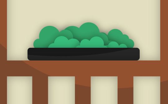
Forests and trees help our planet and us stay healthy. Woodland allows animals to live and grow with food growing from bushes and trees making this a home for many species including us.
But as we rip down forrest and destroy woodland, animals lose their homes and potentially die. We create landfills to store rubbish like plastics which pollutes our planet not just causing a problem for wildlife but also for us.
Oceans, lakes and rivers our places were we can swim and play but also a place for fish to live and with fish being one of many food sources, we need to allow them to live and populate.
These places are also becoming polluted by plastics killing sea life, coral reefs and once again harming our planet. We need clean water in as many places as possible but as we pollute our oceans with plastics people who need water most end up consuming dirty water.
Our planet is needed for the human population and its wildlife and as we pollute it with plastics and chemicals it will slowly die this is why we need to cut down on plastic manufacture and use and focus on recycling and cleaning our planet keeping us and our ecosystem healthy.
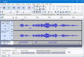
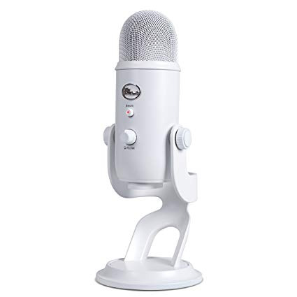
I recorded the script using a software called audacity and a blue yeti microphone.
The sound affects.
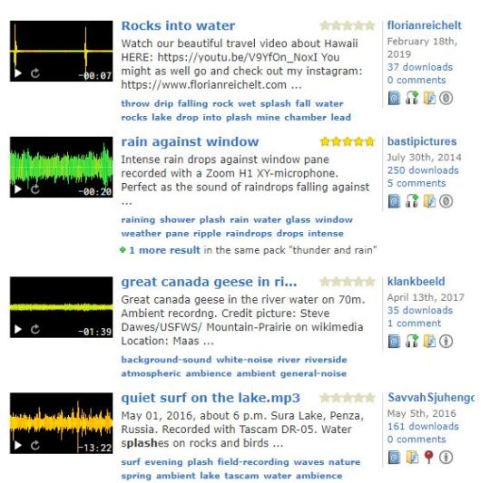
I will be getting my sound affects from a site called free sound. When picking my sounds I will be thinking of some things like does the sound relate and represent the object or movement. Do the sounds have similar recording quality. Do the sounds have to much reverd treble or base and do the sounds work together within the animation. I will finding the sounds as I animate so I can get sounds that relate to certain movements. On this website there are a lot of good sounds but also bad ones so I will be flicking through them and picking the best that work for this project.
Now I have everything I need to make the animation.
I will start by adding the soundtrack and then using it to influence the animated illustrator assets. I will then add sounds to the illustrator assets and finally animate text which will be based off my narration.
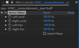
The first thing I did was import all my assets and added the soundtrack and narration to work off. I used aftereffects mixer to make sure all my sounds throughout the animation were as loud as I wanted them so I had to turn the sound track down so the narration could be herd and I did similar things to the sound affects so they all sounded like they were a similar volume. I also used after affects to quickly turn the treble down and the bass up on my voice over to make it sound a little softer.
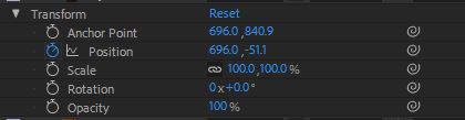
I started by animating my scenes that I had made in illustrator by using the transform key frames in illustrator. Depending on how I wanted my animation to look I would lay out key frames for opacity, rotation, position etc. For something to animate I would turn on the stop watch which would create a key frame and then go along the timeline and either move an asset or change the opacity for example which would then make another key frame animating my assets. Timing was very important and I was making thins appear and drop in to certain beats and music cues within the sound track and I spent a lot of time readjusting my key frames. I also used Key frame assist easy ease on most of my key frames to make the animation look smooth. The reason I did not use easy ease on everything was because sometimes when I was trying to animate something dropping down for example a tree on a piece of land when I added easy ease it would bob too low and go through the land and I didn't want it to look like that and even if I changed the distance the asset dropped from or the speed it dropped within my timeline it kept happening so I had to take it off to make the animation look more realistic.

When animating my objects I had to think about how they would react in the environment I had created and things like there weights to so for example when something drops in water it might bob up and down or how quickly things will move depending on how heavy that item would be.

Sometimes my animation was not as smooth or looked the way I wanted so I would use the graph editor to make slight tweaks to the key frames and positions which helped me with my animation and be more precise.
Something that I did heavily was precompose. Because there were so many different animations going on and so many assets with so many sound affects I precomposed everything mainly to keep everything tidy allowing me to position everything better in my main composition. I did this by simply selecting the things I wanted to precompose and then right clicked and selected precompose and then if I wanted to I could precompse multiple prcompased layers to make a new precomopsed layer with everything organised in it. So at the end of the animation there were lots of layer and some of them had precompasitions inside of precompasitions of precompasitions but essentially I did this to make my illustraghtor file easy to understand because of everything going on. For example with the sound affects I would have swoosh sounds and splashing sounds so I would select the different splashing sound reght click, select precompose and then labeled it splash or something like that.

The audio clips were a little tricky to arrange on my timeline because some of them were very small but I managed to make it work. For the audio clips I used after affects audio mixer to make sure they were all similar volumes but I also cut them up in after affects for example I had a audio clips of 5 different claps but I only wanted one so I double clicked the sound and then used sliders to change where the clip started and ended. I also found this useful for cutting out background noise in clips with extended endings or beginnings.

I animated all of my illustrator assets my self using key frames but because of software issues I was behind so the idea was to take important words out of my narration and animate them but because I had no time I thought it would be a good idea to fade in and out the script to fill up the left hand side of the stage/screen. It looked very wordy and not how I wanted it so my teacher showed my presets so I could cut down on words and would be able to have each individual word animated making the animation look better in terms of composition. I only used the text in and out presets. Some of them were taky or just didn't fit the animation so I picked the ones that fitted the animation which were mainly type righter presets and fades.
Through out the animation process I used things to help me like the text editor alignment panel.

After I had done the animation one thing I had spotted is that It was not 100% in the middle and I thought I could fix it. The plan was to precompose everything withing my main composition and then simply drag and drop the hole animation in and re arrange it. When I did this it looked fine and fit except for one scene which was one were lots of rubbish fills the screen in a pile and what happened was that it cut down through the assets leaving a big white patch because of the new movements. I Had precomposed the rubbish dropping animation and tried to add that back in but the same thing happened. I then thought I could use the new moved animation and then when it came to this scene I would cut bring back the old animation with its placement and then once it was over cut back but it proved impossible to stitch the layers together and make the fades and flow of the animation work as you could see quick cuts in the video so I have had to leave the animation slightly off center.

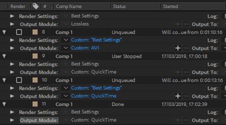
I had now finished the hole animation and was ready to render it but here is where the problems start again. I tried rendering it and it would get the end and crash leaving me with a render cutting off around 15 seconds which is a lot in a 2 minute animation. I googled it and there were suggestions like try rendering it directly to the pc and not a thumb drive so I tried it and It also didn't work. I also thought maybe if I changed the settings from quick time to lossless this might make a difference but it still crashed. So I thought It might be a problem with the collage computers so I went home and tried to render it on my laptop and everything went black.
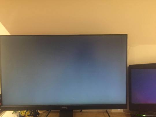
I then restarted my laptop and tried again using lossless and this time it rendered but when I looked at the video the resolution seemed so low you couldn't see anything and this should not happen when rendering lossless. I then once again rendering in quick time and it finally worked. Because quick time is only something like 420p the resolution is not great and the animation dose not look crisp which is annoy when I put lots of time making the vector graphics look detailed but hopefully you can see that In my screenshots in illustrator.
I have now looked over the render and have realized it glitches out slightly towards the end but I have spent hours trying to fix software issues that there are no reasons for happening and everything should work fine but its the best render I have out of countless attempts.
Here is my final animation.
youtube
Evaluation
What went well.
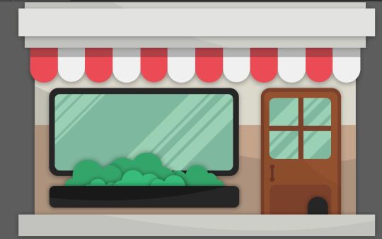
Animation- I think the movements within my animation look smooth and clean and I also thing all the different scenes come together nicely as planned. I also really like the placements of some of my illustrator assets for example for the forest scene I like how the rubbish falling down is over sized compared to the trees expressing the impact of plastic pollution but also allowing you to see the details within the vector graphics.
sound- I think the sound track I created worked well and I manged to portray a more happy sounding section and a darker sadder section and I think I managed to animate to it well. I also think the sounds I picked were simple but effective and represented the animations and graphics.
info graphics- I think the graphics I made looked really clean I personally really liked the buildings I created for the first scene as I thought they had nice shadows and colours.
What skills did you learn.
I learnt some new things within after affects and they were the use of default presets after affects have but also the simple audio manipulation techniques you can use such as using the mixer and changing the bass and treble to sounds as well as cutting off the beginning and ends of sounds.
What would you do to improve your animation
I would probably try and make some more creative and interesting transitions when switching scenes and also center the hole animation but I was short on time with all the software difficulties I encountered.
What would you do to improve your graphics.
I could possibly experiment more with textures and gradients and I also could of created a wider variety of graphics for the plastic waste.
What could you do to improve your sound.
I could of possibly created my own sound affects instead of using others but I did make my own custom soundtrack fully produced by me but I feel like it was a bit long and could of been made shorter allowing me to switch the scenes in my animation quicker possibly making it more engaging.
Feedback from peers.
Bill - it is well nice and simple the animation is quite effective because of the facts and the indirect convo with the viewer, for example when you said "it is our job to look after it"
Rhea - thats well good the way the text enters and exit is aesthetically pleasing. The illustrator assets are made really well and they all have the same style, and i like how you have not just made the text move you had added small movement to the assets which makes the animation in my opinion. I really like the colour palette that you have used they really work well together. Also I like how you have not shown all the words that you have said in the animation, you have only shown the main points of what you are saying. Well Done Rudi :)))
Dean - Very informative and your script is amazing. The assets are well made with nice colour palette that goes together really well, but one thing which you could improve on is possibly do more to animate the assets. Overall, nice animation and really shows you have invested a lot of time for this.
0 notes
Text
In class we had a tutorial lesson and we created a motion acsents peiace using shapes and movements to represent and exspress music.
The first thing I made were moving dash lines. I did this by using the pen tool to create a path and then making a stroke and then adding a trim path to the shape allowing me to manipulate how the line, stroke moves within the anchor points.

With these dash lines you can go and customize lots of things you have all the normal transform options but you can change things like Line join and Line cap, and for the line cap I selected round cap giving my lines rounded edges.

One of the main things we did in this lesson was pre compose. Because I was making lots of things and duplicating things over and over and over it begins to get very messy so I would duplicate shapes lots of times and scale them down and rotate them so there all different and the lines come across the screen at different points and stages and then I would pre compose all those layers and then later on I would create more moving shapes and pre compose them and then I would add all these pr composed layers into a new separate composition and then do more duplication and pre compose more shapes.

We also made a Circle repeater using lines and then turning them into a circle and then used he transform option to scale it up and down.

After Learning about the tools and techniques I then made a new project and picked a song and then expressed the song using shape movements.

Here is my short 10 second video.
youtube
0 notes
Text
we were given the task to take another roald dahl quote and animate it with both words and imagery.
First I went onto a website with lots of quotes from different books of his and started reading them. I was looking for quotes that stand out and use words that I can put imagery too. I Ended up going with a quote from the twits. This quote didn't have a massive amount of imagery but I felt like I could take the words within it and be able to fit some visual elements to it.
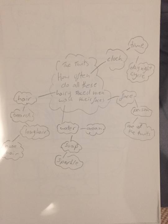
The quote by the twits was “How often do all these hairy faced men wash their faces”
I then created a small mind map where I took the words in the quote and I tried to think of some imagery I could relate to the words and how I would turn them into assets in illustrator to then be animated in after affects.
Here is my mind map.
Here is my story board:
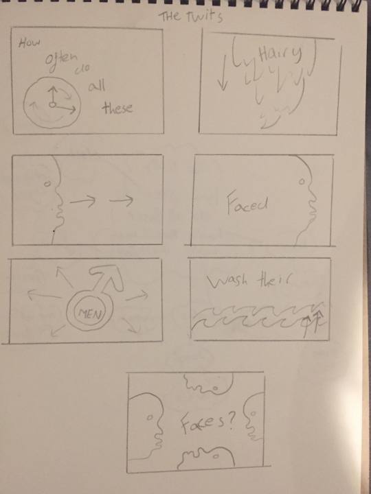
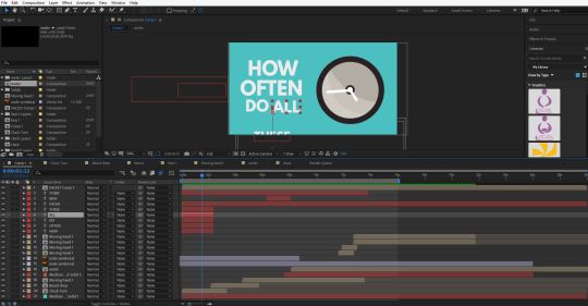
I then decided which imagery I wanted to use that related to the words and started drawing out my animation. For the first five words which are “how often do all these” I wanted them to come on screen and a clock will come on screen with the clock hands turning because the words are talking about the concept of time. For the next animation it was for the word “Hairy” and for this one I wanted a beard to drop down but I wanted separate sections of the beard to flop down and then the word flops down with it. The next word that I wanted to have a separate illustrator design for is “Faced”, the Idea for this word is that A side profile of a face swooshes on the stage on the left and then swooshes off to the right and whilst it moves the background color changes to the color of the face design. The next word is men and for this I thought I would just have the symbol for male and have it come on screen and expand with the word men in it which would also follow similar movements/animations. The next word was wash and For this I wanted to animate waves pop up in layers of waves and start moving, the idea of waves dose not relate to the word wash massively but It could do in some ways. The last two words are their and faces and for this I wanted to use the weird looking face I had previously used and duplicate and flip it so there are a few faces coming onto the stage/screen and then the all move across which will fill the screen with one color.
The next thing I did was go into illustrator and make all my assets. My thought process for time management was to plan it out then make all the assets and then animate everything and not to make some assets then animate them then make some more and then animate them. If I want to change something I can always just change things in the illustrator files its just easier this way so I can just put everything at once into after effects and just focus on the animation.
So I went into illustrator and started making all the assets. When your animating things from illustrator in after affects you haft to put each individual thing that you want to make move on separate layers so for example. When I was making the side profile of a face for the word “face” I put most vectors on one layer and the eye ball on another because I wanted to animate the eye ball so it slightly wobbled depending on the movements the rest of the head makes. Another example is for the word “wash” I wanted the waves to pop up as separate wave layers so I put each line of waves on separate layers
I then went into after affects and set up my document and imported the assets I made in illustrator. Because I was going to be animating lots of things and wanted to make them move at the same time I used precomposed layers so everything didn't get messy. So I did all the main animation in the precomposed layers and then added them all into one main final composition to bring everything together.
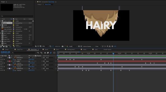
I tried to animate everything word by word going off the story board I had made. For example for the word hairy I wanted a beard to drop down in separate beard layers and then the word hairy also falls down behind one of the beard layers so I animated the beard dropping down in a separate composition and I had three sections of beard so I had three beard layers because that is how I saved it in illustrator, so using position key frames I made each beard layer drop down one after another and then I had the word drop down behind one of the beard layers so it falls into view from behind a beard layer, this was done by creating the word with the text tool and positioning the layer bellow the top beard layer, I then also used position key frames to make it move down. When animating the elements drop down I thought about physics and how they would react so when they drop down they bounce once or twice each bounce getting smaller until it stops moving making it look like the (beard and word) has some weight to it and in terms of the beard its animated so it stops falling down as if it was attached to someones face.
I spent a lot of time getting the timing right so I made sure all the key frames were evenly placed and making the motions within the animation look smooth and not out of time or off, I added easy ease to the key frames to make the movements look more realistic and smooth.
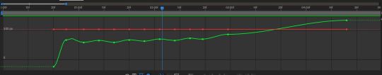
Some times I had finished animating a section of the animation and had added easy ease but the timing was off and not how I wanted so I went into the graph editor were I could get a more detailed closer look at how my key frames were working all together and In the graph editor I could also change everything like I could in the transform options.
For example in on section of the animation I animated the word “Wash” and it dropped down and landed in the waves and I tried to make it look like it was bobbing up and down and then it would sink but my animations timing didn't seem right and as the word bobbed and sank it didn't look accurate or realistic and I couldn't fix it by adjusting my key frames in the timeline so I went into the graph editor and moved key frames slightly to give me a smoother better looking animation compared to what I had.
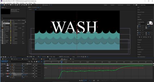
When I was adding all the words and animating them I used lots of different effects like scale opacity and position and I also tried to give them personality as they acted in the environment so when the word rushed onto the screen I made it wobble because it stopped so quick, I also added motion blur to most things in the animation which I thought made quick movements look better. When I was adding the text to my animation which I did last, I laid out the words in order in my main composition rather than having them in separate compositions and precomposing the layers but for the words that I wanted to interact with the illustrator graphics like the word wash sinking into the water I added the word into that separate composition rather than the main one.

When I created the final animation I took all the separate animations and added them into the final composition and then I just duplicated certain graphics and positioned everything how I wanted and added the text that wasn't already added in the separate competitions.
Here is my final animation:
youtube
What was your final idea?
The final idea was to simply represent the words of the quote I picked using imagery and graphics. So in a part of the quote it says “How often do all these”, these few words relate to the concept of time so I thought I could have a turning clock to represent that section of the quote. I also wanted the words and graphics to act and relate to what they were so for the word washed I made a wave graphic and instead of the waves just popping up they move left to right like a wave might the word “wave interacts with the graphic and bobs up and down in the waves. I also wanted to do small details so for the word “faced” a face quickly appears and because the movement is so quick the faces eyeball wobbles and almost hast to catch up with the rest of the body. When picking the quote I also had to make sure that the words contained lots of imagery or words that I would get imagery out of and create graphics in illustrator for.
How did you arrive at this idea?
I did a mind map and took the words from the quote and looked at things that related to them and then picked the ones I thought I could animate and contained good visual elements. I then created a story board where I planed out my animation and drew simple sketches of the graphics I would create in illustrator.
What inspired you?
I wasn't really inspired by anything particular or was trying to implicate or recreate a certain style as I have only done animation a few times so i am just working and learning things out about the software for example this is the first time I made assets in illustrator and then animated them in after affects which I thought was rather handy.
What went well during this final production stage?
I think everything came together well as I put all the animation into one final composition, also I tried to make my illustrator assets minimal and not to complicated so I could put everything on separate layers so each layer/section would be ready to animate in after affects and I think the word animations went reasonably well and how I expected. Also the animation came out as planed on my story board so I didn't get massively stuck anywhere.
What issues did you encounter along the way?
There was one time where I had made a text animation in the main final composition and then I realized that It was not placed where I wanted it and could move it with out it messing up the whole animation.
How did you overcome these issues?
I simply Took the text animation and precomposed the layers and then deleted the old animation and dragged in the precomposed layer which allowed me to place the word animation wherever I wanted without destroying the original movements of the text.
What have you learnt during this project?
I have learnt how to create assets in illustrator and then bring them into after affects and animate them. I also learnt about the graph editor and I discoverer the simple motion blur button.
What do you like about your work?
I Think the animation looks fun and busy and theirs lots going on its not to striped back. I also like How I made transitions using my illustrator assets to help change the background color or clear the stage so more things can appear.
What don’t you like about your work?
I think now that I look back at it the timing on some of the animations is still slightly off also some of the words appear quickly and others appear a lot later on so there is not a smooth flow of text coming on and off the screen making the quote a little hard to read without getting confused so I could of sped sections up to make words appear quicker but I didn't really want to speed up or slow down the illustrator assets as some of the words movements interact with the illustrator assets.
0 notes
Text
I made a small animation Using cicles in after affects. The whole point of making the animation was to give me a better understanding of creating lots of shapes, animating them and then using all these larger animations and put them all into one frinal animation and make all the animations work and flow together.
The first thing I did was make the animations for the final piece. The way I did this to keep everything in order and not get overly messy on my afteraffects timeline is create different compasitions for each animation.
The animations were simple and constisted of the main trasformations that you can do to shapes so I only focused on things like scale, opacity and shape duplications. The main pricnicple for the animations was making circles with the elipse tool and then layering them ontop of each other and each one could be slighlty biger a different colour or both so that when you start expserimentting with scale and opacity your can see all the layers of the circles and you can create visual effects like flashing and exspanding.
To keep all the animations seperate I used nested layers and mutiple compasitions to keep my animations in order. I also used the align pannel and tried to use colours that worked so that when I started exsperiemnting with opacityies you could see layers emerge better because of the color differenaces in the shapes. I created 4/5 animations and pre composed each one so I could use them all in one final compasition/animation.
I then started creating my final animation. First I layed out all my animations on the timeline and then started exsperiementign with how they would work with each other so for example I could duplicate one animation multiple times and see what effect that had or scale one animation up so it became a background whilst other animations were happening in the middle of the stage.
Once I had all my animations I wanted I now had to thing about layout strucrture and timing so I Started using the layers on my timeline and persitioning everything so all the amiations looked smooth and when the animations changed I would once again use the tranform layers to fade them out so all the transitions dident look sudden or jagged. One thing that I used was time remaping which is a techneaque that allowed my to slow down or speed up my animations, this was helpfull for when my aniamtions were too quick and i wanted to slow elements of it down so for example I used it when I wanted to make one of my animations scale up so it created a background colour and the animation was too quick so I slowed it down to fit the timing of the rest of the animation.
youtube
0 notes
Text
We were given a task to take a qwote and use motion graphics to animate it. The qwote was from Roald Dahls book georges marvolouse medicine and it was “will she go pop? will she explode? will she go flying down the road”. First we looked at the words and the imegery and animation that could be used for word so for example the word pop could quickly get larger and the word explode could explode. I made it so the words were mostly all different sizes to add some randomness to the motion graphic and for the first word that I was going to animate more than the word just apearing and disapearing was the word pop. For the word pop I used trasform keyframes to first scale the word up large so it filled the screen and then scaled it back down, these keyframes were close together so the scale up and scale down happend rather quickly to give the word a pop like effect. The next word was explode, for this word I had it duplicated so the first explode world layer was in a red colour and the one placed behind was a white colour. The red word gets larger and fills the screen so you can only see the letter O and then fades out using opacitie keyframes and then whilst thats going on the white explode behind it also starts to get bigger at the same time but then turns into a shape that looks like the words exploding and then keeps geting bigger so theres a white background and then this layer also fades out. Finally I took the words “will she go flying down the stairs” and animated them so the were moveing up and down like as they go across the page to represent the words using motion. I did this by making a wavey path using the pen tool and then I made my text travel along the path I made, I made sure the pather started and ended of the stage so the text would move onto and then off the screen.
youtube
0 notes
Text
I was in a exam so I couldn't make the lesson but after talking with people they went over some animation techniques and made some short motion graphics in after affect. One thing that they did was have a piece of text and they made it bounce up and down by moving it with key frames and warping it by stretching and scaling the text which gave it the affect that its bounce or wobbling. This brings me on to the topic of weights. As each item interacts and moves in your animation you need to think about weights and how a certain thing will react when you move it or turn it because of the weight of it, for example if you have a tree and you want to push it over you need to think about how heavy the tree is how well is it stuck in the ground and were the weight would lie depending on where you push it because if you push a tree over the wait of the tree is at the bottom as its standing so as it falls the bottom of the tree doesn't move very much because the hole weight of the tree is pushing down and in animation to make things look realistic you haft to think about were the weight is and how heavy things our and how they will react in your animation depending on these things. So if you were trying to make a ball bounce you need to think about the momentum its being thrown at and the weight of it so if its a heavy ball like a bowling ball when you drop it its not really going to bounce but if its light and hollow like a tennis ball its will probably bounce once or twice and you would make these decisions based on things like the rotation, momentum/speed and were the weight lies on a item.
Squash and stretch
squash and stretch are very important in animation and can make things more interesting and realistic. If we go back to the bouncing ball if you know how heavy you want the ball to be, which direction its being thrown in and how fast its going you then need to work out of you animate the bounce to make it look realistic and this is where squash and stretch come in. When the ball hits the ground you would use squash and stretch to make the bounce look more realistic and you would do this by shortening the size of the ball because its getting pushed against the ground as it bounces and then slightly stretch it out because the amount you squash the ball horizontally you need to stretch it vertically so it keeps the same mass/area the ball would usual stretch back to its usual size as its raises off the ground and would no longer be squashed and the ball would go back up into the air creating a bounce. This is a scenario where you would use squash and stretch to make something look like it would in the real world.
Key frames
Key frames in animation are used as things like drawings on a timeline or you can use the to create movements in certain ways at certain speeds. In after affects you have transform options like opacity, scale and position, you can then use key frames on a timeline to manipulate and animate something and these transform options are one of the things u can use to animate things with key frames. For example if you had a shapes and you want it to move from one side of the screen/stage to the other you would select you object make sure your making key frames on the position timeline and have a key frame for where the movement starts and stops so there would be one key frame and then you would move the object and have another key frame on the timeline for where the object ends up. The speed the object travels depends on how close or far away the beginning and end movement key frames are away from each other, so if the key frames are very close to each other on the timeline so the movement only takes half a second then the object is going to travel across the screen quickly but if the key frames further apart on the timeline the movement will be slower. this is just one example that key frames are used in. key frames can also be used for things like editing film and effects. Another thing key frames are used for in animation is when you draw each frame in a animation for example lots of cartoons are and animated films are drawn frame by frame and one of the ways this is done is with key frames so if you had a man walking you would do lots of drawings for each frame and every drawing would be a key frame on a timeline, the smoothness of the animation depends on the amount of frames per second.
ease in and ease out
when you animating something an ease in is where you have more drawings at the starting pose and a ease out is where you also have more drawing at the end of a movement compared to the middle. The less drawing the quicker the movement the more drawings the smoother and slower it is, ease in and ease out make the action/movement softer making the animation seem more life like. For example this is used lots when animating cars driving of and stopping and the beginning they don’t just blast of they smoothly accelerate before hitting a constant speed and then smoothly slowdown as they brake this can be done by having more drawing at the beginning and end compared to the amount in the middle.
easy ease
easy ease is essentially the same affect as ease in and ease out but its done with key frames so you can apply ease in or ease out to separate key frames to add the same affect of smoothly starting or stopping a movement to an object or you can add easy ease to two key frames which does the same thing. So in after affects you could have a square moving from the right to the left and this movement consists of two key frames on your timeline one being the starting point in the movement and the other being the end destination. When the square moves its at one constant speed making the movement not look very smooth so you can then select both key frames right click one and go to key frame assist and select easy ease which will then make the square ease in and out of the movement essentially making it speed up and slowdown making the animation look smoother.
0 notes
Text
12 principals of animation.
1 Squash and stretch.
squash and stretch is where you manipulate objects or characters by squashing or stretching them which can give characters and objects the illusion of gravity, weight, mass and flexibility. For example when you bounce a ball when it hits the ground it may squash before it bounces back up showing impact which can be accomplished using squash and stretch.

2 Anticipation
Anticipation helps to prepare the viewer for what's about to happen. When this is applied to something like an object it can make it more realistic and give something more personality. For example when you do a cartwheel you bring your arms up and might rock back slightly before going forward and doing it to give you momentum, this is anticipation.

3 Staging
Staging is a lot like composition and lay out, its simply the art of keeping the viewers focus on certain things and certain parts of the animation allowing you to make the less important things on stage do less movement because the main focus is on something else.

4 Straight ahead action and pose to pose.
These are two techniques used when animating something. Straight ahead is when you draw each individual key frame one after another to create movement this can be useful when your trying to get smooth accurate animation, pose to pose is where you draw the first key frame in a movement and the last and then fill in all the steps in the middle. This can leave you with more of a dramatic affect depending on how you use the key frames in the middle.
For example if you wanted to turn a frog into a prince you would first draw the form and then the last frame would be the prince and you would then fill out the transformation/movements in the middle of the transition.

5 Follow through and overlapping action
this is where an object comes to a stop after moving different parts of that object will stop moving at different rates/catch up with the rest of the object, for example if your dog runs away with its lead attached when it stops after running the dogs lead might carry on moving for a few frames because of the speed and movements of the dog.

6 Slow in and slow out
slow and slow out is a way of expressing movement with more key frames at the beginning and end of somethings movement giving something the illusion of speeding up the slowing down or braking like a car would when it starts to drive and brakes to slow down or stop.
7 Arc
Arc is simply physics and something moves it follows a path which can sometimes be an arc for example when a rabbit jumps forward it does not straight up then straight across then straight back down like a rectangle it follows an arc.

8 Secondary action
secondary actions are used to support and emphasis the main action going on within a animation. Having a secondary action can add more depth to your animation making it more interesting to watch.

9 Timing
For timing you haft to once again look at physics and gravity and how things move in the real world. timing is very important if you want an animation to look realistic for example if you lightly roll a ball and it quickly dashes off the timing is wrong so you haft to get the right placement of frames to make something look realistic and like it would in the real world.

10 Exaggeration
Keeping everything realistic can be a bit boring but if you use exaggeration the animation could become more interesting for example if someone was hitting someone over the head with a bat they could leap in the air before swinging the bat exaggerating the movement potentially making it more interesting to watch.

11 Solid drawing
Drawing is a huge part of animation so you need to have a understanding of form and anatomy, weight and volume, and lights and shadows. Whilst you can go wild and exaggerate in your drawings everything needs to stay consistent or the animation will look sloppy and incorrect.

12 Appeal
You need your animation to appeal to the audience to keep them interested. You can do this by creating good characters and go into detail about there personality and what there like as well as having a good story line and being able to show it through animation creating appeal making your animations more interesting and have more depth.

0 notes
Text
What is the purpose of motion graphics.
Motion graphics is the main combanation of both graphic design and animation, Comonly motion graphics tell some sort of story weather its promoting something telling a story or trying to educate you on a topic. Motion graphics like lots of animation will have sound affects, music or a narator to make the video/peice of work more interesting. The purpose of motion graphics is a way to use animation, graphics and sound to comunicate a message and imegery.
What are motion graphics used for.
Motion graphics can be used for lots of things but because they are a interesting and eye catching way to present information they are comonly used for educational purposes like a video telling a story about history, culture or concept esentially motion graphics can be used to comunacate anything so you could make one for anything. You also see motion graphics within advertisement so they are used when explaining the consept of a product of how it works.
Examples of of motion graphics:
Music video
https://www.youtube.com/watch?v=_2KumR991AE
This is a motion graphic video for a song, In the video its simply exspressing the lyrics in a visual graphical form. The video uses lots of moving text which are also the lyrics of the song, the text usualy comes in with quick but soft smooth transitions. In the video there are lots of geometric shapes and patterns that move and pulsate in time with the music.
Story telling
https://www.youtube.com/watch?v=62lUnjKmebw
This is a short video where they talk about a short histroy of coffee using motion graphics. In this video they are telling a story and they do this with a narrator and then motion graphics that represent and visualise what the narrators saying. There are lots of clever transitions in this video as sets are built using shapes and then the shapes would quickly jump and move to create another set/image. The video is very quick and fast pased as all the animation is very short and snapy, there are also lots of shapes and movements going on in the background and sound affects making elemts of the video seem busy. When you look at the structure of the images created it is simple geometric shapes with textured elements.
Learning videos
https://www.youtube.com/watch?v=rETsYJAcv40
This video teaches a techneake to solve a mathmatical problem, once again this is done using motiong graphics. Because this is maths there is a heavy focus on lettering and type. The animation does not look to complexed as numbers apear using opacity increate and simple movements to make them apear on the stage. There is also a bubble like background and calm instumental in the video which makes it look a little more interesting.
Advertisement
https://www.youtube.com/watch?v=g_i1xAa06c4
This is a way that someone has made an advertisement for macdonalds using motiongraphics. In the video there is lots of movement and transitions for exaple text apears and falls on and off screen also you can see they thaught about phisics when making this video as there is one section where a chicken falls on a plate and some of the food on the plate falls of as a result of the impact so there are little sanarios like that which make the video more interesting to watch. There is also a narator and sound affects that are apropreate for how the items move.
Are motion graphics a new thing.
No motion graphics started in 1960 where computers had the ability to rendering small graphics.
https://www.youtube.com/watch?v=-xsdG5QJi_8
What did we do in the lesson
In the lesson we used after affects and went over some of the basics. I have never used after affects so everything was very knew to me. We first talked about the main tools we would be using what they did and how we use them. The main goal of the lesson was to create a simple motion graphic with moving text and shapes. We were taught how to create shapes and animate there movements using keyframes on the timeline. When you transform a shape there are a few main elements that you can use to animate your shapes and those are Ancher point, position, scale, rotation and opacity. Before animating we looked at anchor point and how shapes would react and move when you change the ancher point/turing point. I then used the tools in after affects that we had learnt about like the text tool and shape tool to create a animation were some text would move onto a screen and shapes would move onto the screen and intereact with the text like underling it, this is were I used transformations like opacity and scale. Once I finished my simple motion graphic I looked at some distortion filters that you could put of shapes to make them look blured creating depth of field and other filters and layer options. I leant lots about how to use keyframes to manipualte and move shapes.
0 notes