
Don't wanna be here? Send us removal request.
Statistics
We looked inside some of the posts by samuelwilkinsa2graphics-blog and here's what we found interesting.
Average Info
Notes Per Post
3
Likes Per Post
3
Reblog Per Post
0
Reply Per Post
0
Time Between Posts
15 hours
Number of Posts By Type
Text
2
Photo
15
Last Seen Tumblr Blogs


Fun Fact
Hackers stole 65M passwords from Tumblr in 2013.
Text
For Examiner
USE THE LINKS ON THE LEFT WHICH IS MUCH EASIER THAN SCROLLING THROUGH EVERYTHING.
<--------------------------------------------
I
I
I
I
I
I
I
I
I
I
I
I
0 notes
Text
Evaluation
Towards the start of experimentation i planned on making a short film that would involve my artists, Dara Scully and Paul M Smith. Then towards the end i didn't think that this was enough for it to stand alone so i began experimenting with poster and possible marketing advertisements. This then linked with my film as the posters advertise the film that i have already created. All of my final narrative pieces are created on a computer, however i did use some constructed process on the Egyptian poster by ripping and adding tea stain marks then putting it on a wall. Most of my i have used primary images from the textures to the characters and animals within the background.
My three main artists that i gained inspiration from where Dara Scully, Paul M Smith and Kyle Cooper. I also did research on animation on the creation process and how long it has been established. For the film i mostly looked at my 2d animation research in combination to Kyle Coopers editing style. By knowing the simple aspects as when animation first started and the style of animation that was created could give me a advantage as i wanted my film as well to be simple like early animation to keep to its tradition. However for the posters i mostly used Dara Scully and Paul M Smith. I liked the combination of both of their work that i used in my final pieces, Imagination dreamland mixed with a variety of characters searching for their own dream. The Dara Scully influence was used in many of my designs from my character finding treasure to interacting with animals. With child like dreams you can get all sorts of story lines so this gave me a lot of different ideas that i could use for my final pieces. Paul M Smith allowed me to show a whole host of characters interacting with the environment all portraying their own story that happens within the film. When designing my poster i wanted to show different parts of the film by including myself several times demonstrating different parts that could persuade the audience to see the film.
Within my final pieces i like how the theme of my posters differed from one another as they all carried similarities but also shows their own flair and individuality. I could have used the second and third posters as sequel film posters to the first, this way i could show how the different characters have changed through the course of the story. For example at the beginning the adventurer is on his own searching for gold however when the story progresses the villain appears to attempt to destroy his plans. The variety of themes allowed me to experiment with the backgrounds and colour schemes. I generally used a mixture of bold colours in my three posters, this was done so that you can tell the difference between the different movies that would be released. The bold colours also made the posters stand out from a dull colour scheme, i could have done this but i don't think it would be consistent enough in comparison to the others. In conjunction with this the concrete texture that i used, which was a primary image, helped show which environment the poster is set in. For example in the first poster in represented cave rock, in the second it represented sandstone. The textures also gave the picture more depth other than having a smooth bland border.
When creating my animation i was trying to attempt and make it as simple as possible, getting influence from early the 1900's style animation. I felt that the animation was fluid and reacted with my character well. This was important as i wanted it to seem as if my character was there so by having good interactions benefited this. At times however, i think that the quality wasn't as good as i hoped. You can see at points a small thin line above my head where it wasn't possible to remove in keying out the green screen. In the future if i was going to do this again i would have to reposition my camera much better so this wouldn't happen.
If i had to do my final narrative again i think i would include possibly 1 or 2 more artists as i think they helped me a lot in the design stage. If i added 1 more then some parts of my posters would be improved as i would have more inspiration to make something creative for the narrative. Overall i think my designs turned out well as ideas bounced of each other well boosting the story that i could create. When making narrative i have learnt that you can make as many ideas as you want but most capture the imagination of the viewer to make it engaging to look at.
0 notes
Photo
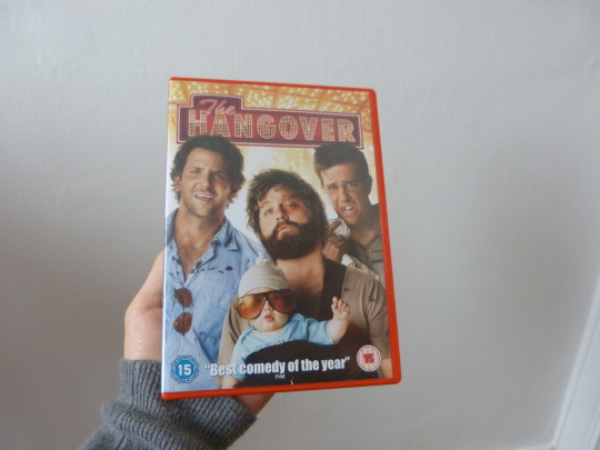

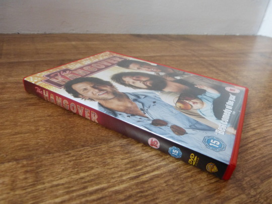
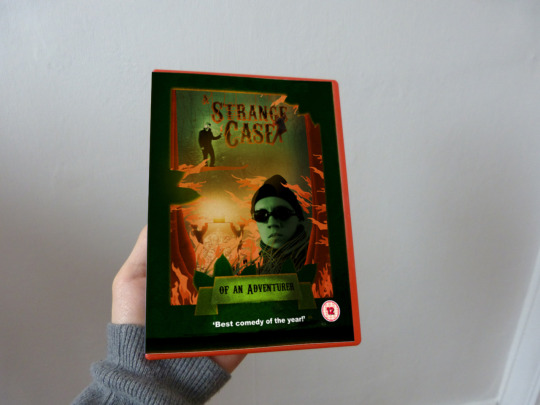
DVD Cover
Along with the book cover i made a dvd cover to go along side of it. Seeing as i made my film i thought this would make sense. I had to add and remove features so that the dvd features were clear.
0 notes
Photo


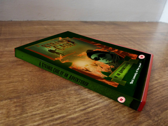
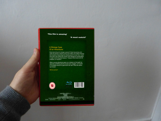
Book Design
After looking at my design i felt that it needed some commercial advertisements. So i cam up with the idea of creating into a book. I thought this would tie in nice with the topic being a narrative so by showing it as a book help shows that this could be a novel. I tried to keep everything consistent with the colour scheme as i didn't want it to be a miss match of colours. I think the outcomes cam out well as the books look realistic and look as if they have been printed off professionally.
1 note
·
View note
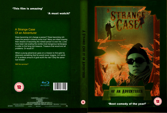
Photo


Advertisements
With this Egyptian poster i wanted to carry on the idea of destruction and make it look like a wanted poster. This meant that i couldn't display the paper textured poster on a digital display, so i had to come up with other ideas. I came up with the idea of displaying it in unusual yet popular places. This meant that i could hang them up on public walls where it wouldn't be rivalled by any other and still have the essence of a wanted poster.
0 notes
Photo

Second Final Poster
Taken place in Egypt, this poster shows the adventurer in trouble as he is being pulled down by an elephant, it also shows him lost as well. However this time the adventurer faces a new fret to find the long lost Egyptian treasure, The Villain, he stands their conniving a plan to kill the adventurer, hence the elephant. The border this time is ripped sandstone as it portrays a wanted poster. The animals shown are primary images that i took when i was at the zoo. Shown in my primary pictures section.
I think that this poster more resembles Paul M Smith than it does Dara Scully. This is because that i didn't use the idea of it being a dream rather than duplicating myself several times. I did this because i wanted to introduce the villain and show a slightly evil factor into the poster. I didn't want the adventurer to seem as if he is in his dreamland, but i did want him to be struggling as a elephant tries to kill him.
Like my previous poster i wanted something different happening on the borders of my poster. For this second final poster i decided to tear into the sandstone texture and some of the primary background. I did this because i wanted it to look old and represent an old wanted poster. By making it old i wanted to achieve the time period that this is set in and show how its dated since then. To make it also look like a wanted poster i added a paper texture on top to give it an authentic look. I used the same texture from the last poster however this time it gave an entirely different object texture, this one is sandstone whereas the other was rock. I looked back at my London themed experiment and took inspiration from that when designing this one. I wanted to make it more subtle through and include the iconic pyramids and sand. This will allow the audience to realise where it is set straight away adding to it narrative.
Again i like the theme of this poster and how the colour scheme corresponds with this to increase its look. However if i were going to do this again i would definitely tried to up the exposure on the characters as the back can be a bit too bold.
0 notes
Photo

First Final Poster
My First final poster. This poster is set in a cave where only the adventurer is found, he has his own troubles in falling from high places, getting lost and finding the long lost treasure that he has been searching for. As he opens the box gold and mystical lighting shoot out to create a dazzling atmosphere. When i started designing for this piece i wanted to carry on with the idea of a theme, this theme was set in a cave. This meant it gave me a lot of ideas as to set out the border and background to the piece. Everything used in this picture is primary other than the gold in the background. To create the texture i used one of the photos i took of the pavement and placed it on top to give the border a more rocky look to it.
When designing i got influence from my two designers Dara Scully and Paul M Smith. With Dara Scully, i wanted to portray how a dream of finding a large amount of treasure can inspire you to search across the most scary of challenges to achieve in fortune. With Paul M Smith i tried to use the element of using yourself many times to create a different profile or feeling to each character. This helped me when creating this movie poster because throughout a movie the characters go through many emotions and tasks they follow out, so showing many of these in one poster can give you a more in depth look into the movie itself.
I like how the border turned out due to it mixing with the theme of the poster. I could of had a plan square border but i thought i needed something more abstract along side it to make it seem as if it was in a cave. I ended up changing the tones of the cave wall to show depth within the poster, this makes it seem a lot larger than without. I tried many different colours for the titles, i found out black suited the title as it suited the dark, spooky tones of the cave. However the white text at the top stood out a lot more because it contrasted the colour scheme, this will help the audience remember when this movie is on and where to see it. As my picture is in a cave i wanted the picture to be dark, although i didn't want the poster to be purely black i added a tint of blue to give the poster more character and a sense of tranquility. I also like how the character profile turned out, this was because you can easily tell what each character is doing. For example if all of the character where standing around doing roughly the same thing you wouldn't be able to tell anything different on their emotions. By showing their emotions you can get a good idea of what the character will be doing within the film.
I like the idea of a theme, this way in the future i could make a similar style of poster however make it look as if it is in a different location in a unique way. I will carry this onto my next two posters and show a distinct difference between the three and keep the same style to the poster making it consistent.
1 note
·
View note
Photo

Third Final Poster
The third and final poster takes place within a forest. This is the final conundrum as the adventurer finds his hidden treasure again but the villain tries to stop him once more by burning down the forest that the treasure is in. In this poster i included more picture of me as the villain and the adventurer as i felt this story was much more in depth than the others. Again this poster is in the exact same style however shows a dominant green colour.
Similar to the first poster i tried to include both Dara Scully and Paul M Smith within the piece. With Dara Scully, i wanted to portray how a dream of finding a large amount of treasure can inspire you to search across the most scary of challenges to achieve in fortune. With Paul M Smith i tried to use the element of using yourself many times to create a different profile or feeling to each character. This helped me when creating this movie poster because throughout a movie the characters go through many emotions and tasks they follow out, so showing many of these in one poster can give you a more in depth look into the movie itself.
Again like the other two posters i like how the variation of border can make an immersive feel onto the poster and can make you feel as if you are there. This time i added trees behind the border to highlight that the characters are in a forest. I also added leaves that are extended from the border, like the first poster with the rock. I think it give my poster a more unique look to them as i can push and pull bits of the border to make them look like objects in its surroundings. The fire also had a good impact within this poster, this is because it gives an element of danger and uncertainty to the characters involved. It also had a high contrast from the greenery to a rich orange, which made it stand out. I also added a glow to this fire to give it a more ambient feel. In this poster i included a more variety of characters from a close up of my face to me climbing the text evading the fire. By making more of a variety of what i do makes it more interesting to look at each profile as you don't know what the next character will be doing.
0 notes
Photo

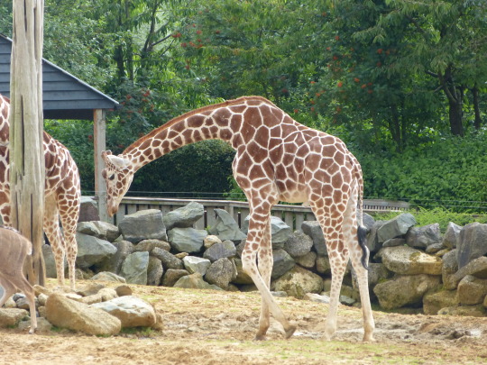
Pictures taken at the zoo. I thought the one with the elephant would be good for pulling my something down while the giraffe to create its surroundings.
0 notes
Photo


Branding
At the end of my project i wished to show what my brand would look like if it was on many media devices. This included a cup, sticky notes, iPad, iPhone, pencils, business cards, a4 paper, cd cover, letter and usb. This way if your logo is on as many devices as possible the more likely people are to see it. If i had only used the cup in this instance then the viewer may not know what the world is but with many you begin to see the name waste and the brand theme of human waste.
The colour scheme that i have chosen throughout this task has been blue white and green. I have kept this constant throughout the different pieces of media so that it is consistent. I wouldn't want too much change as you may begin to think its for a separate company. In the background on some pieces i included a crosshatch pattern, this made it much more interesting than just a white bland background. I didn't this that this was enough so i included stripes along the side of the paper this gave it a much better element of design and stands out much more with than without.
0 notes
Photo

Website
I made this website on hotglue.com. It allowed me to incorporate text as well as imbed my advert. I used the colour scheme of blue and white again so that they would compliment the logo. I also added a texture at the background so that you could tell the difference between the page and foreground. This also gave it more depth and made it seem as if it was floating out at the screen. Behind the logo i included a white box, this was done so that the logo was more visible. As i added a texture on the page the logo couldn't be seen as well so the white box was needed.
I tried to make it like a news website such as the sun website. This was because i wanted to give as much information to the public as possible including pictures. So i would have to cram everything in the composition well in order for it to be visible and have a good design element. The idea to the website is that when you click the different images new text would appear as well as the video and image. This would encourage the viewer to click on all the buttons and gather as much information as possible.
0 notes


Photo


The Villain First Poster
In this experiment i wanted to create a poster using the Great britain theme. I wanted to do this because i wanted the audience to know where the character is located rather than them not knowing. This gives the character their own identity and more uniqueness about them. For example the cliche thing for a British person to do is drink tea so you would expect this character to do the same.
As this poster is in the theme of early 1920's i wanted it to have an old theme to it. The colour scheme of the poster was purposively created so that this theme would be portrayed well. The first version's colour scheme i created was a bit bland so i increased its contrast and applied a paper texture on top to make it stand out more than before. I ended up keeping the same font as before as it suited the theme well and indicates the early 1920's well. The white text stands out against the darker tones used in the pattern.
After including my made banners i like how they make the text of a high importance, i will include this aspect further on also. I want the name to stand out a lot so the audience knows what the film is called so they can remember it in a hope they watch it. Within this picture i think the patterns that i used may have been a bit too dominate so i think in future i may have to remove parts and or change its opacity.
1 note
·
View note
Photo


New Character
Profile - Set in the same time period this new character (The Villain) sets out to destroy the adventurer's plans of finding treasure. The Villain dresses similar to the adventurer as they are from the same time period. His mission is to still the gold and sell it to make himself rich. This new character will have an iconic handlebar moustache edited on top.
With this character i want to include in my final imagery as well as the adventurer. This will hopefully make my piece have a stronger narrative to it rather than one character. By including 2 characters it could then make the audience decide as to whether the villain will succeed or the adventurer. This would then want them to make them see the film boosting your overall attraction to the film.
0 notes
Photo


English Culture/Theme
With my last piece i felt that something was needed to portray where i was in its location, so i choose to look at a culture/theme surrounded around Great Britain. I chose to look at Great Britain because i think it had many iconic aspects such as the letterbox, flag, telephone box, building etc. By including these it can make my piece more recognisable as where i am.
These are possible pictures that i can use in my final piece or an experiment. I think i could combine element to make a collage and include them in the background where my last experiment was lacking.
0 notes


