
Statistics
We looked inside some of the posts by study-creatively-with-me-blog and here's what we found interesting.
Average Info
Notes Per Post
1
Likes Per Post
1
Reblog Per Post
0
Reply Per Post
0
Time Between Posts
13 days
Number of Posts By Type
Text
6
Photo
1
Last Seen Tumblr Blogs


Fun Fact
Tumblr was created by web developers David Karp and Marco Arment.
Text
Study on a Photographer (Part 2)
This post is a continuation of a previous blog I had, talking about a study of Zack Arias - read here
Emma and the Sandstorm
Emma and the Sandstorm is a photography series from Arias’ collection. I would like to share with you the photos that I did a study on from this series.
Since it's a photography study, I would like to share the technical ideas I presented. As for the composition, there is the depth of field here being used and that means there is the use of the foreground and background to show distance and depth in the composition. To do that, the camera is set to a "moderate aperture". The background (the far distant desert) is seen clearly, as well as the background and foreground. That would also mean the aperture setting is set to allow half as much light coming into the lens - not too bright and not too dark.
Speaking of light, the photographer captured well-balanced natural lighting. There is no harsh direct light which gives the image this soft light. Having neutral exposure gives the sense of realness to the image whereas the tonal values are warm tones that match with the aesthetic approach accordingly to the environment.
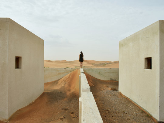
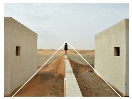
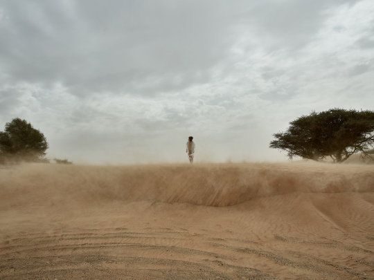
Looking at the photograph above, you can definitely see there is a balance in the composition where the left and right sides are almost symmetrical and identical to each other. Also, there are leading lines present. Especially from the middle vertical line, it leads our eye view directly to the middle point where the model is standing. This gives an overall shape to the composition, like a triangular shape.
Here is another photo I presented on.
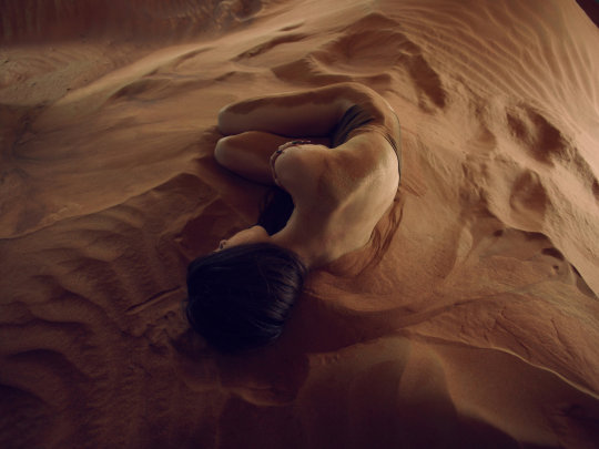
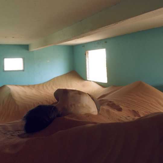
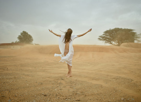
In this photo, Emma the model is centred, giving a visual weight in the composition. Arias used a moderate aperture that helps to capture the texture of the sand. Having lights shown on the subject's body aids in highlighting the contrast differences between her and her surrounding. Again, Arias used natural lighting with no harsh direct light to give this illuminating soft lights. The light source available in the direction of light coming from the windows within the space as seen below.
That’s all from this photography series. Another thing I find why Zack Arias’s personal works that interesting is the fact he uses real people of everyday lives as his photography subjects instead of actual models from industry. He wants to capture stories of real people.
See more of Emma and the Sandstorm series
0 notes
Text
Study on a Photographer
For an assignment we had for our Digital Photography module was to do a study on a chosen photographer and present to the class. So let me share with you the photographer I did a study on.
Zack Arias
Based in Atlanta, Georgia - Arias is a street, editorial and also commercial photographer. He has worked with big names; TIME, AT&T, Coca-Cola Company, Island Records and the list goes on. Even though he is based in Georgia, Arias has travelled to 49 out of 50 states and has worked on various kind of environment - from Film set in LA to farm in Texas.
He started his career as a freelance photographer however after two years, he had to sell off his camera equipment in order to pay off his bills. After some ups and downs, Arias built a strong foundation of his photography career in 2005. His style is simple. He does workshops too for those who are willing.

A fancy B&W portrait of the man himself; Zack Arias
So that’s a short introduction to Arias and who he is as a photographer. Now, I want to talk more about my part of the presentation. Instead of doing a study on his commercial pieces, I decided to research and study more on his personal series. There’s one particular series that really caught my attention.
Emma and the Sandstorm
This series is entitled; Emma and the Sandstorm. There’s a story behind these photographs. Arias blogged about having just another bright sunny day out in the desert doing a photoshoot with Emma (the model here). When out of the blue, the day turned grey and there was a sandstorm coming from a distance. Now normally, people would pack up and hurry to be off. Arias, however, though it was an opportunity. He said he had his truck loaded with his camera gears but his instinct decided to stick to only one camera, one lens. Here was the outcome.
"Pray for bad weather. It makes for great photographs."
-Joe Macnally, a quote from another talented photographer
The above photos I think, are beautiful. The colours in the composition really set an aesthetic value that creates this certain feeling when you look at these photographs. Besides that, what made them work would definitely be the composition; Emma who shows her skin as similar tone as the sand, standing in the midst of the storm fully embracing what seemed to be chaos. The images do capture being in the moment in time.
Sources: Find out more about Zack Arias here
0 notes
Photo

An Artist’s Palette is Also a Piece of Art
This is the palette I used to paint my Coral Reefs mural art. I find the colours layering each other so mesmerising! I guess I’ll keep this palette with me for a little while longer to appreciate its worth.
0 notes
Text
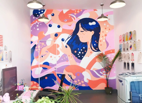
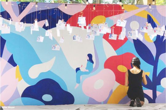
Coral Reef Mural: the Creative Process
This post is part of a continuation of the mural assignment I had mentioned before here. So after some brainstorming with that should be the theme of my mural art, I settled down for underwater-related. I did my research by visiting the Marine Biodiversity Centre at Meragang Beach to look for inspiration.
Afterwards, I noticed there are quite a number of advocates and awareness towards turtles… then I thought to myself, where is there not many awareness towards the corals - they are endangered too, with the issue of coral bleaching as well. That’s when the inspiration came in - my mural art should be on coral reefs. Interestingly enough as I did my research, there are some coral reefs that could be found around the coasts of Brunei - check here! I do believe there is a big percentage of the locals being unaware as well of the coral reefs that we have. Thus, providing me with another strong reason to proceed with the theme.
After doing a close observation of some wild corals from an aquarium, I decided to do sketches and colour experimentations of these cute corals in my sketchbook.

Here is my spread of the experimentation pages. I also stuck some coral photos I took from my uncle’s aquarium (though they are not that visible after printing).
The watercolour wash on the left side of the page is actually to imitate the rocky terrains that the corals set on. Most corals live on these type levelling rocks - so that’s one thing to note about.
The page of the right is filled with watercolour sketches of close the coral subjects - I did more of expressive strokes and tried to replicate the colours the corals give off under the blue UV lighting. All of the corals come in varying shapes and colours. I noticed some are more still-like, literally like just a rock. While there are those with stem and an opening for its fan, almost brush-like. All of them look pretty cool and so diverse from one another. It was a lot of fun painting these sketches.
Although, I do find it quite difficult for me to paint the actual texture of these corals. Most of them have these rough texture and I was not too sure how I should execute that when painting on the actual canvas. After giving some thoughts, I decided to choose to paint corals that do not have obvious rough textures and focus on making the terrains more packed with aquatic plants to go with the corals.
Phase one of the mural

The background is painted blue with white strokes carefully blended along with. I wanted to create the illusion of sunray passing through the water. As the foreground, two large terrains dominants the left and right sides that act as a ground for the corals and plants.

In the previous post of muralists recommendation, I really like Harsa’s artwork as her style reminds me of a lot of Henri Matisse’s cut-outs. The cut-outs look very minimal and playful - I find it suitable for my style of artwork. I wanted to incorporate this idea to my mural work and since it’s a mix media assignment, I could make full use of paper cut-outs to add on. The above photo shows the pieces of papers I painted on. Using a cutter, I traced out the outlines of sea-plants and corals too, accordingly with the set colour choice. As seen on the painted papers, I intentionally painted some areas with the dry-brush effect. This way, it creates textures so it looks visually appealing once assembled on the canvas.
Phase two of the mural

It’s almost complete now! I painted the corals with the colour orange to contrast against the blue background. I think the green seaweeds do help to compliment the strong orange in the composition.
Part of the requirement is to imagine the canvas itself is a wall - so we need to have at least a door and a window. I really liked the aesthetic of the metallic windows they have on submarines - the circular ones. Then I made the same concept as my window and doors. I used cardboard, tin foil and clear plastic sheet to create the model.
The final look of the mural art!

Here is the completed look; it has got the corals, the sea-plants, submarine window, the door on the bottom and the final touch are the bubbles! I think the bubbles made the whole composition look more lively and fun. This artwork is about representing the colourful corals we have and the vibrant sea-life that is endangered. Overall, I’m happy with how it actually turned out - I almost gave up half-way when I ran out of ideas. Throughout the creative process, it’s good to take a step back, recollect some ideas and face your work again with fresh outlooks. That’s what I learnt from this assignment :-)
0 notes
Text
Film study: Baraka (1992)
In a videography lecture I had the other day, my lecturer shared with the whole class a film titled "Baraka" (1992). This documentary film is non-narrative that was directed by Ron Fricke.
My lecturer played the film without telling us the background story of Baraka and that left me to wonder what kind of documentary or more specific - the concept behind it. As the film started playing, the slow-moving scenes accompanied by fitting audio really captured our attention.
About the first five minutes of playtime, the focus shown were mainly shots taken in ritual and sacred places. The technicality for me was the highlight in this focused playtime. Here are just some of the shots I really admire in the very early screentime:
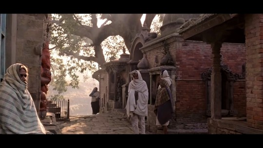
I find these shots were really well composed playing in terms of some principles and elements of composition. For example, the play with the lighting:
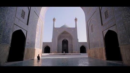
The good contrast between the high-key lighting and low-key lighting creates this dramatic atmosphere and in a way - it has also created a feeling of detachment from the noise of the world and connects us- the audience, into the very moments of being in the spiritual state. In terms of the composition, the compiled video montage showcasing different groups of practices and beliefs provides to be in-sightful. The way I would interpret it; the message is that humanity developed practices that integrated as part of their life and in which is a norm in every part of the world.
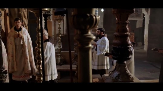
Another scene that truly mesmerised me was the part where a number of men would perform their rituals of worship.
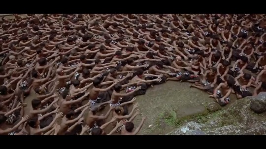
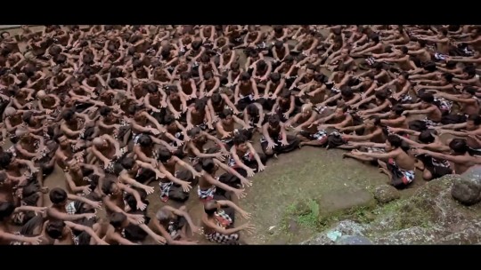
In the film, this scene was edited to have the actual audio alongside the visuals. Watching the men's every step and movement is an experience that you could call quite humanistic - the director captured the atmosphere in which you could feel the strong energy of these men and there is genuity in what they do.
Within the grouped montage, there was also a particular scene that had me thinking. It first starts with a portrayal of an elderly. In the next frame shows the space of a zen garden. The scene then transitions to focus strongly on the elder’s hands.
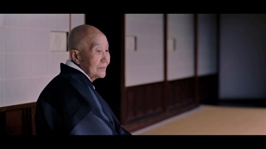
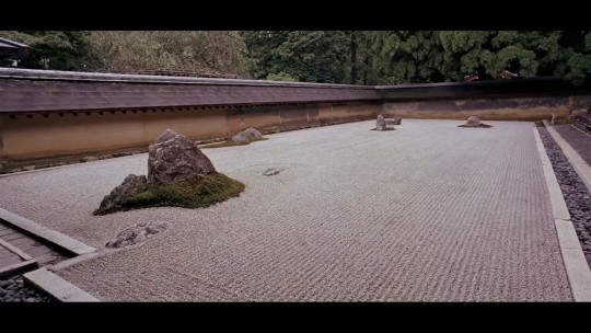
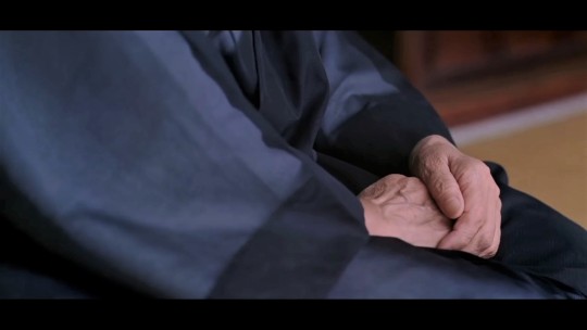
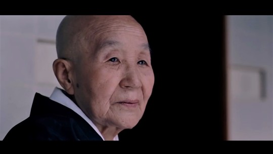
I found these four separate frames to be interesting. In my view, these frames talk about a person’s dedication. The image of the elder's ageing hands could symbolise the many years of work and craftsmanship that may play part in the creation of the zen garden. It's about the time and willingness to create a beautiful landscape; it perfectly captures the essence of human tied together with a touch of nature together. And in the last frame, the elder is shown just starting into the distant (perhaps looking over the garden) in a rather calmed demeanour - to say he has done his part and is relieving the moment.
The film continues to different thematic that revolves around the essence of humanity and nature. Despite the lack of narration in the film, I think that itself made the whole film work. The use of simple snippets that captured daily-life activities to convey messages is the philosophy behind Baraka.
There are definitely more scenes I would like to discuss on but I leave it at that. I’m glad I got introduced to this film - If fully absorbed into watching it, it could provide to be an interesting experience and as for me - it’s good training in learning more about film composition and narration.
Here is a link to watch the full film of Baraka (1992):
https://youtu.be/uiFNbs51O0M
Additional reads on the film:
https://en.wikipedia.org/wiki/Baraka_(film)
http://www.philfilms.utm.edu/1/baraka.htm
0 notes
Text
Muralists you should know
Currently, I’m working on an assignment that requires to create an art piece for a mural. To begin, I’m doing muralist research and I thought it would be nice to share some artist recommendation and my thoughts on their work.

Here’s a spread of the two pages from my sketchbook.
Artist study: Alice Lee
(Top left the sketchbook page)
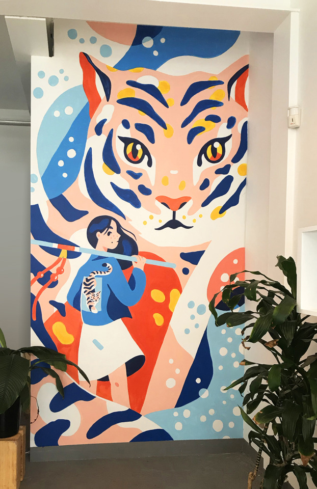
Bright, like your eye by Alice Lee
This mural is really eye-catching. To me, the artist has created a well-balanced composition. Here, there are two subjects - the tiger and the girl. The artist designed the tiger to be bigger in size as compared to the girl, giving the tiger more of the focal point in this composition. The title of this piece is “Bight, like your eye”. It may directly mean to refer to the tiger’s eyes. Alice Lee created this mural just abstract-like that is matched with a fun combination of the colour scheme. I really like the artist’s style - the spaces are filled lively while still has a clean look. What I like most is the artist’s choice of colour palette! The artist knows how to tie a good ratio of vibrant and subtle colours together.
I totally recommend anyone to check out Alice Lee. Here are some of her other works.
https://www.byalicelee.com/murals
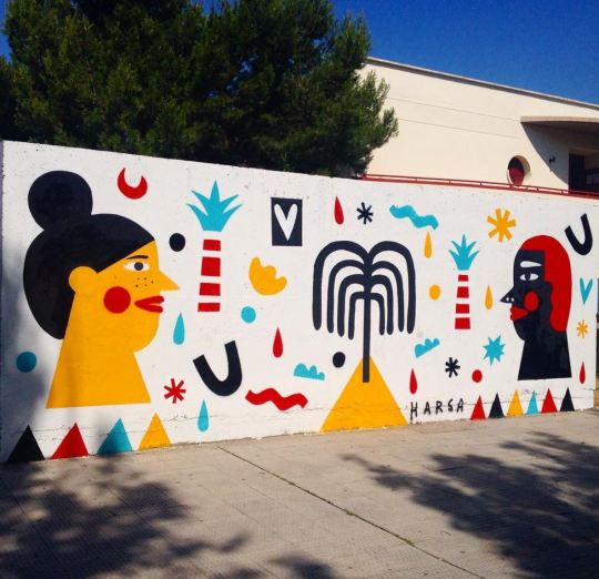
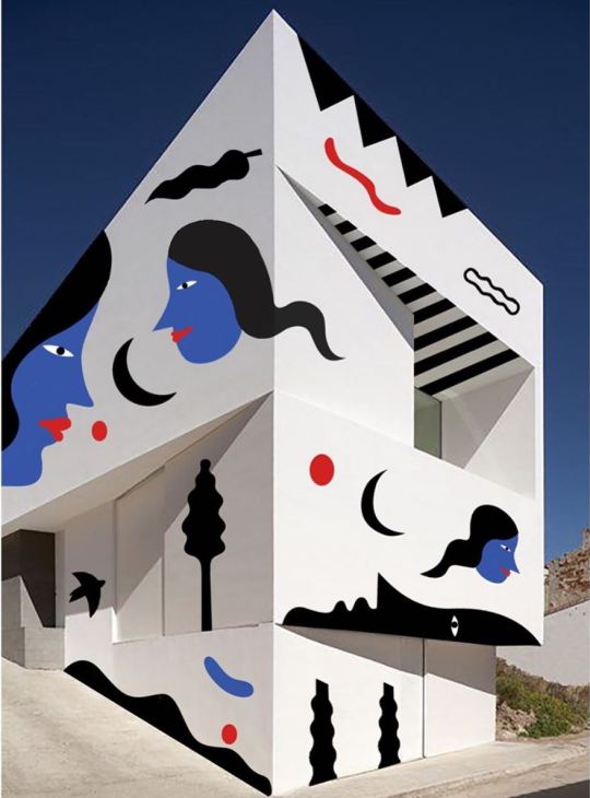
Artist study: Arantxa Recio Parra (Harsa)
(Bottom left the sketchbook page)
Here is another mural by Harsa, a Spain-based muralist.
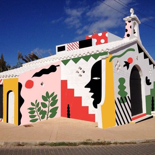
A mural project of a church in Menorca by Harsa
The design of this mural reminds me of Henri Matisse’s cut-outs style! Each element in this mural are kept minimal but the artist managed to make the whole composition harmonised despite the various kinds of abstract drawing done. The placement of the designed objects may look random but I do think there’s a design process behind the artist’s choice to make the whole composition work. Harsa used fun and strong colours that contrast well with the white walls - helps with the visual impact and aesthetics. What’s cool is the fact how the mural made a three-dimensional architecture look almost two-dimensional!
The artist really has a distinct style and her illustrations are just as great! Here are some of her other murals. Check her out!
https://www.instagram.com/harsa_pati/
http://harsa.es/
0 notes
Text
An introduction
Hello everyone!
I’m Zatul, someone who likes the two things mentioned after the name of this blog - studying and being creative.
Study Creatively With Me is a space where I keep my weekly progression as a University student and as a part-time graphic designer. In this blog, I want to be able to freely express myself throughout the new semester - thoughts on some of the things I picked up from lectures, thoughts on any of the works I’m working on, comments on anything I find interesting...perhaps also curate outside contents that could give me ideas to inspire myself (or anyone!).
In the end, this blog is my journal. I hope this journal of mine will be worth the share to help anyone on their journey too and find creative ways to spark well… their creativity! Enjoy.
1 note
·
View note