#<- going with that one to differentiate between my artstyles
Explore tagged Tumblr posts
Visit Tumblr Blog
Explore Tumblr blogs with no restrictions, modern design and the best experience.
Last Seen Tumblr Blogs


Fun Fact
Tumblr was created by web developers David Karp and Marco Arment.
Text

felt nostalgic for my ADA!skk AUs, here they are struggling on a case, wish them luck o7
#what if i posted vaguely cleaned up sketches for once#what then#also playing with a new brush to see how much i can bring in the feel of my paper sketches on the screen#bsd#bungo stray dogs#bungou stray dogs#bsd fanart#bsd dazai#bsd chuuya#bsd dazai osamu#bsd nakahara chuuya#skk#soukoku#ada!chuuya#ada!skk#nawy's art#<- going with that one to differentiate between my artstyles
2K notes
·
View notes
Text
Things I Like about Clinical Trial and How it Differentiates itself from Other Indie Horror Games
This is an addition to my CT Impressions post, and there will be spoilers after the cut. After this any post I make will be tagged "clinical trial spoilers" so you can avoid spoiling yourself on a 3-4hr game. Before going under the cut here's less spoilery reasons I like this game.
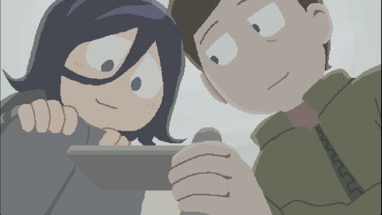
Art: The artstyle of the sprites and CGs are nice and while soft carries a lot of impact. There's a ton of different sprites at play during dialogue that really gives life to the characters. If you decide to go for a second run it's interesting to notice what expressions (or lack thereof) are at play. The creator also had another person draw the art for Angel, making their artstyle more unique to the game artwork.
Dialogue Pacing: Something interesting about the dialogue that I can't recall being used to this effect before is the pacing of the lines. Lines aren't always displays at the same pace. There's pauses between words, there's points where the dialogue box is left empty, there's stuttering. It's makes it easy to imagine how the characters are talking in a really interesting way, and it makes watching playthroughs enjoyable. Even players who don't have a lot of experience reading out loud are able to capture the characters a lot easier thanks to how the dialogue works.
Characterization: To be as spoiler-free as I possibly can here, the two main characters are well-written. They have their own internal lives that's shown both on screen and by what's purposely not shown. By the end of the game you have a pretty clear understanding of who these characters are and what dynamics are at play between them. Some argued that the 11 o' clock plot twists were out of left field, but if you replay it you might notice a lot of hints to how it got to that point.
As I said in my impressions post I don't think this was a perfect game, but it's still an experience that's hard to dismiss. I've watched videos, played it multiple times, stepped away from it awhile to see if I'm just overthinking it, but no matter what I do the impact this game left me with remains the same.
But to really drive home why this game's so interesting and why it's so different from a lot of other indie horrors out there I'll need to get into spoilers, so going under the cut now.
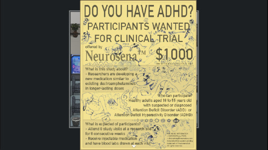
Do you have ADHD?: I feel like this became a siren call to people with ADHD and undiagnosed ADHD. Everything from Angel's little quirks to how it effects their ability to live day-to-day is so familiar to anyone who likely has this condition, to the point that it's scary. And even with how much ADHD affects Angel they still have a solid personality and character. Whenever a character is written intentionally with a certain condition there's a risk of the character just becoming a checklist of symptoms, but this avoids that while still giving us the impact of the condition.
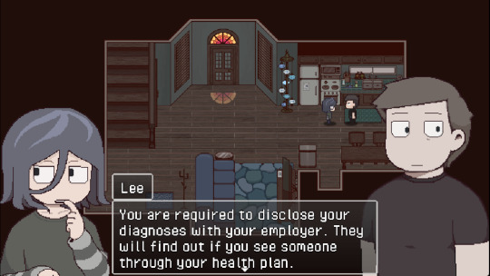
Mental Illness: This game is stunningly aware that the characters need therapy. That's kind of a meme with a lot of stories, that things would've resolved a lot easier if the characters had therapy, chuck this villain into a therapy clinic...but no in this case that's blatantly the answer here. Regardless of how you feel about the characters it is so abundantly clear that they need help...and the tragedy is that neither are able to receive it, either through lack of access or fear of repercussions. There's no one solution here that can save these characters.
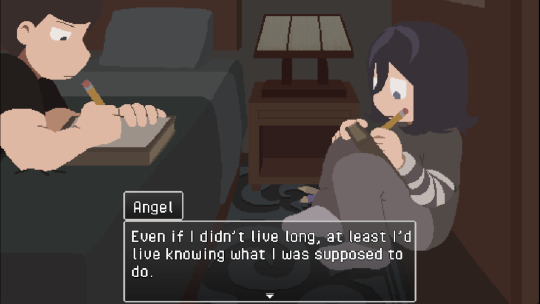
Their name is Angel: Along with mental illness, what isolates Angel is their queerness, during a time when online queer spaces weren't as prevalent, and especially spaces for nonbinary people. I'm nonbinary myself (which is another thing that makes this game way too familiar to me) and during the era the game's placed in I didn't have the words to really understand what I was. It was lonely. Angel's connection to animals comes from not knowing how exactly to define themselves, only understanding that they can't fit the standards expected from them. And when the only person who accepts you as you are is your stalker and a murderer...I can understand why they would still accept him.
No Meta: Don't get me wrong, I'm cool with meta games, but I think what sets this game apart is the reason for a character's actions...okay it's Lee, I'm talking about Lee here. The reasons for Lee's actions have nothing to do with meta. I feel like there's a lot of characters who fit the same niche as Lee that don't have reasons for their horrible actions beyond meta. Prime example being Doki Doki Literature Club, which I think was a huge influence to latter games. The horror stems from it being a meta game, which has the risk of taking away from the character's actually personality outside of meta-influence. Here there's no risk that Lee's actions can be excused by meta.

Realism: In addition to there being no meta-narrative there's also nothing in the game that reaches parody or fantasy. The unfortunate thing is everything in this games setting is fairly accurate to both the time it's set in and today. The horror is in the mundane, in how systems fail people, which leads them to take drastic measures out of desperation and form unhealthy bonds because of loneliness. The reason this game resonates is probably in part because a lot of people have also been failed by these same systems, and I've seen a lot of accounts of people ended up in similar relationships as the main characters out of loneliness.
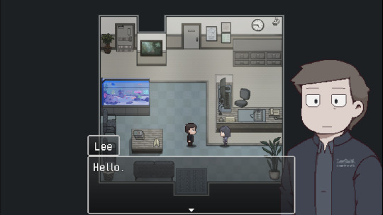
Regular-Ass Dude: With the game being set in the realm of the realistic, can we talk about Lee? I saw a post that was like "You wouldn't like him if he was hot," and I did a double take because like...what...? He's hot???? Like physically????? I feel like I'm out of the loop on who's conventionally attractive these days. Because to me an important part of how Lee works is that he's not conventionally attractive, nor is he conventionally ugly. He looks like just a regular-ass dude you'd meet at a doctor's office. His appearance and flat affect becomes a mask to make him appear "normal" on the surface, which throws Angel and the players off the scent of how much of a freak he actually is from Week 1. Because of his surface level normalcy we miss the signs, possibly even right up to the shrine discovery.
Lee's Actual Appeal: His attractiveness only shows when he opens up, sharing his little wallet schedule with terrible writing, complaining about the medical system that fails his patients, his shrimp talk. When he has Angel in his place he actively tries to make them happy and comfortable instead of taking advantage of the situation. It's what makes the discoveries such a gut-punch. There's genuine effort in making Lee so likable and making his and Angel's dynamic work, and then that dynamic gets challenged. The disappointment I felt from seeing the shrine really felt like the disappointment I'd feel when a friend or family member messes up. Because I like them and I wanted them to do better. And then the body's discovered and I'm like "C'mon Lee you you could have least buried him first before inviting guests!"

The Other Regular-Ass Dude: Brandon's also regular-ass dude, but unlike Lee who's only a regular dude on the surface, Brandon's a regular ass to his core. It's what makes him such a loser in the basement. He's not an ugly mustache-twirling villain, he's a decent-looking dude in his early twenties who never had to learn what "consent" truly meant. He genuinely cannot fathom that he's done anything wrong, which is both mortifying and kinda sad. There are thousands of dudes on the internet who still think like Brandon, who still think anything goes so long as the other person doesn't say no out loud. Brandon is not the exception, he is the standard. He's part of the horror of the mundane.

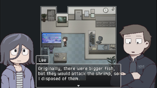
Clinical Murder: Speaking of Brandon I think my favorite scene has to be the basement, where Lee reveals what he believed the basement is for and what he did. Fun as it would be I'm very glad the creator didn't make Lee a typical slasher villain. He's not openly conniving or cruel, he's cynical and very detailed in his violence. His matter-of-fact attitude clashes well with the delusions and fears that brought him to that point. When describing what he was going to do he's cold, casual and uses the same flat affect as he did when describing the testing done to Angel. You could almost say he was...clinical about it. HAH! HAHA!!!
Okay I think I'm past the limit where anyone will tolerate my word vomit so I'll stop here for the day.
90 notes
·
View notes
Text
“Genshin character designs are bad.”
You really can’t navigate through the Genshin fandom without hearing this take. It’s stale at this point, but it’s…. also true. Except that’s usually not what people are actually saying. The true question up for debate: Are Genshin character designs ugly?
It irks me because there is validity to the original statement, and yet the conversation immediately moves into the territory of strictly opinion, leaving the true discussion never to be had.
So I’m having it… with myself…. in the form of a long post, because actually I find Genshin an interesting character design case study.
Before I really get into it I must address the elephant in the room; are Genshin’s character designs colorist?
Yes. Moving on.
Okay, okay, I’ll address it a little, Genshin has a problem with colorism. It’s a fiercely debated topic and honestly it’s one of the only real valid discussions I see around Genshin’s designs. That being said, I have nothing new to add to the conversation. If you don’t know why, sorry I’m not qualified to answer that, but you’re in luck because tons of qualified people have explained it across all platforms.
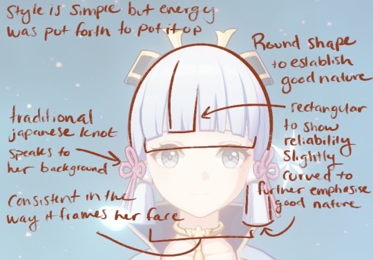
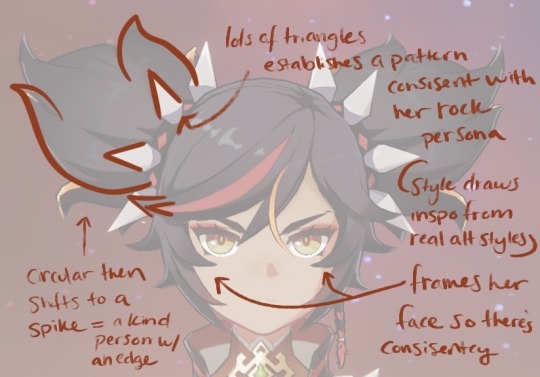
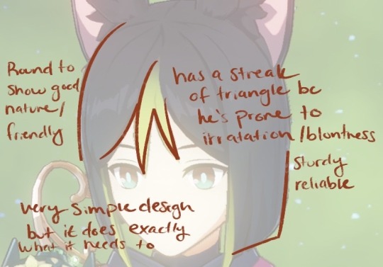
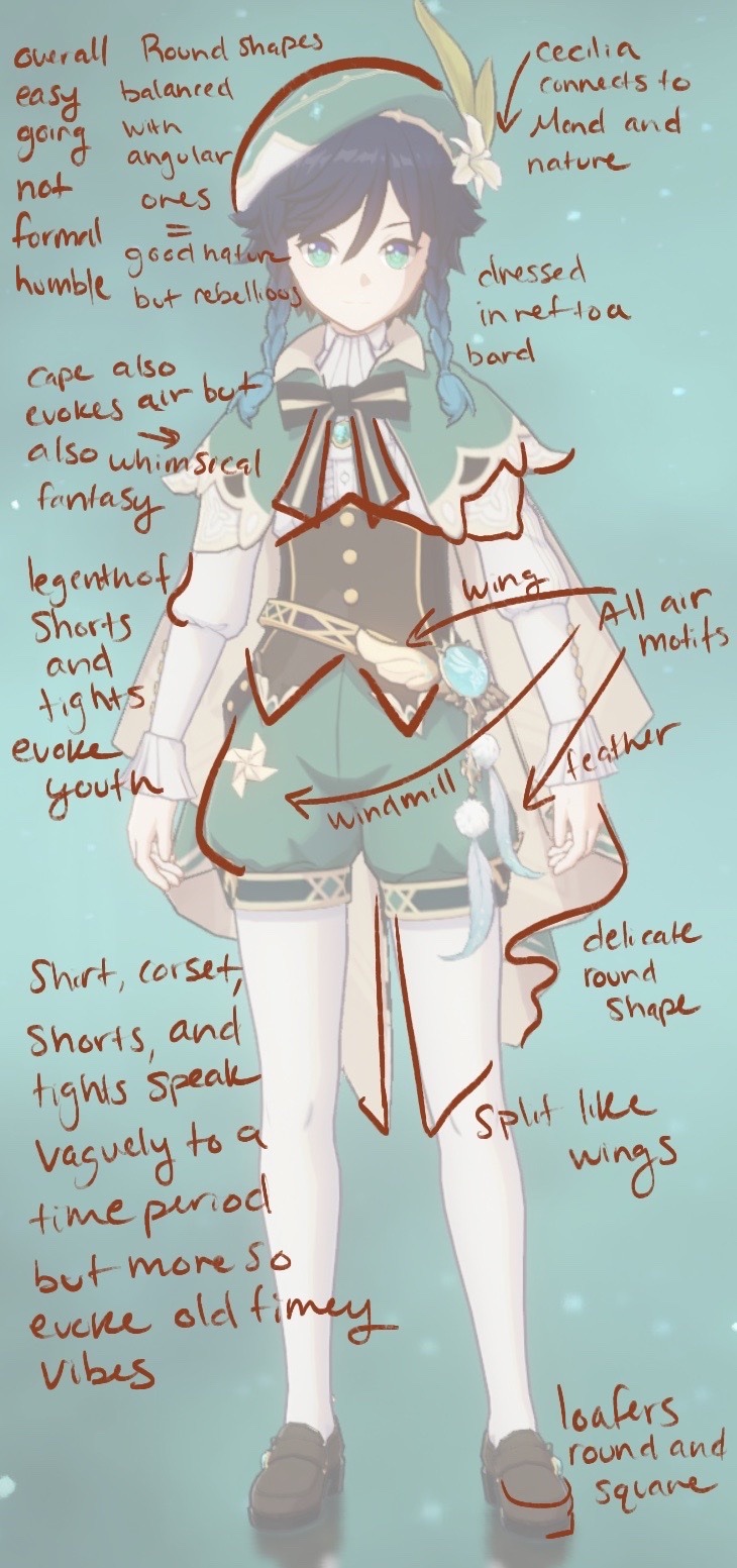
What I am partially equipped to talk about is character design. I’m no expert but I have taken a few formal classes on the subject, so I do have some insight to share. Character design at its core is usually quantified by how much of a character’s personality can be clearly determined from sight alone and how recognizable their silhouette is (though I’m not gonna touch on that today). Now there’s a lot of factors that go into both, but the fundamental thing that contributes to both is something known as shape language.
Shape has meaning. What that meaning is often depends on culture factors that determine your associations, but the Western simplification of shape is that circles are good-natured, rectangles/ squares are reliable, and triangles are energized. (these are my own personal words for them, there are countless ways to go about describing these associations) Shapes are then combined with each other to create more complex associations, and so on and so forth. It’s impossible to create a character without evoking some form of shape language, because art at its core is just shapes. The classic example are the round shapes seen in Mickey Mouse, though often times it’s far more subtle, like how Barbie has soft, round lines in her hair and face, but her hourglass figure is comprised of triangles to tell you she’s sexy, but the soft curves say she’s sweet not sexual— and it quickly gets very complicated. Basically character designs are rarely comprised of one shape alone, and when combined the “vibes” they evoke become complex.
So what does this have to do with Genshin? Genshin has poor shape language. The most obvious example of this are the faces. Genshin has same face syndrome, which I partially contribute to budget constraints with the models seeing as they reuse them over and over. Though it also has a lot to do with Genshin’s need for their characters to be conventionally attractive. Everyone must be beautiful and, as the current trend in anime artstyles dictates, not look a day over 12. The only thing that changes is the eye shape, but even then, it really doesn’t. There’s diversity between the male and female models, but calling it diversity seems generous, because they are practically the same. All the viewer has to go on to differentiate between faces are the expressions (and color but we’ll get there), which are also limited by the models.
The poor quality of the shape language continues into the bodies, seeing as the only thing that really changes is the height, not a lot of room for show casing contrast. (Also body diversity is just a good thing to have for the sake of having body diversity.) Visual contrast is one of the key things good shape language should deliver. It’s within this contrast that the viewer will have the opportunity to compare and thus make these associations. One character design may tell you things based on previous knowledge but it’s like an experiment without a control group.
Then we get to the character’s outfits and hairstyles. While it’s true there is a fair amount of diversity in clothing, the shape language continues to falter. Genshin characters have so much going on constantly in their designs that it seems like that should provide plenty of opportunities to showcase personality. Unfortunately what ultimately happens is that the details compete amongst themselves so much that they overshadow any sort of unified message they might have had about who this character is. Basically there’s too many different shapes. They don’t create a pattern and therefore don’t form any strong associations. You can have a good design with a lot of details but they should communicate a pattern together. A design is not good simply because it has a lot of detail. I will say there are definitely times where the clothing and hair do actually come through to tell me stuff about the character, but overall this over designing tends to be a detriment.
Genshin’s hair while in different styles usually relies on the same type of pointy strands and blunt edges.
(these characters were randomly selected to prove my point that you can quite literally pick any character in genshin and they will have at least one of these two components)
On their own pointy strands might tell us something, but considering every character has them, the pattern within a single character is rendered moot. “If everyone’s super, no one is.” Of course how they choose to wear their hair does speak to the character but its effect is limited when the structure of the hair is fundamentally the same. And then when you consider that the styling of many of these hairstyles doesn’t actually say a whole lot, it becomes obvious that Genshin is more concerned with creating hair that stands out. The problem is that details, asymmetry for example, normally tell us about the character, but considering so many hairstyles utilize asymmetry, it looses its meaning. Overall I will say I think Genshin is more of a 50/50 toss up on whether or not the hair suits the character.
I want to take a moment to point out a couple hair style designs in Genshin I think are really lovely and work very well.

And now I would like to do the same with some outfits.
(honorable mention to Bennett for being over accessorized in a way that actually tells you about his personality (goggles, a scar, bandaids, work gloves, utility belt), to Barbara for somehow mashing the concept of a nun and an idol together, to Klee for her childish whimsy and finally to Scaramoche for the sheer amount of subtle character growth motifs fit into all three of his outfits (the cultural stuff is really cool too))
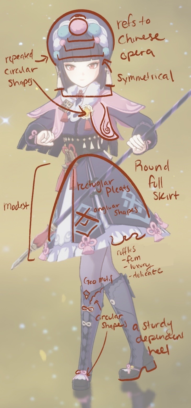
Genshin I will say does a great job of creating and repeatedly using the elemental imagery as well as Khaneira’ah’s star. I also appreciate that every Archon has that ombre hair shift that glows during their burst. Makes them feel unique.
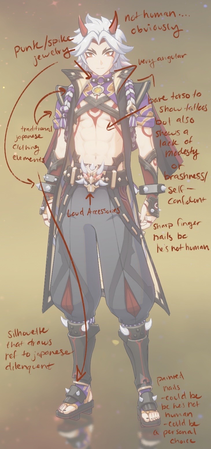
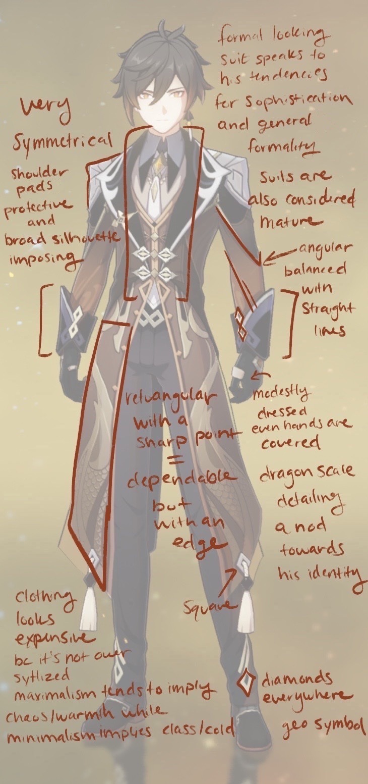
I think Genshin shines the brightest when they successfully incorporate cultural elements into their designs however, the only nation that does this with any sort of consistency is Inazuma. Inazuma’s aesthetic is so instantly recognizable. No one dresses exactly the same, but there are common through lines in the shoes, the style of the armor, and patterns in the clothes. (The design aesthetic is so strong that even after Scara got a Sumeru makeover he managed to keep elements that were clearly identifiable as Inazuman) Every other nation falls short in this department. I will give credit to the knights as there is some level of consistency in their designs, mostly in the metallic detailing; not quite a uniform but there is some commonality. Liyue does have cultural influence that definitely shows but it suffers from an overall lack of consistency in aesthetic, and doesn’t lean into its Chinese inspiration the same way Inazuma does. Mondstadt on the other hand is just vaguely European, but also half the time not even.
And then there’s Sumeru. I distinctly remember looking at the full Sumeru cast the first time and thinking that none of the them looked like they came from the same place. (It’s almost as if Sumeru is based on a bunch of separate countries that are culturally very different.) Pretty much no character has any real ties to any any real culture, but instead they just sorta grab vague elements. And at its worse just leans into orientalism (Nilou and Dori). I think personality wise the designs do a fairly stable job of saying at least something about their characters (Dehya and Kaveh). The designs do well individually but between the vague references and inconsistencies they falter. (I will say Cyno’s whole design being a reference to Yu-Gi-Oh is both hilarious, charming, and also mildly appropriative.)
On the topic of appropriation I think it’s important to note that Inazuma suffers from this too. While I absolutely love the way a lot of Japanese elements were integrated, outfits like Yae Miko’s shrine maiden garb bring forth this sexualization of cultural dress that I’m not particularly fond of. But then again you can also critique Rosaria’s sexy nun design for the same thing.
I also want to touch on something briefly because it’s important to note, but it’s a separate, much bigger conversation; Genshin, like anime, falls into a trap of catering their style to lolicon and shotacon enjoyers. It’s the reason all the characters look so young, why all the age discourse exists, why they refuse to confirm ages, and why all the children with the toddler model have some weird age work around. I don’t like it. It’s gross.
Another brief mention because it’s its own conversation; the female characters in Genshin are often over sexualized. Their clothes are skin tight, they almost always have weird random cut-outs, their skirts and dresses are designed to show off their breasts and asses, and all of their designs are high fem regardless of their personality. Give a female character baggy pants Genshin I dare you. Dori doesn’t count, she’s a toddler model in just a bra. I don’t have a problem with a female character being hot, but when that’s the only requirement…. it’s tiring. The classic female character design video game debate…. yah.
I think my overarching issue with Genshin’s clothing design is it says nothing about whose these people are. What jobs do they do? What do these accessories say about them personally? Take Yanfei. She’s a lawyer, yet nothing about her outfit speaks to that in the slightest. I remember the first time I sat down and looked at all the playable characters with a friend of mine. I didn’t play at the time and we thought it would be fun to see if I could guess their personalities. As you can imagine I did pretty poorly, and that’s because these designs just don’t suggest a whole lot.
And then we get to color.
Color is probably the most complicated part of art let alone character design. I feel as though we all have some familiarity with the concept of color coding in character design. The classic red/blue character foils. Color often suggests specific traits similar to the way shape language does, except unlike shape language color coding doesn’t always apply. You can’t just assign a character a color and call it coding, the character has to physically have that color on them in some significant manner. For example Naruto is clearly an orange coded character. He appears in the color throughout the series, but I couldn’t classify Eren Yeager as a green coded character even if it suited his personality (which it doesn’t) because it’s a uniform everyone wears. Attack on Titan does not evoke color coding the way Naruto does, so it’s not applicable.
With Genshin color is complicated. Genshin does have an established color pattern for all the elements, but not every character wears the color of their element. Now normally I would say just having a color pattern for the elements wouldn’t be enough to justify character color coding (since it would fall back into the uniform category), but in Genshin their visions connect to their personalities, so therefore the color of the elements is connected to them. For some the color coding is very obvious (Kaeya & Diluc) and for others it’s practically nonexistent (Yun Jin & Heizou). In all honestly I don’t know what to make of this other than Genshin is inconsistent in their elemental color coding but always consistent in their high saturation. Because color is complicated and a weaker area of mine it is equally likely that I’m missing something or that Genshin isn’t coding anything and it’s all pure aesthetics.
Which brings me to my final point; aesthetics. Hoyo as a company cares that you spend money. That is the number one goal at the end of the day. That’s why all their characters are conventionally attractive, why their art style is the way it is, why their shape language suffers, and why their outfits are overly detailed. It’s all about aesthetics. As a brand Genshin cares less about their story and more about how pretty their characters look, because if their characters are pretty then you’ll spend money. It’s not like Hoyo designed characters with bad shape language because they were ignorant. They knew exactly what they were doing when they sculpted every last visually pleasing strand of pointy hair.
Which brings me back to the real question that people were actually arguing over in the first place; are Genshin characters ugly?
I can’t answer that question. I mean they weren’t designed to be ugly, but if they don’t appeal to your taste, then to you they are ugly. But it’s more important to understand that “bad” and “ugly” are not the same. Genshin character designs are bad by professional standards but that doesn’t mean you can’t like them. Genshin designs can be both bad and likable, bad and pretty, bad and cute. Those are two vastly different things. It’s the same way people adore cult classic movies. They’re not good in the eyes of a critic, otherwise they wouldn’t be niche. They’re cult classics because people like them. Personal taste is just that. Personal.
But the most important question of all; do I like the Genshin Impact character designs?
I didn’t use to but I gotta say, they’ve grown on me.
#genshin#genshin impact#long post#it’s an essay#i wrote an essay#character design#tagging the characters i look at specifically#in a positive light#yoimiya#venti#ayaka#zhongli#itto#yun jin#xin yan#tighnari#sorry about any potential typos#i have no beta reader#so it’s just me and my notoriously bad reputation for not spotting mistakes
114 notes
·
View notes
Text
ITS BEEN A WHILE BUT I AM BACK WITH HIGH LITERATURE
titles discussed:
red string quests (18+, manhwa)
after a meal (manhwa)
the wind spell (manhua)
ghost gate (18+, manhwa)
high clear (18+, manhwa)
release your persona (18+, manhwa)
red string quests (18+, manhwa): MAN. this one hits. I want to pinch the MC's cheeks and give him a liddol kiss hes so cute, I get cuteness aggression whenever there's a panel of him just looking lovingly at the ML oughghghh....anyways I am a slut for past lives / reincarnation trope and so far this one is cooking. its also very funny and extremely chaotic, especially the beginning. basically, our MC reunited with the ML in college after 4 years of no contact, and they go on a trip together to pray at this landmark called the "red string boulder", which is supposed to improve your dating luck. the ML has had absolute shit luck in his love life which is why hes praying at the boulder, but the MC doesn't believe in all this and proclaims to the boulder that he wants this nonsense to be over so he can go home and play games (ily king). as a result, the boulder "curses" him to complete a series of quests designed to make him believe in "destined love" bc surprise surprise, turns out ML is the MC's destined lover and they better complete those quests quickly if they dont wanna face the consequences!!! anyways one of my fave current reads so far this is the shit I signed up for
after a meal (manhwa): this one is so funny, I love the way the artist draws expressions and the ML is also so cute....I am tucking him into bed and feeding him hot chocolate 🥺 our MC is a loan shark whose favourite soup restaurant unexpectedly closed, but he finds a high school boy sitting alone in front of it who proclaims he can replicate the restaurant's soup if MC let's him stay at his house. it seems like an extremely sus age gap at first but a) its actually not that big and b) the MC has been shutting down the ML's advances so far, so im actually not put off by it at all. I think the story is hinting towards a time skip where the romance will actually start after that, right now its more of a one-sided crush. aside from that I loveeee the artstyle and again, this is so funny its like the funniest thing ive read recently. extremely unserious, highly recommend for a good laugh
ghost gate (18+, manhwa): bruh what the FUCK is going awwwwwn....very nightmare on elm street esque my man is being tortured by a horny ass ghost in his dreams to the point he cannot differentiate between reality and dream. the art in s2 is a huge improvement from s1 imo, but honestly plot-wise i am a little lost bc the MC himself has no clue what's going on and I think he purposefully is in denial of the situation he is in wrt being haunted by a ghost. I think im gonna still keep an eye on this one bc I do love the horror moments in this, but I am very confused about what's going on lol...
the wind spell (manhua): DEAF GIRL X SIREN YURI WOOOAHSJDHSJ!!!!!! the art in this is breathtaking and im frothing at the mouth for the next chapter aoughgbgbgbgb...its got the ethereal, dreamy feel of a grimm fairy tale and the narration makes it feel like im reading a storybook since its in 3rd person POV. it takes place in the 17th century when the church has high influence and accusations of witchcraft are rampant, and our MC is a deaf oyster fisherwoman who lives with her father, who is also a fisherman, but due to a severe leg injury he cant work as much as he used to. right off the bat I actually love her rship with her dad, they both clearly care for each other deeply and her father does everything in his power to protect her from the fate rhar befell her mother when whispers of witchcraft start circling around her. I have a feeling this might be doomed yuri but I am SAT. I got my popcorn out and I am READY.
high clear (18+, manhwa): imma be real with yall i got bored after s1 so I dropped it. the definition of a solid 3/5 manhwa, like its not bad but its not good enough to keep me invested. I also hate the way MC's hair is drawn im sorry but it is a horrendous hairstyle. I also found the rship between him and ML a little boring, and I also am not a huge fan of stoic / cold-looking ML's that dont emote. overall this one was not for me.
release your persona (18+, manhwa): a short 9-chapter story but I ate it tf up!!!!! I loveeee the art in this one and I also liked how certain panels were laid out, like in some conversations the speech bubble would be blocking a person's face so u cant see their expression, which is a really I interesting choice since it leaves it up to the reader to imagine what kind of face they're making based on what was said. the plot itself is very simple, its mainly a character-driven story about being in the public eye, how ppl perceive you, and how rumours can shape your interactions with others. I really enjoyed this one!!!
2 notes
·
View notes
Text
OKAY. MY THOUGHTS ON MUTANT MAYHEM:
its amazing.
(spoilers for tmnt mutant mayhem!!!!!)
this is all going to be very incoherent and in all caps
SO I FUCKING LOVE IT. ITS NOT MY FAVOURITE (thats rise, i owe my soul to rise), BUT.
gods its so amazing
their first time meeting april! ITS VERY SIMILAR TO THE WAY THEY MEET APRIL IN 2012 BUT WITH LEO BEING THE SIMP EXCEPT HES NOT AS CREEPY ABOUT IT????
and oh my gods, april literally said the word 'sus' in the movie. SEVERAL TIMES. WHY. ASHFBSK WHY IS THAT SO FUNNY TO ME HOLY SHIT. AND DONNIE LITERALLY TOLD LEO THAT HE HAS NO RIZZ. USING THE WORD RIZZ.
leo is. in the words of my good friend, @sp-teri, "leo is cringefail". i love leo so much. donnies my favourite, but. leo is wonderful. HE DOESNT KNOW WHAT HES DOING AND HAS LITERALLY NO RIZZ (donnie described it perfectly) HES AMAZING
and oH MY GODS. SUPERFLY?? SUPERFLY IS COOL. VERY COOL. HES KINDA LIKE DRAXUM BUT ALSO NOT???????
how is superflys plan even supposed to WORK. i mean, he wants to turn all animals into mutants and kill humans. HOW DOES THE OOZE (i love that its called ooze in this. ooze rights.) DIFFERENTIATE BETWEEN ANIMALS AND HUMANS????? HUMANS ARE ANIMALS TOO...
idk, ill chalk it up to movie logic, i guess.
AND BRO. DONNIE. MUTANT MAYHEM DONNIE IS AMAZING.
HES A KPOP STAN. im so proud of him.
AND THE ENTIREEEEE MOVIE HINGES ON THE FACT THAT DONNIE RLY RLY RLY LIKES ATTACK ON TITAN. THEY WON BECAUSE OF ATTACK ON TITAN. GO FOR THE NECK!!!!!!! AND IT WORKS. I AM. IM GOING INSANE ABT THAT.
AND DONNIE HIMSELF. HES MY FAVOURITE. I LOVE HIM. HES SO SASSY AND AMAZING AND HE HAS SO MUCH PERSONALITY AND. i stan every version of donnie (...even 2012 donnie...) BUT MM!DONNIE? HES MY SECOND-FAVOURITE (once again, my soul belongs to rise).
donnie is. hes so cool Ɛ>
i literally dont have words.
and i love mm!april so much. IM SO PROUD OF HER. SHES A CONSPIRACY THEORIST AND WE STAN IT. AND SHE OVERCAME HER FEAR OF CAMERAS IN THE END!!! SHES A REAL REPORTER!!!!! APRILLLLLL O'NEILLLLLL
and oh, oh! that weird boss lady that wants to milk the turtles (every damn time they said that they were gonna milk the turtles, i was. that shits hilarious. "they/we dont even have nipples!")! my theory, with basically no evidence to it, is that SHES A KRAANG OR SMTH. IDK. i mean, she mentioned utroms????
OH MAN THE SHREDDER APPEARING AT THE END THO??? CHILLS. CHIIIILLLLSSSS
and omg the turtles get to go to school. im so happy for them. THEY GET TO BE TEENAGERS! i do not approve of them taking their masks off, but pop off ig LMAO.
AND THE. THE ARTSTYLE OF THE MOVIE. AGH. SO FUCKING PRETTY. I LOVED ALL THE EXPLOSIONS AND SCRIBBLES AND -
oh my gods the fuckin childishly drawn scene near the beginning where theyre dreaming about their 'impossible' future is. IT COMES TRUE!!!! almost. BECAUSE THE CHILDISHLY DRAWN VERSIONS OF THEM HAD SIXPACKS, ABHAHAHEBRBDJGJKE THAT IS SO FUCKING FUNNY TO ME-
Back to the art! it was all so... 3d... which is a bit of a redundant statement, considering that i watched the movie in 3d, BUT. it was so... lively ! they were all so animated (pun intentional)!! its such a UNIQUE artstyle and is so amazing and wonderful Ɛ>Ɛ>Ɛ>
im. i dont draw so i cant rly properly marvel at the wondrousness of the art, BUT AS SOMEONE WHO KNOWS NOTHING ABOUT ART??? ITS SO FUCKING PRETTY AND BEAUTIFUL!!!!!
oh and all the little connections and references and parallels to the other iterations of tmnt!!! their goofy-ass belts w their initials, splinter being like... was it 2003 splinter that was originally a rat instead of a human? OH the movie also kinda reminded me of bay tmnt in some ways! cant rly explain it... but there are connections to all the other shows and movies and its so cool ... (not pointing out any rise or 2012 connections because theyre just so INHERENT??? mm is, in a way, kinda like if rise were 2012. BUT ALSO NOT. BECAUSE ITS A SEPARATE THING. but its one way to describe it.)
but also, quickly going back to aprileo thing, i dont. im not into it. leo, i support your rights and wrongs, TRUST ME I DO, but. idk abt this one, man... i rly hope they dont make aprileo properly canon and april just rejects leo. tbf im not big on romance in general, but i rly do think of the turtles and april as being family. aprileo is just odd. BUT I AM VERY GOOD AY IGNORING ROMANCE SO. hopefully i wont have to do that tho.
SPEAKING OF ROMANCE. THE FUCKING SPLINTER X THAT ONE COCKROACH MUTANT? THAts KINDA DISGUSTING BUT ALSO FUCKING HILARIOUS. never thought id see a rat and a cockroach making out be animated in a movie. that cockroach is splinters cockroach friend back when he was just a rat, wasnt she... SHE DIDNT DIE AFTER GETTING RUN OVER BY A SCOOTER!!! accurate to real life cockroaches lmaooo
and the climax of the movie!! i cant believe leos 'we can do it' speech worked. like. POP OFF, but. raph is right, only time leo was ever cool Ɛ> /aff
and the ending of the movie,,, THEY GET TO GO TO SCHOOOLLL!!! WITH APRILLLLLLLL (O'NEILLLLL)!!!!!!
mikey gets to join the improv comedy club.... im unashamed to say that i legit laughed at his 'australian nike is crikey' joke LMAO. its. im laughing just thinking about it. dont. dont question me, i love bad jokes sm
mikey looks like a watermelon Ɛ>
watermelon guy... but fr, mikey is v pog tooooo!! i dont particularly have much to say about him,, i didnt pay much attention to him honestly, but hes still VERY COOL
and raph is cool too!!! i just didnt pay much attention to him either qhdhjd
OH. EVERYBODY LISTEN TO ME: MIKEY AND RAPH ARE TWINS. FUCKING FIGHT ME. WERE IGNORING THE FACT THAT THEYRE ALL THE SAME AGE. MIKEY AND RAPH ARE TWINS. THEYRE GOOFY TOGETHER.
i love them all so much holy shit.
i love this movie so much.
its so amazing.
its so pretty.
the plot is so goofy.
i cant wait for the tv show.
Ɛ>Ɛ>Ɛ>Ɛ>Ɛ>Ɛ>Ɛ>Ɛ>Ɛ>Ɛ>
#sorry for comparing shit to rise#but rise is EVERYTHING to me#i might edit this with more rambling later......#tmnt#mutant mayhem#tmnt mutant mayhem#tmnt 2023#tmnt mm#teenage mutant ninja turtles#teenage mutant ninja turtles mutant mayhem
22 notes
·
View notes
Text
Alright, might as well get this out of the way for archival purposes, and also because I don't really feel like spacing these out into separate posts? Eh, maybe I just need to actually produce some more content for this, but getting all old content uploaded is productive in it's own right I suppose. Here's all the art of Maribel I would consider old and outdated. Some even before I came to the realization that "this is just essentially an AU isn't it". My first drawings were done on June 6th, 2023. There's some oddball oldies between then and like, 2/3 months ago where I now have a more consistent style to go toward(though still figuring stuff out), but considering how I held off on this post I might leave those till later.

First drawing, colored and uncolored. A clearly shocked look on her face, yet still cute(at least to me ;) ). Her long black T shirt and blue skirt are reminiscent of Madeline's jacket shape and color respectively, but the pumpkin hair shape thing I didn't decide upon until later. It's just orange here because of a common misconception that Madeline's hair is more orange than it is red. That wasn't intentional, but it did help differentiate the two.
I believe this half marker half pen doodle is the 2nd ever one. Honestly might redraw this one cus the idea of her shrugging like this definitely fits her character. Also with it's color removed like this the skirt and apron combo kind of looks like a maid dress, especially with how many frills I gave the skirt here
This was like a joke about her being self conscious of her weight but I think Maribel is actually the type to be fine with that. Speaking of that I have slimmed her down just a little bit between then and now.
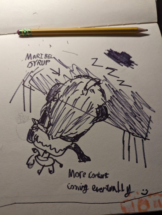
when you want to make more drawings of your cool new idea for reddit but it's like 11 PM
I actually think this is one of the best portrayals of her character despite not having the pumpkin hairdo yet!
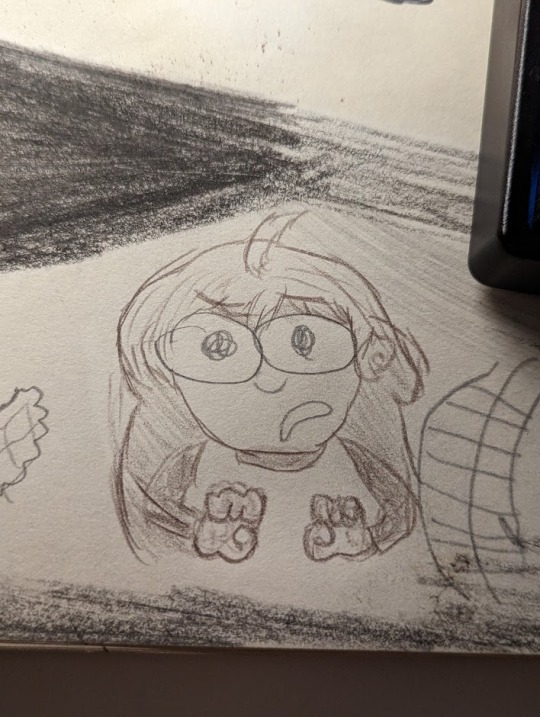
Though it does highlight a point where my artstyle(or more accurately, how I think of my artstyle) and Pizza Tower's art differs/clashes a bit, and that's with mouths. Typically I like to imagine giving characters smaller mouths and big eyes so they look more cute, but in Pizza Tower, Peppino and most of the other guys(even Gustavo partially) have big gaping jaws extending down their chins. It's been a bit of a hard thing to get around... While I'm at it, this art isn't this era of old, I made it more recently, but it does show Maribel with a more extended jaw. She's also really, really pissed off at something;

(don't ask why there's a cheese grater there I couldn't answer you if I tried)
Oh right, I almost forgot, the first time I tried to make a proper pizza tower style sprite for Maribel!
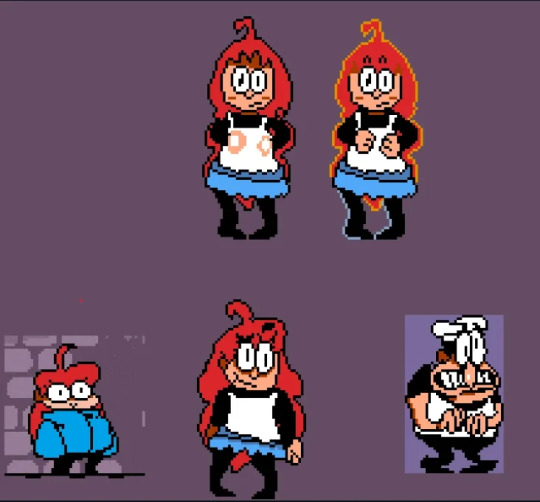
It sucks. This sucks so much. The refined sprite I would make later is so much better than this, just please stop looking; (the madeline sprite on the left was made by Ellisbros)
#alternate universe#celeste game#pizza tower#celeste#maribel syrup#madeline celeste#pizza tower peppino#ok the cheese grater is probably there because I was eating pasta of some kind#helped by the little sauce stains on the bowl
4 notes
·
View notes
Text
Video Games I Played in September 2024

I had been doing these monthly writeups on Cohost but that website is dying at the end of the month and so despite being someone who never used tumblr ardently I stumble back here blind and bedraggled. Mostly these are a way for me to tell all my discord friends what games I've been playing so for that reason I'll likely keep doing them, but who knows.
Dungeons of Sundaria – For years I said that all I wanted out of a video game was Oblivion dungeons with a loot system and enough shit to do that I could play it for 100 hours. The finger on the monkey’s paw curled and spat this game out, which is “functional” but constantly trying to shit itself. Whether it’s the wonky collision, the incredibly low difficulty punctuated by severe difficulty spikes when bosses suddenly are able to one-shot you, the poor differentiation between abilities when all of them do damage, or the fact my lizardman takes up a solid third of my screen when all my attacks require accurately tracking my reticule on an enemy; the fun never stops.
Astro Bot – The PS5 finally has one game, and it’s the $60 sequel to a free tech demo that at best is a pretty okay version of Kirby and the Forgotten Land. It lacks the serendipity of the first game and is instead satisfied with merely being incredibly polished, but the endless references to the endless teams and series killed by Sony’s greed gives it the bittersweet tenor of a high school reunion held in a graveyard. There’s a real love for Sony’s past here, but nostalgia isn’t a future.
Megaloot – What a weird little dungeon crawler. I was sad when Backpack Hero failed to congeal after early access so I’ve been jonesing since then for an inventory management game that had enough mechanics to reward actual builds but enough flexibility to not just make raw burst damage the only strategy that matters. This very much isn’t that game, as raw burst damage is very much all that matters until floor 60 where after 700+ battles there’s an enemy immune for the first three turns who does a truckload of damage. It’s a pretty transparent sledgehammer to prevent endgame viability of a strategy that works 99% of the time on every other enemy, and while roguelikes are always filled with knowledge traps that constrain builds it’s always shitty when the early game doesn’t matter and the late game only allows for certain builds.
Akimbot – Ratchet and Jank is “from the Creator of Pumpkin Jack”, which was one of the video games of all time and which I mostly played because of a friend of a friend seemed to have fun with the speedrun, and I trust his word as gospel because he and I are two of the last supplicants in the church of Vexx. Akimbot is mostly noteworthy for having four unique, powerful, and interesting guns and then only letting you carry one at a time on top of locking it behind an energy bar that slowly fills from killing enemies, forcing you to do 90% of the combat with the shitty basic weapons. It’s a baffling decision but this game is almost on the level of amateur art given how most of those involved are new to making games and there are certainly rookie errors on display.
The Plucky Squire – I really thought Gestalt: Steam and Cinder was going to take the cake this year in terms of video games that had a full suite of functional components but were strikingly less than the sum of their parts, but The Plucky Squire absolutely blew it out of the water. The aesthetic is superb, with bright 2D art and incredibly realistic 3D sections. The conceit of a storybook character hopping between environs and genres is a slam dunk for trying out different artstyles, gameplay genres, and minigames. Being able to use the very words of the storybook as objects you can manipulate is a powerful and endlessly interesting conceit. It should be as simple as just doing the things competently and the game would be solid. And yet. AND YET. You’re unable to go a single screen without an overwrought cutscene that tutorializes the next section. Mechanics come and go at random, making the game feel disconnected and shallow rather than intricate or expansive. All money is good for is combat upgrades, but combat is brainless even by 2D Zelda standards and basic enemies died just as quickly with no upgrades as with all of them (and every boss is a puzzle boss where your damage doesn’t matter). I’ve played some absolute garbage to completion but I dropped this 2/3rds of the way through after seeing the game run out of steam almost immediately.
Crypt Custodian – Speaking of taking some cliché parts but executing well, Crypt Custodian is a perfectly reasonable game that I enjoyed a reasonable amount. As far as isometric metroidvanias go it’s worse than Death’s Door and as far as its artstyle it’s not as charming as Islets or 8Doors, but the game’s fine. If you’re the sort of person who spends $20 and 10 hours to pass the time in a pleasant fashion you could do far worse.
The Legend of Zelda: Echoes of Wisdom – What an absolute breath of fresh air. After the Link’s Awakening remake was fairly rote (and reinforced why I never liked the game much as it’s overall a regression from A Link to the Past), I was worried all they’d do with the engine was remake the Oracle games and move on. I still abhor the tilt shifting with its blurry edges and poor visual clarity, but the amount of chicanery this game lets you get up to makes me forgive it. Stack a bunch of trampolines on each other and bounce around. Throw a spider at a wall then attach to it to be lifted up like a conveyor belt as it climbs. Summon a darknut then possess an enemy so they stand gormlessly still while being hacked to death. One of the best parts of Spirit Tracks was Zelda being a spunky troublemaker who was down to cause problems, and if that’s a personality trait that she continues to retain when she’s allowed to have one then I’m wholly on board. Bring back Midna.
#video game review#vexx#oh so y'all don't have the vexx tag I see how it is#you're gonna learn TODAY#SEO is for bitches
0 notes
Text
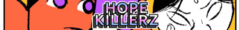
January 27th-February 2nd, 2020 CTP Archive
The archive for the Comic Tea Party week long chat that occurred from January 27th, 2020 to February 2nd, 2020. The chat focused on HOPE KILLERZ by stc019.
Featured Comment:

Chat:
Comic Tea Party
BOOK CLUB START!
Hello and welcome everyone to Comic Tea Party’s Week Long Book Club~! This week we’ll be focusing on HOPE KILLERZ by stc019~! (https://tapas.io/series/HOPE-KILLERZ)
You are free to read and comment about the comic all week at your own pace until February 2nd, so stop on by whenever it suits your schedule! Discussions are freeform, but we do offer discussion prompts in the pins for those who’d like to have them. Additionally, remember that while constructive criticism is allowed, our focus is to have fun and appreciate the comic!
Whether you finish the comic or can only read a few pages, everyone is welcome to join and chat with us!
DISCUSSION PROMPTS – PART 1
1. What did you like about the beginning of the comic?
2. What has been your favorite moment in the comic (so far)?
3. Who is your favorite character?
4. Which characters do like seeing interact the most?
5. What is something you like about the art? If you have a favorite illustration, please share it!
6. What is a theme you like that the comic explores?
7. What do you like about the comic’s story or overall related content?
8. Overall, what do you think the comic’s strengths are?
Don’t feel inspired by the prompts? Feel free to discuss anything else that interested you!
SAWHAND
Ooh! The first thing I'm noticing about this comic is the colors, which are lovely!!
Eightfish (Puppeteer)
agreed! the characters designs made me laugh, too. Haven't finished it yet but will definitely pop in to say a few words when I do
LadyLazuli (Phantomarine)
I'm going through this too - what an awesome style!
RebelVampire
I'm a prompt kind of person, so I'm gonna answer this a bit going by those. XD I like how the comic opens up, mostly at the end of the prologue with the ominous phone message about Isa and Scotty being dead. Like, just when you thought things were ominous enough, there's already a quick payoff, and I like that about this story. It's not holding its punches. As for a favorite moment, I really liked the argument between Hodori and Behzad, because that moment didn't go how I expected. I actually thought Behzad would include Hodori, not go for immediate betrayal. So to me that was interesting and I like things that don't go with my expectations. This is why they are also my favorite characters to interact, cause I liked Hodori was also the one to know what was going on, and I can't wait to see how Hodori will react when Behzad's sort of betrayal is revealed. For a favorite character, at the moment Chaker cause I think Chaker is the most mysterious and I'd love to learn more about Chaker. Who doesn't like mysterious characters with secrets?
In terms what I liked about the art, I find the use of color interesting. I'm not sure I'd classify as like persay, but it's interesting to see how the colors are used to sort of experiment with the mood or each image. Which for me I feel is the comic's strength. Regardless of how you feel about the content, the comic is intriguing to look at and catches your eye.
Comic Tea Party
DISCUSSION PROMPTS – PART 2
9. Do you think what Behzad wants is justice or vengeance? How will he get it ultimately do you think? Overall, what do you think the story might show us regarding the line between the two and how the pursuit of either can change someone?
10. How do you think everyone’s relationships with each other will be challenged given both Behzad’s solo pursuit of the murderers and some of the team member’s withholding information? Will the team be able to survive the conflict?
11. Do you think the characters will be able to recover their hope after losing Isa and Scotty? Overall, given the themes of hope within the story, what do you think is the overall message regarding it?
12. What do you think the ultimate plan of 58 is? Why does it involve murdering Isa and Scotty and replacing them with doubles? Why do you think Behzad wasn’t killed yet, and what might the villains have planned for him?
Don’t feel inspired by the prompts? Feel free to discuss anything else that interested you!
snuffysam (Super Galaxy Knights)
I'm absolutely loving Hope Killerz! The artstyle is amazing, as everyone's said. I love how each panel sets the mood with its unique playing of color palettes! I am curious as to what the ultimate plan is, replacing Isa and Scotty with doubles and seemingly wanting to use this version of Behzad too. Perhaps... 58's plan is to create a team consisting of the most "bold" versions of each hero? Like, Behzad went off on his own rather than waiting around for an investigation - 58 wants a whole team of people like him. As for why... perhaps vengeance for 58 losing his own team?
RebelVampire
Vengeance is plausible. Although I kind of feel there's gotta be more to it than that. Since you can get vengeance without needing to create doubles.
I really like that this comic kind of explores the theme of justice vs. vengeance. With the rise of superhero movies and such, it's kind of easy to forget that there is a really fine line between them. Which in this case, I think Behzad definitely wants vengeance, although I don't think Behzad will get it. I think someone will knock some sense into the idea before it gets that far. However, overall though, I think the story does a great job that it only really takes one step to go from justice to just wanting to hurt people because you're hurt - even at the cost of your personal relationships. Which is definitely going to be a big thing. I definitely think the other characters, especially Hodori, is gonna feel betrayed by Behzad's action. Maybe empathetic, but no way there isn't a rift created. And as more comes to light, none of them will be sure they can trust each other, and that will make Isa and Scotty's loss even more poignant and bring up the question if the group can survive without them.
But I don't think it's all hopeless. I kind of feel that despite their feelings at the moment, time will heal the teams wounds and that they'll find the resolve to hope. Cause you can basically pull hope out of nothing.
Eightfish (Puppeteer)
Unfortunately I'm feeling a bit lost in the story. There are a lot of characters and a lot of scene changes, and I'm having a hard time differentiating the personalities of all the characters. Maybe I just wasn't reading closely enough? Or maybe the plot'll be more clear in the future? The story is just getting started, after all, so I figure the author is kind of front loading all the setup and character introductions. I do really like the art. It's fun and different. I stumbled across this comic a while ago but didn't read much of it, and the art was memorable enough that seeing it again in the bookclub I immediately recognized that I'd seen it before. 9) Both. Don't think he's really thinking straight due to his grief, and is mostly just driven by emotion right now. 10) Probably, just going from the tone of the comic and the art I feel like this will have a happy ending. I think this is an optimistic comic. 5) The author seems to have a love of drawing butts. I appreciate that. Particularly in the little end chapter sketches. 1) I liked everything about the beginning of the comic. Though it was very strong. Not often do you see a vigilante character feeling regret over their chosen path
Comic Tea Party
DISCUSSION PROMPTS – PART 3
13. What are you most looking forward to seeing in regards to the comic?
14. Any final words of encouragement for the comic?
Don’t feel inspired by the prompts? Feel free to discuss anything else that interested you!
RebelVampire
For this comic, I'm definitely looking forward mostly to finding out about 58's plan since there's a lot of directions the story could go at the moment. I'll be interested to see which path will be taken. Regardless, I hope the creator continues with the color experimentation in the comic since it makes it visually stand out, and it'll be interesting to see how this plays out when the comic is further along.
snuffysam (Super Galaxy Knights)
Yeah for Hope Killerz, what I'm really looking forward to is... more. Like the art is so unique and so stylish, and the characters have interesting motivations behind them, I'm just curious to see where this all pans out.
Comic Tea Party
BOOK CLUB END!
Thank you everyone so much for reading and chatting about HOPE KILLERZ this week! Please also give a special thank you to stc019 for volunteering the comic and creating it! If you liked HOPE KILLERZ, make sure to continue to support it via some of the links below!
Read and Comment: https://tapas.io/series/HOPE-KILLERZ
stc019’s Patreon: https://www.patreon.com/stc019
stc019’s Ko-Fi: https://ko-fi.com/stconineteen
stc019’s Storenvy: http://stc019.storenvy.com/
stc019’s Twitter: https://twitter.com/stc019?lang=en
#ctparchive#comics#webcomics#indie comics#comic chat#comic discussion#book club#bookclub#webcomic book club#webcomic bookclub#comic tea party#ctp#hope killerz#stc019
1 note
·
View note
Text
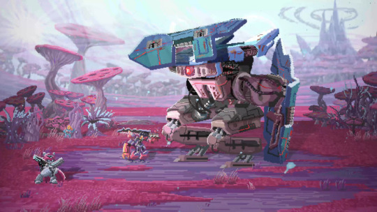
Star Renegades Offers A Stellar Take On The Indie Rogue-lite Genre
July 22, 2020 9:00 AM EST
Star Renegades is entering the saturated market of pixel-art indie rogue-lites, although its depth and string of interesting systems should be enough to make it strong enough against its competitors.
Pixel art has been undergoing somewhat of a renaissance within the indie scene for the last few years now. Massive Damage, Inc.’s upcoming game Star Renegades is part of this resurgence. It takes its own spin on the artstyle and gears it towards an interesting sci-fi setting, looking very good while doing so.
I had the opportunity to go hands-on with the first couple of missions in Star Renegades and from what I played, it’s an interesting rogue-lite strategy RPG full of varied systems, quirky characters, and slightly inconsistent dialogue.
youtube
The early moments of the game set you up for a big revenge story, crossing multiple realities in order to exact vengeance on invading forces. The game quickly, however, seems to forget about the story in favor of witty dialogue exchanges between characters and its interesting gameplay loop, which isn’t necessarily a bad thing. Strategy games aren’t always known for the best stories, so I’m hoping this continues throughout and is just supplementary to the gameplay.
The core gameplay of Star Renegades is split into two parts, exploring and battling, with each section littered with various systems. You enter your scenario on a randomly generated map that has rebellion forces scattered throughout who are trying to impede you from completing your goal.

The missions I played in this build weren’t particularly creative or different from anything else I’ve played within the strategy genre, but what did differentiate Star Renegades from its counterparts was the battle system.
When you encounter foes, you enter (with quite a long jarring delay at points) what the game calls a “deterministic combat system.” Everything within battle takes place on a timeline displayed at the top of the screen. The timeline is completely transparent, showing you how and when the giant robot enemies plan to attack, allowing you to then strategically plan your turn. Some of your attacks hit harder but will fall further down the timeline leaving you open, while others are quicker but are likely to deal less damage. Sometimes, it’s also just best to not attack at all.
The combat in Star Renegades is extremely tactical and is all about being opportunistic and having a solid but adaptable plan.
The most basic, but effective method I found was simply to attack before the enemies could attack me, which in doing so led to landing critical hits. By attacking first you could also stagger and then break the enemies, with each attack pushing the adversary further down the timeline. This lets you knock them off it and stop them from attacking this turn. The combat in Star Renegades is extremely tactical and is all about being opportunistic and having a solid but adaptable plan.
Like most RPG battles, Star Renegades has strengths, weaknesses, and immunities system incorporated into it. This adds yet another layer of depth to combat. Yes, your light attack will be quicker and allow you to hit first, but it will deal significantly less damage to your enemy and might, therefore, be counterproductive to your overall strategy. Battles also have combo attacks, which are stronger moves that take place between two of your party members whose relationships have been leveled up by the campfire (I’ll touch on this later).

Not only are the battles incredibly deep system-wise, but they also look and sound great too. The attack animations are nice and the sound design is fantastic with each move or enemy death sounding slightly different to the last – it’s really damn cool.
While the battle system is unique (at least as far as any game I’ve played) some of Star Renegades’ other features are borrowed or at least heavily influenced by other games. The opposing rebellion forces have “adversaries” – enemies that are unique and get promoted, evolve, and grow whenever they defeat you. It’s very much like the nemesis system from the Middle Earth: Shadow of Mordor/War games. It’s a system which when first released I (as well as many in the industry) thought would become much more commonplace within games. However, this seems like one of the first instances I’ve seen of it outside of its originating series, and most importantly, it has been implemented well.
Depending on what you are tackling you may also have to camp partway through or at the end of a mission. This is a system that, to me at least, feels reminiscent of camping within Darkest Dungeon. This time though you use cards to determine your actions. When you set up camp you have a predetermined amount of action points which allows you to play cards and use up these points to benefit your party. Cards range from healing and armor repairing to relationship building. The relationship-building cards help boost the affinity between two party members which in turn helps improve the aforementioned combos in battle. I’m not sure of the necessity of it being cards rather than character-based skills, but it’s not a huge gripe.
Other influences within the game are slightly more referential but are welcome nonetheless, with small nods to Super Smash Bros. and Star Wars creeping in. Most importantly of all, you can pet the dog in Star Renegades.
There are a couple of further systems in Star Renegades based around leveling up. The main system is simple and sees you earning DNA after every battle and then investing that into leveling up your party members. Secondary to that, when you return to base, you can spend your research points, earned by beating or damaging enemies, on new heroes, upgrades to existing heroes, and perks for your party.
Star Renegades states that there will be 13 different classes at launch. While the game itself is deep and varied, I didn’t particularly see that in the classes I got to use. Visually and personality-wise, each one is unique but I didn’t see a huge difference in play style. I’m willing at this point, based on how many systems this game has, to chalk it up to the fact my party members were all level one and at the beginning of the game, and the more they level up the more they’ll evolve and differentiate themselves. The differing personalities added some light relief and fun dialogue in what is otherwise a thematically dark game, although, at times, the conversations could feel quite contrived.
Overall, what I got to play of Star Renegades showed a deep and complex strategy RPG with some genuinely interesting gameplay systems integrated throughout. The systems and gameplay loop should be strong enough to support what I feel is, at least at this early stage, a slightly lukewarm and unoriginal story. The two missions I played have done more than enough to intrigue me and have definitely made me want to see how the game evolves before it comes out on PC and consoles later this year. It’s certainly one to keep an eye out for.
July 22, 2020 9:00 AM EST
from EnterGamingXP https://entergamingxp.com/2020/07/star-renegades-offers-a-stellar-take-on-the-indie-rogue-lite-genre/?utm_source=rss&utm_medium=rss&utm_campaign=star-renegades-offers-a-stellar-take-on-the-indie-rogue-lite-genre
0 notes