#Accelerated Mobile Pages (AMP)
Explore tagged Tumblr posts
Visit Tumblr Blog
Explore Tumblr blogs with no restrictions, modern design and the best experience.
Last Seen Tumblr Blogs


Fun Fact
After the announcement of the deal with Yahoo!, there were 170K signatures of unhappy Tumblr users petitioning to prevent the sale in 2013.
Text
0 notes
Text
Why AMP is Essential: 5 Major Advantages for Mobile-Optimized Websites

In the digital era, users expect instant access to information, especially when browsing on mobile devices. With Google prioritizing mobile-first indexing, optimizing for mobile speed has become a necessity rather than a luxury. This is where AMP (Accelerated Mobile Pages) steps in. Developed by Google, AMP is a framework designed to enhance mobile performance by delivering fast-loading, streamlined pages. Its benefits go beyond speed, improving SEO, user engagement, and conversion rates. Let’s dive into AMP’s features, how it works, and explore five key advantages it offers for your website.
Understanding AMP: A Quick Overview
Accelerated Mobile Pages (AMP) is an open-source framework developed to improve the speed and responsiveness of web pages on mobile devices. It simplifies HTML, CSS, and JavaScript to create lightweight pages that load almost instantly. By cutting down on unnecessary elements, AMP ensures a smoother browsing experience.
AMP relies on Google’s distributed cache to deliver content quickly, no matter where the user is located. This makes it an excellent choice for websites focusing on improving user experience and reaching mobile audiences more effectively.
How Does AMP Work?
AMP achieves its remarkable speed through three essential components:
AMP HTML: A simplified version of standard HTML that removes unnecessary elements to prioritize speed. This includes restrictions on heavy JavaScript and complex CSS.
AMP JS Library: This library ensures efficient resource loading by managing how images and other assets appear. It prioritizes visible content, optimizing the overall browsing experience.
Google AMP Cache: AMP pages are stored and served via Google’s cache, allowing for near-instant loading and reducing server load for website owners.
By combining these features, AMP delivers a fast, responsive, and consistent mobile experience, making it an excellent option for improving performance across devices.
Top 5 Benefits of AMP for Websites
1. Lightning-Fast Page Loading
AMP significantly reduces page load times, ensuring content is displayed almost immediately. With AMP, your site can load up to 10 times faster than non-AMP pages, reducing the frustration caused by delays. This speed plays a vital role in maintaining user engagement and reducing bounce rates. Faster pages lead to longer visits, better engagement, and a more positive user experience.
2. Boosted SEO and Search Visibility
Google rewards websites that prioritize mobile usability and fast loading. AMP directly impacts ranking signals such as page speed and mobile performance, giving your site an edge in search results.
Additionally, AMP pages are eligible for Google’s "Top Stories" carousel, a highly visible spot that can significantly increase traffic. The AMP lightning bolt icon beside your page can also encourage users to click, knowing they’ll access information quickly.
3. Enhanced User Experience and Retention
A quickly loading website enhances user satisfaction and motivates visitors to navigate through multiple pages. AMP simplifies navigation and ensures content is delivered without interruptions. This seamless experience is especially beneficial for content-driven websites, eCommerce platforms, and service providers.
Integrating AMP can also complement Scalable web application designed to enhance mobile performance and deliver a seamless experience for users across all devices.
4. Improved Ad Performance
For websites that rely on ad revenue, AMP ensures that ads load as quickly as the rest of the content. This results in higher viewability, better user interaction, and increased revenue opportunities. AMP supports multiple ad networks, enabling publishers to monetize their content without compromising on speed or user experience.
5. Broad Compatibility and Accessibility
AMP pages are designed to work seamlessly across all devices, including those with limited connectivity. By serving lightweight pages from Google’s cache, AMP ensures a consistent experience even in regions with slow internet speeds. This global accessibility makes AMP a valuable tool for businesses targeting diverse or international audiences.
Challenges of Using AMP
Despite its advantages, AMP does have some limitations:
Limited Customization: The simplified structure of AMP may restrict design flexibility and branding opportunities.
Restricted Ad Formats: Not all ad networks or types are compatible with AMP.
Separate URLs: Managing analytics and tracking can become complex due to AMP’s separate URLs for mobile versions.
These constraints make AMP unsuitable for websites requiring heavy customization or interactive functionality.
Steps to Implement AMP
Getting started with AMP is straightforward:
Develop AMP Pages: Use AMP HTML to create a streamlined version of your web pages.
Use Plugins: Platforms like WordPress offer plugins to simplify AMP integration.
Validate Your Pages: Check your AMP pages for errors using Google’s AMP Validator.
Monitor Performance: Analyze metrics using tools like Google Analytics to refine your AMP strategy.
Should You Choose AMP for Your Website?
For businesses focusing on mobile traffic and modernized web solutions, AMP is a strategic choice. By enhancing speed, visibility, and user retention, it can give you a competitive edge in today’s mobile-driven world. However, if your site requires complex designs or interactive elements, weigh the trade-offs carefully before adopting AMP.
Testing AMP on high-traffic pages can provide valuable insights into its impact on your site’s performance. Based on the results, you can decide whether to scale its implementation.
Conclusion: Is AMP Right for You?
AMP offers significant benefits for websites prioritizing speed, mobile optimization, and user satisfaction. While it may not suit every business model, its advantages for content-heavy and mobile-first websites are undeniable.
If you’re looking to deliver a faster, more engaging experience while enhancing your custom software solutions, AMP could be the tool you need. By investing in AMP, you ensure your site remains competitive in a fast-evolving digital landscape.
1 note
·
View note
Text
CAN AMP HELP YOU ACHIEVE BETTER CONVERSION RATES? HERE’S HOW.

Speed definitely matters in today's digital world, especially when it comes to websites. Users will get frustrated and become impatient when a website is taking too long to open up. In fact, 53% people are more likely to leave mobile site is it takes more than 3 seconds to load. This either lead to abandoned shopping carts or frustrated users who are meant to purchase products or fill a form in a website. Slow websites also affects your website SEO rankings, which makes a website harder to attract visitors. To avoid this latency, most of the websites now are choosing to implement Accelerated Mobile Pages (AMP).
AMP is an open-source, open-source framework developed by Google to enhance the loading of a web page on smart phones, which is achieved through easy code with light content and by storing some of its content on Google's server for quicker delivery. AMP is designed to enhance the mobile user experience so that pages can also load almost instantly for visitors, even if they are using slow mobile networks. Google even favors AMP pages in search results, thereby increasing their visibility and traffic even more. AMP helps websites in faster loading, better view on mobile devices, and to rank top on Google search results that leads to more conversions.
How AMP Helps Achieve Better Conversion Rates
1. Faster Load Times & Lower Bounce Rates
One of the advantages of AMP is how quick it loads your pages. The quicker your site, the more time visitors will stick around and engage with the content rather than leaving it immediately. According to studies, a 1-second delay in page loading translates to a 7% loss in conversions. That possibility of people bouncing from your website will be reduced because it loads instantly with AMP.
2. Better Mobile Experience
Mobile devices drive more than 60% of internet traffic. It is much more important that your website display well on smart phones and tablets. AMP is created with mobile in mind, so it not only loads the site in a blink but also it will look good on those smaller screens, making sure that the website works well on smaller screens. Keeping the visitors engaged is only possible with a positive and smooth mobile experience.
3. Reduced Friction in the Conversion Process
If users are attempting to complete a specific task on your website (like purchasing or signing up), any obstacles or delays can make them give up. AMP reduces such obstacles by simplifying the structure of your website, cutting off unnecessary elements, and loading pages faster. With AMP, you can ensure that things like forms, product pages, and checkout processes are smooth and fast, helps visitors in completing their actions without distraction.
4. Better SEO Visibility
AMP helps your website to rank top in Google Search Engine results, especially on mobile phones. Google favors AMP pages, by ranking your website on top so that more people will find out your website when they search for something. As it helps in driving more traffic to your website, you can convert those visitors into customers. Additionally, AMP works well with Google Analytics helps you to track how users are interacting with the website, so that you can make necessary improvements to improve conversions.
Speed is everything when talking about websites. AMP (Accelerated Mobile Pages) will make your website load faster, work better on mobile, and get visitors. Improving load times and simplifying the user experience of AMP can help reduce bounce rates and increase conversion rates, so this becomes a smart choice for any website.
At Aarka Solutions, a Web Development Company with trusted experience in Website Development Services, our services aim at making businesses develop fast, mobile-friendly websites. As one of the Top Web Development Agencies, we can help you implement AMP so that your site is always loading quickly, ranks well on Google, and is never cluttered for your users. Whether you are looking for Web Development Services or just looking to partner up with the best Web Development Companies, we are here to help. If you have finally come to a decision to improve your website's functionality and get more conversions, then visit us today at www.aarkasolutions.com.
#aarka solutions#web development#web developers#web development company#best web development company#top web development company#web developers vizag#web development company vizag#accelerated mobile pages#AMP#AMP in web development
0 notes
Text
#Mobile optimization#Business growth#User experience#Mobile-friendly websites#Mobile SEO#Mobile site speed#Accelerated Mobile Pages (AMP)#UI UX design#Responsive design#web design and development
0 notes
Text
Accelerated Mobile Pages WordPress
Pages that load faster rank higher, have fewer bounce rates and have happier site visitors. Google deployed various technologies to increase speed, including accelerated mobile pages, or AMP. It was a big thing when it was initially debuted. Many prominent sites, including Twitter & Google, insisted it was permanent. However, there has been less discussion about AMP in recent years. Google discreetly deleted the AMP indicator from search results in 2021. What's going on with AMP? Is it still applicable in 2024? Why is it available in the first place? In this blog MarsDevs presents a guide on building accelerated mobile pages for the WordPress site in 2024!
0 notes
Text
5 Key Points About Accelerated Mobile Pages (AMP) - Synergos
Sure, you could have the best designers, writers, and SEO strategists on board to help you build viral-worthy content, but you would still have to battle technology and its many constraints. From content that loads too slowly, to addressing the needs of adaptivity, and right down to ever changing search engine algorithms. Digital Marketers and Content Publishers must constantly keep all these variables in mind while creating online campaigns – NOT ANYMORE! Well, not to the degree that we did earlier anyway.
Accelerated Mobile Pages (AMP) have been making the rounds for a few months now. Not only are they a quicker way to load content online, but they are also the default preference for Google Search Results. So, what are Accelerated Mobile Pages, better known as AMP, all about?!
1. Accelerated Mobile Pages are FAST!
Accelerated Mobile Pages (AMP) prioritizes content over any other media. What this means for a digital marketer or online publisher is simple – your audience no longer has to wait. An Accelerated Mobile Page is built to suit the needs of publishers and companies who regularly put up copy heavy content online. Web pages usually take a couple of seconds to load content, the longer the wait the higher the chances are of readers abandoning the link. But unlike usual Javascript based web apps and webpages, AMP based web pages load content before they load heavier media such as videos or pictures.
2. They do wonders for your SEO!
Accelerated Mobile Pages meet two of the most important criteria for optimised search results – They are incredibly fast to load and are mobile compatible. As AMP gets optimised further, what online publishers can expect is better rated Search Engine listings for websites and web apps developed with AMP.
3. Enhanced Promotion
0 notes
Text
TRÁFEGO WEB: ESTRATÉGIAS E TENDÊNCIAS PARA AUMENTAR A VISIBILIDADE ONLINE

Introdução
No mundo digital de hoje, o tráfego web desempenha um papel crucial no sucesso de qualquer negócio online. Neste artigo, vamos explorar estratégias eficazes e as tendências mais recentes para aumentar a visibilidade online e atrair mais visitantes para o seu site.
Importância do Tráfego Web
O tráfego web não se trata apenas de números, mas sim de oportunidades. Mais tráfego significa mais chances de conversões, leads e interações com o público-alvo. Entender como atrair e manter um fluxo constante de visitantes é fundamental para o crescimento e a sustentabilidade de qualquer negócio online.
Estratégias para Aumentar o Tráfego
SEO (Search Engine Optimization)
O SEO é uma das estratégias mais poderosas para aumentar o tráfego orgânico do seu site. Isso envolve a otimização de conteúdo, meta descrições, tags alt em imagens e a criação de backlinks relevantes. Além disso, a pesquisa de palavras-chave e a análise da concorrência são fundamentais para identificar oportunidades de otimização.
2. Marketing de Conteúdo
Criar conteúdo relevante, útil e atualizado é essencial para atrair visitantes e construir autoridade e confiança com seu público-alvo. Isso inclui blogs, vídeos, infográficos e outros formatos de conteúdo. Além de criar conteúdo de qualidade, é importante promovê-lo de forma estratégica nas redes sociais, por meio de email marketing e colaborações com influenciadores.
3 . Redes Sociais
As redes sociais são um canal poderoso para promover seu conteúdo e interagir com seu público. Utilize plataformas como Facebook, Instagram, Twitter e LinkedIn para compartilhar seu conteúdo, criar engajamento com seus seguidores e alcançar novos públicos por meio de anúncios segmentados. A produção de conteúdo exclusivo para cada plataforma e a utilização de hashtags relevantes são práticas eficazes para aumentar a visibilidade.
4 . Publicidade Online
Investir em campanhas de anúncios pagos, como Google Ads, Facebook Ads e redes de anúncios sociais, pode aumentar rapidamente o tráfego para seu site. Segmentação precisa com base em dados demográficos, comportamentais e de interesse, juntamente com a utilização de técnicas de retargeting, são estratégias que garantem um melhor retorno sobre o investimento em publicidade online.
5. Email Marketing
Manter uma lista de assinantes e enviar regularmente conteúdo interessante e personalizado pode direcionar tráfego qualificado para seu site. Segmentação com base em comportamento de navegação, histórico de compras e preferências dos assinantes, aliada a automação de campanhas, são abordagens que maximizam a eficácia do email marketing na geração de tráfego e conversões.
Tendências Emergentes
1. Mobile First Indexing
Com o aumento do uso de dispositivos móveis, otimizar seu site para experiências móveis é essencial para atrair tráfego e melhorar a classificação nos mecanismos de busca. Adoção de design responsivo, carregamento rápido de páginas, AMP (Accelerated Mobile Pages) e recursos de geolocalização são práticas que garantem uma experiência aprimorada para os usuários móveis.
2. Busca por Voz
Com assistentes virtuais como Alexa e Google Assistant, a otimização para busca por voz está se tornando cada vez mais relevante. Perguntas e respostas diretas, conteúdo otimizado para palavras-chave de cauda longa e aprimoramento da usabilidade em dispositivos de voz são estratégias importantes para se destacar na busca por voz e atrair tráfego qualificado.
3. Inteligência Artificial e Machine Learning
Ferramentas avançadas de análise e personalização baseadas em IA podem melhorar a experiência do usuário, oferecer recomendações personalizadas e aumentar a eficácia das estratégias de tráfego. O uso de chatbots para interação em tempo real, a análise preditiva de comportamento do usuário e a personalização dinâmica de conteúdo são exemplos de como a IA está revolucionando a geração de tráfego web.
Perguntas Frequentes sobre Estratégias de Tráfego Web
Como a análise de dados pode contribuir para a otimização do tráfego web?
A análise de dados é fundamental para entender o comportamento dos visitantes, identificar padrões de uso, medir o desempenho de campanhas e tomar decisões estratégicas para aprimorar a experiência do usuário e aumentar a eficácia das estratégias de tráfego.
2. Qual é a importância de uma estratégia de conteúdo personalizada para atrair tráfego qualificado?
Uma estratégia de conteúdo personalizada leva em consideração as preferências e interesses específicos do público-alvo, criando conteúdo relevante e atrativo que ressoa com os visitantes, aumentando a taxa de engajamento e conversão.
3. Como a integração de diferentes canais de marketing contribui para o aumento do tráfego web?
A integração de canais, como SEO, redes sociais, email marketing e publicidade online, cria uma abordagem holística e coesa que amplia o alcance, fortalece a presença digital e proporciona uma experiência consistente aos usuários em diferentes plataformas.
4. Quais são as métricas-chave para avaliar o sucesso das estratégias de tráfego web?
Métricas como tráfego total, taxa de conversão, taxa de rejeição, tempo médio na página, origens de tráfego e ROI (Return on Investment) são essenciais para avaliar a eficácia das estratégias, identificar áreas de melhoria e tomar decisões informadas para otimização contínua.
5. Como a experiência do usuário impacta diretamente o tráfego web?
Uma experiência do usuário positiva, com navegação intuitiva, carregamento rápido de páginas, design responsivo e conteúdo relevante, incentiva os visitantes a permanecerem no site por mais tempo, explorarem mais páginas e retornarem com frequência, aumentando assim o tráfego e a fidelização.
6. Quais são os desafios mais comuns na geração de tráfego web e como superá-los?
Desafios como concorrência acirrada, mudanças nos algoritmos de busca, saturação de conteúdo e adaptação às novas tecnologias exigem estratégias flexíveis, inovação constante e análise de tendências para se manter relevante e competitivo no ambiente online.
7. Como a segmentação de público-alvo pode influenciar na geração de tráfego qualificado?
A segmentação permite direcionar mensagens e conteúdo específicos para diferentes segmentos de público com base em características demográficas, comportamentais e de interesse, aumentando a relevância e eficácia das comunicações e atraindo tráfego mais qualificado e propenso a converter.
8. Quais são as tendências futuras que podem impactar significativamente o tráfego web?
Tendências como inteligência artificial, realidade aumentada, busca por voz avançada, personalização em tempo real e experiências imersivas estão moldando o futuro do tráfego web, oferecendo novas oportunidades e desafios para profissionais de marketing e empresas online.
9. Como a sustentabilidade e responsabilidade social podem influenciar as estratégias de tráfego web?
O engajamento com questões ambientais, sociais e de governança (ESG) está se tornando cada vez mais relevante para consumidores e empresas. Estratégias que demonstram compromisso com a sustentabilidade e responsabilidade social podem atrair um público engajado e consciente, gerando tráfego qualificado e lealdade à marca.
10. Qual é o papel das comunidades online e influenciadores na geração de tráfego e engajamento?
Comunidades online e influenciadores têm um papel significativo na amplificação de mensagens, compartilhamento de conteúdo e criação de conexões autênticas com o público. Parcerias estratégicas e participação ativa em comunidades relevantes podem impulsionar o tráfego e o reconhecimento da marca.
Conclusão
O tráfego web é a essência do sucesso online. Ao implementar estratégias eficazes e acompanhar as tendências emergentes, você pode aumentar significativamente a visibilidade do seu site, atrair mais visitantes qualificados e alcançar seus objetivos de negócio de forma consistente.
Quer alcançar o sucesso com Estratégias de Tráfego Web? Conte com a nossa expertise para ajudar o seu negócio! Entre em contato com a gente!
Agradecemos a sua atenção e acompanhe nossos posts! #seo10digital – SEO10 Projetos Digitais.
Para ficar por dentro do mundo digital, acesse as nossas mídias sociais:
Facebook | Instagram
LEIA TAMBÉM:
Branding: Compromisso com resultados de vendas e ROI
ChatGPT X Google: Uma comparação detalhada
Teletrabalho
6 notes
·
View notes
Text
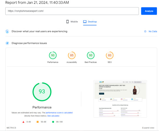
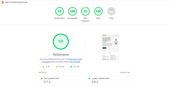
A Step-by-Step Guide: How to Optimize Your Website Speed for a Perfect 99/100 Score
🚀 Boost Your Website Speed with This Step-by-Step Guide! 🚀Hey everyone! Are you ready to supercharge your website? 🌐 In today's digital world, having a lightning-fast website is crucial for success. That's why I'm excited to share a step-by-step guide on optimizing your website speed and achieving a perfect 99/100 score! 📈
1. Start with a Speed Test: Use tools like Google PageSpeed Insights or GTmetrix to analyze your website's current speed performance. This will give you a baseline to work from.
2. Optimize photos: To minimize file size without compromising quality, compress and resize photos. This may have a major effect on loading times.
3. Minify JavaScript and CSS: To minimize file sizes, eliminate extraneous characters and spaces from your code. This might enhance user experience and speed up the loading of your website.
4. Turn on Browser Caching: Use browser caching to save static files, including CSS and graphics, so that a visitor to your site doesn't have to reload them.
5. Content Delivery Network (CDN): Consider using a CDN to distribute your website's files across multiple servers worldwide. This can dramatically decrease load times for users across different locations.
6. Make Use of Accelerated Mobile Pages (AMP): AMP may be used to make mobile-friendly versions of your website that load more quickly, increasing both user engagement and overall speed.
7. Reduce Server Response Time: Optimize your server's performance and eliminate any bottlenecks that could slow down your website.
8. Monitor and Test Regularly: Monitor your website's speed performance and adjust as needed. Testing and continuous optimization are vital to maintaining a fast-loading website.
By taking these simple measures, you can dramatically increase the speed of your website and give users a flawless surfing experience. Recall that a quicker website can improve your search engine rankings and increase user satisfaction! 🌼
So, what are you waiting for? Let's optimize those websites and aim for that perfect 99/100 speed score! Feel free to share your tips and experiences in the comments below. Together, let's speed up the web!
#seo optimization#off page seo#local seo#seo expert#seo company#seo marketing#seo agency#digital marketing#seo services#seo
2 notes
·
View notes
Text
Navigating the Mobile-First Indexing Revolution in 2023: You’re Definitive Guide

The digital landscape is an ever-evolving realm, and in 2023, one thing is abundantly clear – mobile is king. With the advent of Mobile-First Indexing, the way websites are ranked by search engines has undergone a profound transformation. In this comprehensive guide, we'll explore the Mobile-First Indexing landscape, provide you with a "mobile-first indexing checklist," delve into "mobile SEO best practices," and uncover the critical "mobile ranking factors." Along the way, we'll add a dash of human touch to help you truly grasp the significance of this seismic shift.
The Mobile-First Indexing Revolution
What is Mobile-First Indexing?
Mobile-First Indexing is Google's response to the mobile-centric digital age. Traditionally, Google primarily crawled and indexed desktop versions of websites, using that data to determine rankings for both desktop and mobile searches. However, the rise of mobile usage led to a fundamental change – Google began prioritizing the mobile version of a website for indexing and ranking. This means that a website's mobile version now takes precedence in search results, making mobile optimization more critical than ever.
Why Does Mobile-First Indexing Matter?
Mobile-First Indexing matters for several compelling reasons:
User-Centric Approach: It aligns with the user-centric trend, as more people access the internet via mobile devices than ever before.
Improved User Experience: Mobile-First Indexing encourages website owners to enhance the mobile experience, resulting in faster-loading pages and improved usability.
Better Rankings: Websites that perform well on mobile devices are more likely to rank higher in search results, increasing organic traffic.
Mobile-First Indexing Checklist
Embarking on a Mobile-First Indexing journey requires a meticulous approach. Here's a checklist to help you navigate this transformative process:
1. Mobile-Friendly Design:
Ensure your website employs a responsive design that adapts seamlessly to various screen sizes, from smartphones to tablets.
2. Speed Matters:
Optimize your site's loading speed on mobile devices. Compress images, minify CSS and JavaScript, and leverage browser caching to reduce load times.
3. Mobile SEO Best Practices:
Implement on-page SEO techniques tailored for mobile devices, including optimizing title tags, meta descriptions, and headers for mobile users.
4. Mobile Content:
Make sure your mobile site contains the same valuable content as the desktop version, including text, images, videos, and infographics.
5. Structured Data:
Use schema markup to provide search engines with structured data, helping them understand your content and display rich snippets.
6. Test on Mobile Devices:
Regularly test your website's performance on various mobile devices and browsers to identify and rectify any issues promptly.
7. Mobile Sitemaps:
Create and submit a mobile sitemap to Google Search Console to ensure all mobile pages are indexed correctly.
8. Optimize for Local Search:
If you have a physical location, optimize your site for local search, ensuring mobile users can easily find your business.
9. Monitor Mobile Usability:
Keep a close eye on Google Search Console for mobile usability issues and resolve them promptly.
Mobile SEO Best Practices
To excel in the era of Mobile-First Indexing, you need to embrace these Mobile SEO best practices:
1. Mobile-Responsive Design:
Invest in a mobile-responsive design that automatically adjusts to different screen sizes. This ensures a consistent user experience across devices.
2. AMP (Accelerated Mobile Pages):
Consider implementing Accelerated Mobile Pages to create faster-loading, streamlined versions of your content, ideal for mobile users.
3. Optimize Images:
Compress and optimize images for mobile devices to reduce page load times without compromising quality.
4. Mobile-Friendly Navigation:
Simplify navigation menus and use mobile-friendly navigation elements, such as hamburger menus, to enhance user experience.
5. Local SEO Optimization:
If you have a physical business presence, optimize your website for local search by including location-specific keywords and information.
6. Voice Search Optimization:
As voice search becomes more prevalent, optimize your content for natural language queries and long-tail keywords.
7. User Experience Matters:
Prioritize a seamless user experience on mobile devices. Ensure that buttons are easily clickable, fonts are legible, and pop-ups are minimal.
Critical Mobile Ranking Factors
Understanding the key factors that influence mobile rankings is essential. Here are some critical mobile ranking factors to consider:
1. Page Speed:
Fast-loading pages are paramount. Google prioritizes websites that load quickly on mobile devices to improve user experience.
2. Mobile-Friendly Design:
Websites with responsive designs that adapt to different screen sizes are favored by search engines.
3. Mobile Usability:
User-friendly mobile experiences, including easy navigation and legible text, contribute to better rankings.
4. Quality Content:
High-quality, relevant content that satisfies user intent is crucial for mobile rankings.
5. Mobile-Friendly Pop-Ups:
Avoid intrusive pop-ups that can disrupt the user experience on mobile devices.
6. Mobile Crawlability:
Ensure that Googlebot can crawl your mobile website without issues, including access to CSS and JavaScript files.
7. Mobile Interstitials:
Limit the use of interstitials or pop-ups that cover the main content, as these can negatively impact rankings.
As we delve into the intricacies of Mobile-First Indexing, it's vital to remember that behind the algorithms and data points are real people – your audience. The shift towards mobile-centric indexing is driven by the evolving habits and preferences of users who rely on mobile devices for information, entertainment, and connection.
Imagine a user on a busy morning commute, searching for a nearby coffee shop to grab a quick cup of joe. Your website, optimized for Mobile-First Indexing, loads swiftly, provides clear directions, and displays enticing images of steaming coffee cups. In this scenario, Mobile-First Indexing isn't just an algorithmic change; it's an opportunity to connect with users when they need you the most.
In 2023, your website's success hinges on its mobile performance. By following the Mobile-First Indexing checklist, embracing Mobile SEO best practices, and understanding the critical mobile ranking factors, you can position your site at the forefront of the mobile revolution. It's not just about appeasing algorithms; it's about delivering an exceptional mobile experience to the people who matter most – your audience. So, get ready to conquer Mobile-First Indexing, and let your website shine in the mobile spotlight!
4 notes
·
View notes
Text
youtube
In the dynamic and fast-paced market of Dubai, the majority of consumers are tech-savvy and highly reliant on their mobile devices. To capture the attention of this on-the-go audience, businesses need to prioritize local search engine optimization (SEO) strategies that cater to mobile users. In this guide, we'll delve into the significance of local SEO for mobile search in Dubai, providing actionable tips to help businesses reach and engage their target audience effectively.
Dubai's Mobile-First Consumer Landscape: Understanding the Trend
Explore the prevalence of mobile device usage in Dubai and how it shapes consumer behavior, highlighting the need for mobile-friendly local SEO.
Mobile-Friendly Website Design: Creating a Seamless User Experience
Provide insights into responsive design, fast loading times, and mobile-friendly features that enhance the user experience for Dubai's mobile consumers.
Localized Content for Mobile Users: Tailoring Information to Location
Discuss the importance of geo-targeted content, ensuring that mobile users in Dubai receive location-specific information and services.
Google My Business: Maximizing Visibility on Mobile Searches
Guide businesses on optimizing their Google My Business listings for mobile search, including accurate NAP details, categories, and customer reviews.
Mobile-Focused Keywords: Capturing Intent and Localization
Offer tips on selecting and incorporating mobile-centric keywords that align with the search behavior of on-the-go consumers in Dubai.
Voice Search Optimization: Catering to Convenient Mobile Queries
Explore the rising trend of voice search in Dubai and provide strategies for optimizing content to meet the needs of voice-activated search queries.
Local Citations for Mobile SEO: Navigating Dubai's Digital Landscape
Discuss the role of local citations in mobile search and provide guidance on ensuring consistent business information across online directories.
Accelerated Mobile Pages (AMP): Speeding Up Mobile Page Loading
Explain the benefits of AMP for mobile SEO and offer tips for implementing AMP to improve page load times and user experience.
App Optimization for Local Businesses: Connecting with Mobile Users
Discuss the potential benefits of having a mobile app for businesses in Dubai and provide tips for optimizing app listings for local search.
User Reviews and Mobile SEO: Building Trust and Credibility
Highlight the impact of user reviews on mobile search rankings and provide strategies for encouraging and managing customer feedback.
Mobile Analytics and Tracking: Measuring Performance and ROI
Discuss tools and techniques for tracking mobile search performance, including key metrics like mobile traffic, bounce rates, and conversions.
Local Social Media Integration: Engaging Dubai Consumers on Mobile
Provide insights into leveraging social media platforms for local engagement, ensuring that mobile users can easily connect with businesses.
Conclusion:
In Dubai's fast-paced market, mobile search optimization is not just a bonus—it's a necessity for businesses looking to thrive. By prioritizing local SEO strategies tailored for mobile users, businesses can effectively reach and engage the on-the-go consumers of Dubai, driving increased visibility, foot traffic, and conversions. Staying attuned to mobile search trends and user behavior is key to maintaining a competitive edge in this dynamic market.
Read More About Best SEO Agency in Dubai
1 note
·
View note
Text
One "elephant in the room" about Google:
AMP (Accelerated Mobile Pages) was/is basically Google's attempt to make people forget/never learn slim web-design.
"Make a horribly bloated website and "fix" it with AMP."
We need to lay more blame for "Kids don't know how computers work" at the feet of the people responsible: Google.
Google set out about a decade ago to push their (relatively unpopular) chromebooks by supplying them below-cost to schools for students, explicitly marketing them as being easy to restrict to certain activities, and in the offing, kids have now grown up in walled gardens, on glorified tablets that are designed to monetize and restrict every movement to maximize profit for one of the biggest companies in the world.
Tech literacy didn't mysteriously vanish, it was fucking murdered for profit.
78K notes
·
View notes
Note
To add onto this, AmputatorBot is a great resource to quickly remove amps from links.
For those unaware of what an AMP is, it stands for an Accelerated Mobile Page. They're not as widespread as they were 5-8 or so years ago, but they still exist and have a host of ethical problems surrounding them; especially when it comes to data privacy and media integrity on Google's platform--Google News.
I'd highly recommend reading through these articles (I'd do a TL;DR but I don't think I can do a better job than the resources I've provided below)
https://www.theregister.com/2017/05/19/open_source_insider_google_amp_bad_bad_bad/
https://www.reddit.com/r/AmputatorBot/comments/ehrq3z/why_did_i_build_amputatorbot/
------
Link to the AmputatorBot website:
https://www.amputatorbot.com/
All you gotta do is put in the /amp/ link and it'll remove it for you. :)
Do you check for trackers and remove them before sharing links?
39K notes
·
View notes
Text
The Importance Of Mobile SEO In The Smartphone Era
In the current digital landscape, smartphones have become ubiquitous, transforming the way people access information, conduct business, and engage with online content. As a result, the importance of Mobile SEO has surged, impacting search rankings, user experience, and overall online success.
1. Pervasive Smartphone Usage:
With a significant portion of internet traffic originating from mobile devices, optimizing your website for mobile is imperative. Smartphones have become the primary tool for internet browsing, making it crucial for businesses to adapt to user preferences and ensure a seamless mobile experience.
2. Enhanced User Experience:
Mobile SEO focuses on creating an optimized and user-friendly experience for smartphone users. Responsive design, faster loading times, and mobile-friendly navigation contribute to a positive user experience. Google prioritizes mobile-friendly websites in its rankings, emphasizing the importance of catering to mobile users for improved visibility.
3. Google’s Mobile-First Indexing:
Google’s mobile-first indexing means that the search engine primarily uses the mobile version of a website’s content for indexing and ranking. Websites optimized for mobile are more likely to rank higher in search results, impacting overall visibility and attracting a larger audience.
4. Impact on Search Rankings:
Google’s algorithms consider mobile-friendliness as a key ranking factor. Websites optimized for mobile devices are more likely to rank higher in search engine results pages (SERPs), leading to increased organic traffic. Prioritizing Mobile SEO aligns with search engine guidelines, contributing to improved online visibility.
5. Local Search Optimization:
Mobile users often engage in local searches, seeking nearby businesses, services, or information. Optimizing for local search ensures that your business appears prominently in local search results. Features like Google My Business and local SEO strategies are crucial for reaching smartphone users searching for products or services in their vicinity.
6. Accelerated Mobile Pages (AMP):
Accelerated Mobile Pages (AMP) is a Google-backed initiative that enhances mobile web performance by creating faster-loading pages. Implementing AMP can significantly improve page speed, reducing bounce rates and increasing user engagement. Prioritizing AMP is an essential aspect of Mobile SEO in the smartphone era.
7. Maintaining Competitive Edge:
In a competitive digital landscape, staying ahead requires embracing mobile optimization. Businesses failing to prioritize Mobile SEO risk losing potential customers to competitors with mobile-friendly websites. Ensuring a seamless mobile experience not only satisfies current users but also attracts new ones, contributing to sustained success.
In conclusion, the smartphone era underscores the critical importance of Mobile SEO for businesses seeking online visibility and success. Adapting to the preferences and habits of mobile users, optimizing for local searches, and prioritizing mobile-friendliness contribute to improved search rankings, enhanced user experience, and a competitive edge in the digital realm. Best SEO services in Bangalore can ensure businesses adapt to mobile preferences, optimizing for local searches, and maintaining a competitive edge in the digital landscape.
2 notes
·
View notes
Text
Mobile Optimization Tips for Your BigCommerce Store
In this innovative tech-first world, mobile devices can no longer be secondary touchpoints-they have unfortunately become the primary avenue for a user to interact with an eCommerce store. For BigCommerce shops today, this has meant mobile optimization is no longer optional; it lies at the very heart of any successful online retail business. Projection shows that with mobile commerce climbing up rapidly to become the largest source of eCommerce revenues, your BigCommerce store optimized for smartphone and tablet would cause a marked difference in the final sales, user experience, and search engine rankings.
Here are mobile optimization methods to keep BigCommerce storefronts ahead of the pack, whether just launching or refining an existing site. If working with a BigCommerce development company or intending to Hire BigCommerce Developers, be sure these are some of the strategies considered in your mobile approach.
Prioritize Responsive Design
A responsive website design ensures that your BigCommerce store adjusts automatically to any screen size, providing users with a seamless browsing experience. Mobile users expect the same level of fluidity or ease of navigation they experience on desktops. Hence, a bigcommerce development agency can be of assistance in implementing responsive layouts using mobile-first frameworks and good practices.
Responsive design is not just about usability. It also enhances being picked up by Google on its mobile-first indexing and is good for your SEO. Whether you are into bigcommerce website development or are just reskinning a site, make sure your pages load well on every device.
Simplification of Navigation for Mobile Users
On smaller-screen devices, complex navigations tend to annoy users and increase bounce rates. Simple mobile menus worked by means of common hamburger icons or collapsible navigation to quickly allow users to find what they are looking for. This streamlined experience ranks as a top priority among professional bigcommerce website designers and bigcommerce web design services.
Keep things like category filters and product search functionalities within one or two clicks worth of reach, and reduce the required number of clicks to quickly accomplish tasks. Allow users to see the checkout page with low friction.
Optimize Mobile Page Load Speed
Speed remains a prime factor when optimizing for mobile. Users tend to abandon the site after three secs.; Google states over 50% go that way. Image optimization, lazy loading, and cutting down third-party scripts go a long way into decreasing load times.
Enlist a bigcommerce development company to enable caching, compressing code, and using a content delivery network (CDN). The discharge of these optimizations will alleviate the burden from the server and enhance the shopping experience for customers in your store.
Use Mobile-Friendly Fonts and Buttons
Minuscule fonts and tightly packed buttons act to frustrate mobile users. To allow them effortless interaction with your content, use fonts that are readable and scale well across devices. Similarly, call-to-action buttons such as "Add to Cart" or "Buy Now" must be big enough for an easy tap of the thumb.
An expert bigcommerce store design services team will help adjust touch targets to meet accessibility standards. When users easily engage with your site, conversion becomes more probable.
Implement Accelerated Mobile Pages (AMP)
Not necessarily beneficial for every BigCommerce store, though AMP can render pages extremely fast on mobile devices. AMP takes away all the unnecessary code, sending thereby a very basic representation of your page to the mobile device.
If speed and visibility constitute your primary concern in the mobile space, do discuss this with your bigcommerce development agency about whether AMP would be suitable for your product catalog or content-laden pages. The AMP factor would become a plus in both search ranking and engagement.
Checkout Optimization Focused on Mobile
Cart abandonment rates are typically higher on mobile devices. Reducing any kind of friction in the checkout process means a higher rate of conversions. Let customers proceed as guests, keep it short with the checkout steps, and, to the extent possible, auto-fill those fields.
Introduce mobile-friendly payment options such as Apple Pay, Google Pay, and digital wallets right into the fold. Expert BigCommerce development services can tweak the checkout flow to follow mobile behavior trends.
Making Images Mobile-Responsive
While images look beyond stunning on desktops, they may never render well on a cellular device. Use scalable vector images wherever possible, depending on the work; compress any large product images to allow for quick loading.
Bigcommerce website development should allow zooming on product pictures without compromising speed. Mobile shoppers rely on visuals for decision-making; thus, keep the quality and performance of your imagery intact.
Test Regularly Across Devices
Optimization is never a one-time task. It demands maintenance by regular testing on several devices and screen sizes to find issues and the insight on them. Use tools like Google’s Mobile-Friendly Test or BrowserStack to get BigCommerce store performance checked on real devices.
BigCommerce web designers with a mobile-first perspective include such testing in their routine maintenance and quality assurance chores. Do not merely guess that your store is mobile-ready; check it!
Utilize Mobile Pop-Ups Wisely
Pop-ups might be your best way to collect emails or offer discounts. But keep in mind: They must be mobile-friendly. Google penalizes intrusive interstitials that randomly pop-up, blocking most of the main content. So, consider using slide-in pop-ups, exit-intent pop-ups, or bottom banner pop-ups instead of full-screen takeovers.
Since your Bigcommerce development company is in charge, insist that they ensure your pop-ups follow Google's mobile guidelines and aren't insulting to the user.
Enable Mobile-Specific Features
Mobile chat support, product carousel, sticky header, surrounding voice-search compatibility-all go smooth with the shopping experience and significantly help. Consider buying mobile-optimized plugins and extensions for BigCommerce.
Custom features can be developed by Bigcommerce web design services aligning with your goals for the store and your audience's preferences.
Optimize for Local Mobile Searches
More mobile shoppers search for products "near me" or within a particular location. Thus, local SEO optimization of your BigCommerce store is crucial to capture searches driven by intent.
Include your store in Google Business Profile, use location-based keywords, and consult with a bigcommerce development company to improve the store's visibility in local mobile searches.
Work With Mobile-Optimization Experts
Though these tips do provide a solid groundwork, the best results come with the advice of the pros. A bigcommerce development company can evaluate how well your store performs on mobiles today and give you custom solutions that are in line with the changes in the trends of mobiles.
When you are going to hire BigCommerce Developers, make sure they have ample experience in mobile performance, responsive design, and UX optimization. Their advice will transform your store into a mobile high-converting sales channel.
Conclusion
These days, mobile optimization stands far from a mere advantage; in fact, it should be regarded as a prerequisite for any BigCommerce store that wishes to survive in a competitive market. At this point, everything matters-from responsive design and fast load times to personal checkout journey and local SEO.
By implementing all the prior strategies and continuing to collaborate with the right BigCommerce development services provider, your store will have a seamless Mobile experience that will certainly please users and drive conversions.
Beginning from scratch or trying to enhance the current mobile strategy, selecting the right bigcommerce development company or bigcommerce development agency will at all times be essential. Hire BigCommerce Developers who are familiar with the mobile commerce landscape and proficient in designing experiences that convert on every screen.
If you are ready to turn your mobile presence around, you should consult the experts in bigcommerce website development and bigcommerce store design services. A mobile-optimized BigCommerce store is not only good for business but necessary to keep it growing in this day and age.
#BigCommerce development services india#bigcommerce development company india#Hire BigCommerce Developers India#bigcommerce development agency india#bigcommerce website development india#bigcommerce web design company india#bigcommerce store design services india#bigcommerce website designers india#bigcommerce development solutions india#bigcommerce web design services india
0 notes
Photo

JUST IGNORE THIS GRAPHIC -- a poem and song by Bill Kochman #Christian #Poetry #Poem To see other poems related to this one, and to listen to the actual song, go to: https://www.billkochman.com/Poetry/index.html#Miscellaneous-Poems If you don't understand this poem, don't worry about it. It is really just a bit of humor for other webmasters who likewise found it necessary to change some -- actually, a lot -- of their HTML code in order to satisfy Google's specifications for AMP, or Accelerated Mobile Pages. If you are interested in the actual technical specs regarding why I had to make this size change to my poetry graphics, please go here: https://developers.google.com/search/docs/data-types/articles#type_definitions https://www.billkochman.com/Blog/index.php/just-ignore-this-graphic-a-poem-by-bill-kochman/?JUST%20IGNORE%20THIS%20GRAPHIC%20--%20a%20poem%20and%20song%20by%20Bill%20Kochman
1 note
·
View note