#And a more yellow-ish color scheme to boot
Explore tagged Tumblr posts
Visit Tumblr Blog
Explore Tumblr blogs with no restrictions, modern design and the best experience.
Last Seen Tumblr Blogs


Fun Fact
In 2020, Tumblr had 29.4 million users in the US.
Text

Wasn't going to post this one because I feel like I'm posting too many refs lately but fuck it I like this design tbh so here lmao
My smiling friends S/I Garth, the dog...horse...critter. Thing.
Its toyhouse page has juicy lorebits stuff (not a whole lot but a little bit) for the loreheads out there (There are mentions of it dating Pim, Glep and Marge [glep's wife] though just a heads up for anyone seeing this that isn't comfortable sharing them)
#🐺 The Grinning Sniler 🐺#the grinning snilerrrrrrr#Another dog-mouthed horse to add to the roster#And a more yellow-ish color scheme to boot#<- has been trying to make an S/I that would fit the yellow color palettes I have saved but they just never look right I don't know#🎨 bandit art 🎨
11 notes
·
View notes
Text
Color study: Yellow
I painted these minis two years apart; both were studies in using a monochromatic yellow scheme.


Nelly from Zombicide: Black Plague, a boxed game by CMON miniatures.


A Necromunda Escher by G*mes W*rkshop, now a Reb/GCPS sniper in Mantic's Firefight and Deadzone.
On the RYB color wheel, yellow and purple are opposites. This sniper and the next one are Yang and Yin, effectively two different approaches to a yellow-purple complementary scheme. They are also lovers.
Yellow famously takes many coats in acrylic painting, which can make this color out of space a frustrating hue. To mitigate this when basecoating the boots and hair, I used a little trick I learned on R*ddit: basecoat with a strong pink, then cover with yellow. Works like a charm.
The gold armor was achieved via the same method explained in the orange color study: mixing together complementary colors to get a brown shadow, then "highlighting" by adding one of the colors. You may be tempted to use a really dark purple, but that's not necessary; what works best (i.e. less time mixing) is something strongly saturated. I think I used Citadel's Phoenician Purple or Pro Acryl Royal Purple.
Note also on the NMM: no blending. In fact, I don't think I blended anything on the model only thing close would be the purple glaze on the latex. The NMM looks sharp not because the layers are finely blended together; its simply the strong progression of saturation and hue, applied in progressively smaller layers. This illustrates one of my painting mantras: the right colors in the right places. I sometimes call this method "sketch style."
The darker skin tone came out much better here than in the red color study (where I think I went too bright). For painting darker human skin tones here is a trick: basecoat brown and highlight with skin tones, not just browns. And human skin tones are a lot more varied than race theory implies. This is all to say that brown is not brown is not brown; your choices in hue for basecoat and highlight matters. In this instance, I started with a dark brown (to serve as a visual break among bright yellow), and highlighted upwards by mixing yellow-ish skin tones into this base color.
No custom greenstuff butt this time, mostly because I thought the latex skirt with the gogo boots were kind of a look, I dunno. Color-wise there is a nice balance on the model with how this worked out.
Hey, thanks again for checking out my art and what I have to say. This post went on a little longer but I feel I had more to say. As always, please don't hesitate to send any questions about my painting methods or the games I play. Tune into the next post where I show her lover in purple, tomorrow or whenever. Time is nothing but illusion.
#miniature brainrot#miniature painting#mini painting#miniature wargaming#miniature wargames#tabletop wargames#tabletop wargaming#mantic games#warpath deadzone#warpath firefight#color theory#my art
6 notes
·
View notes
Note
Okay I gotta get that out somewhere and you’re the best person to ask that but I feel like my brain is going wild and reaching but like,,, I wanna see the whole design of Godwin‘s Daedalus times because I feel like Crow‘s WRPG riding jacket looks super similar to the one he wears in the Flashbacks where he jumps from the bridge and 🥹🥹🥹 idk it might just be the color and the details but I think that would be so cute. Literally the Daedalus Legend is one of my fav things about Satellite lore.
Finally, finally I can answer this ask! I'm sorry it took so long but I had to go back and rewatch like three episodes to even find young Rex Goodwin's design because as it turns out, the guy is seen in riding gear in exactly two flashbacks in the entire show and I was incapable of finding an animator's reference for him.
So. Allow me to put on my nerd hat and break down my findings for you.

Exhibit A: Crow's riding suit. (These were the best screenshots I had of it). So, basic colour scheme: Brown, black, orange, and yellow/gold. Simple enough. Note the simple collar that splits off into Crow's usual, high collar and the shape of his jacket closure.
As for Goodwin...
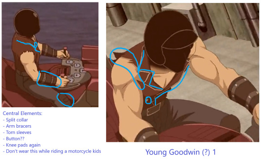
Exhibit B: Young Goodwin's first design, as we see him when Crow tells the story of the legendary duellist. And yes, you read that right: Young Goodwin actually has two designs, and as you'll see, this is going to turn out to be a bit of an inconsistency. (Also, excuse the garbage quality of the images. This guy is hard to get a hold of, for one, and for some reason, my internet did not like rewatching this episode.) Anyway, note the lack of sleeves and shoulder pads. Also, no gloves. You could argue that the detailing around the split collar here is also brown-ish gold, though. All around not very safe motorcycling gear. Not much protection offered. Also, there's a button. I could not figure out what for. Moving on.
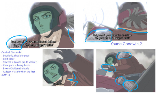
Exhibit C: Yoing Goodwin's second design, the one we see in the flashback when Yusei talks to him during the DS arc's final duel. Funnily enough, this one has sleeves! And shoulder pads! (And they're not the same colour as Crow's, but vaguely the same shape.) Also, knee pads again. And heavy-duty boots to go with them this time. What's more, the brown-ish/golden detailing is a lot more obvious here. And Goodwin has gloves here, but unlike Crow's, they disappear under his jacket. The colour scheme isn't far off from Crow's riding suit, though.
Finally...
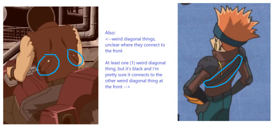
Exhibit D: Their backs. (It was impossible to get a back shot of young Goodwin #2, I'm sorry) What stands out here is that Crow's outfit is all around more detailed. But then, given that Goodwin's outfit is presumably thrown together with whatever he had, whereas Crow's is a professional riding suit, that's not all that surprising. Both have diagonal thingies here. If they serve a functional purpose, I have not found it.
Verdict: So, here's the thing. I can definitely see some similarities here. The shoulder pads have the same shape, both have yellow/brown/golden detailing around the collar and the front of the jacket, and at least going from Goodwin's second design, both have black gloves, too. And, of course, all three jackets are brown. I don't know if that's enough to say that Crow intentionally took inspiration from the man who built the Daedalus bridge, but you can see some nods here and there, I'd say. (If nothing else, it might be a cheeky add-in by the animators.) As for the inconsistency between Goodwin's two designs, allow me to introduce a silly headcanon: Since the first design is seen in Crow's version of the story of the legendary duellist, this may be how Crow imagined him to look. Even though Goodwin's "real" design is slightly different (and safer lmao).
But yeah, make of this what you will! This was all I could find, haha.
#yugioh 5ds#crow hogan#rex goodwin#this was very silly and I had a lot of fun with it#also please forgive the image quality this is all ms paint avant garde by yours truly#I'd personally say that regardless of whether Crow took inspiration from Goodwin in-universe#the animators certainly made a little joke here#orchid rambles
9 notes
·
View notes
Text
Favourite Outfits Made For Fics PT.1
Original Post:
https://www.tumblr.com/hoperays-song/726065505478344704/i-know-i-never-have-mentioned-this-except-in-like?source=share
----------------------------------------
Ok! So, I made a post awhile back talking about how I have folders of costume design for characters and if anyone wants to see anything in particular to let me know, and someone asked for any outfits that I'm particularly proud of that I've made for my fics!
I've really been looking forward to this so, I'm gonna show off a few of my favourites in terms of pure design here! These were the ones that were the most fun to design in my opinion, aka, Nooshy's interview outfit and Porsha's new casual clothes!
*Reminder that all of my stuff for fics is placed in the human au so the clothes fit into that too*
----------------------------------------
Nooshy's Interview Outfit:
So one of my favourite headcanons of Nooshy is that she loves bright colours and contrasting patterns and will dress deliberately very mismatched. This causes her clothes to be pretty memorable a lot of the time, even when she's just wearing borrowed clothes from her brother or friends. However, her interview outfit is a time where I really let this shine.


Ok so:
The main attention draw of Nooshy's outfit is a very shiny silver jacket with fringe that matches silver boots that they wear as well.
As for her shirt, it looks like just a purple button up but is actually iridescent fabric, so it looks more magenta-ish in certain lighting and with movement.
The only seemingly plain things of the outfit are black shorts and a plain black choker but the rest of her accessories are neon green and magenta, including their earrings, bracelets, and they changed her laces to be neon green too.
I really like this one because I think it shows Nooshy's very out there and bold personality as well as being one of the most unique, in terms of style, outfits I've ever made.
----------------------------------------
Porsha's New Casual Clothes:
So Porsha's original outfit was very much like her dad's in terms of color scheme and I really wanted to make an outfit that was a bit more colourful like her personality was. I kept a bit of designer clothes in there but I really wanted it to showcase the fact that I headcanon her to be living with Buster and Eddie now, so she's probably not going to be decked head to toe in it anymore.


Ok so:
I am a firm believer in giving these kids jewelry so Porsha is decked out in a gold anklet, chokers, and moon earrings (to honour her connection to Moon Theatre now).
The same is with her sunglasses, I switched the from something very crystal-like to a sun and moon design to show her affiliation with New Moon Theatre.
I wanted to add a jean jacket like she had before but made it much simpler with just a yellow stripe instead of the fancy sleeves of before. The yellow also represents cheerfulness and I wanted to keep that running as a good descriptor of Porsha's character.
The jeans are just plain white because of the tons of detail elsewhere on the outfit, like the desert on the shirt representing Redshore and the stars on her shoes alluding to her role in Out Of This World.
I like this version of Porsha's outfit as it's a lot more colourful yet still more toned down than her original. I think this would be a good way of showing her leaving a life of luxury and showing the importance the show and troupe have come to have for her.
#sing 2#sing porsha#sing nooshy#im not great at writing these two but i love designing for them#they are a lot more accessories driven than the characters that wear introduced in sing 1 when it comes to design#i also really love ryan and johnny's formal clothes so i might make another post talking about them#or how i changed the costumes to suit the new show better#let these kids wear jewelry damn it#fic stuff#please ignore spelling errors im very tired#porsha crystal
10 notes
·
View notes
Text
Selma the Tassie Devil-Background Info!
Check out my Ko-fi account for more information on this upcoming comic series! Donate at least $1 USD to get access to exclusive content! Thanks for reading!
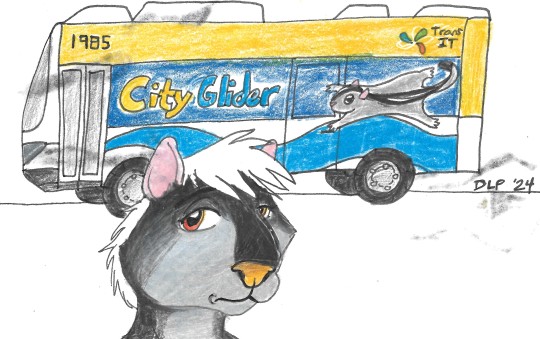
Tasmanian devils are a carnivorous marsupial, with a color scheme similar to a badger or a skunk--thus, the transition of Selma's character from a skunk to a Tassie devil was an easy one in terms of species appearance.
Tassie devils in real life are stocky, solitary creatures that eat a lot and move with a loping bounce. Their voices are loud and sometimes scary--hence their name--but they are generally shy, preferring not to interact with others. They are an endangered species--I enjoy making characters after endangered or extinct animals, as these are rarely represented in anthro/furry media.
Selma has changed from a thin, long haired, waif-ish skunk to a thick, short haired and intimidating devil. Her eyes are reddish orange, her nose with a more yellow-brown cast than a black one. Selma does have a wide mouth, as expected for Tassie devils, but it usually only shows up when she is yawning, angry, or exceedingly happy/anxious. Her ears are noticeably pink, verging on red when she's in her feelings, which is often.
Selma's fashion sense is like my own--casual, comfortable, tomboy-ish. There is a sense of androgyny in this character, more than with the previous iteration--Selma prefers short hair (she hates the summer heat in the northern parts of the continent!), oversize tees, khaki or gray cargo shorts or workout pants, and reluctantly wears the brace she was prescribed on her right foot. The brace is currently drawn as a metal and plastic support boot, rather than a velcro wrap around--this might change as I refine the story behind her disabilities further.
Selma has a cane in addition to her brace--she chose firey racing stripes, sort of like Hot Wheels colors!--so that the visual cue and comfort makes her want to use it.

Selma struggles with undiagnosed vestibular issues, Ehlers Danlos Syndrome and ADHD--just like me. At first, she refuses to acknowledge and accept her disabilities, as she has dealt with rejection, ridicule and isolation, socially and inwardly. Her coworkers and friends struggle to understand the invisible disabilities she has, some outright denying they exist, insisting she is being her typical stubborn devil self, and refusing tasks/situations on purpose. This makes her job and relationship track record much less than stellar--and she was the 20 minute kilometer runner in primary school.
Selma moved north as a joey with her mum, Ophelia, and once she was old enough to live on her own, chose a quiet suburban life with what little she could afford on a preschool teacher's salary. She relies on public transit to take her to work and to the dreaded grocery shops every week. Her dreams involve travelling across the Australian continent, seeing the musical stallion Darren Hayes live in concert, and--possibly!--falling in love and having a caring family or partner.
Selma's calling changes with her career when she passes out at work--and that's when her real journey begins!

I hope you've enjoyed reading this first look at Selma the Tassie devil--the main character of the Back of Beyond comic. Thanks for your support, and until the next post!
~DLP
#ko fi#artists on tumblr#ko fi support#ko fi link#tasmanian devil#original comic#anthro#comic artist#comic book#webcomic#indie comics#invisible disability#disability#hypermobile ehlers danlos#ehlers danlos awareness#neurospicy#neurodivergent#adhd#FirstDraftFall
0 notes
Text
VADD Fashion Analysis 1: Hunting Competition Arc
The MLs' hunting outfits have design elements that tie into their normal outfits. At a closer look, there are also details that help make the MLs cohesive and also relate to Penelope's own hunting outfit.
Reynold Eckhart

His normal color palette seems to be grey-black, varying shades of brown/tan, and red.
Reynold's normal outfit is a classic one that shows the "laidback second son" trope, with an untucked and undone shirt, rolled-up sleeves, a pendant, loose belts, and chains, as well as a coat draped over his shoulders.
In his hunting outfit, red is reflected in the ribbons that run parallel on the center panel of his outfit. On the top ribbon, there are two red and black ribbon-ends, likely reflecting the ribbon on the right of his chest in his normal outfit.
His hunting pants are a tan color, and his boots are a darker brown. His hunting suit is made of a wide black collar, dark grey sleeves, and a light grey inner collar. His sleeves in both outfits are rolled up to his elbows. (His collar looks like a hoodie, ngl)
Reynold's metallic accents, both in his normal and hunting outfits, seem to be copper. While it's unclear whether the chains, buttons, and bracelet that he normally wears are copper(due to the inconsistent lighting), his vest pinstripes have a copper-like color. He also has a belt(garter?) on his left leg in both outfits.
Derrick Eckhart

Derrick's color palette is black, blue, and purple, with metallic accents of gold and silver. He shares it with his father, Duke Eckhart. This also gives a stark contrast to his brother: since Derrick is the next duke, he's expected to be the perfect heir and to take after his father the most.
His coat is always buttoned up and is shorter than the duke's own. He's also normally seen with gloves. Blue becomes the dominant color with his hunting outfit, as well as silver. He wears a deep blue-purple cape on his right shoulder, mirroring the thin, sash-like purple cape that's on his normal outfit.
Both outfits have silver chains on his upper body.
Derrick also wears a diamond-shaped pin in both outfits with diamond patterns repeating throughout his hunting outfit, like his cufflinks and lapel pins.
This can also be seen on the duke's coat before he changes the pins out for Penelope's amulet.
In all three of his outfits, there is brocade, which is also shared with the duke(gold brocade in his default). With his dining hall outfit, it reflects the hunting competition one more in the way his jacket buttons up in the middle.
All of his outfits have epaulet designs, though, unlike the duke, Derrick's do not possess any tassels.
Winter Verdandi


Winter's color palette is a mix of black, white, and purple, with silver accents. Design-wise, he's very consistent with the diamond patterns and black-and-white details.
Winter's normal outfit seems to be a neater, more refined version of Reynold's: the open coat, untucked button-up, and lack of gloves. In his White Rabbit disguise, he's seen in a thick, buttoned-up coat and heavy black gloves, as well as the trademark mask. His shirt also changes from the folded-down collar to a pleated-ruffle collar.
Throughout all of his outfits, we see the same yellow-ish brooch at his neck with a dark purple bow, though his hunting outfit is a simple ribbon.
In an interesting contrast to his White Rabbit persona, Winter's hunting outfit also has a white ribbon, with the White Rabbit possessing a black bow underneath the purple one. Like in all of his outfits, there's the diamond fabric in the lining of his outer suit, as well as the pins, buttons, and even the chains crisscrossing his body.
Winter's hunting outfit seems to be a vest of sorts over a black shirt; during the trial arc, he's seen with his original coat over the black shirt with Penelope's cufflinks.
All of his outfits have some sort of thin, pale scarf/sash, which appears as a set of belts in his hunting outfit.
Callisto Regulus

Callisto's color scheme is primarily white and black, with gratuitous use of gold, as well as deep red and purple accents.
His first appearance outfit is the same as the hunting competition one; likely to show how Callisto is always ready for a fight. It's also an interesting parallel with the duke: both of them are the only male characters(Marquis Ellen included, perhaps) who don't wear special outfits for the Hunting Competition.
His suit has wide gold epaulets, the Regulus crest on the upper arms, and multiple aiguillettes, as well as a deep purple and silver sash(which he ditches during the competition).
In the middle, his suit has a black panel with gold lacing. Interestingly, his lapels are asymmetrical; the left is black with two panels; the bottom one being a gold pinstripe color. The singular right panel is plain white(can be classified as a shawl lapel, though the shape is more triangular than curved). He wears white pants and matching boots; the boots have gold detailing on the heel.
Overall, his adult outfit seems to be very similar to the one he wore as a child, though the dark brown is swapped for white, and his lapels are switched. His epaulets also have tassels, though he always has some sort of white ribbon tied on one of them.
On the eve of the hunting competition, Callisto's suit has different touches. For example, his lapels match and lack the pinstripe, with the top sections being black and the bottom being white. The stomach panel is white instead of black. He forgoes the fur-lined cape for a burgundy one that wraps underneath his left arm and swaps the white bow on the right epaulet for a black one on the left. His cuffs are no longer folded back or black, and his cufflinks match the diamond-shaped ones on his lapel.
Design Parallels with each other and Penelope

- The Eckhart siblings all have some sort of white ruffle/cravat detail at their neck
- All of them except for Reynold have brooches, with Penelope being the outlier without a jeweled one.
- All of them except for Derrick have a ribbon, tie, or bow around their necks. Derrick has the elaborately embroidered high collar, which doesn't count.
- Derrick and Penelope also have silver-lined boots with notches in the front.
- Winter and Reynold don't have metallic trimmed boots, though Reynold has cords(?) wrapping around the top of his boots.
- Derrick and Winter seem to be the only ones with boots that have visible lacing.
- Derrick and Reynold have silver patterns over a black fabric in the middle panel of their outfits.
- The brothers also have capes, though Derrick's is draped over one shoulder.
- Derrick and Reynold also have the Eckhart crest at the right side of their chest, with chains attached to them.
- Winter and Derrick have silver armbands on their upper arm.
- The two also have cufflinks.
- Reynold, Callisto, and Penelope all have folded-back cuffs with contrasting colors.
- The pink-haired siblings have cuffs that are light-grey with black and gold edges, as well as a single button on each cuff.
- Callisto and Reynold have an attachment on their right chest( the Eckhart crest for Reynold, protective amulet for Callisto) that has black and red decorations(ribbons for Reynold, and tassels for Callisto)
- Derrick and Penelope have black gloves, though Penelope's resembles Winter's, with the cutout at the back of the hand.
- Reynold is the outlier with his copper accents; Derrick and Winter have silver with Penelope and Callisto sharing gold.
- Reynold and Penelope have taller boots than the rest of the main characters.
- They all have open collars, though Reynold's outfit can be interpreted as a lowered hood.
- Winter and Reynold have multiple belts over their body.
- Winter and Reynold have multiple belts over their body.
#lysia's posts#scrutinies#fashion analysis#villains are destined to die#vadd#death is the only ending for a villainess#death is the only ending for the villainess#ditoeftv#penelope eckhart#derrick eckhart#reynold eckhart#callisto regulus#winter verdandi
117 notes
·
View notes
Text
Ni unpacks some design comments on the new 02 group's design.
(because all i wanted was just one person's motivational boost to make this lol) (i got three. extra dose of motivation boost)
This is kinda a thing i like the most -- i love do design characters and coloring, so i'm always studying character reference sheets for the sake of learning bits and improving my own art 👀
So, we recently had more details (even if bare minimum) for Digi02: The Beginning, and i'd like to write a post analyzing their clothes and the coloring. Also their hairstyles too (hello Miyako, Hikari??)
So, let's roll!!
Daisuke's design!!
Ok, i had talked about this one before (when we had the sketches of it revealed at Digimon Con lol) and I'm super duper happy with this color palette invoking Daisuke's original human world's clothes. Not only the style, BUT the coloring too!!
The first thing I notice is... He got pants now. Well, it's funny because since this movie is set in the Winter... 02 Daisuke had shorts on winter!? Okay, some people were also surprised by it too, no kidding. Anyway, this seems to be very comfy! And has the coloring of his iconic shorts hehe.
He did not ditch the dummy sunglasses, THANK GOODNESS I LOVE THEM SO MUCH! Also i find funny the shoes are the reverse of his iconic boots -- White with orange details. His socks are the same color as his DW's socks (which were the same blue-color of his jacket, i'm not kiddin')
He got a cool vest that has the same colors of his vest in 02 😭 But this one has more details and is probably made with some extra layers for winter (i guess) -- and he's wearing a cool hoodie! Idk what is that stamp, but it has its bottom part colored in orange? Or is it a pouch? Haramaki...?? Who knows...!
Ken:

No ponytail aw... But i find him pretty with his short hair -- I'm really loving his short hair that i have to remind myself his hair was long when he was a kid orz
Whoa classy! Ken-chan continues to wear the finnest clothes as possible. He's really bringing some smooth detective style 🤔
His new friend, the hair sprout is still there and strong, I guess he's still a dummy like his other five friends lol. I love this little sprout, better he never cut that lone warrior or i will be upset.
There's not much to talk about here, only that he's very formal and classy. Ok, he's still wearing neutral colors but at least they're having not so sad like the grey uniform in 02.
I love his face tho, he's really pretty.
Miyako:
No headgear this time, my dear!? Wow you're so pretty without any accessories on!! I love her new glasses! Still round and Miyako-ish 🥰
I like the color palette of this outfit! The pink poncho with the cyan pantyhose/tights are a nice touch! Also wow those boots are so pretty 👀👌
I also noticed her hair is still curly and got some bangs hehe. I hope to see more cool Miyako's hairstyles in this movie -- Kizuna already was so precious about those two hairstyles 😭
Since the poncho covers a good part of her design, i can't say much about it. Anyway, maybe in the movie we see this one without the poncho... I hope so.
Iori:
Are we finally seeing Iori without a school uniform!? Wow, and he's pretty stylish somehow huh... Since Iori is a reserved and polite person like Ken, his design only differs from the fact is a bit more casual than Ken's classy detective coat.
Iori also likes neutral colors if you check his outfits in 02 & its previous movies. So, a grey jacket it's very in-character for him. His shoes have some interesting patterns and color scheme. I like the blue with black-purple and salmon colors. It suits Iori's personality imo.
Ah, he got a... watch? I wonder what kind of watch would fit Iori's personality... Analog or digital? 🤔
(also, i wonder if he's a little more taller now...)
Takeru:

I dunno why, but this one design reminds me 02 as well, but the yellow consumes a good part of the jacket, forming a "T" with the black accents on the upper body.
He got... a beanie now!? Wow, it's a cute beanie and the color matches with the entire design i think (the colorist of those design is a mad genius i love their color game) -- and he got some cool off-white sneakers with light gray, blue and orange red details 👀👌
I think this is very Takeru-ish. Ah, is he wearing a necklace under his jacket? Because I can see a necklace cord there...?
Hikari:

Hikari's a pretty lady. And by that, i mean we saw her outfits in Kizuna were a bit more sophisticated and comfy than stylish or simple. I feel like she's getting a good fashion game here and might be my most favorite of out of the six characters.
I love her sweater and pants. They're pretty and cute, and her coat is a nice addition to this design, especially its color. Hikari's color palette is more neutral than her 02 outfits (where Pink was almost in some part of said designs, even if by just one cloth piece of that color) and i think it shows how mature and pretty she became.
Also, we can notice her hairstyle is changing a little too! Her hair is getting longer enough to have this cute ponytail. Some strands are longer on her back too, and I'm in love with this new change of pace.
Stay cute and cool, Hikari-chan 💖
BONUS: Rui's design!!
Since he's a new character and it's his debut movie, there's not much to talk about his design, other than his spiky purple-grey-ish hair makes me think about Ken's late brother.
His palette has too much black, and some grey and white. I feel he's a sad person at this point... I don't know how to interpret this, since we know basically nothing about him and his possible partner Ukkomon. But, i think it's an intriguing character design.
I've seen a press' screenshot of the scene shown at the event, and seems like under that bang covering his eye... He's wearing an eyepatch?? Really, who are you Rui? I want to know more about you asap!!
That's all everyone!! I hope you enjoy my silly analysis of those seven characters 😊
Peace~✌
9 notes
·
View notes
Text
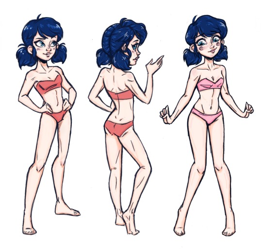

First image:
A year ago I made some bases I can use to draw different outfits on Ladybug / Marinette. And now you can to, so long as you credit me, of course. Figured it made sense to use Marinette as a model because 1. She's into fashion, 2. I want to draw some fashion designs, and 3. I want to see Marinette in my fashion designs. First one's meant for her superhero persona, third's meant for civilian outfits, and the one in the middle is meant to show off the back of any outfit in either persona. Not sure if I'll ever really use it though. Not all designs I draw on these Marinette bases will necessarily be intended for her (like I don't see them as her style), so in a way it feels like I'm drawing fanart but not really drawing fanart at the same time, if that makes any sense, since I'm really drawing clothes not necessarily intended for the Miraculous Universe.
Second image: Finally a year or so later I'm posting some designs! First off in the Marinette fashion collection we have casual and superhero outfits based on color schemes I find appealing and how I view those color schemes. Originally red, white, and black was another pair, but that superwear design needed refining and I wanted to finally post this, so that one will be in another set of color scheme casual & superwear clothes. This was a lot of work already and it is a minimal color scheme challenge, so I hope no one minds the lack of shading on the clothes. Anyway... ABOUT THE SUPERPOWERS: #1 - Hero Name : Fractal Power: Fractal Shields, Barriers, and Small Weapons - Can generate incredibly strong iridescent crystallized shields and crystallized shuriken-like weapons that look like snowflakes by focusing energy out of her hands (don't ask me for a scientific explanation, she just can. If you can think of one let me know.) Her barriers and weapons always follow a fractal arrangement for some reason. (Yes, her name is very literal.) #2 - Hero Name : Cricket (or Silent Cricket?) Power: Tech provides Super Hearing and Super Jump - Ironically, unlike a noisy cricket, Cricket's goal is stealth and information-gathering. She uses her insect-like antennae for super-hearing, listening in on secrets and shady dealings. She is called "cricket" not only because of her antennae but because her super boots are able to power up, storing enough energy to allow her to leap very high and across vast distances like her namesake. There are small cushions underneath her boots that deploy when she leaps so that she always lands quietly and does not give away her position. #2 - Hero Name : Kore Power: Plant Super-growth & Control over Plants - Named after the Greek nature goddess of spring and fertility Kore (another name for the goddess Persephone that means "maiden" and has a little more of a punchy ring to it than Persephone), Kore the hero likewise can stimulate plant growth to produce plants of enormous size. She can also use surrounding plants, including her gigantic plants, to protect and attack. Just in case she finds herself fighting in an area lacking in plant life, she has seeds stowed away in hidden pockets in her cape. All she needs to do is locate a suitable spot for vegetation (even something as small as crack in the pavement will do in a pinch), and then the fight is back on! ABOUT THE CLOTHES: * Note: You can imagine that the casual wear is the "civilian look" of the hero wears the paired costume. 📷 #1 - Bubblegum Pink, Yellow, Light Blue : I love yellow and blue together and combined with pink I think it adds just the right amount of POP! With these colors I really wanted to go for a color-blocking look with both outfits since I love that aesthetic and it suits the bright colors. I also knew when I started this project that I REALLY wanted to make a minimal-aesthetic hero suit with asymmetry for flair. For the casual look, I thought a 60's, 70's-ish mod style dress would be perfect for color-blocking. While Marinette looks super cute in this casual look, I think it most suits Chloe actually, who I see as having the perfect look for 60's-70's style clothes. Color scheme might have to be changed though, probably to black, white, and yellow or to pumpkin orange and lavender, oddly enough. #2 - Purple, Neon Green, Black : Maybe I'm just being influenced by Winx Club, but there's something about these colors together that SCREAM techno and techno music to me. For the casual look Mari is modelling a cute club outfit complete with glow stick accessories, even though I think Marinette and I would agree it's not either of our's usual tastes (You'd see me wearing #1 with a belt and possibly #3). I wanted her tights to look like an arcade floor. 📷 Funny enough, my brother really likes that look, so go figure. The hero look is tech mixed with insect. The cricket idea came from me wanting to give the outfit funky looking antennae and jump boots and it kinda just evolved from there. The butt cape
(?) is meant to emulate cricket wings and the line designs on her arms, legs, and butt-cape skirt-thing are based off of the look of crickets' legs. (Lovely design on a cricket's leg, but that doesn't mean I ever wanna have to google those disgusting creatures again. I actually really HATE crickets. 📷 Saw one in my room once and it was the creepiest thing I had ever seen, rivaling big ass praying mantises and house centipedes.) #3 - A lighter Celadon/Sea foam Green, Darker Pink, A bluish Celadon Green, A kind-of Celadon Green : ...It's hard to specifically name these shades of green, okay? Just know I really like green. Anyway, this combination may seem a bit more random, but I think that's because for these looks I started with the aesthetic in mind before I picked the colors (I think I did, anyway. It's been like a year, who knows?). I wanted to make outfits that were soft and gentle. I also really wanted to make a flower-themed hero suit because I LOVE florals and flowers. For the casual look, I want to push the cutesy aspect of it without making it seem like too much. It's kinda like a softer, cuter version of the first casual look's aesthetic. I can see Marinette wearing this but perhaps without the headband and with flats instead of the socks and heels. For the hero outfit, I just went all out with the detail. I wanted the hero look like a mix between modern hero and classic Greek goddess. Check the vines emulating gladiator sandals, the laurel wreath, and the flowy cape meant to emulate a flowing dress. WHEW! Finally done! Thanks for reading if you did!
#i hope @zoe-oneesama sees this#marinette miraculous#miraculous marinette#color scheme#color scheme challenge#fashion design#miraculous#miraculous ladybug#miraculous fashion#miraculous ladybug fashion#fashion#superhero#hero costume design#superhero design
65 notes
·
View notes
Text


I finally colored in the Adult Leopard Gang designs!!! Took me long enough! I hope they look decent-ish. Again, I'd like to say I drew over the original art. So that is why their proportions are extremely off.
I also included the old art to help compare. (The ones without an alt. design either keep the same design the whole time, or weren't around at a certain point.)
Changes I want to point out (Some are small, some I just really want to be known)
2 (Eva Gold) I made the purple darker? Idk. I gave her purple pants with mustard boots instead of purple... footed.... pants?
3 (Otis Fate) Similar outfit, but it's new! A darker jacket and lighter pants sure, but that's not important. His heart shaped pin moved to the other side! And the most important change is that he now has a little bit of chub!!! Enough chub that he doesn't need his old belt!
4 (Phillip Phantom) Completely new outfit!!! A blue ghost shirt! Pants with a ton of pockets instead of shorts(?)! And... That belt looks familiar! 😳 He also got his phone replaced by an EMF Reader! Nice! ...He seems a bit nicer too!
5 (Albert Rose) His fur is pushed away from his face! His outfit is slightly brighter now. Especially with the yellow boots, matching coat buttons, and matching rose pin! He a bit looks happier!
7 (Raine Danz) Completely different outfit! It's more purple! Seems the flowers moved from her head to her outfit, and the moon and stars moved from her outfit to her head! I mentioned this long before I did this, but I stopped giving her a human-ish nose in this doodle style because it just... Yeah it felt weird and wrong on many levels. Also I completely changed the skin color because it was just purple?? Please pretend her skin was always this way. 😅
8 (Dustin Pan) Same color scheme. I swapped the colors of the top and bottom tho? Also I gave him shoes instead of whatever shoe/pants combo he had before. The most important change is probably the fact the he finally learned how to wear a pocket watch hkvkgvgkc
11 notes
·
View notes
Text
crystal and homeworld colors

it may seem a small change, but when applying the show’s use of color theory, it’s very interesting that jasper’s new outfit has less of an obvious contrast and invokes more gradual, even pastel shades.
because that's a core visual distinction between a homeworld and crystal gem.
homeworld gems are vibrant. high contrast. in living technicolor. the first three HW gems we meet are bright blue, bright green, and bright orange respectively. there is not a single homeworld gem who could pass for “human”.

crystal gems have softer tones. pastels. peaches. earth tones. rose, pearl, and garnet could all kinda-sorta pass for human, whereas amethyst’s purple is pastel, and feels more muted by her gradient-relationship with the general color scheme of the crystal gems.

this was basically a hard rule in season 1-2. you do not make the crystal gems too vibrant, or a homeworld gem too peachy / earthy / pastel.
since then, things have changed quite a bit... or at least, the crystal gems have changed. the CGs have told steven about being alien invaders, gone through character development that have boosted their confidence, and have expanded, with new ex-HW members - all befitting of become more aesthetically vibrant.

the pink / rose / steven transition is tentative to discuss in any scenario, but it does fit this color trend. pink’s... pink is vibrant, high contrast, “alien”. rose’s pink is soft, pastel, earthy, and gradual. steven marks the midpoint between the two - as he leads the CGs in a bolder direction, his colors are more vibrant than rose’s, but never as inhuman as pink’s.

amethyst, in s1, started out with a grey-ish purple shirt, which punctuated how she matched the softer, more “gradient” colors of the crystal gems. post-alien reveal, she got a black top, making her purple stand out more, then white, which made for an even stronger contrast. her newest regeneration reveals more skin (her legs + her gem are exposed), making her “alienness” all the more obvious.

pearl’s color journey is even more interesting. her colors, while consistently pastel, were far bolder while she served homeworld than when we first met her in season one. in s1 (before steven is told the gems are aliens), she’s at her softest. yellow and cyan are usually her ‘strongest’ colors, and they’re far less dominant here. soft pinks and blues take the lead, making her color-scheme appear much more gradual. as she regenerates, she reclaims vibrancy on her own terms: her cyan become more visually striking, while the baby pink recedes.

garnet’s perhaps the most obvious, going from softer brown and red colors in s1 to a more vividly alien pink/purple hue upon her “jailbreak” regeneration. her most recent change makes the point even better - incorporating not just a flashy gold visor, but bolder distinction between her pink and blue hues. this makes the “fusion” more obvious. it’s also worth noting her “cotton candy” form: it’s pastel, but in line with rupphire first fusing on accident as homeworld gems, it’s also brighter and flashier than her s1 outfit.
the inclusion of gold is also mirrored by newer crystal gems - lapis’ bow and sandals underpin this, as does peridot’s new visor and boots, and lars’ cape.

ok, fair enough - the crystal gems have become more vibrant, challenging the initial split of “pastel vs saturated” and “gradient vs contrast” they had with the homeworld gems. that probably explains jasper’s change too, if the lines between “crystal” and “homeworld” gem have becoming blurred over time.
but here’s the thing - the homeworld gems did not become less vibrant in turn... at least not until very recently.

the original HW trio of peridot, lapis, and jasper remain the most striking, but the elements of vibrancy, contrast, and a comparatively more saturated homeworld has remained consistent throughout the entire show.
think of the high contrast color schemes between the diamonds themselves, for instance, or between the zircons, or emerald’s bright green & yellows, or even topaz and aquamarine. none embody the earthiness of the CGs.

and this makes sense within the show - as the CGs have grown comfortable as aliens, addressing their past as invaders, learning the truth about rose and finding new hope in their cause... its individual members have become healthier, more emotionally honest beings.
meanwhile, homeworld became stagnant. like white diamond herself, it stubbornly upheld the status quo of the gem hierarchy... basically until now.

to that end, jasper marks a genuine change, both on a personal and homeworld-level. personally, this may symbolize further growth as she learns the truth about pink and finds closure regarding her old cause. jasper was always connected to the earth - but only recently did she find reason to admit it.
however, it also carries color-implications for the whole of homeworld, which is underpinned by how it reflects what happened to white diamond herself.
when she was made aware of her emotions, it was punctuated by a temporary shift in color. pastel pink - the quintessential color of rose quartz - was incorporated into white’s starkly contrasting black/white scheme, and only then was she made to admit her feelings.

homeworld has only recently started to change, as a gestalt. they have a long way to go. therefore, this change only coming about now makes sense.
it’s no surprise that it’s punctuated by color. as the crystal gems have become bolder than ever, so their colors reflect this. and as steven found his way into white’s mind, so homeworld gems are letting the earthly and pastel tones of the crystal gems slip into their world, ever so slightly.
#steven universe#the diamonds#the crystal gems#jasper#garnet#amethyst#pearl#rose diamond#steven#white diamond#gifs /#su spoilers#su theory
3K notes
·
View notes
Note
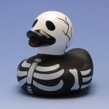
effy x harper finkle mashup? how can i make her rubber duck outfit more effy-ish?
The cut of the dress is already pretty “Effy” in its laid back, tee shirt dress vibes, and the blue in the dress is reminiscent of the blue in Effy’s 301 dress. The vinyl, light blue accents give an edgy and unexpected touch to the dress, referencing Jean Paul Gaultier and Yves Saint Laurent’s work with vinyl in their own collections.
For a true Effy look, hack several inches off the hem of the dress and remove the sleeves for an edgy, muscle tee dress. Then, the real key here is the choice of rubber duck. Harper opts for classic yellow ducks with orange beaks, but don’t feel limited by her choices. By incorporating some edgier rubber ducks, we can really give this look a whole new feel. Ducks in unexpected colors like blue or purple are best, as they provide a fun pop of color without overpowering the color of the dress.
Finally, it’s important to have the right accessories. Of course, fishnets are a given- I would go for grey here to mesh with the color scheme without overpowering it. Sancho boots are also advisable, as they can provide some edge to the look. Throw on Effy’s classic smokey eyeliner and some stacked black bracelets, and you’re good to go.


4 notes
·
View notes
Note
4, 7, and 8 for the s/i meme!
you didn’t specify which s/i so i’m gonna go with -spins wheel- my Sally Face S/O, Nicky!
4. Does your insert have a backstory? Tell us about it! How does their backstory, if any, define who they are? How does it reflect their relationships now? Their hopes and dreams?
Not much of one, honestly- at least not much that’s notable. She’s the only daughter of a hippy-ish single mother who purposefully became a single mother because she wanted a baby and not a man. Or a woman or any person of any other gender identity. She just wanted a child and that was it.
Nicky has no idea who her father is and doesn’t care. She grew up always being supported and being told to be herself no matter what that looked like, and also not to take shit from anybody for any reason. Her mom taught her that if she got into trouble at school for standing up for herself, she’d never be in trouble for it at home. Because of this, Nicky is no stranger to detentions and suspensions when she enters high school, and she’s a big defender of her friend group. She’s shoved people up against lockers for talking smack about Chug’s weight, punched people for calling Todd homophobic slurs, and chased people down and left them with black eyes and bloody noses for stealing Sal’s prosthetic.
Her mom is pretty sure she talked to ghosts constantly when she was a child, although Nicky doesn’t really remember this. Growing up doing this gave her a strong connection to the spirit world which Nicky continued to cultivate as she grew, become an experienced Tarot card reader and giving her a much easier time talking to and interacting with spirits than the others. It comes in handy.
They moved to Nockfell from Cincinnati when Nicky was eleven, so she kind of knows what it’s like to be the new kid.
7. What kind of clothing style do they like? What would they never be caught dead wearing? What’s likely in their closet right now?
She’s a goth-punk, with a little bit of pastel goth mixed in. She mostly wears black and pink, with some accents of white.
Her closet is full of band t-shirts, fishnet/mesh shirts, black button-downs with moon or star or cross designs on them,some blouses, dark jeans and jean shorts, hoodies, fishnet tights, and then combat boots and chuck taylors. She’s not much of a dress person except for fancy occasions, but she’s got a couple of skirts mixed in there too Honestly she likes to wear a variety of different kinds of clothes, but all in her same kind of color-scheme. And with the dark makeup and accessories she wears, she’s got a pretty steady look going.
She doesn’t wear ‘bright’ clothing- no bright blues or yellows, only pinks if they’re paired with black. No long maxi dresses, either. Really nothing beachy or summery- it’s just not her. I mean she’ll wear a bathing suit to the beach or to go swimming, but no wraps or linen dresses or anything ‘breezy’. She doesn’t think clothes like that make enough of a statement.
8. How do they fit into their canon world? What’s their role to play, if any? Do they have a big destiny? Or do they more live as a side character that’s helpful for the protagonists/antagonists?
Nicky is in Sal’s group of best friends, so she’s really important to the story. In a lot of ways she takes Ashley’s place (sorry Ash ^^’)- she’s an artist, the one Sal gets a crush on, etc etc. She and Sal become best friends while they go through school- they have a level of closeness similar to Sal and Larry, but in a different way. She’s a good confidant for Sal, or anyone in the group really. She’s there to be a sounding board whenever anyone needs someone to talk to them without judging. Who doesn’t need that once in a while?
She also does a lot of foreshadowing through her tarot card abilities. Whenever she reads for Sal, his future is always the Hanged Man in Reverse, a card and position which represents that he will make a big sacrifice in his life and receive no thanks for it. They don’t know what it means at the time, but it keeps getting pulled. As the days grow closer to The Addison Apartment Murders, she gets a sick, sinking feeling in her stomach. She knows something is wrong, she just doesn’t know what.
It’s also due to her connection to the spirit world, as well as the strong connections she’s forged with them, that she’s able to bring both Sal and Larry back to life on the day the end of the world doesn’t come. It’s not written in the prophecies of the Devourers of God- they never saw anything like her coming. But that just makes her even more powerful because it means she defied the will of something that thought itself all powerful.
1 note
·
View note
Text
I’m Bored, Let’s Discuss (some of) the Class 1-A Boys’ Hero Designs.
This is just how I feel about em. Because no matter what I love these kids.
1- Deku

I like this one! Much better than the first costume. Colors are mostly balanced, save for the two different shades of red on the belt and shoes. His knees and elbows are braced bc he’s a mobile fighter who probably suffers from repetitive stress injuries a lot, let’s be honest. The gloves are v puffy. Remind me of a sonic character. His bunny motif hood is adorable but he never wears it, which isn’t really a design thing tbh I just want him to wear it more. The muffler thing around his neck is like that too- he doesn’t wear it, but I think it fits. 4/5
2- Lord Explosion Murder Bakugou

It’s goofy but I really like it? Colors are very well-balanced. He keeps with the explosion theme consistently (hair spike things, the grenade gauntlets). Bulkiness of the gauntlets is balanced by the chunky boots. Mask is goood, lends him a kind of mystique he lacks everywhere else in his personality. 5/5
3- Ingenium

My good boi!! VERY nice. Cool color palette, not too busy. Again, it’s bulky, but it’s consistently bulky. He looks like a knight and a mech at once. VERy shiny, the gold accents are good, and the parts of his body that generally need to be bendier (around his hips, his elbows/shoulders) are more lightly accommodated, which is cool. 4/5
4- Shoto

I love Shoto, but the costume...I mean, it’s better than the first all-white ice design. Overall, I think it’s good. Simple jumpsuit but the deep blue does a good job at bringing his white and red color scheme together without leaning too much toward one side. It IS a bit plain overall, though. Not a lot of Shoto’s personal flare. 3/5
5- Chargebolt
The white zigzags are cool as shit. They provide a good focus in all the black. I like that his hair and eyes are the only starkly yellow elements, too. This entire getup looks like a zebstrika from pokemon, which fits. BUT also these just look like slightly glitzed up civilian duds. I don’t think these clothes are gonna do a whole lot of protecting. They look like they’ll tear in a fight. 3/5
6- Tokoyami

Why you wearing a trash bag, my beautiful boy? 1/5
7- Red Riot

Dig the shirtless w/ half-skirt...thing...look. Reminds me of a dnd design. Honestly the ridgy shoulder pad things are awkward to me, like I might’ve still given him something on his shoulders, but it would’ve been more slim. He can harden his skin, he doesn’t need shoulder pads. The mask is great, the puffy pants and bulky boots are awesome. The big red R is goofy, but it fits. The R’s red matches his hair’s red. It’s bold, it’s over the top, I like it a lot. 4/5
8- Can’t Stop Twinkling Aoyama

Like...actual knight in shining armor. I kinda love it tbh. The gold accents tie it together nicely (espeically the lines going over the black fabric on his pants). Everything else is a nice lavender-ish shade that’s easy to look at. The only thing that doesn’t match the color scheme are the glasses, but there’s just enough brightness in the cape and the gem on his belt that it still fits. 5/5
9- Cellophane

Tape dispensers on his shoulders make the tape dispensers on his elbows stand out a little less. Yellow, black, and white usually go really good together, and that is absolutely still the case here. The jagged pattern of white around his rib cage divides his bodysuit up and gives some rhythm without having to add a belt which would take away from the slim, spider man-esque look. The only thing I would change is the straight line right across his chest/collar bone. 4/5
10- Tailman

This boy’s out here lookin like Luke Skywalker with a tail. Fur collar on the gi matches the tail, which would be cool, but it’s really bushy and it kinda throws me tbh. His shoes have a strange swirly pattern that doesn’t jive with the sci fi-looking belt, and they’re cropped just a bit too short. Looks like the costume was made to take a punch though. 3/5
2 notes
·
View notes
Photo


(After getting a question about Hellion and Prodigy’s uniforms; I’ve decided to do a ‘Best Look/Worst Look’ posts for New X-Men characters.)
This week I’m examining the BEST and WORST Looks of David Alleyne- Prodigy!
Uniforms:
1. David’s New Mutants Uniform is… Kind of rough, in my opinion. It has A LOT going on, is seemingly based off of ‘the Matrix’ (as many things were in the early 2000’s), and the color scheme doesn’t work well for David.
While I do like how David’s consistently kept the yellow glasses in all of his uniforms; it just feels a little too generically tying into the ‘Guy Behind the Computer’ trope for me. The sunglasses DO work in the fact that they look like something a teenager would totally pick out thinking it makes them ‘look cool’ however (plus David IS a little bit of a dork, even if he won’t admit it…). It just looks a little silly for David to continue wearing them as he gets older.
2. The Uniform featured on the cover of issue #10 is an improvement to the New Mutants uniform, in my opinion.
While still very busy (and featuring 90’s pouches); the orange and grey look much better than the yellow, and subdues the white to being trim instead of being a primary color and becoming overwhelming like it is in the NM uniform.
3. David’s M-Day Uniform again uses the yellow/orange and white color scheme- which I think looks terrible on him. The collar also looks too cult-ish with the uniform and bell sleeves (which IS kind of the point in that story arc, but still…).
4. The outfit David wears during the Nimrod battle, while boring, does work really well. It utilizes David’s focus on functionality at the forefront (with a bulletproof vest, army boots, and dark colors for tactical or recon missions), instead of visual appeal.
It also suits David’s new status as depowered, by providing more protection.
This outfit is basically a less formal version of FX’s Archer ‘tactleneck’…
5. I have mixed feelings on Xavier’s School Uniforms.
On the one hand, they pretty much look good on everyone, and are easily made personal by adding simple accessories (a perfect example of this is Dani Moonstar in Claremont’s original New Mutants).
On the other hand, they often times are used even after the characters have largely outgrown the 'student’ role (again, a perfect example is Dani Moonstar). Usually it’s laziness from X-Men artists, who don’t want to design a new outfit for the character.
With David, I COULD see him continuing to wear it after graduation; since David has little concern about things like rank and fashion. 'Why waste a perfectly good uniform, if it still fits and is useable’- would probably BE David’s thought process.
That being said, I WOULD like to see David get a more personal uniform; created solely with him in mind.
BEST LOOK- Probably the orange, grey, and white uniform. While the black recon outfit and school uniform both look great on David; this look has the most individuality of David’s uniforms.
WORST LOOK- New Mutants Uniform. With it being too busy, a bad color scheme for David (the yellow looking particularly bad) and too outdated a look- it’s the clear choice for WORST look.
Civilian Wear:
1. David’s fashion sense is based more on functionality and comfort over esthetics and trends. This fits well with his character, who tends to see wealth and vanity as frivolous. Most of David’s civilian clothing was basic jeans, tee shirts, and hoodies in both DeFilippis and Weir/Kyle and Yost.
2. In Kieron Gillen’s YA 2.0, as Daivid gets older; we see David’s clothing style becoming a little more formal, with sweater vests, ties, and button downs. This tends to be as dressy as David usually gets.
This slightly more structured look has been continued in his appearances in the America solo, and recent appearances in Matthew Rosenberg’s New Mutants.
BEST LOOK- The suit David wore in his dream future (because OF COURSE Emma made him fashionable, even in a simulated future 😜…)
WHAT I WOULD LIKE TO SEE: I’d like to see David designed a more individualized Uniform; probably using black, grey, and a SMALL amount of orange, yellow or army green trim. The focus of this design should be function, with more of a focus around black ops missions in the design. I’d also prefer David to loose the yellow sunglasses, because while they’ve been a character staple; I think David’s outgrown them…
Next week I’ll examine Noriko Ashida- Surge’s BEST and WORST Looks!

#Best Look#Worst Look#fashion#style#Prodigy#David Alleyne#new x men#new xmen#Marvel#Young Avengers#America Chavez#New Mutants#academy x#bring back the new x men
18 notes
·
View notes
Text
Val

Name: Val
Pronouns: He/Him
Race: Aspect (native to the fan plane, Ferely)
Colors: R (B)
Age: ??? (Looks Mid-20s)
Origin plane: Ferely
Stuck on: Ravnica (planebound)
Appearance: Generally appears human. 6'6" with yellow slit eyes, and fiery red hair, usually kept up in a ponytail. Generally scowling or grinning (if something is on fire, or his schemes are working). He has three marks under each eye. Has pointed ears and a forked tongue. His appearance isn't specific to any race, as it is of his own design.
After feeding on someone's anger, his eyes burn green-ish and his teeth get a bit sharper. The skin on his forearms turns pitch black and his fingers gain claws. This appearance wears off after a short while.
He wears a light blue sweater and white pants. His main weapon is a pair of metal, clawed gauntlets that he can channel fire through. His boots are the same, but he seldom uses them as any sort of conduit for the fire.
Abilities: he feeds on the anger of others and uses it to boost his own powers. He can also redirect the anger to other targets. His powers mainly comprise of wielding fire and forcing hot temperatures, but he can also use a defensive subset that forms glass.He doesn't use it much, but if he's being chased, or chasing someone, he'll absolutely exploit it to its full potential of creating walls of glass. It's incredibly fast cooling so there isn't much chance of causing damage with it, but it's good to create roadblocks and traps. He can keep it molten if he's touching it, but it's really not as combat efficient as his regular fire, so it's more of a defensive move. He's also immune to the effects of heat and fire
Personality: Quick to anger and rather manipulative. Smarter than he looks and sometimes seems. Tends to scheme. Generally untrustworthy.
7 notes
·
View notes
Photo

((Some redoooos. I’m not sure which is better so pls help
#1:This one’s more based around Akira’s old hero outfit, kinda like a tribute. I’m not to sure about it but it’s more traditionally hero-ish so I wanted to include it anyway.
#2:A good one. The belt’s got reels to store wire, as do the other two outfits, but in different ways. I like this one but the yellow jacket kinda reminds me of Jubilee from X-men so I’m not sure.
#3:This one’s a bit more ‘practicality first’. Tied up hair, backpack, wire storage on the wrists, running boots. What’s bugging me about this one is that I can’t figure out the color-scheme.
#4: I think, purely in terms of looks, this one is my favorite. But it isn’t quite as practical as the others, with heels and less possible storage, for wires or otherwise. But I am kinda attached to it..
I’m on the fence with these. If you have any questions or ideas then please shoot me them))
1 note
·
View note