#Art Guide
Explore tagged Tumblr posts
Visit Tumblr Blog
Explore Tumblr blogs with no restrictions, modern design and the best experience.
Last Seen Tumblr Blogs


Fun Fact
Tumblr has 16.74 million mobile monthly users in the US.
Text
legs tutorial
a female-centric tutorial for legs <3

we start with bones.
as you can see, the femur juts out, and there's a gap between it and the iliac crest-- this forms what ppl know as "hip dips". some women don't have them.
here's some legs with different fat and muscle contents for comparison

but why are they *shaped* like that? (I hear u ask). well, muscles. muscles can Bulge or Wrap. Think of it as a garter on a thigh-- the thigh bulges, the garter wraps. the thigh then bulges gloriously around it.

here are some simplified representations of the important muscle groups in the leg.
the gracilis/abductor magnus is the "inner thigh". it bulges.
the rectus femoris is a part of the massive bulges we see on muscular legs. it's the middle one
the vastus medialis and vastus lateralis are muscles on the lower inside and outside of your thigh, and are the other bulges you see on muscular legs
the sartorius originates at the hip and wraps around the rectus femoris to terminate at the medial femur (inner knee-ish). it's the garter in this example-- it causes those bulging muscles to squish in the inner thigh.
the anterior tibialis and some other muscles wrap around the shin area.
the gastrocnemius is what we know as the calf. it's the meat of your lower leg, the bulging muscle we all think of when we think "calf"


#maeellen#digital art#art#maetheellen#anatomy#anatomy tutorial#art guide#art tutorial#drawing tutorial#art tips#art help#art resources#art advice
3K notes
·
View notes
Text
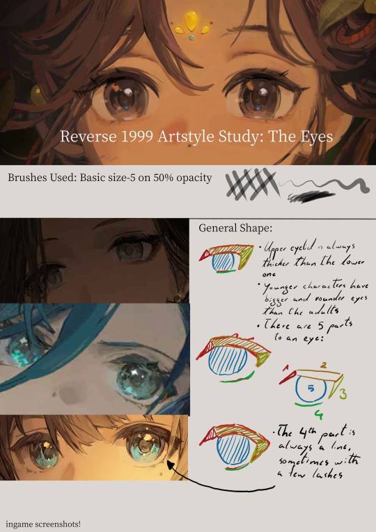
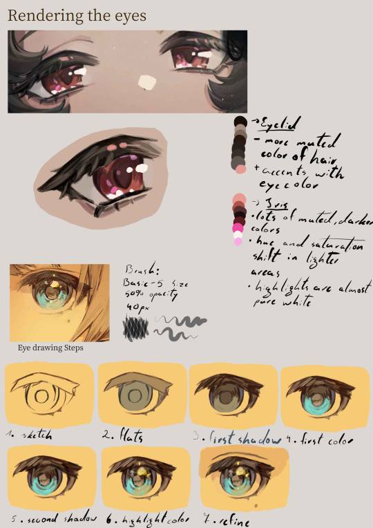
Disclaimer: I do not actually know how they paint the eyes,this is just me guessing their process purely from observations
Transcript:
General Shape:
- Upper eyelid is always thicker than the lower one
- younger characters tend to have bigger and rounder eyes than the adults
- there are five parts to an eye: 1. the upper eyelid corner(towards the nose) ; 2. the upper eyelid main part ; 3. the upper eyelid corner at the back ; 4. the lower eyelid ; 5. the iris
Eyelid:
- more muted color of the hair + accents with saturated eye color
Iris:
- lots of muted darker colors
- hue and saturation shift in lighter areas
- highlights are almost pure white
Eye drawing Steps:
sketch
flats
first shadow
first color
second shadow
highlight color
refine
#art style#art study#eye#eyes#anime eyes#godofart#r1999#r1999 fanart#reverse 1999#drawing guide#guide#art guide#art tutorial#drawing tutorial#fanart#art#digital art#illustration
2K notes
·
View notes
Text


Here are some painting tips, as promised. I hope they will help beginner artists!
Composition
Position of characters on the sheet
Choose the location of your character to be beneficial to the appearance of the art in general, you can accentuate the important places where the viewer should look first by using perspective and composition.
Tone sketch
Set the lights based on references, but adjust to your own, favourable lighting.
Contrasts come in many forms. Contrast in color (warm and cold), values (dark and light), shapes soft and hard, straight and curve, etc.
Less is better. Work on the details of the most important part of your work while cutting down everything else. If you do strong detail in one place, don't forget to add looser detail in another so the viewer's eye can rest. For example: If you are detailing a portrait, don't detail the background as much. Next to a place of high detail, there should be a place of low detail so that the picture does not look overloaded.
All in all, you can twist and break perspective, anatomy and shapes to convey your idea better. No rules are made of steel, they should support your imagination, not restrict it
Anatomy
Break down objects into simple shapes to arrange them in space.
Check references! plasticity comes first, then structure (muscles are important, but proportions and line of movement come first).
Take a photo of yourself, you will be able to understand how to perform your pose naturally. Color/light.
Light is part of the composition, put it in a way that highlights the important things. Air perspective
General rules of composition. From the general to the particular, first prepare the general scene, correctly place contrasts and accents, make everything important in contrast, and take the unimportant into an aerial perspective. (aerial perspective, or atmospheric perspective, refers to the technique of creating an illusion of depth by depicting distant objects as paler, less detailed, and usually bluer than near objects.)
When all the points are ready we can start working out the details.
When all the details are finished again it's back to the overall picture, looking at it from a distance. Check if the accents you wanted to draw attention to are working. They should have the highest contrast. Check if the contrast is not created by objects on the edges, where you don't want the viewer to pay attention. For example, if you are painting a portrait then the focus should be on the face and not on the details of the clothes or details in the background. (You can always convert the image to black and white and check the contrast)
Save the stages of your work to check against the initial idea and see what things have changed for better or worse!
#digital art#art tips#beginner artist#small artist#digital artist#art advice#art tutorial#art guide#step by step#drawing basics
757 notes
·
View notes
Text


Alastor 3/4 (right) expression sheet.
I’m gonna make a 3/4 (left), profile, front, and back sheet too. There might be another sheet or two of the 3/4 right because I have a lot of screenshots and I like all his silly little expressions ❤️
(I want to do this for all the characters, but WOOF, it’s a lot of work so it might take a while).
Here’s my Masterpost where I have more character drawing guides and resources!
#I like his stupid little face#so many ways to wear a smile ❤️#love this freak so much#drawing guide#art guide#art reference#hazbin hotel#alastor#hazbin alastor#hazbin hotel alastor#the radio demon#my stuff
563 notes
·
View notes
Text


BEHOLD!!!!!! my mystical archive of Horse Knowledge.
disclaimer: you can stylise horses however you please. I myself am in the mlp fandom. I myself draw ponies with small upturned snouts tiny nostrils and forward facing eyes on occasion. this is for MORE REALISTIC HORSES!!!!! another disclaimer I am a hobbyist and these are based on casual studies!!! go forth and horse it
167 notes
·
View notes
Note
Your Cas sheet was SO helpful! Is it possible to do a Dean one?
sure thing! :)
starting off with the usual:

remember that those freckles are essential!
he has some stubble, but it's optional and i keep it less prominent than cas's stubble anyways
on with the rest!

again, like cas, the hair tuft at the front is just something i think is cute and fun
one more thing—i usually draw dean's hair parting on his left but sometimes i forget or just think it looks better for the drawing on his right (same with cas but the opposite!)
hope i could help and have fun!! :)
#spn#supernatural#spn fanart#supernatural fanart#dean winchester#dean winchester fanart#fanart#art guide#asks
655 notes
·
View notes
Text


Guides for drawing Stobotnik that I made for myself and thought looked cool enough to post
Additional thoughts/guide stuff below:
- basic shape language!!! I thought it was fun that Stone (the square) is a rock for Robotnik in both his cartoonishly evil (triangular) and cartoonishly depressed (round) stages of life. I love designs for Stone that lean into this
- when translating their faces into a cartoonier style, I realized that when their facial features are exaggerated, Robotnik takes on an intrusive look as opposed to Stone’s more reserved look. All of Stone’s features are closer to his face, whereas Robotnik’s are very pronounced. This could be played into to represent Robotnik’s very assertive personality, as opposed to Stone’s (for lack of a better term) submissiveness. (I figured this would be a useful observation since they’re constantly in each other’s faces anyways)
- Stone has beautiful lips. Like not even in a weird way. I’m jealous. Don’t steal them from him when you draw him, lest you taint perfection. Also how does he have a completely solid beard? Does he just have great genes? I’m confused
- it’s just my personal interpretation that Robotnik has gray eyes. When I was researching for this guide I actually couldn’t tell what color his eyes were. If you want a more “canon” eye color, Jim Carrey’s eyes are hazel (green with a brown ring around his pupils). Or you could just go with black. Or brown. Or blue. I’m not your boss
- I wanted to make the second Robotnik rendered better but I was running out of steam oopsies
- even though I was tracing screenshots from the movie, I barely had to alter the expressions of the actors to make this guide interesting to look at. They’re very good at emoting. So, if you’re struggling to draw them like I am, I would trace/reference some screenshots as practice! Speaking of, here are the images I used:


Hope this helps someone
#sonic#sonic movie universe#sonic 3#dr robotnik#Eggman#dr Eggman#stone x robotnik#ivo robotnik#agent stone#stobotnik#art guide#shape language#my art
348 notes
·
View notes
Text

Quick little bonus tip if you wanna experiment with my style! When handling the transition from pixel to vector art, it helps immensely if you line up the vector shading and lines with the edges of pixels! This can help prevent that dreaded "mixel" look many tend to avoid in traditional pixel art.
#pixel art#digital illustration#digital art#furry artist#artwork#my art#illustration#art style#art guide#art tips#art help#art advice#art tutorial#pixelguzzler#guzzy
153 notes
·
View notes
Text
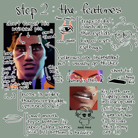

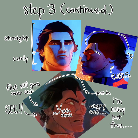
miguel art guide i made [smiles with broken teeth]
sorry for the overload of notes for step 2 😭
pt. 2
#marsh’s guides#miguel o'hara#across the spiderverse#atsv#spiderman#spiderverse#miguel ohara#spiderman 2099#art guide
1K notes
·
View notes
Note
Hello! First of all I love your art, second, I have a question, what canvas size/resolution do you usually use for your illustrations? Like i.e. a minimum of 1500 x 2500 pixels or something like that.
Asking because it seems like I always end up drawing with a resolution either too low or too high and it could be useful to know what other artists do.
Hello! I’m happy you enjoying my work, thank you<3
I use different canvas sizes for each type of art! Usually it is:
1024 * 347 for eyes covers


3000 * 4000 for portraits

4000 * 3000 or higher for ref sheets
(I usually work on horizontal canvases, but sometimes I may pick vertical ones as well)


And 2800 * 2800 for square chibis! I used to pick a 1200 * 1255 canvas size for them before but as time went on, my chibis became more detailed and more space was needed:


However, often even when I choose the right canvas size, I'm constantly editing it during the process! I can enlarge the canvas size if I don't have enough space for some details (usually it’s horns, wings, long tail, etc.), or reduce it if there’s too much empty space
77 notes
·
View notes
Text


Background art tutorial for people scared of perspective!
228 notes
·
View notes
Text
How to draw Manga/Anime heads in the rev1999 style!


it's not a rendering tutorial and just the construction of the female head for rev1999(and other anime art style really)
the images have alt text!
I highly recommend practicing by trying to replicate the heads in the wallpapers they provide with this method:
1. draw in the guidelines on the image itself(yes,basically tracing,bare with me)
2. hide the construction and draw the same guidelines beside the image
3. compare to the first construction lines
4. now,with the mistakes in mind,hide both the constructions and the image and try to replicate the constructions from memory
repeat 3-4 until satisfied
you should be able to remember how to draw the heads even without reference after doing this a bunch of times! ヽ(o^▽^o)ノ
#the next tutorial might be about the rendering#or the male heads#really depends on my mood ngl#also this is kinda a sequel to the eye tutorial :D#reverse 1999#rev1999#r1999#art#art tutorial#tutorial#anime#manga#anime head#manga head#head construction#step by step#art guide#guide#step by step guide#art style#art style analysis#digital art#illustration#kaalaa baunaa#tooth fairy#jessica#godofart
158 notes
·
View notes
Text

a brief guide on drawing amblyopic eyes
(red is the unaffected eye, staring forwards, blue is the amblyopic eye)
more below the cut, all text
now, amblyopia is a pretty wide range of eye drifting which may cause anything from very mild eye drift to extreme drifting and even blindness. typically one eye is far weaker than the other, or even technically blind due to being ignored by the brain. it often causes blurred vision and poor depth perception as well. these are the most common depictions of the most common one eyed amblyopia issues, though crossed eyes and eyes pointing in different directions appears in some as well. it can be caused by injury, but most commonly is a condition seen from birth.
i personally have extropia. i find the easiest way to properly depict amblyopia is to give the stronger eye (seen here in red, looking forward) a focus. the lazy eye typically will not be focused, no matter the direction it drifts. i should note, for some, amblyopia gets worse when tired (like me), becoming more pronounced. typically, however, it doesnt cause harmful side effects beyond stigma. head tilting, squinting, and closing one eye is a common sign.
the pupils do NOT change size. that is a concern and should be brought up as an emergency unless the patient has always displayed this and is already diagnosed with a reason as to why the pupil may be of a different size. the pupils react to light the same, but the affected eye tends not to move with the stronger eye.
484 notes
·
View notes
Text

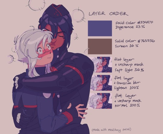
#signalis#elster signalis#ariane yeong#lstr 512#arielster#biruesque art#doodle#comic#art guide#i coudl make more of those kinda guides later but i never know how to put things to words#so it's just a bunch of layer settings and “go fuck around”
265 notes
·
View notes
Text

I'm currently going through and making myself some drawing guides for the Hazbin characters, but I just want to share my Alastor face sheet because fnlnjgelfjlekgn I can't with this guy, I love him so much.
#hazbin hotel#alastor#hazbin alastor#hazbin hotel alastor#the radio demon#my art#fan art#drawing guide#art guide
621 notes
·
View notes