#Article Generator
Explore tagged Tumblr posts
Visit Tumblr Blog
Explore Tumblr blogs with no restrictions, modern design and the best experience.
Last Seen Tumblr Blogs


Fun Fact
Premium Tumblr themes are available from anywhere between $9 to $49.
Text
you know, you know. no gods, no masters, no kings on pedestals. everyone is fallible. death of the author. you know! you are balanced about your intake of media - you allow the wiggle room, the grace, the gratitude, the skepticism. nobody above criticism.
but still. a weird gut-punch feeling, something akin to betrayal. you read the article. surprise! an author you love is actually: a serial fucking predator.
well, shit. what now. no, you knew he was a person (all people are), but now you're wondering - what have i overlooked by accident? what messages have i internalized that are strange and cruel? and also, like, what the fuck?
his actions lay a thick glaze on top of everything. like each place is now ruined, opaque in a new way. but okay, fine, you've done this before. you knew better, right? you've been betrayed by many a cherished childhood author.
still, this stickiness. fuck. can you pick up that book again. will you read it to your children. you've recommended it to others - will you ever do that again? and of course, of course, no parasocial relationships. you were theoretically above this kind of sentiment. but the artist informs the art, right.
so it's not something as clear-cut as feeling he owed you, specifically (a stranger) better behavior - just that you kind of, in a distant and odd way... sort of trusted him to do better. it's not like a real trust or something speakable, just the faint hope that the product (good books) was a thin representation of the soul. now it feels like the product (good? books?) was a mask. in some small or insignificant way, your previous support of this person lent them power. your money and your time and your laughter.
and the thing is - you have this terrible, echoing sensation. how many times will this happen? over and over. you find out that the singer you love is actually a predator. you learn over drinks that your favorite high school english teacher is in jail for what he did to her. you listen to the news idly and suddenly discover that a woman you used to idolize has been abusing her kids for an actual eon.
what can you touch without the static melting off. you can't even really complain about it too much (you were supposed to know better, and besides, you don't want the same re-split "it's not your fault, love what you love" basic advice), but now it's here. somehow, it feels like - you let him into your life.
it's not that things need to be pure or an artist has to be like, endlessly perfect, mindful. demure. it's more just this terrible truth that has been replayed through your veins so often it feels criminally vain. power corrupts, absolute power corrupts absolutely. did you want any one person to be worth that power?
it's just that he wrote books where he seemed to understand that. he seemed to know about hierarchies and unfair systems and bigotry and privilege. you thought they were books about what it means to struggle. you thought they were about having power and still using it for good rather than for control. he spooned you a narrative of being a good guy, a kind soul. you fucking bought what that fucking monster sold.
maybe that's why they were fantasies, after all.
#spilled ink#warm up#oh im .... sick to my stomach.#i talked to him. like ....... we talked. that man interacted with my poetry and writing.#that article.... gutwrenching. i am so sorry to everyone he's ever even been in the room with.#i feel.... like... unbearably. sick.#he acted like he was cool and friends with me!! we were cool internet writers together!!!!!#i feel sick for even having been polite to him.#i ...... am experiencing something so fucking complicated.#i wonder how many of u are feeling that too. like ''oh i sent him an ask and he was funny and sweet''#THATS HOW THEY GET U. ..... and YES I KNOW!!!#i am so fucking well-read about parasocial relationships. it would just be nice to like. trust that someone ISNT#hiding a huge fucking background of BEING A COMPLETE MONSTER. LIKE WHAT THE FUCK.#by the way i am not part of a fandom. this is “what the fuck i accidentally supported a rapist” not#“but my showww”. like i care far more about like. the human cost.#but also like... people are people. idk i saw a take on here about how nobody should mourn the books#and idk. people almost always reply to any scenario with their personal experience first -#''i knew him'' or ''wow i was just at that store'' or ''i grew up there'' or whatever. because that is how we establish connection &#emotional weight. that's just... a person thing. and there is a difference between 'oh this guy is a monster'' & the feeling of:#he's been a monster and i SUPPORTED THAT. i CELEBRATED him. i !!! a fucking victim myself!!!!!!!!! SUPPORTED . HIM.#i am sick. i feel so much pain for her and everyone he's ever hurt. saying ''the books are ruined'' is i think ... like how people say#they're shocked and disgusted by him. (obviously there's nuance here. im sure there's some creep doin it wrong. but u know. in general)#idk..... im an author. i understand my work is in your life in whatever small way. i understand that connection. it's real.
2K notes
·
View notes
Text
Do you guys notice how when Shawn Fain, president of the United Auto Workers union, started planning a general strike, he did it by a) targeting his messaging towards unions with the ability to safely and effectively strike in large numbers, b) laid out a clear, actionable plan for those unions to follow (setting contracts to all expire at the same time, since many unions cannot strike while under contract), c) is using union contracts to set clear, actionable demands that can be met in order to gauge success and provide an end goal, and d) started organizing FOUR YEARS before the proposed strike date to give people the chance to plan accordingly, because it takes a really freaking long time to get tens of millions of people organized?
You notice how he didn't do it by slapping a message on Twitter saying 'hey nobody go to work on Monday, that'll really show 'em'?
#those 'monday is a general strike stay home if you can!!!' posts are SO performative and they really annoy me#like. you MUST know you can't organize a general strike of tens of millions of people by sharing an infographic on twitter. Right?#don't even get me started on the most recent one that was like 'we understand the last strike only gave one day of notice'#'so this time we're giving you two! strike is on tuesday everyone don't forget!'#like GENUINELY was that supposed to be a joke#the linked article also touches on how difficult actual organizing a workplace is which is nice#because they mention previous failed attempts in which organizers basically just handed out leaflets#and assumed the benefits would be obvious. which i think is basically the equivalent of posting an infographic on twitter#which is to say - not effective at all. Organizing is a LOT of work! Running an effective union even more so!#labor rights
6K notes
·
View notes
Text
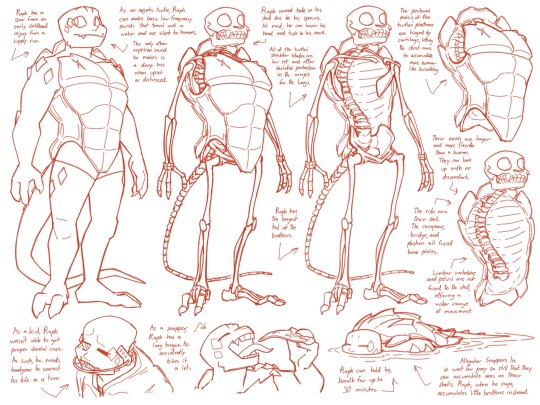
Raphael skeletal anatomy! Click for better quality
Turtle shells are really funky, and in real life turtles, their shoulders and hips are actually fused to the shell and form immobile shoulder and pelvic girdles. Their scapula (shoulder blades) therefore are pushed almost fully downwards to give turtle arms that elbow up look. Most of their muscles are attached via ligaments to their plastron and limbs, with their large neck muscles reaching back along their spine with very minimal muscles on their sides or back.
Because of how funky their bones are, I tried to find a good middle ground between the brothers’ humanoid shape and mobility vs. their original species limitations. Their shoulders are very human, with their collarbone instead connecting to the top of their plastron rather than a sternum (flat bone in the middle of the ribs) with the addition of their shoulder blades resting much lower than a humans and protecting the open space in the armpit of their shell (rather than being set on their back under their carapace). Their necks can stretch slightly longer than a humans and have some extra mobility, on account of how they usually sit curved and tucked into their shoulders. Their pelvises and lumbar vertebrae (hips and lower back) are not fused to their shell to enable them to twist their torsos some.
As for how flexible the show depicts their shells to be… suspension of disbelief! I like to keep the idea of their shells being turtle like, so even though they’re all bone, I’ll allow cartoon physics to bend them some.
Additional info on Raph: The spikes on his shell are mostly bone. Also (something I didn’t draw because it was only after I finished this that I was able to find a picture of an alligator snapper shell bone without its scutes) there are small gaps between his pleural bone plates (middle of shell) and his peripheral bone plates (edges of shell). The scar on his shell is probably from a bone deep injury, as broken scutes shed away, but because scars don’t grow with a person, the injury is small enough that it probably happened so long ago that Raph can’t even remember it.
This is all just my speculation, so feel free to disagree or expand upon these ideas!
[General][Donnie][Leo][Mikey][Splinter]
#rottmnt#rise of the teenage mutant ninja turtles#rise of the tmnt#rise raph#rottmnt raph#speculative biology#skeletons#I had to skim through so many scientific articles for this#turtle evolution and turtle dissections and turtle development#my general understanding of anatomy for art was not prepared for the amount of scientific detail lol#looking at my search history thinking I’m an exotic pet veterinarian but I’m actually just drawing tmnt comics#tcest dni
2K notes
·
View notes
Text
“When you start with the Beatles, your résumé looks pretty good,” Chris O’Dell says. A new documentary charts the extent of that CV, as a music manager with bands including Fleetwood Mac, Genesis and Santana, but it all began with a chance encounter in Los Angeles in 1968.
Derek Taylor was heading publicity at the Beatles’ company, Apple Corps, and O’Dell was a low-level assistant in radio promotion. When Taylor suggested she come work at the Apple office in London, she dropped everything and moved halfway across the world. “Paul [McCartney] was there every day organising everything,” she says, on the phone from her home in Arizona. “One day he came into my office and said, ‘Chris, should we use paper towels or cloth towels in the bathroom?’ That’s how detailed he was.”
(source)
1968 Paul I am obsessed with you
#paul in general of course#but 1968 paul is so compelling#paul mccartney#chris o’dell#anyway a new chris o’dell documentary!!#the whole article is good#george going into the garden and john joining him#getting stared at by bob dylan#the linda interview??
149 notes
·
View notes
Text
every time anyone that's even slightly critical of C3 calmly writes a post that's longer than 750 words in an attempt to unpack what they feel is not working in the campaign or what's happening in the fandom, there's a rash of its defenders going "why are the haters always writing these long posts all the time, we don't need anyone to be writing novels, why is the post so long. it's so ridiculous that anyone is writing essays."
personally, especially if I was trying to position myself as having intelligent and complex opinions and capable of paying attention to episodes that are five hours long on a weekly basis, I would not admit I thought 1.5k words was dissertation length.
it's especially funny because many of the same people keep stamping their feet that critics never explain their perspectives or stances, then they're mockingly dismissive when doing so doesn't fit into a tweet.
not to make it sound grave, but it's anti-intellectual, it's simplistic. above all: it's juvenile, childish, asking to be treated as a child. wah, so silly anyone could possibly have a meaningful thought that requires enough space it doesn't fit on my phone screen at once.
#For the record. This post is 200 words. 750 words is generally three pages. 1.5k words is standard feature article in journalistic writing.#No wonder the cutesy “she's so silly. she's a girlfailure. [babytalk version of every character's name]” took off in those spaces. Children#No wonder it feels like only a handful of people write meta in defense of C3 or positively about it. Many of its defenders are like this.#I very rarely agree with what people write about C3's themes or construction or arc but at least those people write.#Unlike this sort. Who have a negative reaction whenever a post can't fit into a tweet thread.#No wonder the fandom discussion is of such poor quality this campaign.#Critical Role things#CR discourse
181 notes
·
View notes
Text

#the pitt#frank langdon#mel king#these are my personal thoughts#i am having fun with the whole fandom and all the ships tho they are all wonderful to read and write about#i do have some i dont like which is my business and my business alone uwu#and i have some i like way more but ye uwu#maybe ill make a similar post about the pitt ships in general#but the fucking people writing articles about the pitt fanfics are fucking pissing me off#and if people get way up in my business on tumblr about fandom stuff ill do what i did last time and delete my blog and vanish for years
132 notes
·
View notes
Text
This has been an absolutely horrible couple weeks for the Jewish and Israeli community, so I want to throw in at least a tiny bit of hope in here. Amina Hassouna, the Bedouin girl who was severely hurt in Iran’s missile attacks, has been recovering well and seems to be in good condition! She is described as being ‘fully conscious’ and ‘communicating and smiling’. Two bomb shelters have been placed in Al-Fura, the town that she and her family are from, as well.
#ישראבל��#ישראל#jumblr#(I know technically it’s not but I think people will be happy to see this)#also#putting this in the tags— I don’t want to focus on politics because this news is more important right now#but I do truly hope that this will initiate stronger moves towards protecting Bedouin towns and villages#many of them are unrecognised and do not have bomb shelters despite being there for decades#the treatment of Bedouins by the government in general needs to vastly improve#hopefully there will be proper steps in the future towards improving conditions for these towns#like I’m trying to be mild about this because it’s a subject that makes me very upset and I don’t want to go on an angry rant lol#like I said— hopefully things’ll to start change in a few years if the next government can please form a coalition not full of crazy people#if you want to read more about Amina and her family the Times of Israel has quite a few articles btw
435 notes
·
View notes
Text
June 25-30, 2024 - ???

Not for the first time [x] [x], Supernatural decided to increase everyone's blood pressure by trending for absolutely no reason. It's been jumping at random trending slots on and off, but as far as I can tell, there's no specific source, other than the universe hating to see us at peace.
Unless- @mishacollins do you know something we don't?
#why is supernatural trending#i wish i knew#might be tumblr just messing with us#or it's in preparation for some incoming major post-spn event#there've been some articles and general spn-posting but nothing major enough to cause the trend looks like#ofc if something changes i'll make sure to post#supernatural#spn
478 notes
·
View notes
Text
a lot of these news articles are also like what possibleee reasonnnn would jorge martin have for wanting to jump ship at aprilia when ai ogura has been sooo goooodd and like um guys jmartin confidence guy of the universe has had a bunch of escalatingly terrible injuries on aprilias since february, AND marco bezzecchi has had genuine massive problems with the bikes stability, AND they lost their tech director that used to develop for ducati for fucking KTM’s old one, AND honda is over here staring down reg changes with a FATTTT stack of cash (plus that same old ducati tech director…), AND jmartin makes career decisions with his pussy first and his brain later
#i do think it’s funny that martin’s camp just loves to leak contract deets super publicly it tickles me#callie speaks#like. idk it’s gonna burn some bridges but he’s a confidence guy so this isn’t terribly incongruous with his general character#ans it might even like. work out for him. even if i don’t want him at honda like stay awayyyy#‘a lot of these articles’ okay it’s simon patterson’s that i got mad at#mgp
121 notes
·
View notes
Text
I think we could all stand to unpack our feelings about societal standards of Intelligence and why it's important to us that someone else is less intelligent & capable
#i'm tireddddd#i know many of these ai posts are made jokingly but#it makes me tired how quick people are to make fun of others for needing help with communication#as though it's completely absurd that some people might need help writing an email or putting together a shopping list#missing the more pointed and relevant critique of ai writing which is that it is mainly a mediocre tool for companies to save on costs#at the expense of both their employees and the general public#that the advertising industry has become so bloated and inescapable that there's a robot made to write bad ad copy#and useful articles are buried under ads disguised as articles#and that most writers were not making a living off their writing before and were doing it out of enjoyment#meaning ai writing is missing the point and is mainly useful to grifters#all in all i do not care some students are cheating. that has been going on since the beginning of time#i care that employers are exploiting people
91 notes
·
View notes
Text

new promo shot of rose and mike for junior taskmaster (via the guardian)
#taskmaster#junior taskmaster#rose matafeo#mike wozniak#been looking forward to this for ages!!#apparently the official date is still tba but the article is about autumn releases in general#so hopefully it shouldn’t be too long now
205 notes
·
View notes
Text
To Boldly Sew: The Creation of Star Trek's Iconic Wardrobe
Gene Roddenberry’s arguments with NASA, costumes crafted from shower curtains, male characters in miniskirts, and why the gold command uniforms were actually green—this is the story of Star Trek’s groundbreaking wardrobe and the visionary work of the man behind it, Bill Theiss.
If you’d like to read the formatted article with easily accessible references, you can also find it on AO3.
During the production of the original Star Trek, the creative team faced numerous challenges, the most persistent being, unsurprisingly, the show’s limited budget. These restrictions had a significant impact on many aspects of the series, including one of its most crucial visual elements: the wardrobe.
Each week, the costume department was tasked with creating original outfits for the show’s characters. Alien civilizations had to look distinct and believable without distracting from the storyline—all while staying within a tight budget. To achieve this, the team employed clever tricks, such as repurposing and dyeing old uniforms, turning garments inside out, and even fashioning costumes from unconventional materials like vinyl shower curtains.
"Sometimes a show will call for 30 or 40 costumes," explained Star Trek’s costume designer William "Bill" Theiss. "And since we film back to back, that means I have to design, get approval from the producers and director, and construct the costumes in six to eight days." [Source]
Commander Spock and Lieutenant Tormohlen don "protective suits" fashioned from shower curtains as they investigate the mysterious death of a mannequin crew member. (Season 1, Episode 4, "The Naked Time.")
Theiss was a key figure in shaping the visual identity of Star Trek’s universe. Over the course of the show’s three seasons, he designed costumes for a wide range of characters, from blue-skinned Andorians to the infamous Orion slave girls, and even the Nazi-inspired inhabitants of the planet Ekos. (Interestingly, the episode Patterns of Force, featuring Ekos, was banned from German television until 1995 due to its controversial themes.) [Source]
Theiss first met Star Trek creator Gene Roddenberry while Roddenberry was developing the show’s pilot. At the time, Theiss had gained attention for his innovative work on the science fiction play The Veldt, based on Ray Bradbury’s short story of the same name. This caught the eye of Star Trek writer Dorothy Catherine Fontana, who introduced Theiss to Roddenberry. By then, Roddenberry had already interviewed over a dozen costume designers but had yet to find someone who could bring his vision to life. Theiss’s creative approach, which often involved crafting unique costumes from unconventional materials, immediately resonated with Roddenberry. Their collaboration would continue for decades, even though, amusingly, Theiss never learned how to sew. [Source]
After the original Star Trek series was canceled, Theiss and Roddenberry remained close collaborators, working together on various projects until Roddenberry’s passing in 1991.


Left: William Theiss adjusts Susan Oliver's costume on the set of the 1965 pilot episode, "The Cage."
Right: William Theiss and Leonard Nimoy on the set of Season 2, Episode 26, "Assignment: Earth" (1968).
When designing Star Trek’s now-iconic multi-colored uniforms, Roddenberry drew inspiration from the color-coded uniforms used on American naval vessels, where quick role recognition was essential in low-visibility environments. As a former military pilot during World War II and later a police officer, Roddenberry had firsthand experience with structured, hierarchical organizations. These influences shaped not only Star Trek’s command structure but also its visual design. [Source]
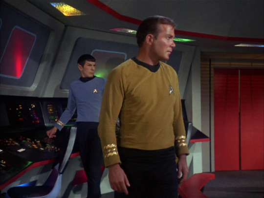
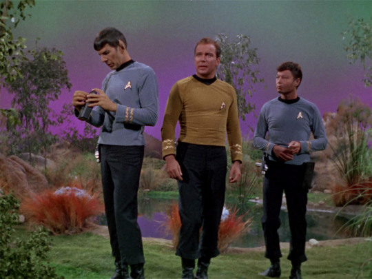
Each division was assigned a distinct color: engineers, communications officers, and security personnel wore red; medical staff and scientists were dressed in blue; and command officers wore—believe it or not—green. (But more on that later.) All uniforms were paired with dark ash-colored trousers and high boots.
Star Trek is not typically associated with realism, which makes it surprising to learn that NASA was involved in the show’s production, offering advice to ensure it was "scientifically believable." Among their suggestions was the idea that 23rd-century astronauts might wear form-fitting jumpsuits. However, Gene Roddenberry dismissed the concept, humorously referring to the design as “long underwear.”
NBC, on the other hand, had entirely different priorities. The network insisted that female Starfleet officers wear more revealing attire, a demand that clashed with Roddenberry’s vision of a future where women were treated as equals to men. In the first pilot episode, The Cage (1965), Roddenberry boldly dressed female characters in pants—an unconventional choice for 1960s television. However, after much debate with the network, a compromise was reached: miniskirts. Highly fashionable at the time, they were paired with shorts and dark tights, blending contemporary trends with Star Trek’s futuristic aesthetic. [Source]
Captain Pike and a group of serious women in pants protect the heroine from an ass-headed very wise alien. The first pilot of Star Trek, "The Cage" (1965).
Years later, when NBC faced accusations of sexism and objectifying women, Nichelle Nichols, who played Uhura, defended the wardrobe choice in a BBC interview. She explained that the miniskirts weren’t unusual or inappropriate for the era:
“I was wearing them on the street. What's wrong with wearing them in the air? I wore 'em on airplanes. It was the era of the miniskirt. Everybody wore miniskirts.” [Source]
Grace Lee Whitney, who portrayed Janice Rand, echoed Nichols’s sentiment, adding that she “didn't think the women should be in pants” and that she wanted to “look like Flash Gordon” on screen. [Source]
Meanwhile, costume designer Bill Theiss had his own, more subtle approach to creating “revealing” costumes.
“He felt that revealing non-sexual flesh (the outside of the leg, off one shoulder, the back) promised that the viewer would see more — but they never did,” explained screenwriter D.C. Fontana, citing the gown worn by Lt. Palamas in Who Mourns for Adonais? as a prime example. [Source]
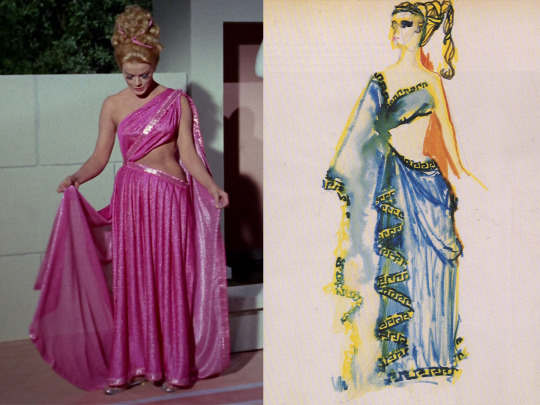
Lieutenant Palamas's "ancient Greek" dress from the episode "Who Mourns for Adonais?" alongside William Theiss's original sketch for the design.
When designing the original Star Trek uniforms, Theiss was tasked with creating something that reflected military influences while also looking futuristic and remaining inexpensive to produce. His approach was practical:
“As for where I get my ideas from… well, I don’t get them from my dreams or anything. Mainly, I get them from fabric that I see that’s available; I look for interesting patterns in the material itself,” Theiss once explained. [Source]
For the first two seasons, the Star Trek uniforms were made from velour, a newly invented fabric that was cheap, easy to maintain, and had an appealing sheen under studio lights. However, velour had its drawbacks: it tore easily (as evidenced by Captain Kirk’s frequent shirt-ripping battle scenes...) and shrank significantly after dry cleaning. Since the costumes had to be cleaned after every episode, viewers may notice that the uniforms became progressively tighter throughout the first two seasons. By the third season, velour was replaced with double-knit nylon, a more durable fabric used in professional baseball uniforms.
Left: Kirk's velour shirt from Season 1, Episode 10, "The Corbomite Maneuver." Right: The same shirt in Season 2, Episode 22, "By Any Other Name." Shatner is diligently sucking in his stomach.
This brings us to another interesting aspect of the original velour uniforms—their appearance on screen.
“It was one of those film stock things,” Theiss explained. “It photographed one way—burnt orange or gold. But in reality, it was another; the command shirts were definitely green.” [Source]
So, what color was Captain Kirk's uniform really? In truth, Kirk's uniform—like the rest of the command crew's—was olive green. However, under the bright studio lighting and the quirks of 1960s film stock, it appeared gold on screen. The greener hue becomes more noticeable in scenes filmed on location with natural light. The difference is also evident in photos of the original uniforms on display, such as those taken at an exhibit in Detroit, USA. In one image, taken under dimmer lighting without flash, the fabric looks closer to its true green color; in another, taken with flash, it appears more golden.


Left: Kirk's velour shirt photographed without flash—olive green. Right: Kirk's velour shirt photographed with flash—yellow gold.
This might come as a surprise to Star Trek fans, but it makes sense when you consider that Kirk's alternate uniforms—the wrap-around tunic and dress uniform—were distinctly green. This wasn’t an intentional design difference; those variations were simply made from a different fabric that didn’t react to light the way velour did.

“The problem is that a lot of my work is seen on screen for only two to three seconds, and even then, it might be in bad light or at a bad angle,” Theiss noted. “But then, you can't really justify taking two hours to light and block a scene just to showcase a costume.” The play's the thing, according to Theiss. "That's what it's really all about. It's not about the costumes." [Source]
The color discrepancy of the uniforms became an interesting challenge when animators began working on Star Trek: The Animated Series in 1973. They had to decide whether to depict the uniforms in their originally intended green or the gold shade that had become iconic to audiences.
At the time of Star Trek's release, many viewers were watching on black-and-white televisions, making it impossible for them to discern the true colors of the uniforms. At the Kirk/Spock convention, @kiscon, I spoke to a longtime Trek fan who told me she had no idea what color the uniforms were when she first watched the show as a teen. For those fortunate enough to see the series in color, however, the command uniforms became strongly associated with yellow. As a result, changing the uniforms to their intended green in Star Trek: The Animated Series would likely have confused audiences who had grown accustomed to the gold appearance on screen.
Ultimately, the gold uniform was canonized in The Animated Series and used in all fan materials until the release of the Star Trek feature films. Meanwhile, the trousers—whose color had also been slightly distorted on film—remained their original dark ash shade.
Because of these discrepancies, fans often debate which version of the uniform to follow when cosplaying or creating visual content. Many cosplayers choose to replicate the original olive-colored velour, trusting that proper lighting will naturally recreate the golden appearance seen on screen. Others opt for the now-iconic gold shade, reflecting the way the uniform has been depicted in official materials for decades.

Star Trek: The Animated Series (1973).
Ironically, NASA was right in its assumption that jumpsuits would become the norm for astronauts, and Roddenberry was forced to use them in the first feature-length Star Trek film, 1979's Star Trek: The Motion Picture. The multi-colored shirts were rejected by the studio as too garish, and the miniskirts worn by Uhura and most of the female crew members were already considered a relic of the sexist 1960s by 1979.
William Theiss, who designed the costumes for the original series, was too busy with other projects to work on the film, so Gene Roddenberry brought in a new costume designer, Robert Fletcher, who created the Starfleet uniforms now remembered as the worst in the franchise's history. In an effort to avoid comparisons to military uniforms, the studio opted for muted tones ranging from pale blue to dirty beige and nude shades. The result? The Enterprise crew looked more like spa staff than starship officers, and some background extras in nude-tone bodysuits appeared practically naked on screen. Not only did these uniforms make it impossible to distinguish the characters' ranks and departments, but they were also surprisingly impractical. The suits were sewn onto the actors' shoes, meaning they needed an assistant every time they went to the bathroom.
Star Trek: The Motion Picture (1979).
Luckily for us all, in the next film, Star Trek II: The Wrath of Khan (1982), it wasn’t just Khan who was filled with rage—the cast themselves rebelled and outright refused to wear the dreadful jumpsuits again.
Despite the failure of his design, Robert Fletcher remained as costume designer for the next three films, promising changes. In Star Trek II: The Wrath of Khan, the uniforms returned to a more military style, with the lead actors wearing maroon jackets with overlapping lapels that they could dramatically unbutton if their character was meant to look tired or stressed. If you look closely, you’ll notice that these maroon uniforms were actually redyed and slightly modified versions of the jumpsuits from The Motion Picture. The reason for the maroon color? It was the best shade that worked with the existing fabric from the first film. [Source]
William Theiss, reflecting on Fletcher’s designs, commented:
“Bob Fletcher is a very fine designer, and I mean that very sincerely. We don’t design the same way, and there’s no reason we should—or could. It’s apples and oranges. But my personal feeling is, if you go to a structured, woven fabric and do the kind of tailoring and structuring he’s done, it puts those costumes back, historically, 500 years, with shoulder seams and shoulder pads of that type.” [Source]
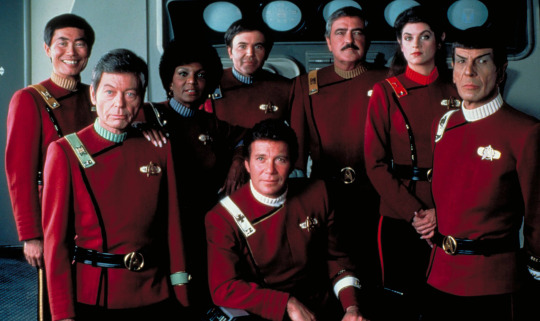
Star Trek II: The Wrath of Khan (1982). Everyone turned red with anger.
In Star Trek: The Next Generation, Roddenberry reunited with Bill Theiss, and together they decided to bring back the iconic miniskirts as part of the uniform, but with a twist—they wanted to make them inclusive. In The Next Generation, male crew members were occasionally seen wearing the same miniskirts or “scants” (a hybrid of skirts and pants), reflecting Roddenberry and Theiss’s vision of a future where gender norms no longer dictated clothing choices.
However, the social climate of the 1980s and 1990s wasn’t as receptive to this progressive idea.
“Having both actresses and actors in skirts was meant to diffuse any sexist accusations that might have been associated with designs from the old show,” Theiss explained. “It’s also fashionably probable that, 400 years from now, men would wear skants. Even so, there was usually a problem on the set,” he admits, “because some wisecracks were always made.” Theiss emphasized that he wanted his actors to feel at ease in the designs. “I won’t force an actor or actress to wear something they’re not at least 80 percent comfortable with.” [Source]

While Theiss’s designs were undeniably groundbreaking, he was known to be a challenging person to work with. Constantly preoccupied with time and budget constraints, Theiss had little patience for anyone—whether they were directors, producers, or even Gene Roddenberry himself. He was even less tolerant of people who approached him simply to praise or critique his work, or even just to say hello. His philosophy was simple: “Better to be rude than to delay filming.”
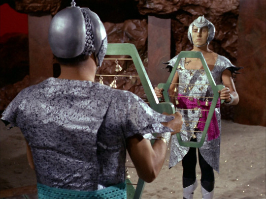
Actors, extras, and costume assistants often recalled how Theiss would dart around the set, frantically hemming, tucking, and adjusting costumes between takes. Many of the alien outfits seen on the show weren’t actually "costumes" in the traditional sense. Instead, they were often assembled from patches, ribbons, scarves, curtains, and wire, with actors being "stitched into" them directly on set. [Source]
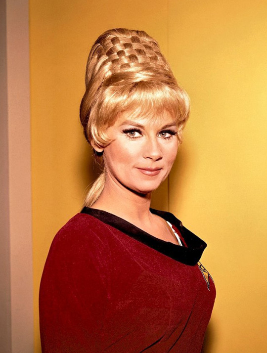
For example, Janice Rand's iconic beehive hairstyle was crafted from several wigs braided together over a cone. Grace Lee Whitney, who played Rand, recalls running back and forth between the dressing room and Roddenberry’s office with Theiss, constantly piling on more hair. Each time, Roddenberry would stare at her intensely, then declare, “Higher!” Whitney and Theiss would rush back to add more wigs until the hairstyle reached its iconic height. [Source]
One Smithsonian Institute employee, who worked with Theiss in 1992 while preparing for a Star Trek costume exhibit, recalls combing through the Paramount warehouse filled with racks and boxes of costumes. She was amazed to discover that most of the "costumes" were actually scraps of fabric neatly hung on a single hanger. Yet, when these scraps were sewn, tied, and pinned together, they became the iconic designs we now associate with Star Trek.
Andrea Weaver, one of Theiss’s fellow costume designers on the original series, remembers:
“Bill Theiss was a creative designer. His designs for Star Trek were original, rather than distilled from other sources or redefinitions of previous works. This is what I appreciated about Bill Theiss. I thought he was a truly unique and rare costume creator.” [Source]
William Ware Theiss’s contributions to Star Trek are legendary. His uniforms for both Star Trek: The Original Series and Star Trek: The Next Generation remain iconic, instantly recognizable even by those who aren’t fans of the franchise. His innovative, DIY approach to creating futuristic costumes brought a distinctive charm to the original series and left an enduring legacy.
Here are some of his most memorable designs:


Left: Season 2, Episode 11: "Friday's Child" Right: Season 3, Episode 13: "Elaan of Troyius"
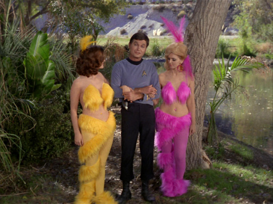

Left: Season 1, Episode 15: "Shore Leave" Right: Season 3, Episode 20: "The Way to Eden"

Left: Season 2, Episode 1: "Amok Time" Right: Season 1, Episode 23: "A Taste of Armageddon"


Left: Season 2, Episode 9: "Metamorphosis" Right: Season 1, Episode 6: "Mudd's Women"


Left: Season 3, Episode 5: "Is There in Truth No Beauty?" Right: Season 1, Episode 15: "Shore Leave"


Left: Season 1, Episode 23: "A Taste of Armageddon"Right: Season 2, Episode 16: "The Gamesters of Triskelion"


Left: Season 3, Episode 11: "Wink of an Eye" Right: Season 3, Episode 8: "For the World Is Hollow and I Have Touched the Sky"
#star trek#star trek tos#spock#kirk#s'chn t'gai spock#star trek the original series#star trek tng#star trek the next generation#star trek the motion picture#star trek the animated series#star trek the wrath of khan#articles#eldar of zemlya#captain kirk#james t kirk#behind the scenes#wardrobe#costume#costume design#costume department#filmmaking#gene roddenberry#bill theiss#william shatner#leonard nimoy
145 notes
·
View notes
Text
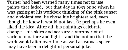
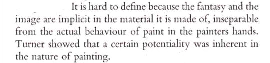
jmw turner + (im)permanence, change, & a painting as a process that includes both the creation & the eventual falling apart:

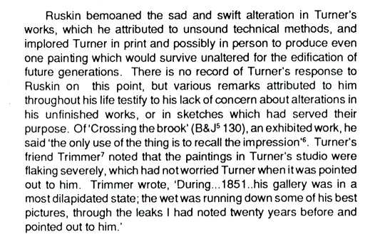
'Turner: Imagination and Reality', Lawrence Gowing // The cleaning of two paintings by Turner, Jim Dimond // 'Turner's Oil Paintings: Changes in Appearance', Joyce H. Townsend // JMW Turner's Paintings That Defy Preservation, Julia Margaret Lu // Color: A Natural History of the Palette, Victoria Finley
#once again who was doing it like turner!!!!!!!!! what's the opposite of wanting to live on forever in your art this is the opposite of that#smugly dying knowing that all things must fade & nothing is permanent & art is a ongoing work that will change constantly#it's genuinely such an incredible perspective on art to me. that everything from the act of painting to the act of falling apart is part of#the art itself & is even like. in the nature of the pain almost. absolute king.#thoughts#turnerposting#i will say if you're looking for one of those to read gowings is the best. not on preservation but just in#general on turner. for preservation townsend gets into the technical aspect pretty well i think#those are both longer more academic pdfs. the other links are articles one from the v&a which is good but limited & the other is only okay.#& the last is a book ofc
88 notes
·
View notes
Text
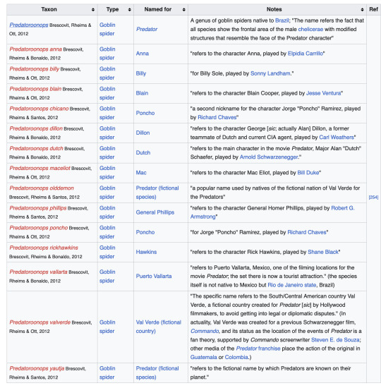
Some sons of bitches named an entire genus worth of goblin spiders after Predator (1987)
#Forgot about this I had it in my drafts from infodumping during my marathon session#This is a fun wikipedia article in general
767 notes
·
View notes
Note
What’s your thoughts on wui hei quan dogs?
This response is going to derail.
My thoughts about any and all non-western breeds are that English (or Norwegian, which are inevitably translated from English) sources are rubbish, and the current media environment makes it near-impossible to search for anything.
This isn't new. This is western dog fancy.
My search engines will organize my location-based results over the things i actually write in the search field. My English-language and Latin-alphabet search results will inevitably land me search results in English.
Which means that from my scope, the wui hei quan dog could be anything from a fabricated tiktok trend featuring a black "chow" puppy to a genuine heavily pigmented regional breed of Chinese farmdog ("garden dog" but I've been around this translation block before, i c u). I'm tempted to lean toward the latter, just because the google search results want me to exchange "wui hei quan dog" for "xiasi dog," and the regions those are supposed to originate from are some minor fifteen travel hours apart. Which is a little bit like exchanging a Norwegian buhund for a German schnauzer. A household/farmdog from comparable regions. Right?
We run into this problem pretty often. You've got your chows and your shar peis, but otherwise, not-noble breeds are easily overlooked. Pekingese were "stolen" from the aristocracy so they're novel, our knowledge of Japanese breeds curiously spikes after WW2. You can throw a racism argument and I agree, but let's add a class card as well. How many regional Chinese ratters do FCI recognize?
Our knowledge of dogs is limited by access, language, and curiosity. We have access, arguably, and to an extent we can overcome language barriers. But I'm not sure we're curious enough.
In short, I've got zero to no thoughts about the wui hei quan dog or wuyishan black dog, because I know nothing about it. I would love to have more thoughts. I'd love to hear about regional asian dog breeds and their quirks and their qualms and politics.
whats YOUR thoughts on the wui hei quan dogs?
pls tell me
tell me
#IN MY DEFENSE: ive had an inadvisable amount of that labrador wine. the wine with the lab on it. and i am unwell. coundlt drive a car lol#theres a whole side debacle here abt the regional differences between what your average DOG is#which will change depending on both generation and location#i ran into an issue with a sideblog a little while ago regarding an old newspaper article that listed and pictured quote#'chinese collies'#which by all definitions and by conformation would be - some type of central asian shepherds#and i listed them as CAS#but heres the thing: i dont know#and i dont know where to ask?#i dont know their origin or their modern corresponding iteration#i dont know where they from or what their type suggests#and it does genuinely worry me how my contact network diminishes#i used to have daily easy contact w ppl from Beijing and Shanghai through msn but now I've got? americans and a canadian-#- if i played my cards right.#maybe a hungarian IF IM POLITE#(and im rarely polite)#the point is: the answer is there if you know where to look#but im not sure where to look these days
80 notes
·
View notes
Text


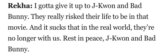


does rekha know she’s the funniest person alive
(taken from this article! it’s very good you should all read it)
#okay yes this is basically every part of the interview#but in my defense. she’s simply the funniest person ever#also i love this article in general. i can hear all of their voices so clearly lmao#dimension 20#never stop blowing up#rekha shankar#usha rao#g13#loosely. i’m counting them
177 notes
·
View notes