#BigDataViz
Explore tagged Tumblr posts
Visit Tumblr Blog
Explore Tumblr blogs with no restrictions, modern design and the best experience.
Last Seen Tumblr Blogs


Fun Fact
Tumblr has been banned in Indonesia for providing people with access to pornographic content.
Text
Telling the Story: Effective Visualization for Big Data
In the era of big data, the ability to effectively visualize information is more crucial than ever. A well-crafted data visualization not only communicates insights clearly but also tells a compelling story that can drive decision-making. This blog will explore best practices for visualizing big data, including choosing the right chart types, maintaining clarity and minimalism, embracing interactivity, and utilizing powerful tools. We'll also look at real-time dashboards and delve into case studies that illustrate these concepts in action.
Choosing the Right Chart Type for the Right Data
The foundation of any successful data visualization is selecting the appropriate chart type. Here are some guidelines:
Bar Charts: Ideal for comparing quantities across different categories.
Line Charts: Best for showing trends over time.
Pie Charts: Useful for illustrating proportions but should be used sparingly.
Scatter Plots: Great for revealing relationships between two variables.
Heat Maps: Excellent for displaying data density or intensity.
Choosing the right chart type ensures that your audience can quickly grasp the key insights without getting lost in the details.

Data Visualization Types
Best Practices: Clarity, Minimalism, Interactivity
Effective data visualization hinges on a few core principles:
Clarity: Ensure your visualizations are easy to understand. Use clear labels, legends, and annotations to guide the viewer.
Minimalism: Avoid clutter. Every element in a chart should serve a purpose; eliminate anything extraneous.
Interactivity: Engage users by allowing them to explore the data. Interactive features like hover effects, filters, and drill-downs can make complex datasets more accessible.
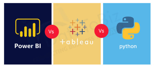
Tools Overview: Power BI, Tableau, Python, and R
Harnessing the right tools can significantly enhance your data visualization capabilities. Here's a brief overview of some popular options:
Power BI: A user-friendly tool from Microsoft that integrates seamlessly with other Office products, ideal for business analytics.
Tableau: Renowned for its ability to handle large datasets and create interactive dashboards with ease.
Python (Seaborn, Plotly): Offers robust libraries for creating a wide range of visualizations, from simple plots to complex interactive graphs.
R (ggplot2): A powerful package for creating elegant and complex visualizations with a strong statistical foundation.
Data Visualization Tools
Real-time Dashboards with Live Data Sources
In today's fast-paced world, real-time data visualization is invaluable. Real-time dashboards allow organizations to monitor key metrics continuously and respond to changes as they happen. This is particularly useful in fields like finance, logistics, and social media analytics, where timely decisions are critical.

Real-time Dashboards
Case Studies: Sales Data, IoT, Social Media Analytics
To illustrate these concepts, let's look at a few real-world examples:
Sales Data: A retail company uses a combination of bar and line charts in Tableau to track sales performance across regions and time periods, identifying trends and areas for improvement.
IoT: A manufacturing company employs real-time dashboards in Power BI to monitor machinery health through IoT sensors, reducing downtime and maintenance costs.
Social Media Analytics: A marketing team leverages Python's Plotly to create interactive visualizations of social media engagement, allowing them to tailor campaigns more effectively.
Frequently Asked Questions
What is the most important consideration when choosing a chart type? The most critical factor is ensuring the chart type aligns with the data's story, allowing for easy comprehension of the insights.
Why is minimalism important in data visualization? Minimalism helps eliminate distractions, enabling the viewer to focus on the most critical information without unnecessary clutter.
How can I incorporate interactivity in my data visualizations? You can use tools like Tableau or Python's Plotly, which offer built-in functionalities for creating interactive charts and dashboards.
What are the benefits of using real-time dashboards? Real-time dashboards provide up-to-the-minute data insights, allowing for prompt decision-making and the ability to react swiftly to changes.
Which tool should I choose for my data visualization needs? The choice depends on your specific requirements, such as data size, the complexity of visualization, and integration needs. Consider experimenting with a few tools to determine the best fit for your objectives.
By adhering to these best practices and leveraging the right tools, you can transform complex datasets into clear, actionable insights that drive your organization forward.
Home
instagram
#DataVisualization#DataStorytelling#DashboardDesign#PowerBI#Tableau#BigDataViz#VisualAnalytics#DataInsights#SunshineDigitalServices#BIReporting#Instagram
0 notes
Text
Ces start-ups qui font la BI de demain : Datameer, la BigDataViz
Datameer génère des datamarts en utilisant Hadoop, et propose une offre analytique de bout en bout – de l’ingestion des données à leurs visualisations.
« Meer » est le mot allemand pour « mer », ce qui n’est pas un hasard puisque le fondateur de la société, Stefan Groschupf, vient d’Allemagne de l’est (alors la RDA), où ses parents ont été persécutés par la Stasi. Il est donc, dit-il, sensible aux questions de confidentialité et de sécurité.
Tous les ingénieurs sont aujourd’hui en Allemagne.
Son offre n’est pas sans rappeler un tableur pour l’utilisateur final, mais sa technologie est spécialisée dans la stack Hadoop. Stefan Groschupf a été un des premiers contributeurs du moteur de recherche open source Nutch, au côté de Doug Cutting, le « papa de Hadoop ».
« 80% des données dans le monde sont déjà dans Hadoop », avance Stefan Groschupf. Qui compare Excel au volant dans une voiture : « c’est juste ce que les métiers et les professionnels IT ont l’habitude d’utiliser quand il s’agit de données ».
Le premier client de Datameer a été Apple. Il possède aujourd’hui une base utilisateurs dans les services financiers (dont Citibank, Visa ou Amercian Express), les télécommunications et le retail.
« Les banques utilisent nos logiciels pour identifier des traders véreux », explique-t-il.
A la différence des outils de Data Discovery et de DataViz comme Qlik et Tableau, Datameer traite la préparation des données, qu’elles soient dans un cluster ou d’autres outils analytiques. « Nous nous intégrons avec Qlik et Tableau, mais nous avons aussi des clients qui remplacent ces produits par le nôtre. C’est un mélange des deux ».
Une des devises de cette société fondée en 2009 est « faisons fonctionner les Data Lake Hadoop ». La principale étant « Restez curieux ».
De l’importation de données…
… à la visualisation de données
Go to Source
Ces start-ups qui font la BI de demain : Datameer, la BigDataViz was originally published on JDCHASTA SAS
0 notes