#ColorTrends
Explore tagged Tumblr posts
Visit Tumblr Blog
Explore Tumblr blogs with no restrictions, modern design and the best experience.
Last Seen Tumblr Blogs


Fun Fact
28.6 is the average number of monthly visits per US mobile user.
Text
Top Kitchen Color Trends You’ll Love! 🎨✨
Looking for the perfect colors to transform your kitchen? Here are 9 trending shades that combine style and elegance:
🌿 Sage Green: Fresh and earthy vibes. 🍃 Mint Green: A refreshing and clean look. 🌊 Aqua Blue: Cool, calm, and contemporary. 🔵 Navy Blue: Bold and timeless sophistication. ⚪ Light Gray: Minimalist and versatile. 🔳 Dark Gray: Sleek and modern appeal. 🤍 White: Classic and ever-chic. 🌸 Dusty Rose: Subtle and charming. 🌾 Beige: Warm and cozy neutrals.
Which one is your favorite? Let Qube Interiors bring these shades to life in your kitchen!
#kitchencolors#QubeInteriors#interiordesign#kitchenmakeover#colortrends#modernkitchens#stylishinteriors#dreamkitchen#kitcheninterior#homeworkoutchallenge#kitchendesign#kitchenrenovation#kitcheninspiration#kitchencolorideas#hometransformation#interiordesigninspiration#falseceiling#falseceilingdesign#homedecor#dreamhome#interiordesignerhyderabad#designwithqube
4 notes
·
View notes
Text
Scope Computers
Interior Design Online & Offline Classes
Admission Open
New Batch Start 25/05/2024
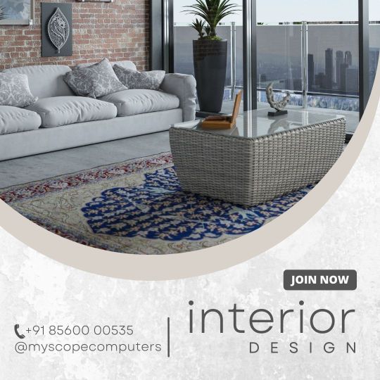
#InteriorDesign#HomeDecor#InteriorInspo#Interiors#InteriorStyling#InteriorDesignIdeas#InteriorAndHome#Decor#ModernDesign#BohoDecor#ScandinavianDesign#MidCenturyModern#IndustrialDesign#MinimalistDecor#FarmhouseStyle#EclecticDecor#LivingRoomDecor#BedroomDecor#KitchenDesign#BathroomDesign#HomeOffice#OutdoorLiving#DiningRoomDecor#KidsRoom#SustainableDesign#SmartHome#DIYDecor#VintageDecor#LuxuryInteriors#ColorTrends
2 notes
·
View notes
Text
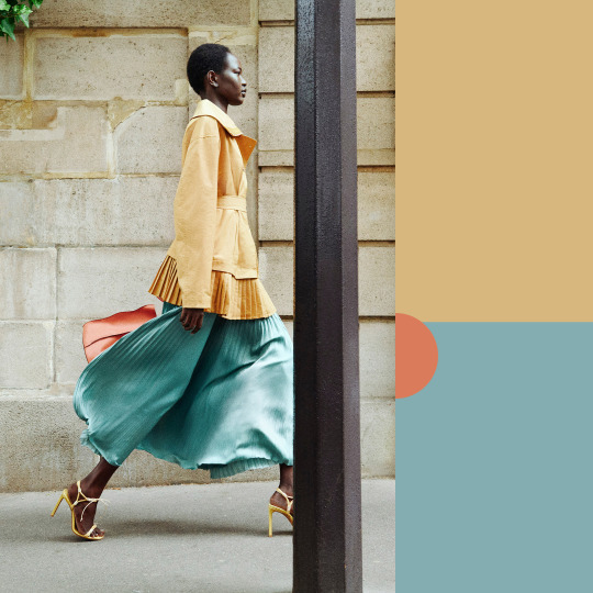
Breaking down the color palette in Ulla Johnson Resort 2026 using simple geometric shapes.
See more at https://www.thefashionfold.com/ulla-johnson-resort-2026-color-palettes/
Lookbook image by Julia Noni for Ulla Johnson; image provided by the brand.
#ullajohnson#resort2026#colorfocus#trendingcolors#colortrends#colourfocus#trendingcolours#colourtrends#colorpaletteinspiration#colortrends2026#colourtrends2026
1 note
·
View note
Text
🖌️ Shocking 2025 Color Trends Mistakes — Are You Making These? 🎨
In 2025, color trends are taking a bold new direction — but many designers and creators are falling into traps that make their sites look outdated or hard to read. If you're a blogger, creative, or business owner, this is a must-read.
✨ In this post, you'll learn: • The top color mistakes to avoid in 2025 • How to choose the right color palette for your brand • Color contrast and accessibility tips • Real fixes to keep your visuals trend-smart
Whether you're designing your blog, brand, or social media content — don’t let color confusion hold you back. Stay ahead of the curve and create a visual identity that truly connects.
🔗 Read the full guide here →
0 notes
Text
#InteriorDesign#OfficeDesign#WorkSpaceGoals#ModernInteriors#InteriorInspiration#OfficeDecor#OfficeInteriors#WorkplaceDesign#OfficeAesthetics#SmartOffice#ColorPsychology#OfficeColors#ColorTrends#InteriorColorPalette#PerfectColorScheme#KolkataInteriors#KolkataDesign#BestInteriorCompanyKolkata#TopInteriorDesignerKolkata#ProductivityBoost#CreativeWorkspace#OfficeVibes#WorkFromOffice#ProfessionalSpace
1 note
·
View note
Text
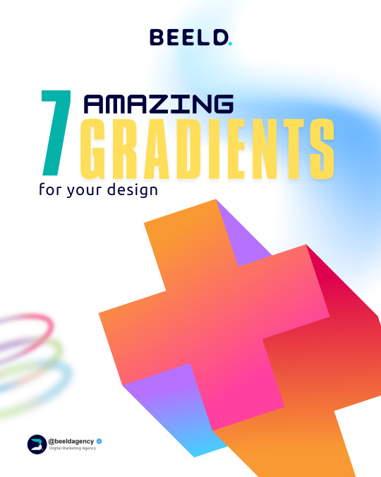
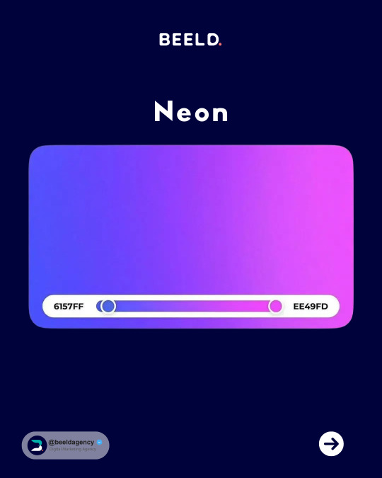
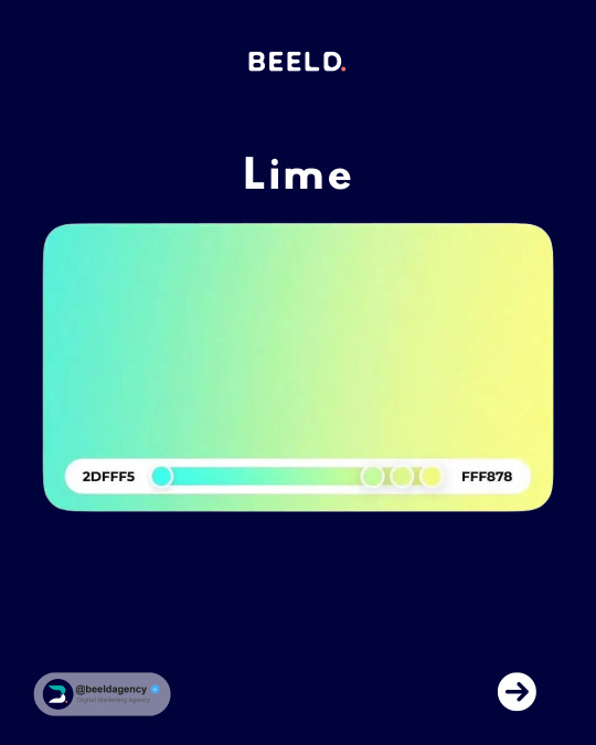
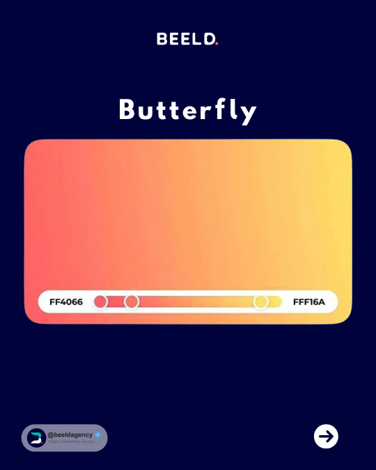


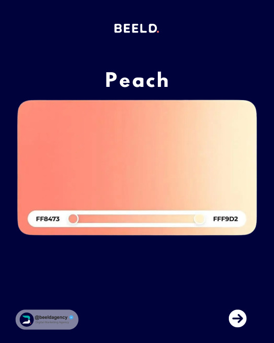
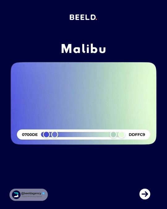

🔥 Elevate Your Designs with 7 Stunning Gradients! 🔥✨ Explore a vibrant palette of color transitions to add depth and visual interest to your projects. From subtle blends to bold contrasts, these gradients will make your designs pop! ✨👉 Follow
@beeldagency for daily doses of design inspiration, marketing tips, and resources to fuel your creative fire. 🔥
#GradientInspiration#ColorTrends#DesignTips#MarketingTips#DigitalMarketing#GraphicDesign#UIUXDesign#WebDesign#Branding#CreativeAgency#beeldagency#BEELD#tutorial
1 note
·
View note
Text
Create a lasting impression with the best paint types for your interior walls. Durable finishes included!
#HomeDecor#InteriorPaint#WallPainting#PaintingIdeas#HomeImprovement#InteriorDesign#DIYProjects#WallPaintTypes#RoomMakeover#PaintSelection#ColorTrends#PaintFinishes
0 notes
Text

🎨 Explore the beauty of abstract color trends! These vibrant palettes—neons, pastels, and bold gradients—are redefining art, fashion, and aesthetics. ✨ Perfect for adding creativity to your posts or inspiring your next project. 🌈 🌟 Let the colors speak to you! Share your favorite abstract looks.
A visually stunning abstract artwork featuring bold neon and pastel gradients, creating a vibrant and aesthetic design perfect for artistic inspiration.
#artists on tumblr#branding#success#founder#startup#AbstractColors#ColorTrends#AestheticArt#TumblrAesthetics#CreativeInspo#ModernArt#ColorfulDesigns#VibrantPalette#NeonVibes#SoftPastels#TrendingColors#ArtForLife#AestheticTumblr
1 note
·
View note
Text
Top Color Trends for Dresses You Need to Try This Season
Introduction
Front: Colors can transform your entire look and set the tone for your outfit. This season, bold hues and soft tones are taking center stage in women’s fashion. Here’s a guide to the top color trends for dresses that will keep you stylish and on-trend.
Vibrant Red
Front: Red is the color of confidence and passion.
Best For: Date nights, parties, or festive events.
Styling Tip: Pair with nude heels and gold accessories for a polished look.
Earthy Brown Tones
Front: Warm browns and chocolate shades are trending this season.
Best For: Casual outings and cozy gatherings.
Styling Tip: Add beige or cream accessories for a chic earthy vibe.
Soft Pastels
Front: Pastel shades like lavender, mint, and blush are timelessly elegant.
Best For: Weddings, garden parties, and daytime events.
Styling Tip: Keep accessories minimal with delicate silver or pearl jewelry.
Bold Neon
Front: Neon shades like lime green and hot pink are bold and playful.
Best For: Summer outings, festivals, and casual streetwear.
Styling Tip: Tone down the rest of your look with neutral accessories.
Classic Black
Front: Black dresses are always in style and work for every season.
Best For: Formal events, evening dinners, and professional settings.
Styling Tip: Add pops of color with bright heels or statement bags.
Deep Jewel Tones
Front: Colors like emerald green, sapphire blue, and ruby red exude luxury.
Best For: Formal occasions and evening wear.
Styling Tip: Pair with metallic accessories for a glamorous finish.
Sunny Yellow
Front: Yellow is the ultimate mood-boosting color.
Best For: Brunch dates, vacations, and summer events.
Styling Tip: Wear with neutral sandals and a straw bag for a fresh look.
Neutral Beige
Front: Beige and taupe shades are perfect for understated elegance.
Best For: Everyday wear or minimalist styles.
Styling Tip: Layer with bold accessories to add depth to your look.
Vivid Orange
Front: Bright orange shades are bold and fun for a standout outfit.
Best For: Fall fashion and casual wear.
Styling Tip: Pair with gold jewelry and ankle boots for an autumn vibe.
Cool Blues
Front: Shades like sky blue and navy bring calm and sophistication.
Best For: Office wear, evening outings, and casual lunches.
Styling Tip: Complement with silver accessories and sleek hairstyles.
Conclusion
Front: Experimenting with new colors is a great way to refresh your wardrobe and express your personality. Try these trending shades in your dresses and see how they brighten your style. Reblog and share your favorite color trend this season!
#womensfashion#fashion#fashion trends#womenswear#style#timelessfashion#styletips#ColorTrends#SeasonalFashion#TumblrStyleTips#WardrobeColors#WomenFashionInspo#TrendingDresses2024#StyleGoalsTumblr#ColorYourOutfit#FashionForWomen#TumblrFashionTrends
1 note
·
View note
Text
youtube
WGSN & Coloro - Key Colors and Color of the Year for 2026.
0 notes
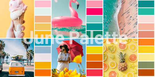
Text
Colour Craze: Innovative Design & Branding Trends
As June arrives with its unique shade splash, it brings about a tidal wave of fresh design inspiration. BrandiQ values the potency of colour in transmitting messages, eliciting emotions, and forming unforgettable branding moments. In this blog, we delve into June's colour trends and share tips on incorporating them into your design and branding game plan to stay future-ready.
Savouring June Colours
June is a month full of warmth, vigour, and imagination, mirrored in its seasonal shade scheme. Ranging from tranquil pastels to bold, lively colours, June's hues provide a wide selection to display your brand character and engage more deeply with audiences.
Sunlit Yellow: A symbol of positivity and cheerfulness, sunlit yellow adds a delightful pop to your designs.
Deep Sea Blue: Evocative of peace and depth, deep sea blue imparts a calm, serene vibe to your branding.
Verdant Green: Signifying growth and liveliness, verdant green conveys a fresh and rejuvenating feel.
Coral Blush: An exuberant tone, coral blush contributes colour and fun to your visuals.
Sun-Kissed Orange: Profoundly warm and eager, sun-kissed orange makes a bold impression in your branding.
Integrating June Colours Spectrum into Your Brands Visual Presentation
Logo Redesign:
Integrate June's hues into your logo to craft a contemporary look that connects with your desired demographics.
Social Media Imagery:
Employ June's colour scheme for striking social media posts that engage followers and echo the season's essence.
Website Refresh:
Revamp your website with June's hues for a harmonious and attractive online presence that captivates visitors.
Product Packaging:
Weave June's colour scheme into your product packaging to generate shelf appeal and unforgettable brand encounters for customers.
Marketing Materials:
Incorporate June's shades in your marketing collaterals like brochures, flyers, and posters for consistent brand recognition that remains etched in the mind.
Brand Campaigns:
Add a dash of June's colours to your brand campaigns to evoke feelings, narrate a story, and engage your audience on a deeper level.
Rely on BrandiQ for Smart, Creative Branding Solutions
We thrive on helping brands differentiate in a crowded market with unique and strategic branding approaches. Our team of experts understands the value of colour in design and branding and can guide you in utilizing June's colour scheme to elevate your brand and resonate with your audience in meaningful ways.
Uplift Your Brand with June Colors
This June, get swept away by the season's vivid colours to inspire your design and brand initiatives. Blend the sunlit yellows, deep sea blues, verdant greens, coral blushes, and sun-kissed oranges of June into your visual branding to create an imprint that resonates with your audiences and creates lasting connections.
#JuneColors#ColorTrends#BrandDesign#VisualIdentity#BrandingTips#CreativeInspiration#ColorPsychology#DesignStrategy#BrandIdentity#MarketingTips
0 notes
Photo
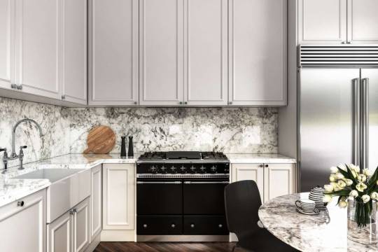
Choosing the right countertop color transforms your kitchen, blending function and style. Start with the key elements: cabinets, flooring, and appliances. Match cool tones for a modern feel or warm shades for a cozy vibe. For longevity, opt for neutral hues that adapt to changing trends. Texture plays a role too; pair matte finishes with glossy surfaces to add depth. Find harmony in your space by considering the lighting; natural light brings out the best in certain colors. Remember, the best choice reflects your personality and fits your home's heart.
0 notes
Text
Fashion News and Trends in 2024 modern world
Fashion Designer Spotlight: Where Innovation Meets Inspiration
The fashion industry is a canvas painted with strokes of creativity, innovation, and the boundless spirit of its designers. This spotlight shines on the individuals who push boundaries, challenge conventions, and leave an indelible mark on the world of style. Fashion Designer Spotlight: Where Innovation Meets Inspiration Runway Report: Fashion Shows Redefined Modeling in 2024: Shattering Stereotypes, Embracing Diversity Sustainable Fashion: Stitching a Greener Future Tech Meets Fashion: Where Innovation Threads Style Style Guides for Every Occasion: Your Sartorial Compass Fashion Industry Icons: The Pillars of Style and Innovation Global Fashion: Where Cultures Collide and Trends Take Flight The top 21 fashion brands in the 2024 world Comparing the Fashion Industries of India and the USA: Pioneers of Progress:

FASHION read full article in details https://mahashankh.com/fashion-design-trends-modern-world/ Read the full article
#ArtandFashion#Athleisure#AugmentedReality#AugmentedRealityFashion#BodyPositivity#BohemianStyle#BusinessAttire#CasualFashion#CelebrityStyle#ColorTrends#ConsumerTrends#CulturalInfluences#DesignConcepts#DesignPhilosophies#DesignerInspirations#DesignerSpotlight#DiversityandEmpowerment#Eco-FriendlyApparel#Eco-FriendlyDesigns#EmergingDesigners#EmergingTrends#EthicalChoices#EthicalDesign#EthicalFashion#FabricTrends#FashionAccessories#FashionAdvice#FashionandActivism#FashionandCommunity#FashionandConfidence
0 notes
Text
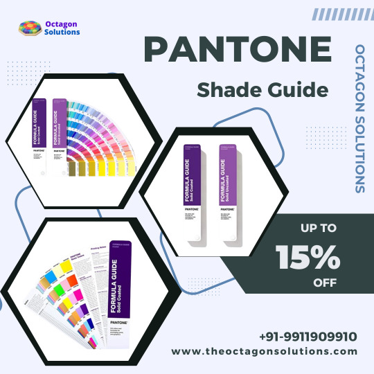
The Pantone Shade Guide is a comprehensive tool for professionals in the design and printing industry. It provides a wide range of color options, allowing users to accurately select and match colors for their projects. With its organized layout and easy-to-use format, this guide is an essential resource for achieving precise color consistency and accuracy. Whether you are a graphic designer, printer, or anyone working with colors, the Pantone Shade Guide is a must-have tool to ensure your colors are on point every time. From Octagon Solutions
#PantoneShadeGuide#PantoneFormulaGuide#PaperColorGuide#Print#PrintingIndustries#ColorPalette#ColorInspiration#ColorTrends#GraphicDesign#PrintDesign#PrintedMaterials#PrintedArt#PrintedProducts#PrintedGraphics#PrintedMedia#PrintedMatter#PrintedWorld#PrintedBeauty#PrintedCreativity#PrintedExcellence
0 notes
Text
Bảng phối màu đẹp cho designer – Full các website phối màu online
Các website phối màu online mang đến cho bạn sự linh hoạt trong việc thích nghi với các yêu cầu thiết kế khác nhau. Dễ dàng tạo ra các bảng phối màu đẹp mắt và phù hợp với dự án của bạn.
Hãy tham khảo các bảng phối màu đẹp cho designer và 18 website phối màu online chuyên nghiệp mà công ty thiết kế website Miko Tech chia sẻ dưới đây sẽ giúp trang web của bạn dễ dàng gây ấn tượng và thu hút khách hàng hơn đấy.
0 notes