#DesignTips
Explore tagged Tumblr posts
Visit Tumblr Blog
Explore Tumblr blogs with no restrictions, modern design and the best experience.
Last Seen Tumblr Blogs


Fun Fact
Tumblr was acquired by Yahoo for $1.1B in 2013.
Text
Libros de arte PDF (Art Books) 📷 Créditos a "Babel Brueghel"
Link: https://t.co/5luXSvhlFm

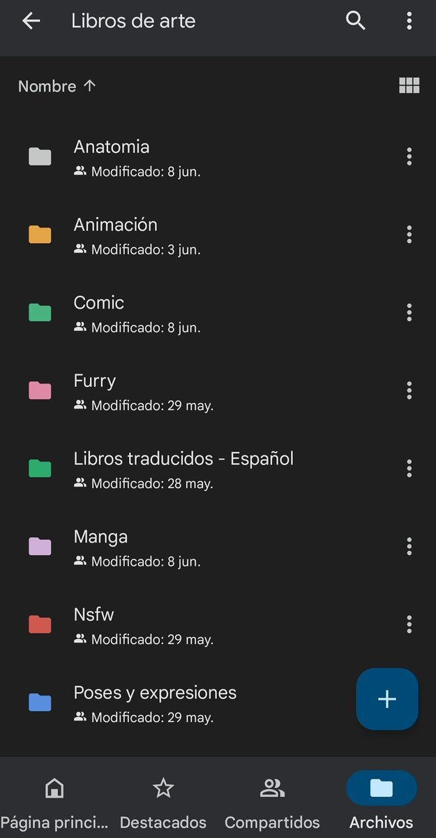

#drawing#Traditionalart#digitalart#designtips#DesignInspiration#art#manga#animation#comic#furry#artbook#Posereference#Colorart
6 notes
·
View notes
Text

🎨 Perfect Color Pairings for Designers & Creators
Looking for color combos that just work? Save these stunning pairs to your moodboard ��� they’re your next design secret weapon!
✨ #45C4BE + #F4EDD0 🔥 #253159 + #BB542D 🌬 #A5CCD3 + #EEEBE6 🍂 #C29A7B + #7C1D21 🖤 #130C0E + #BBB5AC 🌿 #0A8066 + #DED3CD ☕ #57412B + #D5C8A0 💧 #ABBFBD + #C99985 🌌 #4C506D + #E0C68B
Which combo is your favorite? 👀 Drop a comment below!
2 notes
·
View notes
Text
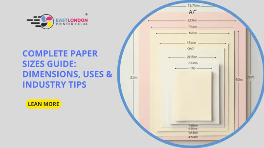
Complete Paper Sizes Guide: Dimensions, Uses & Industry Tips
When it comes to printing, paper size matters a lot. Whether you are printing a flyer, poster, business card, or invitation, choosing the right size can make your work stand out.
In this guide, we will explain all the standard paper sizes, what they are used for, and how to pick the best one for your project. We’ve kept it very simple and easy to understand, so even if you are new to printing, you’ll know exactly what to ask for.
Understanding the A-Series Paper Sizes
The most commonly used paper sizes in the UK and across Europe follow the A-series format. These sizes start from A0 (the largest) and go down to A8 (the smallest).
Let’s look at the main paper sizes:
A0 – 841mm x 1189mm This is a huge sheet! Mostly used for large posters, exhibitions, and architectural drawings.
A1 – 594mm x 841mm Often used for display posters, charts, or presentations at events and exhibitions.
A2 – 420mm x 594mm A popular choice for posters and wall art prints.
A3 – 297mm x 420mm Used for presentations, charts, or folded brochures.
A4 – 210mm x 297mm The most common size – used for letters, standard documents, menus, leaflets, and more.
A5 – 148mm x 210mm Ideal for flyers, small notepads, or invitations.
A6 – 105mm x 148mm Handy for postcards, thank-you notes, or small handouts.
A7 – 74mm x 105mm Used for labels, price tags, or small information cards.
A8 – 52mm x 74mm Very tiny – used for business cards or promotional tags.
Choosing the Right Paper Size for Your Project
Here are some common uses and tips:
Posters & Signs
Go for A0, A1, or A2 sizes. These are great for catching attention from a distance, especially at exhibitions or on shop windows.
Menus & Price Lists
A4 is the perfect menu size, but you can use A5 for smaller tables or takeaway menus.
Flyers & Handouts
A5 and A6 are budget-friendly and portable. Great for street promotions and in-store handouts.
Invitations & Cards
Use A6 or custom square sizes. These are neat and easy to handle.
Notepads & Booklets
A5 and A4 are the most practical for notebooks or training booklets.
Business Cards
Typically not from the A-series, but closest to A8 in size. We can do custom sizes too.
Industry Tips for Choosing Paper Size
Think about space: Will people need to write on it? Will it be folded? That affects size.
Budget matters: Smaller sizes are cheaper to print and post.
Know your audience: If it’s going in a pocket, go small. If it’s for display, go big.
Ask us for samples: Sometimes it helps to see and feel it in real life.
Need Help With Printing?
We’re here to make things easier. At East London Printer, we offer fast, affordable, and high-quality printing for all standard and custom paper sizes. We guide you through the best choices and offer same-day and next-day printing across London.
You don’t have to be an expert — that’s our job.
📍 Contact East London Printer
✅ Website: www.eastlondonprinter.co.uk 📧 Email: [email protected] 📞 Phone: +44 (0)20 7041 9649
Final Thoughts
Choosing the right paper size may seem small, but it can make a big difference in how your design looks and feels. From large banners to small thank-you cards, every size has its place.
So whether you’re launching a business, planning an event, or just need professional printing done right — East London Printer is your trusted local partner.
#EastLondonPrinter#PaperSizeGuide#PrintingTips#LondonPrinting#FlyerPrinting#PosterPrinting#BusinessCards#DesignTips#A4Paper#PrintWithEase
2 notes
·
View notes
Text
🎨 Simple Interior Design Tips by Qube Interiors
✨ Transform your space with these easy and effective ideas!
1️⃣ Choose Your Style First
Start with a clear design style — modern, classic, minimal, or boho — to keep your space cohesive and intentional.
2️⃣ Spend Smartly
Invest in the essentials! Quality sofas and beds make a big impact and last longer.
3️⃣ Light It Right
Let in natural light or add accent lights to brighten small or dark rooms. Good lighting = good vibes!
4️⃣ Add Personality with Accents
Decorate with books, bowls, candles, or art pieces to give your space a personal touch.
5️⃣ Give Furniture Some Breathing Room
Pull furniture slightly away from the walls to make the space feel airy and open.
📲 Follow us for more design inspiration
🔗 qubeinteriors.in
📱 Instagram: @qubeinteriors11
📞 Contact Us
📍 White Fieldroad, Kondapur, Hyderabad
📱 +91 84999 88488
#interiordesign#homedecor#designtips#qubeinteriors#modernliving#cozyspaces#lightingdesign#personalstyle#furniturearrangement#homeinspiration#hometransformation#falseceiling#falseceilingdesign#dreamhome#designwithqube#interiordesignerhyderabad#interiordesigninspiration
3 notes
·
View notes
Text

#PatelVisual#GraphicDesign#VisualDesign#CreativeDesign#DigitalArt#Branding#LogoDesign#WebDesign#PrintDesign#AdobePhotoshop#VectorArt#DesignTrends#LayoutDesign#DesignPortfolio#CreativeProcess#DesignInspiration#FreelanceDesigner#DesignProjects#DesignTips#DesignTools#FlyerDesign#LetterheadDesign#3DMockup#VisitingcardDesign#PackagingDesign
3 notes
·
View notes
Text
How to mix more than two fonts without creating visual chaos
Ever wondered how to combine more than two fonts? We've got you covered! After reading the article in the comments, you'll be able to select fonts that complement each other, create visual hierarchy, and establish a clear brand identity. Check it out!
1 note
·
View note
Text


Consistency is Key 🎨 Great design is not just about creativity but maintaining harmony across all elements. Stick to these tips and elevate your designs to new heights! 🚀
🌐 Visit: fluxitsolutions.in 📧 [email protected] | 📞 +91 8527471171
#DesignTips#ConsistencyIsKey#GraphicDesign#CreativeDesign#DesignInspiration#BrandingTips#WebDesign#DigitalMarketing#UXDesign#UIUX#Typography#ColorPalette#VisualHierarchy#WhiteSpaceMatters#MobileOptimization#HighQualityDesign#ProfessionalDesign#ModernDesign#DesignDaily#MarketingTips#SocialMediaDesign#BusinessBranding#CreativeAgency#FluxITSolutions#DesignGoals#ElevateYourBrand
2 notes
·
View notes
Photo

Bold sans-serif display face with high contrast, originally inspired by OakPark, featuring three members: two weights, one caps-only style, and expanded to four weights with matching obliques.
Link: https://l.dailyfont.com/Z0Yd4
#aff#Typography#DesignInspiration#FontsOfInstagram#TypeFace#DesignElements#GraphicDesign#FontLovers#DesignStyle#TextLayout#VisualCommunication#CreativeContent#SocialMediaMarketing#DesignTips#FontFrenzy#CreativeDirection#DesignConcepts
2 notes
·
View notes
Text
💻 Designers, streamline your workflow with the best free Figma UI kits! 🚀
Want to speed up your design process with high-quality, customizable elements? Check out this roundup of top-notch Figma UI kits that offer everything from sleek buttons to detailed templates. Perfect for web and mobile projects, these kits—featuring resources from Relume, Untitled UI, and more—are ideal for creating modern, cohesive interfaces with ease. Elevate your designs and save time with these go-to Figma tools.
👉 Dive in here: Best Free Figma UI Kits
#Figma#UIKits#UIDesign#FreeResources#FigmaKits#DesignInspiration#UXUI#WebDesign#AppDesign#FigmaCommunity#CreativeTools#DesignTips#UXDesign#DigitalDesign
4 notes
·
View notes
Text

🔍 Conduct User Research: Identify your audience's preferences, behaviors, and pain points. Use these insights to design an interface that meets their needs effectively.
1️⃣ Simplify Navigation: Easy-to-find menus and features.
2️⃣ Consistent Design: Uniform colors, fonts, and icons.
3️⃣ Fast Performance: Quick load times, minimal lag.
4️⃣ Touch-Friendly: Large buttons, easy tapping.
5️⃣ Clear CTAs: Standout buttons with strong action words.
6️⃣ Readable Text: Legible fonts, good contrast.
7️⃣ User Feedback: Instant responses to actions.
8️⃣ Real User Testing: Gather feedback, and make improvements.
9️⃣ Accessibility: Features for users with disabilities.
🔟 Minimalistic Design: Avoid clutter, and focus on essentials.
Ready to enhance your app’s user interface? Contact us today to discuss how we can optimize usability and engagement through intuitive design practices! 📱✨
WhatsApp: https://wa.me/918985992323
3 notes
·
View notes
Text
Master Adobe InDesign with These Essential Keyboard Shortcuts! 🎨✂️
Looking to speed up your design workflow in Adobe InDesign? Keyboard shortcuts can help you save time and boost productivity! Check out this comprehensive guide to InDesign Shortcut Keys that will make your life easier and your designs more efficient. 🔥 From quick navigation to formatting tricks, this list covers everything you need to know! 👉 Read the full guide here: InDesign Shortcut Keys
2 notes
·
View notes
Text

🌈 Color of the Day
Today’s color story is giving calm, warmth, and contrast — all at once. Perfect for moodboards, web design, interior palettes, or even your outfit inspiration. Let’s break it down:
🔹 83BBC1 – A calming Soft Ocean Blue, perfect for backgrounds, skies, and serenity. 🔸 E7DDC7 – Sand Beige, subtle and grounding, like linen curtains in golden hour. 🔴 B92C0D – Rust Red, bold, vintage, dramatic. Adds tension and energy in just the right spots. 🌲 1F2C24 – Deep Forest Green, earthy and dark, great for text or a grounding accent.
This palette feels like:
a quiet morning by the coast, coffee brewing, terracotta pots on a windowsill, and forest air coming through linen drapes. ☕🌿🌊
🎨 Whether you're designing a brand, curating a space, or just saving pretty hex codes for your future moodboard — this one’s a keeper.
💾 Save it. Share it. Use it.
2 notes
·
View notes
Text
youtube
Hello Everyone! I am excited to share that we’ve just launched our YouTube channel to help Founders and Designers learn more about UX and UI Design! 🎉 If you're a founder looking to improve your product design or a fellow designer wanting to grow your skills, this channel is for you. 👉 Check out our first intro video here: https://lnkd.in/dN99DXcu 👉 Don’t forget to Like, Subscribe, and hit the bell icon 🔔 to stay updated with new videos! Let’s learn and create amazing digital products together! 💡 I’d also love to hear your thoughts and feedback so I can keep improving the quality of the content and videos! 💡
#UXDesign#UIDesign#ProductDesign#DesignTips#StartupDesign#Founders#Entrepreneurship#DesignForStartups#DesignInspiration#DesignThinking#UXForFounders#LearnUX#LearnUI#DesignSkills#DigitalProducts#StartupJourney#DesignEducation#UIUXDesign#UserExperience#UserInterfaceDesign
2 notes
·
View notes
Text


Unlock the secrets of color theory to elevate your poster and video editing skills! In this tutorial, we'll delve into the fundamentals of color theory, covering concepts like the color wheel, complementary colors, and the emotional impact of different hues. Whether you're creating eye-catching posters or captivating video content, understanding how to use color effectively will make your designs stand out. Learn how to create harmony, contrast, and balance with color to convey the right message and mood in your visual projects.
Mastering Color Theory for Stunning Posters and Video Edits
#ColorTheory#GraphicDesign#VideoEditing#PosterDesign#CreativeDesign#ColorPalette#VisualStorytelling#DesignTips#EditingTutorial#DesignInspiration#ColorPsychology#hyderabad#srnagar
3 notes
·
View notes
Text
Simple Living Room Idea for Your Home by Qube Interiors!
Give your living room a stunning makeover with these modern design ideas! From cozy furniture arrangements to eye-catching decor, create a space that feels both inviting and stylish. Qube Interiors shares tips for optimizing your living room layout, choosing the right colors, and adding unique accents that reflect your personal style. Make every moment in your living room a beautiful one!
📍 Visit us at White Fieldroad, Kondapur, Hyderabad 📞 Contact us: +91 84999 88488 🌐 qubeinteriors.in
#livingroomdesign#qubeinteriors#modernlivingroom#homedecor#interiordesign#cozyspaces#livingroommakeover#stylishinteriors#designtips#homeinspiration#designwithqube#falseceiling#interiordesigninspiration#dreamhome#interiordesignerhyderabad#hometransformation#falseceilingdesign
3 notes
·
View notes
Text

#PatelVisual#GraphicDesign#VisualDesign#CreativeDesign#DigitalArt#Branding#LogoDesign#WebDesign#PrintDesign#AdobePhotoshop#VectorArt#DesignTrends#LayoutDesign#DesignPortfolio#CreativeProcess#DesignInspiration#FreelanceDesigner#DesignProjects#DesignTips#DesignTools#FlyerDesign#LetterheadDesign#3DMockup#VisitingcardDesign#PackagingDesign
2 notes
·
View notes