#ESNext Features
Explore tagged Tumblr posts
Visit Tumblr Blog
Explore Tumblr blogs with no restrictions, modern design and the best experience.
Last Seen Tumblr Blogs


Fun Fact
Total funding amounts to $125.3M.
Text
#Future of JavaScript#JavaScript Trends#Modern JavaScript#Frontend Development#Web Development Innovations#ESNext Features#Progressive Web Apps#JavaScript Frameworks#Coding Trends#Software Development
1 note
·
View note
Text
Using Top Level Await In Typescript: Simplifying Asynchronous Javascript Code
TypeScript code where you needed to use the “await” keyword outside of an asynchronous function? TypeScript 3.8 introduced a new feature called “Top Level Await” which allows you to use the “await” keyword at the top level of your code. Isn’t that exciting?
In this article, we will explore what exactly Top Level Await is, how it works, and the benefits and limitations of using it in TypeScript.
What is Top Level Await in TypeScript?
Have you ever encountered situations where you wanted to use the ‘await’ keyword at the top level of your TypeScript code? Well, you’re in luck because TypeScript now supports top level await!
In traditional JavaScript and TypeScript, the ‘await’ keyword can only be used within an ‘async’ function. This means that you need to wrap your code in an ‘async’ function and call it to use the ‘await’ keyword. However, this can sometimes lead to messy and unoptimized code. With the introduction of top level await TypeScript, you can now use the ‘await’ keyword directly at the top level of your code without the need for an ‘async’ function. This makes your code cleaner, more readable, and easier to maintain.
Top level await allows you to write asynchronous code in a synchronous manner. It provides a convenient way to handle Promises and async/await syntax without the need for additional boilerplate code. When using top level await, you can directly await a Promise or any other asynchronous operation in the global scope. This means that you don’t need to wrap your code in an ‘async’ function or use an immediately invoked async function expression.This feature is especially useful when you want to perform initialization tasks or fetch data from an API before your application starts running. Instead of chaining multiple ‘await’ calls or nesting them within ‘async’ functions, you can now simply use top level await to await the promises and continue with the execution of your code.
However, it’s important to note that top level await is currently an experimental feature in TypeScript and may not be supported by all JavaScript runtime environments or transpilers. It is recommended to check the compatibility of the runtime environment or transpiler you are using before using this feature in production code.
How Does Top Level Await Work?
Top level await changes this by allowing you to use await at the top level of your module, meaning you can use it outside of any function or block scope. This way, you can directly await a promise without having to wrap your code in an async function.
When you use top level await in TypeScript, the compiler automatically wraps your code in an immediately invoked async function. This function encapsulates your top level await expression and executes it synchronously, blocking the execution of any following statements until the promise is resolved or rejected.
For example, let’s say you have a module that needs to fetch some data from an API. With top level await, you can write code like this:import { fetchData } from './api';const data = await fetchData();console.log(data);
In this example, the fetchData function returns a promise that resolves to some data. Instead of using a traditional then callback, we can directly await the promise at the top level of our module and assign the result to the data variable. The console log statement will only execute once the promise is successfully resolved.
Top level await also allows you to use try-catch blocks to handle promise rejections. If the awaited promise is rejected, the catch block will be executed just like in regular async/await code.
It’s important to note that top level await is only available in modules that are marked as ES modules (i.e., have the module flag set to “ESNext” or “ES2020”). If you’re using CommonJS modules, you won’t be able to directly use top level await.
Furthermore, you need to ensure that your runtime environment supports top level await.
Benefits of Using Top Level Await in TypeScript
Top level await offers several benefits for asynchronous programming in TypeScript:
Simplified Syntax:
With top level await, you can directly use “await” at the outermost level of your code, eliminating the need for async function wrappers. This results in cleaner and more readable code.
Improved Error Handling:
Using top level await allows you to handle errors in a centralized manner. Instead of scattering error handling throughout multiple async functions, you can use a try/catch block at the top level to catch and handle errors from the awaited operations.
Easier Debugging:
Top level await simplifies the debugging process by providing a straightforward way to pause the execution and inspect the state of the code. This can be especially useful when working with complex asynchronous operations.
Faster Development:
By eliminating the need for explicit async function wrappers, top level await reduces boilerplate code, resulting in faster development time. It allows you to directly use “await” wherever needed, reducing the cognitive load of managing async functions.
Limitations of Top Level Await in TypeScript
While using top level await in TypeScript can be beneficial, it is important to note that there are also some limitations to be aware of. These limitations may impact your decision to use top level await in certain scenarios.
1. Compatibility
One major limitation of top level await in TypeScript is that it is only supported in environments that have native support for ECMAScript modules and top level await. This means that if you are working with older versions of JavaScript or in environments that do not support these features, you will not be able to use top level await.
Additionally, not all browsers and JavaScript engines have implemented top level await yet, which can restrict where you can use this feature. It is important to check the compatibility of your target environments before deciding to use top level await in your TypeScript code.
2. Module Systems
Another limitation of top level await is its interaction with module systems. When using top level await, your code must be within an ECMAScript module, which may require additional configuration and setup, especially if you are working with existing codebases that use different module systems.
For example, if you are using CommonJS modules in Node.js, you would need to convert your code to ECMAScript modules in order to use top level await. This can be a time-consuming process, and may not be feasible in all projects.
3. Debugging and Tooling
Debugging and tooling support for top level await in TypeScript can also be limited. Some IDEs and development tools may not fully understand and handle top level await, which can lead to issues with code completion, type checking, and other features.
Similarly, when debugging code that uses top level await, the debugger may not be able to step through the asynchronous code in the expected manner. This can make debugging more challenging and time-consuming.
4. Code Complexity
Using top level await can also introduce additional complexity to your code. Especially if you are not familiar with asynchronous programming concepts. It may require a deeper understanding of promises, async/await syntax, and potential pitfalls such as handling errors and cancellations.
This added complexity can make your code harder to read, understand, and maintain, especially for developers. It is important to consider the skill level and experience of the developers who will be working with the codebase.
5. Performance Implications
Lastly, it is worth noting that using top level await can have performance implications, especially in certain scenarios. Top level await blocks the execution of the module until the awaited promise is resolved. It can potentially delay the loading and execution of other modules or scripts that depend on it.
This can lead to slower application startup times and decreased performance, especially in large codebases with complex dependencies. It is important to carefully consider the performance impact of using top level await in your specific use cases.
Conclusion
While top level await can be a powerful feature in TypeScript, it is important to be aware of its limitations. By understanding these limitations, you can make an informed decision and ensure that your codebase remains maintainable and performant.
0 notes
Photo

EsNext features in TypeScript with Babel https://ift.tt/3zm8abj
0 notes
Photo

EsNext features in TypeScript with Babel https://ift.tt/3zm8abj https://ift.tt/2UgvLrq
0 notes
Text
Monorepos with Ionic, Vue, and npm

This is part three of a new series on monorepos. By the end of the series, you’ll have the tools you need to adopt monorepo setups in your organization.
Rounding out our series on monorepos, we take a look at an old friend, but a newcomer to the monorepo game, npm. Npm has long been the de-facto solution for managing dependencies, and it only makes sense that, with the release of npm 7.0, we finally have a built-in solution for creating a monorepo without relying on external tools. Compared to other solutions, however, npm workspaces lack a few features and still have some rough edges. While it is possible to build something with it, for simplicity, I’d suggest looking at Lerna as an alternative. With that being said, let’s look at how we can configure an npm workspace to work with Ionic and Vue.
Scaffolding
To set the scene, what we’re going to build is an Ionic Vue app and a second project that contains a Vue hook. The hook is borrowed from the vue-composable project.
Let’s get started by first creating our base directory and initializing both a package.json and an ionic.config.json. For the package.json, run:
mkdir vue-monorepo cd vue-monorepo npm init -y
From here, we can also create a base Ionic project with the ionic init command.
ionic init --multi-app
We can also create a directory that will hold all the packages. For this, a directory called packages will do, but the name can be whatever you’d like. packages is just a common convention that people have settled around.
mkdir packages cd packages
With this done, we’re going to create a single Ionic Vue project and a minimal utility package.
mkdir utils ionic start client-app tabs --type vue --no-deps --no-git
Currently, even if you pass the --no-deps flag, dependencies will be installed when Capacitor is set up. Just cd client-app and delete the node_modules folder from the project.
Setting up the Utils
For our utils package, we’re going to do a bit more manual work to set up a minimal package of hooks for our Vue project.
cd packages/utils npm init -y mkdir src touch tsconfig.json
Open your package.json and paste the following:
{ "name": "@client/hooks", "version": "0.1.0", "private": true, "main": "dist/index.js", "module": "dist/index.js", "scripts": { "build": "tsc -p tsconfig.json", "watch": "tsc -p tsconfig.json --watch" }, "dependencies": { "vue": "^3.0.0" }, "files": ["dist/"], "devDependencies": { "typescript": "~4.1.5" } }
Then, open your tsconfig.json and paste the following:
{ "compilerOptions": { "target": "ES5", "outDir": "dist", "module": "CommonJS", "strict": true, "importHelpers": true, "moduleResolution": "node", "skipLibCheck": true, "esModuleInterop": false, "declaration": true, "allowSyntheticDefaultImports": true, "sourceMap": true, "lib": ["esnext", "dom", "dom.iterable"] }, "include": ["src/**/*.ts"], "exclude": ["node_modules"] }
From here, we can make a file, src/index.ts, and paste the following code.
/* eslint-disable */ import { ref, Ref } from 'vue'; // useOnline composable hook. // Adapted from https://github.com/pikax/vue-composable const PASSIVE_EV: AddEventListenerOptions = { passive: true }; let online: Ref<boolean> | undefined = undefined; export function useOnline() { const supported = 'onLine' in navigator; if (!supported) { online = ref(false); } if (!online) { online = ref(navigator.onLine); window.addEventListener( 'offline', () => (online!.value = false), PASSIVE_EV ); window.addEventListener('online', () => (online!.value = true), PASSIVE_EV); } return { supported, online }; }
Now we can leave the utils directory and get back to the root project.
Setting up the Workspace
With the initial code created, we can now set up the workspace. For npm, workspaces are just an entry in the root package.json. Since all of our packages are in the packages directory, we can add the following to the root package.json.
{ "name": "ionic-vue-npm-workspaces", "version": "1.0.0", "description": "", "scripts": {...}, "license": "MIT", "workspaces": [ "packages/*" ] }
The workspaces entry allows us to declare what packages are available from this top level. Since we want to expose all packages in the packages directory, we can use the packages/* to get all of them.
With this completed, run npm install from the top level. With our workspace set up to include all the sub-packages, our install will actually install all dependencies used in both projects in one top-level node_modules directory. This means we can have better control over what dependencies we are using in which project and unifies all duplicated dependencies to one version.
With the dependencies installed, how do we go about actually building our sub-packages? This can be done by calling the script we want to run, followed by the --workspace=<package-name>. If we want to build the utils directory, we use the name entry from the package.json (@client/hooks) as the value for the workspace. So our final command looks like this:
npm run build --workspace=@client/hooks
The same logic would be applied if we want to build/serve our app: we pick the script we want to run and pass the name to the workspace.
Including a Package
So far, we have our packages set up and building, but we’re not making use of them, which kind of defeats the point of having a monorepo. So how can we consume our utils packages in our main app? To do this, we’ll reference the package in our app.
In the client-app project, let’s open our package.json and add a line to our dependencies for @client/hooks:
{ "dependencies": { "@capacitor/core": "3.0.0-rc.1", "@client/hooks": "0.1.0", "@ionic/vue": "^5.4.0", "@ionic/vue-router": "^5.4.0", "core-js": "^3.6.5", "vue": "^3.0.0-0", "vue-router": "^4.0.0-0" } }
Then we can add a reference to @client/hooks in our project in the client-app/src/views/Tab1.vue component.
<template> <ion-page> <ion-header> <ion-toolbar> <ion-title>Tab 1</ion-title> </ion-toolbar> </ion-header> <ion-content :fullscreen="true"> <ion-header collapse="condense"> <ion-toolbar> <ion-title size="large">Tab 1</ion-title> </ion-toolbar> </ion-header> <h1>Is the App online?</h1> <p></p> <ExploreContainer name="Tab 1 page" /> </ion-content> </ion-page> </template> <script lang="ts"> import { IonPage, IonHeader, IonToolbar, IonTitle, IonContent } from '@ionic/vue'; import ExploreContainer from '@/components/ExploreContainer.vue'; import { useOnline } from '@client/hooks'; export default { name: 'Tab1', components: { ExploreContainer, IonHeader, IonToolbar, IonTitle, IonContent, IonPage }, setup() { const { online } = useOnline(); return { online }; }, } </script>
We can save and go back to the terminal, and from the root, run:
npm install npm run serve --workspace=client-app
When we open the browser to localhost:8080, our app should include the code from our second package.
Parting Thoughts
Of all of the options available, npm workspaces include the fewest features when compared to yarn/Lerna or nx. But that could be beneficial to you and your team if you want to have more control over how your monorepos work. This could be perfect for a team that likes to tinker with things, or wants to assemble their own monorepo infrastructure. Either way, it’s great to see npm enter the monorepo game, and we can’t wait to see how workspaces evolve over time.
0 notes
Photo

React with TypeScript: Best Practices
React and TypeScript are two awesome technologies used by a lot of developers these days. Knowing how to do things can get tricky, and sometimes it’s hard to find the right answer. Not to worry. We’ve put together the best practices along with examples to clarify any doubts you may have.
Let’s dive in!
How React and TypeScript Work Together
Before we begin, let’s revisit how React and TypeScript work together. React is a “JavaScript library for building user interfaces”, while TypeScript is a “typed superset of JavaScript that compiles to plain JavaScript.” By using them together, we essentially build our UIs using a typed version of JavaScript.
The reason you might use them together would be to get the benefits of a statically typed language (TypeScript) for your UI. This means more safety and fewer bugs shipping to the front end.
Does TypeScript Compile My React Code?
A common question that’s always good to review is whether TypeScript compiles your React code. The way TypeScript works is similar to this interaction:
TS: “Hey, is this all your UI code?” React: “Yup!” TS: “Cool! I’m going to compile it and make sure you didn’t miss anything.” React: “Sounds good to me!”
So the answer is yes, it does! But later, when we cover the tsconfig.json settings, most of the time you’ll want to use "noEmit": true. What this means is TypeScript will not emit JavaScript out after compilation. This is because typically, we’re just utilizing TypeScript to do our type-checking.
The output is handled, in a CRA setting, by react-scripts. We run yarn build and react-scripts bundles the output for production.
To recap, TypeScript compiles your React code to type-check your code. It doesn’t emit any JavaScript output (in most scenarios). The output is still similar to a non-TypeScript React project.
Can TypeScript Work with React and webpack?
Yes, TypeScript can work with React and webpack. Lucky for you, the webpack documentation has a guide on that.
Hopefully, that gives you a gentle refresher on how the two work together. Now, on to best practices!
Best Practices
We’ve researched the most common questions and put together this handy list of the most common use cases for React with TypeScript. This way, you can use this article as a reference in your own projects.
Configuration
One of the least fun, yet most important parts of development is configuration. How can we set things up in the shortest amount of time that will provide maximum efficiency and productivity? We’ll discuss project setup including:
tsconfig.json
ESLint
Prettier
VS Code extensions and settings.
Project Setup
The quickest way to start a React/TypeScript app is by using create-react-app with the TypeScript template. You can do this by running:
npx create-react-app my-app --template typescript
This will get you the bare minimum to start writing React with TypeScript. A few noticeable differences are:
the .tsx file extension
the tsconfig.json
the react-app-env.d.ts
The tsx is for “TypeScript JSX”. The tsconfig.json is the TypeScript configuration file, which has some defaults set. The react-app-env.d.ts references the types of react-scripts, and helps with things like allowing for SVG imports.
tsconfig.json
Lucky for us, the latest React/TypeScript template generates tsconfig.json for us. However, they add the bare minimum to get started. We suggest you modify yours to match the one below. We’ve added comments to explain the purpose of each option as well:
{ "compilerOptions": { "target": "es5", // Specify ECMAScript target version "lib": [ "dom", "dom.iterable", "esnext" ], // List of library files to be included in the compilation "allowJs": true, // Allow JavaScript files to be compiled "skipLibCheck": true, // Skip type checking of all declaration files "esModuleInterop": true, // Disables namespace imports (import * as fs from "fs") and enables CJS/AMD/UMD style imports (import fs from "fs") "allowSyntheticDefaultImports": true, // Allow default imports from modules with no default export "strict": true, // Enable all strict type checking options "forceConsistentCasingInFileNames": true, // Disallow inconsistently-cased references to the same file. "module": "esnext", // Specify module code generation "moduleResolution": "node", // Resolve modules using Node.js style "isolatedModules": true, // Unconditionally emit imports for unresolved files "resolveJsonModule": true, // Include modules imported with .json extension "noEmit": true, // Do not emit output (meaning do not compile code, only perform type checking) "jsx": "react" // Support JSX in .tsx files "sourceMap": true, // Generate corrresponding .map file "declaration": true, // Generate corresponding .d.ts file "noUnusedLocals": true, // Report errors on unused locals "noUnusedParameters": true, // Report errors on unused parameters "incremental": true, // Enable incremental compilation by reading/writing information from prior compilations to a file on disk "noFallthroughCasesInSwitch": true // Report errors for fallthrough cases in switch statement }, "include": [ "src/**/*" // *** The files TypeScript should type check *** ], "exclude": ["node_modules", "build"] // *** The files to not type check *** }
The additional recommendations come from the react-typescript-cheatsheet community and the explanations come from the Compiler Options docs in the Official TypeScript Handbook. This is a wonderful resource if you want to learn about other options and what they do.
ESLint/Prettier
In order to ensure that your code follows the rules of the project or your team, and the style is consistent, it’s recommended you set up ESLint and Prettier. To get them to play nicely, follow these steps to set it up.
Install the required dev dependencies:
yarn add eslint @typescript-eslint/parser @typescript-eslint/eslint-plugin eslint-plugin-react --dev
Create a .eslintrc.js file at the root and add the following:
module.exports = { parser: '@typescript-eslint/parser', // Specifies the ESLint parser extends: [ 'plugin:react/recommended', // Uses the recommended rules from @eslint-plugin-react 'plugin:@typescript-eslint/recommended', // Uses the recommended rules from @typescript-eslint/eslint-plugin ], parserOptions: { ecmaVersion: 2018, // Allows for the parsing of modern ECMAScript features sourceType: 'module', // Allows for the use of imports ecmaFeatures: { jsx: true, // Allows for the parsing of JSX }, }, rules: { // Place to specify ESLint rules. Can be used to overwrite rules specified from the extended configs // e.g. "@typescript-eslint/explicit-function-return-type": "off", }, settings: { react: { version: 'detect', // Tells eslint-plugin-react to automatically detect the version of React to use }, }, };
Add Prettier dependencies:
yarn add prettier eslint-config-prettier eslint-plugin-prettier --dev
Create a .prettierrc.js file at the root and add the following:
module.exports = { semi: true, trailingComma: 'all', singleQuote: true, printWidth: 120, tabWidth: 4, };
Update the .eslintrc.js file:
module.exports = { parser: '@typescript-eslint/parser', // Specifies the ESLint parser extends: [ 'plugin:react/recommended', // Uses the recommended rules from @eslint-plugin-react 'plugin:@typescript-eslint/recommended', // Uses the recommended rules from the @typescript-eslint/eslint-plugin + 'prettier/@typescript-eslint', // Uses eslint-config-prettier to disable ESLint rules from @typescript-eslint/eslint-plugin that would conflict with prettier + 'plugin:prettier/recommended', // Enables eslint-plugin-prettier and displays prettier errors as ESLint errors. Make sure this is always the last configuration in the extends array. ], parserOptions: { ecmaVersion: 2018, // Allows for the parsing of modern ECMAScript features sourceType: 'module', // Allows for the use of imports ecmaFeatures: { jsx: true, // Allows for the parsing of JSX }, }, rules: { // Place to specify ESLint rules. Can be used to overwrite rules specified from the extended configs // e.g. "@typescript-eslint/explicit-function-return-type": "off", }, settings: { react: { version: 'detect', // Tells eslint-plugin-react to automatically detect the version of React to use }, }, };
These recommendations come from a community resource written called “Using ESLint and Prettier in a TypeScript Project”, by Robert Cooper. If you visit this resource, you can read more about the “why” behind these rules and configurations.
VSCode Extensions and Settings
We’ve added ESLint and Prettier and the next step to improve our DX is to automatically fix/prettify our code on save.
First, install the ESLint extension and the Prettier extension for VSCode. This will allow ESLint to integrate with your editor seamlessly.
Next, update your Workspace settings by adding the following to your .vscode/settings.json:
{ "editor.formatOnSave": true }
This will allow VS Code to work its magic and fix your code when you save. It’s beautiful!
These suggestions also come from the previously linked article “Using ESLint and Prettier in a TypeScript Project”, by Robert Cooper.
Note: to read more about React.FC, look here, and read here for React.ReactNode.
Continue reading React with TypeScript: Best Practices on SitePoint.
by Joe Previte via SitePoint https://ift.tt/3miQ04t
0 notes
Text
Adding a Custom Welcome Guide to the WordPress Block Editor
I am creating a WordPress plugin and there is a slight learning curve when it comes to using it. I’d like to give users a primer on how to use the plugin, but I want to avoid diverting users to documentation on the plugin’s website since that takes them out of the experience.
What would be great is for users to immediately start using the plugin once it’s installed but have access to helpful tips while they are actively using it. There’s no native feature for something like this in WordPress but we can make something because WordPress is super flexible like that.
So here’s the idea. We’re going to bake documentation directly into the plugin and make it easily accessible in the block editor. This way, users get to use the plugin right away while having answers to common questions directly where they’re working.
My plugin operates through several Custom Post Types (CPT). What we’re going to build is essentially a popup modal that users get when they go to these CPTs.
The WordPress block editor is built in React, which utilizes components that can be customized to and reused for different situations. That is the case with what we’re making — let’s call it the <Guide> component — which behaves like a modal, but is composed of several pages that the user can paginate through.
WordPress itself has a <Guide> component that displays a welcome guide when opening the block editor for the first time:

WordPress displays a modal with instructions for using the block editor when a user loads the editor for the first time.
The guide is a container filled with content that’s broken up into individual pages. In other words, it’s pretty much what we want. That means we don’t have to re-invent the wheel with this project; we can reuse this same concept for our own plugin.
Let’s do exactly that.
What we want to achieve
Before we get to the solution, let’s talk about the end goal.
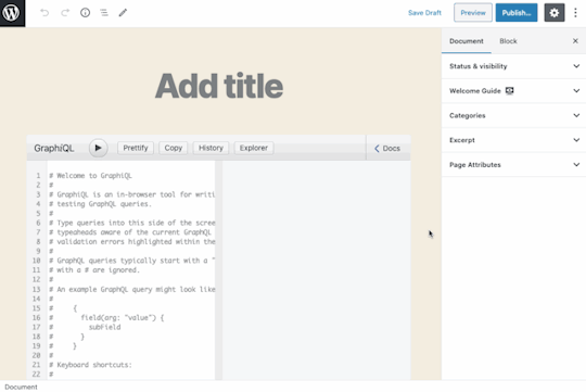
The design satisfies the requirements of the plugin, which is a GraphQL server for WordPress. The plugin offers a variety of CPTs that are edited through custom blocks which, in turn, are defined through templates. There’s a grand total of two blocks: one called “GraphiQL client” to input the GraphQL query, and one called “Persisted query options” to customize the behavior of the execution.
Since creating a query for GraphQL is not a trivial task, I decided to add the guide component to the editor screen for that CPT. It’s available in the Document settings as a panel called “Welcome Guide.”

Crack that panel open and the user gets a link. That link is what will trigger the modal.
For the modal itself, I decided to display a tutorial video on using the CPT on the first page, and then describe in detail all the options available in the CPT on subsequent pages.

I believe this layout is an effective way to show documentation to the user. It is out of the way, but still conveniently close to the action. Sure, we can use a different design or even place the modal trigger somewhere else using a different component instead of repurposing <Guide>, but this is perfectly good.
Planning the implementation
The implementation comprises the following steps:
Scaffolding a new script to register the custom sidebar panel
Displaying the custom sidebar panel on the editor for our Custom Post Type only
Creating the guide
Adding content to the guide
Let’s start!
Step 1: Scaffolding the script
Starting in WordPress 5.4, we can use a component called <PluginDocumentSettingPanel> to add a panel on the editor’s Document settings like this:
const { registerPlugin } = wp.plugins; const { PluginDocumentSettingPanel } = wp.editPost; const PluginDocumentSettingPanelDemo = () => ( <PluginDocumentSettingPanel name="custom-panel" title="Custom Panel" className="custom-panel" > Custom Panel Contents </PluginDocumentSettingPanel> ); registerPlugin( 'plugin-document-setting-panel-demo', { render: PluginDocumentSettingPanelDemo, icon: 'palmtree', } );
If you’re experienced with the block editor and already know how to execute this code, then you can skip ahead. I’ve been coding with the block editor for less than three months, and using React/npm/webpack is a new world for me — this plugin is my first project using them! I’ve found that the docs in the Gutenberg repo are not always adequate for beginners like me, and sometimes the documentation is missing altogether, so I’ve had to dig into the source code to find answers.
When the documentation for the component indicates to use that piece of code above, I don’t know what to do next, because <PluginDocumentSettingPanel> is not a block and I am unable to scaffold a new block or add the code there. Plus, we’re working with JSX, which means we need to have a JavaScript build step to compile the code.
I did, however, find the equivalent ES5 code:
var el = wp.element.createElement; var __ = wp.i18n.__; var registerPlugin = wp.plugins.registerPlugin; var PluginDocumentSettingPanel = wp.editPost.PluginDocumentSettingPanel;
function MyDocumentSettingPlugin() { return el( PluginDocumentSettingPanel, { className: 'my-document-setting-plugin', title: 'My Panel', }, __( 'My Document Setting Panel' ) ); }
registerPlugin( 'my-document-setting-plugin', { render: MyDocumentSettingPlugin } );
ES5 code does not need be compiled, so we can load it like any other script in WordPress. But I don’t want to use that. I want the full, modern experience of ESNext and JSX.
So my thinking goes like this: I can’t use the block scaffolding tools since it’s not a block, and I don’t know how to compile the script (I’m certainly not going to set-up webpack all by myself). That means I’m stuck.
But wait! The only difference between a block and a regular script is just how they are registered in WordPress. A block is registered like this:
wp_register_script($blockScriptName, $blockScriptURL, $dependencies, $version); register_block_type('my-namespace/my-block', [ 'editor_script' => $blockScriptName, ]);
And a regular script is registered like this:
wp_register_script($scriptName, $scriptURL, $dependencies, $version); wp_enqueue_script($scriptName);
We can use any of the block scaffolding tools to modify things then register a regular script instead of a block, which gains us access to the webpack configuration to compile the ESNext code. Those available tools are:
The WP CLI ‘scaffold’ command
Ahmad Awais’s create-guten-block package
The official @wordpress/create-block package
I chose to use the @wordpress/create-block package because it is maintained by the team developing Gutenberg.
To scaffold the block, we execute this in the command line:
npm init @wordpress/block
After completing all the prompts for information — including the block’s name, title and description — the tool will generate a single-block plugin, with an entry PHP file containing code similar to this:
/** * Registers all block assets so that they can be enqueued through the block editor * in the corresponding context. * * @see https://developer.wordpress.org/block-editor/tutorials/block-tutorial/applying-styles-with-stylesheets/ */ function my_namespace_my_block_block_init() { $dir = dirname( __FILE__ );
$script_asset_path = "$dir/build/index.asset.php"; if ( ! file_exists( $script_asset_path ) ) { throw new Error( 'You need to run `npm start` or `npm run build` for the "my-namespace/my-block" block first.' ); } $index_js = 'build/index.js'; $script_asset = require( $script_asset_path ); wp_register_script( 'my-namespace-my-block-block-editor', plugins_url( $index_js, __FILE__ ), $script_asset['dependencies'], $script_asset['version'] );
$editor_css = 'editor.css'; wp_register_style( 'my-namespace-my-block-block-editor', plugins_url( $editor_css, __FILE__ ), array(), filemtime( "$dir/$editor_css" ) );
$style_css = 'style.css'; wp_register_style( 'my-namespace-my-block-block', plugins_url( $style_css, __FILE__ ), array(), filemtime( "$dir/$style_css" ) );
register_block_type( 'my-namespace/my-block', array( 'editor_script' => 'my-namespace-my-block-block-editor', 'editor_style' => 'my-namespace-my-block-block-editor', 'style' => 'my-namespace-my-block-block', ) ); } add_action( 'init', 'my_namespace_my_block_block_init' );
We can copy this code into the plugin, and modify it appropriately, converting the block into a regular script. (Note that I’m also removing the CSS files along the way, but could keep them, if needed.)
function my_script_init() { $dir = dirname( __FILE__ );
$script_asset_path = "$dir/build/index.asset.php"; if ( ! file_exists( $script_asset_path ) ) { throw new Error( 'You need to run `npm start` or `npm run build` for the "my-script" script first.' ); } $index_js = 'build/index.js'; $script_asset = require( $script_asset_path ); wp_register_script( 'my-script', plugins_url( $index_js, __FILE__ ), $script_asset['dependencies'], $script_asset['version'] ); wp_enqueue_script( 'my-script' ); } add_action( 'init', 'my_script_init' );
Let’s copy the package.json file over:
{ "name": "my-block", "version": "0.1.0", "description": "This is my block", "author": "The WordPress Contributors", "license": "GPL-2.0-or-later", "main": "build/index.js", "scripts": { "build": "wp-scripts build", "format:js": "wp-scripts format-js", "lint:css": "wp-scripts lint-style", "lint:js": "wp-scripts lint-js", "start": "wp-scripts start", "packages-update": "wp-scripts packages-update" }, "devDependencies": { "@wordpress/scripts": "^9.1.0" } }
Now, we can replace the contents of file src/index.js with the ESNext code from above to register the <PluginDocumentSettingPanel> component. Upon running npm start (or npm run build for production) the code will be compiled into build/index.js.
There is a last problem to solve: the <PluginDocumentSettingPanel> component is not statically imported, but instead obtained from wp.editPost, and since wp is a global variable loaded by WordPress on runtime, this dependency is not present in index.asset.php (which is auto-generated during build). We must manually add a dependency to the wp-edit-post script when registering the script to make sure it loads before ours:
$dependencies = array_merge( $script_asset['dependencies'], [ 'wp-edit-post', ] ); wp_register_script( 'my-script', plugins_url( $index_js, __FILE__ ), $dependencies, $script_asset['version'] );
Now the script setup is ready!
The plugin can be updated with Gutenberg’s relentless development cycles. Run npm run packages-update to update the npm dependencies (and, consequently, the webpack configuration, which is defined on package "@wordpress/scripts") to their latest supported versions.
At this point, you might be wondering how I knew to add a dependency to the "wp-edit-post" script before our script. Well, I had to dig into Gutenberg’s source code. The documentation for <PluginDocumentSettingPanel> is somewhat incomplete, which is a perfect example of how Gutenberg’s documentation is lacking in certain places.
While digging in code and browsing documentation, I discovered a few enlightening things. For example, there are two ways to code our scripts: using either the ES5 or the ESNext syntax. ES5 doesn’t require a build process, and it references instances of code from the runtime environment, most likely through the global wp variable. For instance, the code to create an icon goes like this:
var moreIcon = wp.element.createElement( 'svg' );
ESNext relies on webpack to resolve all dependencies, which enables us to import static components. For instance, the code to create an icon would be:
import { more } from '@wordpress/icons';
This applies pretty much everywhere. However, that’s not the case for the <PluginDocumentSettingPanel> component, which references the runtime environment for ESNext:
const { PluginDocumentSettingPanel } = wp.editPost;
That’s why we have to add a dependency to the “wp-edit-post” script. That’s where the wp.editPost variable is defined.
If <PluginDocumentSettingPanel> could be directly imported, then the dependency to “wp-edit-post” would be automatically handled by the block editor through the Dependency Extraction Webpack Plugin. This plugin builds the bridge from static to runtime by creating a index.asset.php file containing all the dependencies for the runtime environment scripts, which are obtained by replacing "@wordpress/" from the package name with "wp-". Hence, the "@wordpress/edit-post" package becomes the "wp-edit-post" runtime script. That’s how I figured out which script to add the dependency.
Step 2: Blacklisting the custom sidebar panel on all other CPTs
The panel will display documentation for a specific CPT, so it must be registered only to that CPT. That means we need to blacklist it from appearing on any other post types.
Ryan Welcher (who created the <PluginDocumentSettingPanel> component) describes this process when registering the panel:
const { registerPlugin } = wp.plugins; const { PluginDocumentSettingPanel } = wp.editPost const { withSelect } = wp.data;
const MyCustomSideBarPanel = ( { postType } ) => {
if ( 'post-type-name' !== postType ) { return null; }
return( <PluginDocumentSettingPanel name="my-custom-panel" title="My Custom Panel" > Hello, World! </PluginDocumentSettingPanel> ); }
const CustomSideBarPanelwithSelect = withSelect( select => { return { postType: select( 'core/editor' ).getCurrentPostType(), }; } )( MyCustomSideBarPanel);
registerPlugin( 'my-custom-panel', { render: CustomSideBarPanelwithSelect } );
He also suggests an alternative solution, using useSelect instead of withSelect.
That said, I’m not totally convinced by this solution, because the JavaScript file must still be loaded, even if it isn’t needed, forcing the website to take a performance hit. Doesn’t it make more sense to not register the JavaScript file than it does to run JavaScript just to disable JavaScript?
I have created a PHP solution. I’ll admit that it feels a bit hacky, but it works well. First, we find out which post type is related to the object being created or edited:
function get_editing_post_type(): ?string { if (!is_admin()) { return null; }
global $pagenow; $typenow = ''; if ( 'post-new.php' === $pagenow ) { if ( isset( $_REQUEST['post_type'] ) && post_type_exists( $_REQUEST['post_type'] ) ) { $typenow = $_REQUEST['post_type']; }; } elseif ( 'post.php' === $pagenow ) { if ( isset( $_GET['post'] ) && isset( $_POST['post_ID'] ) && (int) $_GET['post'] !== (int) $_POST['post_ID'] ) { // Do nothing } elseif ( isset( $_GET['post'] ) ) { $post_id = (int) $_GET['post']; } elseif ( isset( $_POST['post_ID'] ) ) { $post_id = (int) $_POST['post_ID']; } if ( $post_id ) { $post = get_post( $post_id ); $typenow = $post->post_type; } } return $typenow; }
Then, ,we register the script only if it matches our CPT:
add_action('init', 'maybe_register_script'); function maybe_register_script() { // Check if this is the intended custom post type if (get_editing_post_type() != 'my-custom-post-type') { return; }
// Only then register the block wp_register_script(...); wp_enqueue_script(...); }
Check out this post for a deeper dive on how this works.
Step 3: Creating the custom guide
I designed the functionality for my plugin’s guide based on the WordPress <Guide> component. I didn’t realize I’d be doing that at first, so here’s how I was able to figure that out.
Search the source code to see how it was done there.
Explore the catalogue of all available components in Gutenberg’s Storybook.
First, I copied content from the block editor modal and did a basic search. The results pointed me to this file. From there I discovered the component is called <Guide> and could simply copy and paste its code to my plugin as a base for my own guide.
Then I looked for the component’s documentation. I browsed the @wordpress/components package (which, as you may have guessed, is where components are implemented) and found the component’s README file. That gave me all the information I needed to implement my own custom guide component.
I also explored the catalogue of all the available components in Gutenberg’s Storybook (which actually shows that these components can be used outside the context of WordPress). Clicking on all of them, I finally discovered <Guide>. The storybook provides the source code for several examples (or stories). It’s a handy resource for understanding how to customize a component through props.
At this point, I knew <Guide> would make a solid base for my component. There is one missing element, though: how to trigger the guide on click. I had to rack my brain for this one!
This is a button with a listener that opens the modal on click:
import { useState } from '@wordpress/element'; import { Button } from '@wordpress/components'; import { __ } from '@wordpress/i18n'; import MyGuide from './guide';
const MyGuideWithButton = ( props ) => { const [ isOpen, setOpen ] = useState( false ); return ( <> <Button onClick={ () => setOpen( true ) }> { __('Open Guide: “Creating Persisted Queries”') } </Button> { isOpen && ( <MyGuide { ...props } onFinish={ () => setOpen( false ) } /> ) } </> ); }; export default MyGuideWithButton;
Even though the block editor tries to hide it, we are operating within React. Until now, we’ve been dealing with JSX and components. But now we need the useState hook, which is specific to React.
I’d say that having a good grasp of React is required if you want to master the WordPress block editor. There is no way around it.
Step 4: Adding content to the guide
We’re almost there! Let’s create the <Guide> component, containing a <GuidePage> component for each page of content.
The content can use HTML, include other components, and whatnot. In this particular case, I have added three <GuidePage> instances for my CPT just using HTML. The first page includes a video tutorial and the next two pages contain detailed instructions.
import { Guide, GuidePage } from '@wordpress/components'; import { __ } from '@wordpress/i18n';
const MyGuide = ( props ) => { return ( <Guide { ...props } > <GuidePage> <video width="640" height="400" controls> <source src="https://d1c2lqfn9an7pb.cloudfront.net/presentations/graphql-api/videos/graphql-api-creating-persisted-query.mov" type="video/mp4" /> { __('Your browser does not support the video tag.') } </video> // etc. </GuidePage> <GuidePage> // ... </GuidePage> <GuidePage> // ... </GuidePage> </Guide> ) } export default MyGuide;

Hey look, we have our own guide now!
Not bad! There are a few issues, though:
I couldn’t embed the video inside the <Guide> because clicking the play button closes the guide. I assume that’s because the <iframe> falls outside the boundaries of the guide. I wound up uploading the video file to S3 and serving with <video>.
The page transition in the guide is not very smooth. The block editor’s modal looks alright because all pages have a similar height, but the transition in this one is pretty abrupt.
The hover effect on buttons could be improved. Hopefully, the Gutenberg team needs to fix this for their own purposes, because my CSS aren’t there. It’s not that my skills are bad; they are nonexistent.
But I can live with these issues. Functionality-wise, I’ve achieved what I need the guide to do.
Bonus: Opening docs independently
For our <Guide>, we created the content of each <GuidePage> component directly using HTML. However, if this HTML code is instead added through an autonomous component, then it can be reused for other user interactions.
For instance, the component <CacheControlDescription> displays a description concerning HTTP caching:
const CacheControlDescription = () => { return ( <p>The Cache-Control header will contain the minimum max-age value from all fields/directives involved in the request, or "no-store" if the max-age is 0</p> ) } export default CacheControlDescription;
This component can be added inside a <GuidePage> as we did before, but also within a <Modal> component:
import { useState } from '@wordpress/element'; import { Button } from '@wordpress/components'; import { __ } from '@wordpress/i18n'; import CacheControlDescription from './cache-control-desc';
const CacheControlModalWithButton = ( props ) => { const [ isOpen, setOpen ] = useState( false ); return ( <> <Button icon="editor-help" onClick={ () => setOpen( true ) } /> { isOpen && ( <Modal { ...props } onRequestClose={ () => setOpen( false ) } > <CacheControlDescription /> </Modal> ) } </> ); }; export default CacheControlModalWithButton;
To provide a good user experience, we can offer to show the documentation only when the user is interacting with the block. For that, we show or hide the button depending on the value of isSelected:
import { __ } from '@wordpress/i18n'; import CacheControlModalWithButton from './modal-with-btn';
const CacheControlHeader = ( props ) => { const { isSelected } = props; return ( <> { __('Cache-Control max-age') } { isSelected && ( <CacheControlModalWithButton /> ) } </> ); } export default CacheControlHeader;
Finally, the <CacheControlHeader> component is added to the appropriate control.

Tadaaaaaaaa 🎉
The WordPress block editor is quite a piece of software! I was able to accomplish things with it that I would have been unable to without it. Providing documentation to the user may not be the shiniest of examples or use cases, but it’s a very practical one and something that’s relevant for many other plugins. Want to use it for your own plugin? Go for it!
The post Adding a Custom Welcome Guide to the WordPress Block Editor appeared first on CSS-Tricks.
Adding a Custom Welcome Guide to the WordPress Block Editor published first on https://deskbysnafu.tumblr.com/
0 notes
Text
Adding a Custom Welcome Guide to the WordPress Block Editor
I am creating a WordPress plugin and there is a slight learning curve when it comes to using it. I’d like to give users a primer on how to use the plugin, but I want to avoid diverting users to documentation on the plugin’s website since that takes them out of the experience.
What would be great is for users to immediately start using the plugin once it’s installed but have access to helpful tips while they are actively using it. There’s no native feature for something like this in WordPress but we can make something because WordPress is super flexible like that.
So here’s the idea. We’re going to bake documentation directly into the plugin and make it easily accessible in the block editor. This way, users get to use the plugin right away while having answers to common questions directly where they’re working.
My plugin operates through several Custom Post Types (CPT). What we’re going to build is essentially a popup modal that users get when they go to these CPTs.
The WordPress block editor is built in React, which utilizes components that can be customized to and reused for different situations. That is the case with what we’re making — let’s call it the <Guide> component — which behaves like a modal, but is composed of several pages that the user can paginate through.
WordPress itself has a <Guide> component that displays a welcome guide when opening the block editor for the first time:

WordPress displays a modal with instructions for using the block editor when a user loads the editor for the first time.
The guide is a container filled with content that’s broken up into individual pages. In other words, it’s pretty much what we want. That means we don’t have to re-invent the wheel with this project; we can reuse this same concept for our own plugin.
Let’s do exactly that.
What we want to achieve
Before we get to the solution, let’s talk about the end goal.
The design satisfies the requirements of the plugin, which is a GraphQL server for WordPress. The plugin offers a variety of CPTs that are edited through custom blocks which, in turn, are defined through templates. There’s a grand total of two blocks: one called “GraphiQL client” to input the GraphQL query, and one called “Persisted query options” to customize the behavior of the execution.
Since creating a query for GraphQL is not a trivial task, I decided to add the guide component to the editor screen for that CPT. It’s available in the Document settings as a panel called “Welcome Guide.”

Crack that panel open and the user gets a link. That link is what will trigger the modal.
For the modal itself, I decided to display a tutorial video on using the CPT on the first page, and then describe in detail all the options available in the CPT on subsequent pages.

I believe this layout is an effective way to show documentation to the user. It is out of the way, but still conveniently close to the action. Sure, we can use a different design or even place the modal trigger somewhere else using a different component instead of repurposing <Guide>, but this is perfectly good.
Planning the implementation
The implementation comprises the following steps:
Scaffolding a new script to register the custom sidebar panel
Displaying the custom sidebar panel on the editor for our Custom Post Type only
Creating the guide
Adding content to the guide
Let’s start!
Step 1: Scaffolding the script
Starting in WordPress 5.4, we can use a component called <PluginDocumentSettingPanel> to add a panel on the editor’s Document settings like this:
const { registerPlugin } = wp.plugins; const { PluginDocumentSettingPanel } = wp.editPost; const PluginDocumentSettingPanelDemo = () => ( <PluginDocumentSettingPanel name="custom-panel" title="Custom Panel" className="custom-panel" > Custom Panel Contents </PluginDocumentSettingPanel> ); registerPlugin( 'plugin-document-setting-panel-demo', { render: PluginDocumentSettingPanelDemo, icon: 'palmtree', } );
If you’re experienced with the block editor and already know how to execute this code, then you can skip ahead. I’ve been coding with the block editor for less than three months, and using React/npm/webpack is a new world for me — this plugin is my first project using them! I’ve found that the docs in the Gutenberg repo are not always adequate for beginners like me, and sometimes the documentation is missing altogether, so I’ve had to dig into the source code to find answers.
When the documentation for the component indicates to use that piece of code above, I don’t know what to do next, because <PluginDocumentSettingPanel> is not a block and I am unable to scaffold a new block or add the code there. Plus, we’re working with JSX, which means we need to have a JavaScript build step to compile the code.
I did, however, find the equivalent ES5 code:
var el = wp.element.createElement; var __ = wp.i18n.__; var registerPlugin = wp.plugins.registerPlugin; var PluginDocumentSettingPanel = wp.editPost.PluginDocumentSettingPanel;
function MyDocumentSettingPlugin() { return el( PluginDocumentSettingPanel, { className: 'my-document-setting-plugin', title: 'My Panel', }, __( 'My Document Setting Panel' ) ); }
registerPlugin( 'my-document-setting-plugin', { render: MyDocumentSettingPlugin } );
ES5 code does not need be compiled, so we can load it like any other script in WordPress. But I don’t want to use that. I want the full, modern experience of ESNext and JSX.
So my thinking goes like this: I can’t use the block scaffolding tools since it’s not a block, and I don’t know how to compile the script (I’m certainly not going to set-up webpack all by myself). That means I’m stuck.
But wait! The only difference between a block and a regular script is just how they are registered in WordPress. A block is registered like this:
wp_register_script($blockScriptName, $blockScriptURL, $dependencies, $version); register_block_type('my-namespace/my-block', [ 'editor_script' => $blockScriptName, ]);
And a regular script is registered like this:
wp_register_script($scriptName, $scriptURL, $dependencies, $version); wp_enqueue_script($scriptName);
We can use any of the block scaffolding tools to modify things then register a regular script instead of a block, which gains us access to the webpack configuration to compile the ESNext code. Those available tools are:
The WP CLI ‘scaffold’ command
Ahmad Awais’s create-guten-block package
The official @wordpress/create-block package
I chose to use the @wordpress/create-block package because it is maintained by the team developing Gutenberg.
To scaffold the block, we execute this in the command line:
npm init @wordpress/block
After completing all the prompts for information — including the block’s name, title and description — the tool will generate a single-block plugin, with an entry PHP file containing code similar to this:
/** * Registers all block assets so that they can be enqueued through the block editor * in the corresponding context. * * @see https://developer.wordpress.org/block-editor/tutorials/block-tutorial/applying-styles-with-stylesheets/ */ function my_namespace_my_block_block_init() { $dir = dirname( __FILE__ );
$script_asset_path = "$dir/build/index.asset.php"; if ( ! file_exists( $script_asset_path ) ) { throw new Error( 'You need to run `npm start` or `npm run build` for the "my-namespace/my-block" block first.' ); } $index_js = 'build/index.js'; $script_asset = require( $script_asset_path ); wp_register_script( 'my-namespace-my-block-block-editor', plugins_url( $index_js, __FILE__ ), $script_asset['dependencies'], $script_asset['version'] );
$editor_css = 'editor.css'; wp_register_style( 'my-namespace-my-block-block-editor', plugins_url( $editor_css, __FILE__ ), array(), filemtime( "$dir/$editor_css" ) );
$style_css = 'style.css'; wp_register_style( 'my-namespace-my-block-block', plugins_url( $style_css, __FILE__ ), array(), filemtime( "$dir/$style_css" ) );
register_block_type( 'my-namespace/my-block', array( 'editor_script' => 'my-namespace-my-block-block-editor', 'editor_style' => 'my-namespace-my-block-block-editor', 'style' => 'my-namespace-my-block-block', ) ); } add_action( 'init', 'my_namespace_my_block_block_init' );
We can copy this code into the plugin, and modify it appropriately, converting the block into a regular script. (Note that I’m also removing the CSS files along the way, but could keep them, if needed.)
function my_script_init() { $dir = dirname( __FILE__ );
$script_asset_path = "$dir/build/index.asset.php"; if ( ! file_exists( $script_asset_path ) ) { throw new Error( 'You need to run `npm start` or `npm run build` for the "my-script" script first.' ); } $index_js = 'build/index.js'; $script_asset = require( $script_asset_path ); wp_register_script( 'my-script', plugins_url( $index_js, __FILE__ ), $script_asset['dependencies'], $script_asset['version'] ); wp_enqueue_script( 'my-script' ); } add_action( 'init', 'my_script_init' );
Let’s copy the package.json file over:
{ "name": "my-block", "version": "0.1.0", "description": "This is my block", "author": "The WordPress Contributors", "license": "GPL-2.0-or-later", "main": "build/index.js", "scripts": { "build": "wp-scripts build", "format:js": "wp-scripts format-js", "lint:css": "wp-scripts lint-style", "lint:js": "wp-scripts lint-js", "start": "wp-scripts start", "packages-update": "wp-scripts packages-update" }, "devDependencies": { "@wordpress/scripts": "^9.1.0" } }
Now, we can replace the contents of file src/index.js with the ESNext code from above to register the <PluginDocumentSettingPanel> component. Upon running npm start (or npm run build for production) the code will be compiled into build/index.js.
There is a last problem to solve: the <PluginDocumentSettingPanel> component is not statically imported, but instead obtained from wp.editPost, and since wp is a global variable loaded by WordPress on runtime, this dependency is not present in index.asset.php (which is auto-generated during build). We must manually add a dependency to the wp-edit-post script when registering the script to make sure it loads before ours:
$dependencies = array_merge( $script_asset['dependencies'], [ 'wp-edit-post', ] ); wp_register_script( 'my-script', plugins_url( $index_js, __FILE__ ), $dependencies, $script_asset['version'] );
Now the script setup is ready!
The plugin can be updated with Gutenberg’s relentless development cycles. Run npm run packages-update to update the npm dependencies (and, consequently, the webpack configuration, which is defined on package "@wordpress/scripts") to their latest supported versions.
At this point, you might be wondering how I knew to add a dependency to the "wp-edit-post" script before our script. Well, I had to dig into Gutenberg’s source code. The documentation for <PluginDocumentSettingPanel> is somewhat incomplete, which is a perfect example of how Gutenberg’s documentation is lacking in certain places.
While digging in code and browsing documentation, I discovered a few enlightening things. For example, there are two ways to code our scripts: using either the ES5 or the ESNext syntax. ES5 doesn’t require a build process, and it references instances of code from the runtime environment, most likely through the global wp variable. For instance, the code to create an icon goes like this:
var moreIcon = wp.element.createElement( 'svg' );
ESNext relies on webpack to resolve all dependencies, which enables us to import static components. For instance, the code to create an icon would be:
import { more } from '@wordpress/icons';
This applies pretty much everywhere. However, that’s not the case for the <PluginDocumentSettingPanel> component, which references the runtime environment for ESNext:
const { PluginDocumentSettingPanel } = wp.editPost;
That’s why we have to add a dependency to the “wp-edit-post” script. That’s where the wp.editPost variable is defined.
If <PluginDocumentSettingPanel> could be directly imported, then the dependency to “wp-edit-post” would be automatically handled by the block editor through the Dependency Extraction Webpack Plugin. This plugin builds the bridge from static to runtime by creating a index.asset.php file containing all the dependencies for the runtime environment scripts, which are obtained by replacing "@wordpress/" from the package name with "wp-". Hence, the "@wordpress/edit-post" package becomes the "wp-edit-post" runtime script. That’s how I figured out which script to add the dependency.
Step 2: Blacklisting the custom sidebar panel on all other CPTs
The panel will display documentation for a specific CPT, so it must be registered only to that CPT. That means we need to blacklist it from appearing on any other post types.
Ryan Welcher (who created the <PluginDocumentSettingPanel> component) describes this process when registering the panel:
const { registerPlugin } = wp.plugins; const { PluginDocumentSettingPanel } = wp.editPost const { withSelect } = wp.data;
const MyCustomSideBarPanel = ( { postType } ) => {
if ( 'post-type-name' !== postType ) { return null; }
return( <PluginDocumentSettingPanel name="my-custom-panel" title="My Custom Panel" > Hello, World! </PluginDocumentSettingPanel> ); }
const CustomSideBarPanelwithSelect = withSelect( select => { return { postType: select( 'core/editor' ).getCurrentPostType(), }; } )( MyCustomSideBarPanel);
registerPlugin( 'my-custom-panel', { render: CustomSideBarPanelwithSelect } );
He also suggests an alternative solution, using useSelect instead of withSelect.
That said, I’m not totally convinced by this solution, because the JavaScript file must still be loaded, even if it isn’t needed, forcing the website to take a performance hit. Doesn’t it make more sense to not register the JavaScript file than it does to run JavaScript just to disable JavaScript?
I have created a PHP solution. I’ll admit that it feels a bit hacky, but it works well. First, we find out which post type is related to the object being created or edited:
function get_editing_post_type(): ?string { if (!is_admin()) { return null; }
global $pagenow; $typenow = ''; if ( 'post-new.php' === $pagenow ) { if ( isset( $_REQUEST['post_type'] ) && post_type_exists( $_REQUEST['post_type'] ) ) { $typenow = $_REQUEST['post_type']; }; } elseif ( 'post.php' === $pagenow ) { if ( isset( $_GET['post'] ) && isset( $_POST['post_ID'] ) && (int) $_GET['post'] !== (int) $_POST['post_ID'] ) { // Do nothing } elseif ( isset( $_GET['post'] ) ) { $post_id = (int) $_GET['post']; } elseif ( isset( $_POST['post_ID'] ) ) { $post_id = (int) $_POST['post_ID']; } if ( $post_id ) { $post = get_post( $post_id ); $typenow = $post->post_type; } } return $typenow; }
Then, ,we register the script only if it matches our CPT:
add_action('init', 'maybe_register_script'); function maybe_register_script() { // Check if this is the intended custom post type if (get_editing_post_type() != 'my-custom-post-type') { return; }
// Only then register the block wp_register_script(...); wp_enqueue_script(...); }
Check out this post for a deeper dive on how this works.
Step 3: Creating the custom guide
I designed the functionality for my plugin’s guide based on the WordPress <Guide> component. I didn’t realize I’d be doing that at first, so here’s how I was able to figure that out.
Search the source code to see how it was done there.
Explore the catalogue of all available components in Gutenberg’s Storybook.
First, I copied content from the block editor modal and did a basic search. The results pointed me to this file. From there I discovered the component is called <Guide> and could simply copy and paste its code to my plugin as a base for my own guide.
Then I looked for the component’s documentation. I browsed the @wordpress/components package (which, as you may have guessed, is where components are implemented) and found the component’s README file. That gave me all the information I needed to implement my own custom guide component.
I also explored the catalogue of all the available components in Gutenberg’s Storybook (which actually shows that these components can be used outside the context of WordPress). Clicking on all of them, I finally discovered <Guide>. The storybook provides the source code for several examples (or stories). It’s a handy resource for understanding how to customize a component through props.
At this point, I knew <Guide> would make a solid base for my component. There is one missing element, though: how to trigger the guide on click. I had to rack my brain for this one!
This is a button with a listener that opens the modal on click:
import { useState } from '@wordpress/element'; import { Button } from '@wordpress/components'; import { __ } from '@wordpress/i18n'; import MyGuide from './guide';
const MyGuideWithButton = ( props ) => { const [ isOpen, setOpen ] = useState( false ); return ( <> <Button onClick={ () => setOpen( true ) }> { __('Open Guide: “Creating Persisted Queries”') } </Button> { isOpen && ( <MyGuide { ...props } onFinish={ () => setOpen( false ) } /> ) } </> ); }; export default MyGuideWithButton;
Even though the block editor tries to hide it, we are operating within React. Until now, we’ve been dealing with JSX and components. But now we need the useState hook, which is specific to React.
I’d say that having a good grasp of React is required if you want to master the WordPress block editor. There is no way around it.
Step 4: Adding content to the guide
We’re almost there! Let’s create the <Guide> component, containing a <GuidePage> component for each page of content.
The content can use HTML, include other components, and whatnot. In this particular case, I have added three <GuidePage> instances for my CPT just using HTML. The first page includes a video tutorial and the next two pages contain detailed instructions.
import { Guide, GuidePage } from '@wordpress/components'; import { __ } from '@wordpress/i18n';
const MyGuide = ( props ) => { return ( <Guide { ...props } > <GuidePage> <video width="640" height="400" controls> <source src="https://d1c2lqfn9an7pb.cloudfront.net/presentations/graphql-api/videos/graphql-api-creating-persisted-query.mov" type="video/mp4" /> { __('Your browser does not support the video tag.') } </video> // etc. </GuidePage> <GuidePage> // ... </GuidePage> <GuidePage> // ... </GuidePage> </Guide> ) } export default MyGuide;
Hey look, we have our own guide now!
Not bad! There are a few issues, though:
I couldn’t embed the video inside the <Guide> because clicking the play button closes the guide. I assume that’s because the <iframe> falls outside the boundaries of the guide. I wound up uploading the video file to S3 and serving with <video>.
The page transition in the guide is not very smooth. The block editor’s modal looks alright because all pages have a similar height, but the transition in this one is pretty abrupt.
The hover effect on buttons could be improved. Hopefully, the Gutenberg team needs to fix this for their own purposes, because my CSS aren’t there. It’s not that my skills are bad; they are nonexistent.
But I can live with these issues. Functionality-wise, I’ve achieved what I need the guide to do.
Bonus: Opening docs independently
For our <Guide>, we created the content of each <GuidePage> component directly using HTML. However, if this HTML code is instead added through an autonomous component, then it can be reused for other user interactions.
For instance, the component <CacheControlDescription> displays a description concerning HTTP caching:
const CacheControlDescription = () => { return ( <p>The Cache-Control header will contain the minimum max-age value from all fields/directives involved in the request, or "no-store" if the max-age is 0</p> ) } export default CacheControlDescription;
This component can be added inside a <GuidePage> as we did before, but also within a <Modal> component:
import { useState } from '@wordpress/element'; import { Button } from '@wordpress/components'; import { __ } from '@wordpress/i18n'; import CacheControlDescription from './cache-control-desc';
const CacheControlModalWithButton = ( props ) => { const [ isOpen, setOpen ] = useState( false ); return ( <> <Button icon="editor-help" onClick={ () => setOpen( true ) } /> { isOpen && ( <Modal { ...props } onRequestClose={ () => setOpen( false ) } > <CacheControlDescription /> </Modal> ) } </> ); }; export default CacheControlModalWithButton;
To provide a good user experience, we can offer to show the documentation only when the user is interacting with the block. For that, we show or hide the button depending on the value of isSelected:
import { __ } from '@wordpress/i18n'; import CacheControlModalWithButton from './modal-with-btn';
const CacheControlHeader = ( props ) => { const { isSelected } = props; return ( <> { __('Cache-Control max-age') } { isSelected && ( <CacheControlModalWithButton /> ) } </> ); } export default CacheControlHeader;
Finally, the <CacheControlHeader> component is added to the appropriate control.

Tadaaaaaaaa

The WordPress block editor is quite a piece of software! I was able to accomplish things with it that I would have been unable to without it. Providing documentation to the user may not be the shiniest of examples or use cases, but it’s a very practical one and something that’s relevant for many other plugins. Want to use it for your own plugin? Go for it!
The post Adding a Custom Welcome Guide to the WordPress Block Editor appeared first on CSS-Tricks.
source https://css-tricks.com/adding-a-custom-welcome-guide-to-the-wordpress-block-editor/
from WordPress https://ift.tt/30KQMi4 via IFTTT
0 notes
Text
300+ TOP AURELIA Interview Questions and Answers
Aurelia Interview Questions for freshers experienced :-
1. What is Aurelia? Aurelia is an open source UI framework which is used for web and mobile app development. This framework is focused on web standards and follows simple conventions. 2. What are the features of Aurelia? There are 5 Features of Aurelia: Components Web Standards Extensible Commercial Support License 3. What are the advantages of Aurelia? Advantages of Aurelia are: It is very clean Easily extensible It is very easy to use It is directed towards web standards 4. What are the component life cycle methods of Aurelia? The component life cycle methods of Aurelia are: constructor() created(owningView, myView) bind(bindingContext, overrideContext) attached() detached() unbind() 5. What is eventAggregator() plugin in Aurelia? The eventAggregator() plugin is used for cross-component communication. This plugin is also used to handle subscribing and publishing to messages or channels inside your app. 6. What are the types of Official Plugins used in Aurelia? Types of Official Plugins used are: i18n() fetch() dialog() animatorCSS() validation() animator-velocity() ui-virtualization() 7. What are the types of Standard Plugins used in Aurelia? Types of Standard Plugins used are: Router() History() eventAggregator() defaultResources() defaultBindingLanguage() 8. What is Throttle in Aurelia? Throttle: It is used to slow down the rate of updating input view-model. 9. What is Debounce in Aurelia? Debounce: It will update the binding after the user has stopped typing. It is almost the same as throttle. 10. Which command is used to install i18n plugin in Aurelia? Command used is: C:\Users\username\Desktop\aureliaApp>jspm install aurelia-i18n

AURELIA Interview Questions 11. What is fetch() plugin in Aurelia? fetch(): This plugin is used for handling HTTP requests. You can also use some other AJAX library. 12. What is i18n() plugin? i18n() Plugin is used for internalization and localization. 13. What is animator-velocity() in Aurelia? animator-velocity(): It is the standard plugin of Aurelia. Here, you can use velocity animation library instead of CSS animations. 14. What is ui-virtualization() in Aurelia? ui-virtualization(): This plugin is a useful library for handling large performance heavy UI tasks. 15. What are the types of data bindings used in Aurelia? There are two types of bindings used in Aurelia are: Simple Binding Two-Way Binding 16. What is the significance of index.html in Aurelia? index.html is deafult page of the app like in most of the HTML based apps. It is a place where scripts and stylesheets are loaded.It looks as under Aurelia System.import('aurelia‐bootstrapper'); We can also configure the programming language selection.Let's adjust our programming language. The default is pointing to TypeScript. However, we will choose ESNext. So we need to change that to So our index.html will now look like Aurelia System.import('aurelia‐bootstrapper'); 17. Explain the components Of Aurelia? Components are main building blocks of Aurelia framework. Simple Component : Each component contains view-model which is written in JavaScript and view, written in HTML. You can see our view-model definition below. This is an ES6 example but you can also use TypeScript. app.js export class MyComponent { header = "This is Header"; content = "This is content"; } We can bind our values to the view as shown in example below. ${header} syntax will bind the defined header value from MyComponent. The same concept is applied for content. app.html ${header} ${content} Aurelia Questions and Answers Pdf Download Read the full article
0 notes
Link
!
Most web developers I talk to these days love writing JavaScript with all the newest language features—async/await, classes, arrow functions, etc. However, despite the fact that all modern browsers can run ES2015+ code and natively support the features I just mentioned, most developers still transpile their code to ES5 and bundle it with polyfills to accommodate the small percentage of users still on older browsers.
This kinda sucks. In an ideal world, we wouldn’t be shipping unnecessary code.
With new JavaScript and DOM APIs, we can conditionally load polyfills because we can feature detect their support at runtime. But with new JavaScript syntax, this is a lot trickier since any unknown syntax will cause a parse error, and then none of the code will run.
While we don’t currently have a good solution for feature-detecting new syntax, we do have a way to feature-detect basic ES2015 syntax support today.
The solution is <script type="module">.
A working example
I created webpack-esnext-boilerplate so developers could see a real implementation of this technique.
With this boilerplate I intentionally included several advanced webpack features because I wanted to show that this technique is production-ready and works in real-world scenarios. These include well-known bundling best-practices like:
Code splitting
Dynamic imports (loading additional code conditionally at runtime)
Asset fingerprinting (for effective long-term caching)
And since I would never recommend something I wouldn’t use myself, I’ve updated this blog to use the technique as well. You can check out the source code if you’d like to see more.
1 note
·
View note
Photo

ES5 to ESNext — Here's Every Feature Added to JavaScript Since 2015: https://t.co/5Zi9GedUxP
0 notes
Photo

ES5 to ESNext — Here's Every Feature Added to JavaScript Since 2015: https://t.co/5Zi9GedUxP
0 notes
Link
Next Level Javascript in Bangla | From ES5 to ESNext | বাংলা ##realdiscount ##UdemyFreeDiscountCoupons #Bangla #ES5 #ESNext #JavaScript #Level #বল Next Level Javascript in Bangla | From ES5 to ESNext | বাà¦à¦²à¦¾ à¦à¦¾à¦à¦¾à¦¸à§à¦à§à¦°à¦¿à¦ªà§à¦ à¦à¦° বà§à¦¯à¦¬à¦¹à¦¾à¦° à¦à¦¬à¦ à¦à¦¨à¦ªà§à¦°à¦¿à§à¦¤à¦¾ নিà§à§ নতà§à¦¨ à¦à¦°à§ বলার à¦à¦¿à¦à§ নà§à¦à¥¤ নিà¦à§à¦° à¦à§à¦ à¦à¦¾à¦ পà§à¦°à¦à§à¦à§à¦ থà§à¦à§ শà§à¦°à§ à¦à¦°à§ নà§à¦à¦à§à¦²à¦¿à¦à§à¦¸, à¦à§à¦à¦², ফà§à¦¸à¦¬à§à¦ সব পà§à¦°à¦¾à§ সব পà§à¦°à¦¤à¦¿à¦·à§à¦ ানঠà¦à¦¾à¦à¦¾à¦¸à§à¦à§à¦°à¦¿à¦ªà§à¦ ফà§à¦°à¦¨à§à¦à¦à¦¨à§à¦ à¦à¦¬à¦ বà§à¦¯à¦¾à¦à¦à¦£à§à¦¡à§à¦° বিà¦à¦¿à¦¨à§à¦¨ à¦à¦¾à§à¦à¦¾à§ বà§à¦¯à¦¬à¦¹à¦¾à¦° à¦à¦°à¦à§à¥¤ à¦à¦° তাঠà¦à¦ সমà§à§ à¦à¦¾à¦à¦¾à¦¸à§à¦à§à¦°à¦¿à¦ªà§à¦ শà§à¦à¦¾à¦à¦¾ à¦à¦à¦°à¦à¦® পà§à¦°à§à§à¦à¦¨ হà§à§ পà§à§à¦à§à¥¤ à¦à¦° মরà§à¦¡à¦¾à¦¨ à¦à§à¦¡à¦¿à¦ পà§à¦¯à¦¾à¦à¦¾à¦°à§à¦¨ à¦à¦¬à¦ à¦à¦¾à¦à¦¾à¦¸à§à¦à§à¦°à¦¿à¦ªà§à¦ à¦à¦° নতà§à¦¨ à¦à¦¡à¦¿à¦¶à¦¨à¦à§à¦²à§ à¦à¦¾à¦¨à¦¾à¦° à¦à§à¦¨ বিà¦à¦²à§à¦ª নà§à¦ যদি নিà¦à§à¦à§ à¦à¦à¦à¦¨ দà¦à§à¦· à¦à¦¾à¦à¦¾à¦¸à§à¦à§à¦°à¦¿à¦ªà§à¦ ডà§à¦à§à¦²à¦ªà¦¾à¦° বলৠদাবি à¦à¦°à¦¤à§ হà§à¥¤ à¦à¦° à¦à¦ à¦à§à¦°à§à¦¸à§ à¦à¦ রà¦à¦®à¦ à¦à¦¿à¦à§ à¦à¦¾à¦à¦¾à¦¸à§à¦à§à¦°à¦¿à¦ªà§à¦ à¦à¦° লà§à¦à§à¦¸à§à¦ বà§à¦¯à¦¬à¦¹à¦¾à¦° à¦à§à¦ à¦à§à¦ à¦à¦à§à¦¸à¦¾à¦®à¦ªà¦² সাহাযà§à¦¯à§ দà§à¦à¦¾à¦¨à§à¦° à¦à§à¦·à§à¦à¦¾ à¦à¦°à¦¾ হà§à§à¦à§à¥¤à¥¤ à¦à¦ à¦à§à¦°à§à¦¸à¦à¦¿ à¦à¦¾à¦° à¦à¦¨à§à¦¯ ? à¦à¦¾à¦à¦¾à¦¸à§à¦à§à¦°à¦¿à¦ªà§à¦ নিà§à§ à¦à¦à§à¦°à¦¹ থাà¦à¦¤à§ হবৠà¦à¦¬à¦ à¦à¦à¦¾à¦ সবà¦à§à§à§ à¦à§à¦°à§à¦¤à§à¦¬à¦ªà§à¦°à§à¦£à¥¤ যà§à¦¹à§à¦¤à§ à¦à§à¦°à§à¦¸à§ à¦à§à¦¡ à¦à¦°à¦¾à¦° à¦à¦¨à§à¦¯ à¦à¦¾à¦à¦¾à¦¸à§à¦à§à¦°à¦¿à¦ªà§à¦ বà§à¦¯à¦¬à¦¹à¦¾à¦° à¦à¦°à¦¾ হবà§, তাঠà¦à¦¾à¦à¦¾à¦¸à§à¦à§à¦°à¦¿à¦ªà§à¦ à¦à¦° à¦à§à¦à¦¾à¦¨ থাà¦à¦¾ à¦à¦°à§à¦°à¦¿à¥¤ à¦à§à¦°à§à¦¸ শà§à¦·à§ à¦à¦¿ শিà¦à¦¬ ? à¦à¦¾à¦à¦¾à¦¸à§à¦à§à¦°à¦¿à¦ªà§à¦ লà§à¦à§à¦¸à§à¦ à¦à¦¾à¦°à§à¦¸à¦¨ à¦à§à¦²à§à¦¤à§ à¦à§à¦¡ à¦à¦°à¦¾à¦° দà¦à§à¦·à¦¤à¦¾à¥¤ à¦à¦¨à§à¦¸à¦à§à¦°à¦¾à¦à§à¦à¦°à§à¦° পরিà¦à§ ? হà§à¦¯à¦¾à¦²à§, à¦à¦®à¦¿ নà¦à¦¶à¦¾à¦¦à¥¤ পà§à¦¶à¦¾à§ à¦à¦à¦à¦¨ সফà¦à¦à§à§à¦¯à¦° à¦à¦à§à¦à¦¿à¦¨à¦¿à§à¦¾à¦° à¦à¦¬à¦ à¦à¦à¦à¦¨ à¦à§à¦à¦¨à§à¦²à¦à¦¿ নিà§à§ à¦à¦à§à¦°à¦¹à§ মানà§à¦·à¥¤ নিà¦à§à¦° শিà¦à¦¤à§ à¦à¦¾à¦² লাà¦à§ à¦à¦¬à¦ নলà§à¦ শà§à§à¦¾à¦° à¦à¦°à¦¤à§ à¦à¦¾à¦² লাà¦à§à¥¤ à¦à¦¾à¦°à¦£ à¦à¦®à¦¿ মনৠà¦à¦°à¦¿ শà§à§à¦¾à¦° à¦à¦°à¦¤à§ à¦à¦¿à§à§ নিà¦à§à¦ à¦à¦¾à¦² à¦à¦¾à¦¬à§ শà§à¦à¦¾ সমà§à¦à¦¬à¥¤ à¦à¦ à¦à¦¿à¦à¦à§à¦°à¦¿à§à¦¾à¦² বানাতৠবানাতৠà¦à¦®à¦¿ নিà¦à§à¦ à¦
নà§à¦ à¦à¦¿à¦à§ শিà¦à§à¦à¦¿ à¦à¦¬à¦ বà§à¦à§à¦à¦¿à¥¤ à¦à¦¶à¦¾ à¦à¦°à¦¿ à¦à¦ªà¦¨à¦¾à¦°à¦ à¦à¦¾à¦² লাà¦à¦¬à§ :)Inspired by: ES5 to ESNext â hereâs every feature added to JavaScript since 2015 by Flavio Copes Who this course is for: intermediate 👉 Activate Udemy Coupon 👈 Free Tutorials Udemy Review Real Discount Udemy Free Courses Udemy Coupon Udemy Francais Coupon Udemy gratuit Coursera and Edx ELearningFree Course Free Online Training Udemy Udemy Free Coupons Udemy Free Discount Coupons Udemy Online Course Udemy Online Training 100% FREE Udemy Discount Coupons https://www.couponudemy.com/blog/next-level-javascript-in-bangla-from-es5-to-esnext-%e0%a6%ac%e0%a6%be%e0%a6%82%e0%a6%b2%e0%a6%be/
0 notes
Link
0 notes
Text
detect-es - ESnextのコード有無をチェック
from http://www.moongift.jp/2018/02/detect-es-esnext%e3%81%ae%e3%82%b3%e3%83%bc%e3%83%89%e6%9c%89%e7%84%a1%e3%82%92%e3%83%81%e3%82%a7%e3%83%83%e3%82%af/
旧来のJavaScriptは変数のスコープに問題があったり、クラスをサポートしていないなど大きなWebアプリケーションを作るには不向きな言語でした。しかし現在はPromiseやクラス、Proxyなど多彩な機能が追加されています。
これらはESnextと呼ばれる仕様で、すべてのWebブラウザで間違いなく使える訳ではありません。そうしたESnextのコードが存在するかどうかチェックできるのがdetect-esです。
detect-esの使い方
インストールはYarnまたはnpmを使って行います。
yarn global add detect-es
後はファイルを指定して detect-es コマンドを実行するだけです。
$ detect-es client/www/js/app.js CONST client/www/js/app.js:1:0 CONST client/www/js/app.js:2:0 CONST client/www/js/app.js:3:0 CONST client/www/js/app.js:4:0 ARROW_FUNCTION client/www/js/app.js:6:46 CONST client/www/js/app.js:7:2 ARROW_FUNCTION client/www/js/app.js:7:22 API You may need a polyfill for Promise client/www/js/app.js:8:15
detect-esが対応しているのはconst/let、テンプレート、クラス、アローファンクション、Async Function、モジュール、インポート、分割代入、ジェネレータ、for of 文となっています。これらは使ってはいけない訳ではありませんが、古いブラウザでは動かない可能性があるので利用の際にはサポートブラウザを確認する必要があるでしょう。
detect-esはnode/JavaScript製のオープンソース・ソフトウェア(MIT License)です。
egoist/detect-es: Detect ESnext features in your code.
0 notes
Photo
How tiny dependencies can topple the JavaScript Jenga tower
#486 — May 1, 2020
Unsubscribe : Read on the Web
JavaScript Weekly
🌍 I18n Ally: An All-in-One i18n Extension for VS Code — Got some internationalization work to do? I18n Ally gives you inline annotations, automated translations via Google Translate (which you can review), progress indication, etc. Supports React, Angular, Vue and other frameworks.
Anthony Fu
How a Few Lines of Code Broke Lots of Packages — Just under a week ago, people were reporting that create-react-app was broken. The culprit? A tiny change in a tiny dependency: is-promise. Luckily a fix was out very quickly and the creator of is-promise reflects on what happened here. Liran Tal also has some analysis of the situation.
Forbes Lindesay
Identify Front-End Issues Like JavaScript or Network Errors Fast — Datadog’s algorithmic alerts will proactively alert on any client-side issues such as JavaScript and network errors. Optimize the load time of your front-end resources, and detect any UI issues that affect critical user journeys. Try it free with Datadog Synthetics.
Datadog sponsor
Q: A JavaScript 'Quantum Circuit' Simulator — Bring quantum computing to your browser with this JavaScript simulation. If you were never quite sure what your JavaScript code was going to do, now you can formally explore the concept 😂
Stewart Smith
Quick bytes:
The first release candidate of TypeScript 3.9 is here.
A look at the current state of Vue.js in the form of a slide deck. 3.0.0-beta.5 just dropped BTW.
If your team uses Storybook, the same team have released Chromatic 2.0 which brings team 'code review' practices to your UI components.
A look at wink-scroll, a JavaScript-powered way to scroll Web content using your eyes alone.
If you didn't realize we have a Node Weekly newsletter somewhat similar to this one, you do now.. 😄
💻 Jobs
Find a Job Through Vettery — Vettery specializes in tech roles and is completely free for job seekers. Create a profile to get started.
Vettery
Senior Full-Stack Developer (Malmö/Sweden) — Every day is different from the next. Join our upbeat Team and work on exciting, major projects using a modern JavaScript stack.
Ortelius AB
📚 Tutorials
A Guide to window.location — A breakdown that covers most of the methods and properties available on the DOM’s window.location object.
samantha ming
Implementing Dark Mode in React Apps Using styled-components
Blessing Krofegha
▶ Let's Build a Financial Dashboard App with React (Webinar On‑Demand) — Join TJ VanToll as he walks you through building a responsive Bootstrap-themed Stocks Portfolio app. Check it out today.
Progress KendoReact sponsor
Getting Started with NuxtJS — Learn how to create Vue.js-powered server-side rendered apps with NuxtJS including configuring an app and deploying it on Heroku.
Timi Omoyeni
▶ Learn Svelte: A 16-Part Course on Learning the Popular UI Framework — The course centers around building a chatbot, which is a nice change from the todos and other overused tutorial examples.
noah kaufman
10 Practical JavaScript Tricks — These kinds of lists are usually pretty run of the mill, but this one actually contains some lesser-known quick tips that you may not have seen before.
zander shirley
Moving TinyMCE to Modern JavaScript — The creators of TinyMCE (a popular WYSIWYG HTML editor) have been refactoring its rather legacy JavaScript (the first version came out 17 years ago!) to modern practices.
Joakim Lindkvist
7 JavaScript Design Patterns Every Developer Should Know — This is sort of like a (very) mini version of Addy Osmani’s 2017 book on JS design patterns (which is referenced at the end of the post).
deven rathore
▶ An Introduction to State Machines Using XState — XState is a neat way to work with state machines in JavaScript, Kyle is a neat teacher, and Egghead is a neat platform for unlocking these videos for us too.
Kyle Shevlin
Ride Down Into JavaScript Dependency Hell
AppSignal sponsor
A Collection of Challenging TypeScript Exercises — “The goal: Let everyone play with many different TypeScript features and get an overview of TypeScript capabilities and principles.”
Marat Dulin
A Visual Guide to React Mental Models — Different people learn in different ways but good mental models are always valuable and can be helpful if you need to juggle all of the pieces involved in a framework like React.
Obed Parlapiano
Turning Vue Components Into Reusable npm Packages — Outlines how you can reuse Vue components across your projects by automating your process to bundle, test, document, and publish your components.
Sjoerd de voorhoede
🔧 Code & Tools

jExcel v4: A Vanilla JS Interactive Table / Spreadsheet Control — 4.0 adds support for tabs/workbooks, updating a remote data source with JSON, formula support in a sheet footer, and more. There are lots of demos and examples on the official homepage.
Paul Hodel
Will It CORS? — A handy online tool/wizard for establishing how your (potential) use case will (or won’t!) operate alongside CORS (Cross-Origin Resource Sharing).
HTTP Toolkit
Get Great Visual Feedback & Bug Reports, Even from Non-Technical Folk — Simply click a page element to pin visual feedback with screenshots & metadata. BugHerd = fast and easy bug tracking.
BugHerd sponsor
utfu: Replace Busted Characters From Legacy Text with UTF-8 — Useful when old content contains characters like “— in place of a single quote, and similar legacy text issues.
Daniel Sieradski
Middy 1.0: A Node Middleware Framework for AWS Lambda — Middy’s aim is to make writing serverless functions (hosted on AWS Lambda) easier by providing a familiar middleware abstraction to Node developers.
Luciano Mammino
useWorker() 3.0: A React Hook for Blocking-Free Background Tasks — Makes it easier to throw tasks off to a Web Worker in React.
Alessio Koci
webpack-blocks: Configure webpack using Functional Feature Blocks
Andy Wermke
JZZ: A MIDI Library for Node and the Browser — Send, receive and play MIDI messages from both Node and the browser on Linux, macOS and Windows.
Sema
MDX 1.6: Use JSX in Markdown Documents — This version introduces initial Vue support.
Compositor and Vercel
🗓 Upcoming Online Events
JavaScript Remote Conf 2020 (May 14-15) — Speakers lined up already include Raymond Camden, Christian Heilmann, and Aleksandra Sikora.
ESNEXT CONF 2020 (May 18-22) — From the Pika folks (of Snowpack fame). 12 speakers over 5 days so it's a gradual pace.
ForwardJS (May 26-29) — A real world event (ForwardJS Ottawa) that has now become a virtual event.
CascadiaJS 2020 (September 1-2) — This upcoming online conference is set to take place in September, and the CFP is open now through May 15.
by via JavaScript Weekly https://ift.tt/2YpchDS
0 notes