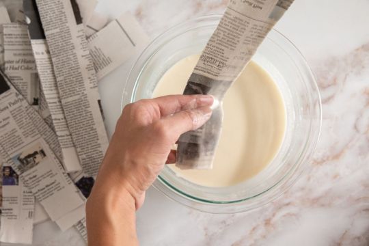
#I added in the third image with the layered photos
Explore tagged Tumblr posts
Visit Tumblr Blog
Explore Tumblr blogs with no restrictions, modern design and the best experience.
Last Seen Tumblr Blogs


Fun Fact
25% of US internet users with an annual income of $80-100K use Tumblr.
Text


Murderbot showrunner Chris Weitz shared that Murderbot's look had partly been inspired by Max von Sydow's character in the 1957 film, The Seventh Seal.
#I added in the third image with the layered photos#art of this would be beautiful#murderbot tv show#murderbot#murderbot tv#the seventh seal#Max von Sydow#the murderbot diaries#alexander skarsgård#SecUnit with a sword...#my favorite genderless knight
61 notes
·
View notes
Text
Estera Ch 35 - Ten
What went before
It’s been a while! Ironic that in March of the OCs I have throughly neglected my dear OC but I shall try to make up for it! This one fought me (while I’ve written tens of thousands of words for further down the line 🙄) because I wanted one chapter to achieve too many different things and I rather lost confidence in myself to make it work or even to continue with it at all. (Every scrap of credit goes to @sofasurf for giving me a metaphorical shake and waving snippets of her excellent future chapters to bribe me).
The end result is… again… I have broken one event down into more than one chapter. Hoping there is the right balance of fluff and angst to suit those still reading (thank you xx)
Here we ponder whether one can be homesick for somewhere that is no longer your home, there is an addition to the gallery, Scott has a wobble and the giant floof introduces us to his favourite Thunderbird…
✨✨✨✨✨✨✨✨✨✨✨✨✨✨✨✨
Bez stood guard at the front door, clearly determined to give the earliest possible warning of their visitor’s approach. It had been five minutes since Estera had heard the unmistakeable sound of VTOL engines through the open window which told her he’d decided to leave the jet somewhere nearby, maybe at the fancy golf club where such things didn’t stand out as so unusual. That was 15 mins walk away on normal-human-length legs, so she could probably expect him fairly imminently.
She gave up on the article she was staring at in a futile attempt to stop herself thinking too much and dumped the tablet on the coffee table with a little more force than intended before getting up to pace around the room. Maybe moving would help? Bez glanced over before returning his serious gaze to the door handle.
The intensity of his expression was offset rather by the little blue polka dot bow tie she had attached to his collar to mark the occasion. It had been 5 years to the day since she collected a tiny ball of puppy floof from the breeder and finally made her apartment feel like a home. Because on that particular day it had been exactly 5 years since she’d seen the last place that felt that way.
And thus today, dziesięć. Ten.
Ten years since she’d opened the back door in the morning to stand barefoot in the grass. Ten years since she’d taken a deep, rejuvenating breath of the air rolling off the Tatra mountains.
Ten years since she’d sat on the back porch with a cup of coffee, stealing a few moments to listen to the excitable call of the woodlark, one of the few privileges the militia hadn’t managed to take from them. The yellow-painted structure had been plagued by woodworm even then… it was probably long gone now. In fact, she didn’t even know if the house was still there. That felt wrong. Even if she knew she could never go back to it… surely she should know? But who could she call to ask? Nobody was there anymore…
Ten years since she’d held a meaningful conversation in her native tongue. Bez didn’t count.
Ten years since she‘d started to feel the constant need to justify her presence by being useful, by being an asset to her adopted country. Ten years since she felt like she truly belonged anywhere.
Ten years since she’d hugged her parents and promised to live.
She sighed and walked over to their photo on the wall for the third time that morning and pressed her palm against it. Then rested her forehead on the back of her hand. It felt as though she was fighting through the fuzzy layer that time was beginning to paint over her mental image of them, trying to fix the happy memories somewhere safe. Somewhere accessible. The memories before that day. Before the war and all the horrors that had brought.
Ten years too since she’d found and lost a hero within minutes and gained an imaginary soulmate.
Ten years since she should have died. Maybe in some ways the old her had. Ten years since her life had changed forever anyway.
Her gaze shifted to the new photo, framed in blue, that she had recently added to her gallery. Yes, and in the last few months… everything had suddenly changed again. But this time in an indisputably good way. Because the imaginary hero had somehow shed the imaginary bit and become her friend. The two of them grinned manically out of the hasty selfie - hair dishevelled, flushed with adrenaline and drenched in seawater but vividly, irrepressibly alive.
She couldn’t help smiling back. He was hero to lots of people, but friend was infinitely better.
Bez, who had quietly padded over to sit close beside her whined quietly and rested his big head on her hip.
“Quite right, Niebieski, enough introspection.”
He huffed a non-committal response before an ear twitched and he flung himself towards the door, his claws skittering on the tiles, and resumed his supervision of the door handle.
✨✨✨✨✨✨✨✨✨✨✨✨✨✨✨✨
Elevator was out again, Scott noticed. He rolled his eyes and then took the stairs at a run… just because. He found himself counting them in groups of ten. Ten ten ten ten ten ten ten… and… hmph, two more. If she’d only lived on the 5th floor that would have been far more satisfying. He took a moment to calculate how much height each individual stair would need to have added to fix this… would that make the rise too steep? Maybe if they could reduce each by 20% and add four more to each flight?
Huh, he was clearly more on edge than he realised if he was compulsively doing math. He recalled frantically focusing on trying to disprove Goldbach’s Conjecture while refusing to visibly react to the agony of…
No. Stop it. He was here so that he didn’t need to lose himself in thinking about it. So that neither of them did.
He looked over at her door. He was technically a few minutes early, did that matter? He decided not and braced himself to withstand 60 kilos of furry, drooling enthusiasm. Bez, the big, fluffy, friendly dog who was most definitely not a half-starved killer. He was a different creature in every way and Scott was definitely getting better at forgetting the nightmare dogs. Much better actually.
It was all good. Even the bark he was about to hear was different - deep and booming and safe. Not snarling and howling. All good.
Scott raised a hand to knock but froze as an unexpected noise reached him… the scratching of claws on stone. They prowled relentlessly outside, waiting... Daring him to even try… He gasped out loud as his lower back slammed painfully into the bannister at the top of the stairs and he grabbed it tight, trying to ground himself. His vision blurred.
A voice drifted through the fog, the same sibilant quality of speech that haunted his nightmares and he was nearly overwhelmed by nausea before he heard a joyful laugh and knew… with a rush he knew… that it wasn’t there it was… here. It was her language, her’s and the dog’s, not… not theirs.
He gripped the bannister hard as the door opened and his friend looked up at him, the smile sliding off her face and her hand slipping from the dog’s collar as it surged towards him and… and skidded to a halt a metre away, ears raised, head tilted.
“Niebieski, Noga!
Scott? What’s wrong?”
The dog returned to heel immediately and sat down, looking up at him with that same questioning head tilt. Scott blinked the sweat from his stinging eyes, cursed himself for overreacting and was about to apologise when he realised Estera had gone… what? He shook his head in frustration and was about to call after her. Except she was already back and lugging a huge beanbag which she placed just to his left away from the top of the stairs. He rubbed his eyes with the back of a hand, it was passing he didn’t need to sit down. He was about to thank her for the thought but reassure her it was unnecessary when his knees decided for him and he sank into the thing, vaguely noticing the loud scrunching noise of the filling reshaping around him. He leant forward to rest his forearms on his bent knees… scrunch again. The noise drowned out the whistling and the barking and he wriggled a little to make it happen a third time. Then all was quiet.
“I’m so sorry.”
“Don’t be daft, Scott.”
“It’s so stupid.”
“No it’s not.”
“I’m sorry…”
“Just breathe for a minute, Blue.”
He did that. Precisely 60 seconds passed. 13 breaths, a couple more than would be usual. His comm pulsed quietly and he triple-tapped it to answer the enquiry in the affirmative. His head was much clearer now. He tried to relax his shoulders and looked around. Bez was nowhere to be seen. Estera was crouched next to him though, humming quietly. She smiled reassuringly as he looked at her and made to stand.
“I’ll just drop him round to George and Edith’s then we can go inside.”
“No! Don’t. Please.”
“It’s really not a problem at all.”
“No, it wasn’t his fault. I… something just took me by surprise. It’s not a problem.” Scott took a shaky breath and sat up straight. “I don’t want it to be a problem. I want to say hello.”
She frowned at him.
“I really do. Please bring him back.” Scott put as much confidence into the request as he could muster with the result it sounded more like a command than a request.
“Do Mnie!” She called quietly. He knew that one - Come! He focussed on practising the pronunciation in his head.
Bez poked his head out of the front door, his mouth full of some huge green cuddly toy. As Scott repeated the command the dog walked slowly forwards and placed the toy in front of him before lying quietly down next to his mistress.
Scott reached out cautiously and patted Bez on the head and murmured his thanks for the gift of… err… whatever the giant green drool-soaked plushie monster Bez had deposited at his feet was meant to be. Some kind of chunky lizard? A turtle with a zip on its belly? The dog looked at the toy and then back at Scott. Waiting for something?
Ah. He needed to physically accept the gift. Ugh… but he could literally see dog-spit-bubbles gleaming on the fuzzy surface. Shudder. Come on Tracy, you’ve dealt with grosser things in Gordon’s bedroom…
Acting with the kind of caution he’d exercise towards potentially explosive toxic waste, Scott picked the item up with a thumb and forefinger, and dangled it as far from his body as possible to inspect. It spun slowly in the air to reveal a very familiar yellow, red and white pattern on the top side and his jaw dropped in delighted surprise.
The shape, he could now see, was almost recognisable but it had been significantly squashed and white stuffing was poking out from several holes. Other sections had evidently been firmly re-stitched together which only emphasised how the rest of the original seams were on the point of bursting. The tail was hanging on by mere threads. Bez sat up tall on his hind legs and looked immensely proud of himself.
“Oh Bez… whatever would Virgil say?”
Now the adrenaline was dissipating Scott felt the overwhelming urge to giggle.
He cleared his throat to repress it and then bit his lip, not wanting to offend the giant animal by laughing in his face. His body shook a little as he shuffled forward and reverently placed the mutilated toy back down in front of its owner but he kept his cool. Said owner eyed him and then promptly picked up the toy and put it more decisively on top of Scott’s shoes.
“Goodness you are highly honoured Scott, he won’t let me near Thunderbird Chew! I’ve had to sneak her away while he sleeps to carry out routine maintenance in the dead of night and… err, Scott? Are you ok?”
Scott knew he was a lost cause even as he crammed a hand into his mouth to suppress the laughter. Bez looked at him with evident concern but it was Estera’s smug expression tipped him over the edge and he threw his head back and cackled.
Thunderbird Chew! He absolutely had to tell Virgil…
✨✨✨✨✨✨✨✨✨✨✨✨✨✨✨✨
Next: Chapter 36 - Lost
#thunderbirds are go#thunderbirds#thunderbirds fanfiction#scott tracy#tb estera#estera#thunderbirds oc#idontknowreallywhy fanfic
26 notes
·
View notes
Note
So, thoughts on the Fall Formal outfits for the Humane 5 + Twilight, Flash, Trixie, Snips, Snails, CMC, Diamond Tiara, and Silver Spoon in the first EQG movie?
Okay fall formal outfits:
Twilight - Pretty okay. A little generic. I think she could've gone with something a touch more regal since part of her story arc is accepting her role as Princess and Leader. But they wanted everyone in short skirts and all.
Pinkie - I love this one actually. Layers, bows, the hat? A lot better fitting. My only suggestion would once again be 'More!!' but I understand the limitation of keeping her simple for animation
Rarity - Fabulous as always! I kinda wish she had a necklace though.
Applejack - I..... look. The Fall Formal is one of the times I'm down for AJ wearing a dress of her own accord but... that's- that's not a vibe at all. It's trying way too hard. Jean dress and apples everywhere.
Rainbow - Once again she suffers from the design team wanting to put her in rainbow-colored outfits. I like the style of it decently for 'she has to wear a dress', but I'd love for them to let her have a more solid colors.
Fluttershy - Real cute! I think she should have sleeves, but it's still a vibe!
Sunset - Did not wear a different outfit for the formal. Of the three we see in her photos of previous wins, I like the first one best and the third the least.
Flash - Pretty generic suit tbh, but he's the sexy lamp at a school dance so it works!
Trixie - I can't find any images of her at the Fall Formal, and I don't feel like scouring the background right now.
Snips and Snails - Wearing a tuxedo print shirt/adding a bowtie to your default outfit with a tophat? Peak freshman energy.
CMC - why are they all in pinks?? I think if you adjust the colors to be more personal it'd work for Bloom and Belle. Scoots is entirely too frilly tho
Diamond and Silver - I wish we got to see what the actual color scheme for them is because I can only find images of them in funky lighting, but I love both their dresses on them
10 notes
·
View notes
Text
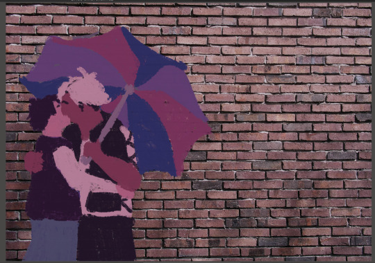
helloooo i wanted to share the way that you too can make wall graffiti digital art like the one i posted because it is genuinely fairly easy and simple ! :]
lets hop right into it!
so first u are going to need the art! my process was to make lineart first and then paint over it but the lineart isn't necessary - I just ended up getting frustrated with the lines and decided to scrap the lineart and go in a different direction than my original plan for the piece LOL
for the painting, find a brush that looks chalky or spray painted. the brush i used is one i made myself, normally used to look like a marker thats running out of ink but I messed with the settings to end up with what I used for this piece. now slap some colours on your canvas!

keep it messy! leave gaps in the colouring for the bg to show through! depending on if youre going for a chalk/chalk paint or spray paint look, you can use different techniques here. keep details to a minimum (or don't! do what feels right!) if u want to achieve more of a typical wall graffiti look!
okay now that you've got your art, time for the wall!
stick a free-to-use photo of a brick wall into your layers under the paint layer (first image):

(second image) the wall looked too bright and brown for paint colours i'd chosen, so I put a fill layer of dark purple (colour picked from the painting) and set it to "hard light" and turned the opacity down a bit to get a more cohesive colour.
okay time to get your paint looking more like it's on the wall properly - we're going to go from A to B here:
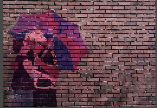
this is where i give the disclaimer "you can do whatever you want but here's what i did" LOL. here's what I ended up with for layers by the end of this part of the process:
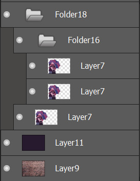
first (bottom) layer7 is my base layer. i set the paint layer to "overlay" at 100% opacity. the second (middle) layer7 is set to "multiply" at around 30% opacity. the third (top) layer7 is set to "screen" at around 20% opacity. do i know what any of these do in proper terms? nope! i learned a little bit of photoshop in grade 11 and 12 and barely remember any of it so I'm just flying by the seat of my pants 🙂👍
base layer alone (just overlay) VS with the added folder 16 (multiply and screen layers) - the difference is barely noticeable but in the second one the colours are a little bolder and more opaque.


screen seems to brighten it a little and multiply seems to darken it. why did i add both? who knows!
for the shadows on the wall, it's pretty easy:
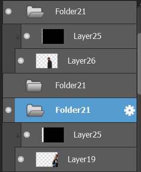
i found free-to-use (and free-to-modify etc) photos of people walking, used "motion blur" in filters on that, added a fill layer of black/dark purple and set it to be a clipping layer over the person walking so they were now a silhouette, and set the motion-blurred person layer (19 and 26) to "multiply". play with the opacity to your heart's content and boom-shaka-laka we've got a shadow (or two) on the wall!


i think it adds a little bit of something extra to it! :]
that's the long and short of what I did to make that piece - if you want to do more stuff like this, mainly I just suggest getting somewhat acquainted with layer filters and then you can have some real fun messing with textures and incorporating photo elements into your digital art!
#this is so disorganized SORR-EE this is a fair representation of my brain lately though LOL#the actual art process is much more chaotic but i tried to organize it a little bit to make sense for yall fdsjkl#dandy.cmd#doodlebug.jpeg#i guess? idk what to tag this with tbh
5 notes
·
View notes
Note
How do you make the light effects in your art
Its so awesome🤗
Aw, thank you so much! And you mean the glowy aura, right? What I do is save a render of the finished character, use an online photo editor to make it solid gray or off white depending on the color I want the aura to be. Then I blur it just enough to make a nice glow when added in a layer placed behind the character. If it needs to be brighter so to speak I just copy the blurred image again, it usually helps to make a third solid black layer beneath the other two to test out how it looks. As for the other effects I kinda just use various settings on different art programs usually...
I'd share an actual tutorial or something but my laptop is dead so I won't be making any digital artwork until I get another one which my dad and uncle said they'd help me with. But for now I'm just going back to my roots making hand drawn artwork which I can share using my ipad that can connect to my scanner.
2 notes
·
View notes
Text
Making Medieval Plans
October 3, 2023
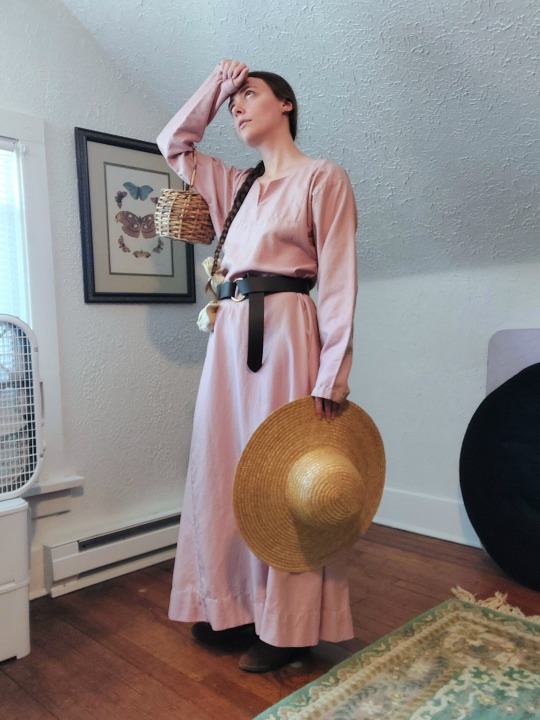
[Image ID: a photo of Alex in a pink medieval tunic and dark belt, posing with a straw hat and small basket and pretending to wipe her forehead.]
With basic SCA garb done (in the form of my t-tunics), I can start making more elaborate, long-term plans.
Nothing is concrete yet, but I want to do this in a strategic way so that I don't end up with partial outfits for multiple eras.
My goal with each era is to make a small capsule-style wardrobe which I can later add to and upgrade, while still knowing that everything will go together well. I've already decided on color schemes for the Greco-Roman stuff (sage green and slate blue) and the 13-14th centuries (blue, oranges and yellows, small amounts of green and pink).
13th Century (1200-1299 AD) (vaguely English/French)
My t-tunic are a great base for the 1300s, and I'll just need some accessories to really pull off this era. I don't have much interest in this era, so I'm aiming for a general look as a branching-off point for other eras (and so I always have backup garb).
Other than the historical-looking crocheted snood I'm working on right now, my first priority is a white linen veil and wimple, and probably a simple cap to wear them over. A barbette and filet/"pie crust hat" could be made to go with the snood/hairnet if I want to double down on the last quarter of the 13th century.
A drawstring bag to wear from my belt is also high on the list, but I can use some of my Regency reticules for now.
For some variety in over-layers, a cyclas (like a sleeveless overdress) or two out of thrifted sheets would be easy, as would some sort of mantle/cape.
I might work on under-layers while I'm in this era, too, just to really have the basics down. (Or to really procrastinate.) A simple linen smock, probably a supportive linen smock, maybe some hose (stockings) and braies (technically men's underwear).
14th Century (1300-1399) (vaguely English/French)
This was my original goal when I got into the SCA, and still my favorite!
The cap, veils, bags, and any underthings I've done already will be a good starting point here, and allow me to focus on larger pieces.
If I haven't made one already, a supportive linen smock with a wide neckline will have to be my first priority here, since I will be the foundation garment for my fitted cotes/kirtles (dresses).
Next up is the kirtles themselves! I should be able to use the supportive smock pattern as a starting point for these. One is necessary. Two-three in different colors is ideal. I bought a slightly too-large one in dark blue from another SCA-dian which will be refashioned to fit me. I'd also like a tawny/orange one.
The 13th-century cyclas evolved into the sideless-surcote. One sideless surcote would be fine, especially if it is reversible. These were often statement pieces, so something silk-like would be best. Maybe one side in a golden yellow and one side a pink/peach?
In the third quarter of the century (~1350-1375) a second, usually short-sleeved kirtle could also be worn, often with tippets (white armbands with streamers) and fitchets (pocket slits, usually bound in white). One of these is probably enough, and it's a low-priority project. Probably a middling or lighter shade of blue.
Hoods are an important cold-weather accessory. I'd like at least two wool hoods - one in an earlier style and one in a later style. I have enough cotton from my t-tunics left over to line one hood with each color.
Misc Accessories
I managed to thrift a nice, generic-looking straw hat which is suitable for most of the medieval era. I also have one of those long leather belts with a metal ring at one end that you see on a lot of SCA/ren faire/fantasy outfits.
A simple linen apron would be a quick project and should be plausible for the 13-14th centuries.
I've started accumulating a vaguely medieval sewing kit, which I would like to continue adding to and upgrading. I even have a lucet fork, which I'm excited to learn to use! These currently live in a small, stained linen pouch, which in turn lives in a thrifted wicker basket. The basket is about the size of a small purse, and is a good size for carrying at smaller events.
Speaking of bags, I also have a large, heavy-duty linen market bag which I made at a local workshop! It's a bit too big for most of my needs right now, but I imagine it would be nice for bigger events. A smaller one might also be nice if I can find something suitably heavy-duty.
Other
I'd also like to upgrade my ancient Roman ensemble with maybe a new chiton, some sort of decorative border on the pallas, and maybe even a patterned stola.
Eventually I'd like to take a stab at a 1490s/northern Italian Renaissance ensemble too, but that's even further down the line. (Colors: maroon, yellow, and warm pink.)
5 notes
·
View notes
Text
Appendage Process
Unfortunately I was unable to find my process photos for this project. Instead I have found stock images that show the process I took.
First, I began by breaking my sketch into the shapes i needed to make.

Second, I used chickenwire to make the shapes I sketched. I did this by bending, folding, and twisting the chickenwire in order to get it into the shape I wanted.

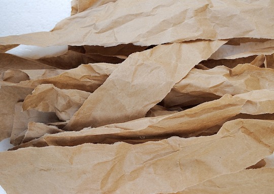
Third, Now that the armature was made with the chicken wire, It was time to mix the paper mache paste. The paper mache paste was a mixture of water and all purpose flour. The consistency of paste i preferred to work with was like pancake batter to make are i could cover the strips of paper evenly.
Fourth, It was time to start applying paper to the armature. I began with strips pf brown paper bags. this type of paper is stronger creating for a strong shell on the appendage.
Fifth, Once there was two layers of the brown paper bags covering the structure, I then used newspaper to add another two layers. The layers of newspaper gave it a smother more consistent finish.
Sixth, Now that the paper mache was hardened i could now begin th process of adding a veneer to the appendage. I chose to use air condition ducts and aluminum tape as the base materials for my veneer.


Seventh, I used tin snips to cute the ducts into pieces to create patchwork look. My vision was a very industrial look.


Eighth, To adhere the metal pieces to the appendage I used hot glue and sometimes the aluminum tape for parts I couldn't get to with the hot glue gun.

Ninth, I added some more air conditioning parts to finish off the industrial look. I used a flex duct to cover the cylindrical part of the appendage my arm was meant to go inside. and at the end of it i used a vent connector to act as the part that connects my body to the appendage.

Finally, The piece is complete and ready to wear in different environments for the next step in the project.

2 notes
·
View notes
Text
14_Journal
Looking back on this course, I see visuals and design differently now. There are three main things I learned that really stuck with me and changed how I think about images and meaning.
The first is understanding how images can work on different levels through icon, index, and symbol. Before, I didn’t think about the deeper layers of meaning in something as simple as a photo or drawing. Now, I see that an image isn’t just what it shows—it can also point to something else (like an index) or stand in for a bigger idea (like a symbol). For example, a photo of a tree isn’t just a tree. It’s an icon because it looks like one, an index because it can suggest nature or environmental issues, and a symbol when people use it to represent growth or sustainability. That really helped me understand how designers and artists can communicate so much in just one image.
The second thing I learned is how important it is to read the context of an image. We talked about how visual cues can tell us much about the social, cultural, political, or economic meanings behind what we see. With an ad or a movie poster, it’s not just about what’s in the picture, but how it’s framed—who’s in it, what colors are used, and even the background. All of that can suggest ideas about class, gender, race, or power. I used to just look at visuals for what they were, but now I try to think more critically—like, who made this image, why, and what message is it trying to send? That’s something I never really considered before this class.
The third thing I’ve been thinking about is how some symbols work across cultures, like how an arrow, a heart, or a warning sign can be understood by people worldwide. It made me wonder how that’s possible when people have such different experiences and languages. I’ve learned that some comes from shared human experiences—we all understand specific shapes or colors similarly. And then there’s globalization, where people are constantly exposed to the same images online or in public spaces. Still, even though we might recognize the same symbol, what it means could change depending on culture or personal background. That idea really stuck with me and made me think more about how meaning is shared and individual. These three ideas—semiotic layers, reading visual context, and how symbols travel across cultures—have changed how I see images. I notice more, ask more questions, and feel like I’m more aware of how design works on people, whether they realize it or not.
0 notes
Text
Illustration [The God of Shadow & The Sacrifice]
As part of my project plan, I am going to make two rendered illustrations of two characters interacting together. The first one I've made is the interaction between The God of Shadow and The Sacrifice.

Here is my thumbnail, a very vague idea of values and composition.
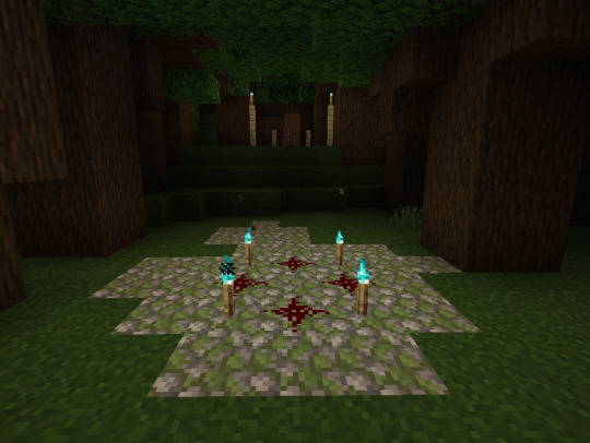
To help cheat learning perspective, I made my setting in Minecraft. I'm clearly a master builder. But it helped me work out a general perspective and also was a starting point for the background so I wasn't sketching it completely from scratch.

Here is my sketch. I used a photo of myself as reference for the pose and I vaguely sketched over the Minecraft reference. I added two large trees in the foreground to give depth and also to add to my original composition plan of keeping it in thirds.
Here I finished the background lineart. Since my canvas was A3, I didn't have many layers to work with, only about 20. So I did this all on one layer and I regretted it heavily later. Even with many filter layers, I have a lot of leeway with my layer count so I should have done the foreground, middle and background on different layers. But that's something to know for next time. To help add perspective and distance I made the lineart thinner for each set of trees the further back they were. I think it helps add to the illustration.
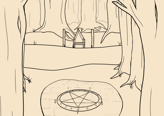
Here I finished the ritual circle. I used the circle tool and the distort tool to make the circle and thickened the lineart of the stone underneath the closer it was to the camera. Then I made a solid brick line and used a painting type of brush to vaguely erase it to make it look aged.
Then here I finished the lineart of The Sacrifice, The God of Shadow and the fog He arrived in. I also added a portal under The Sacrifice and had some extra arms grabbing him because I liked the idea of a direct interaction of Him trying to pull him down.

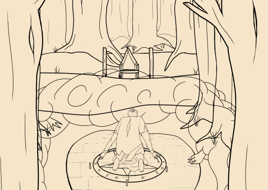
To start the colouring I coloured in The Sacrifice and the fog, the portal and the hands of The God of Shadow since I could easily colourpick those from their references.
For the background I used generic wood colours and made each set of trees darker the further back they went so they looked like they were getting deeper in the dark forest.

Here I started shading. I had shaded the fog, added flames to the candles and torches and I shaded the ground and the trees. I added glowing effects to the ritual circle to add a more mysterious magical element to it and I made all the flames purple to show that The Sacrifice's power was changing them all purple.

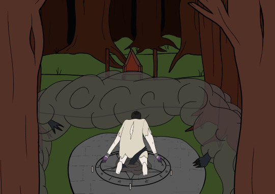
And here's the finished outcome. I shaded The Sacrifice and made sure all the lineart was coloured. I added blood to his shirt to make it look old and ruined and I added some multiply layers of dark red to the forest to make it look looming and dark. Then over the whole image I added a very low opacity red multiply layer so it didn't look too red but it added a red hue and made the red of the ritual circle pop.
I had a big issue with motivation in drawing this one, as well as the other one. But as I expected, in the last few weeks before the deadline my ADHD has kicked in and I'm finding it easier to draw these illustrations for college. All that's left now is to make my poster and the other illustration, which I know I can finish. Those won't be my next posts but they will be soon.
0 notes
Text
Rams draft TE Terrance Ferguson
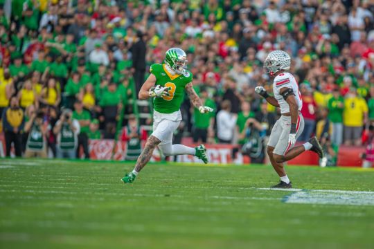
Los Angeles, CA (News4usOnline) - The Los Angeles Rams opted to go with offense on their first pick in the 2025 NFL Draft. That means more fireworks to exploit for quarterback Matthew Stafford and the rest of the Rams offense for the 2025 NFL season. It also means a great opportunity for Terrance Ferguson, whom the Rams selected with the No. 46 pick in the second round. Rams head coach Sean McVay, speaking after Day 2 of the draft, outlined what he likes about Ferguson. “I think he can play in the ‘C’ area and he’s moved around the formation,” said McVay. “When things go off-schedule, he shows what a great feel that he has to find soft spots. I thought he and Gabriel had a great rapport.” “I'm really excited to get him in that tight end room with Tyler Higbee, Colby Parkinson and Davis Allen,” McVay added. “It allows us to be able to explore maybe doing some different things. We'll see where it goes, but he's a stud. We're very excited about him.”

Pasadena, CA - Oregon Ducks tight end Terrance Ferguson (3) in action against the Ohio State Buckeyes in the Rose Bowl Game on Jan. 1, 2025. Photo credit: Sammy Saludo/News4usOnline Now that he’s done catching passes at the collegiate level, Ferguson will be hauling in throws from a future Hall of Famer in Stafford. He’s pretty stoked about it. “Having a guy like that who is a Super Bowl champion and one of the greats… my little brother is a die-hard Lions fan. He loves Matt(hew) Stafford and has loved him his whole life,” Ferguson said. “Being able to play with a guy like that who has a lot of experience, won a Super Bowl, is super detailed and is a super talent, I can't wait to be able to catch passes from him.” He may have to wait in line for that reality to come to fruition. The Rams have quite a few pass-catchers on their roster, especially at the tight end position. Following the departure of Cooper Kupp, the Rams had to rebuild their wide receiver corps. They started the remake by signing DeVante Adams, a big-time playmaker. By pairing Adams with Puka Nacua as the team’s leading wideouts, the Rams have bolstered their pass-catching needs significantly. The Rams also re-signed downfield playmaker Tutu Atwell as the possible third wheel among the receivers. Throw in a dash of Kyren Williams at the running back position, and the Rams appear to have a full-blown, multi-faceted offensive system ready to go. The addition of Ferguson adds another layer of depth to McVay’s offense. During his brief Zoom press conference call, Ferguson was still trying to grasp the idea of being drafted by the Rams.
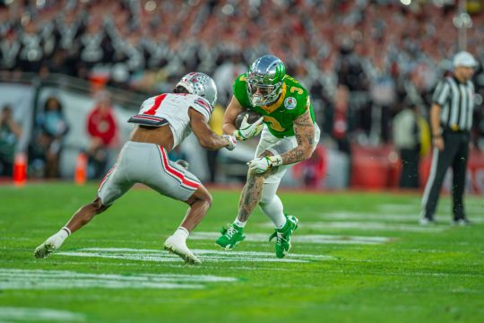
Pasadena, CA - Oregon Ducks tight end Terrance Ferguson (3) is trying to make a play against an Ohio State defender during a College Football Playoff game during the Rose Bowl Game on Jan. 1, 2025. Ferguson caught five passes for 71 yards in Ohio State's 41-21 win. Photo credit: Sammy Saludo/News4usOnline “Honestly, it hasn't sunk in yet,” said Ferguson. “It’s kind of a surreal moment for me. I’m just trying to take it in, be with my family and be able to go attack the opportunity. It really hasn't hit me honestly. It's been surreal. I'm kind of just in awe right now.” At 6-5, Ferguson gives Stafford another big target to throw to. A couple of attributes that make Ferguson an ideal tight end in McVay’s offense are that he’s exceptional in finding spots in a zone defense, is a decent route runner, and can find the open area in seam routes. During his senior season, Ferguson caught 43 passes for 591 yards and three touchdowns. Ferguson shared his thoughts on what he can offer the Rams. "I think I bring a lot of things, versatility being the biggest, being able to stretch the field and creating mismatches with linebackers or safeties but also being able to put my nose on somebody,” he said. “The God-gifted ability, but also the versatility and ability to be able to line up anywhere and be able to make an impact however I need to." Featured Image: Oregon Ducks tight end Terrance Ferguson (3) gets behind the Ohio State defense in the Rose Bowl Game played in Pasadena, California, on Jan. 1, 2025. Photo credit: Sammy Saludo/News4usOnline Read the full article
0 notes
Text
Week 4 - Process
To create the intended window collage effect I needed to adjust my photos' perspective. (before vs after)


I then cleaned up some of the grain and adjusted the lighting of the image to emulate night time so that all my photos match.
I then took the image to Photoshop and masked out the window frame. For the interior I masked and added a hue/saturation adjustment layer with colourise so the colour was even.

I added in one of my silhouette images, editing it to make it solid like a person was standing there. I also blended the silhouette image's background in to add contrast between the background and silhouette.
I darkened the silhouette and painted in some fog around the windows for realism. I also added in glow around the window.

This is the final result, my third attempt. I really enjoyed my other two before this but wasn't happy with the silhouette in this image because it doesn't look realistic. The part I am most satisfied with is the window, I feel that it looks realistic with an illustrated quality.
0 notes
Text
Book review - Quick and Simple Painting in ProCreate
Quick and Simple Painting in Procreate is a great source of learning for both beginner and experienced artists. A quarter of the book is dedicated to a wealth of beginner-friendly introductions to the functions and tools available in Procreate. It explains how to perform basic tasks such as creating canvases, organizing files in the gallery, using tap gestures to undo and rotate, as well as making perfect lines and circles. Additionally, it covers how to use perspective guides—something I only discovered myself after a year or two of using Procreate—making this a particularly helpful piece of information for beginners. The book also explains the use of filters and image adjustments, including curves, saturation, channels, and liquify. The introduction further provides guidance on creating and editing custom brushes, as well as pinning and sorting them for future use.


Another section focuses on blending modes. Even though I am not as much of a beginner as some who may purchase this book, I still would have found such a resource extremely useful because, even now, I do not fully understand how each blending mode works in detail. The book includes an example showcasing each blending mode, which is consistent with the rest of the sections: they all feature detailed images for those who are more visually inclined, allowing them to progress in a step-by-step manner with labels and annotations.
All this knowledge is then put to use in the following section: the tutorials. This part features eight separate tutorials from different artists, guiding the reader through creating artworks similar to theirs with detailed instructions, step-by-step guidance, annotations, and images. Each artist has their own unique style, using different brushes and providing links to download them, ensuring that readers can best emulate their techniques. Every one of these tutorials showcases how to work with textures to enhance the speed and effect of the artwork.

The first tutorial explains how to create custom brushes and customize the default brush shape, paint a stylized cityscape, simplify complex details, and create depth and atmosphere with values. The second tutorial covers painting with default brushes and the selection tool, dividing a scene into organized and minimal layers, applying stylization to an image, and creating landscapes with reflections on surfaces like water. The third tutorial explores painting in a sketchy, textured style, building up a painting with minimal layers, using selections to create gradients and details, and utilizing adjustment options to refine colors and textures. The fourth tutorial teaches how to adapt an image from a photo reference, create stylized flowers and foliage, use blur effects to create depth of field, and add focus and appeal with a character. The fifth tutorial discusses painting an atmospheric sunset environment, using real-life inspiration to create a magical scene, using the smudge tool, and adding depth through mist, scale, and lighting. The sixth tutorial explains how to create strong line and color thumbnails, set a mood and time of day through color choices, use textured custom brushes for a stylized effect, and paint stylized water inspired by real life. The seventh tutorial provides insights on illustrating a stylized fantasy scene, creating depth in a landscape, using selections to create objects, and painting with a sketchy, fluid approach. Finally, the eighth tutorial teaches how to paint a cozy urban nighttime scene, use block colors to organize objects in a scene, create manual masks for painting and shading, and build up light effects using layer blend modes.

My favorite tutorials from this section are the third one, Furry Friends by Jackie Droujko, the sixth one, On the Beach by Alone Lee, and the final one, Les Bonbons d’Owen by Owen Labbe.
The Furry Friends tutorial was one of the main reasons I purchased this book. I was already familiar with the artist and had been watching Jackie’s videos on YouTube. Her sketchy style appeals to me, and it is something I want to emulate in my own work. Even though sketchiness can sometimes create muddiness, she manages to produce a clear and compelling illustration. The use of texture is a central aspect of her tutorial. Many of the steps in her process involve either using textured brushes or creating texture through various means, such as keeping the initial sketch visible and transparent or adding noise and chromatic aberration later in the process. Jackie also strongly emphasizes the importance of avoiding tunnel vision or hyper-focusing on one section. She urges the reader to spread their attention across different parts of the artwork to maintain motivation and prevent getting stuck. One particularly helpful technique I learned from her tutorial was the use of Gradient Maps to create more interesting color variations. Overall, this tutorial was highly informative, and the artist’s work is both appealing and engaging.


Alone Lee’s tutorial, On The Beach, was the most useful one for me personally due to her stylization and workflow. She encourages the reader to sketch out all their ideas first and then refine them into a composition. She also advises taking one’s own reference photos, as this makes the final illustration more personal and helps the artist better understand what they are drawing. Her explanation of composition is insightful, and the accompanying visual aids make it even more effective. Her working method is something I aim to improve upon, as I already work in a similar way but hope to refine it further. Her use of simple shapes and design is distinctive and plays a key role in her artistic language, which I find to be an interesting approach to illustration. She also utilizes custom brushes to achieve her unique stylization. Additionally, she uses blur in an intriguing way to create reflections and guide focus within the piece. Her entire process is appealing because she demonstrates how to create an interesting, stylized piece in a relatively short amount of time without investing excessive hours into rendering. Her simple use of colors and shapes contributes to this time-efficient aspect of her work. I find that Alone Lee’s illustrations share a visual aesthetic with photography, as they depict people in various everyday scenarios while applying similar compositional principles.


Owen Labbe’s tutorial, Les Bonbons d’Owen, is on a more advanced level compared to the previous tutorials, which makes sense as it is placed at the end of the book. His work has a distinct animator-like quality, with rounded, lively characters and a whimsical feel. A significant portion of this tutorial focuses on color theory, helping the reader understand how to use colors effectively in a scene with numerous different elements. He provides insightful tips on creating texture and implying detail in objects, such as adding wood grain to wooden sections or defining the stone tiles on a rooftop. In addition to color, the tutorial also emphasizes lighting techniques, as the scene is set at nighttime with illuminated shop lights. Owen explains how to create value studies, allowing the reader to grasp how to apply such techniques in their own work. To enhance vibrancy and bring life to a scene, he includes numerous details and encourages the reader to apply their own artistic flair using similar methods. Another key aspect of the tutorial is teaching how to separate a composition into masks to make shading and shadow placement more efficient. His method follows the background-midground-foreground rule, which is something I hope to incorporate into my own workflow. I have been trying to transition into painting without linework, and Owen’s approach aligns with my artistic goals. His insights have inspired me to work towards achieving this technique, and I plan to apply what I have learned in the coming months.

Overall, this book is highly informative. The tutorials are well-paced and offer valuable insight into the workflows of various professionals. For beginners, this book is highly recommended. Some of the terminology may feel daunting at times, though the glossary and index help mitigate this; however, the knowledge gained from this book is incredibly valuable, especially when learned early in one’s artistic journey. I wish this book had been available a few years ago so I could have discovered these techniques earlier in my career, but even now, I find much of the information relevant and beneficial to my workflow. Following each tutorial step-by-step will gradually improve one’s skills. Even just selecting the tutorials that feel most relevant to your own style will still be useful. Completing all the tutorials at a steady pace will likely take a few months if practiced consistently, but doing them intermittently in your free time could take up to a year.
In conclusion, I am very happy with my purchase of this book and would highly recommend it to both beginners and experienced illustrators alike.
0 notes
Text
24/2 WEEK 2
New week! Today we're starting by learning about image adjustments in Photoshop. In particular we're looking at colour correction and colour grading, and the differences between them. We also looked at the colour wheel in relation to colour grading, and how colour is a language within itself. Warm/cool colours, complementary colours, triadic colours. I love using colour in my works, especially complementory colors.


We started by looking at the image above and deciding what the best was to adjust it would be. The bright areas look good, but it's clear that there is not enough contrast in the dark area which makes it look washed out. We have to be careful with our adjusting though, as we have to try and not lose any visual information while adjusting the contrast- the best tool for this is curves. By playing with curves, we can adjust the lightest and darkest parts on the image much more specifically than just using the brightness/contrast tool, as that shifts the whole image.
This is how curves work; by using bezier curves, we can adjust how our image looks from lightest to darkest, while also controlling the middle values (making them lighter or darker)
Rather than working on the image itself, we are using non-destructive layers which are layers which can be removed, added or edited without permanently affecting the original image.

Here's my adjusted image. We used a curved layer mask, and I brought the dark nodule further to the right in the histogram to increase the contrast in the image. A histogram is a graph of values in an image.


Here is my before and after image for our second round of adjustments. This time the image was too dark, and I used the same techniques as the last image, but the opposite was around. I dragged the nodule on the top of the histogram further to the left to increase the saturation/whites in my image (making the highlights brighter), balancing it out.


Before and after of our third image. This time we made our middle values lighter, effectively making the image look softer.

By using the HSB (hue/saturation/brightness) tool, I was able to make the color in the image stronger by sliding the saturation bar further up. This makes the image look warmer and removes some of the grey tones in the image. I had to make sure not to overdo it, otherwise spots of colour would appear and the image would look weird.


Before and after curve adjustments with our fourth image. I made the highlights lighter to make the image brighter, but I also added another point down the bottom of the curve to make some of the darker values a little bit darker, just to add a bit more contrast between the lights and the darks (ie- the trees in the forground and the houses in the background).

Played around a little bit with the hue/saturation. I put saturation up to 20 points to make the colours stronger, and I also pushed the hue down a tiny little bit to make the colours a little bit cooler. Just a subtle adjustment to change the feeling of the photo.

Heres our fifth image. This is the before,


And these are the after. By using the colour balance tool, I used complamentory colours for all of these to create interesting effects with the light and shadows. By making the midtones and the shadows a similar colour, I can make a neat effect by making the highlights a different (or opposite) colour. I turned to opacity down a little bit on all of the images above so that the effect wasn't so overpowering. Complementary colours are always quite catching and distinct, as well as fun to play with when it comes to setting the mood and feel of a piece.


Here's all of the images without any opacity adjustments. I didn't go too overboard with them in terms of the colours and their saturation. Admittedly I wanted to make them look pleasing to the eye, which I think I achieved with the first three.


For our sixth image, we have this landscape on the left that is a little bit too blue. The first change I made was to add a colour balance to make the colours a bit warmer by tinting the shadows slightly blue, and the highlights and midtones a more yellow/red.

Next, I added a curves layer to make the midtones lighter and the darks a little bit lighter to increase contrast that wasn't there in the original photo while keeping the background and foreground looking cohesive. I wanted to make sure that the nice fogginess in the background was not lost.


Thirdly, I added a hue/saturation to make the colours a bit more saturated, as they looked a little bit bland beforehand. Adding the saturation filter helped lift the mood of the photo a bit, and made the colours pop a lot more.

Finally, I added an orange photo filter. This pulled the whole piece together and made it feel a bit more cohesive. This is the first time i've used the photo tint, but it felt like a succinct way to end the piece in the way it tied it all together.


The full before/after.


Before and after of our final image. I used a similar process to the last photo, starting with a colour balance, into a daturation shift and finally a curves adjustment. With the colour balance I tried to bring out some more of the blues that are quite orange in the original image by making the shadows and midtones bluer, but keeping the mightlights warm. The hue/saturation filter was to bring the general saturation of the piece up, as it was a bit desaturated. The final adjustment was a curves tool, as this photo has alot of midtones, but needed a little bit more oomph on the shadows to add some more depth. I couldn't make the highlights any lighter, otherwise the cream colour behind the tapestry would have blown out a bit, so it was easier to make the shadows darker than work mostly with the highlights.Increasing the darkness also created more contrast and depth that was lacking in the original photo.
0 notes
Text
Blog Prompt 5 - Glitch
~all photos were taken with an iPhone 7 Plus camera~
this image was used in a previous assignment (photomontage)

I used layers to do this glitch effect, desaturated the hues for one layer then I added another layer where I took out the red channel. I moved the layer without the red channel and moved it left. Then I grouped the layers together and duplicated all the group layers then I used the shape tool to cut out some rectangles and moved them around. I liked the desaturation of the image so I left it like that.
It changes the meaning to a previous one because it creates an alternative reality, like Spider-man into the Spider-verse, were all multiverses are colliding into one.

This image I took a while back were I created scrapbook cover for a CD case based on my favorite single (don't go insane by Dpr Ian). I wanted to keep the colors so I didn't desaturate the image. The process is still the same so I duplicated the image and removed the red chanel. I was going to add lines and I had created one with lines to add a more glitch effect but I chose to re-do it because I wanted to see if it would look different if I added a grainy texture like a tv static glitch. I loved how this one turned out! I used a rectangle and oval tool to cut out some parts of the image to add more glitch features
It creates a deeper meaning to "don't go insane" and adds to that insane/paranoia feel. And because it's a picture with me holding the CD case it adds a p.o.v.
i know i didn't have to add a third image but this is how the previous had turned out...

1 note
·
View note
Text
Late 1890s Corset Part 2 - Mockups
March 11, 2021
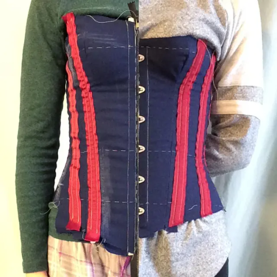
[Image ID: a photo of Alex's torso wearing a navy and red corset mockup, split down the middle to show the left half wearing the poorly fitting first mockup and the right half wearing a well-fitted third mockup.]
Pattern Selection
I had my heart set on a Symington pattern from the start (because heaven forbid we make things easy on ourselves), and I knew I was aiming for the late 1890s, so I was able to significantly narrow down my pattern search just like that.
Doing research into materials and costs (and my limited spending money) narrowed things down one step further - I needed a pattern I could make as a single-layer corset, aka no fashion fabric (aka no beautiful, expensive silk), aka no cording.
Because of these limitations and my own sense of style I was able to narrow down my choices to five patterns which I traced in Illustrator, printed, cut, and assembled into five small paper corset models. I used those to get a sense of the shape created by the original pattern and make my final pattern selection based on the shape and how difficult it might be to construct. I ended up going with the Symington pattern that has instructions (though we'll see later whether or not I end up following them).
From there I followed the Wicked Rain Studio tutorial on scaling a pattern to your measurements to create my pattern. I had measured the paper model incorrectly on the first go-around and created some... alarming shapes. Once I re-measured it, though, and re-did my math the process went really smoothly! (Note to self: consider switching to the metric system! Converting decimals to fractions of an inch is hard!) I did make a slight adjustment to the process, though - I added an underbust line, so I would know approximately where to end the bust curve. I didn't measure around the underbust, just the distance from there to the bust and waist lines.
After I drew out the pattern I double-checked my bust, waist, and hip measurements, cut the pattern out, and 'walked' my seams to make sure the seams and measurement lines matched. Thankfully, everything matched pretty well!
Mockups
Then I gathered my supplies - I had a mostly-suitable mockup fabric in my stash, heavy-duty zip ties to use as bones (admittedly not ideal, but I already had them and I'm on a budget), and stash ribbon for boning channels. Then I borrowed some 'hacks' I've seen other people use, including using grommet trim/tape instead of setting grommets for the lacing and using a heavy-duty zipper which will be reinforced with zip tie 'bones' instead of a busk. Because I don't know the height of the corset yet, I didn't want to buy bones or a busk only to have them be the wrong length!
At long last, it was time for mockups! I traced my pattern onto the fabric and cut the pieces out with a generous 2" seam allowance on the sides (you don't need seam allowance at the top and bottom edges), and then thread-marked the seam lines and the bust, waist, and hip lines. I made the seam allowances so wide so that I could make any adjustments on those pieces instead of cutting new pieces since I don't have much mockup fabric left.
My first mockup went together quickly (minus some thread tension issues), but had some glaring fit issues. It was too large overall and left me with no lacing gap. Even completely laced it was slightly too large in the waist, but was slightly too snug in the hips (I suspect this was because I had used my full hip measurement instead of my high hip measurement, which is where my hip bones stick out and sits about 1.25" higher than the hip measurement I had taken). The front of the corset was also too long - it came up higher on the bust than I liked and was long enough that the bones stabbed me in the legs when I sat down.
To account for these issues, I took 1" at the bottom of the center front (evening out at panel 3), 1.75" at the center front top (evening out at panel 4), 2" off the bust and hip lines all around and 3" off the waist (all spread evenly across each seam). I then remembered that I needed more room in the hips (aka hip spring) at certain seams, so I added a bit back to those seams. The pattern pieces were re-traced, re-thread marked, and re-sewn into mockup #2.
The second mockup seemed to fit a lot better, with the only glaring error being an uneven lacing gap - about 2" at the top, which I wanted, but almost 5" at the bottom, which is way too much. I wore the corset mockup around the house for a few hours that evening to understand how the corset would feel after being worn for a few hours, and I'm VERY glad I did that. The pattern encourages a slightly conical shape sloping from the underbust to the waist, and it seems that my lower two ribs are NOT amenable to that (I have a decidedly rectangular rib cage) and I started to experience discomfort in that area after about two hours that was bad enough by hour four that I had to remove the corset entirely. I expect to wear my corset for hours at a time for events and such, so this had to be fixed. (I was uncomfortable enough that I forgot to get photos of the second mockup, and put it back on briefly a few days later.)
On the bright side of things, I decided I had my pattern close enough to the final that I went ahead and ordered my busk, boning, and lacing cord! I put off making my third mockup until those arrived so that I could practice inserting a busk and also so that I could have one lacing cord instead of three mismatched stash ribbons.
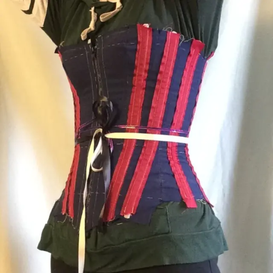
[Image ID: a 3/4 view of ALex's torso wearing a navy and red corset mockup, with three mismatched ribbons tied around the waist.]
My adjustments for the third pattern included evening out the bust curve and adding width to the waist and hip of pieces 1-4. I also had to shorten the height of the back panels (piece 6) to account for the fact that I underestimated how long the spiral steel bones on either side of the lacing needed to be, though that adjustment didn't make it into the mockup as I didn't want to remove and reattach the grommet strips.
The third mockup gave me a much more consistent lacing gap (though still not completely parallel, it got narrower at the hips), but slightly less waist reduction. I wore it around the house again to see how my ribs felt, and it was really comfortable! I had it on for four hours in the morning and another five in the afternoon (with about an hour break in between for a nap). Lacing it up was infinitely easier with a proper lacing cord!
Finishing Up
Ultimately, I was content with my third mockup and deemed that my final pattern! I took apart my final mockup, ironed the pieces, and compared them to the pattern to ensure wearing hadn't warped them (it hadn't).
That means I'm ready to start on the final corset!
My next blog post will go over the construction of the final corset and material costs. Then there will be a fourth and final post looking at flossing and decoration and the final reveal. I can't wait to see how my first corset turns out!
4 notes
·
View notes
Text
Week 12
WIP


For my third composite image, I layered two photos of Ruby standing in the shower, and added a motion blur to the bottom layer. I also used a photo of a window as an overlay, to add a grainy texture, as well as suggest the presence of shower glass. I think this image incorporates techniques from my artist models and portrays my concept well. The use of layering (which gives the effect of a double exposure) was a recurrent technique seen in my artist models, and it was my main way of showing the relationship with the self. This photo also uses bare skin as a site of vulnerability, and the pose suggests intimacy with oneself. The blue gradient is a stylistic component that I added to work with the other images I have made so far, as well as emphasise the reflective, solitary feeling that I wish to convey in this photo series.
0 notes