#Interactive data visualization
Explore tagged Tumblr posts
Visit Tumblr Blog
Explore Tumblr blogs with no restrictions, modern design and the best experience.
Last Seen Tumblr Blogs


Fun Fact
In Q3 of 2020, 31% of US users access the Tumblr app daily.
Text
Alien: Covenant (2017) - UIs
#alien covenant#graphic design#user interface#user interaction#graphic art#cyberpunk aesthetic#data analytics#data visualization#scifi#computers#computing
68 notes
·
View notes
Text

Ino (first sprite) [wip]
#visual novel#interactive fiction#if#oc#fantasy#kainabluedraws#hotb#howloftheblood#hotb:art#oc:ino#after my pc broke and i lost all my data#it took me a while to recover and get back to work#moving on to the next one!
12 notes
·
View notes
Text
Interactive User Interface - Data Visualization GUIs with Dash and Python p.2
Welcome to part two of the Dash tutorial series for making interactive data visualization user interfaces with Python. In this tutorial … source
0 notes
Text

How ai sees me
#ai generated#chatgpt#Ask any AI you’ve been interacting with to take datas of you to create a visual interpretation of your inner self—a symbolic image
0 notes
Text
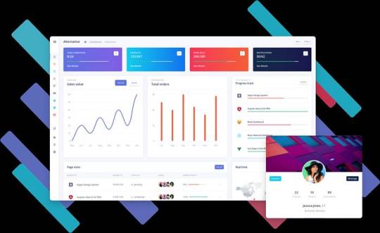
Graphy.app Data Visualization Made Easy (and Fast!)
Stop struggling with data! Graphy.app makes creating beautiful, impactful graphs a breeze. See how easy it is!" #datavisualization #graphs #dataanalysis #graphyapp #productivity #businesstools #analytics
Don't forget to like, comment, and subscribe for more AI content!
#impactful graphs a breeze. See how easy it is!"#datavisualization#graphs#dataanalysis#graphyapp#productivity#businesstools#analytics#Don't forget to like#comment#and subscribe for more AI content!#“data visualization”#“graph maker”#“create graphs”#“data analysis tools”#“chart maker”#“easy data visualization”#“online graph maker”#“ai graph generator”#“data visualization software”#“business graph maker”#“data reporting tools”#“interactive graph maker”#“data dashboard tools”#“graph creation online”#“data presentation tools”#“google sheets graph integration”#“notion graph integration”#“business intelligence tools”#“analytics software”
0 notes
Link
3D Earthquake Map is a real-time interactive global earthquake map showing the depth of the shakes as well as where.
#earthquake#earthquakes#map#online#free#visualization#data#real time#real-time#interactive#global#globe#world#3D#live data#live
0 notes
Text
The Best Tools for Creating Interactive Dashboards Without Coding
Creating interactive dashboards without coding is now easier than ever, thanks to a range of user-friendly tools. These platforms allow businesses to visualize data, track key metrics, and share insights across teams without the need for complex coding knowledge. Here are some of the best tools available: 1. Tableau Public One of the most popular tools for creating interactive dashboards,…
#business intelligence tools#data analytics#data visualization#interactive dashboards#no-code dashboards
0 notes
Text
talking about impenetrable accents/dialect just reminded me. when I was in Milan a couple of years back I was staying in this little rathole hotel and I had the biggest fucking migraine, so I was like non c'è problema I'll just go buy painkillers. of course every pharmacy on the map in a three block radius was closed, so my stupid ass just starts wandering around trying to figure out on the fly if you can get OTC from supermarkets in italy.
I walk into this little everything store (to my foreign eyes the kind of place that back home could sell you a bunch of carrots, a 6-pack of beer, pantyhose, bleach and a screwdriver set) and I see some household basics in the back but not what I need. with the confidence of a person who is only in the city for 3 days because he got bored and packed a bag and booked the cheapest flight available the week before (<= MENTAL ILLNESS), I was like no worries I know some italian, I can just ask.
I grab a bottle of water, walk up to the counter, and I'm like Ciao, hai il paracetamolo? And the guy is like che, and I'm like paracetamolo. Per la mia testa. And he's like che?
This is where I would have said 'aspirina' except I can't take aspirin for medical reasons, or 'antidolorifico' except I don't know that word and I've got no phone data for google translate and also I'm stupid. So in my fucked up leith-glasgow-italian accent I'm like paaa-ra-cetta-mollll-ooo. He's like ohhh bene, bene, and he calls another guy out of the back and asks him to go get something. Other guy then walks out of the store into the street, and before I can be like hey, che la fuck, he comes back and hands me a huge bundle of herbs.
At this point I'm like okay this entire interaction has been a bust, but these guys have been very nice and patient and they're both smiling happily at me because they've been of service, so I'm like ahh perfetto, grazie, pay them a couple of euros and leave.
EVENTUALLY I find a pharmacy that's open, and my head is fucking killing me, and my phone still isn't connecting, and now I have this small shrubbery poking out of my coat pocket, so I don't even bother looking around the shelves. I just walk straight to the counter and I'm like uhh ciao, scusi. And hearing my nightmare of an accent the guy answers in english and I'm like thank christ, do you please have paracetamol. Not aspirin, I can't take aspirin. And he's like yeah yeah hold on, goes into the back, comes out with what I need.
Only when he comes out he gives me this look, and then he starts laughing. And then he pretends he's not laughing and rings me up and I pay, and as I'm leaving I can see him losing it. But I don't care, my head is going to explode, I'm going back to the rathole to close the blinds and fall comatose for four hours.
When I get back to my hotel room I take off my coat and remember the huge bouquet of herbs in my pocket. They smell amazing, and I'm like I'm pretty sure this is parsley in which case I can just get some tomatoes and mozzarella later and make it work. but since I have no idea what that interaction was, I want to make sure. I bring out my phone to get a visual reference of what parsley leaves look like, and because I was using it for google translate earlier I put 'parsley' in the wrong box like a dope and translate it to italian.
prezzemolo
I wish I could have been the pharmacist in the moment he looked at my tired pissed off anglophone ass, heard me say 'paracetamol' in my fucked up accent, and turned around saw what was in my pocket. I'd have lost my shit too.
38K notes
·
View notes
Text
100,000 Stars 1.2
O projeto, batizado de “100,000 Stars”, permite uma navegação virtual bem simples, em 3D e com direito até a um “guia turístico”, que vai explicando alguns elementos básicos do universo. Edson Jesus – 2012 nov 15 An incredible interactive visualization of 100,000 stars you can view in your Chrome web browser. Paul Strauss – The Awesomer. nov 14 2012 O Google Chrome lançou, numa quarta-feira…

View On WordPress
#000 Stars#000 Stars lets you spin round the galaxy#100#100 mil estrelas Via Láctea#200 bilhões de estrelas#Aaron Koblin Chris Milk&039;s The Exquisite Forest#Carlos Merigo B9#Chrome web browser#CSS3D#dados imagens NASA ESA#Data Arts Google#experimento Chrome Google #Google&039;s interactive 100#guia interativo#Gustavo Bonato Abrão Mundo Conectado#HTML 5 Web Audio#incredible interactive visualization#informações detalhadas astronomia#localizações reais#mapeadas Via Láctea#Paul Strauss The Awesomer#platform public collaborate develop animations#sound track trilha sonora#space artist&039;s impression#sun Sol#Tate Modern exhibit#the product of Google&039;s Chrome Experiments workshop#Via Láctea pelo navegador#visualização interativa#zoom estrelas
0 notes
Text
How to Keep Your Audience Engaged Using Interactive Content
💥 Want to stand out? Learn how to engage your audience with interactive content! From polls to quizzes, make your content memorable. #InteractiveContent #AudienceEngagement
How to Keep Your Audience Engaged Using Interactive Content Written By: that Hannah Jones Time to Read: 5 minutes In a digital age flooded with content, it’s no longer enough to post static images or blog articles and hope for engagement. The modern consumer craves active involvement, and interactive content can give your brand that edge. According to the Content Marketing Institute,…
#actionable marketing#audience engagement strategies#brand loyalty#brand storytelling#BuzzFeed quizzes#content creation tips#Content Marketing Institute#content strategy tips#customer retention#data-driven content#digital engagement#engagement metrics#Hannah Jones#immersive content#interactive calculators#interactive content marketing#personalized content#Small business marketing#social media polls#Spotify Wrapped#Strategic Hannah#viral quizzes#Visual Content
0 notes
Text
Create a Scrollable Progress Chart in Excel | Interactive Data Visualization
Practice File : Want to make your Excel … source
0 notes
Text
Your Career with a Google Data Studio Course in Vasai-Virar
Introduction: Mastering Data Visualization
In today's data-driven world, the ability to analyze and visualize data is crucial for making informed decisions. Google Data Studio is a powerful tool that allows users to create interactive and dynamic reports and dashboards. Whether you're a student, a marketing professional, or a data analyst, learning Google Data Studio can significantly enhance your data presentation skills. Enrolling in a Google Data Studio Course in Vasai-Virar will equip you with these essential skills. This article will explore the benefits of learning Google Data Studio, the demand for data visualization expertise, career opportunities, and why HrishiComputer is the best place to learn.
Why Learn Google Data Studio?
Learning Google Data Studio offers numerous benefits that can enhance various aspects of your professional life:
Enhanced Data Reporting: Google Data Studio enables you to turn raw data into insightful visualizations. By enrolling in a Google Data Studio Course in Vasai-Virar, you can learn how to create compelling reports that clearly communicate key metrics and trends.
Improved Decision-Making: Effective data visualization helps identify patterns and insights quickly, leading to better decision-making. Mastering Google Data Studio can help you provide valuable data-driven recommendations.
Career Advancement: Proficiency in Google Data Studio is a highly sought-after skill in many industries, including marketing, finance, and healthcare. Completing a Google Data Studio Course in Vasai-Virar can make you a more competitive candidate and open up new career opportunities.
Growing Demand for Data Visualization Skills
The ability to visualize data effectively is increasingly important as more businesses rely on data to drive their strategies. Companies need professionals who can transform complex data sets into clear, actionable insights. Enrolling in a Google Data Studio Course in Vasai-Virar will prepare you for roles such as data analyst, business intelligence specialist, and marketing analyst, where data visualization is a critical skill.
Career Opportunities and Earnings with Google Data Studio Skills
Career opportunities for those skilled in Google Data Studio are diverse and often come with attractive salary packages:
Data Analyst: Analyzing data sets and creating visual reports to support business decisions. Data analysts typically earn between INR 4,00,000 and INR 7,00,000 annually.
Business Intelligence Specialist: Developing and maintaining business intelligence tools and dashboards. Salaries for these roles range from INR 5,00,000 to INR 9,00,000 per year.
Marketing Analyst: Using data to analyze market trends and measure the effectiveness of marketing campaigns. Marketing analysts can earn between INR 3,50,000 and INR 6,00,000 annually.
Google Data Studio Course Syllabus at HrishiComputer
HrishiComputer in Vasai-Virar offers a comprehensive Google Data Studio Course designed to equip you with essential data visualization skills. The syllabus includes:
Introduction to Google Data Studio: Learn the basics of data visualization and navigate the Google Data Studio interface.
Connecting Data Sources: Understand how to connect various data sources, including Google Analytics, Google Sheets, and SQL databases, to Google Data Studio.
Building Reports and Dashboards: Gain hands-on experience in creating, customizing, and managing reports and dashboards.
Using Visualization Tools: Explore different types of charts and visualizations, such as bar charts, pie charts, and geo maps, to effectively represent your data.
Advanced Features: Learn advanced techniques such as creating calculated fields, blending data, and using filters to create dynamic reports.
Collaboration and Sharing: Discover how to share your reports and collaborate with team members in real-time.
Why Choose HrishiComputer for Google Data Studio Training?
HrishiComputer in Vasai-Virar is a top choice for learning Google Data Studio due to its comprehensive curriculum and expert instruction. Here’s why our Google Data Studio Course stands out:
Experienced Instructors: Our trainers are certified professionals with extensive experience in data visualization and Google Data Studio. They provide practical insights and hands-on guidance.
Interactive Learning: The course includes real-world projects and practical exercises, ensuring that you gain the skills needed to create impactful data visualizations.
Recognized Certification: Upon completing the course, you will receive a certification from HrishiComputer, which is highly valued by employers and enhances your resume.
Affordable Fees: We offer competitive pricing to make our courses accessible to everyone. Our goal is to provide quality education at an affordable cost.
How to Enroll
Ready to enhance your data visualization skills and boost your career prospects? Enroll in our Google Data Studio Course in Vasai-Virar at HrishiComputer. Our comprehensive training program is designed to equip you with the skills needed to excel in today’s data-driven world.
Sign Up for Google Data Studio Training at HrishiComputer and start transforming your data skills today!
Frequently Asked Questions (FAQ)
Q1: Do I need prior experience with data visualization to join the course?A: No prior experience is necessary. The course is suitable for both beginners and those looking to enhance their data visualization skills.
Q2: What type of certification will I receive upon completion?A: Upon successful completion of the course, you will receive a certification from HrishiComputer, recognized by many employers.
Q3: Are classes conducted online or offline?A: The primary mode of instruction is offline, providing a hands-on learning experience. However, we also offer supplementary online resources.
Q4: What is the duration of the course?A: The course typically spans 8 weeks, with flexible scheduling options to accommodate students and working professionals.
Q5: How can data visualization skills benefit my career?A: Data visualization skills are highly valuable across various job roles, enhancing your ability to interpret and communicate data effectively. These skills make you a more attractive candidate to employers and can lead to better job opportunities and higher earnings.
By completing this course, you will gain a comprehensive understanding of Google Data Studio, from basic functionalities to advanced features. This will empower you to create impactful data visualizations and make informed, data-driven decisions. Join HrishiComputer today and master the skills essential for success in the modern workplace.
#Google Data Studio Course in Vasai-Virar#Learn Google Data Studio in Vasai-Virar#Data Visualization Course Vasai-Virar#Google Data Studio Training Vasai-Virar#Google Data Studio Certification Vasai-Virar#Best Google Data Studio Course Vasai-Virar#Data Studio Classes in Vasai-Virar#Google Data Studio for Beginners Vasai-Virar#Advanced Google Data Studio Vasai-Virar#Google Data Studio Workshop Vasai-Virar#Professional Google Data Studio Course Vasai-Virar#Google Data Studio Skills Vasai-Virar#Data Analysis with Google Data Studio Vasai-Virar#Google Data Studio Training Institute Vasai-Virar#Interactive Data Reports Vasai-Virar#Long-Tail Keywords:#Google Data Studio Course with Certification in Vasai-Virar#How to use Google Data Studio for Data Visualization Vasai-Virar#Best Training for Google Data Studio in Vasai-Virar#Top Google Data Studio Classes in Vasai-Virar#Affordable Google Data Studio Course in Vasai-Virar#Google Data Studio Course for Professionals Vasai-Virar#Enhance Data Skills with Google Data Studio in Vasai-Virar
0 notes
Text
Creating an Effective Power BI Dashboard: A Comprehensive Guide

Introduction to Power BI Power BI is a suite of business analytics tools that allows you to connect to multiple data sources, transform data into actionable insights, and share those insights across your organization. With Power BI, you can create interactive dashboards and reports that provide a 360-degree view of your business.
Step-by-Step Guide to Creating a Power BI Dashboard
1. Data Import and Transformation The first step in creating a Power BI dashboard is importing your data. Power BI supports various data sources, including Excel, SQL Server, Azure, and more.
Steps to Import Data:
Open Power BI Desktop.
Click on Get Data in the Home ribbon.
Select your data source (e.g., Excel, SQL Server, etc.).
Load the data into Power BI.
Once the data is loaded, you may need to transform it to suit your reporting needs. Power BI provides Power Query Editor for data transformation.
Data Transformation:
Open Power Query Editor.
Apply necessary transformations such as filtering rows, adding columns, merging tables, etc.
Close and apply the changes.
2. Designing the Dashboard After preparing your data, the next step is to design your dashboard. Start by adding a new report and selecting the type of visualization you want to use.
Types of Visualizations:
Charts: Bar, Line, Pie, Area, etc.
Tables and Matrices: For detailed data representation.
Maps: Geographic data visualization.
Cards and Gauges: For key metrics and KPIs.
Slicers: For interactive data filtering.
Adding Visualizations:
Drag and drop fields from the Fields pane to the canvas.
Choose the appropriate visualization type from the Visualizations pane.
Customize the visual by adjusting properties such as colors, labels, and titles.
3. Enhancing the Dashboard with Interactivity Interactivity is one of the key features of Power BI dashboards. You can add slicers, drill-throughs, and bookmarks to make your dashboard more interactive and user-friendly.
Using Slicers:
Add a slicer visual to the canvas.
Drag a field to the slicer to allow users to filter data dynamically.
Drill-throughs:
Enable drill-through on visuals to allow users to navigate to detailed reports.
Set up drill-through pages by defining the fields that will trigger the drill-through.
Bookmarks:
Create bookmarks to capture the state of a report page.
Use bookmarks to toggle between different views of the data.
Different Styles of Power BI Dashboards Power BI dashboards can be styled to meet various business needs. Here are a few examples:
1. Executive Dashboard An executive dashboard provides a high-level overview of key business metrics. It typically includes:
KPI visuals for critical metrics.
Line charts for trend analysis.
Bar charts for categorical comparison.
Maps for geographic insights.
Example:
KPI cards for revenue, profit margin, and customer satisfaction.
A line chart showing monthly sales trends.
A bar chart comparing sales by region.
A map highlighting sales distribution across different states.
2. Sales Performance Dashboard A sales performance dashboard focuses on sales data, providing insights into sales trends, product performance, and sales team effectiveness.
Example:
A funnel chart showing the sales pipeline stages.
A bar chart displaying sales by product category.
A scatter plot highlighting the performance of sales representatives.
A table showing detailed sales transactions.
3. Financial Dashboard A financial dashboard offers a comprehensive view of the financial health of an organization. It includes:
Financial KPIs such as revenue, expenses, and profit.
Financial statements like income statement and balance sheet.
Trend charts for revenue and expenses.
Pie charts for expense distribution.
Example:
KPI cards for net income, operating expenses, and gross margin.
A line chart showing monthly revenue and expense trends.
A pie chart illustrating the breakdown of expenses.
A matrix displaying the income statement.
Best Practices for Designing Power BI Dashboards To ensure your Power BI dashboard is effective and user-friendly, follow these best practices:
Keep it Simple:
Avoid cluttering the dashboard with too many visuals.
Focus on the most important metrics and insights.
2. Use Consistent Design:
Maintain a consistent color scheme and font style.
Align visuals properly for a clean layout.
3. Ensure Data Accuracy:
Validate your data to ensure accuracy.
Regularly update the data to reflect the latest information.
4. Enhance Interactivity:
Use slicers and drill-throughs to provide a dynamic user experience.
Add tooltips to provide additional context.
5. Optimize Performance:
Use aggregations and data reduction techniques to improve performance.
Avoid using too many complex calculations.
Conclusion Creating a Power BI dashboard involves importing and transforming data, designing interactive visuals, and applying best practices to ensure clarity and effectiveness. By following the steps outlined in this guide, you can build dashboards that provide valuable insights and support data-driven decision-making in your organization. Power BI’s flexibility and range of visualizations make it an essential tool for any business looking to leverage its data effectively.
#Dynamic Data Visualization#Business Analytics#Interactive Dashboards#Data Insights#Data Transformation#KPI Metrics#Real-time Reporting#Data Connectivity#Trend Analysis#Visual Analytics#Performance Metrics#Data Modeling#Executive Dashboards#Sales Performance#Financial Reporting#Data Interactivity#Data-driven Decisions#Power Query#Custom Visuals#Data Integration
0 notes
Text
New Post ‹ Site Title — WordPress.com
https://wordpress.com/post/amanandrabiaonline.wordpress.com?url=https%3A%2F%2Fwordpress.com%2Fgo%2Fcontent-blogging%2Fsetting-your-podcast-marketing-strategy-three-key-steps%2F%3Fpage_id%3D18003265&is_post_share=true&v=5 Aman and Rabia Enterprise can leverage various AI tools to enhance productivity and streamline their operations in the Ethiopian cultural clothes industry. One such tool is…

View On WordPress
#AI tools for image recognition and virtual fitting rooms can revolutionize the online shopping experience for customers#AI-powered demand forecasting tools can help Aman and Rabia Enterprise optimize their inventory management#allowing them to make data-driven decisions and tailor their products to meet consumer needs effectively. Additionally#allowing them to visualize how the cultural garments will look on them before making a purchase. By implementing such tools on their e-comme#Aman and Rabia Enterprise can gain valuable insights into customer preferences#Aman and Rabia Enterprise can increase customer engagement#Aman and Rabia Enterprise can leverage various AI tools to enhance productivity and streamline their operations in the Ethiopian cultural cl#Aman and Rabia Enterprise can unlock new opportunities for growth#and deliver a seamless and personalized experience to their customers in the Ethiopian cultural clothes industry.#and drive sales. In conclusion#and external factors#and market trends#and maximize profitability. Furthermore#and minimize excess inventory costs. By analyzing historical sales data#and personalize marketing campaigns. By utilizing AI-powered analytics#and provide personalized recommendations#automating repetitive tasks through AI-based tools such as chatbots or virtual assistants can free up valuable time for the team to focus on#buying patterns#by integrating AI tools strategically into their workflow#enabling the company to optimize production schedules#enhancing the overall shopping experience for customers while improving operational efficiency for Aman and Rabia Enterprise. Moreover#improve operational efficiency#market trends#minimize waste#process orders#reduce return rates#reduce stockouts#these tools can predict future demand accurately#track sales leads#which can help them efficiently manage customer interactions
0 notes
Text
#How_can_we_grow_our_Business?#⭐⭐⭐⭐⭐#To grow your business with Google Ads and Facebook Ads#start by defining clear goals and target audiences for each platform. Create compelling ad campaigns with eye-catching visuals and persuasi#For Google Ads#conduct keyword research and bid strategically to maximize your ROI. Use ad extensions and negative keywords to refine your targeting. Cont#On Facebook Ads#leverage the platform's extensive targeting options to reach your ideal customers. Create engaging content that encourages interaction and#such as carousel ads#video ads#and sponsored posts.#Consistent monitoring#adjustment#and data-driven decision-making are key. Track your ad performance using analytics tools and adapt your strategies based on what works best#DigitalMarketing#OnlineMarketing#SalesBoost#MarketingTips#BusinessGrowth#DigitalStrategy#instagram#socialmedia#marketing#advertising#brand#business#research#ecommerce#facebook#engagement
1 note
·
View note
Text
Ahm, hello Life is Strange fandom- I got an announcement
I have been working on my own LiS fan visual novel

This is VortexVN,
You play as Victoria waking up from a hangover with no memory of the week prior, you are tasked with piecing together what happened between her and one of the 4 love interests.

And of course the love interests are:
-Chloe (Chaseprice)
-Max (Chasefield)
-Kate (Chasemarsh)
-Rachel (Amberchase)


The game starts with a quiz; you unlock a route by picking answers related to the character you wanna romance (they are very obvious)
It takes place in an AU where the events of LiS1 and BtS didn't really happen and there are no special powers, Victoria's still a bi tch- I guess that's her special powers.
Think of this game as a spiritual successor to Love is Strange by Team Rumblebee rather than Life is Strange 1


Gameplay so far is your typical point and click visual novel affair, you will be given options to explore rooms, examine objects and talk to other characters- the interactions will play a crucial part in how the game ends,
You can win the girl or get rejected or worse... It will depend on how Victoria carried herself throughout the game,
Mistreating certain characters may prove to be a dealbreaker for the love interest,
Each girl has two close friends in the dorm that you should not upset (I'll reveal who in the guide pdf)
This game is also perfect for Victoria haters as you can ruin her life

The game has its own journal system that will be different depending on who you're romancing, it also comes with a read button (I blurred most of the text so you can get curious and play the game)
Read button will display the journal content in Open Dyslexic font
In the demo you'll only get to explore Victoria's room and the dorm hallways and you'll get two encounters from Juliet (Showers) and Alyssa (Hallway)

VortexVN is still in development, I have finished part.1 of the project and will start polishing it soon- the initial build of part.1 will be available to play as a demo!
The cutscenes lack color and proper shading at the moment and you will find placeholders as well, the art style is all over the place- this will change after the polishing phase
Download links:
Mac and Windows
Web browser ver (I don't recommend that you play it on mobile, also the web version lacks animation and takes forever to load graphics)
programs used:
-Renpy (visual novel engine)
-Photoshop CS5 (Drawing/rendering/animating/designing)
-Clips studio (Texturing)
-tablet: XP-Pen Artist 13
Note: I'm not monetizing this project nor do I claim ownership of the Life is Strange ip, all materials and assets presented in this visual novel were either created by me or are royalty free- I did not lift anything from the games via data mining or by leaks
This game is not a response to or a gotcha at Life is Strange Double Exposure or Deck Nine, I didn't really dislike the game
Besides, I've had the idea of a Victoria centric fan game since the first LiS back in 2015
I'm open for feedbacks! You can DM me or reblog this with a review or something- maybe write a comment.
#life is strange#lis#victoria chase#chloe price#max caulfield#kate marsh#rachel amber#chasemarsh#chaseprice#chasefield#amberchase#life is strange before the storm#lis bts#alyssa anderson#juliet watson#VortexVN
951 notes
·
View notes