#Page Layout ( arrangement of visual elements on a page)
Explore tagged Tumblr posts
Visit Tumblr Blog
Explore Tumblr blogs with no restrictions, modern design and the best experience.
Last Seen Tumblr Blogs


Fun Fact
US Tumblr user growth rate is estimated to slow down to 4.1%.
Text
Mod Role Descriptions
Since there has been some confusion! Thanks to @thatartiststudios for explaining this so well. (Note that all the dates on this could be subject to change.)
Fic Mod
Role Overview: The Fic Mod oversees all fanfiction contributions, ensuring high-quality. This role involves reviewing applications, providing feedback, and editing submissions.
Key Responsibilities:
Review writer applications, scoring portfolios (2-3 excerpts, 500-3000 words) for storytelling, Rayllum characterization, and Arc 2 relevance (August 2025).
Coordinate with 10-15 writers via Discord, managing check-ins (outlines, drafts, finals) from September to November 2025.
Edit fics for grammar, clarity, and consistency, ensuring they meet guidelines (SFW, 500-3000 words, G/T rating).
Collaborate with the Art Mod (Tategaminu) for artist-writer collabs (if applicable).
Assist with PDF layout by organizing fics thematically (December 2025).
Skills Needed:
Strong writing/editing skills (familiarity with Google Docs or Word).
Organizational skills to track deadlines and provide constructive feedback.
Discord communication for contributor support.
Time Commitment: 5-8 hours/week, peaking during application reviews (August) and editing (October–November).
Contributor Mod
Role Overview: The Contributor Mod manages the overall contributor experience, ensuring artists and writers stay on track and feel supported. This role is focused on coordinating deadlines and communication across the team.
Key Responsibilities:
Oversee contributor applications (August 2025), coordinating with Fic and Art Mods to select 20-30 contributors (10-15 artists, 10-15 writers).
Manage Discord server, posting announcements, reminders, and guidelines for contributors.
Track check-ins (September–November 2025), following up with contributors on sketches, drafts, and finals.
Handle dropouts (10-20% expected) by activating pinch-hitters from the backup list.
Resolve contributor questions or conflicts via Discord, maintaining a positive, inclusive environment.
Assist with final PDF compilation and charity donation logistics (February–March 2026).
Skills Needed:
Project management or organizational skills (e.g., Trello, Google Sheets).
Strong communication to liaise between mods and contributors.
Conflict resolution to handle delays or disputes calmly.
Time Commitment: 6-10 hours/week, peaking during application reviews (August) and check-ins (September–November).
Design/Graphics Mod
Role Overview: The Design/Graphics Mod creates the visual layout of the PDF zine, ensuring a polished, cohesive look that showcases art and fics. This role includes formatting the PDF and potentially designing the cover (if our potential cover artist is unavailable).
Key Responsibilities:
Format the PDF (December 2025) using Canva or Adobe InDesign, arranging 50-70 pages of art and fics by theme (themes to be announced).
Design or integrate the cover art, ensuring it reflects Rayllum’s Arc 2 vibe (November–December 2025).
Add elements like table of contents, contributor bios, and charity info, maintaining consistent fonts and margins.
Test the PDF for quality (300 DPI, compressed for download) and accessibility on multiple devices.
Collaborate with Fic and Art Mods to ensure submissions meet specs (A5 art, formatted fics).
Skills Needed:
Experience with graphic design tools (Canva, InDesign, or similar).
Eye for aesthetics to create a professional, fandom-inspired layout.
Basic understanding of PDF formatting (e.g., DPI, file compression).
Optional: Ability to create cover art if needed.
Time Commitment: 4-7 hours/week, peaking during PDF layout (December 2025).
15 notes
·
View notes
Text
Learn HTML and CSS: A Comprehensive Guide for Beginners
Introduction to HTML and CSS
HTML (HyperText Markup Language) and CSS (Cascading Style Sheets) are the core technologies for creating web pages. HTML provides the structure of the page, while CSS defines its style and layout. This guide aims to equip beginners with the essential knowledge to start building and designing web pages.
Why Learn HTML and CSS?
HTML and CSS are fundamental skills for web development. Whether you're looking to create personal websites, start a career in web development, or enhance your current skill set, understanding these technologies is crucial. They form the basis for more advanced languages and frameworks like JavaScript, React, and Angular.
Getting Started with HTML and CSS
To get started, you need a text editor and a web browser. Popular text editors include Visual Studio Code, Sublime Text, and Atom. Browsers like Google Chrome, Firefox, and Safari are excellent for viewing and testing your web pages.
Basic HTML Structure
HTML documents have a basic structure composed of various elements and tags. Here’s a simple example:
html
Copy code
<!DOCTYPE html>
<html>
<head>
<title>My First Web Page</title>
<link rel="stylesheet" type="text/css" href="styles.css">
</head>
<body>
<h1>Welcome to My Web Page</h1>
<p>This is a paragraph of text on my web page.</p>
</body>
</html>
: Declares the document type and HTML version.
: The root element of an HTML page.
: Contains meta-information about the document.
: Connects the HTML to an external CSS file.
: Contains the content of the web page.
Essential HTML Tags
HTML uses various tags to define different parts of a web page:
to : Headings of different levels.
: Paragraph of text.
: Anchor tag for hyperlinks.
: Embeds images.
: Defines divisions or sections.
: Inline container for text.
Creating Your First HTML Page
Follow these steps to create a simple HTML page:
Open your text editor.
Write the basic HTML structure as shown above.
Add a heading with the tag.
Add a paragraph with the tag.
Save the file with a .html extension (e.g., index.html).
Open the file in your web browser to view your web page.
Introduction to CSS
CSS is used to style and layout HTML elements. It can be included within the HTML file using the <style> tag or in a separate .css file linked with the <link> tag.
Basic CSS Syntax
CSS consists of selectors and declarations. Here’s an example:
css
Copy code
h1 {
color: blue;
font-size: 24px;
}
Selector (h1): Specifies the HTML element to be styled.
Declaration Block: Contains one or more declarations, each consisting of a property and a value.
Styling HTML with CSS
To style your HTML elements, you can use different selectors:
Element Selector: Styles all instances of an element.
Class Selector: Styles elements with a specific class.
ID Selector: Styles a single element with a specific ID.
Example:
html
Copy code
<!DOCTYPE html>
<html>
<head>
<title>Styled Page</title>
<link rel="stylesheet" type="text/css" href="styles.css">
</head>
<body>
<h1 class="main-heading">Hello, World!</h1>
<p id="intro">This is an introduction paragraph.</p>
</body>
</html>
In the styles.css file:
css
Copy code
.main-heading {
color: green;
text-align: center;
}
#intro {
font-size: 18px;
color: grey;
}
CSS Layout Techniques
CSS provides several layout techniques to design complex web pages:
Box Model: Defines the structure of an element’s content, padding, border, and margin.
Flexbox: A layout model for arranging items within a container, making it easier to design flexible responsive layouts.
Grid Layout: A two-dimensional layout system for more complex layouts.
Example of Flexbox:
css
Copy code
.container {
display: flex;
justify-content: space-around;
}
.item {
width: 100px;
height: 100px;
background-color: lightblue;
}
Best Practices for Writing HTML and CSS
Semantic HTML: Use HTML tags that describe their meaning clearly (e.g., , , ).
Clean Code: Indent nested elements and use comments for better readability.
Validation: Use tools like the W3C Markup Validation Service to ensure your HTML and CSS are error-free and standards-compliant.
Accessibility: Make sure your website is accessible to all users, including those with disabilities, by using proper HTML tags and attributes.
Free Resources to Learn HTML and CSS
W3Schools: Comprehensive tutorials and references.
MDN Web Docs: Detailed documentation and guides for HTML, CSS, and JavaScript.
Codecademy: Interactive courses on web development.
FreeCodeCamp: Extensive curriculum covering HTML, CSS, and more.
Khan Academy: Lessons on computer programming and web development.
FAQs about Learning HTML and CSS
Q: What is HTML and CSS? A: HTML (HyperText Markup Language) structures web pages, while CSS (Cascading Style Sheets) styles and layouts the web pages.
Q: Why should I learn HTML and CSS? A: Learning HTML and CSS is essential for creating websites, understanding web development frameworks, and progressing to more advanced programming languages.
Q: Do I need prior experience to learn HTML and CSS? A: No prior experience is required. HTML and CSS are beginner-friendly and easy to learn.
Q: How long does it take to learn HTML and CSS? A: The time varies depending on your learning pace. With consistent practice, you can grasp the basics in a few weeks.
Q: Can I create a website using only HTML and CSS? A: Yes, you can create a basic website. For more complex functionality, you'll need to learn JavaScript.
Q: What tools do I need to start learning HTML and CSS? A: You need a text editor (e.g., Visual Studio Code, Sublime Text) and a web browser (e.g., Google Chrome, Firefox).
Q: Are there free resources available to learn HTML and CSS? A: Yes, there are many free resources available online, including W3Schools, MDN Web Docs, Codecademy, FreeCodeCamp, and Khan Academy.
#how to learn html and css#html & css course#html & css tutorial#html and css#html course#html css tutorial#html learn#html learn website#learn html#learn html and css#html and css course#html and css full course#html and css online course#how to learn html and css for beginners
4 notes
·
View notes
Text
9 AI Tools to Build Websites and Landing Pages: Revolutionizing Web Design

In the ever-evolving world of web design, staying ahead of the curve is essential to creating visually stunning and highly functional websites. With the advent of artificial intelligence (AI), designers and developers now have a powerful set of tools at their disposal to revolutionize the web design process. AI website design tools offer innovative solutions that streamline and enhance the creation of websites and landing pages.
In this article, we will explore nine AI tools that are reshaping the web design landscape, discuss their various types, and highlight the benefits of using AI tools for website building.
1. Wix ADI:
Wix ADI (Artificial Design Intelligence) is a game-changer for website building. It utilizes AI algorithms to automatically generate customized website designs based on user preferences and content inputs. With Wix ADI, even users with no design experience can create stunning websites in a matter of minutes.
2. Grid:
Grid is an AI-powered website builder that uses machine learning to analyze design principles and create visually pleasing websites. It takes user inputs, such as branding elements and content, and generates unique layouts and designs tailored to the user's needs. Grid eliminates the need for manual coding and design expertise, making it accessible to users of all skill levels.
3. Firedrop:
Firedrop is an AI chatbot-based website builder that guides users through the entire website creation process. The AI-driven chatbot asks questions, gathers information, and generates a personalized website design. It also offers real-time editing and customization options, allowing users to make changes effortlessly.
4. Bookmark:
Bookmark is an AI website builder that combines artificial intelligence with human assistance. It provides an intuitive interface where users can select a design style and content preferences. The AI algorithms then generate a website layout, which can be further customized using Bookmark's drag-and-drop editor. Users also have access to AI-driven features like automated content creation and personalized marketing recommendations.
5. Adobe Sensei:
Adobe Sensei is an AI and machine learning platform that enhances the capabilities of Adobe's creative tools, including website design software like Adobe XD. Sensei analyzes user behavior, content, and design elements to offer intelligent suggestions, automate repetitive tasks, and speed up the design process. It empowers designers to create impactful websites with greater efficiency and creativity.
6. The Grid:
The Grid is an AI-driven website builder that uses machine learning to analyze user content and generate unique, responsive website designs. It employs a card-based layout system, automatically arranging and resizing content for optimal visual appeal. The Grid's AI algorithms continuously learn from user feedback, improving the quality of designs over time.
7. Elementor:
Elementor is a popular AI-powered plugin for WordPress that simplifies the process of building landing pages. It offers a drag-and-drop interface with a wide range of pre-designed templates and widgets. Elementor's AI features include responsive editing, dynamic content integration, and intelligent design suggestions, enabling users to create professional landing pages efficiently.
8. Canva:
Although primarily known as a graphic design tool, Canva incorporates AI elements to make website design accessible to non-designers. It offers a user-friendly interface with customizable templates, stock images, and drag-and-drop functionality. Canvas AI algorithms suggest design elements and provide automatic resizing options, making it easier to create visually appealing websites and landing pages.
9. Sketch2React:
Sketch2React is an AI tool that simplifies the process of converting design files from Sketch (a popular design software) into interactive, code-based websites. It automates the conversion process, reducing the need for manual coding and accelerating the development timeline. Sketch2React's AI capabilities ensure that the resulting websites are responsive and optimized for different devices.
Benefits of Using AI Tools for Website Development:
1. Time-saving: AI tools automate repetitive and time-consuming tasks, allowing designers and developers to focus on creativity and strategic aspects of web design.
2. Cost-effective: AI tools eliminate the need for extensive coding knowledge or hiring professional designers, making website building more affordable for businesses of all sizes.
3. User-friendly: AI website builders provide intuitive interfaces, drag-and-drop functionality, and automated design suggestions, making them accessible to users with limited technical skills.
4. Personalization: AI algorithms analyze user preferences and content inputs to generate personalized website designs that align with the brand and target audience.
5. Enhanced creativity: AI tools offer design suggestions, templates, and automated content creation features that inspire creativity and enable designers to experiment with new ideas.
6. Improved user experience: AI-driven websites are optimized for responsiveness, usability, and accessibility, resulting in enhanced user experiences and increased engagement.
Conclusion:
AI tools have revolutionized the web design industry by simplifying and enhancing the process of building websites and landing pages. Whether it's generating personalized designs, automating repetitive tasks, or offering intelligent design suggestions, AI-driven solutions empower designers and non-designers alike to create visually stunning and highly functional websites. By leveraging the power of AI, businesses can save time, reduce costs, and deliver exceptional user experiences, ultimately driving success in the digital landscape. As AI technology continues to advance, we can expect even more innovative tools to emerge, further revolutionizing the field of web design. Embracing these AI tools is key to staying at the forefront of web design trends and creating websites that captivate audiences and achieve business goals.
#Hire Machine Learning Developer#Machine Learning Development in India#Looking For Machine Learning Developer#Looking For Machine Learning Dev Team#Data Analytics Company#Vision AI Solution#Vision AI Development#Vision AI Software#Vision API#Vertex AI Vision#Web Development#Web Design#AI Tool
2 notes
·
View notes
Text
Lodi Palle - What is Web designing and its Types?
Web designing refers to the process of creating and designing the visual and functional aspects of websites. It involves various disciplines and skills to ensure that a website is aesthetically pleasing, user-friendly, and functional. Web designers combine elements such as layout, typography, color schemes, graphics, and user interface (UI) design to create an engaging and effective online presence.
There are several types of web designing, each focusing on different aspects of the website's design and functionality. Some of the common types of web designing explained by Lodi Palle:
Responsive Web Design (RWD): This type of design focuses on creating websites that adapt and respond to different screen sizes and devices, ensuring a consistent user experience across desktops, tablets, and mobile phones.
User Interface (UI) Design: UI design involves creating the visual elements and interactive components of a website, such as buttons, navigation menus, forms, and other interactive elements that users interact with.
User Experience (UX) Design: UX design aims to create a seamless and user-friendly experience for visitors to a website. It involves understanding user behavior, conducting research, and optimizing the website's layout and functionality to enhance user satisfaction.
Graphic Design: Graphic design for the web involves creating visually appealing elements like logos, banners, icons, and other graphical elements that contribute to the overall aesthetics of the website.
Interactive Design: This type of design focuses on creating engaging and interactive elements on a website, such as animations, sliders, carousels, and other features that encourage user engagement.
Typography Design: Typography plays a crucial role in web design by selecting and arranging fonts in a visually appealing and readable manner. Typography choices impact the website's overall tone and readability.
Flat Design: Flat design is a minimalist approach that emphasizes simplicity, clean lines, and vibrant colors. It eliminates unnecessary embellishments to create a sleek and modern look.
Material Design: Developed by Google, material design is a design language that emphasizes realistic and tactile interactions. It uses depth, shadows, and animations to create a sense of depth and realism in the digital environment.
Minimalist Design: Minimalist design focuses on simplicity and elegance, using a minimal amount of elements and content to convey information. It often uses ample white space and clean layouts.
E-commerce Design: E-commerce design focuses on creating online shopping experiences that are user-friendly, visually appealing, and optimized for conversions. It includes features like product listings, shopping carts, and secure checkout processes.
Landing Page Design: Landing pages are designed with a specific goal in mind, such as collecting leads or promoting a product. The design focuses on encouraging visitors to take a specific action.
Parallax Design: Parallax design involves creating a scrolling effect where background and foreground elements move at different speeds, creating a sense of depth and immersion.
According to Lodi Palle These are just a few examples of the types of web designing. Depending on the goals, target audience, and nature of the website, designers may incorporate elements from multiple types to create a cohesive and effective web presence.
10 notes
·
View notes
Text
Elevate Your Brand: A Comprehensive Look at Designing an Engaging Online Office Supplies Catalog
In the digital age, where first impressions matter more than ever, the design of your online office supplies catalog can make or break your brand. A well-crafted catalog not only showcases your products but also establishes a visual identity that resonates with your target audience.
Let's delve into the key elements that can elevate your brand through the design of an engaging online office supplies catalog.
1. Visual Consistency
Creating a cohesive visual experience is paramount. Consistency in color schemes, typography, and imagery across your catalog helps establish a strong and memorable brand identity. Choose a color palette that aligns with your brand personality, and use fonts that are easy to read. Consistency fosters trust and professionalism.
2. User-Friendly Layout
The layout of your office products catalog should be intuitive and user-friendly. Arrange products logically, categorize them effectively, and provide clear navigation. Users should be able to find what they're looking for easily. Utilize whitespace to avoid clutter, making the catalog visually appealing and easy to scan.
3. Enhance the Overall look of your Catalog
Invest in high-quality images of your office supplies. Clear, sharp, and well-lit photos enhance the overall look of your catalog and give customers a realistic preview of the products. Consider incorporating lifestyle images to showcase how your products fit into a professional environment. An office supplies distributor can help you to get high-quality imagery.
4. Highlight Key Features of your Product
Accompany each product with compelling and informative descriptions. Highlight key features, benefits, and potential uses. Craft language that aligns with your brand voice, creating a narrative that engages and informs customers. Office supplies wholesale distributors can also help you to create compelling descriptions.
5. Include Interactive Elements for better engagement
Consider incorporating interactive elements to enhance user engagement. Features such as zoomable images, 360-degree product views, or clickable hotspots for additional information can elevate the overall user experience and keep customers exploring your catalog.
6. Provide Optimal Experience across all Devices
In today's mobile-centric world, ensuring that your office supplies eCommerce store is optimized for various devices is crucial. A responsive design ensures a seamless experience across desktops, tablets, and smartphones, allowing customers to access your catalog anytime, anywhere.
7. Integration with eCommerce Platform
If your goal is to drive sales, seamlessly integrate your office supply catalog with your eCommerce platform. Each product should link directly to its corresponding product page, facilitating a smooth transition from browsing to purchasing. Make the checkout process simple and secure to encourage conversions.
8. Integrate your catalog with share buttons
Leverage the power of social media by integrating sharing buttons or links within your catalog. Encourage customers to share their favorite products, creating a buzz around your brand and expanding your online reach.
9. Regular Updates
Keep your catalog dynamic by regularly updating it with new products, promotions, or seasonal offerings. This not only keeps your content fresh but also encourages repeat visits from customers who are eager to see what's new. Office supplies distributors catalog integration will ensure that the product prices are updated in real-time.
Designing an engaging office supplies online catalog involves a strategic blend of aesthetics, functionality, and user experience. By focusing on visual consistency, user-friendly layouts, high-quality imagery, and interactive features, you can create a catalog that not only showcases your products but also elevates your brand in the eyes of your customers.
Stay current with design trends, embrace technology, and continuously refine your catalog to keep your brand at the forefront of the online office supplies market.
#varstreet#officesuppliesonline#it product catalog#it and office supplies distributors#ecommerce#sales quoting software
6 notes
·
View notes
Text
Choosing Between Flexbox and Grid for Your Basic Layout Structure

Introduction
Beyond the aesthetics of web design, the choice of layout structure forms the backbone of a project's responsiveness and adaptability. At the heart of this decision lie two powerful CSS tools: Flexbox and Grid. These elements are more than mere design choices; they dictate how a webpage responds to different screen sizes and user interactions, impacting usability and visual appeal.
Understanding the Basics

Flexbox: Flexbox is a one-dimensional layout model best suited for organizing items within a container, offering flexibility in managing space distribution, alignment, and order. Its strength lies in its ability to handle complex layouts while maintaining simplicity in code structure. Grid: Grid is a two-dimensional layout system that creates a grid-based design, allowing precise placement and alignment of elements in rows and columns. Its advantages include fine control over both the rows and columns, making it ideal for overall page structure and layout alignment. Both Flexbox and Grid can be effectively utilized for basic layouts by structuring a header, main content area, and footer with distinct approaches tailored to their strengths.
Comparative Analysis

Flexbox Pros: - Efficient for arranging elements in a single direction, vertically or horizontally. - Great for small-scale layouts like navigation menus or individual components within a page. - Simplified syntax and intuitive approach make it easier to learn and use. Cons: - Complex layouts might require nested flex containers, leading to potential complications. - Challenges in controlling the alignment of both rows and columns simultaneously. Suitable Scenarios: Ideal for smaller, simpler layouts or for organizing elements in one direction, such as in menus or single-axis content layouts. Grid Pros: - Perfect for managing both rows and columns simultaneously, enabling more precise layouts. - Best for complex and multi-dimensional layouts, especially entire page structures. - Offers fine control over placement, making it suitable for responsive designs. Cons: - Complexity in understanding and implementing for beginners due to its comprehensive grid structure. - Not as effective for single-axis layouts compared to Flexbox. Suitable Scenarios: Best suited for larger-scale layouts or designs that demand strict control over both rows and columns, like entire webpage structures or responsive grid systems.
Usage Scenarios

Flexbox Scenarios Where Flexbox Shines: - Small-Scale Components: Flexbox excels in organizing smaller elements within a webpage, like menus, buttons, or individual sections. - Single-Direction Layouts: It's perfect for arranging elements in a single direction, simplifying the structure for one-dimensional layouts. - Mobile-First Designs: Ideal for mobile-responsive designs where content needs to adapt to smaller screens with straightforward layout adjustments. Grid Scenarios Distinct Advantages of Grid: - Full-Page Layouts: Grid is optimal for structuring entire pages, managing complex alignments in multiple directions (rows and columns). - Multi-Dimensional Layouts: Perfect for designs that require precision in both row and column placement, ensuring a cohesive and responsive layout. - Responsive Grid Systems: Offers extensive control for building responsive grid systems that adapt seamlessly across various screen sizes.
Responsiveness and Adaptability
Flexbox and Responsiveness Catering to Responsive Design: Flexbox simplifies responsiveness by allowing elements to adjust based on available space and container size. It facilitates flexible resizing of components within a single direction, aiding in responsive designs. Adaptability in Viewport Sizes: Flexbox is particularly suitable for smaller devices where elements need to flexibly adjust in a single axis, making it easier to adapt content to varying viewport sizes. Grid and Responsiveness Catering to Responsive Design: Grid systems provide a more comprehensive approach to responsiveness by allowing precise control over both rows and columns, enabling intricate adjustments for various screen sizes. Adaptability in Viewport Sizes: Grid excels in handling complex layouts across different viewport sizes, ensuring elements maintain their specified placement and alignment in both axes, enhancing adaptability in various screen sizes.
Best Practices and Recommendations
Choosing Between Flexbox and Grid When to Choose Flexbox: Opt for Flexbox when dealing with simpler, single-direction layouts or smaller components within a webpage. It's ideal for basic layouts requiring flexibility in one axis. When to Choose Grid: Prefer Grid for more complex, multi-dimensional layouts or when structuring entire pages. Choose it when precise control over both rows and columns is necessary. Combining Flexbox and Grid Effective Combination: Consider using Flexbox within specific sections or components within a grid-based layout. For instance, employing Flexbox to organize elements within grid-defined areas can harness the strengths of both techniques. Hybrid Approach: Experiment with combining both Flexbox and Grid to achieve optimal results. For instance, using Flexbox for header and footer elements while implementing Grid for the main content area can leverage the strengths of each method within a single layout.
Real-world Application
Flexbox in Real Projects Project Example: Portfolio Website In a portfolio website, Flexbox was utilized to arrange sections within the main content area. Each project section was organized in a single direction, allowing for easy adaptation to various screen sizes. This choice enhanced responsiveness, especially for mobile devices, providing a seamless browsing experience. Grid in Real Projects Project Example: E-commerce Platform An e-commerce platform used Grid to structure its product listings and category sections. The complex layout demanded precise alignment in both rows and columns, ensuring scalability across different viewport sizes. This choice significantly improved the scalability and responsiveness of the platform, offering a consistent and visually appealing layout.
Conclusion
Flexbox and Grid stand as powerful tools in the realm of web design, each offering distinct advantages based on the nature of the layout and design requirements. Distinguishing Factors: Flexbox excels in simpler, single-direction layouts and smaller components, offering flexibility and ease of use. On the other hand, Grid shines in complex, multi-dimensional layouts, providing precise control over both rows and columns. Significance of Choosing the Right Layout: The choice of layout structure forms the foundation of a project's scalability and responsiveness. A well-thought-out decision between Flexbox and Grid, or a strategic combination of both, is pivotal in ensuring a website's adaptability across various devices and screen sizes. Read the full article
2 notes
·
View notes
Text
Graphic Design Services in Faridabad
Graphic Design Company in Faridabad
Elevating Your Brand with Mudrak Advertising Services
In today's visually driven world, the importance of compelling graphic design cannot be overstated. Whether you are a startup looking to establish a brand identity or an established company seeking to refresh your visual presence, the right graphic design can make all the difference. Mudrak Advertising Services, a leading graphic design company in Faridabad, offers a comprehensive suite of graphic design services tailored to meet the unique needs of businesses across industries.
Graphic Design Services with Mudrak Advertising Services
At Mudrak Advertising Services, we understand that every business has its unique voice, and we strive to reflect that in our designs. Our graphic design services are not just about creating attractive visuals; they are about crafting stories that resonate with your audience. From logos to brochures, business cards to banners, our team of skilled designers works closely with you to ensure that every piece of design aligns with your brand's identity and communicates your message effectively.

Types of Graphic Design Services

Logo Design
The logo is the face of your brand. We create logos that are not only visually appealing but also represent the essence of your business.

Brand Identity Design
Beyond just a logo, we help you establish a complete brand identity, including color schemes, typography, and other design elements that create a cohesive visual language for your brand.

Print Design
Whether it’s brochures, flyers, business cards, or posters, our print design services ensure that your printed materials are professional, impactful, and of the highest quality.

Packaging Design
Your product’s packaging is the first thing customers see. We design packaging that not only catches the eye but also communicates the value of the product inside.

Web and Digital Design
From website layouts to social media graphics and digital ads, we create designs that are optimized for the digital space, ensuring a seamless user experience across all platforms.

Infographics
We transform complex data and information into visually engaging infographics that are easy to understand and shareable.

Marketing Collateral
We design a range of marketing materials, including banners, billboards, and promotional items, to help you effectively market your brand.
Why Choose a Company for Graphic Design Services?
Choosing a professional graphic design company like Mudrak Advertising Services ensures that your visual assets are not only aesthetically pleasing but also strategically aligned with your business goals. Here are a few reasons why partnering with a graphic design company is beneficial:
Expertise:Professional designers have the skills and experience to create high-quality designs that resonate with your target audience.
Consistency:A graphic design company ensures consistency across all your visual materials, reinforcing your brand identity.
Time Efficiency:Outsourcing your graphic design needs, allows you to focus on your core business activities, while the experts handle the creative work.
Access to Resources:Professional design companies have access to the latest design tools, software, and industry trends, ensuring that your designs are modern and effective.
Types of Work in Graphic Design Services
Graphic design services encompass a wide range of creative work, including:
Concept Development:This involves brainstorming and developing the initial concept that will guide the design process.
Layout Design:Creating the structure and arrangement of visual elements on a page or screen, ensuring a balanced and aesthetically pleasing composition.
Typography:Choosing and arranging fonts in a way that enhances readability and complements the overall design.
Color Theory:Selecting colors that evoke the right emotions and align with the brand’s identity.
Illustration:Custom illustrations that add a unique and artistic touch to your designs.
Photo Editing and Manipulation:Enhancing or altering images to fit the design’s needs.
How This Works
Working with Mudrak Advertising Services is a seamless process. Here’s how it typically works:
Consultation:We begin by understanding your business, brand, and design needs. This helps us tailor our services to your specific requirements.
Conceptualization:Based on our consultation, we develop design concepts that align with your brand identity and goals.
Design Development:Once a concept is approved, we move on to creating the actual design, ensuring that every detail is perfect.
Review and Feedback:We present the design to you for feedback and make any necessary revisions to ensure complete satisfaction.
Final Delivery:After the design is finalized, we deliver the high-quality files in the required formats, ready for use in print or digital media.
Benefits
Tailored Solutions:Our designs are customized to fit your brand’s unique needs and goals.
Professional Quality:We deliver high-quality designs that are polished and professional.
Efficiency:Our streamlined process ensures timely delivery without compromising on quality.
Why Choose Mudrak Advertising Services?
Choosing Mudrak Advertising Services means choosing a partner who is as invested in your success as you are. Here’s why we stand out:
Experienced Team:Our designers have years of experience and a deep understanding of design principles and trends.
Customer-Centric Approach:We prioritize your needs and ensure that you are involved in every step of the design process.
Comprehensive Services:From concept to delivery, we handle all aspects of graphic design, providing you with a hassle-free experience.
Innovative Solutions:We stay ahead of the curve, offering innovative design solutions that set you apart from the competition.
Affordable Pricing:Quality design shouldn’t break the bank. We offer competitive pricing without compromising on quality.
That's How Our Design Strategy Works
At the heart of every successful brand lies a meticulously crafted design strategy. At Mudrak Advertising Services, our approach is more than just about making things look good—it's about creating visual experiences that tell your brand's story and resonate with your audience. Here's a glimpse into how our design strategy works, turning ideas into impactful designs.
1. Discover: Understanding Your Vision
Every great design begins with a deep understanding of your brand's vision, values, and goals. We start by engaging in a thorough discovery phase, where we listen to your ideas, analyze your brand’s identity, and explore the competitive landscape. This foundational step ensures that every design decision we make is aligned with your brand’s essence and business objectives.
2. Ideate: Crafting the Concept
Once we have a clear understanding of your brand, we move on to the ideation phase. Here, our creative minds brainstorm and generate ideas that capture the essence of your brand. We explore various design directions, color palettes, typography, and visual elements, creating a mood board that reflects the overall feel we aim to achieve. This is where your brand's visual identity starts to take shape.
3. Design: Bringing Ideas to Life
With a solid concept in place, we move into the design phase. Our skilled designers transform ideas into tangible designs, meticulously crafting each element to ensure harmony and balance. Whether it's a logo, a website layout, or a marketing campaign, every detail is thoughtfully designed to evoke the right emotions and communicate your brand’s message effectively. This is where creativity meets precision, and your vision becomes a visual reality.
4. Refine: Perfecting the Details
Design is an iterative process, and we believe in refining our work until it’s perfect. We present the initial designs to you for feedback and make adjustments based on your input. This collaborative approach ensures that the final design is not only aesthetically pleasing but also aligns with your vision and expectations. It's about fine-tuning the details to create a design that truly represents your brand.
5. Deliver: Finalizing the Masterpiece
Once the design is refined and approved, we prepare the final files for delivery. But our work doesn’t stop there. We provide you with the necessary formats for both digital and print media, ensuring that your brand’s visual assets are versatile and ready for any platform. We also offer guidance on how to use these assets effectively, ensuring consistency across all your marketing channels.
6. Evolve: Adapting to Change
In the ever-evolving world of design, staying static is not an option. We believe in the power of adaptability, and our design strategy is built to evolve with your brand. Whether it’s a rebrand, a new campaign, or a seasonal update, we’re here to ensure that your design remains fresh, relevant, and impactful.
The Result: Designs That Work for You
Our design strategy is more than just a process—it’s a partnership. We work closely with you every step of the way, ensuring that the final design not only meets your expectations but exceeds them. The result is a visual identity that is not only beautiful but also functional, driving your brand forward in the competitive marketplace.
0 notes
Text
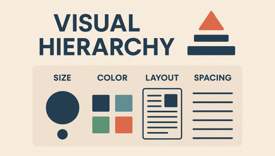
How Visual Hierarchy Shapes User Behavior in the Digital Age
In a digital world overflowing with information, the way content is structured and presented can make or break user engagement. Visual hierarchy—how design elements are arranged to guide a viewer's attention—plays a pivotal role in shaping online behavior. Whether it’s a landing page, blog, e-commerce site, or a mobile app, how users navigate and interpret visual information directly affects conversions, bounce rates, and time-on-site metrics.
What Is Visual Hierarchy?
Visual hierarchy refers to the arrangement and presentation of elements in a way that implies importance. It’s a design principle that leverages size, color, contrast, alignment, repetition, proximity, and whitespace to draw attention to the most critical parts of a page first.
For example, a bold, large headline at the top of a page naturally pulls the eye before smaller body text. Similarly, a brightly colored call-to-action (CTA) button stands out against a muted background, guiding users to click where it matters most.
Why Visual Hierarchy Matters in Online Experiences
In the realm of digital marketing and web design, every second counts. According to Google's research, it takes users about 50 milliseconds to form an opinion about a website. Visual hierarchy determines whether they stay or leave.
Key ways visual hierarchy impacts user behavior include:
Navigation Clarity: Clear visual cues help users understand where to click or scroll next.
Content Prioritization: Users are more likely to consume information in the order it’s visually presented.
Conversion Optimization: CTAs that stand out increase the chances of clicks and purchases.
Bounce Rate Reduction: Well-structured content keeps users engaged longer, reducing drop-offs.
The Science Behind Eye Tracking
Eye-tracking studies have provided invaluable insight into how visual hierarchy guides user attention. For instance, the F-pattern and Z-pattern are common ways people scan websites. The F-pattern is prevalent in content-heavy pages like blogs, while the Z-pattern works best for landing pages with concise information.
Designers and marketers who understand these patterns can structure content to align with natural eye movement, increasing engagement and comprehension.
Design Elements That Shape Hierarchy
1. Size and Scale
Larger elements naturally attract more attention. Headlines, banners, and key visuals should be sized according to their priority in the message.
2. Color and Contrast
Color not only evokes emotion but also differentiates content. High-contrast elements like buttons or alerts guide users quickly. Red for urgency or blue for trust can subconsciously influence decisions.
3. Typography
Fonts and their arrangement communicate hierarchy clearly. Bold or uppercase fonts signal importance. Line height and letter spacing further enhance readability and focus.
4. Spacing and Layout
Whitespace, often underrated, gives room for elements to breathe. Proper spacing makes content digestible and helps users distinguish between different sections without confusion.
5. Imagery and Icons
Strategic placement of visuals can act as directional cues. For example, an image of a person looking toward a CTA naturally directs the viewer's gaze in the same direction.
How Poor Visual Hierarchy Sabotages Experience
Neglecting visual hierarchy leads to cognitive overload. When users cannot quickly identify what to focus on, they leave. Unclear CTAs, inconsistent typography, or overcrowded layouts confuse visitors and reduce credibility. It’s not just about aesthetics—bad design erodes trust.
Visual Hierarchy in Action: Real-World Examples
Amazon
Amazon is a masterclass in visual hierarchy. Despite its dense pages, users can always find what they need because product names, prices, reviews, and buy buttons are clearly prioritized.
Airbnb
Airbnb’s homepage uses large, compelling images and minimal text to guide users smoothly toward booking. Strategic white space and subtle animation direct attention without overwhelming.

Google's Take on User-Centric Design
Google consistently emphasizes user experience as a core part of its ranking algorithm. In 2024, the company expanded its Page Experience update, incorporating metrics like visual stability and layout shift. This highlights that visual hierarchy isn't just good for users—it's vital for SEO too.
Google’s Material Design guidelines even specify a “hierarchy” principle that encourages layering, bold colors, and movement to create depth and focus. It’s clear: digital success today demands thoughtful design backed by behavioral science.
Visual Hierarchy and Mobile-First Design
With mobile users dominating traffic, visual hierarchy must adapt to smaller screens. Key takeaways include:
Larger CTAs that are thumb-friendly
Clear section breaks with vertical hierarchy
Simplified navigation menus
Responsive typography that adjusts to screen sizes
An intuitive visual hierarchy ensures that users on smartphones have just as good an experience as those on desktops.
Visual Hierarchy Trends in 2025
The latest design trends show a shift toward functional minimalism, 3D layering, and motion hierarchy—where subtle animations guide users through a digital journey. For example, hover effects, loading indicators, and animated CTA entrances are being used to improve user engagement without being flashy.
Notably, global design agencies are using AI-powered UX tools to test and optimize hierarchy in real time. Tools like EyeQuant and Attention Insight simulate user attention, helping designers see how effective their visual layout is before it goes live.
Growing Importance of Design Literacy in Digital Marketing
In cities like Mumbai, the demand for performance-driven design is rising. Startups and enterprises alike are hiring UI/UX strategists who understand visual hierarchy deeply. This trend has also boosted interest in programs like a Digital Marketing Course Mumbai, where design principles are taught not just as a side topic but as a core component of customer engagement strategies.
Conclusion: Mastering Hierarchy for SEO and UX
Visual hierarchy is no longer a nice-to-have—it's foundational to both user experience and search performance. When done right, it increases engagement, boosts conversions, and elevates brand credibility. And as businesses in cities like Mumbai continue to prioritize digital excellence, the need for upskilling in SEO and UX has grown substantially.
Enrolling in Certification Courses for SEO Mumbai can be a strategic step for marketers, designers, and business owners who want to master these evolving principles and stay ahead in an increasingly visual web landscape.
0 notes
Text
How to Improve Website Conversions with Better WordPress Design

Your website isn’t just a digital business card—it’s your best salesperson. But what if you're getting traffic and still not getting leads, signups, or sales? The problem often lies in poor website design and user experience.
If your site is built on WordPress, good news: it's one of the most flexible platforms for improving conversions. In this blog, we’ll show you how to design your WordPress site to not just look good—but convert visitors into customers.
Why Website Conversion Matters More Than Ever
A "conversion" can mean many things:
Filling out a contact form
Signing up for a newsletter
Buying a product
Booking a consultation
Downloading an eBook
The average website conversion rate is just 2–3%. But with the right design tactics, you can double or triple that. WordPress offers the tools—if you use them correctly.
1. Simplify Navigation to Reduce Drop-offs
Users don’t stay long on confusing sites. Your menu should be clear, concise, and structured based on user intent.
Best Practices:
Keep top menu to 5–7 items
Use logical labels (e.g., “Services” not “Solutions”)
Include CTAs in the header or sticky nav
Add breadcrumbs on internal pages for navigation clarity
A web design company in Udaipur can help you map the most intuitive layout based on visitor behavior.
2. Improve Page Load Speed for Better UX
Speed directly affects user satisfaction and SEO. A 1-second delay in page load time can reduce conversions by 7%.
Quick Speed Tips for WordPress:
Use a caching plugin like WP Rocket
Compress images with tools like ShortPixel or Smush
Host on a fast server with SSD storage
Remove unused plugins and scripts
Use a lightweight, optimized theme
Speed isn’t just technical—it’s psychological. A fast site feels more trustworthy and professional.
3. Use Visual Hierarchy to Guide Attention
Don’t overwhelm users with scattered content. Arrange elements based on importance using a clear visual hierarchy.
Visual Strategy:
Place the main CTA (Call to Action) above the fold
Use larger fonts and buttons for primary actions
Apply color contrast to guide attention
Use whitespace to break up sections
Bold your value proposition in the hero area
A good first impression can cut bounce rates significantly.
4. Optimize Your WordPress Forms
Your contact or lead form is the final step in the conversion path. If it's confusing or too long, users will abandon it.
Form Optimization Tips:
Ask only for essential info (name, email, message)
Use inline validation for real-time error checking
Add trust elements (privacy note, testimonials)
Make buttons action-oriented: “Get My Quote” vs “Submit”
Use mobile-friendly form layouts
Tools like WPForms or Gravity Forms help create beautiful and responsive forms without coding.
5. Make Your CTAs Impossible to Ignore
Your call-to-action (CTA) is what drives results. If it's weak or hard to find, you're missing out.
Effective CTA Tactics:
Use active language: “Get Started,” “Book Now,” “Claim Offer”
Use buttons with high-contrast colors
Place CTAs at strategic points (top, middle, bottom of the page)
Test pop-ups and sticky bars for lead magnets
Align CTA text with the offer’s value
Use A/B testing to discover what CTA text, color, or position works best for your audience.
6. Add Trust Signals to Boost Confidence
Visitors are more likely to convert when they trust your business. WordPress makes it easy to add trust-building features.
Trust Elements You Should Include:
Customer reviews and star ratings
Client logos or “As Featured In” badges
Secure SSL badge (https and padlock)
Clear contact info with map
Certifications, memberships, or awards
Social proof works—especially in industries like hospitality, healthcare, education, and services.
7. Use Conversion-Focused WordPress Themes
Not all WordPress themes are designed for business growth. Some focus too much on design and forget functionality.
What to Look For:
Mobile-responsive layout
Optimized for fast load times
Easy integration with marketing plugins
Customizable header, footer, and CTA areas
SEO-friendly markup
A custom-coded theme from a WordPress Development Company in Udaipur can give you both performance and pixel-perfect design.
8. Add Live Chat or WhatsApp Integration
Modern users want immediate responses. Adding live chat or WhatsApp can dramatically increase inquiries and reduce bounce.
Recommended Plugins:
Tidio
WP-Chatbot
WhatsApp Chat Button by Cresta
HubSpot Live Chat (also integrates with CRM)
Just make sure someone’s actively managing it—or use chatbots for off-hours.
9. Track & Analyze User Behavior
WordPress easily integrates with tracking tools to help you understand how users behave—and where they drop off.
Top Tools:
Google Analytics
Microsoft Clarity (heatmaps and session recordings)
MonsterInsights (WordPress plugin for analytics)
Hotjar
Data-driven design decisions help you focus on what actually increases conversions—not just what looks good.
10. Update Your Content & Offers Regularly
Stale websites drive users away. Keep your WordPress site fresh with:
Seasonal offers or time-limited deals
New blog posts or success stories
Updated FAQs
Changed pricing, testimonials, or CTAs
Your homepage should evolve as your business does.
Final Thoughts
Great WordPress design isn’t about flashy visuals—it’s about clarity, speed, trust, and action. Every design element, layout decision, and plugin you use should serve one purpose: driving conversions.
0 notes
Text
The Hidden Strategy Behind Every High-Converting Visual
When you see a powerful visual—a landing page banner that makes you stop scrolling, a product image that makes you click, or a social post that gets saved and shared—you’re not just witnessing good design. You’re seeing strategy at work.
Behind every high-converting visual lies a carefully crafted blend of psychology, hierarchy, color theory, and user intent. These elements aren’t randomly thrown together by chance—they’re the result of deliberate, user-focused design thinking. That’s why brands that consistently generate ROI from their creative campaigns often partner with professionals who specialize in Graphic Designing Services that combine aesthetic appeal with performance.
In this post, we’ll break down what actually makes a visual convert, and how that “hidden” strategy works behind the scenes.
1. Start with the End Goal in Mind
Every high-converting visual is built with a clear intention: click, sign up, buy, share, or remember. The designer first identifies what action the user should take—and then removes anything that distracts from that action.
This means:
One clear call-to-action (CTA)
Strong focal point (usually a headline or button)
Clean layout to reduce decision fatigue
Before any colors or icons are chosen, the goal drives the entire structure.
2. Visual Hierarchy Guides the Eye
Visual hierarchy refers to the way elements are arranged to show importance. It helps the viewer’s eye flow naturally from point A to point B—and finally, to the CTA.
A strong visual hierarchy uses:
Size (bigger elements get attention first)
Color contrast (CTA buttons in bold shades)
White space (to emphasize key points)
Alignment (keeping layouts easy to scan)
When hierarchy is done right, users don’t get overwhelmed—they glide effortlessly toward the conversion.
3. The Psychology of Color
Color isn’t just a design choice—it’s a strategic tool. Different colors evoke different emotions and behaviors:
Red: urgency, energy (often used for sales)
Blue: trust, calm (popular in fintech and healthcare)
Green: growth, eco-friendliness
Yellow: optimism, attention-grabbing
The best visuals use color not just for branding, but to trigger action or reinforce a feeling that nudges the user closer to conversion.
4. Consistency Builds Trust
Even the most beautiful graphic won’t convert if it looks like it came from a different brand. High-converting visuals maintain brand consistency across:
Fonts and typography
Logo usage
Color palette
Illustration or photo style
This consistency builds trust. And trust drives conversions. That’s why high-performing brands use design systems or style guides—and why smart businesses rely on cohesive graphic design partnerships that don’t start from scratch every time.
5. Mobile-First Thinking
A huge portion of traffic comes from mobile devices. A visual that looks great on a desktop might be unreadable or ineffective on a smartphone.
Strategic design means:
Legible fonts on small screens
CTAs placed within thumb-friendly zones
Fast-loading image formats
Scannable content broken into digestible chunks
Conversion rates plummet when users have to pinch, zoom, or scroll endlessly. Mobile-first design ensures your visual doesn’t just look good—it performs across every device.
6. A/B Testing & Data Feedback Loops
Even with great strategy, the most successful visuals are refined through data. Designers often create multiple versions (A/B tests) and track:
Click-through rates
Engagement time
Conversion drop-offs
This feedback informs future design choices—colors that convert better, placements that perform stronger, or copy that grabs more attention. Conversion-optimized design is as much about testing as it is about talent.
7. Storytelling Through Design
Finally, powerful visuals don’t just push products—they tell stories. Whether it’s a carousel post that highlights customer transformation or a landing page banner that showcases purpose-driven impact, visual storytelling keeps users emotionally invested.
The design isn’t there to explain—it’s there to evoke. And when users connect emotionally, they’re more likely to convert.
Conclusion: Design That Sells Starts with Strategy
Design without strategy is decoration. But when each pixel serves a purpose—driven by user behavior, psychology, and clarity—it becomes a silent salesperson for your brand.
If your current visuals aren’t getting the results you want, maybe it’s not about changing your product or price. Maybe it’s time to rethink the design—strategically. And if you want visuals that aren’t just attractive but also effective, consider working with professional Graphic Designing Services that blend creativity with conversion science.
Because high-converting visuals don’t happen by chance. They’re designed that way.
0 notes
Text
Unlock Your Website's Potential: 7 Web Design Tricks You Need to Know
The digital canvas of the internet is a vibrant and ever-evolving space, where a website serves as a crucial digital handshake for businesses and individuals alike. Beyond just aesthetics and functionality, certain "web design tricks" can elevate a good website to a great one, significantly impacting user experience, engagement, and ultimately, conversion rates. For a Freelance Web Designer navigating the competitive landscape, particularly in a tech-savvy hub like Singapore, mastering these subtle yet powerful techniques can be the differentiator that sets their work apart.
One of the most effective, yet often underestimated, web design tricks is the strategic use of whitespace (or negative space). It's not about emptiness; it's about giving elements room to breathe. Proper whitespace reduces visual clutter, improves readability, and draws attention to key content. Imagine a product description on an e-commerce site – ample whitespace around the image and text makes it easier for the eye to process the information, preventing cognitive overload. A Freelance Website Designer in Singapore understands that in a market saturated with information, clarity and ease of consumption are paramount.
Another powerful trick lies in implementing strong visual hierarchy. This involves arranging and styling elements to indicate their relative importance. Larger fonts, bolder colors, prominent placement, and strategic use of contrast all guide the user's eye, directing them to the most critical information or calls to action. For instance, a "Buy Now" button should inherently stand out more than a "Terms and Conditions" link. A skilled Web Designer Singapore intuitively understands how to orchestrate these visual cues to create a seamless user journey, ensuring visitors naturally gravitate towards desired actions.
The trick of micro-interactions adds a delightful layer of personality and feedback to a website. These are small, subtle animations that occur when a user interacts with an element, like a button changing color on hover, a checkmark appearing after form submission, or a loading spinner providing a visual cue. While seemingly minor, these interactions enhance the user experience by providing immediate feedback and making the site feel more dynamic and responsive. A Freelance Web Developer Singapore often possesses the technical prowess to implement these intricate details, transforming a static page into an interactive experience.
Optimizing for perceived performance is a clever trick to mitigate the impact of actual loading times. Even if a site takes a few seconds to load completely, strategic design can make it feel faster. This involves using skeleton screens (loading placeholders that mimic the page layout), lazy loading images (only loading images as they scroll into view), and prioritizing above-the-fold content. A Website Developer Singapore understands that while actual speed optimization is crucial, these perception-based tricks can significantly improve user patience and reduce bounce rates.
The art of persuasive typography is another subtle trick. Beyond just choosing readable fonts, it involves using different font weights, sizes, and styles to convey tone, emphasize points, and establish a clear brand identity. A compelling headline, for instance, might use a bold, impactful font, while body text requires a more legible, neutral typeface. A seasoned Freelance Web Designer Singapore knows that typography contributes significantly to the overall aesthetic and message of a website, influencing how information is perceived.
Strategic use of color psychology can subtly influence user emotions and behavior. Different colors evoke different feelings – blue for trust and stability, red for urgency and passion, green for growth and nature. While not a one-size-fits-all solution, incorporating colors that align with your brand message and desired user action is a powerful trick. For an e-commerce site, for example, a call-to-action button in a contrasting, attention-grabbing color can significantly boost click-through rates. This thoughtful application of color is a hallmark of a skilled Web Designer Singapore.
F-pattern and Z-pattern layouts are design tricks based on how users typically scan web pages. The F-pattern suggests users scan horizontally across the top, then down, then horizontally again, forming an 'F'. The Z-pattern is similar but for less content-heavy pages, moving from top-left to top-right, then diagonally to bottom-left, and finally to bottom-right. Placing crucial information and calls to action along these natural scanning paths can drastically improve visibility and engagement. A knowledgeable Freelance Website Developer considers these user behaviors when structuring the layout and content flow.
The trick of smart use of imagery and video goes beyond just high-quality visuals. It involves using images and videos that tell a story, evoke emotion, or clearly demonstrate a product or service. Background videos can create an immersive experience, while carefully chosen hero images can instantly convey a brand's essence. Crucially, optimizing these media for web performance (file size, format) is a trick a Web Developer Singapore excels at, ensuring visual richness doesn't compromise loading speed.
Social proof integration is a powerful psychological trick. Displaying customer testimonials, product reviews, social media follower counts, or even "X people are viewing this product now" notifications can significantly boost conversions. Humans are inherently influenced by the actions of others, and seeing that others trust and value your products or services builds confidence in potential customers. A proficient Freelance Website Developer Singapore can seamlessly integrate these dynamic elements into an e-commerce platform, leveraging existing user data to drive new sales.
Finally, the often-overlooked trick of ongoing testing and iteration is perhaps the most crucial. Web design isn't a static endeavor. A/B testing different button colors, headline variations, or layout changes provides invaluable data on what truly resonates with your audience. Tools like heatmaps and user recordings reveal how users interact with your site, exposing areas for improvement. For a Freelance Website Designer Singapore, this commitment to continuous optimization based on real user data is the ultimate trick to building highly effective and enduring websites.
In essence, these "web design tricks" are not about deception, but about leveraging psychological principles and best practices to create a more intuitive, engaging, and persuasive online experience. For any Freelance Web Designer or Freelance Web Developer, especially those operating in a competitive and demanding market like Singapore, understanding and expertly applying these techniques is not just a skill – it's an art that transforms a mere website into a powerful digital asset. Meet your web design Singapore expert today.
#freelance web designer singapore#website developer singapore#web design singapore#web designer singapore#web developer singapore#website designer singapore
0 notes
Text
A well-organized digital platform effectively transforms visitors into valuable leads. Each component, including layout and visual aesthetics, also significantly impacts user behavior. A cluttered interface can deter potential customers, while an engaging experience quickly encourages prompt action. High-Performing vs. Basic Websites: What Sets Them Apart? An online platform that effectively attracts and retains potential customers is not merely aesthetically pleasing. It is designed with intention. In contrast to standard portals that function as digital brochures, successful designs prioritize engagement. Each element, from imagery to layout, is fine-tuned to reduce distractions and guide buyers toward suitable actions. In addition, technical aspects such as rapid loading times are also vital. A slow or unresponsive site can frustrate users. Conversely, an adaptive layout builder like Webflow can help create a site that adjusts to various devices, ensuring seamless navigation and accessibility. The Role of User Psychology Visual hierarchy, contrast, and spacing determine where attention is drawn first. They quickly steer visitors toward critical call-to-action buttons or essential information. A cluttered or poorly organized page can overwhelm users. This can result in indecision or frustration. Factors like color, font, and even the shape of icons foster trust. They urge potential buyers to truly engage with the content. Additionally, when navigation becomes intricate or the number of options appears overwhelming, users may experience decision fatigue. Simplified interfaces that reduce distractions and offer limited choices facilitate quicker responses. Thoughtful positioning of progress indicators or gentle prompts can also subtly coax visitors. These can enable them to engage in desired behaviors without being intrusive. Designing with a Purpose The Importance of Clear Site Architecture A coherent and systematically arranged layout allows buyers to locate what they seek without difficulty. Organized menus and consistency also minimize obstacles. This approach enables visitors to concentrate on meaningful actions rather than struggling to find information. Thoughtful elements like breadcrumb navigation further help with retention and decrease abandonment rates. The best part is that a predictable framework also quickly fosters trust. When customers instinctively know where to find contact information or product listings, they are more inclined to take action. Strategic positioning of sticky headers or labeled sections aids in sustaining engagement across various pages. Structuring Content A well-defined hierarchy ensures that the most significant information is easily accessible. It minimizes the need for excessive scrolling or searching. Essentials like service descriptions and calls to action should also follow a logical progression. This is because they play a major role in creating a cohesive experience. Especially one that actively guides visitors toward: Subscribing to a newsletter Requesting a quote Finalizing a purchase Capturing Mobile Leads As smartphones continue to outpace standard browsing, a responsive design has become crucial. This feature allows sites to seamlessly adjust to various screen sizes. It guarantees that menus, buttons, and content remain user-friendly. For these visitors, speed and simplicity are also paramount. Touch-friendly buttons and concise content can be key to triggering prompt action. Auto-fill and minimal scrolling can further help improve convenience. Essential Features That Convert High-Impact CTAs Options such as above-the-fold buttons, sticky elements, and thoughtfully designed exit-intent pop-ups ensure that the next step is readily accessible. Additionally, the repetition of prompts throughout the page enhances engagement. The wording must also be straightforward. Rather than using vague phrases, call-to-actions should emphasize expressions that convey urgency and clarity.
Design aspects like contrast and whitespace also significantly influence effectiveness. Landing Pages In contrast to general webpages that juggle multiple elements, targeted sections focus on a singular objective. This could be capturing email addresses, encouraging sign-ups, or promoting a product. Clean layouts and compelling headlines along with testimonials can also help foster a persuasive atmosphere. In addition, links that are slow to load risk deterring potential customers. An effective structure strikes a balance between providing information and maintaining simplicity. Explanatory videos or bullet-points can further aid in reinforcing key messages. Forms That Don’t Scare Away Simplified versions with only essential fields tend to boost submission rates. Requesting excessive information at the outset also creates friction. Therefore, asking only for what is necessary and gradually gathering additional details later can significantly enhance completion rates. The design and layout also contribute to user comfort. Multi-step forms prevent overwhelm. Clear labeling and a progress indicator further help remove uncertainty. The Role of Trust Signals Social Proof Consumers tend to place greater trust in the opinions of others rather than the assertions made by a brand itself. Authentic experiences shared through testimonials and comprehensive case studies alleviate skepticism. Additionally, video reviews and endorsements further enhance credibility. Security Elements SSL encryption provides assurance that all data is protected. Trust badges from payment processors and cybersecurity organizations also help indicate legitimacy. Displaying privacy policies and customer service information can further eliminate hesitation. Authority-Building Content Thoroughly researched material establishes a brand as a leader in its field. Whitepapers and reports attract professionals seeking reliable information. Similarly, consistently updated blogs demonstrate expertise. When visitors trust a platform, they are more inclined to engage and convert. Leveraging SEO On-Page Tactics Use targeted keywords to attract visitors who are actively seeking solutions Organize content to enhance search rankings and engagement Add internal links to encourage further exploration Optimize images and enhance page speed to boost the overall experience Blog Content Strategies Comprehensive, well-researched articles address basic queries. They actively draw in readers who are more inclined to engage. The incorporation of infographics and videos also captivates visitors. These also quickly underscore the author's expertise. Using Lead Magnets Provide valuable resources to coax users into disclosing their contact information Offer complimentary guides and trials to establish brand authority Conduct webinars to channel participation UX and Performance Optimization Page Speed’s Direct Impact Links that load slowly can frustrate users and lead to increased abandonment rates. Enhancing image optimization, minimizing scripts, and implementing caching techniques can significantly boost performance. Creating a Seamless Browsing Experience Implementing mobile-first design principles guarantees accessibility Responsive layouts adapt seamlessly to various screen sizes Touch-friendly navigation improves overall usability How A/B Testing Helps Experimenting with different layouts, calls to action, and content formats uncovers the most effective strategies. Heatmaps and analytics also offer valuable insights into user behavior. They enable ongoing adjustments to improve conversion rates. Automation and Lead Capture Real-Time Engagement AI-driven chatbots can help provide instant responses Timed pop-ups can effectively gather leads without interrupting browsing Live chat introduces a personal element to minimize abandonment rates Email Techniques
Exit-intent pop-ups deliver value just before visitors leave Inline forms integrate smoothly within the content Multi-step menus enhance completion Maximizing Conversions Automated lead tracking prevents potential customers from being overlooked. CRM systems also facilitate personalized follow-ups, boosting conversions. Endnote By enhancing navigation, lead capture, and utilizing SEO, organizations can craft a seamless experience. Minor adjustments like increasing page speed or streamlining forms can also significantly impact sales. The main approach is to engage in ongoing testing and refinement. This allows any lead-generation platform to become a dynamic instrument that quickly adapts to visitor interactions. Emmad R. is a writer known for delivering engaging articles across diverse topics. With keen insight and a clear, informative style, he connects with readers through compelling content that educates and inspires.
0 notes
Text
Layout Composition: The Foundation of Effective Visual Design

In every powerful piece of visual content—whether it's a website, magazine spread, mobile app, or brochure—there’s a hidden force that determines its effectiveness: layout composition. It’s the blueprint that guides the visual structure of a page, dictating how images, text, and design elements work together to create a unified, functional, and aesthetically pleasing experience.
Understanding layout composition isn’t just for graphic designers; it’s crucial for marketers, web developers, content creators, and anyone involved in communicating through visuals. In this blog, we’ll break down what layout composition is, why it matters, the key principles behind it, and how to apply it across different formats.
What Is Layout Composition?
Layout composition is the strategic arrangement of visual and textual elements within a design space. It determines the flow, balance, and hierarchy of a piece, guiding the viewer’s eyes and attention. A well-composed layout brings clarity, enhances readability, and creates visual harmony, whereas a poorly composed layout leads to confusion and disengagement.
In simpler terms, layout composition is like the architecture of a building—it holds everything together, provides structure, and enhances function.
Why Layout Composition Is Important
Good design is not just about making something look pretty; it’s about communicating effectively. Layout composition helps achieve this in several ways:
1. Guides the Viewer’s Eye
Strategic composition ensures that the viewer’s eyes move through the content in a logical, intentional way. It helps highlight key messages and CTAs without overwhelming the audience.
2. Creates a Visual Hierarchy
Not all content is equal. Headlines, subheadings, body text, and images need to be arranged in a way that communicates importance and sequence.
3. Improves Readability
Proper spacing, alignment, and grouping make content easier to scan and read. This is critical in a digital world where users often skim rather than read word-for-word.
4. Supports Brand Identity
Consistent layout styles across platforms (web, mobile, print) reinforce brand recognition and professionalism.
5. Enhances User Experience
Especially in web and app design, layout composition directly affects usability and engagement.
Core Principles of Layout Composition
To create an effective layout, you must understand the basic principles that shape good composition. These principles serve as the foundation of professional visual design.
1. Balance
Balance refers to how visual elements are distributed within a layout. There are two main types:
Symmetrical balance: Elements are mirrored on either side of a central axis, creating a formal and stable design.
Asymmetrical balance: Uses contrast in size, color, or placement to create a more dynamic and modern feel.
Both approaches aim to achieve visual equilibrium that feels right to the eye.
2. Alignment
Alignment creates order and consistency. Whether aligning elements to a grid or along margins, it gives structure to a layout and makes it visually coherent. Poor alignment often looks amateur and chaotic.
3. Hierarchy
Hierarchy guides the viewer to the most important information first. It’s created through:
Size (bigger = more important)
Color and contrast
Typography (bold vs. light)
Position (top of page, center, etc.)
4. Contrast
Contrast is used to make elements stand out from one another. It helps define relationships and separate sections. For example, using dark text on a light background improves legibility, and a bold headline contrasts with light body text.
5. Proximity
Grouping related elements closely together and separating unrelated items helps users understand content structure intuitively. This principle makes layouts more organized and easier to navigate.
6. White Space (Negative Space)
White space isn’t wasted space—it’s a crucial part of layout composition. It helps reduce visual clutter, creates emphasis, and gives the design room to breathe. Minimalist designs rely heavily on white space to achieve clarity and elegance.
7. Repetition
Repetition reinforces consistency. Repeating visual elements like font styles, icons, colors, and spacings creates a unified look. It’s especially important in multi-page or multi-screen designs.
Layout Composition Techniques
While layout composition principles remain the same across formats, there are different techniques used to implement them depending on the design context.
1. Grid Systems
Grids are invisible frameworks that help organize content. Common grid types include:
Column grids
Modular grids
Hierarchical grids
Grids ensure alignment and proportion, making your layout cleaner and more professional.
2. Rule of Thirds
This classic design rule divides a layout into three equal parts horizontally and vertically. Placing key elements at the intersections of these lines creates natural visual interest and balance.
3. F-Pattern and Z-Pattern
These patterns mimic the natural way people scan web pages:
F-pattern: Users scan horizontally at the top, then down and across less frequently.
Z-pattern: Common in minimal designs with limited content—eyes follow a Z-shaped path across the page.
Understanding these patterns can help position important content more effectively.
4. Visual Flow
Visual flow refers to how a layout guides a viewer’s eye through the content. Flow can be created with arrows, shapes, text direction, or image placement. The goal is to move the user from entry to action naturally.
Applying Layout Composition Across Formats
Web and UI Design
In digital design, layout composition affects user behavior and conversion rates. Responsive grids, mobile-first layouts, and modular blocks are common. The layout must adapt to screen size while maintaining hierarchy and functionality.
Print Design
In brochures, posters, and magazines, designers use fixed layouts with precise margins, bleed areas, and typographic grids. Print layouts often focus more on symmetry, font pairing, and color schemes since they don’t need to be responsive.
Social Media Graphics
Here, quick impact is everything. Layouts need bold typography, high contrast, and clear focal points. Space is limited, so every element must be intentional.
Presentation Slides
In slides, layout composition ensures your message is concise and visually digestible. Avoid cramming content; instead, use whitespace, visual aids, and consistent alignment for impact.
Tips for Better Layout Composition
Sketch before you design: Wireframes help plan structure without getting distracted by style.
Use a grid: Even a simple column system improves balance and alignment.
Limit fonts and colors: Too many variables cause visual confusion.
Prioritize clarity over creativity: A layout should serve the message first.
Test your layout: Review how real users interact with your design.
Common Mistakes to Avoid
Overcrowding the layout: Less is often more.
Ignoring mobile users: Mobile-first design is essential in today’s digital landscape.
Too many focal points: Focus attention where it matters most.
Lack of hierarchy: Viewers won’t know what’s important.
Inconsistent spacing or alignment: Disrupts visual flow and professionalism.
Conclusion
Layout composition is the unsung hero of visual design. It's not always the first thing a viewer notices—but when done right, it makes your design work seamlessly and effectively. Whether you’re building a landing page, designing a brochure, or creating a social media post, mastering layout composition means mastering the art of communication.
By applying foundational principles like balance, hierarchy, alignment, and whitespace, you can create layouts that not only look stunning but also serve a clear purpose. In a world overflowing with visual content, great layout composition is what helps your message stand out and stick.
1 note
·
View note
Text
Bringing Your Vision to Life: The Power of a Professional Floor Plan Creator and Designer
In today's fast-paced world, where design trends evolve rapidly and precision is paramount, planning a new space or renovating an existing one can feel overwhelming. Whether it’s a cozy home extension, a sprawling commercial office, or a stylish retail fit-out, the foundation of any successful project lies in a well-executed plan. This is precisely where a dedicated floor plan creator and designer becomes an indispensable tool.
Modern digital floor planning tools have revolutionized how we conceive and refine our spatial ideas, offering an unparalleled level of detail, flexibility, and collaborative potential.
Why Your Project Needs a Digital Edge
The benefits of utilizing a professional floor plan creator and designer extend far beyond mere visualization.
Precision and Accuracy from the Outset: One of the most significant advantages is the ability to work with exact measurements and scaled elements. A digital floor plan ensures that every wall, door, window, and piece of furniture is placed with pinpoint accuracy. This eliminates costly assumptions and guarantees that what you design virtually will translate seamlessly into reality. Say goodbye to finding out a critical piece doesn't fit after construction has begun!
Limitless Experimentation and Optimization: Imagine being able to rearrange your entire kitchen layout with a few clicks, or seeing how moving a partition wall impacts the natural light in a living room. A robust floor plan designer allows for boundless experimentation. You can drag, drop, resize, and reconfigure elements until the ideal arrangement is found, optimizing flow, functionality, and aesthetics without any physical effort or expense. This iterative process is crucial for achieving truly optimized spaces.
Enhanced Communication and Collaboration: Projects rarely happen in a vacuum. Architects, interior designers, contractors, clients, and even family members often need to weigh in. A digital floor plan acts as a universal language, allowing all stakeholders to visualize the same concept. These tools facilitate easy sharing, real-time feedback, and collaborative editing, streamlining communication and ensuring everyone is literally on the same page, minimizing misunderstandings and accelerating decision-making.
Informed Budgeting and Material Planning: A detailed floor plan provides the bedrock for accurate cost estimation. Knowing the exact square footage of each area, the number of doors, windows, and even the type of flooring (like the comprehensive options available from Morefloor), enables precise material calculation. This foresight is invaluable for budgeting, reducing waste, and preventing unexpected expenses down the line.
Visualize Furniture and Decor Before You Buy: Avoid the common pitfall of purchasing furniture that doesn't quite fit or overwhelms a space. With a floor plan creator and designer, you can virtually place furniture, rugs, and decor elements within your planned layout. See how different pieces interact, how they affect traffic flow, and ensure they align with your overall design vision before making any financial commitments.

Choosing Your Professional Partner
When selecting a platform, look for a floor plan creator and designer that combines user-friendliness with powerful features. The best tools offer extensive libraries of objects, realistic rendering capabilities, and the flexibility to handle projects of all scales, from a simple room makeover to a complex multi-story building.
Ultimately, investing time in creating a comprehensive digital floor plan means investing in the success and efficiency of your project. It transforms abstract ideas into tangible blueprints, enabling you to refine your vision, collaborate effectively, and avoid costly mistakes. For anyone serious about spatial planning, leveraging a professional floor plan creator and designer is not just an advantage—it's a necessity.
Are you ready to transform your ideas into precise, beautiful plans? Explore professional services that provide intuitive tools for bringing your designs to life.
0 notes
Text
Using Miro
Starting from late Semester B, I began to experiment with Miro for my project management.
The initial reason I wanted to try using software for project management was that I'm not very good at managing my time and progress. I often get caught in anxiety and self-doubt, which easily leads to distractions when I'm working. For example, I might be sketching and suddenly think, "Oh! Do I have another assignment to work on?" Then I'd get sidetracked from dealing with it. After a while, I might return to sketching, but then I'd look at my own sketches and feel dissatisfied, thinking they weren't good enough or the idea wasn't strong enough, and decide to redraw. Or, I might have extensive plans in my head, but because I never fully write them down, I often have to repeatedly rethink things I've already considered but forgotten. This constant back-and-forth results in very little actual time spent drawing.
So, in late Semester B, I realized I couldn't go on like this. I had to find software to help me record and visualize all the ideas and plans in my head, making them immediately visible so I wouldn't get stuck in repetitive overthinking and anxiety.
Initially, I actually tried Xmind, a software specifically designed for creating mind maps. Predictably, that attempt failed, as Xmind is, after all, "mind map creation" software. I'll write a separate article comparing Xmind and Miro for the detailed process. In short, after that failure, I began searching for the next software. After researching various articles, I chose Miro.
Miro is indeed a very powerful project management tool!
What I personally love most about Miro is its extremely high degree of freedom! When you first enter Miro, you see a blank space. You can arrange the entire page however you like. Plus, Miro's smart alignment feature genuinely helps someone like me, who's a bit obsessive-compulsive, quickly achieve a neat and tidy layout, rather than spending a lot of time fussing over whether something is perfectly centered or other minor details.
Next, another thing I personally love about Miro is its wide array of built-in tools! Features like sticky notes, Kanban boards, or text can all be connected with lines. Basically, any practical design tool you can think of, you'll likely find in Miro!
Finally, what I love most about Miro is that its free version is very, very sufficient and user-friendly!


The image on the left shows my initial Miro layout, and the one on the right is my current Miro layout! I underwent extensive experimentation to design the current setup, which is the most convenient for me.
The main reason my initial Miro layout wasn't effective was that I hadn't user-friendly planned each area. Visually, it looked neat, but it was like a drawer where things were just put away tidily without considering practical use. This led to me spending a lot of time searching for my own notes when I first started using Miro.
However, "failure is the best teacher." It was through this experience that I was able to organize my new Miro workspace layout! Now, let me show you how I use Miro today!

First, this red box represents the core board of my workspace.
Here, I've listed my project name, the project's core concept (in a single sentence), my own core objectives, and a linked Gantt chart from Google Sheets. This is the area I check and use most frequently. Essentially, whenever I need to check progress or quickly revisit my project's goals or core concepts, I can see everything at a glance here. All other sections are generally developed around this central area!

Below the core board is my progress planning area. Here, I mainly use Miro's built-in Kanban feature to categorize the major items in my project, break them down into smaller goals, and then set my monthly and weekly targets based on those smaller goals and the Gantt chart.
The reason I designed this section to be right below the core board is that I genuinely tend to forget things easily, so I constantly need to refer back to my Gantt chart. By placing this progress planning area directly underneath it, I can quickly compare and check back and forth to ensure I haven't missed anything. I personally really like this layout!

To the left of the core board is my instructor feedback and resource organization area. Here, I organize all the feedback I receive from lectures or tutorials, arranging it chronologically. As I mentioned, I really tend to forget things! Previously, I used to organize all my feedback in Notion, but unlike Miro, Notion doesn't allow for easy zooming or flexible layout. This made it less convenient when I needed to compare feedback. So, I decided to consolidate all received feedback here. Now, when I need it, I can see it immediately, which is super convenient! I also organize various self-study resources in this same area. Since this section will grow over time, I've placed it on the far left to avoid any overlap with other areas.

Next, this section is dedicated to recording all my sudden ideas and questions, as well as the core requirements for assignments!
I often get sudden ideas, and then, fearing I'll forget them, I'll repeatedly ponder them, which ultimately leads to anxiety. Alternatively, I might write them down in a notebook, but then I can never find them when I actually need them. Now, I can quickly centralize and record my thoughts, freeing up mental space to focus on action. Miro even has a neat little tool that lets you place a digital notepad right next to your board! I really love this small feature, haha.

Next, this largest section is dedicated to recording my project process and various ideas!
The reason it's placed on the far right is that I can't determine how much space this section will ultimately need, similar to the feedback and resource organization area on the far left. That's why I need to put it on the right side, where it can expand infinitely. Also, because I still prefer to think by "writing," you can see there's a dedicated area for me to "write things down"!
In conclusion, I feel Miro has truly helped me a lot! It allows me to visualize all the plans and progress in my mind at a glance, significantly reducing my anxiety and unease. I can focus on what I need to do now, and if I start feeling anxious about progress, I can immediately check the Gantt chart to confirm I'm on track, or I can quickly review the smaller goals I initially broke down to ensure nothing has been missed! Although it took me some time to find the best way to use it, I personally believe it's been well worth it!
0 notes
Text

Drop A Two
• Mark Fisher Photography •
1917 Series United States Note.
It Was Backed By Bonds, That Government Sold.
Not Silver Or Gold, But, Money From The U.S. Residents.
The Silly Civilians, Who Make It All Work.
The Country Has A Monster Debt.
Fear Is Running With The Best, That There Will Be a Collapse.
There Have Been Tougher Times.
Through The Hard Moments,
I Say " I Have Seen Worst Than This"
Things Work Themselves Out.
Don't Cry To Hard, Elon... He's Worried
Interview After Interview, There Is A Correction Ahead.
Over And Out
∆
Captured Under Average Existing Light.
Modified For Web Presentation.
Changing The Appearance,
Of The Display Image.
With Adjustments Of The Key Values.
Mastered For Sizing And Shaping.
To Fit The Platform.
Working The Approach Of The Design.
Pushing The Core Plain,
Using Developed Creative Techniques,
Controlling The Placement
And Linear Arrangement.
While Placing The Assets In Order,
To Construct The Layout.
Through Photo Graphic Engineering.
Assembling The Structured Appearance
Within The Cell Frame Field.
Maneuvering The Created Elements,
To Complete The Visual Result.
During Post Lab In New York City.
•
Just Be Creative™
•
No Second Usage Without Permission
• All Rights Reserved •
Talent Used In The Web Post All Have Management.
Removal Of The Image,
Scripting Implant,
Or Tampering With Blog May Violate U.S. Laws.
Photographer Mark Fisher™ Is
A Well Accomplished Published Photographer
In Beauty, Fashion, and Music Photography.
New York City
Based Image And Filmmaker
Has A Worldwide Following.
Is A Member Of The Press.
There Is Fan Page On Facebook.
Mark Fisher American Photographer
∆
Commissions Accepted Through Contract
• New York • • Paris • • Milan • • London •
Private Client Request Accepted.
Website www.americanphotographernyc1.com
For More Info Contact
First Stamp Multimedia
Located In
New York, New York
Contact Also
In New York City
Or Contact Mark Fisher
In New York City
Thank You
¨•
Veteran Of The United States Army.
Trained And Educated In Medicine.
•
#american photographer mark fisher#photographer mark fisher#first stamp multimedia#new york photographer mark fisher#mark fisher american photographer#Mark Fisher Photography#Mark Fisher NYC#Mark Fisher Creative#Mark Fisher NYC1#Mark Fisher Photo#First Stamp Multimedia
0 notes