#PlotlyInR
Explore tagged Tumblr posts
Visit Tumblr Blog
Explore Tumblr blogs with no restrictions, modern design and the best experience.
Last Seen Tumblr Blogs


Fun Fact
Tumblr.com is the 103rd most visited website in the world.
Text
Data Visualization with R: From Raw Numbers to Stunning Insights
In the age of big data, transforming raw numbers into meaningful insights is more important than ever. Data visualization is a powerful tool that allows us to see trends, patterns, and outliers in data, enabling better decision-making and storytelling. Among the many tools available for data visualization, R stands out as a particularly effective choice. This blog explores why R is a great tool for plotting and storytelling, examines some of its best packages, and shares best practices for creating clean, readable visualizations. We'll also delve into a real-world example of visualizing data from government sources.

Pair Plot in R language
Why R is Great for Plotting and Storytelling
R is a language designed specifically for data analysis and visualization. Its strengths lie in its ability to handle complex data manipulation and its extensive range of packages that facilitate sophisticated visualizations. Here are a few reasons why R is ideal for data visualization:
Comprehensive Package Ecosystem: R offers a vast array of packages that cater to different visualization needs, including statistical analysis and graphical representation.
Flexibility and Customization: R provides a high degree of customization, allowing users to tailor visualizations to specific needs.
Community and Support: With an active community of users and developers, R offers extensive documentation, tutorials, and forums where users can seek help and share insights.
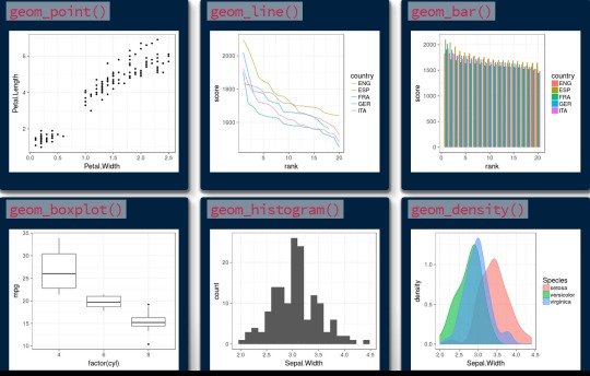
Using ggplot2, plotly, and lattice
Three of the most popular R packages for visualization are ggplot2, plotly, and lattice. Each has its unique strengths and can be used to create different styles of visualizations.
ggplot2
ggplot2 is perhaps the most widely used visualization package in R. It is based on the Grammar of Graphics, which provides a coherent system for describing and building graphs. It is highly flexible and particularly effective for creating complex, multi-layered plots. Users appreciate its intuitive syntax and the ability to build plots incrementally.
plotly
plotly is renowned for its ability to create interactive visualizations. It is built on top of ggplot2 and allows users to convert static plots into interactive ones with ease. This package is especially useful for web applications and dashboards where user interaction can provide deeper insights.
lattice
lattice is a powerful system for creating trellis graphs, which are particularly useful for conditioning plots on one or more variables. It excels in creating multi-panel displays and is an excellent choice for visualizing data across different dimensions.
Data Visualizations
Best Practices for Clean, Readable Visualizations
Creating effective visualizations requires more than just choosing the right tools; it also involves adhering to best practices to ensure clarity and impact:
Simplicity: Avoid clutter by removing unnecessary elements and focusing on the key message.
Consistency: Use consistent color schemes, fonts, and scales to make comparisons easy.
Labeling: Ensure all axes, legends, and annotations are clearly labeled for better understanding.
Accessibility: Consider colorblind-friendly palettes and ensure that visualizations are accessible to all audiences.

Readable Visualizations
Real-World Hook: Visualizing Government Data
To demonstrate the power of R in visualizing real-world data, let’s consider an example of visualizing government data related to climate change. Government sources, such as the National Oceanic and Atmospheric Administration (NOAA) or the Environmental Protection Agency (EPA), provide extensive datasets on climate metrics such as average temperature, precipitation levels, and CO2 emissions.
Using ggplot2, we can create a time series plot to show trends in global temperature over time. By layering additional data, such as CO2 levels, we can provide a comprehensive view of how these factors interact, offering insights into climate change trends over the decades.
Frequently Asked Questions
What makes R better than other data visualization tools? R is designed for statistical analysis and visualization, providing extensive packages and customization options not available in many other tools.
Can I use R for interactive visualizations? Yes, with packages like plotly, R can create interactive visualizations suitable for web applications and dashboards.
Is it difficult to learn R for data visualization? While there is a learning curve, R's extensive community support and comprehensive documentation make it accessible to beginners.
How do I choose the right visualization package in R? Your choice depends on your specific needs. For static plots, ggplot2 is excellent, while plotly is best for interactivity, and lattice is ideal for multi-dimensional data.
Where can I find datasets for practice? Many government agencies provide open datasets, such as the U.S. Census Bureau, NOAA, and World Bank, which are great resources for practice.
Home
youtube
instagram
#DataVisualization#Ggplot2#VisualizeWithR#DataStorytelling#RGraphs#InteractiveCharts#RVisuals#PlotlyInR#DesignWithData#SunshineDigitalServices#Youtube#Instagram
0 notes