#Switch Rows/Columns of chart data
Explore tagged Tumblr posts
Visit Tumblr Blog
Explore Tumblr blogs with no restrictions, modern design and the best experience.
Last Seen Tumblr Blogs


Fun Fact
Women make up for the other 50% of Tumblr’s audience.
Text
Master Excel Fast: Shortcut Keys, Commands & Free Courses
Drowning in spreadsheets? Tired of clicking through endless menus in Excel just to get simple tasks done? It's time to supercharge your workflow with Excel Shortcut Keys and advanced Excel commands.
Whether you're an analyst juggling massive datasets or a student learning the ropes, Mastering Excel Spreadsheet & Workbook, Formulas And Functions can transform your Excel experience from tedious to efficient. Discover how to work more efficiently, not harder with Microsoft Excel.

Why Excel Is More Important Than Ever in Data Management
Gone are the days when Excel was just a simple number-crunching tool. Today, it's a powerhouse for data organization, analysis, and visualization. From finance and marketing to education and logistics, industries rely on Excel to manage large datasets efficiently.
With cloud integrations via OneDrive and Microsoft 365, Excel now supports real-time collaboration, cross-device access, and automated updates—making it an indispensable part of modern data management strategies.
And the best part? You don’t have to be a data expert to unlock its full power. With courses like Essentials Of MS Excel - Formulas And Functions free course offered by UniAthena’s online short courses, even beginners can become pros.
Top Excel Shortcut Keys for Workbook Navigation
Let’s kick things off with some time-saving shortcut keys that help you move around your Excel workbook like a pro:
Action
Create a new workbook : Ctrl + N
Open an existing workbook : Ctrl + O
Save workbook : Ctrl + S Switch between workbooks : Ctrl + Tab
Close workbook : Ctrl + W
Want to go beyond the basics? The Mastering Excel Spreadsheet & Workbook - Formulas And Functions course is your gateway to unlocking hidden efficiencies.
Easy Excel Shortcut Keys for Cell Formatting
Formatting cells shouldn’t feel like a chore. These shortcut keys make it lightning-fast:
Formatting Action
Bold text : Ctrl + B
Italicize text : Ctrl + I
Underline text : Ctrl + U
Format cells dialog box : Ctrl + 1
Add border : Ctrl + Shift + &
Need to fix a cell format or input mistake? These keys will save you time and frustration.
Advanced Excel Commands for Power Users
Ready to level up? These advanced Excel commands are game-changers for anyone working with large datasets or complex formulas:
Action
Insert function : Shift + F3 Name a cell range : Ctrl + F3 Recalculate all worksheets : F9 Show formulas : Ctrl + ` Create a chart : Alt + F1
Want to dive deeper into formulas and automate repetitive tasks? Explore the free Essentials of MS Excel, Formulas, and Functions course from UniAthena’s online short courses.
Shortcut Keys for Pivot Table Users
Pivot Tables are Excel’s secret weapon.These shortcuts make it easy to master them quickly:
Action
Create a Pivot Table : Alt + N + V Refresh data in Pivot Table : Alt + F5 Group selected items : Alt + Shift + Right Arrow Ungroup selected items : Alt + Shift + Left Arrow
Pivot Tables can do more than you think, these shortcuts help you get there faster.
5 Powerful New Excel Functions You Should Be Using
Microsoft continues to innovate, and these new Excel functions are proof. They bring more automation, flexibility, and clarity to your data analysis:
1. GROUPBY()
Quickly group data and apply operations like sum or average—no Pivot Table needed.
2. PIVOTBY()
Merge Pivot Table capabilities with formula-based customization for deeper insights.
3. PERCENTOF()
Easily calculate percentages of totals, streamlining reports and dashboards.
4. BYCOL()
Automatically apply a formula to every column in your data.
5. BYROW()
Just like BYCOL(), but row-wise. Perfect for row-specific calculations.
Ready to explore these and more? A Diploma in Microsoft Excel from UniAthena can give your resume and skills the boost they need.
Excel Education: What’s Available?
If you're looking to sharpen your Excel skills, you're in luck. Online learning has never been more accessible. Platforms like UniAthena offer free and flexible learning paths that are perfect for professionals, students, and entrepreneurs.
Why should consider UniAthena:
100% online: Learn from anywhere—Windhoek, Swakopmund, or the remotest town.
Free Excel courses: Perfect for budget-conscious learners.
Industry-aligned curriculum: From beginner to advanced levels.
Certification options: Boost your CV with a recognized Diploma in Microsoft Excel.
Improving your Excel skills isn’t just smart, it’s a must in today’s competitive job market.
Conclusion
Don’t let Excel overwhelm you. With the right Excel Shortcut Keys, advanced Excel commands, and the guidance of free online courses like Essentials Of MS Excel - Formulas And Functions, you can become an Excel expert in no time.
Whether you're exploring a career upgrade, streamlining daily tasks, or diving into data analysis, UniAthena’s online short courses make learning Excel accessible, effective, and engaging. Take the first step toward Mastering Excel Spreadsheet & Workbook - Formulas And Functions, and explore a Diploma in Microsoft Excel to formalize your skills.
Bonus Tips: Quick Wins for Beginners
Begin with the basics: master common shortcuts like Ctrl + C (copy), Ctrl + V (paste), and Ctrl + A (select all).
Practice daily: Repetition is key to memorizing Excel Shortcut Keys.
Bookmark this guide for easy reference!
Don’t forget to explore UniAthena’s full library of online short courses to boost your productivity.
#MasterExcelFast#ExcelShortcutKeys#ExcelCommands#ExcelFreeCourses#ExcelTips#ExcelTraining#LearnExcel#ExcelHacks#ExcelSkills#ProductivityTools#DataAnalysis#ExcelTutorial#Spreadsheets#ExcelMastery#FastLearning#ExcelForBeginners#OnlineCourses#ExcelShortcuts#IncreaseProductivity#OfficeSkills
0 notes
Text
Visualizing Data Differences: Utilizing the "Difference" Option in Think-Cell Charts
Think Cell: Q & A Tutorial
1. How to adjust scale in think-cell?
To adjust the scale in think-cell, right-click on the chart and select "Format." In the format menu, go to the "Scale" section. Here, you can modify the minimum and maximum values, as well as adjust intervals for the axes. After making your changes, click "OK" to apply them to the chart.
2. How to add percentages in think-cell?
To add percentages in think-cell, first create a chart. Select the data series you want to adjust and right-click to open the context menu. Choose "Data Table" to enter your values, including percentages. Ensure the total is set correctly and think-cell will automatically calculate the percentages based on your input. Adjust formatting as needed for clarity.
3. How to add cagr in think-cell?
To add CAGR in think-cell, first create a chart using the think-cell add-in in PowerPoint. Then, select the data series you want to calculate CAGR for. In the data sheet, add a new row and use the formula `= (End Value/Start Value) ^ (1/Number of Years)-1` to calculate CAGR. This can then be displayed in your chart.
4. How do you set a total in think-cell?
To set a total in think-cell, right-click on the data series in your chart. Select "Add Total" from the context menu. This will create a total value based on the selected data. You can adjust the total's formatting or positioning as needed. Make sure your data is properly structured to reflect the values you want to total.
5. How do you transpose data in think-cell?
To transpose data in think-cell, first select the data range in your Excel sheet. Then, right-click and choose "Copy." Next, go to the think-cell chart in PowerPoint, right-click on the chart, and select "Paste Special." Choose the "Transpose" option to switch rows and columns. Your data will now be transposed in the chart.

Visit: VS Website See: VS Portfolio
0 notes
Text
TVAlertsManager – Tips & Tricks for Faster TradingView Alerts
youtube
Are you tired of juggling multiple alerts on TradingView and missing out on key market moves? Meet TVAlertsManager (TVAM), your go-to solution for creating fast, efficient, and automated trading alerts on TradingView. In this post, you’ll learn essential tips and tricks to speed up your workflow, optimize alert creation, and streamline your trading routine. Let’s dive in!
1. Start with a Clean Chart Layout
A cluttered chart can slow you down. Here’s how to set up a clean workspace before creating alerts:
Load the desired indicator or strategy on your TradingView chart.
Turn off Autosave and save your chart layout only after you verify your settings and finish creating your alerts batch.
Perform a simple settings check: Verify everything is set exactly how you want it before proceeding with alert creation.
By ensuring your chart is tidy and your settings are correct, you eliminate potential issues down the road.
2. Create a Template Alert
Using template alerts can save you significant time:
Press ALT + A on your TradingView (TV) pane to create a template alert.
If your indicator uses alert function calls and lets you select the direction within the indicator, you only need one alert for both buy and sell.
If no alert function calls are available, create two alerts: one for buy and one for sell.
With these template alerts ready, you can push them to your Google Sheet as the “master” version to be duplicated.
3. Get the TVAM GSheet Template
If you need a fresh sheet:
Go to TOOLS → Copy Template in TVAlertsManager to get the latest blank GSheet template.
Or let TVAM create a new sheet automatically by clicking SAVE ALERTS (as long as the sheet name isn’t used).
4. Organize Alerts in the Spreadsheet
Once you have a set of “template alerts” in your sheet:
Insert new rows above or below the existing alerts if you’re only adding 20–30 tickers.
For more than 30 tickers, consider using one of the parsers (Generic Parser video coming soon).
Copy and paste the template alert data into the new rows.
Use CTRL + F (Find/Replace) to quickly change the ticker symbols (e.g., replace QQQ with SPY, AMZN, META, VIX, etc.).
Always check the range of cells you’re applying Find/Replace to, ensuring you don’t accidentally change unrelated data.
5. Verify Ticker-Specific Settings
Double-check your sheet before loading alerts back into TradingView:
If using ticker-specific data in the Webhook Message URL, update it accordingly.
Once everything looks correct, switch back to your TradingView pane and click LOAD ALERTS.
Use the spacebar on column A to select or deselect all alerts for loading.
In a few clicks, TVAM will load all your alerts from the GSheet straight into your TradingView account.
6. Make Indicator Changes on the Fly
Need to tweak an indicator variable across multiple alerts?
Use the CTRL + F (Find/Replace) method again.
Example: Replace 30 with 40 to quickly adjust a specific parameter across all relevant alerts.
This method is perfect for mass-updating any detail (ticker symbol, timeframe, or indicator parameters) for one or many alerts.
7. Scale Up by Duplicating Sheets
If you want the same set of alerts for different timeframes or a new set of parameters:
Duplicate the entire GSheet.
Adjust the sheet name, timeframe, and any other indicator variables.
Use LOAD ALERTS in TVAlertsManager to push them to TradingView.
This approach keeps your workflow organized and efficient-especially when managing large numbers of alerts.
Ready to Supercharge Your Alerts?
Installing TVAlertsManager is quick and straightforward. Enjoy a 14-day FREE trial and see how it revolutionizes your TradingView alerts management:
TVAlertsManager puts you in control of your TradingView alerts, helping you save time and never miss a trade. Whether you’re a beginner or an advanced trader, these tips and tricks will refine your workflow and keep your trading edge sharp.
Try TVAlertsManager today and experience a new level of efficiency in creating, managing, and automating TradingView alerts!
Originally published at https://www.tvalertsmanager.com on February 6, 2025.
0 notes
Text
Top 10 Excel Tricks You Should Know
Excel is a versatile tool widely used for data management, analysis, and visualisation. As part of the Microsoft Office suite, Excel is indispensable for students and professionals, offering a platform to organise and process information efficiently. Its ability to perform calculations, create charts, and handle large datasets makes it an essential skill in academics, business, and everyday problem-solving. If you want to enhance your skills, learning these 10 tricks will make your work easier and more efficient.

1. Use Pivot Tables to Summarise Data
Pivot Tables help you quickly summarise large datasets. Instead of manually calculating totals or averages, you can use this tool to analyse your data with a few clicks. For example, if you have sales data for different regions, a Pivot Table can display total sales by region in seconds. Mastering Pivot Tables can give you an edge in any Excel course, as this feature is highly valued in data analysis.
2. Split Data into Separate Columns
When you have combined data, like full names or addresses, in one column, you can split it into multiple columns using the “Text to Columns” feature. Go to the “Data” tab, click “Text to Columns,” and choose how you want to split the data, such as by space or comma. This trick is especially useful for cleaning datasets before working on projects or assignments.
3. Transpose Rows and Columns
Need to switch rows into columns or vice versa? The transpose feature saves time and effort. Copy your data, right-click where you want to paste it and select “Transpose.” This simple trick is handy for reorganising data layouts.
4. Apply Conditional Formatting
Conditional Formatting highlights cells based on specific criteria. For instance, you can make all cells with marks above 90 turn green. Select your data, go to “Home” > “Conditional Formatting,” and set your rules. This trick helps you visually track trends or patterns in your data.
5. Remove Duplicate Data
Removing duplicates makes sure that your data is accurate and free from redundancy. Highlight the relevant column, go to the “Data” tab, and click “Remove Duplicates.” This trick is essential for students dealing with multiple datasets, such as when merging survey results or reports.
6. Use the IF Formula for Logical Conditions
The IF formula allows you to create logical conditions. For example, you can use it to check if marks are above a certain threshold and assign a grade accordingly. The formula format is =IF(condition, value_if_true, value_if_false). Learning this formula in an advance Excel course will help you automate repetitive tasks.
7. Leverage VLOOKUP to Find Data
VLOOKUP (Vertical Lookup) is useful when you need to search for data in a table. For example, if you have a list of student IDs and want to match them with their names, VLOOKUP can retrieve the relevant information instantly. It is an invaluable tool for assignments that involve cross-referencing data.
8. Use Filters to Simplify Data
Filters allow you to display only the rows you need. Click on the “Data” tab, select “Filter,” and use the dropdown options in each column to sort or filter your data. Filters are perfect for students working with large datasets, enabling them to focus on specific categories, such as filtering out overdue tasks.
9. Combine Text with the CONCATENATE Function
The CONCATENATE function merges text from multiple cells into one. For instance, if you have separate columns for first and last names, you can combine them into a full name using =CONCATENATE(A1, “ “, B1). This trick is particularly useful for creating clean, professional datasets.
10. Lock Cells with Absolute References
You might want specific cell references to remain constant when working with formulas, even when the formula is copied. Adding a dollar sign ($) before the column and row (e.g., $A$1) locks the reference. This trick prevents calculation errors, making it a fundamental concept covered in any Excel course.
Why Should You Learn These Tricks?
Mastering these Excel tricks will help you work smarter, not harder. These skills are invaluable for students in any field, from managing complex datasets to automating repetitive tasks. By enrolling in an advance Excel institute like ESS Institute, you can gain practical experience and build expertise in advanced features that will make your assignments and projects stand out. These tips are just the beginning. If you want to become proficient and gain an edge in academics or your career, it is time to invest in learning Excel.
Explore an advance Excel course at ESS Institute to unlock the full potential of this powerful tool!
0 notes
Text
TIBCO Spotfire Training Institutes in Hyderabad | TIBCO
What is Data Visualization in TIBCO Spotfire?
Introduction:
Data visualization in TIBCO Spotfire is the process of transforming raw data into graphical formats, such as charts, graphs, heat maps, and dashboards, to help users quickly and easily understand insights, patterns, and trends. It eliminates the need for users to analyse raw data in tabular formats, making it easier to identify key information and make informed decisions without extensive technical knowledge or coding.

TIBCO Spotfire, a powerful analytics and business intelligence platform, is designed to empower users by providing a wide range of visualization tools and techniques that enable both novice and experienced users to turn complex datasets into clear, interactive visuals. These visualizations help to communicate data stories effectively, facilitating decision-making across industries. TIBCO Spotfire Online Training
Importance of Data Visualization in TIBCO Spotfire
1. Simplifying Complex Data
One of the key advantages of data visualization in TIBCO Spotfire is its ability to simplify complex datasets. Raw data, especially in large volumes, can be overwhelming when presented in a tabular or textual format. Spotfire’s visual tools, such as bar charts, line graphs, and scatter plots, condense this information into more digestible forms, allowing users to interpret data more effectively.
For example, instead of analysing rows and columns of numbers in a spreadsheet, Spotfire users can create visualizations that represent sales trends over time, geographic performance of different regions, or customer demographics, all of which provide clearer insights at a glance.
2. Real-Time Interaction and Exploration
Unlike static reports, TIBCO Spotfire provides interactive data visualizations that allow users to explore their data in real-time. This means that users can dynamically filter, sort, and manipulate visualizations to get more specific insights. By adjusting filters or parameters, users can instantly see how changes in the data affect the results, helping to identify trends, outliers, and correlations. TIBCO Spotfire Training
For instance, an organization tracking product sales across regions can filter the data by region, time period, or product category, and the visualizations will automatically adjust to reflect the new criteria. This dynamic interaction allows for deeper analysis and more flexible reporting.
3. Customizable Dashboards
Spotfire allows users to create custom dashboards where multiple visualizations are displayed simultaneously. These dashboards are fully interactive and can be designed to show key performance indicators (KPIs), trends, and insights from different aspects of the business in one view. With these customizable dashboards, decision-makers can monitor important metrics in real-time and make quick, informed decisions.
For example, a sales team could create a dashboard that shows regional sales performance, revenue growth, customer segmentation, and product returns—all on a single screen. This enables a comprehensive view of the business without switching between different tools or reports. TIBCO Spotfire Training Certification Course
4. Diverse Visualization Types
TIBCO Spotfire offers a wide variety of visualization types to fit different data analysis needs. These include:
Bar Charts: Ideal for comparing categories or groups.
Line Graphs: Perfect for tracking trends over time.
Scatter Plots: Useful for analysing relationships between two or more variables.
Pie Charts: Effective for showing proportions within a dataset.
Heat Maps: Used for visualizing data intensity across geographical locations or grids.
Tree Maps: Great for hierarchical data representation.
Geospatial Visualizations: Enable users to plot data on maps for location-based analysis.
By providing such diverse visualization options, Spotfire caters to different industries and use cases, from healthcare and finance to marketing and manufacturing.
5. Storytelling with Data
Data storytelling is the process of using data to create a compelling narrative that conveys insights in a meaningful way. TIBCO Spotfire allows users to build data stories by combining multiple visualizations and adding annotations, labels, and narratives to highlight key insights.
For instance, a marketing team analysing customer data can use Spotfire to visualize customer behaviour patterns, overlaying demographic information and purchase history. They can then create a narrative around this data to present findings to stakeholders, helping to drive targeted marketing strategies. TIBCO Spotfire Online Course Hyderabad
6. Predictive Analytics and Advanced Insights
While TIBCO Spotfire is known for its powerful visualizations, it also supports advanced analytics, including predictive modelling. Users can integrate Spotfire with predictive tools like TIBCO Data Science, R, or Python to apply predictive algorithms to their data, and then visualize the results directly within Spotfire.
For example, by applying predictive models to historical sales data, a company can forecast future sales trends. The resulting predictions can be visualized in the form of graphs or charts, providing a clear, visual representation of future performance, helping businesses make proactive decisions.
7. Collaboration and Sharing
One of the strengths of TIBCO Spotfire is its focus on collaboration. Data visualizations created in Spotfire can be easily shared with other team members, stakeholders, or clients, fostering collaboration across the organization. Users can also add comments, annotations, and highlights to visualizations to emphasize certain data points, enabling more effective communication. TIBCO Spotfire Training Course Online
Additionally, Spotfire allows for publishing visualizations and dashboards online via the Spotfire Web Player, making it easy for users to access reports from any location, collaborate in real-time, and ensure alignment across teams.
8. Integration with Multiple Data Sources
TIBCO Spotfire supports integration with a wide variety of data sources, ranging from traditional databases like SQL Server and Oracle to cloud-based platforms such as Amazon Redshift and Google Big Query. This integration capability allows users to combine data from multiple sources and visualize it in one central place, providing a unified view of business operations.
For example, an organization can integrate its marketing data from Google Analytics, CRM data from Salesforce, and financial data from Oracle into Spotfire, creating a single dashboard that provides a holistic view of the company’s performance.
9. Improved Decision-Making
By simplifying the process of interpreting data, TIBCO Spotfire helps organizations make faster and more informed decisions. Visualizations enable decision-makers to identify trends and outliers quickly, ensuring that opportunities are seized, and risks are mitigated. Moreover, Spotfire’s interactivity allows users to conduct ad-hoc analyses, test different scenarios, and make data-driven decisions in real-time. TIBCO Spotfire Training in Hyderabad
For instance, an e-commerce company can track website traffic, customer purchases, and conversion rates using Spotfire visualizations, and instantly identify which products are performing well and which need attention, allowing them to adjust their marketing strategy accordingly.
Conclusion
Data visualization in TIBCO Spotfire is an indispensable tool for any organization looking to turn data into actionable insights. By providing a user-friendly interface, diverse visualization options, and real-time interactivity, Spotfire allows users to explore their data intuitively, make informed decisions, and collaborate effectively. From simplifying complex datasets to driving data-driven storytelling, Spotfire’s visualization capabilities are essential for businesses in today’s data-centric world.
Spotfire not only helps in visualizing historical data but also supports predictive analytics, enabling businesses to plan for the future. As a result, data visualization in TIBCO Spotfire plays a critical role in enhancing business intelligence, improving operational efficiency, and ultimately, driving better business outcomes.
Visualpath is the Best Software Online Training Institute in Hyderabad. Avail complete TIBCO Spot fire worldwide. You will get the best course at an affordable cost.
Attend Free Demo
Call on - +91-9989971070.
WhatsApp: https://www.whatsapp.com/catalog/917032290546/
Visit https://visualpathblogs.com/
Visit: https://www.visualpath.in/tibco-spotfire-training-in-hyderabad.html
#TIBCO Spotfire Training in Hyderabad#TIBCO Spotfire Online Training#TIBCO Spotfire Training Course Online#TIBCO Spotfire Training#TIBCO Spotfire Training in Ameerpet#TIBCO Spotfire Online Training in Hyderabad#TIBCO Spotfire Training Certification Course#TIBCO Spotfire Training Institutes in Hyderabad#TIBCO Spotfire Online Course Hyderabad
0 notes
Text
A Step-by-Step Guide to Transferring Data from Google Sheets to Power BI
In today's data-driven world, businesses rely heavily on robust tools for data analysis and visualization. Google Sheets and Power BI are two such powerful platforms widely used for managing and analyzing data. However, integrating data from Google Sheets into Power BI can be a significant change for organizations seeking to streamline their data analysis processes. In this step-by-step guide, we will walk you through the process of transferring data from Google Sheets to Power BI, empowering you to harness the full potential of your data.
Step 1: Prepare Your Google Sheets Data
Before transferring your data to Power BI, ensure that your Google Sheets document is well-structured and organized. Clean up your data by removing any unnecessary rows or columns, fixing formatting inconsistencies, and ensuring that column headers are descriptive and consistent.
Step 2: Share Your Google Sheets Document
To access your Google Sheets data from Power BI, you will need to share your document with the appropriate permissions. Open your Google Sheets document, click on the "Share" button, and set the visibility to "Anyone with the link" or "Public," depending on your organization's privacy policies. Make sure that "View" access is granted to anyone with the link.
Step 3: Generate the Google Sheets URL
Once your Google Sheets document is shared, you will need to generate a URL that Power BI can use to access the data. Open your Google Sheets document, copy the URL from the address bar of your browser, and save it for later use.
Step 4: Connect to Google Sheets in Power BI
Now, it is time to switch to Power BI and connect to your Google Sheets data. Open Power BI Desktop or Power BI Service, depending on your preference. In Power BI Desktop, click on "Get Data" in the Home tab, select "Web" from the list of data sources, and paste the Google Sheets URL you copied earlier into the URL field. Click "OK" to proceed.
Step 5: Select Data to Import
Power BI will load the data from your Google Sheets document and display a navigator window with a preview of the available sheets. Select the sheets containing the data you want to import into Power BI and click "Load" to import the selected data into Power BI.
Once the data is imported into Power BI, you may need to perform additional transformations or cleaning steps to prepare it for analysis. Use Power BI's built-in data transformation tools to reshape, filter, or combine data from multiple sources as needed.
Step 6: Create Visualizations and Reports
With your data successfully imported into Power BI, you can now start creating visualizations and reports to gain insights into your data. Use Power BI's drag-and-drop interface to create interactive visualizations such as charts, graphs, and maps, and arrange them into insightful dashboards for easy consumption.
To ensure that your Power BI reports always reflect the latest data from your Google Sheets document, you can schedule automatic data refreshes. In Power BI Service, navigate to the dataset settings, and configure a refresh schedule that suits your needs. Power BI will automatically retrieve updated data from Google Sheets according to the specified schedule.
Step 7: Share and Collaborate
Once your reports and dashboards are ready, you can share them with your colleagues or stakeholders for collaboration and decision-making. Publish your Power BI reports to the Power BI Service and use sharing options to grant access to specific users or groups within your organization.
Step 8: Monitor and Iterate
Finally, continuously monitor the performance and effectiveness of your Power BI reports and dashboards. Gather feedback from users, analyze usage metrics, and iterate on your reports to improve insights and usability over time. Power BI's robust monitoring and analytics capabilities make it easy to track the impact of your data analysis efforts and drive continuous improvement.
By following these Eight simple steps, you can seamlessly transfer data from Google Sheets to Power BI, unlocking powerful insights and driving data-driven decision-making within your organization. Whether you are a business analyst, data scientist, or decision-maker, mastering the art of data integration with Power BI opens a world of possibilities for extracting value from your data and driving business success.
0 notes
Text
ORACLE APEX 19.1

Unlocking the Power of Oracle APEX 19.1: A Low-Code Development Revolution
Oracle Application Express (APEX) is a powerful, low-code development platform nestled within the Oracle Database ecosystem. APEX 19.1 introduces a wave of new features and improvements that push the boundaries of low-code development, enabling you to build sophisticated web applications with incredible speed and ease. Let’s dive into what makes this release a must-try for developers.
Key Highlights of Oracle APEX 19.1
Effortless Data Loading
Say goodbye to complex data loading scripts! APEX 19.1 introduces a modernized drag-and-drop interface for uploading native Excel (XLSX), CSV, XML, and JSON documents. Plus, a new public data loading PL/SQL API streamlines data loading processes.
RESTful Data Integration
APEX now seamlessly handles RESTful data sources. You can declaratively create reports, charts, calendars, and forms based on data from REST services, with absolutely no coding required. This unlocks endless possibilities for integrating external data into your applications.
Faceted Search
Enhance your application’s search capabilities with Faceted Search. This powerful component allows users to narrow their results with multiple filters, creating a user-friendly, guided search experience that resembles popular e-commerce sites.
Revamped Interactive Reports
Interactive Reports have received a makeover! Now you can effortlessly pivot data on the fly – switch rows and columns easily for greater visualization flexibility. Users can also download reports in Microsoft Excel format directly within the application.
New Chart Types
Expand your visualization toolkit with new chart types designed for specific data. Heatmaps, timelines, and Gantt charts are now at your fingertips, providing additional ways to present data meaningfully.
Why Choose APEX 19.1?
Rapid Development: Build stunning web applications in record time using APEX’s intuitive, low-code approach, making fast iterations and prototyping seamless.
Scalability and Security: Applications built on APEX ride on the security and robustness of the Oracle Database. Enjoy enterprise-grade scalability and trust Oracle’s built-in security features.
Tight Integration: Oracle APEX is natively integrated into your Oracle Database, giving you direct access to all your data with zero extra configuration hassles.
Cost-Effectiveness: As a component of the Oracle Database, APEX reduces licensing costs and eliminates the need for expensive middleware.
Conclusion
Oracle APEX 19.1 solidifies its position as a premier choice for low-code enterprise application development. Don’t miss out on the chance to elevate your development process and deliver exceptional applications faster than ever.
youtube
You can find more information about Oracle Apex in this Oracle Apex Link
Conclusion:
Unogeeks is the No.1 IT Training Institute for Oracle Apex Training. Anyone Disagree? Please drop in a comment
You can check out our other latest blogs on Oracle Apex here – Oarcle Apex Blogs
You can check out our Best In Class Oracle Apex Details here – Oracle Apex Training
Follow & Connect with us:
———————————-
For Training inquiries:
Call/Whatsapp: +91 73960 33555
Mail us at: [email protected]
Our Website ➜ https://unogeeks.com
Follow us:
Instagram: https://www.instagram.com/unogeeks
Facebook: https://www.facebook.com/UnogeeksSoftwareTrainingInstitute
Twitter: https://twitter.com/unogeeks
0 notes
Text
15+ Figma Plugins to Help You Design Better
Figma, the second most-used tool for designing user interfaces (and the first most-used tool when counting only Windows OS), has really taken the digital design industry by storm lately, with even Adobe XD shipping their own version of Figma’s multiplayer feature (naming it “coediting”).
However, the hot topic at Figma right now is the release of plugins — extensions that Figma users can install on Figma to allow for extra functionality or to improve their design workflow.
Let’s take a look at some of the best Figma plugins so far.
1. Arrow Auto (create user flows)

Arrow Auto adds flowchart functionality to Figma, which is useful for creating user flow maps. Select any two objects on the canvas and Arrow Auto will enable you to draw a connector between them. You can also hide and show the flows on demand.
Autoflow is a decent (and maybe nicer looking) alternative, but Arrow Auto has more features, including the ability to switch connector directions and also move connected objects around while keeping connectors intact.
2. Angle (utilize device mockups)

Angle allows you to display your screens (i.e. artboards) from within a number of realistic or matte-effect device frames that each come with a variety of angle options and shadow styles.
Impressively, they’re 100% vector as well.
Artboard Studio isn’t quite the same thing, as it allows for inserting a whole bunch of random 3D objects onto the canvas (like a kiwi, for example). If you only care about device mockups, I’d install Angle. Vectory 3D is similar to Artboard Studio, but it outputs actual 3D assets.
3. Master (manage components more easily)

Master offers a better way to manage components, such as the ability to turn multiple identical objects into a component, duplicate components into other Figma files, and much more.
4. Clean Document (auto-clean documents)
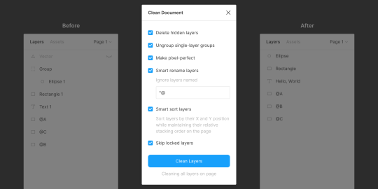
Clean Document, well … cleans your document! It deletes hidden layers, sorts them intelligently, renames them according to your liking, ungroups single-layer groups, and even rounds dimensions to the nearest pixel. A terrific tool for obsessive neat freaks!
5. Similayer (select similar layers)
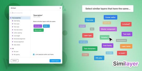
Quite simply, Similayer allows you to select layers based on their similarity to the layer that’s currently selected. Let’s say that you wanted to change a shadow style that’s being used on a number of different elements: Similayer could do that.
You could also use it to batch-reassign multiple components.
6. Viewports (change the viewport)
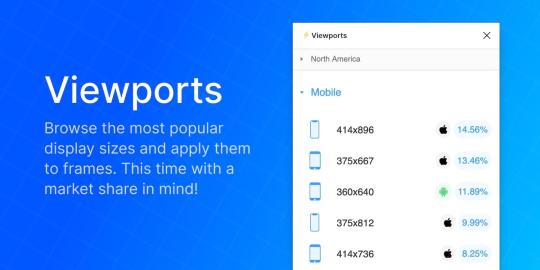
Find out the correct market share of all viewport dimensions, then apply them to frames. It’s insane how useful this is!
Viewport data is live-sourced from StatCounter.
7. Todo (create todo lists)

There are dozens of terrific todo lists, but this one exists within Figma. It’s not designed to replace your everyday todo list, but it’s a more convenient way of keeping track of your design-specific todos without needing to leave Figma. Have a list of changes to make? Need to establish priorities?
If so, install Todo.
8. Font Scale (establish a font scale)
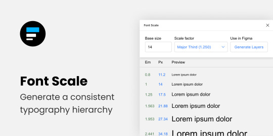
Establish a visually consistent/hierarchical font scale by choosing a base size and scale factor, then save the results to your document for continuous reference (as either em or px).
9. Content Reel (insert better-than-lorem-ipsum content)

Content Reel inserts “real” content into your design. Need a quick address? Or an avatar? For some reason can’t think of a single name when you need one? Content Reel has your back.
Designing with real data ensures that the design doesn’t look odd once developed, and also helps us to design for edge cases.
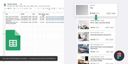
10. Google Sheets Sync (sync data from Google Sheets)
Whether your app has an API or you just want to create a table of data manually, Google Sheets Sync will basically allow you to sync this data directly into Figma. It’s like Content Reel, but instead you define the data yourself. It’s useful for designers that want to build ultra-realistic mockups with data from their actual niche (or live application), and it’s especially useful for teams that want to design using the same library of data.
11. Chart (create “real data” charts)

Create stunning, customizable charts with data from Excel, Numbers, Google Sheets, or simply import a local CSV or JSON file. Datavizer is suitable alternative, but Chart can also sync with live JSON (i.e. you can connect Chart to a REST API).
12. Iconify (utilize icon fonts)
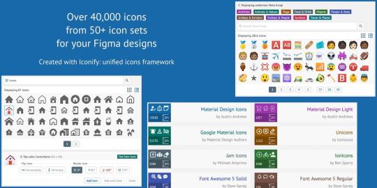
All icon fonts, right inside Figma. Material Design Icons, FontAwesome, Jam Icons, EmojiOne, Twitter Emoji — you name it.
Pretty iconic, really.
13. Figmotion (create animations)

If the thought of exploring animation scares you, or you dread switching tools to access advanced animation features, Figmotion makes animation a lot less anxiety-inducing. The animations are also easy to hand off, since they’re based on web technologies.
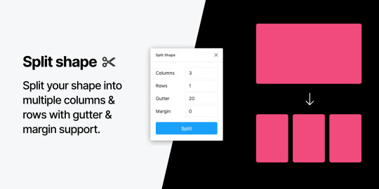
14. Split Shape (make columns … and stuff)
An interesting method of creating columns, Split Shape splits, say, a rectangle into multiple rectangles from which you can then create columns (or rows, or whatever). Split Shape can be used for various things if one thinks outside the box! 😁
15. Remove BG (create transparent bitmaps)

Remove BG is a web tool that removes the background of bitmap images, effectively turning them into transparent PNGs. Remove BG for Figma essentially does the same thing, but within Figma.
If you’ve been hoarding Adobe Photoshop only so that you can remove backgrounds, you can now delete it and probably free up approximately 80 thousand million GBs of space on your SSD 😌.
Popular Figma Plugins
There are a few Figma Plugins that I didn’t mention because they’re already super well-known to users of other UI design tools such as Sketch. You probably have these ones already:
Confetti (create dispersions)
Unsplash (insert stock images)
Rename It (rename layers more efficiently)
Humaaans (insert mix-n-match illustrations)
Stark or A11y – Color Contrast Checker (measure color contrast)
Bonus Figma Plugins
These Figma Plugins are awesome, but you might not need them often (if at all). It’s nice to know they’re there, though.
Arc (arch text)
Roto (rotate-extrude shapes)
Table Generator (create tables)
To Path (create text on a path)
Brandfetch (source brand assets)
Isometric (make objects isometric)
Mapsicle or Map Maker (create maps)
Skew (create simple isometric mockups)
Image Tracer (convert bitmaps to vectors)
Shadow Picker (intelligently create shadows)
Metaball/Blobs/Waves (create abstract shapes)
And finally, all Figma Plugins (in case you just can’t get enough of ’em! 😉).
Keen to learn the ins and outs of developing your own plugins, either to improve your workflow or the workflow of others? Check out Figma’s Plugin Docs.
14 notes
·
View notes
Text
Switch Rows/Columns of Chart Data & Embedding Fonts in PowerPoint Documents using Java
What's New in this Release?
Aspose team is happy to share the announcement of Aspose.Slides for Java 17.8.0. This is one of important product releases whereby we have added support for certain long awaiting features along with resolution of incurring issues in API. There are some important features introduced in this release, such as support for switching Rows and Columns of chart data, Support for setting offset values of stretched picture, Support embedding fonts in the PowerPoint documents, Support for getting loaded fonts list from LoadExternalFonts() and support for adding Notes styles. Some important enhancements and issues have been fixed in this release, such as Exception on extracting internal slide hyperlink, Gradient and Texture effects are missing in exported HTML, Shape outlines on tables/charts are not rendered in PDF/PNG, Text in exported SVG is misplaced, Autofit property is not working properly, Table rendered as blurred in exported PDF, Difference in Language ID for PPT and PPTX files, Information is removed from NotesMaster XML on saving presentation, Chart plot area missing in exported PDF, Exception on loading presentation, ole object property not working properly and many more. This list of new, improved and bug fixes in this release are given below
Embedding a PDF or mp3 as an icon in presentation
Add support for PP2010 PPTX presentations with embedded video
Support for switching Rows and Columns of chart data
Support for setting offset values of stretched picture
Adding the picture border feature
Difference between organization of text extracted from PPT and PPTX
Support embedding fonts in the PowerPoint documents
Support for getting loaded fonts list from LoadExternalFonts()
Add support for PP2010 PPTX presentations with embedded video
Exception on extracting internal slide hyperlink
Gradient and Texture effects are missing in exported HTML
Package "com.aspose.slides.Collections" is not exported in the MANIFEST.MF
Shape outlines on tables/charts are not rendered in PDF/PNG
Text in exported SVG is misplaced
Autofit Property is not working properly
Table rendered as blurred in exported PDF
Difference in Language ID for PPT and PPTX files
Information is removed from NotesMaster XML on saving presentation
Chart plot area missing in exported PDF
Exception on loading presentation
OLE object property not working properly
Exception on saving presentation
PPTX not properly rendered to SVG
Missing shapes and misaligned chart in exported PDF
Other most recent bug fixes are also included in this release
Newly added documentation pages and articles
Some new tips and articles have now been added into Aspose.Slides for Java documentation that may guide users briefly how to use Aspose.Slides for performing different tasks like the followings.
Add StretchOff Property
Adding Notes Style
Overview: Aspose.Slides for Java
Aspose.Slides is a Java component to create, read, write and modify a PowerPoint document without using Microsoft PowerPoint. It supports PHP applications and provides all advanced features for managing presentations, slides, shapes, tables and supports PPT, POT, POS PowerPoint formats. Now you can add, access, copy, clone, edit and delete slides in your presentations. It also supports audio & video frames, adding pictures, text frames and saving presentations as streams or SVG format.
More about Aspose.Slides for Java
Homepage of Aspose.Slides for Java
Downlaod Aspose.Slides for Java
Online documentation of Aspose.Slides for Java
#Switch Rows/Columns of chart data#set offset values of stretched picture#embed fonts in PowerPoint documents#get loaded fonts list#add Notes styles#Java PowerPoint API
0 notes
Text
Mastering Chart And Graph Essentials In Excel
Imagine impressing your team, executives, and clients with your new skills, presenting data visually in engaging professional charts!
Effective charting is a strongly “in-demand” and valuable skill to possess in government, private and education sectors.
Charts (graphs) can present information for decision-makers and researchers in appealing presentations, making it easier to interpret data.
A visually-oriented audience responds especially well to graphs and often understands the information better without complex tables and text.
With 16 chart types in MS Excel including the new funnel chart, there are many choices to present information in a clear, engaging, and professional manner.
Each chart type has up to 7 sub-chart variations plus a massive range of formatting options and variations.
Maximize your practical application of this powerful Excel feature and take data analysis and interpretation to a professional level, helping your audience visualize and understand the results of your research.
Charts emphasize key information and trends, make data presentation more convincing, and can provide a far clearer and more concise way of presenting information than displaying a bulk of numerical data and tables.
Master this impressive capability of Excel and how you can create charts in seconds, "working smarter, not harder"!
Why Should You Attend
» Gain a practical understanding of effective and engaging Excel chart and graph techniques. » Retain over 75% of your knowledge gained through practice using the step-by-step Learner Guide and exercise files provided.
Areas Covered
» Correct data setup for charting » Create a new chart from scratch » Chart sheet Vs. embedded chart » Professional chart formatting » Resize, reposition and delete a chart » Add and manage chart elements » Adjust the axis scale and elements » Change layouts » Switch row and column orientation » Add a data table with a legend » Stack pictures in column graphs » Create Sparkline charts » Add chart annotations and graphics » Link a chart heading to your table » Link a chart into Word or PowerPoint » Print charts » Quick Analysis feature
Who Will Benefit
Staff, managers, and executives who are required to confidently manage data and present business-critical information in a wide variety of private and public sector professions including:
» Accounting » Banking » Business Analysis » Economics » Finance » Insurance » Investment Advice » Management » Statistics » Strategic planning » Government / Public Service » Education / Academic » Valuation » Audit » Supply Chain & Logistics » Human Resources » Retail To Register (or) for more details please click on this below link: https://bit.ly/3M1V3Fq/a> Email: [email protected] Tel: (989)341-8773

0 notes
Text
statistics excel cheat sheet download 100% working WCVO?
💾 ►►► DOWNLOAD FILE 🔥🔥🔥🔥🔥 Excel Formulas Cheat Sheet. Database Functions. DAVERAGE This function will return the average of selected database entries. Guide to cheat sheet of Excel Formulas. Here we are going to discuss the Different Excel Formulas with respective examples with detailed explanation. Returns the average (arithmetic mean) of all cells that meet multiple criteria. Returns the correlation coefficient between two data sets. Excel Formulas Cheat Sheet. Page 1 of 7. Basic Formulas. Explanation. =AVERAGE(A2:A10). Returns a mathematical average of a. 9 Are you looking to get a discount on popular programming courses? Then click here. View offers. Disclosure: Hackr. When you purchase through links on our site, we may earn an affiliate commission. Microsoft Excel is one of the top in-demand skills on the market. Whether you're starting to learn Excel or already an expert, having a cheat sheet in your pocket can help. An Excel cheat sheet gives you a brief overview of the functions, commands, formulas, and shortcuts in Excel—so you can focus on your work. Review your basic vocabulary before looking at functions and commands to fully understand how Excel formats its data. As a spreadsheet program, Excel focuses on storing data. Here are the data types that Excel frequently stores. In Excel, a function is simply a preset formula or algorithm. Here are some of the most common Excel formulas in our Excel functions list cheat sheet. Shortcuts are a great way to increase productivity. Here are some of the most common keyboard shortcuts to help you work faster in Excel. In addition to shortcuts, Excel has many built-in commands that can be accessed using shortcut keys or the ribbon. Here are some of the most common. Not everything is readable in a series of columns and rows. When you need something human-readable, you need a graph. Excel offers several ways to create graphs and charts. A Basic Excel cheat sheet or Excel commands cheat sheet can only do so much. It would help if you still learned the basics of Excel. But once you have a basic understanding of what the spreadsheet program is capable of, you should be able to look up things you need to know in the above Excel cheat sheet. Use the above Excel function cheat sheet whenever you need to do something specific in Excel. Most formulas that you would need will pop up when you start typing in Excel. As long as you know what formulas are available in Excel, you should be able to look them up on this sheet. These are just a few of the many formulas available in Excel. Jenna Inouye has been a full stack developer for two decades, specializing in web application design and development. For the last eight years, she has worked as a news and feature writer focusing on technology and finance, with bylines in Udemy, SVG, and The Gamer. View all posts by the Author. Don't have an account? Sign Up. Already have an account? We recognized you are using an ad blocker. We totally get it. Still, ads support Hackr and our community. That's why we give you the option to donate to us, and we will switch ads off for you. Submit a tutorial Jobs Sign In. Cheat Sheet. Related Tutorials Data Science. Intro to Programming. Jenna Inouye. Table of Contents. Take This Course. What are the 5 Functions in Excel? What are the 7 Basic Excel Formulas? Cheat Sheet Excel. Jenna Inouye Jenna Inouye has been a full stack developer for two decades, specializing in web application design and development. Leave a comment. Submit Cancel. Welcome Back. Forgot Password. Welcome to Hackr. Create Account. Send Password. Turn off your ad-blocker Donate. Select from the best sales here. Paid Video Resources. Paid Video Advanced. Paid Video. A predefined formula is used to perform standard calculations, such as summing a range of values. Also called labels, text values identify data in a worksheet or store things like names and descriptions. Example: Hello, World! Numbers are used for calculations and can be formatted as currency, percentages, decimals, etc. Example: 1. Formats text with the correct capitalization; useful when importing data from other sources. Round a number up to the first number of significance, e. Round a number down to the first number of significance, e. Get the current date and time. Example: NOW. Similar to now, but this just gives the date, rather than the date and time. Opens the Paste Special dialog box, which allows you to choose how to paste data from the clipboard.
1 note
·
View note
Text
statistics excel cheat sheet download new 149V#
💾 ►►► DOWNLOAD FILE 🔥🔥🔥🔥🔥 Excel Formulas Cheat Sheet. Database Functions. DAVERAGE This function will return the average of selected database entries. Guide to cheat sheet of Excel Formulas. Here we are going to discuss the Different Excel Formulas with respective examples with detailed explanation. Returns the average (arithmetic mean) of all cells that meet multiple criteria. Returns the correlation coefficient between two data sets. Excel Formulas Cheat Sheet. Page 1 of 7. Basic Formulas. Explanation. =AVERAGE(A2:A10). Returns a mathematical average of a. 9 Are you looking to get a discount on popular programming courses? Then click here. View offers. Disclosure: Hackr. When you purchase through links on our site, we may earn an affiliate commission. Microsoft Excel is one of the top in-demand skills on the market. Whether you're starting to learn Excel or already an expert, having a cheat sheet in your pocket can help. An Excel cheat sheet gives you a brief overview of the functions, commands, formulas, and shortcuts in Excel—so you can focus on your work. Review your basic vocabulary before looking at functions and commands to fully understand how Excel formats its data. As a spreadsheet program, Excel focuses on storing data. Here are the data types that Excel frequently stores. In Excel, a function is simply a preset formula or algorithm. Here are some of the most common Excel formulas in our Excel functions list cheat sheet. Shortcuts are a great way to increase productivity. Here are some of the most common keyboard shortcuts to help you work faster in Excel. In addition to shortcuts, Excel has many built-in commands that can be accessed using shortcut keys or the ribbon. Here are some of the most common. Not everything is readable in a series of columns and rows. When you need something human-readable, you need a graph. Excel offers several ways to create graphs and charts. A Basic Excel cheat sheet or Excel commands cheat sheet can only do so much. It would help if you still learned the basics of Excel. But once you have a basic understanding of what the spreadsheet program is capable of, you should be able to look up things you need to know in the above Excel cheat sheet. Use the above Excel function cheat sheet whenever you need to do something specific in Excel. Most formulas that you would need will pop up when you start typing in Excel. As long as you know what formulas are available in Excel, you should be able to look them up on this sheet. These are just a few of the many formulas available in Excel. Jenna Inouye has been a full stack developer for two decades, specializing in web application design and development. For the last eight years, she has worked as a news and feature writer focusing on technology and finance, with bylines in Udemy, SVG, and The Gamer. View all posts by the Author. Don't have an account? Sign Up. Already have an account? We recognized you are using an ad blocker. We totally get it. Still, ads support Hackr and our community. That's why we give you the option to donate to us, and we will switch ads off for you. Submit a tutorial Jobs Sign In. Cheat Sheet. Related Tutorials Data Science. Intro to Programming. Jenna Inouye. Table of Contents. Take This Course. What are the 5 Functions in Excel? What are the 7 Basic Excel Formulas? Cheat Sheet Excel. Jenna Inouye Jenna Inouye has been a full stack developer for two decades, specializing in web application design and development. Leave a comment. Submit Cancel. Welcome Back. Forgot Password. Welcome to Hackr. Create Account. Send Password. Turn off your ad-blocker Donate. Select from the best sales here. Paid Video Resources. Paid Video Advanced. Paid Video. A predefined formula is used to perform standard calculations, such as summing a range of values. Also called labels, text values identify data in a worksheet or store things like names and descriptions. Example: Hello, World! Numbers are used for calculations and can be formatted as currency, percentages, decimals, etc. Example: 1. Formats text with the correct capitalization; useful when importing data from other sources. Round a number up to the first number of significance, e. Round a number down to the first number of significance, e. Get the current date and time. Example: NOW. Similar to now, but this just gives the date, rather than the date and time. Opens the Paste Special dialog box, which allows you to choose how to paste data from the clipboard.
1 note
·
View note
Text
statistics excel cheat sheet download 100% working TCI+
💾 ►►► DOWNLOAD FILE 🔥🔥🔥🔥🔥 Excel Formulas Cheat Sheet. Database Functions. DAVERAGE This function will return the average of selected database entries. Guide to cheat sheet of Excel Formulas. Here we are going to discuss the Different Excel Formulas with respective examples with detailed explanation. Returns the average (arithmetic mean) of all cells that meet multiple criteria. Returns the correlation coefficient between two data sets. Excel Formulas Cheat Sheet. Page 1 of 7. Basic Formulas. Explanation. =AVERAGE(A2:A10). Returns a mathematical average of a. 9 Are you looking to get a discount on popular programming courses? Then click here. View offers. Disclosure: Hackr. When you purchase through links on our site, we may earn an affiliate commission. Microsoft Excel is one of the top in-demand skills on the market. Whether you're starting to learn Excel or already an expert, having a cheat sheet in your pocket can help. An Excel cheat sheet gives you a brief overview of the functions, commands, formulas, and shortcuts in Excel—so you can focus on your work. Review your basic vocabulary before looking at functions and commands to fully understand how Excel formats its data. As a spreadsheet program, Excel focuses on storing data. Here are the data types that Excel frequently stores. In Excel, a function is simply a preset formula or algorithm. Here are some of the most common Excel formulas in our Excel functions list cheat sheet. Shortcuts are a great way to increase productivity. Here are some of the most common keyboard shortcuts to help you work faster in Excel. In addition to shortcuts, Excel has many built-in commands that can be accessed using shortcut keys or the ribbon. Here are some of the most common. Not everything is readable in a series of columns and rows. When you need something human-readable, you need a graph. Excel offers several ways to create graphs and charts. A Basic Excel cheat sheet or Excel commands cheat sheet can only do so much. It would help if you still learned the basics of Excel. But once you have a basic understanding of what the spreadsheet program is capable of, you should be able to look up things you need to know in the above Excel cheat sheet. Use the above Excel function cheat sheet whenever you need to do something specific in Excel. Most formulas that you would need will pop up when you start typing in Excel. As long as you know what formulas are available in Excel, you should be able to look them up on this sheet. These are just a few of the many formulas available in Excel. Jenna Inouye has been a full stack developer for two decades, specializing in web application design and development. For the last eight years, she has worked as a news and feature writer focusing on technology and finance, with bylines in Udemy, SVG, and The Gamer. View all posts by the Author. Don't have an account? Sign Up. Already have an account? We recognized you are using an ad blocker. We totally get it. Still, ads support Hackr and our community. That's why we give you the option to donate to us, and we will switch ads off for you. Submit a tutorial Jobs Sign In. Cheat Sheet. Related Tutorials Data Science. Intro to Programming. Jenna Inouye. Table of Contents. Take This Course. What are the 5 Functions in Excel? What are the 7 Basic Excel Formulas? Cheat Sheet Excel. Jenna Inouye Jenna Inouye has been a full stack developer for two decades, specializing in web application design and development. Leave a comment. Submit Cancel. Welcome Back. Forgot Password. Welcome to Hackr. Create Account. Send Password. Turn off your ad-blocker Donate. Select from the best sales here. Paid Video Resources. Paid Video Advanced. Paid Video. A predefined formula is used to perform standard calculations, such as summing a range of values. Also called labels, text values identify data in a worksheet or store things like names and descriptions. Example: Hello, World! Numbers are used for calculations and can be formatted as currency, percentages, decimals, etc. Example: 1. Formats text with the correct capitalization; useful when importing data from other sources. Round a number up to the first number of significance, e. Round a number down to the first number of significance, e. Get the current date and time. Example: NOW. Similar to now, but this just gives the date, rather than the date and time. Opens the Paste Special dialog box, which allows you to choose how to paste data from the clipboard.
1 note
·
View note
Text
Stockmarketeye v4

Stockmarketeye v4 pro#
Stockmarketeye v4 plus#
Stockmarketeye v4 mac#
Stockmarketeye v4 mac#
If you are a newbie of the Mac computer, you might be not. Most common problems for the app removal. The APP in my iPhone needs many things to improve. StockMarketEye 4.2.4 should be re-installed on the computer. Options to change colors and highlight rows Rather than click the 'ADD' bottom to add a stock, maybe just enter the symbol directly in the symbol cellį. StockMarketEye isn't an analysis tool it won't pick investments for you, just help you keep track of them. Simple copy/paste to another program like excel or power pointĮ. StockMarketEye even accepts data imported in Quicken's QIF file format. P/E, Short Interest, Mkt.Cap) in regards of market cap, it shows some ADRs in different currency rather than USD.confusing.ĭ. Not very accurate or updated some information (e.g. Option to change the Chart font.small numbersī. Great to manage watchlists and portfoliosĪ. Charts in the same screen to see all togetherĥ. Enough fundamental information.very completeģ. StockMarketEye offers what I need and I look forward of new upgrades.the APP great complement but is far behind of the computer version. I wanted something simple, easy but complete to watch my portfolios fast and in real time.
Stockmarketeye v4 plus#
I would like to be able to chart the overall performance of my portfolio, and display it in comparison with indices, moving averages, etc.Ĭomments: I'm a portfolio manager with 20 plus years of experience, and I use Bloomberg for many years. So, user created/defined views would be great.Ģ. Currently, I'm finessing this by creating duplicate watchlists for each view I'd like, but that is a pain if I add, delete, or change entries in a portfolio. I would really like to create as many views as I want for each portfolio or watchlist (e.g. Currently, there are two views on portfolios: Prices and Fundamentals. All in all, though, I find the tool solid, reliable, and well-designed.ġ. It does provide a very useful range of fundamental metrics and ratios through the "Configure Columns" command, although the command is hard to access (you need to right click on the column header).
Stockmarketeye v4 pro#
The user interface is simple and intuitive, for the most part. Corel VideoStudio Ultimate 2022 25.1.0.472 (crk) Corel VideoStudio Ultimate 2019 v22.3.0.436 Final (crk) Corel VideoStudio Ultimate 2021 24.0.1.260 (crk) Corel VideoStudio Pro X10 20.1.0.14 (Kgn) Windows Small Buisiness Server 2011. Nothing is worse than sitting down to check your portfolio and finding your tool is offline. StockMarketEye - Investment Management Software. It is reliable which is the main reason I switched from my other tool. SalesPage Financial is in use by 4 of the top 10 US Mutual Funds companies and is consider to be among. If you could add the two features I listed under cons, I would be very happy. iBank was the first alternative I found, but the reviews I read indicated the. R from CA posted over 10 years ago: A month ago I was looking for a Mac program that would track my investments (including downloading transactions). Comments: I'm enjoying the tool, and it beats what I've used before. I've found StockMarketEye an even better app for investments, partly because it offers Notes and has superb charts.
0 notes
Text
Google sheets for excel

#GOOGLE SHEETS FOR EXCEL PASSWORD#
There’s a free, browser-based version similar to Sheets.
Collaborators can see who’s made changes.
Creators can disable the ability to forward, copy, or print documents.
#GOOGLE SHEETS FOR EXCEL PASSWORD#
You can password protect Individual documents.You can send documents as email attachments.In addition, Excel surpasses Google Sheets in the following ways: The ability to filter and sort to facilitate analysisĮxcel is more feature-rich than Google Sheets, is superior at handling complicated calculations, and offers far more in-depth support.The ability to include links to external data sources.The ability to format spreadsheets for web publication.The ability to add comments and reply to collaborators’ questions.The ability to share documents with collaborators.Visual representations of data, like line graphs, bar charts, pie charts, area graphs, histograms, and maps.Pivot tables, which allow you to filter and sort large data sets.Formulas, which allow you to perform all kinds of calculations - from simple math to complicated computations, like figuring out sales tax for multiple jurisdictions or determining projections of future income based on multiple factors.Here are some of the key benefits and features of both Excel and Google Sheets: And, they are not just for financial professionals or accountants creative people can use them as well. Whether you use Google Sheets, Excel, or another lesser-known application, spreadsheets are powerful tools that allow you to manipulate and analyze the data (both numeric and textual) in cells, columns, and rows. When you move a document from Sheets to Excel, most formulas will continue to work, but you should still verify all of them.īefore you transfer documents, make note of any macros and formulas, so you can recreate the macros and verify if the formulas are working after you open the document in Excel. While there is a lot of overlap between the formulas Google Sheets and Excel use, there are many that only work in one of the applications or in which the format is different. When you convert macros in Google Sheets documents to Excel, you will have to recreate those macros after you open the documents in Excel.īoth applications use formulas. VBA (Visual Basic for Applications) is the scripting language Excel uses Google Sheets uses Google Apps Script. Macros won’t transfer because Excel and Google Sheets each use different scripting languages to create and store them. The key items to be aware of are macros and formulas. When you’re opening a Sheets document in Excel, not all spreadsheet functions will make the transfer. What Happens to VBA, Macros, and Formulas When Transferring from Google Sheets to Excel? Spreadsheets are getting larger and more complex, so an organization requires the accelerated responsiveness of Excel.Sheets doesn’t have certain functions that a company needs.Policy requires sending documents as attachments rather than links.Users may not want to be tied to the Google ecosystem.A key person may not want to use Google Sheets.There are a variety of reasons an organization may decide to switch from Google Sheets to Excel for its spreadsheet needs. Reasons to Convert from Google Sheets to Excel If you’ve given Google Sheets a try, but want to move back to Excel as your primary spreadsheet program, here are some things to think about and steps to take that can help expedite the process. WorkApps Package your entire business program or project into a WorkApp in minutes.Digital asset management Manage and distribute assets, and see how they perform.Resource management Find the best project team and forecast resourcing needs.Intelligent workflows Automate business processes across systems.Governance & administration Configure and manage global controls and settings.Streamlined business apps Build easy-to-navigate business apps in minutes.Integrations Work smarter and more efficiently by sharing information across platforms.Secure request management Streamline requests, process ticketing, and more.Process management at scale Deliver consistent projects and processes at scale.Content management Organize, manage, and review content production.Workflow automation Quickly automate repetitive tasks and processes.Team collaboration Connect everyone on one collaborative platform.Smartsheet platform Learn how the Smartsheet platform for dynamic work offers a robust set of capabilities to empower everyone to manage projects, automate workflows, and rapidly build solutions at scale.
0 notes